Modern Home Decor: 10 Considered Picks for a Curated Home
Modern home decor lives or dies by restraint — the willingness to let one piece carry the room rather than crowding every surface with intent. These ten picks cross the Gallery Flair line: Frame TV art, printable wall art, and desktop wallpapers that share a certain considered quietness, whatever palette they arrive in.
1. Nature's Earthy Rhythm — Frame TV Art
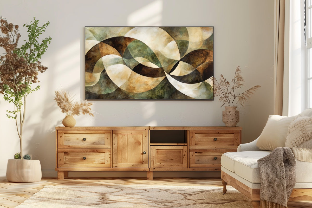
Warm sienna, soft ochre, and the quiet brown of turned soil — this Frame TV piece brings an outdoor stillness into the room without demanding you notice it. On a Samsung Frame, it holds the wall the way a linen panel would: softly structural. The earthy tones make it a natural anchor in a living room that already leans neutral, and the composition breathes without empty-feeling space.
2. Celestial Night Harmony — Frame TV Art
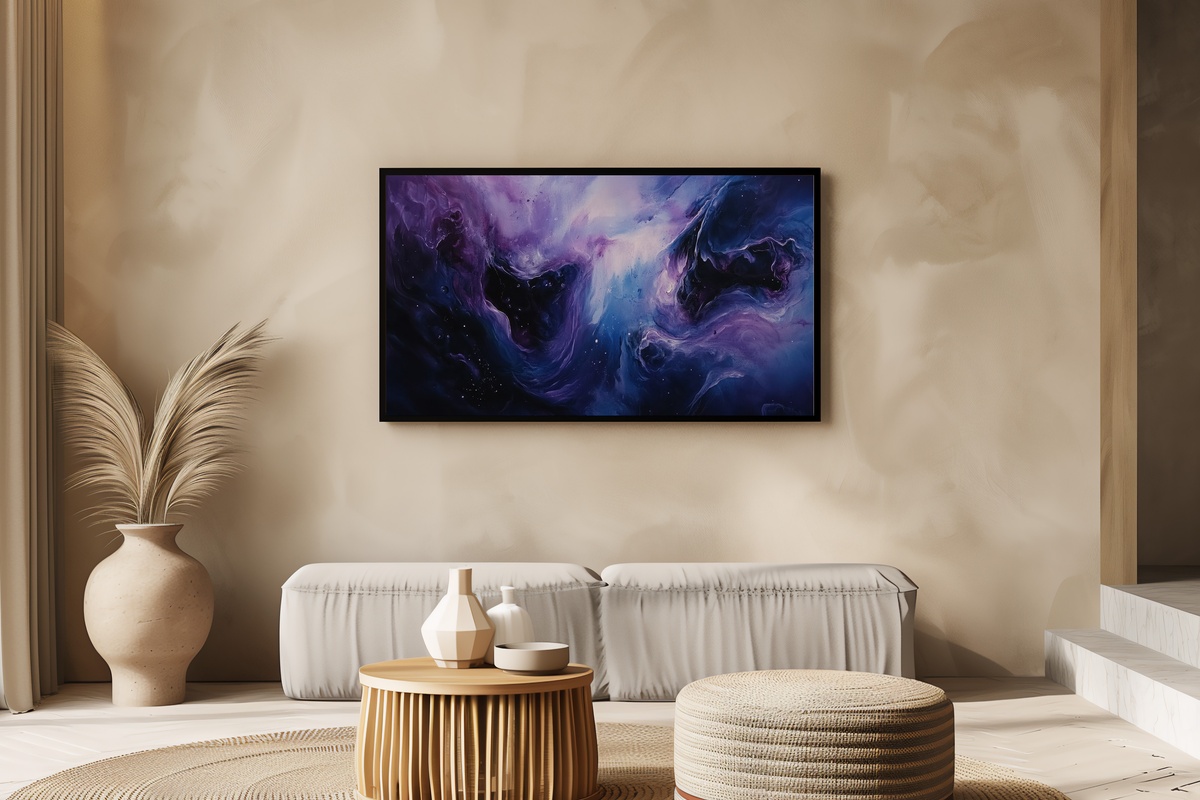
This one shifts the mood entirely toward dusk. Deep navy bleeds into soft violet with the kind of tonal layering that reads almost atmospheric — as though the sky beyond a window were just on the other side of the screen. Pair it with warm-toned lamp light in the evening and the contrast between the cool celestial palette and your room's ambient warmth becomes quietly dramatic without being theatrical.
3. Textured Line Flow — Frame TV Art
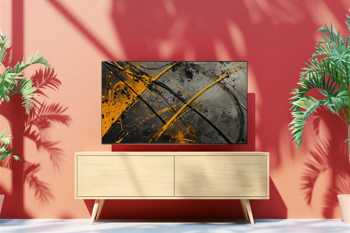
If you've been looking for something that reads as art rather than decoration, the deliberate line work here earns that distinction. Thin, unhurried strokes move across a textured ground — not the smooth digital perfection that can flatten a piece, but something that looks as though it absorbed a little light before it reached you. An ideal choice for a study, bedroom, or any space where clutter is already minimal.
For a focused Frame TV-specific edit across the modern cluster — composition breakdowns, aspect ratio notes, and how each piece handles the transition from active screen to ambient mode — our 7-piece modern Frame TV Art guide goes considerably deeper.
4. Nature's Earthy Rhythm — Printable Wall Art
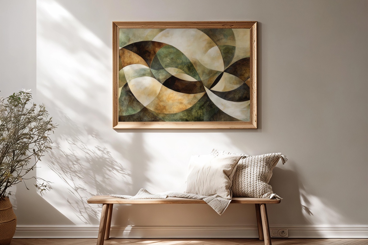
The same earthy palette from item one, now sized for a printed frame. Terracotta-adjacent warmth, softened by the kind of dusty mid-tone that makes a room feel lived-in rather than styled. Download, print at a local lab on matte paper, and the texture of the stock adds a dimension the screen version can only gesture toward. Works beautifully in a gallery wall alongside natural fiber frames or raw wood.
5. Ocean Wave Blue Harmony — Printable Wall Art
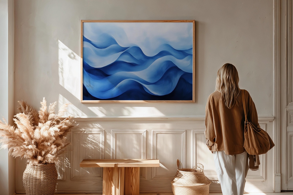
Blue in motion, but without the obvious coastal cliché. The tonal range here moves from pale aqua through deeper teal in a way that feels more painterly than photographic — closer to a studio piece than a surf poster. Hang it in a bathroom where morning light can find it, or in a bedroom as the single point of cool color against an otherwise warm scheme. The wave form is abstract enough to age well.
6. Line Dance on Textured Canvas — Printable Wall Art
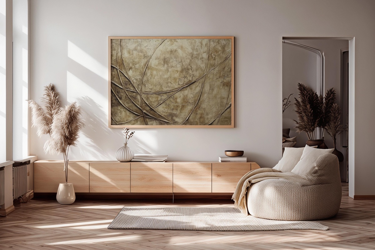
Lines that feel hand-traced rather than vector-precise — the slight variance in weight and direction is what separates this from generic minimalist wall art. The textured ground gives it a canvas-like quality even before it reaches the printer. Frame it simply in thin black or natural oak and let the piece do the rest. A strong candidate for a dining room accent wall or a dedicated reading corner.
If you want this same modern line aesthetic carried through to your devices, our modern aesthetic wallpaper edit shows how to build visual continuity from your walls to your screens.
7. Desert Calm in Modern Brushstrokes — Desktop Wallpaper
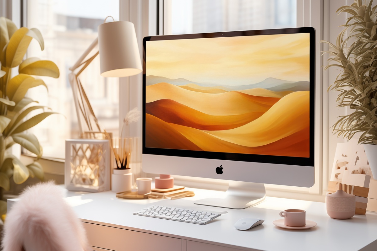
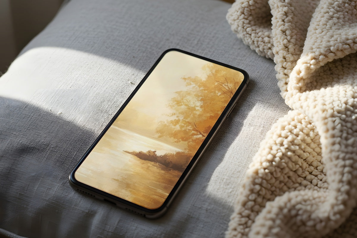
Sand, warm stone, and the faint blush of late-afternoon desert light — all rendered in loose, open brushwork that fills a monitor without competing with whatever you're working on. A desktop wallpaper this restrained has real functional value: it softens screen fatigue without disappearing into grey neutrality. Pair it with the earthy printable pieces in this edit for a desk-to-wall palette that actually coheres.
8. Vivid Red and Black Energy — Desktop Wallpaper
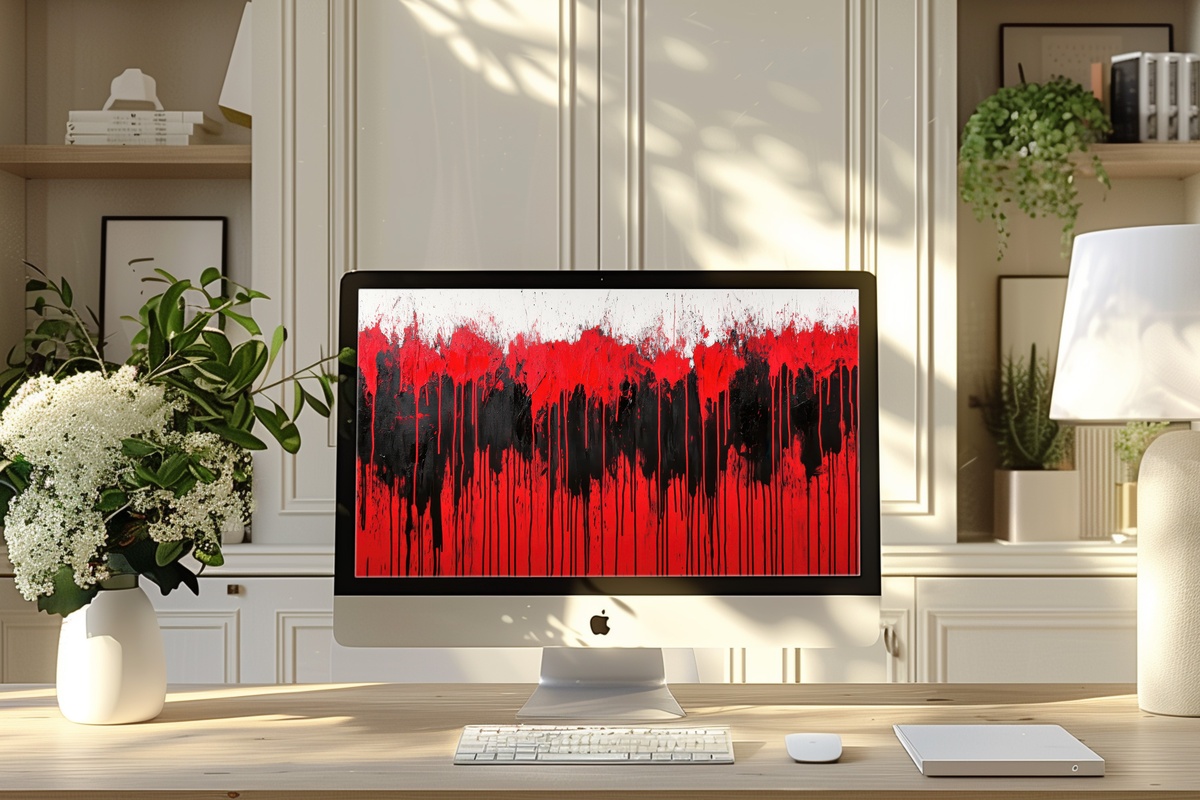
One deliberate departure from the quieter palette of the rest of this edit. Red and black at high contrast demands something from the room — and from you — and that's precisely the point. This one belongs in a workspace where energy and focus matter more than calm. The brushwork keeps it from reading as graphic-design aggressive; it stays on the art side of the line, which is the only place it should be.
9. Line Dance on Textured Canvas — Desktop Wallpaper
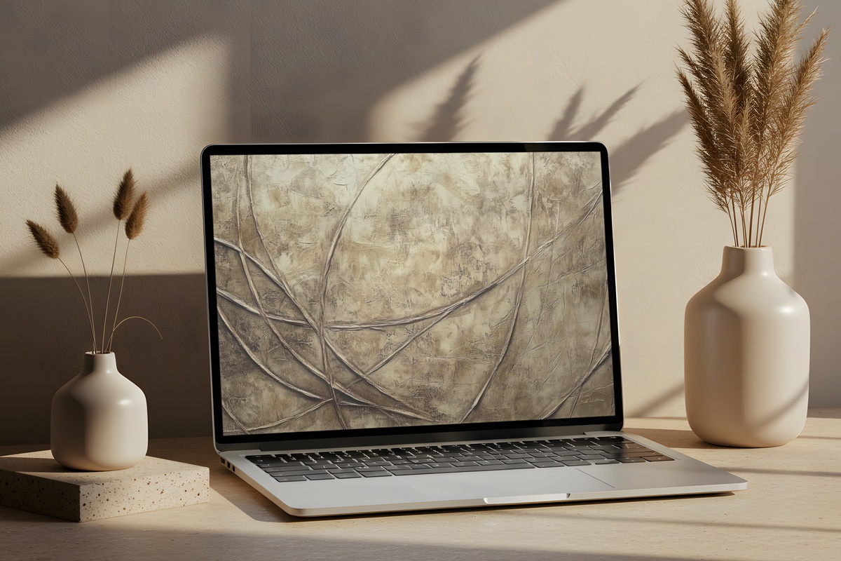
The line-and-texture pairing that worked so well as a printable translates with equal composure to a desktop screen. The tonal subtlety — off-white lines on a warm, slightly grained ground — means it recedes when a browser window opens but rewards you every time you glimpse the desktop. A Mac or Windows setup that pairs this with the printable version on the wall above the monitor will feel more intentional than most studio spaces.
10. Essence of Nature in Color — Printable Wall Art

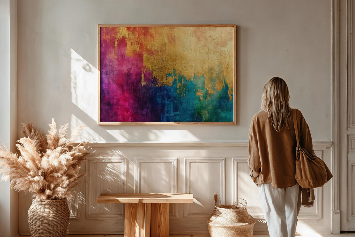
Where the rest of this edit sits in neutral or tonal territory, this one commits to color — and earns it. Botanical references filtered through a modern color sensibility: hues that feel saturated but not overwrought, the kind that shift slightly with the hour of the light. Morning sun pulls out the warmth; evening lamp light deepens the greens. A single-piece statement for a hallway, dining room, or bedroom wall that can hold its own without supporting players.
Ten pieces across three formats — and the through-line across all of them is the same attention to palette and proportion that makes a room feel genuinely curated rather than assembled. Whether you anchor around the earthy neutrals, the celestial night tones, or the single bold color statement, the pieces here are built to layer with each other and with what you already have.
Any three pieces across the Gallery Flair line bring the bundle to 30% off, any five to 50%. The line is built to layer.