8 Abstract Printable Wall Art Picks: Composition, Palette & Mood Guide
There's a particular pause that happens when a piece of art stops you mid-room — not because it shouts, but because something in its weight or warmth feels exactly right. Abstract wall art lives or dies on that feeling, and choosing it well means reading three things before anything else: how the composition moves your eye, what the palette does to the light, and whether the mood matches the life you're actually living in that room.
What to Look for Before You Choose
Composition governs rhythm — an asymmetric sweep of color pulls the eye across a wall in a way that a centered geometric form never will. Palette sets the room's emotional temperature: ochre and terracotta read as warmth gathered in; slate and tidal blue read as space opened out. Mood is the hardest to name, but it's the thing you feel when you walk past the piece at seven in the morning. A good rule of thumb: if the art changes the room's atmosphere rather than merely decorating it, you've found the right one.
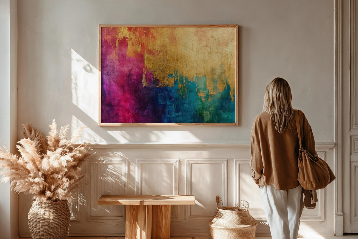
1. Golden Tapestry Splendor - Printable Wall Art
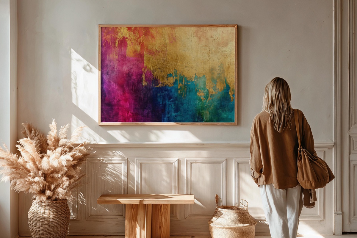
Vivid gold leaf threads across a dark ground here, creating something between a ceremonial textile and a night-lit skyline. The layering has genuine depth — areas of burnished amber sit next to cooler gilded tones, so the piece reads differently under morning sun than it does under a dimmed evening lamp. A natural choice for a dining room or a study where presence is the point. Anyone drawn to maximalist richness without maximalist clutter will recognize exactly what this piece is offering.
2. Rosy Gilded Harmony - Printable Wall Art
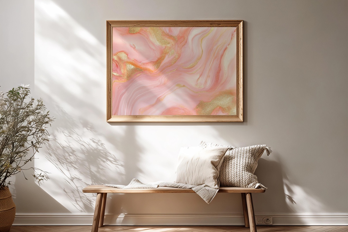
Blush and pale gold — it sounds like a recipe for saccharine, but the execution here is measured. The pink tones shift from dusty rose into near-champagne depending on the light source, and the composition keeps its restraint by letting the negative space breathe. This one earns its softness; it doesn't default to it. Consider it above a linen-upholstered headboard, or in a reading corner where the goal is a room that feels like exhaling.
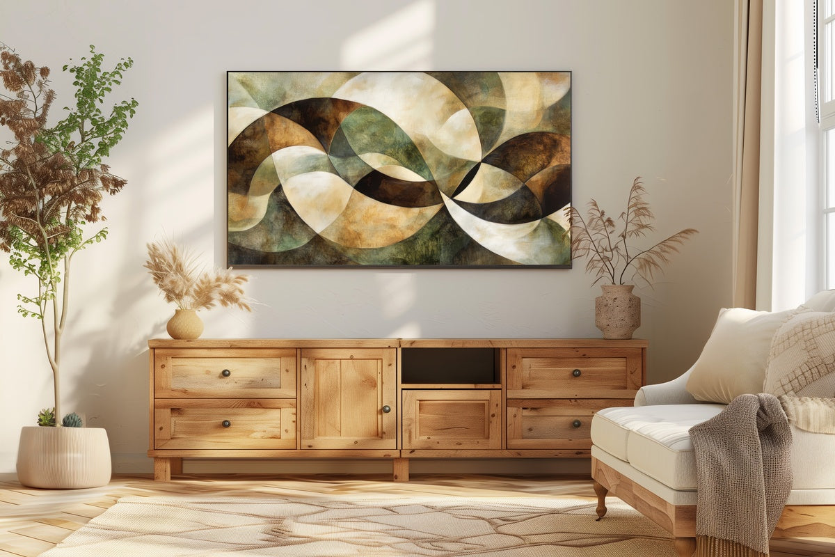
3. Neutral Geometry Elegance - Printable Wall Art
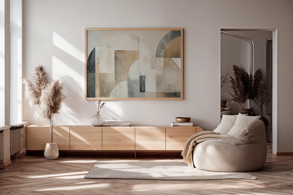
Warm greige, parchment, and a thread of charcoal — the palette here is so considered it functions almost like a neutral in the architectural sense. Geometric forms overlap without competing; each shape holds its edge without tension. If your room already has a strong character in the furniture or textile layer, this is the piece that participates without interrupting. Particularly at home in a minimalist office or a hallway that needs visual weight without visual noise.
4. Oceanic Blue Rhythms - Printable Wall Art
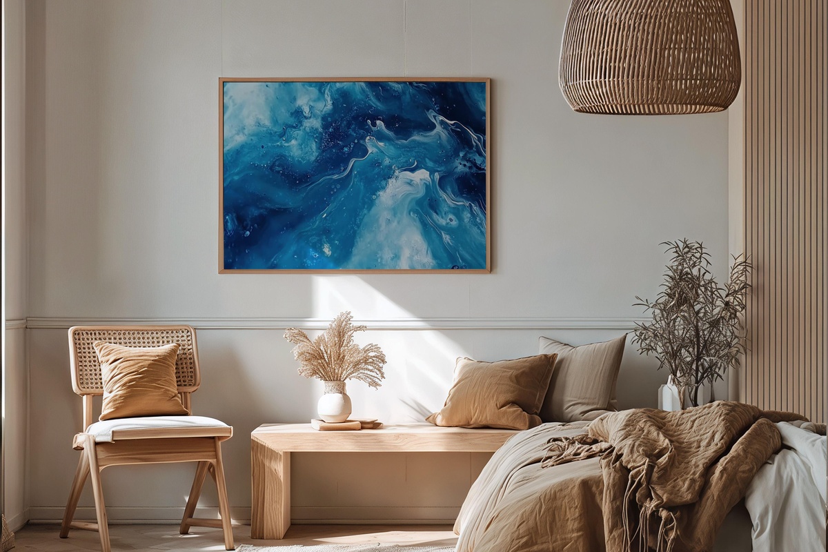
Tidal blues move across this composition in overlapping layers — deep navy pulling against cerulean, a line of near-white where they crest. The rhythm is genuinely kinetic; stand far enough back and the piece breathes. Up close, the tonal gradations are where the real craft lives. A bathroom wall benefits enormously from this kind of water-resonant palette, though it works equally well in a living room that currently reads a little too warm and needs cooling down.
A note on building a collection: pairing pieces from opposite ends of a palette temperature — say, something in the warm-gold family alongside something in the cool-blue register — creates the kind of visual tension that makes a gallery wall feel curated rather than collected. You don't need five pieces in the same mood; you need a dominant mood with one deliberate contrast. That contrast is often where the wall comes alive.
5. Crimson Noir Cascade - Printable Wall Art
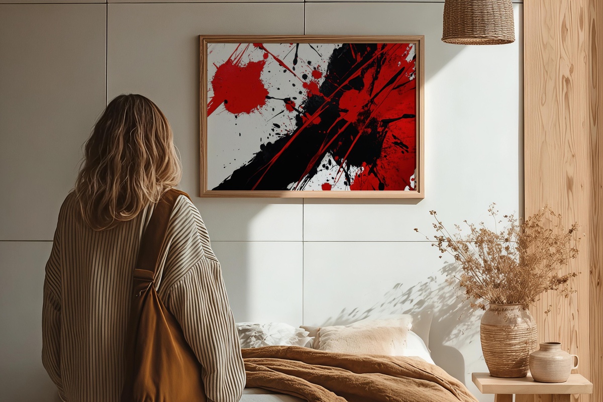
Red and black in abstraction can slide into aggression fast — this doesn't. The cascade structure gives the crimson somewhere to travel, so the energy reads as momentum rather than confrontation. Black acts as frame and ground simultaneously, which keeps the composition contained even at large print sizes. For rooms with dark walls, polished concrete, or moody velvet furnishings, this is a natural extension of the palette. Spaces that prize drama without decoration will find their match here.
6. Vivid Line Harmony - Printable Wall Art
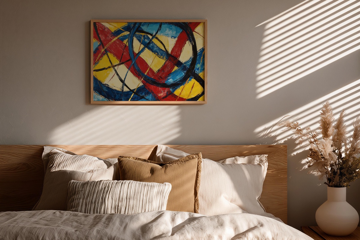
Primary color used with this much discipline is rarer than it sounds. The bold lines here — cobalt, cadmium yellow, arterial red — work because of the white space between them; remove that breathing room and the whole thing collapses into noise. It's closer to Mondrian-adjacent graphic tension than to decorative color-blocking. A children's playroom is the obvious answer, but honestly — a white-walled kitchen or a modern home office handles this equally well. An acquired taste. Confidently so.
7. Brushstroke Dreamscape Waves - Printable Wall Art
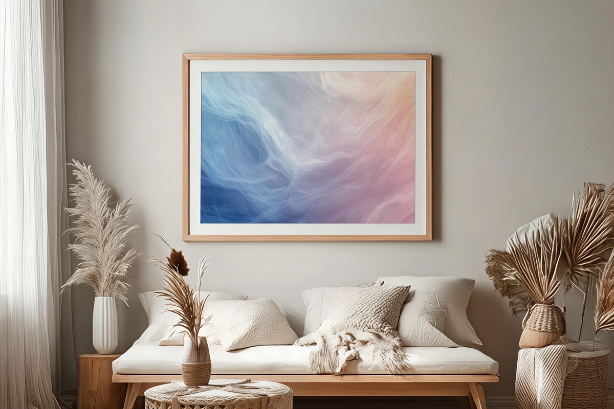
Soft sage, pale lavender, and a wash of ivory — the brushstrokes here move in gentle lateral waves, which gives the piece an almost atmospheric quality, as though looking through gauze at late-afternoon light. There's genuine painterly texture preserved in the print resolution, so even at a larger format it holds its nuance. For rooms built around slow-living or cottagecore sensibilities, this sits in without trying. A natural companion to natural linen, dried botanicals, unfinished wood.
8. Earthy Brushstroke Rhythm - Printable Wall Art
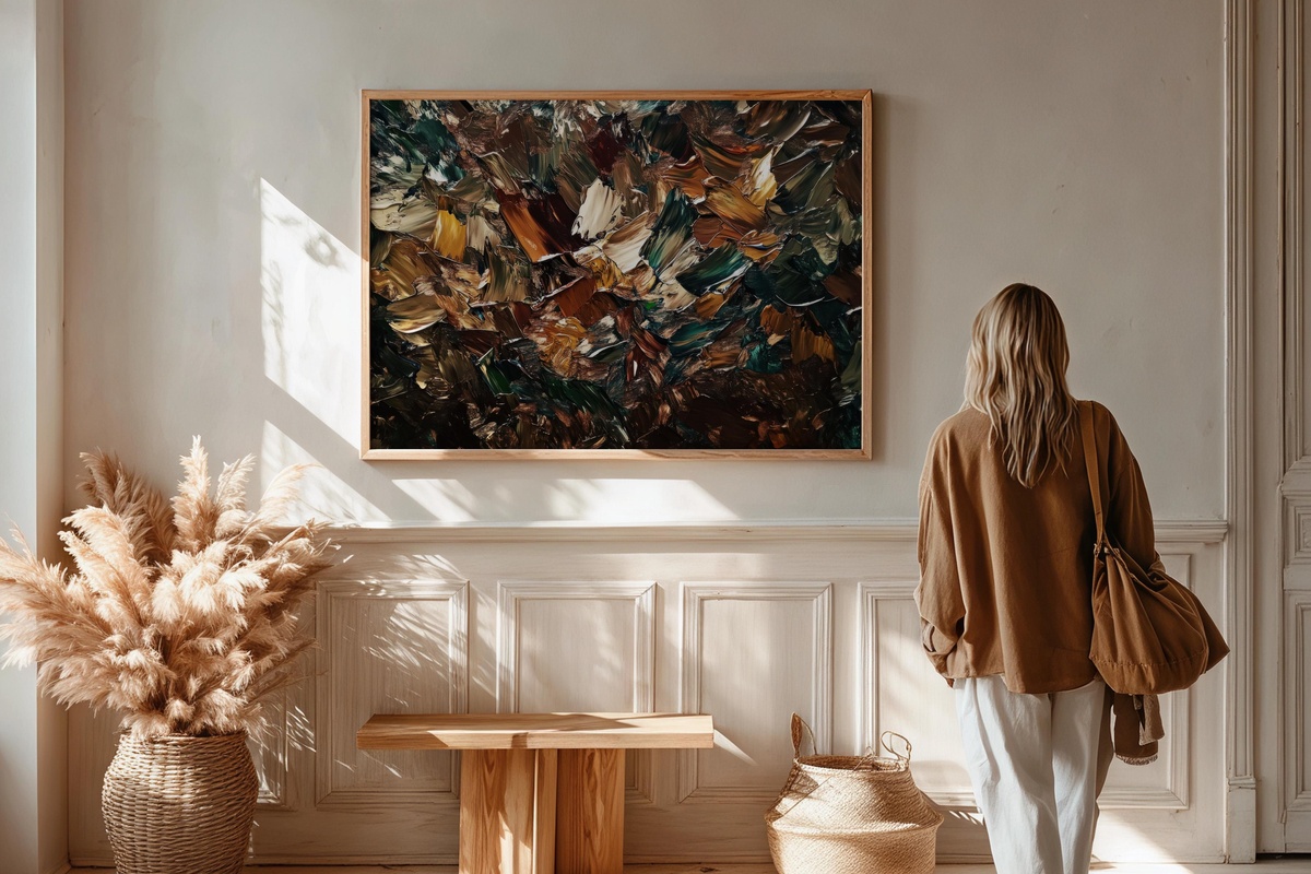
Raw sienna, warm ochre, and a low dark ground — strokes that move with the urgency of something sketched quickly and then left to settle. What keeps this from tipping into decorative mud is the rhythm: the marks are directional, almost like a score written in pigment. If your room runs toward earthy, organic materials — terracotta vessels, jute, aged brass — this piece reflects that language back in a format that holds the wall. Grounding without being heavy.
Each of these prints downloads instantly — no waiting for a courier, no rolling the dice on print quality from a third party. The files are sized for multiple formats so you can take one piece from a single frame above the sofa to a triptych across a full dining wall. When one of them stops you mid-scroll the way a good piece of art should, it's there in the collection whenever you're ready.
One small number worth knowing as you build: any three pieces across the entire Gallery Flair range — printable wall art, Frame TV art, device wallpapers, any mix — brings the total down by 30%, and five pieces brings it to 50% off. A warm-gold print, a cool blue companion, and a brushstroke piece in a coordinating neutral: three different moods, one continuous visual world, and the arithmetic works quietly in your favor.