9 Landscape iPhone & iPad Wallpapers for the Quiet-Luxury Home
There's a particular moment — phone face-up on the nightstand, screen lighting up for the first time in the morning — when the image you've chosen sets the register for everything that follows. The right landscape does something a filter or a colorway can't: it holds light in a way that feels genuinely collected, not curated by an algorithm.
What Makes a Landscape Wallpaper Feel Quiet-Luxury?
The difference between a landscape that reads as a stock photo and one that reads as an art piece usually comes down to three things: restraint in the palette (two or three tones doing the work of many), compositional breathing room (sky or water as negative space, not filler), and a mood that lands in a specific time of day rather than a generic "outdoors." The picks below all pass that test — each one anchors itself in a recognizable light condition and a palette narrow enough to feel intentional.
1. Tranquil Autumn River Flow - iPhone Wallpaper
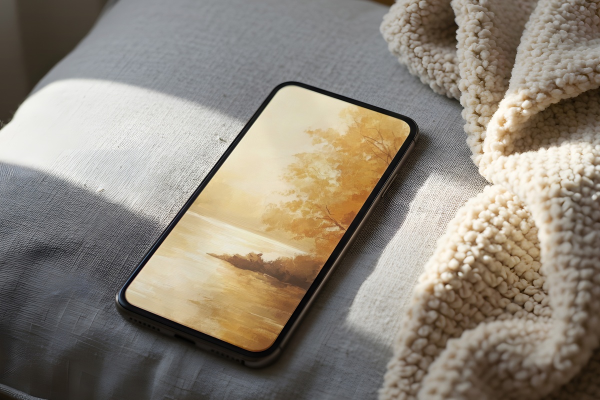
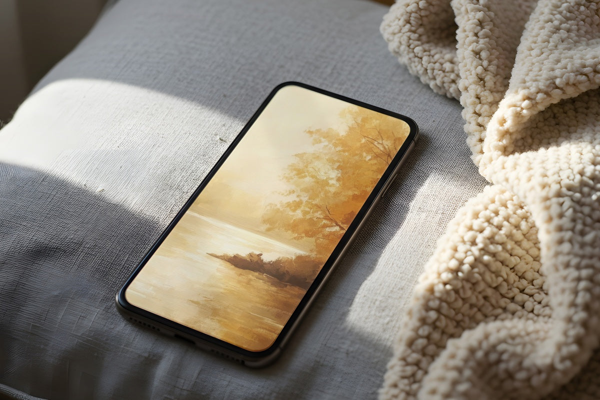
Warm amber bleeds into the kind of burnt-sienna that you'd find in a ceramic glaze — and that's exactly the register this wallpaper occupies. A river moves through the frame at mid-depth, its surface catching the low angle of autumn light without tipping into the oversaturated golds that most seasonal palettes over-rely on. Pull your phone from your pocket and you get a color story closer to a well-worn leather journal than to a pumpkin spice anything. Suits someone whose home runs on terracotta, linen, and the occasional copper accent.
2. Cherry Trees by Serene Waters - iPhone Wallpaper
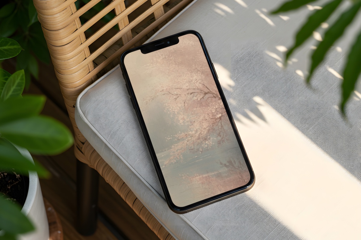
Blossom-season wallpapers run the risk of going pink in a way that reads as a screensaver from 2009. This one sidesteps that entirely: the cherry trees are muted, their blush barely above a warm white, and the water below them holds a grey-green that grounds the whole scene. What you notice, actually, is the stillness — the way both the trees and their reflection share the same measured quiet. Anyone whose bathroom shelf is already a study in pale stone and undyed cotton will recognize the frequency immediately.
3. Mountain Desert Horizon - iPhone Wallpaper
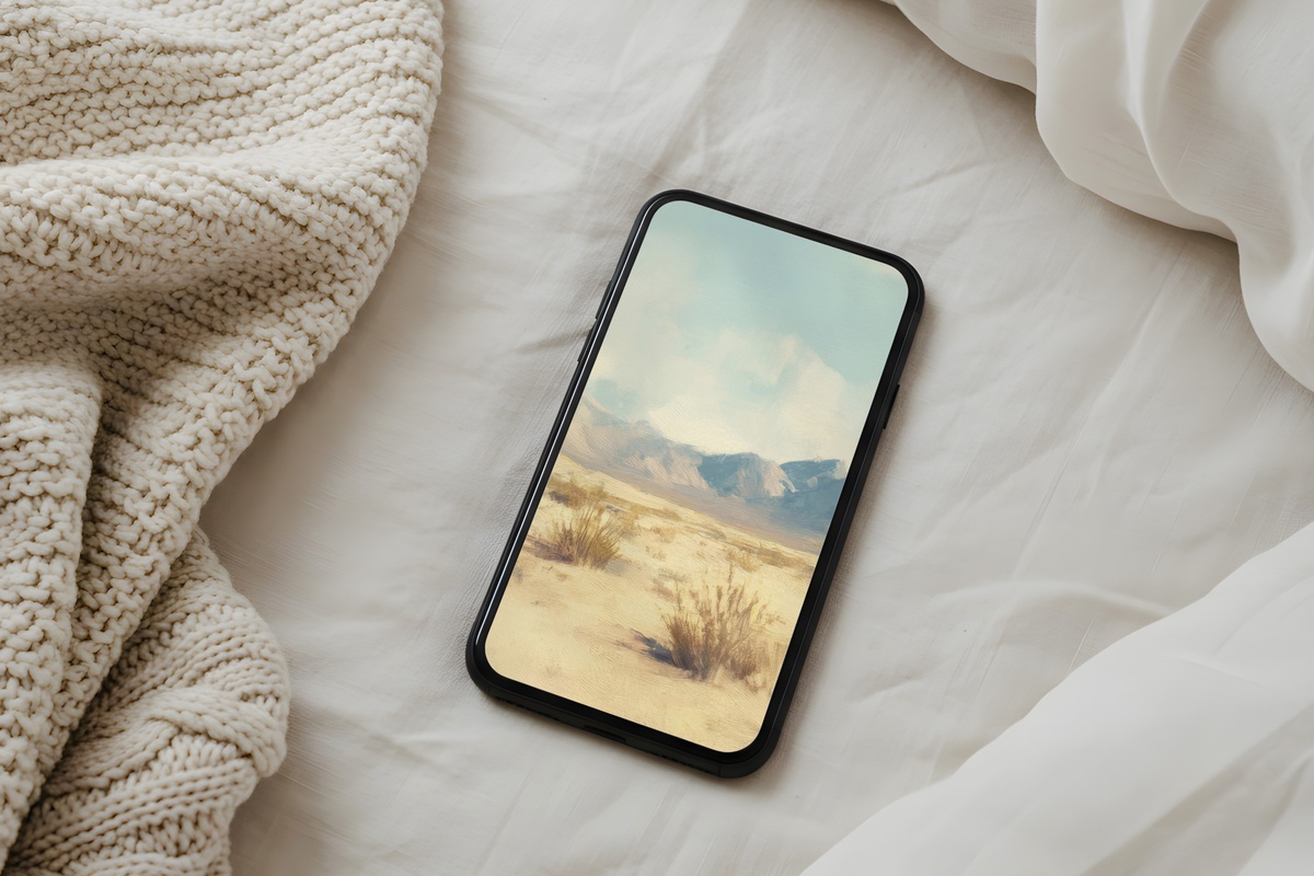
Sandy ridgelines recede into a sky that reads as bleached lavender at the horizon and almost nothing by the top of the frame — and that gradient is the whole story. There's a structural restraint here that feels more architectural than scenic; the mountains are flat-fronted, graphic, closer to a Morandi still life in spirit than to a wilderness photo. It's the wallpaper for the person whose home palette is already built on raw plaster, dried botanicals, and natural fibers. Unlocking the phone feels like stepping briefly into a very specific kind of high-desert afternoon.
4. Misty Forest Veil - iPhone Wallpaper
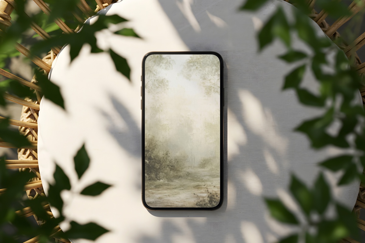
Fog sits between the tree trunks here in a way that removes all drama from the scene. That's a curatorial choice, not an accident — the depth is built from four or five values of grey-green, each layer a little cooler and lighter than the one in front, so the eye reads recession rather than detail. It's closer to a Japanese ink painting in its logic than to a forest photograph. If your screen tends to glow against an otherwise neutral desk or bedside table, this one carries exactly the right weight — present without demanding attention.
5. Golden River Reflection - iPhone Wallpaper
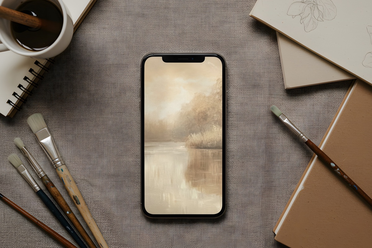
Where the Autumn River Flow runs amber-warm, this one goes quieter — the gold here is diluted, almost honey suspended in water, with long vertical reflections that give the composition a rhythm not unlike vertical stripe fabric. The palette sits in that narrow band between champagne and raw sienna where things feel genuinely expensive without announcing it. A natural fit for rooms where the lighting is kept low and warm in the evenings: the screen becomes another warm surface in a room already full of them.
6. Earthy Landscape Symphony - iPad Wallpaper
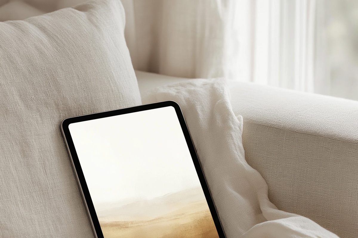
The wider canvas of an iPad screen lets a landscape breathe differently, and this one uses every bit of that horizontal real estate. Layer upon layer of warm ochre and clay-brown build a horizon that feels like sediment — geological in its patience. There's no single focal point pulling the eye; instead the scene holds its weight evenly across the frame, so when the tablet is open on a coffee table or propped on a kitchen counter, it reads as an artwork from across the room, not just a screensaver up close.
7. River of Autumn Serenity - iPad Wallpaper
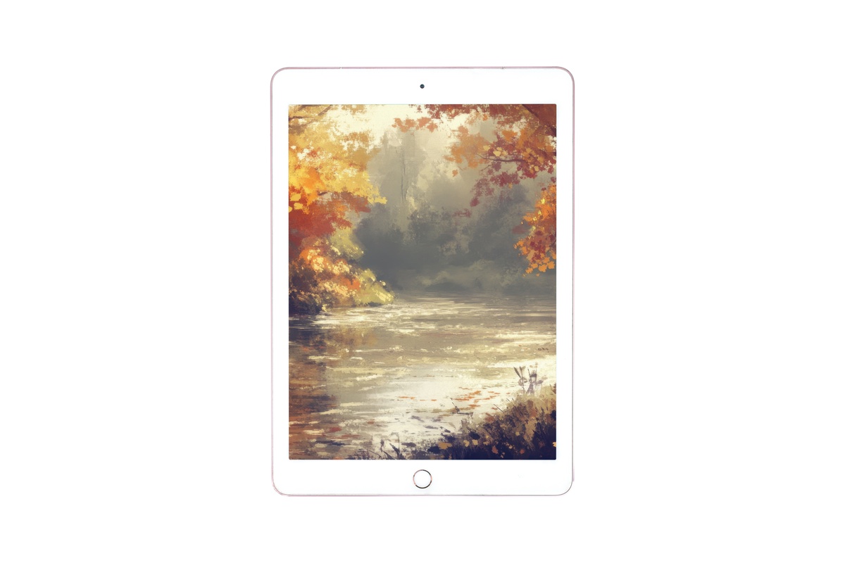
Rich ochre meets rust at the waterline, and the transition between them is slow enough that you register it as a mood shift rather than a color change. Something between a Cy Twombly color field and a plein-air study — loose at the edges, certain at the center. If you use your iPad primarily on a linen-covered sofa with the afternoon light coming in sideways, this one joins that visual ecosystem rather than competing with it. The warm temperature of the scene makes the screen feel less like a device and more like a window.
8. Impressionist Cliffside Horizon - iPad Wallpaper
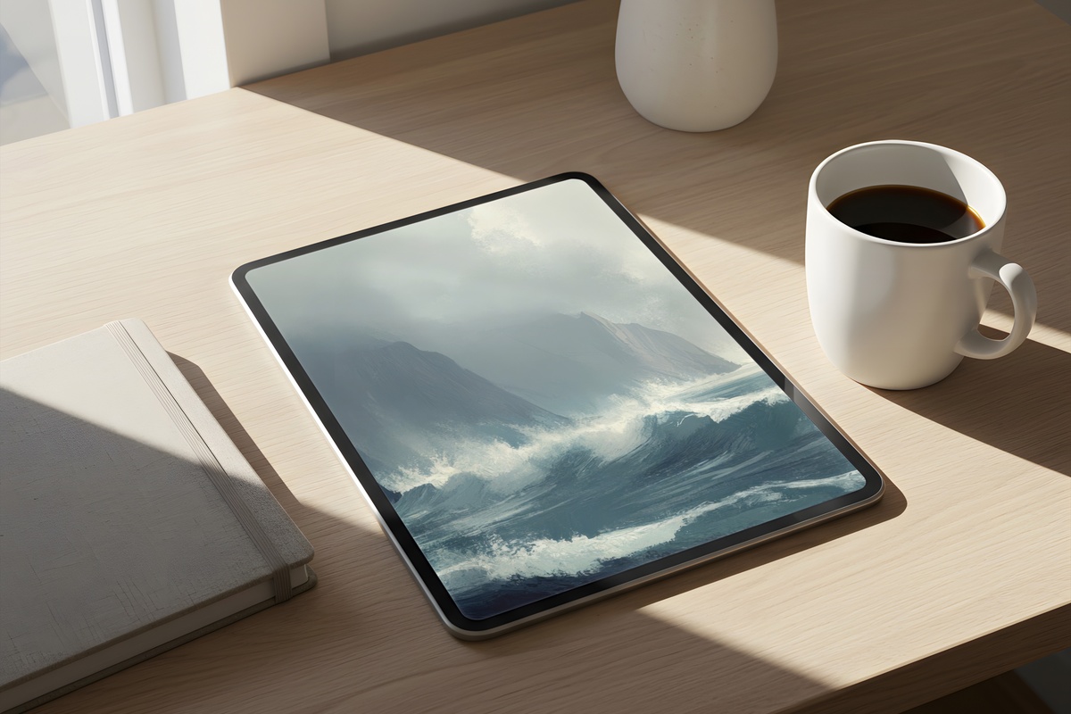
This is the cool counterpoint in the collection — where most of the other pieces run warm, this one operates in the range of slate blue, dusty seafoam, and the particular grey that chalk cliffs go at low tide. The brushwork is loose in an impressionist sense: edges suggest rather than define, and the sky and sea share enough tone that the horizon reads as a soft seam rather than a hard line. Rooms with white oak furniture, stone countertops, and an east-facing window will feel like this was made specifically for them.
9. Soft Toned Cacti Serenity - iPad Wallpaper
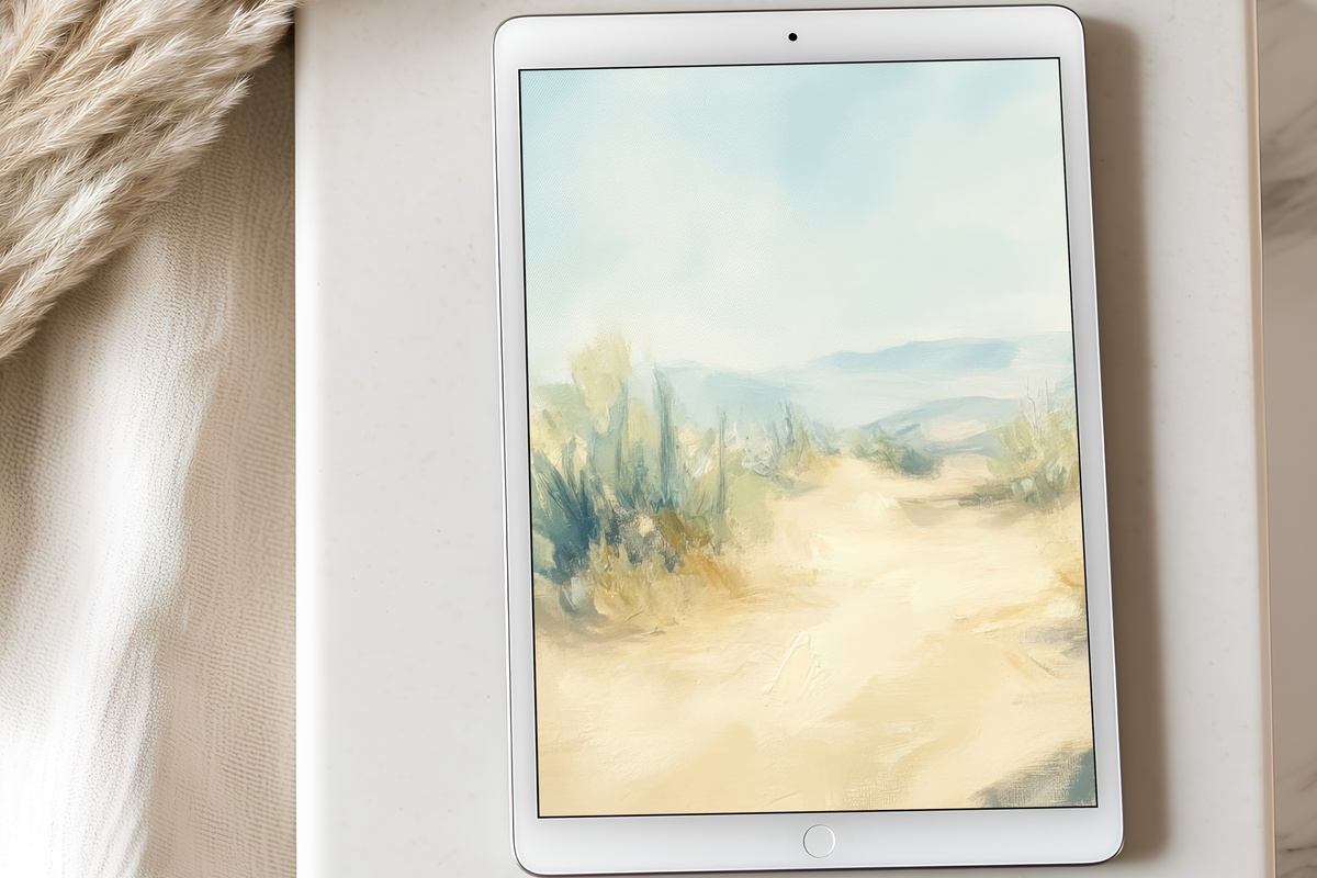
Cacti in a dusty sage and faded blush palette — and it shouldn't work as quietly as it does, but the color temperature is so carefully desaturated that the subject reads as texture first and botanical second. There's a sculptural quality to the forms, shadows falling in flat planes that give the piece the dry stillness of a Georgia O'Keeffe study without the drama. If maximalist desert décor makes you nervous but you're still drawn to high-desert subjects, this is where that tension resolves itself. Slow, dry, specific.
Every one of these lands on your screen the moment you complete the download — no waiting, no subscription, no app required. They're yours to set, to change, to layer across every device in your home. The collection is open whenever you're ready to revisit it.
And if you find yourself drawn to more than one — which happens — the numbers work gently in your favor: any three pieces across the Gallery Flair range (iPhone wallpapers, iPad wallpapers, Frame TV art, wall prints, all of it mixed freely) comes to 30% off, and any five reaches 50%. One continuous visual world, one quiet discount.