8 Modern Desktop Wallpapers for the Slow Hour — Your Living Room Mood, Rendered
There's a particular quality to the 9 a.m. laptop open — the room still quiet, the first sip still warm, the screen filling with whatever you've decided the morning should feel like. These eight wallpapers were chosen for exactly that moment: the unhurried one, before the day starts demanding things from you.
What Makes a Desktop Wallpaper Feel Like a Mood Anchor?
The best ambient wallpapers share a few quiet traits: a palette that doesn't fight the light in your room, a composition that holds peripheral attention without pulling focus from your work, and enough visual texture to feel considered rather than default. Look for pieces with clear tonal temperature — warm or cool, but committed — and negative space that lets the eye rest. A wallpaper that doubles as a small piece of art earns its place on the screen every single morning.
1. Desert Calm in Modern Brushstrokes - Desktop Wallpaper
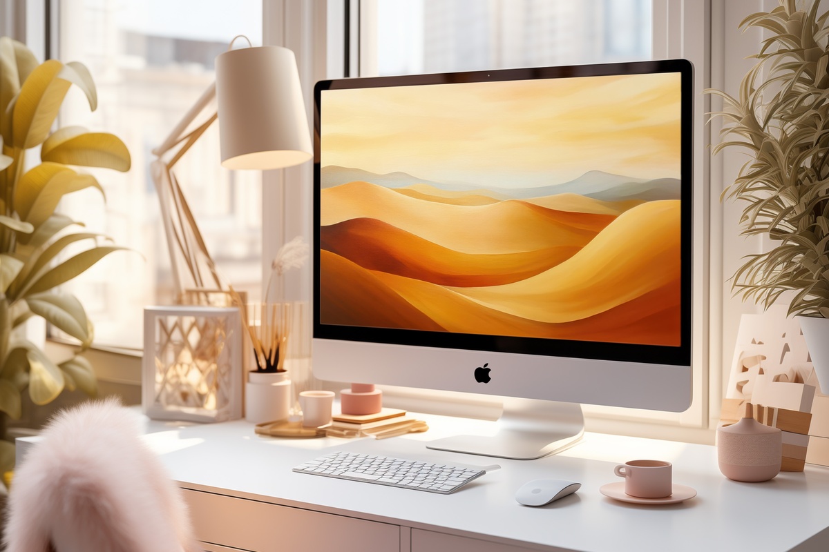
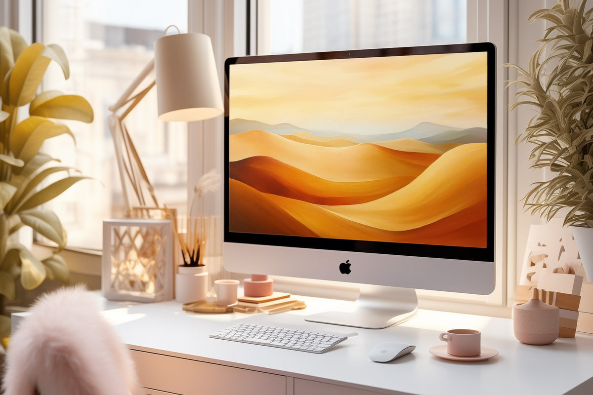
Warm ochre and raw umber meet in broad, unhurried strokes — the kind of palette you'd find drying on a studio wall in the late afternoon. This one reads less like a landscape and more like a feeling: arid, still, wide open. It pairs naturally with a light wood desk and anything ceramic in the space beside it. If your mornings tend toward a single podcast and a slow cup, the tonal warmth here will feel like a considered choice rather than a screensaver left on default.
2. Vivid Red and Black Energy - Desktop Wallpaper
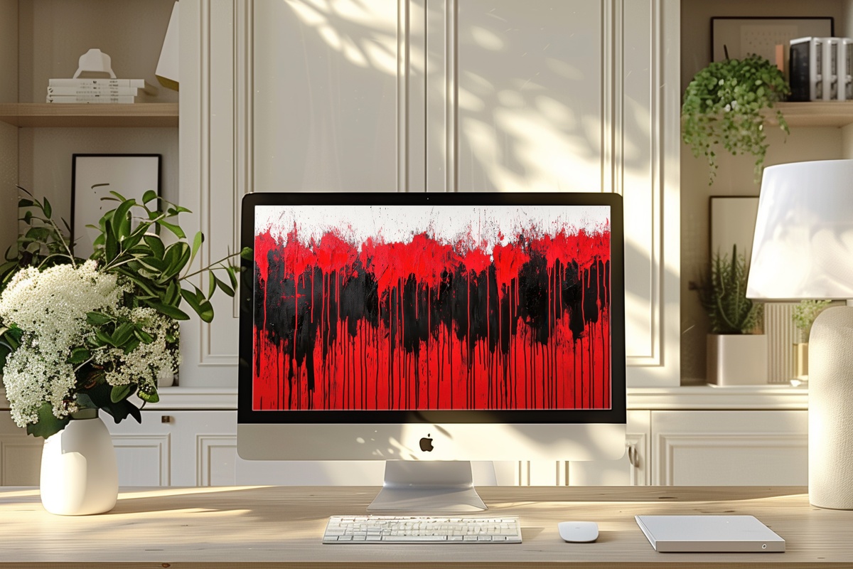
Not everything in a slow hour needs to whisper. This one arrives with intention — lacquer red against a deep charcoal ground, the contrast sharp enough to feel electric without tipping into chaos. Where the other picks in this edit lean on restraint, this wallpaper asserts. It suits a home office with dark walls or a matte-black monitor setup, and it rewards the person whose creative process needs a little friction to start. Closer to a gallery statement than ambient dressing.
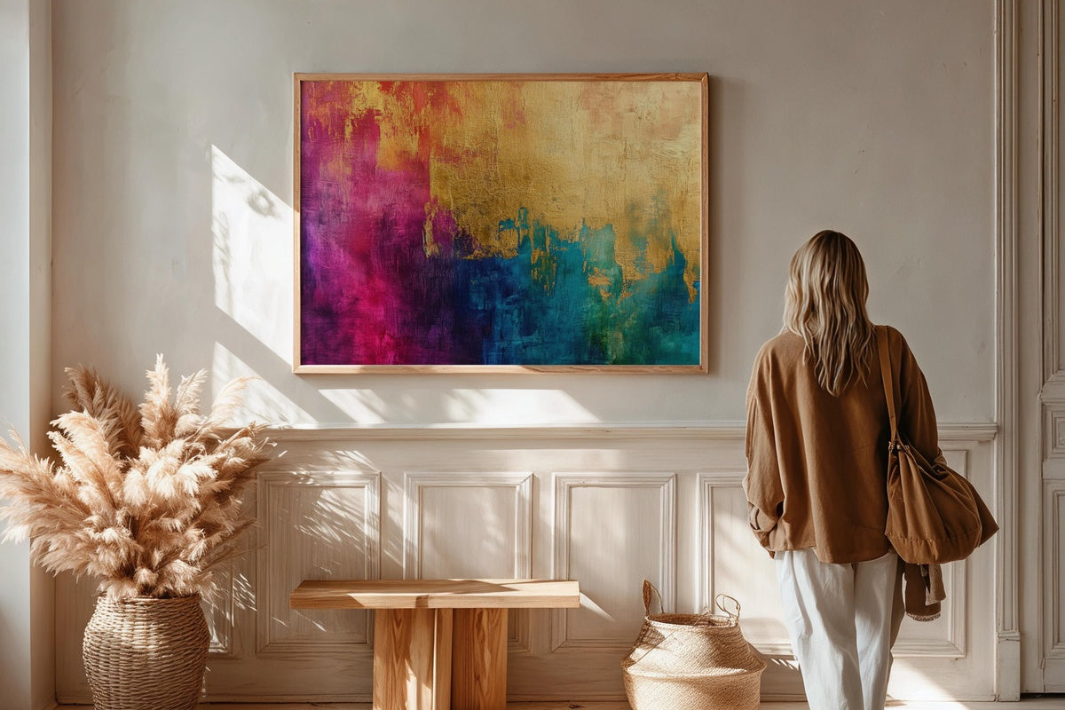
A note on building a visual world: a warm-toned desktop wallpaper, a matching phone wallpaper, and a framed wall print in the same amber-to-ochre family can make an entire workspace feel intentional — one continuous palette rather than three separate decisions. That kind of cross-format layering is quietly satisfying in a way that's hard to explain but immediately felt.
3. Textured Line Flow - Desktop Wallpaper
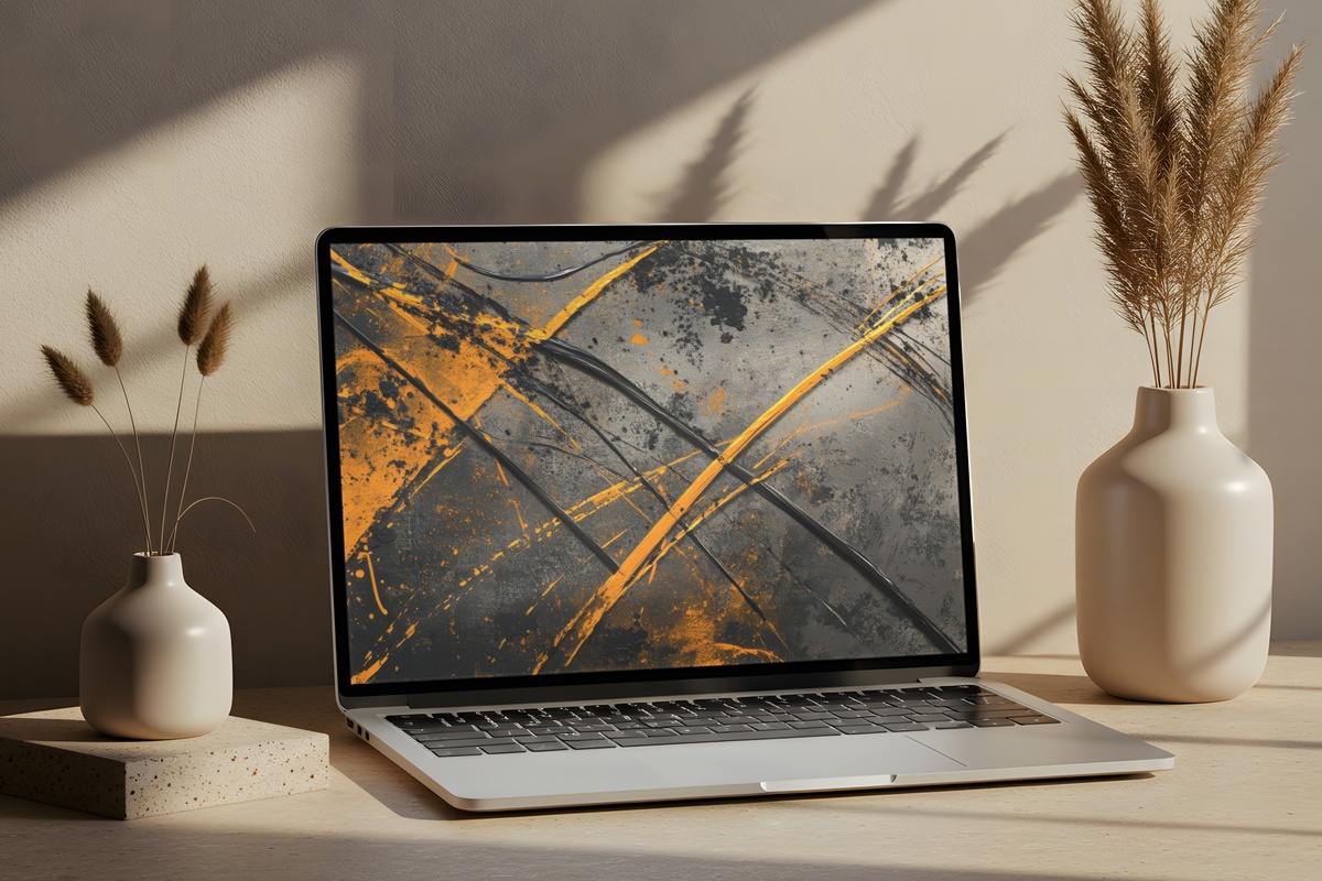
Minimalism has a reputation for coldness it doesn't always deserve — and this piece makes that argument quietly. Fine lines traverse a textured ground with just enough variation in weight and spacing to feel hand-drawn rather than generated. The neutral base means it disappears behind open windows and resurfaces beautifully the moment the screen dims. A natural fit for Scandinavian-leaning interiors, linen desk mats, and anyone who keeps their workspace deliberately spare.
4. Pastel Landscape Tranquility - Desktop Wallpaper
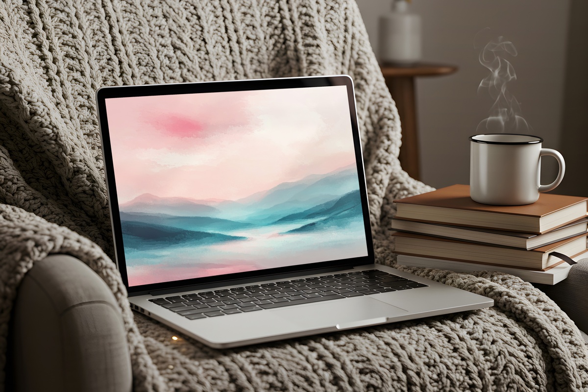
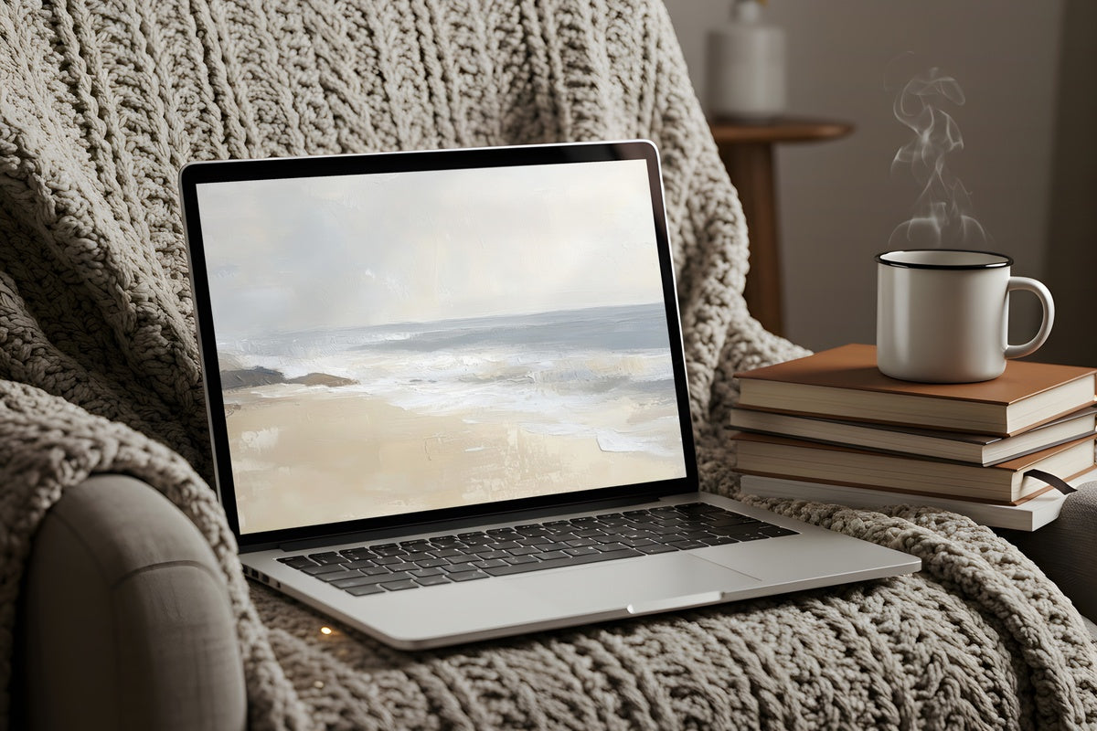
Dusty rose, soft sage, and a wash of pale horizon blue — the palette here behaves like early morning light before it decides what color it wants to be. There's a gentleness to the layering that pastels can sometimes lose when they lean too sweet; this composition avoids that by keeping the values close and the forms loose. Set it on a MacBook screen in a light-filled room and it practically dissolves into the surrounding space. Restful without being forgettable.
5. Desert Calm in Modern Brushstrokes - iPhone Wallpaper
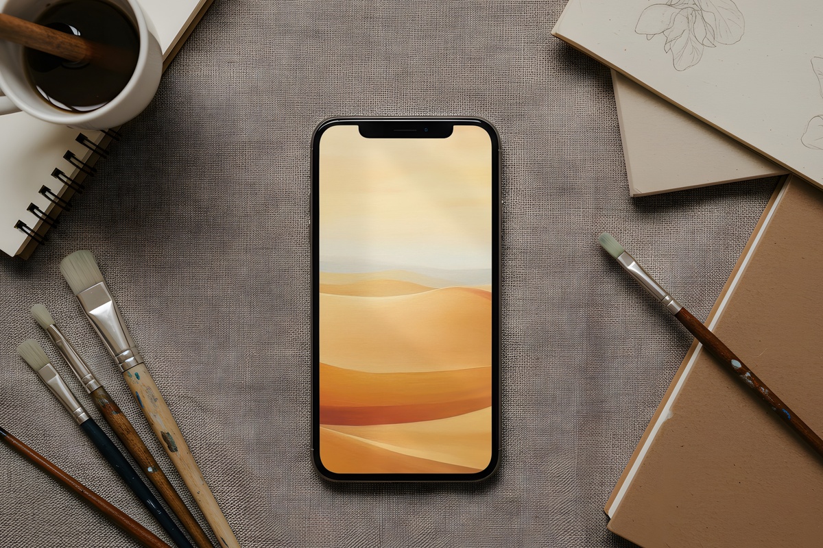
The same warm desert palette from pick one, now formatted for the phone you pull from your pocket forty times a day. Cropped to portrait, the brushwork feels more intimate at this scale — the ochre tones closer, the texture easier to read. For anyone building a cohesive visual environment across devices, this is how you carry the morning's mood into the afternoon. One palette, two formats, one continuous feeling.
6. Ocean Wave Blue Harmony - iPhone Wallpaper
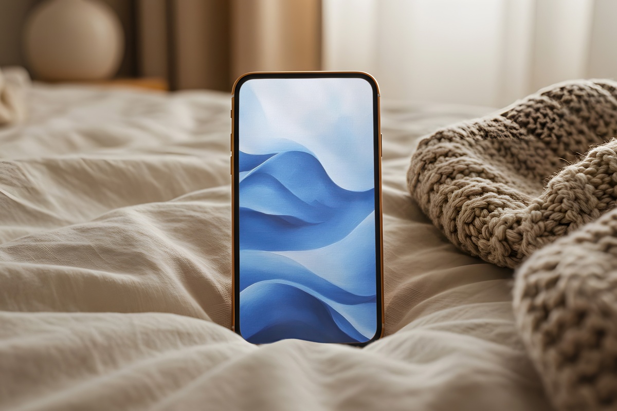
Something between seafoam and deep cerulean — a blue that shifts depending on the ambient light around it. On a bright screen it reads vivid; dimmed for evening use, it settles into something closer to a twilight cove. The movement in the composition is slow and lateral, which gives the phone screen an unusual sense of horizontal breath for a portrait format. Anyone whose nervous system resets around water imagery will recognize exactly what this does.
7. Floral Forms in Blush Tones - iPhone Wallpaper
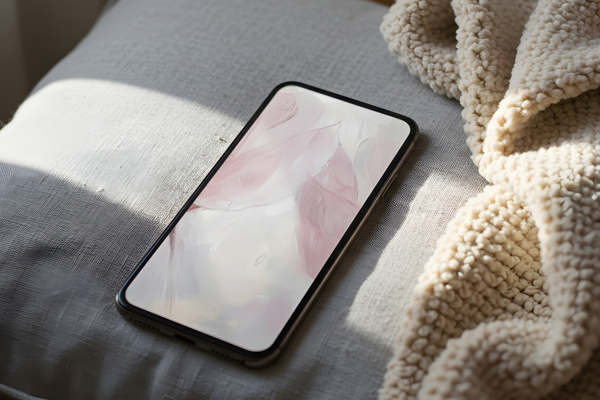
Blush florals occupy a crowded corner of the aesthetic internet — and most of them lean saccharine in a way that dates quickly. These forms sidestep that by staying abstract: petals suggested rather than illustrated, the blush grounded by a creamy near-white and the faintest trace of dusty mauve. What you get on screen is something closer to a botanical study than a greeting card. The restraint is the point, and it ages well.
8. Celestial Wonder of Night - iPhone Wallpaper
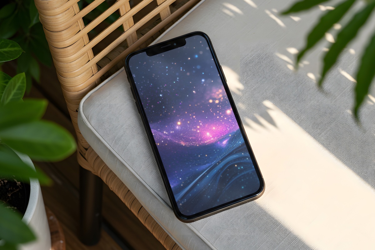
Deep indigo with scattered luminance — the kind of night sky that feels less like photography and more like memory. At phone scale the depth reads as almost dimensional, the lighter points drawing the eye inward rather than across. This is the wallpaper that earns its place at the other end of the day: the wind-down unlock, the lamp already off, the screen the only light in the room. Contemplative by design.
Each of these downloads straight to your device — no waiting, no subscription, yours the moment you check out. The full edit lives in the collection whenever you're ready to settle on one, or two, or the whole mood-board at once.
Worth noting: the 3-for-30% and 5-for-50% discounts apply across every format we carry — desktop wallpapers, phone wallpapers, wall prints, Frame TV art — so mixing a MacBook background, a matching phone wallpaper, and a printable in the same tonal family counts as a set. Palette math, really.