7 Neutral iPhone Wallpapers to Start Your Morning with Calm
There's a particular quality to the first few seconds after your alarm goes off — before the day has any weight to it, before the notifications pile in. Your thumb slides to dismiss the sound, and for just a moment, your lock screen is the only thing in front of you. What greets you there matters more than we tend to admit.
This edit is built around that moment: seven neutral iPhone wallpapers with the kind of quiet presence that makes a morning feel a little more intentional.
What Makes a Neutral Wallpaper Work on a Lock Screen?
Not every muted image reads well at 6 a.m. The best morning lock screens share a few qualities: tonal restraint (so notification text stays legible), enough visual interest to feel considered rather than empty, and a palette that doesn't spike your nervous system before you've had a drink of water. Look for softened contrast, low saturation, and compositions that sit still. That last one sounds obvious — but plenty of "neutral" wallpapers still carry a restless energy. The seven below don't.
1. Elegant Shadow Arches Serenade - iPhone Wallpaper
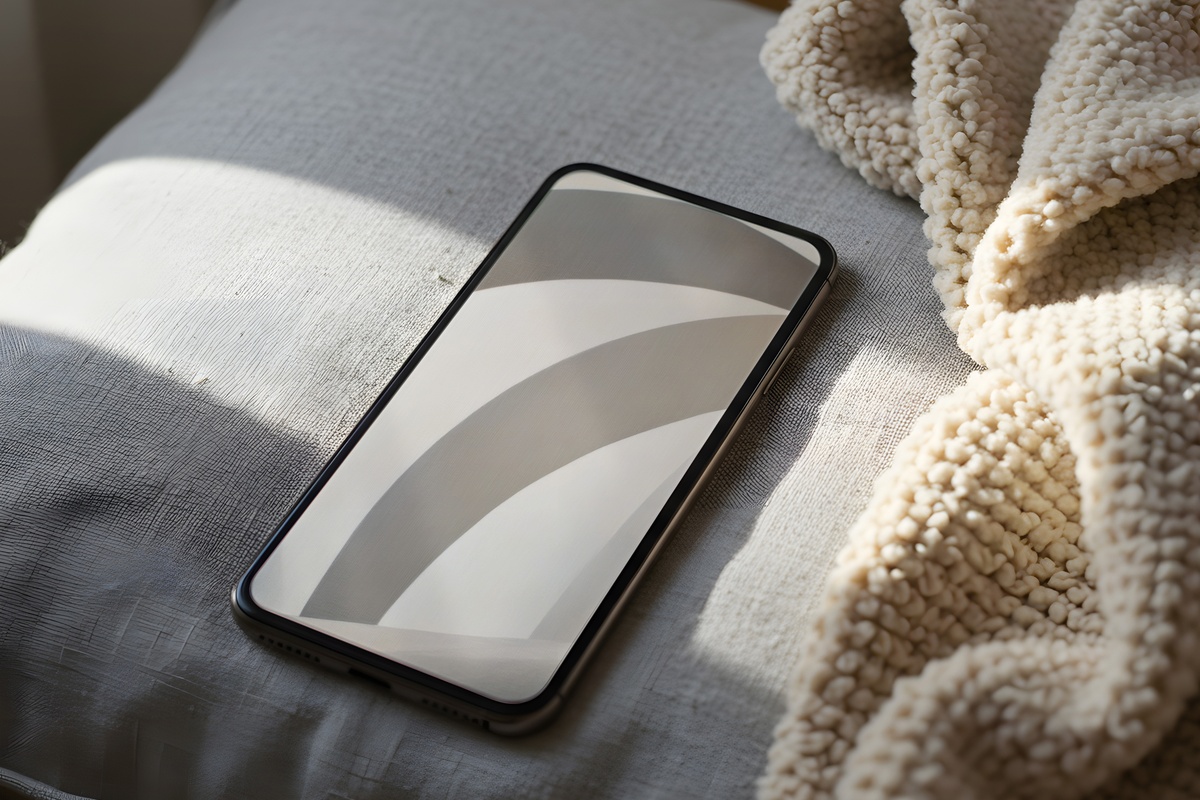
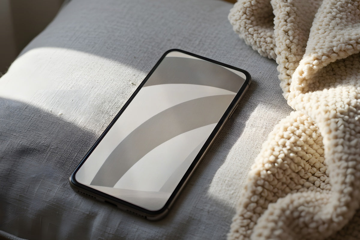
Shadow play at its most disciplined. This one draws from the language of late-morning light filtered through a sheer curtain — soft arches that barely announce themselves against an off-white ground. The palette reads closer to plaster than paper, with a warmth that doesn't demand attention. Notification text floats cleanly over it, and the arched forms give just enough visual structure to feel curated without being fussy. A natural match for anyone whose aesthetic leans toward linen tablecloths and unscented candles.
2. Calming Celestial Cycle Melody - iPhone Wallpaper
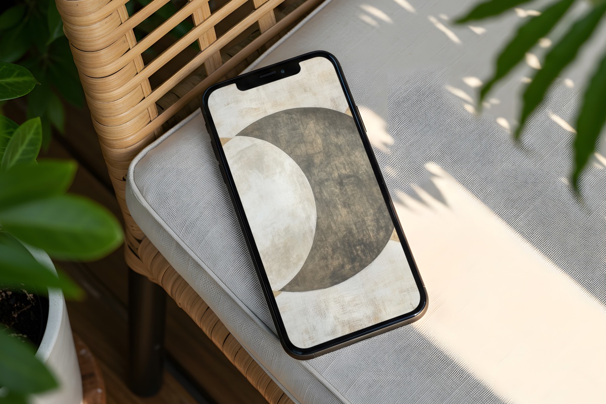
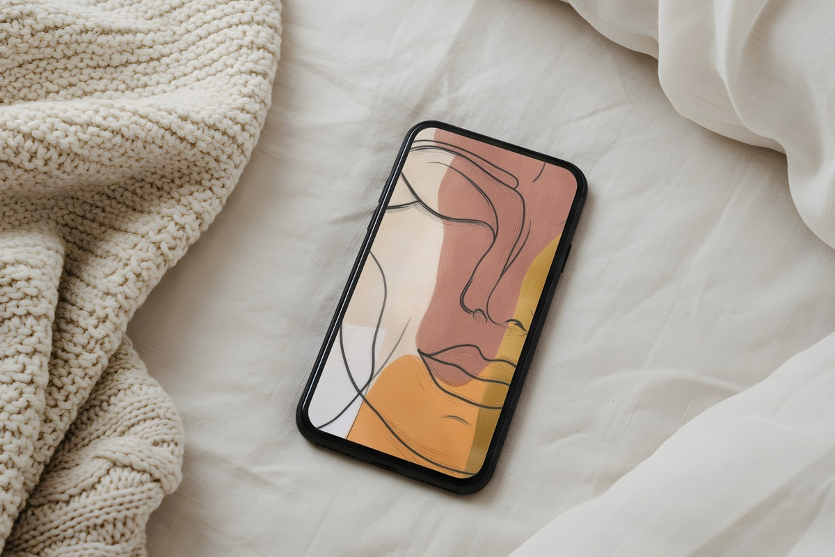
Warm earth tones arranged with an almost celestial patience — think raw sienna dust settling on a pale canvas, circular forms that orbit slowly without urgency. This is a wallpaper that rewards the unlocking moment: it looks different at 7 a.m. than it does at noon, depending on how your screen brightness adjusts to the room. The tonal family sits in terracotta-adjacent territory without ever tipping into something loud. Something between a botanical cross-section and a moon-phase chart, rendered in the softest possible ink.
3. Earthy Window Harmonies - iPhone Wallpaper
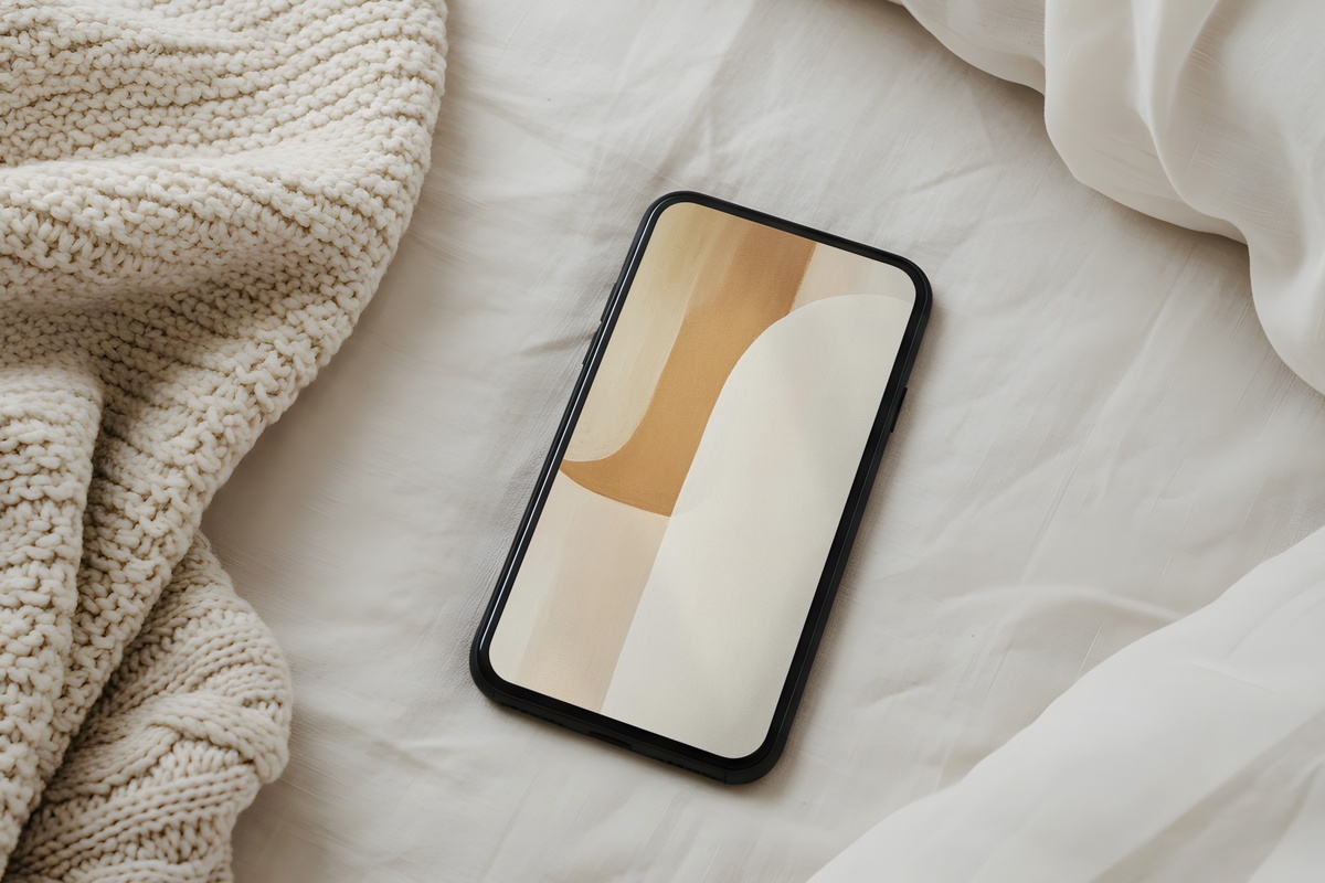
A window viewed through gauze — that's the immediate register. Warm stone and pale ochre bleed together along soft horizontal bands, evoking the particular stillness of a morning before anyone else in the house is awake. There's no hard edge here, and that's the point. The palette reads as undyed linen next to a bone-colored wall, grounded without being heavy. It's a genuinely restorative thing to see before you've opened a single app — and it holds up through a full day of glances.
4. Sands of Tranquil Beige - iPhone Wallpaper
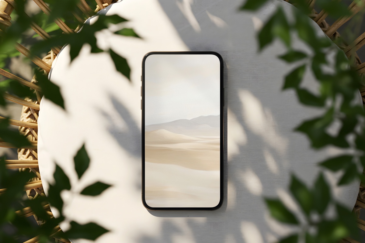
Beige gets dismissed too often. Here, it earns its place — the palette moves through pale dune, sun-dried clay, and faded wheat, with a grain that suggests sand captured mid-drift. Horizontal layering gives the composition its quiet rhythm, and the contrast is genuinely low enough that your time and date text hover without fighting for attention. If your mornings already start with a clean counter, warm tea in a ceramic mug, and absolutely no overhead lighting, this wallpaper was made for that same sensibility.
5. Marble Dreams in Motion - iPhone Wallpaper
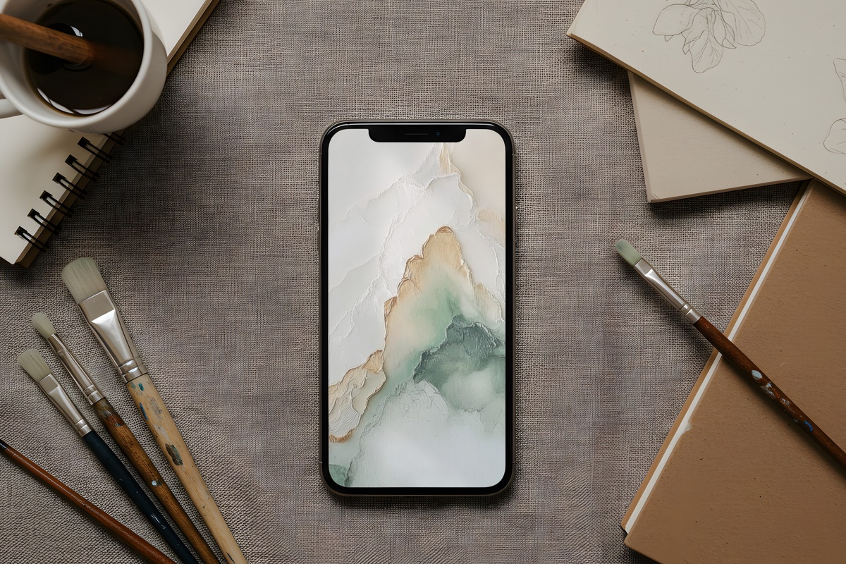
Sage-tinted marble — a combination that shouldn't be this restful, and yet. The veining moves with a slow drift rather than a sharp crack, and the ground color sits somewhere between pale green tea and unpolished stone. It's the one pick in this edit that carries a barely-there coolness, which makes it worth noting: if your mornings run warm (golden hour coming through east-facing glass, amber everything), this brings a counterbalancing freshness. The softness of the marble rendering keeps it from reading as stark or clinical.
6. Geometric Harmony Whispers - iPhone Wallpaper
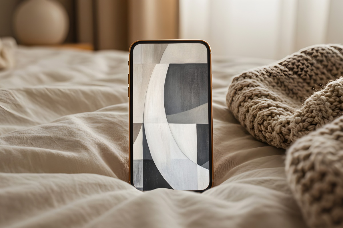
Geometry doesn't have to be loud. These forms — muted, slightly overlapping, arranged with deliberate breathing room — use negative space as generously as any fine-art print. The palette stays in a chalky white-and-warm-gray family, with each shape dissolved at its edges rather than sharply defined. We're drawn to how it reads: structured enough to feel intentional, diffuse enough that it never interrupts the drowsy quality of a slow morning. And yes — we'll admit this one is our personal favorite from the edit.
7. Gray Balance of Geometric Traces - iPhone Wallpaper
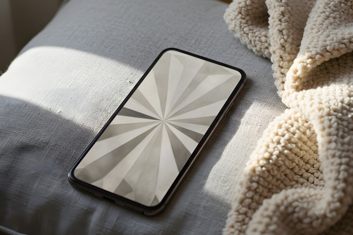
Where the other picks in this edit lean warm, this one holds a cooler note — dove gray and ash white, with traced geometric lines so fine they read almost as texture rather than pattern. Think: the surface of a hand-pressed concrete tile, abstracted. The restraint here is remarkable. Lines recede just enough that the wallpaper functions as a near-solid field, but look for a moment and the structure appears. Anyone who finds pure white lock screens too stark but finds textured ones too busy will recognize exactly what this is doing.
Each of these downloads straight to your camera roll — no waiting, no account to manage, no subscription standing between you and a calmer morning screen. Whenever one of these palettes calls to you, it's there in the collection, ready to set before tomorrow's alarm.
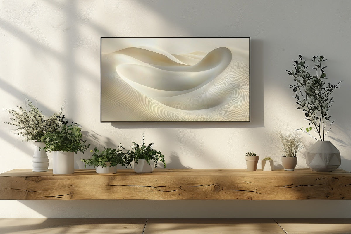
A quiet note on building a set: all seven of these sit comfortably alongside Gallery Flair's printable wall art and Frame TV art — same tonal families, different surfaces. Any three pieces across those categories combined (a phone wallpaper, a wall print, a Frame TV piece, or any mix) brings the total to 30% off, and any five brings it to 50%. Worth knowing if you're pulling a whole room — and a whole screen — into the same mood.