11 Neutral Frame TV Art Picks That Make the Samsung Frame Feel Like a Gallery Wall
There's a particular quality of light in a room where the television has disappeared into the wall — where a piece of art holds the space instead, and no one stops to ask if it's real. That's the promise of the Samsung Frame, and it's a promise these eleven neutral pieces keep effortlessly.
What Makes Neutral Art Work So Well on the Samsung Frame?
The short answer: restraint reads as permanence. A neutral palette — bone, ash, warm sand, deep charcoal — never fights the room's existing color story. Instead it anchors it. Look for pieces with clear compositional intention: a focal tension, a gradation that gives the eye somewhere to travel, or a surface quality that rewards a second glance across the room when the lamps dim. These eleven picks each earn their place for exactly those reasons.
1. Dunes Whispering Tranquility - Frame TV Art
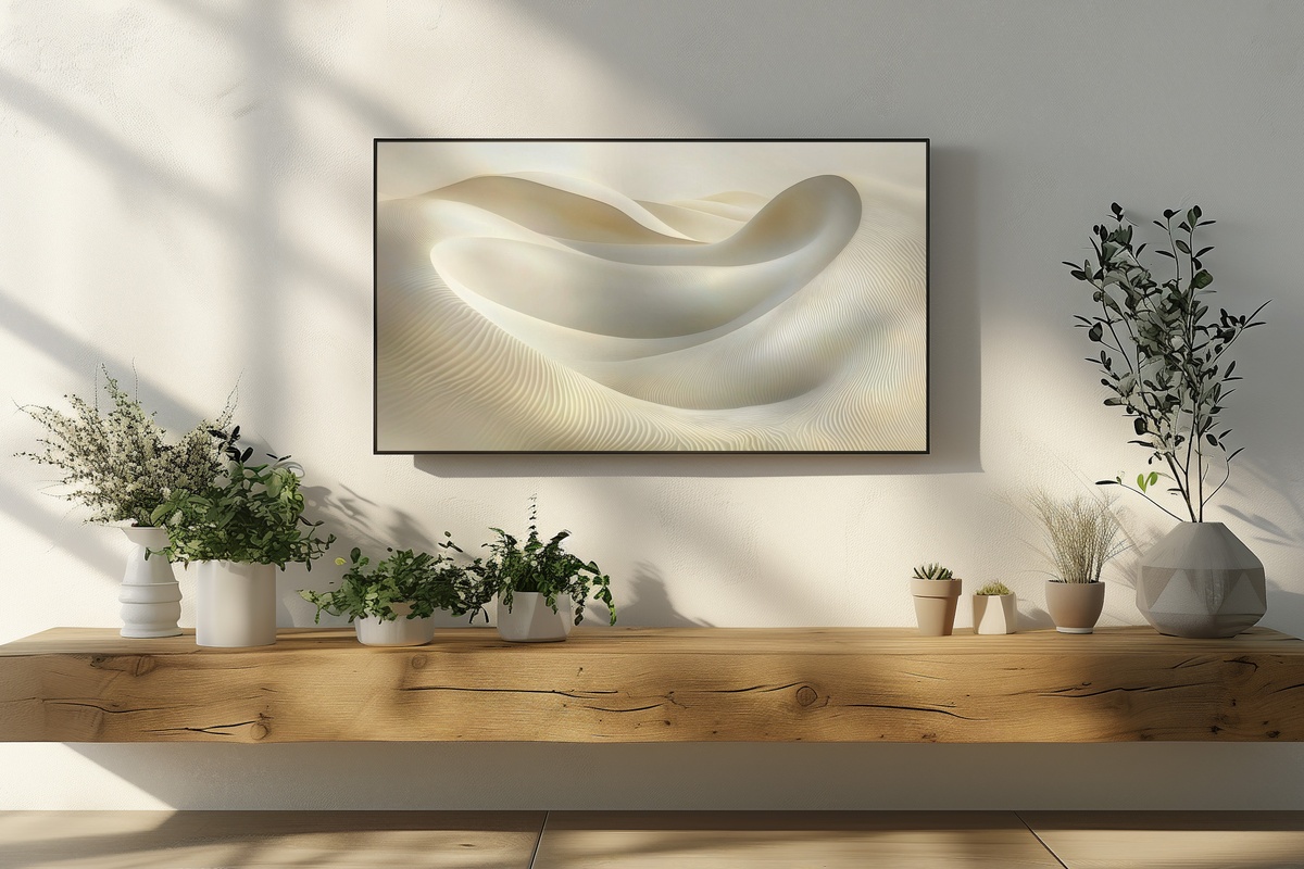
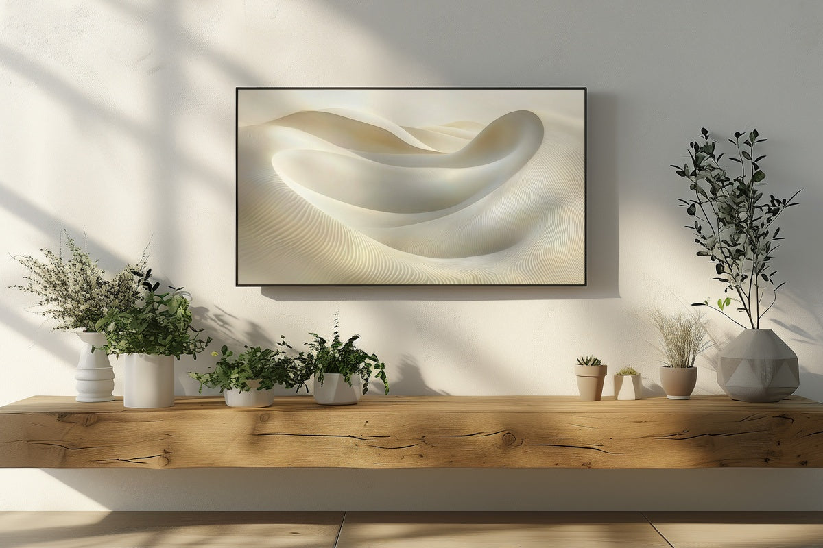
Horizontal ridges of warm sand and shadow move across this piece with the patience of actual dunes at low tide. The palette sits in that narrow band between ivory and pale ochre — close enough to white that it recedes into the wall, warm enough that it glows under incandescent light. Abstract and unhurried, this one carries a meditative quality that earns its place above a linen sofa or flanked by two unlit sconces on an otherwise bare wall.
2. Celestial Tranquil Night Symphony - Frame TV Art
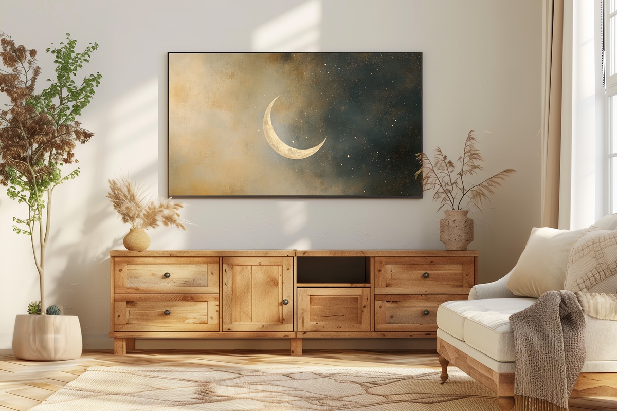
Not every piece in a neutral edit needs to be pale. This one works with depth rather than lightness — a field of deep dusk tones punctuated by abstracted celestial forms that feel less like astronomy and more like memory. What makes it neutral isn't the value range but the restraint: there's no color here pulling for attention, only tone, texture, and the particular stillness of a very late evening. A bedroom wall, or a living room after the dinner guests have gone.
3. Equilibrium of Tranquil Waves - Frame TV Art

Wave forms in art can slide quickly toward the decorative — busy, repetitive, predictable. This piece avoids that entirely by prioritizing rhythm over illustration. The forms undulate with just enough variation that each pass across the canvas feels different, the way actual water does. Tones stay close to stone and pale linen, giving nothing away too quickly. It reads as meditative from across the room and genuinely interesting up close — a combination that's harder to achieve than it looks.
4. Earthy Window Harmonies - Frame TV Art
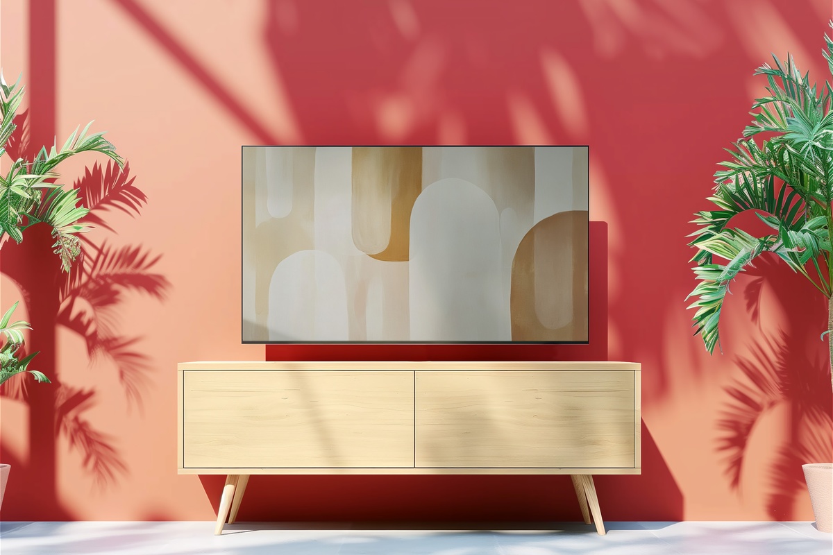
Abstract window shapes in terracotta, raw umber, and sun-bleached cream — this is the warmest piece in the collection, and the one that does the most to make a room feel inhabited rather than decorated. If your space already leans toward warm-toned textiles, jute, or aged wood, this will feel less like a new addition and more like something that was always supposed to be there. The layered architectural forms give it weight without heaviness. A natural companion to rooms with afternoon sun.
5. Nature's Graceful Trace - Frame TV Art
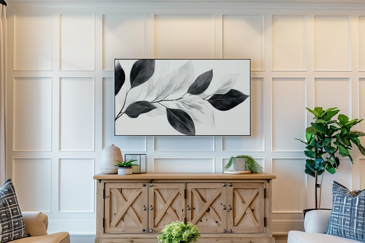
Single-weight botanical lines on a ground of warm off-white — the kind of piece that looks hand-drawn even when you know it isn't. There's an economy to the mark-making here: each line earns its place, and the negative space between them is as deliberate as the marks themselves. Anyone who keeps a few dried stems in a ceramic vase, or folds their linen napkins with a particular care, will recognize the sensibility immediately. Refined without being remote.
6. Artistic Silhouettes of Expression - Frame TV Art
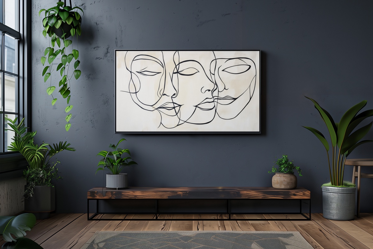
Monochrome line-art portraiture is a well-worn category — and this piece makes a clear case for why the form endures. The faces are rendered with a continuous, unhurried line that captures expression without detail, leaving just enough open that the viewer finishes the thought themselves. Strictly charcoal and white, with a surface that reads almost like graphite on cotton paper. On a Samsung Frame in a study or a reading nook, it holds attention the way a considered object on a shelf does — quietly, persistently.
7. Marble Dreams in Motion - Frame TV Art
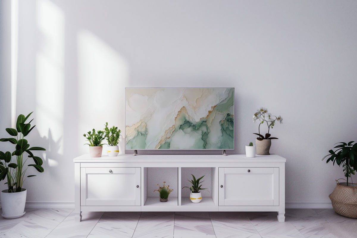
Marble veining done well on a screen is a rare thing — it needs the resolution to carry the fine threads of mineral color, and the compositional sense to keep the movement from tipping into chaos. This one manages both. The ground is cool white, veined in dove grey and the faintest warm taupe, with a fluid energy that feels geological in scale. Particularly striking on larger Frame TV sizes, where the veining has room to breathe the way actual stone does across a wide surface.
8. Geometric Harmony Whispers - Frame TV Art
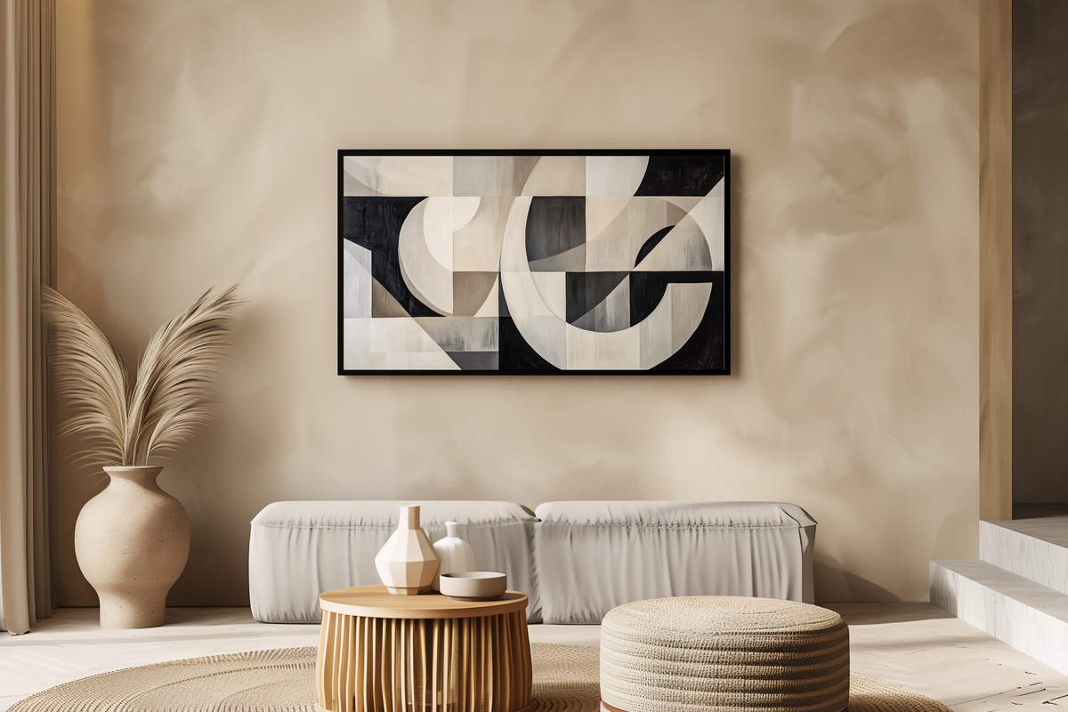
Where most geometric art in a neutral palette settles for clean and cold, this one finds warmth in the relationship between shapes — adjacent tones of greige, pale flax, and soft ash that shift the mood closer to textural than architectural. The forms overlap and recede with a logic that feels considered rather than generated. It works especially well in rooms where the existing furniture already has strong geometric bones: a boxy sofa, grid-pane windows, a low concrete coffee table.
9. Timeless Silhouettes in Grayscale Elegance - Frame TV Art
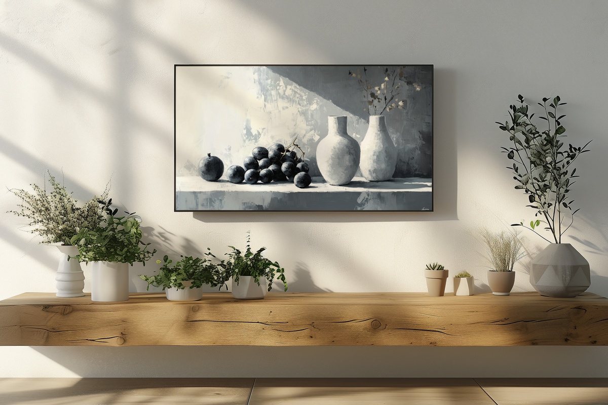
A still life rendered in the full tonal range of grey — from near-black at the deepest shadow to a warm paper-white at the highest light — with the unhurried patience of a classical study. It's worth noting: still life on a Frame TV is where the format earns its name most literally. Guests pause. They look twice. This particular composition has the settled authority of something that might hang in a European flat where the walls are very thick and the light comes from one north-facing window.
10. Rectangles of Somber Elegance - Frame TV Art
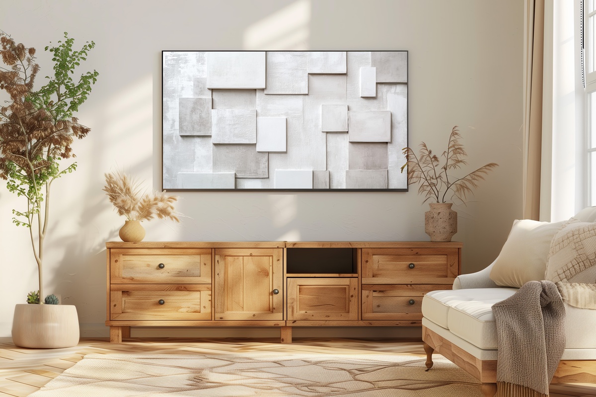
If your instinct runs toward rooms that hold their breath — spare, unhurried, with fewer objects chosen for longer — this is the piece for that space. Layered rectangles in cool slate, graphite, and the particular off-white of aged paper sit in deliberate proximity without touching. The tension in that near-contact is what gives the piece its personality. Minimalism at this register isn't absence; it's precision. The Frame TV renders the crisp edges immaculately, which is precisely the point.
11. Circular Serenity Symphony - Frame TV Art
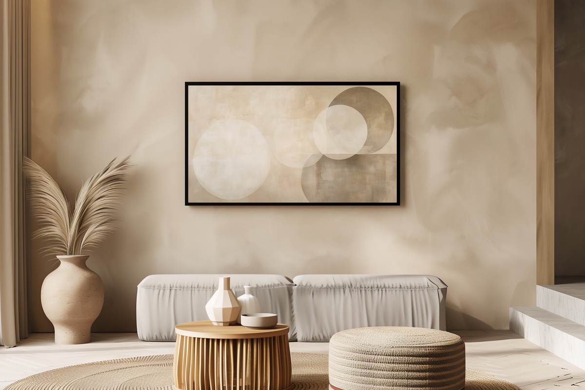
Concentric circles and soft radial gradations in pale stone and warm dove grey — a composition that reads as both ancient and completely contemporary. There's something almost acoustic about it: the forms suggest resonance, a tone held and slowly fading. On a Frame TV in a room with curved furniture or rounded ceramics, the visual echo is immediate and satisfying. A gentle counterpoint to rooms that already have a lot of straight lines, and a grounding presence in rooms that have too few.
Each of these downloads to your Frame TV within moments of purchase — no waiting, no subscription, no file that expires. Pick the one that feels most at home in your room right now, and let it settle in for a few evenings before you decide if it stays. It almost always does.
And if you find yourself drawn to more than one — which tends to happen — the collection math works in your favor: any three pieces across our entire range (Frame TV art, printable wall art, wallpapers for desktop or phone, any mix) comes to 30% off, and any five brings that to 50%. Building one continuous visual world across your home costs less than you'd expect.