11 Neutral Frame TV Art Picks That Make Every Room Feel Gallery-Calm
There's that moment, somewhere between clearing dinner and dimming the lamps, when the living room finally belongs to itself. The right piece on a Samsung Frame TV doesn't announce itself — it settles into the wall like it was always there, holding the room's tone without asking for attention. These eleven neutral Frame TV art picks do exactly that.
What Makes Neutral Frame TV Art Work in Any Room
The most successful screensaver art for the Samsung Frame shares a few quiet traits: a limited palette (two or three values, rarely more), a focal tension that gives the eye somewhere to rest without pulling focus, and enough restraint that the piece reads as part of the room rather than a broadcast. Look for pieces that echo materials already in your space — stone, linen, raw plaster — and the transition from watching to displaying becomes genuinely seamless.
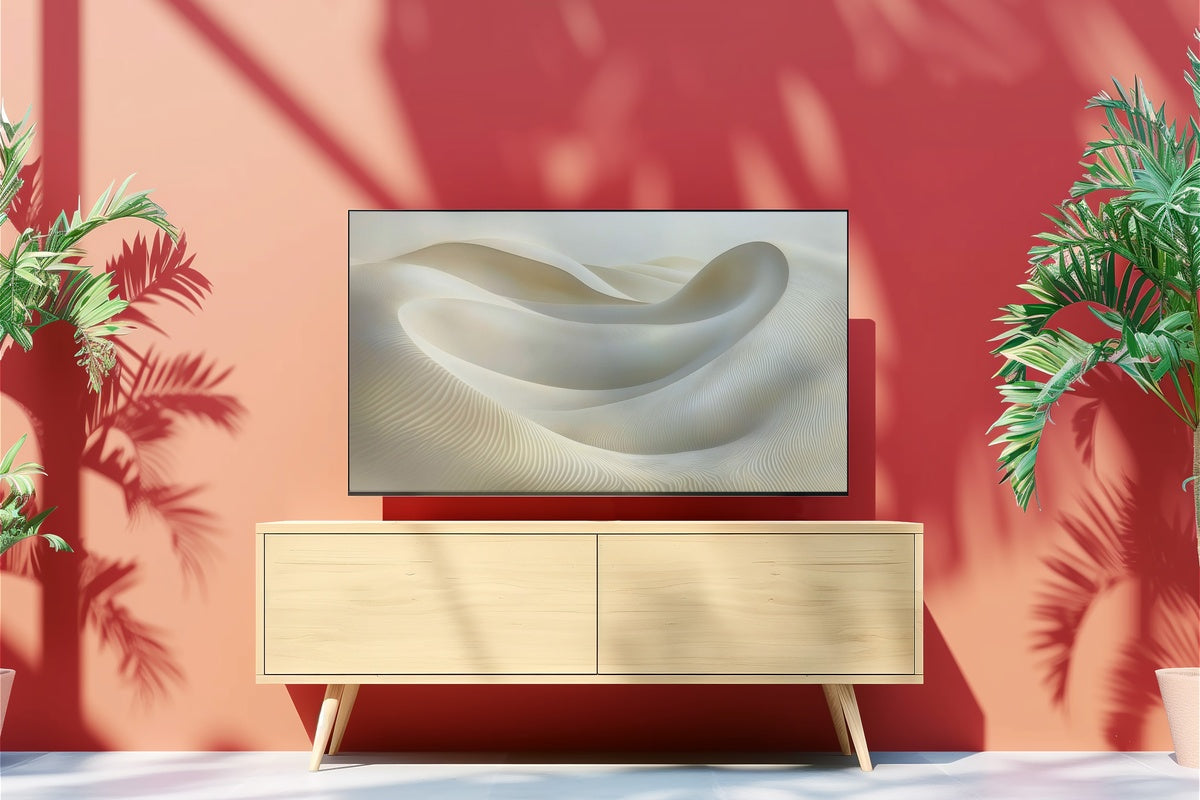
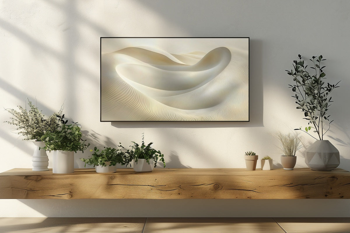
1. Dunes Whispering Tranquility - Frame TV Art
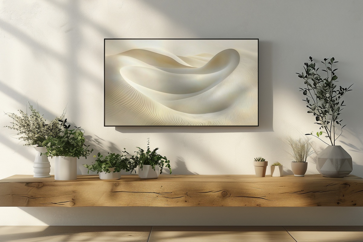
Linear dune forms sweep across this piece in warm sand and bone, each ridge a little quieter than the one before it. The horizon sits low, leaving the upper register open — an unusual compositional choice that reads almost like breath. Against a plaster wall or pale oak shelving, it disappears into the room in the best possible way. A natural anchor for living rooms that skew warm but want to stay grounded rather than golden.
2. Celestial Tranquil Night Symphony - Frame TV Art
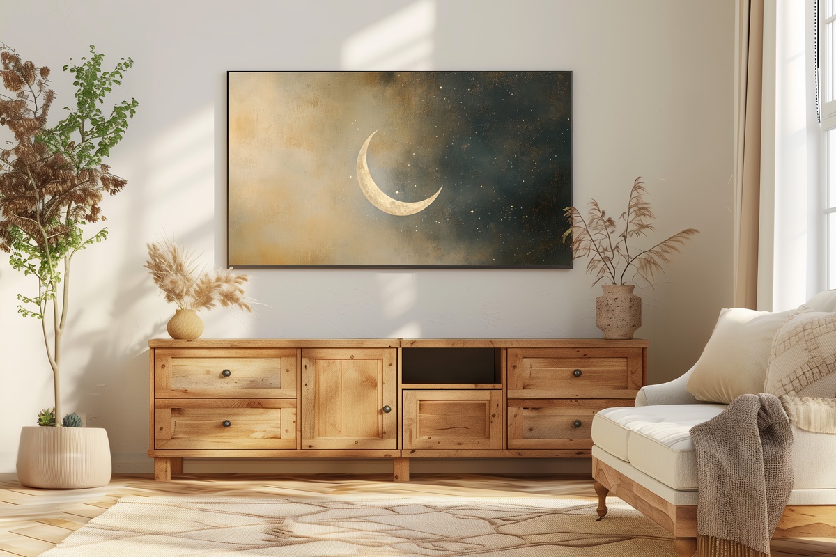
Deep charcoal fading into a soft ash — this piece captures what the sky looks like at that specific hour when it's neither evening nor night. There's an abstract celestial quality here that avoids the pitfall of being merely decorative: the tonal gradient carries genuine visual weight. It reads as sophisticated rather than moody, making it an unexpected fit for rooms furnished in cool whites, slate, or aged pewter. Let it run on a dark-paneled wall and it practically dematerializes the television.
3. Whispering Circles of Balance - Frame TV Art
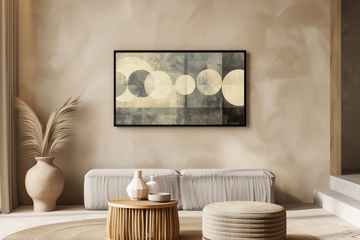
Abstract geometry done with enough restraint that it never tips into corporate. Layered circles in muted greige and warm off-white overlap and breathe, their edges soft rather than ruled. The composition holds a quiet bilateral tension — nothing is perfectly centered, which is precisely what keeps it from feeling static. Pair it with rooms where you've already committed to rounded forms: oval mirrors, curved sofas, ceramic vessels. The repetition becomes a whole room conversation.
4. Monochrome Palm Elegance - Frame TV Art
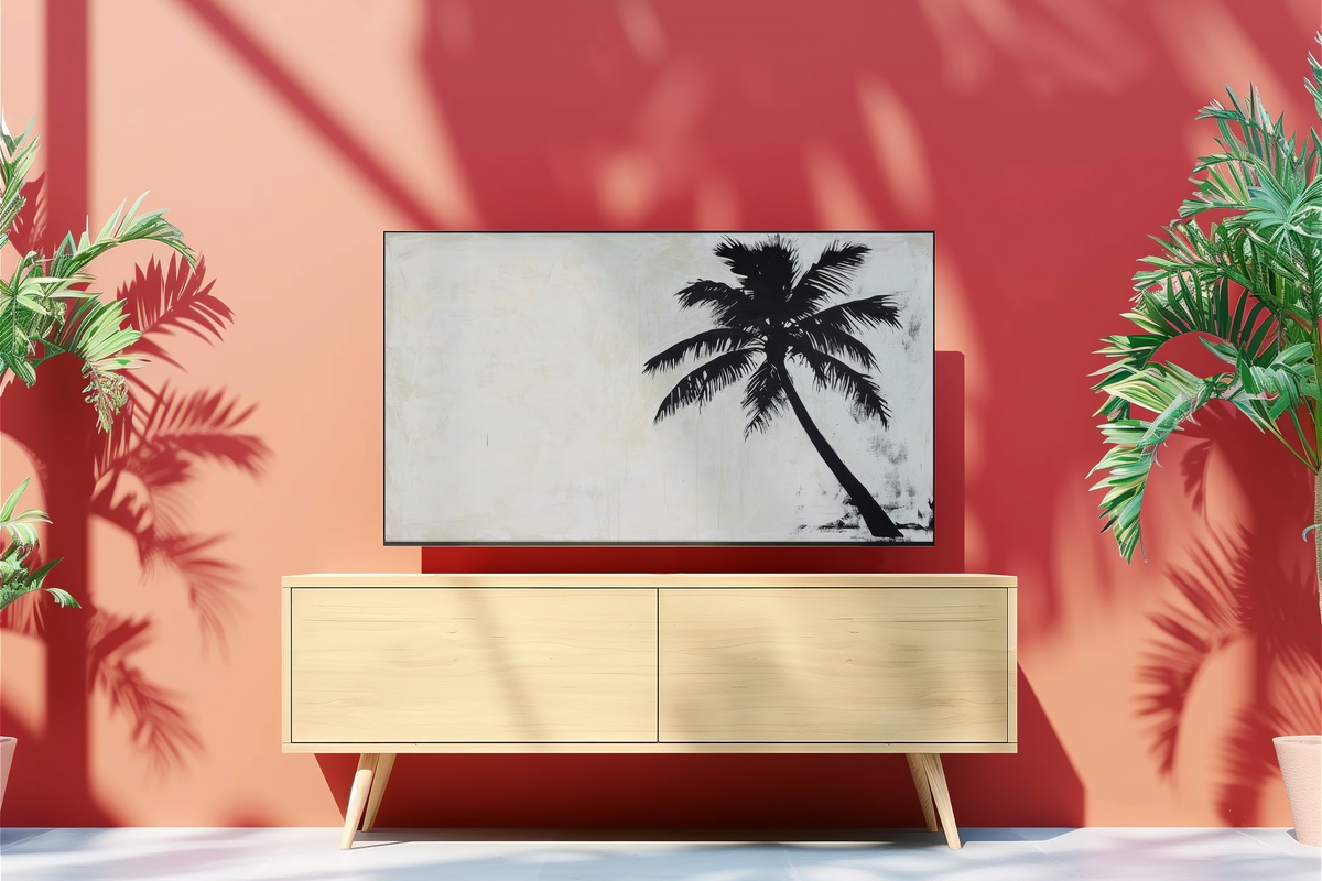
A palm silhouette rendered in deep charcoal on a near-white ground — it sounds like a wallpaper trope until you see how the fronds are handled. The linework is sparse and slightly irregular, more like an ink study than a print. That hand-drawn quality is what separates it from the botanical cliché. Honest to say: if your space already leans maximalist, the starkness here will fight rather than settle. But in a room with breathing room and a few natural materials, it holds its ground with quiet authority.
5. Desert's Soft Embrace - Frame TV Art
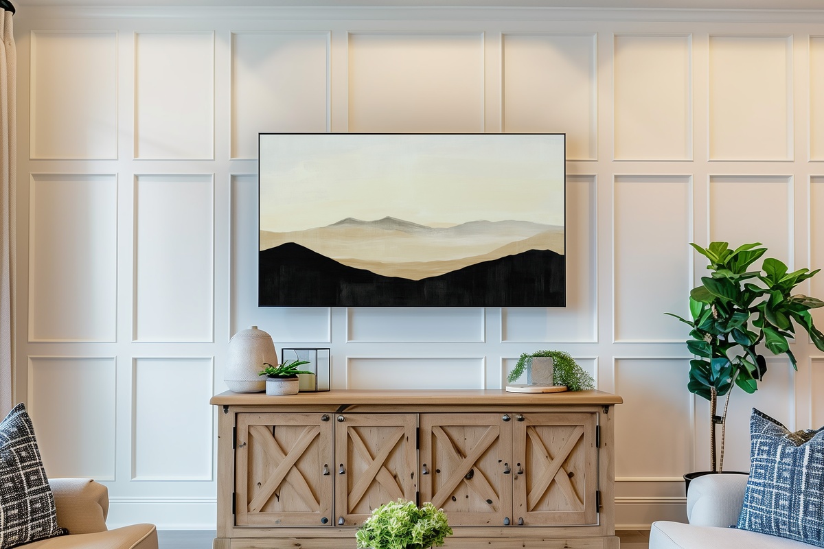
The palette here is all dusty terracotta and pale straw — a desert horizon caught at the moment just before the light fully flattens. What makes it work as screensaver art specifically is its horizontal emphasis: the landscape bands align naturally with the Frame TV's proportions, so the piece feels composed for the format rather than adapted to it. Something to note for anyone building a warm-toned palette across their room — this one threads effortlessly between sand-and-linen textiles and raw wood furniture.
6. Monochrome Botanical Elegance - Frame TV Art
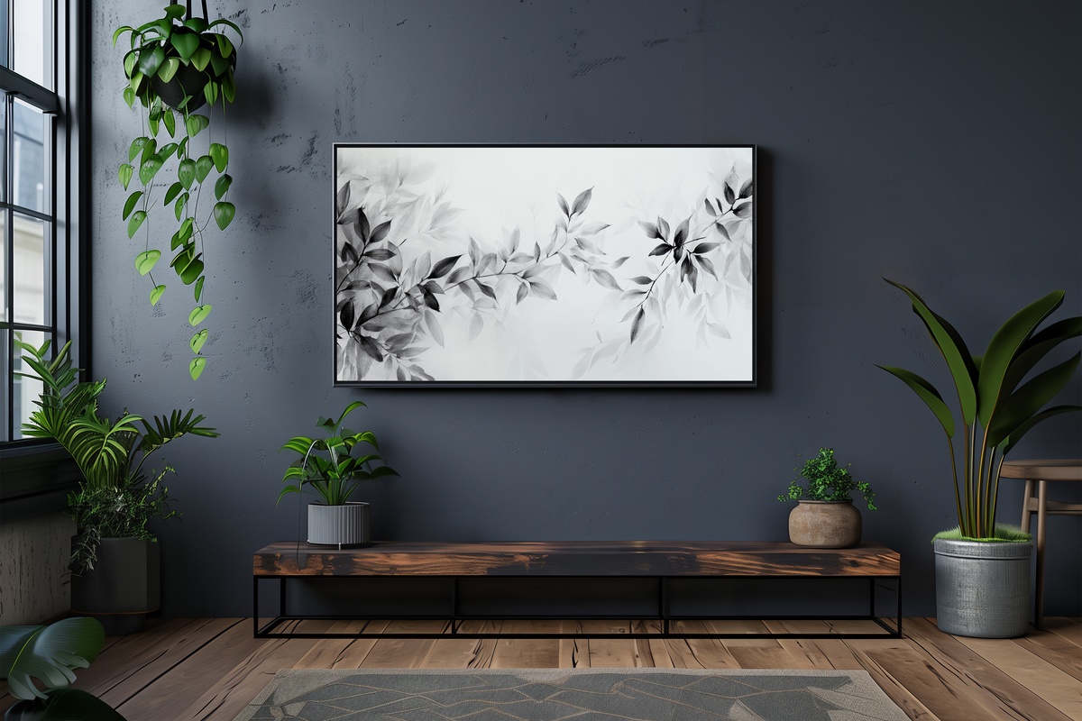
Fine-line botanical illustration in a single ink tone on a creamy field — where the Palm Elegance piece works through silhouette and mass, this one rewards closeness. The detail lives in the drawn edges of each leaf, the slight variation in line weight that suggests a human hand rather than a vector. Anyone who keeps a stack of art books on the coffee table and a few dried stems in a tall vessel will feel the logic of this immediately. It belongs in that same visual register: considered, unhurried, referential.
7. Marble Dreams in Motion - Frame TV Art
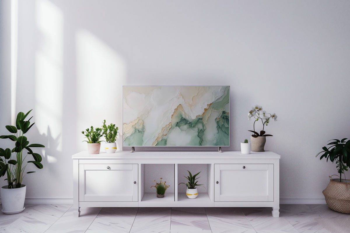
Veining in pale grey and warm ivory moves across this piece with the kind of organic irregularity that genuine marble has — which digital art rarely captures convincingly. This one does. The movement in the stone pattern gives it a living quality that prevents it from sitting flat on the screen. It earns its place in rooms where the existing materials already speak a stone-and-white language: marble countertops, plaster walls, bleached concrete. A natural pairing with a cooler-toned botanical or a gradient piece in the same ivory-and-grey family.
8. Whispering Mountain Hues - Frame TV Art
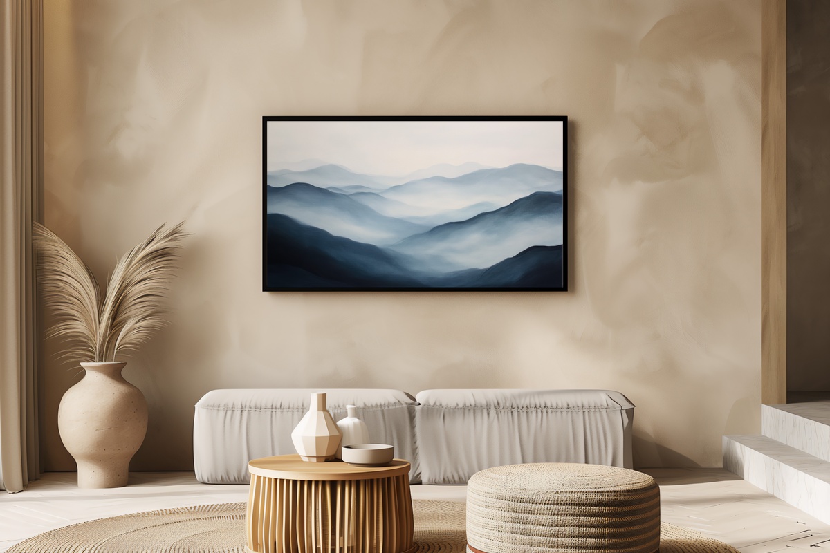
Soft gradient ranges — muted sage, pale violet-grey, and washed stone — layer into a mountain form that's more impressionistic than literal. The atmosphere sits somewhere between early morning and overcast afternoon, the kind of light that makes a room feel unhurried. Where the desert piece runs warm, this one pulls the temperature down just enough to feel like a change of air. A considered option for spaces that want landscape without committing to anything lush or verdant.
9. Circles of Calm Beauty - Frame TV Art
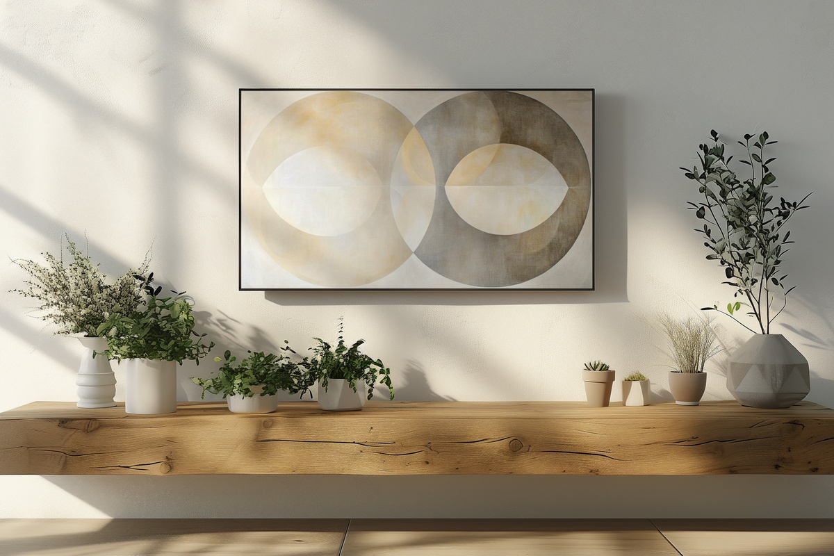
Where Whispering Circles of Balance plays with overlap and soft tension, this piece takes a more spacious approach — geometric rings in warm taupe and chalk, held apart by deliberate negative space. The restraint is its strength. Each circle reads as its own object, and the resulting composition has a meditative rhythm closer to Japanese spatial philosophy than to Western pattern-making. It suits rooms where you've deliberately left wall space empty and want the Frame TV to continue rather than interrupt that discipline.
10. Shadows Whisper in Grayscale Dance - Frame TV Art
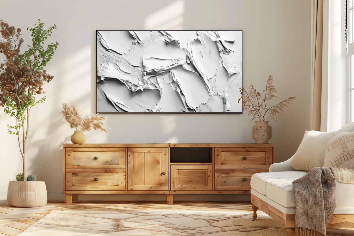
Pure grayscale, but not cold — the tonal shifts here move through a range of warm greys that feel closer to linen washed in dim light than to anything clinical. Shadow forms drift across the surface with just enough ambiguity to sustain looking. This is the piece for the room that already works and needs the Frame TV to do nothing more than hold the mood. And it does. Quietly, without drawing a single eye away from the conversation, the candlelight, or the meal on the table.
11. Serene Layers of Tranquility - Frame TV Art
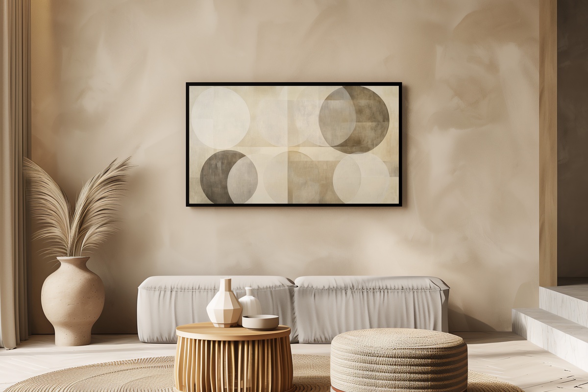
Concentric layered circles in the softest palette of this entire edit — chalky white, barely-there blush, and warm grey — stacked with a precision that reads as both minimal and generous. The depth created by each successive ring gives the piece a quiet dimensionality, as though the surface recedes rather than sits flat on the screen. A closing note to this collection in every sense: it gathers the warmth of the landscape pieces and the geometry of the circle series and settles them into something entirely its own.
Each of these files downloads instantly — on your Frame TV within minutes, no subscription required and yours to keep across every future display. When the room is finally quiet and the lamps are low, the right piece on the wall is less a decoration than a mood decision. Browse the full neutral Frame TV art collection whenever you're ready to make that decision for your own space.
A small note worth mentioning: the 3-for-30% and 5-for-50% discounts apply to any combination across the entire Gallery Flair catalogue — Frame TV art, printable wall art, and device wallpapers all count together. So if one landscape speaks to you here and a botanical wall print catches your eye elsewhere in the shop, they pool toward the same threshold. That's the cross-format collection logic, and it's there whenever you want to use it.