7 Neutral Frame TV Art Picks for a Curated Living Room
Late afternoon, the lamps are dimmed, dinner is on the stove, and the living room earns its keep. What hangs on the wall — or glows quietly from the Frame TV — does more than fill space. It sets the temperature of the whole room. These seven neutral Frame TV art picks share a commitment to restraint: no gesture that shouts, no palette that competes. Just considered compositions that let the rest of the room breathe.
What Makes Neutral Frame TV Art Work in a Curated Room?
Not every muted piece earns the word "neutral." The ones that do share a few qualities worth looking for: a tonal range that holds interest without introducing color contrast, compositional weight distributed evenly enough that the eye can rest anywhere in the frame, and a texture or mark — whether sand, veining, or line — that rewards a second look. A truly neutral piece functions as a visual anchor, not a backdrop. These seven do exactly that.
1. Dunes Whispering Tranquility - Frame TV Art
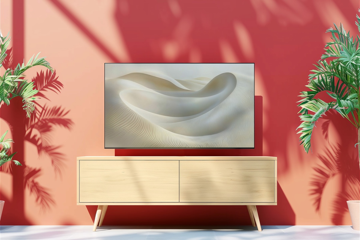
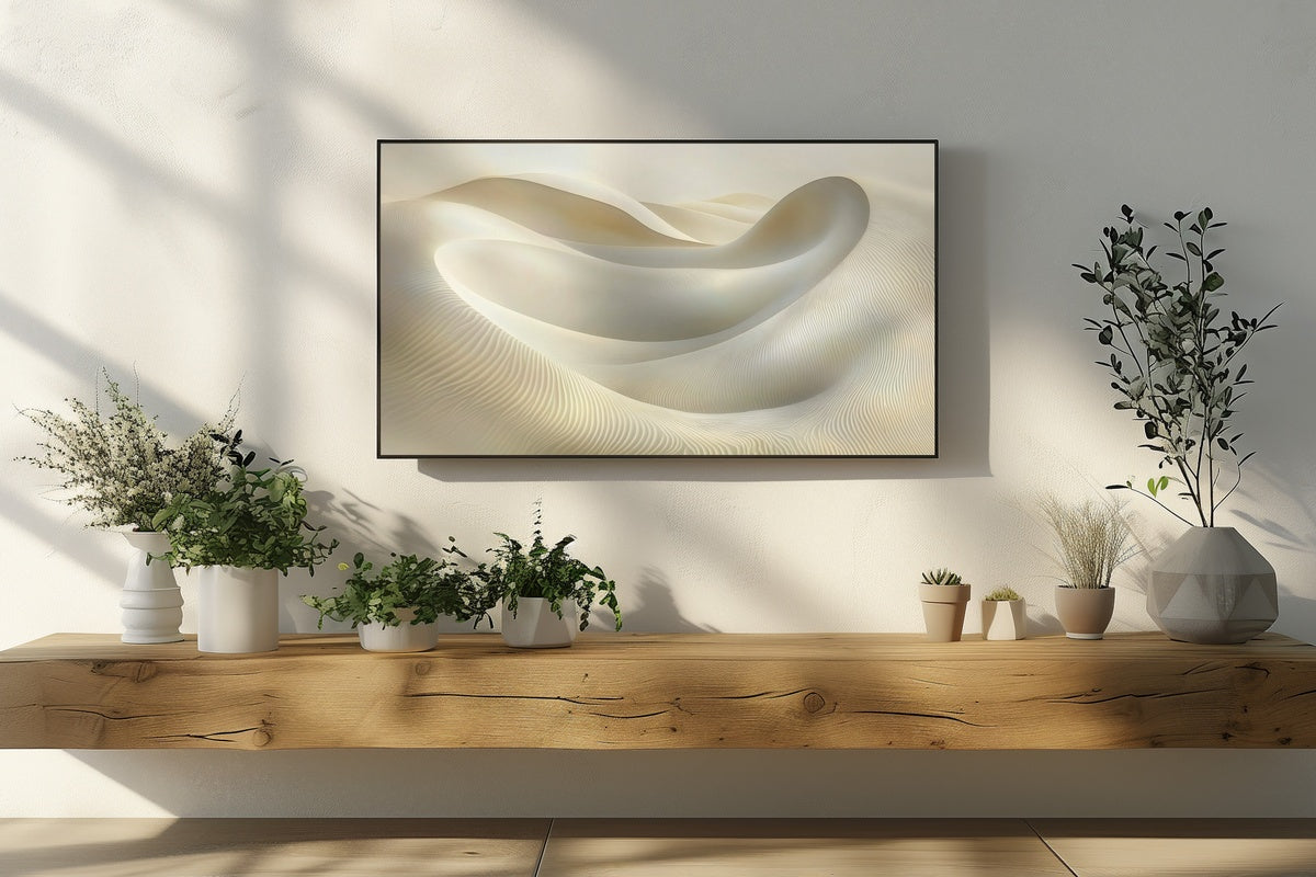
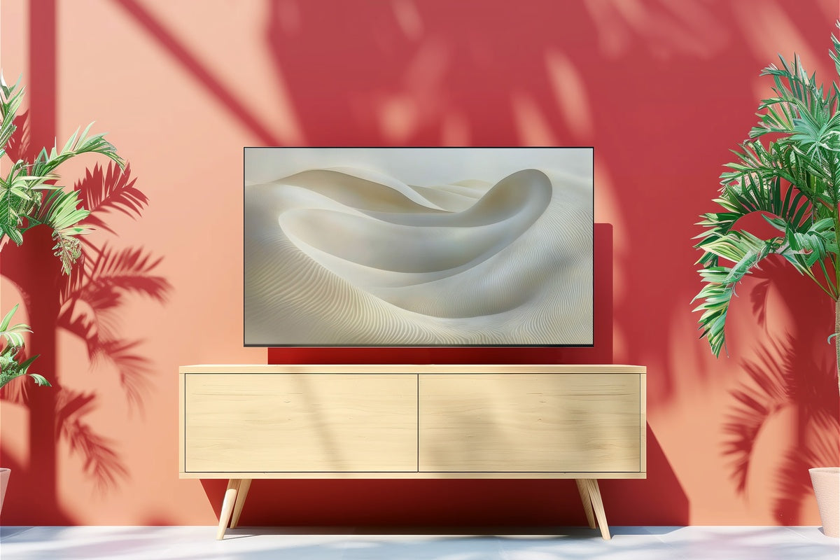
Linear dunes rendered in parchment and warm ash — this piece reads almost like a topographic study, the kind of image that gets quieter the longer you sit with it. The horizontal rhythm of the ridges creates a natural visual cadence, pulling attention left to right in a slow, unhurried sweep. It belongs in rooms where you've already stripped back the layers: bare linen, unvarnished wood, a single ceramic on the shelf. Someone who rearranges books by spine tone will know immediately where this fits.
2. Whispering Circles of Balance - Frame TV Art
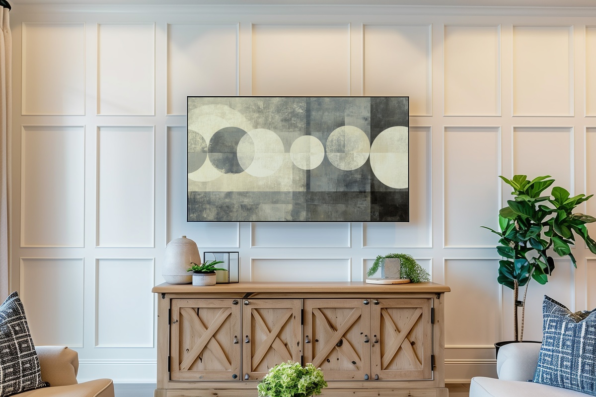
Abstract circles suspended in a field of cream and soft grey — not geometric in the rigid sense, but organic enough that the forms feel like they arrived naturally rather than by construction. There is a tension between the circles that gives the piece its energy: overlapping edges, slight weight differences, a quiet asymmetry that keeps it from tipping into decoration-aisle predictability. Against a white plaster wall or floating above a low credenza, this one holds the room together without making a claim on it.
3. Monochrome Palm Elegance - Frame TV Art
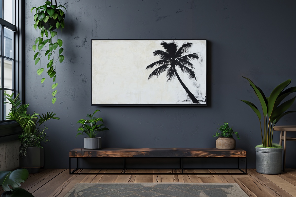
A word on botanical art in monochrome: it can slide toward the generic without much encouragement. This piece avoids that fate through the quality of its silhouette — the palm fronds are rendered with enough specificity that the shadow reads as real light, not clip-art contrast. Charcoal on near-white, with a softness at the edges that feels less like a graphic and more like a print pulled from a darkroom tray. Rooms with rattan, a woven runner, and the scent of something citrus-clean belong to this one.
4. Sands of Tranquil Beige - Frame TV Art
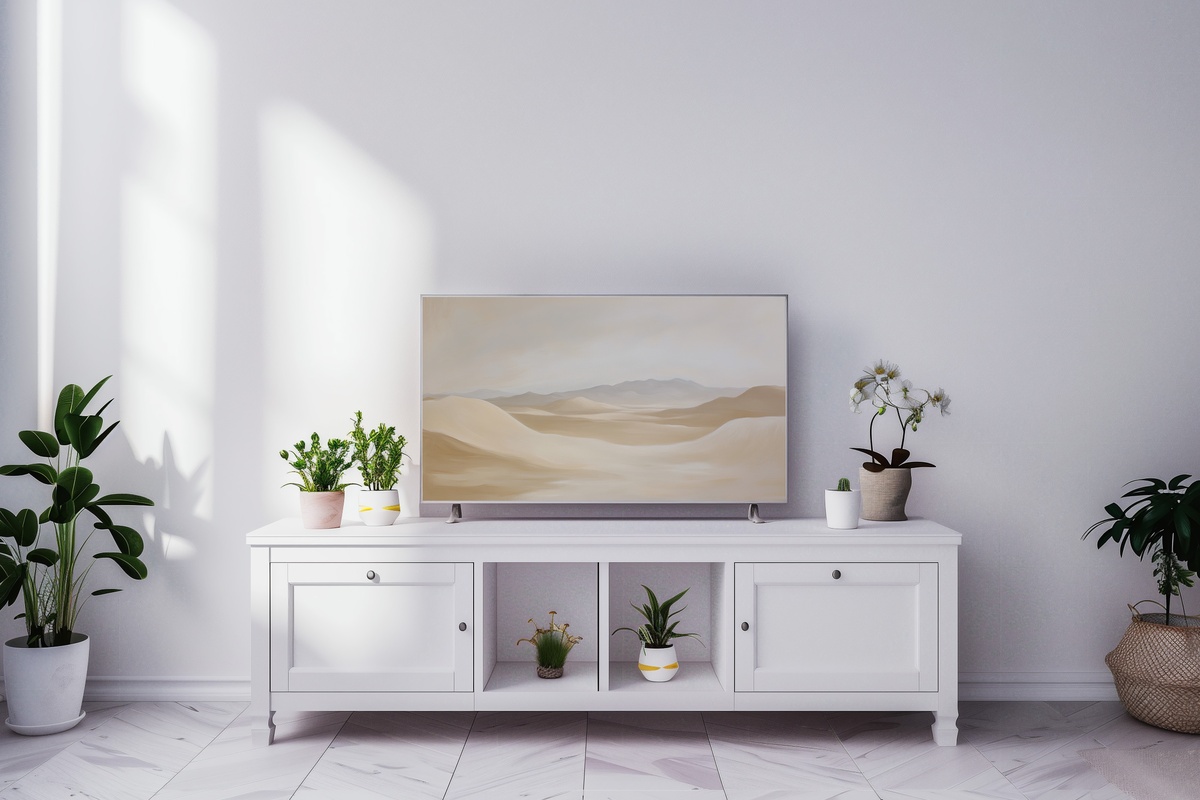
Where the dunes piece moves in horizontal lines, this one settles into a broader, more open composition — a wide desert view rendered in warm beige, bone, and pale sand. The horizon sits low, giving the upper two-thirds of the frame to a washed, luminous sky tone that feels almost like late morning before the heat arrives. This is the neutral Frame TV art pick for rooms already living in a warm register: aged brass fixtures, terracotta accents, the particular gold of a well-worn oak floor.
5. Marble Dreams in Motion - Frame TV Art
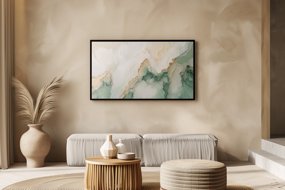
Marble veining at this scale — filling the full TV frame — transforms a familiar material into something closer to landscape. The grey and white veins move diagonally with just enough variation in weight to suggest depth, the way real stone catches raking light differently depending on where you stand. Nothing here reads as cold or clinical; the tones sit in a warm white-to-dove range that bridges the gap between minimal and inviting. A natural pairing for rooms with polished concrete, matte white walls, and deliberate negative space.
6. Whisper of Feathered Lines - Frame TV Art
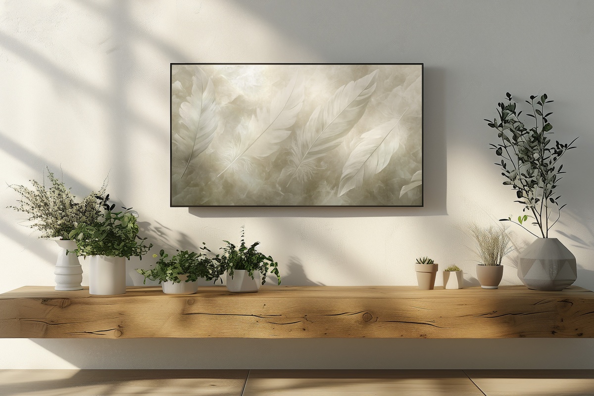
Feather abstraction in monochrome sounds like it could tip into spa-catalogue territory. It doesn't here, because the mark-making is loose enough to feel considered rather than decorative — the lines branch outward with an irregularity that suggests something observed rather than designed. The tonal range runs from near-black at the central quill to a soft fog-grey at the outermost tips. And the amount of breathing room the composition leaves around the central form is exactly right: generous without feeling empty.
7. Serene Layers of Tranquility - Frame TV Art
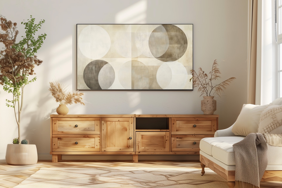
Concentric layered circles in a palette that moves through oyster, warm white, and pale linen — this piece operates at the quietest end of the neutral spectrum and is stronger for it. The layering creates a subtle dimensionality, as though the circles recede gently into the frame rather than sitting flat against it. For rooms that have already committed to a single warm neutral throughout — walls, soft furnishings, floor — this piece doesn't interrupt that conversation. It continues it. If maximalism is your register, look elsewhere; this one belongs to rooms that value the pause.
Any of these arrives on your Frame TV within moments of purchase — no waiting, no subscription, no ongoing cost. Each file is yours to keep and re-display across seasons, rearranged any time the room calls for something different. If you find yourself drawn to more than one — and pairing a warm-toned landscape with a monochrome abstract and a textural close-up is a genuinely satisfying combination — consider that these pieces work across categories too. A Frame TV art file, a printable wall print, and a desktop wallpaper in the same neutral palette all count together: any mix of three across the full Gallery Flair collection brings 30% off, and any five brings 50%.
There's something worth noting about setting up a piece like this before the room is fully finished. Living with it during the in-between — the half-arranged shelf, the paint still drying — is often when you learn whether it actually belongs. These seven are steady enough to hold their own through that process.