9 Black and White iPhone Wallpapers That Actually Match the Mood
There's something about pulling your phone from your pocket and landing on a screen that feels genuinely considered — not just a default gradient or a photo you meant to replace months ago. Black and white does something the color palettes often can't: it strips the moment down, lets the composition breathe, and reminds you that restraint is its own kind of beauty.
What Makes a Black and White Wallpaper Actually Work?
Not all monochrome is equal. The pieces in this edit earn their place through contrast that holds at small scale, a composition that doesn't fight the app icons layered over it, and a mood that stays consistent whether the screen is at full brightness or dimmed to night mode. Look for negative space with intention, mark-making that rewards a closer look, and a tonal range that reads as deliberate — not simply desaturated.
1. Zebra Stripe Symphony
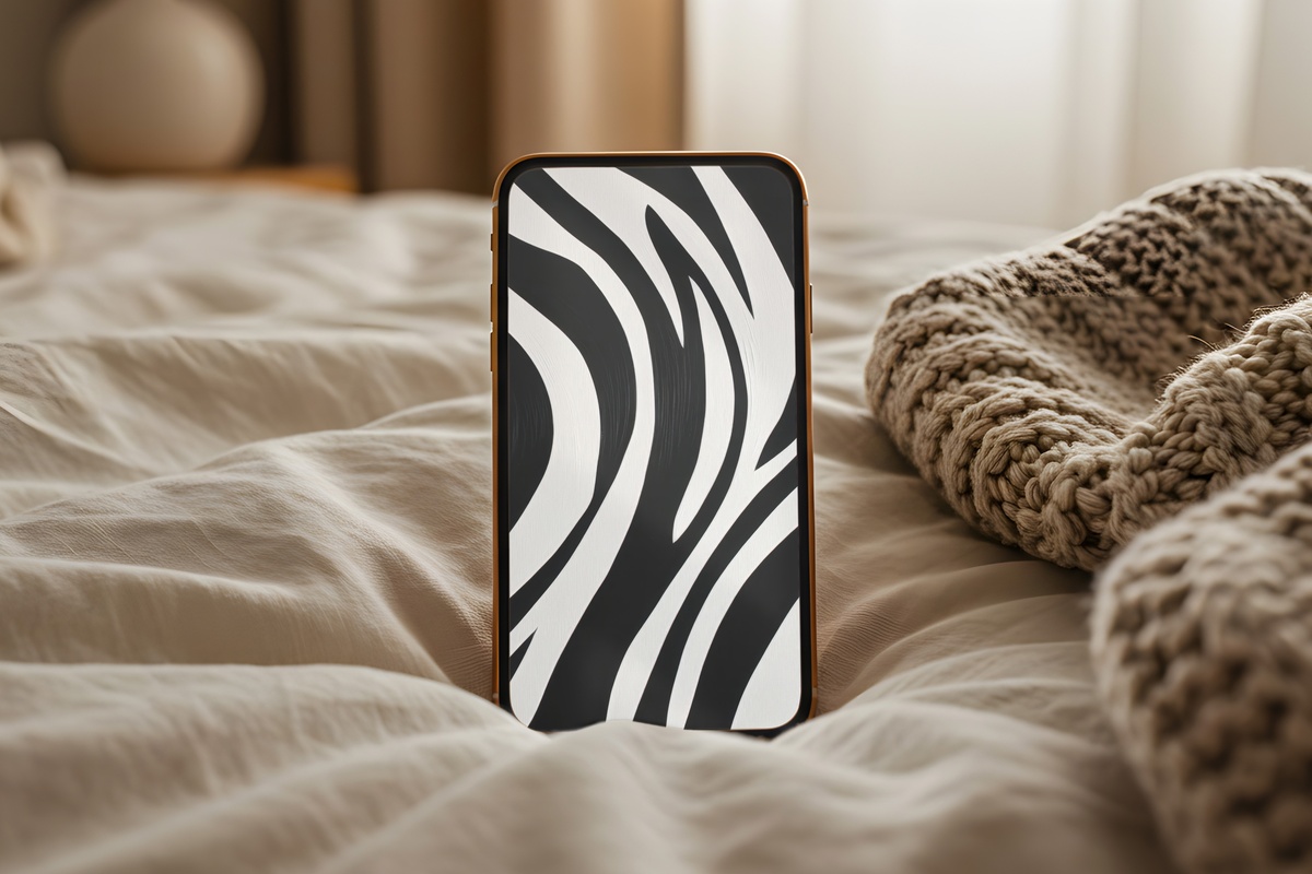
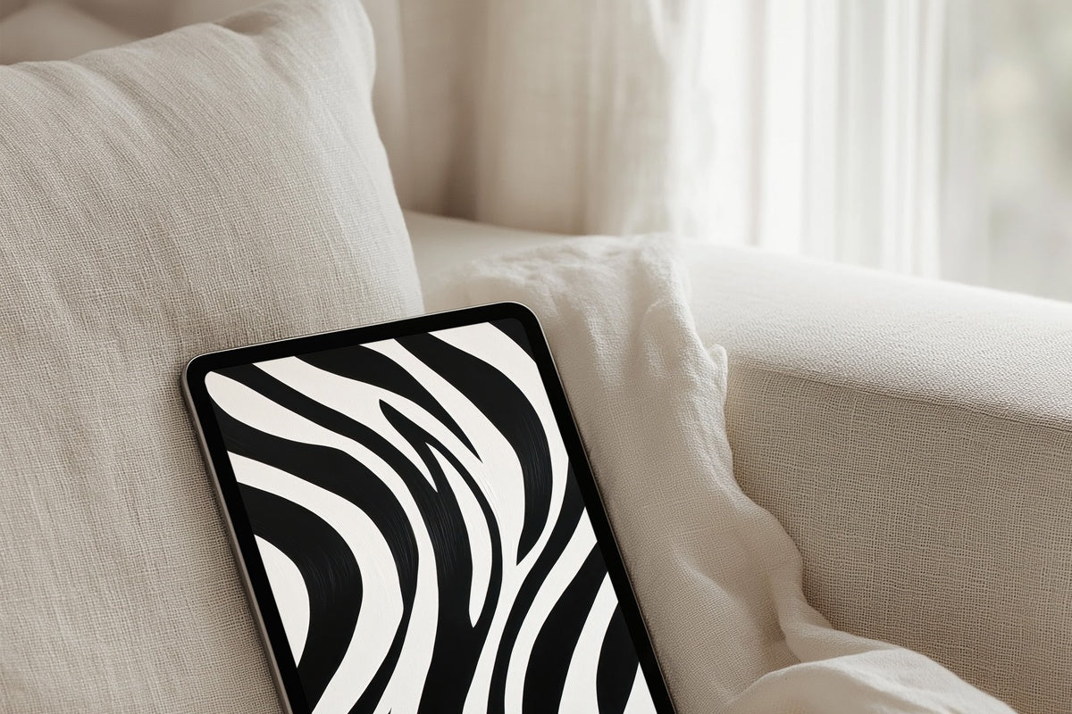
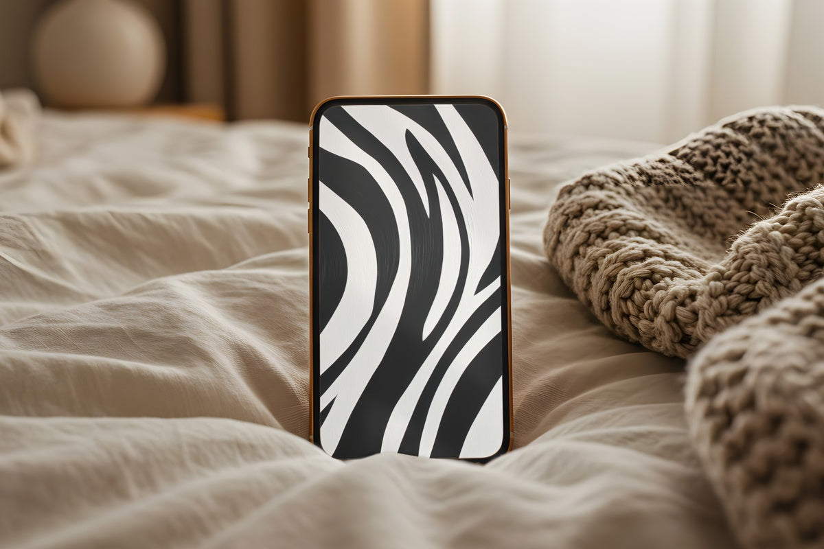
Organic curves rendered in stark ink — this one reads like a close study of hide and shadow, where the stripes don't quite repeat and that irregularity is exactly the point. The contrast is high without feeling aggressive, closer to a botanical print that's been stripped of color than anything graphic-design loud. Set it on a white phone case and the whole object becomes an object. Anyone drawn to nature reimagined as pattern will recognize this language immediately.
2. Monochrome Inked Whimsy
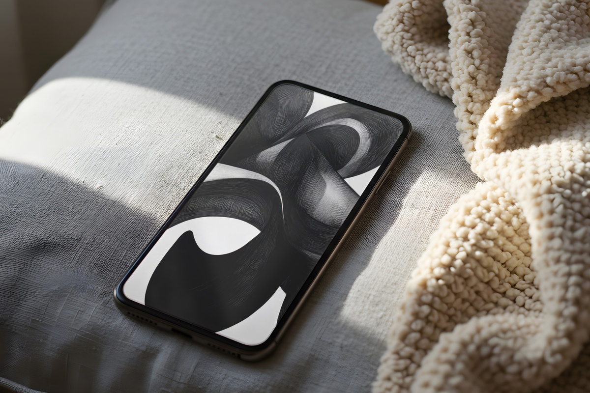
There's a looseness here that most monochrome wallpapers avoid — the linework has that particular energy of a pen that was moving fast and meant it. Whimsical without being cartoonish, the illustration floats against white ground in a way that feels like a sketchbook page that earned a gallery wall. It's the black and white iPhone wallpaper for someone whose Notes app is full of small observations and whose playlist changes hourly. Moody, a little playful, entirely intentional.
3. Angular Animal Symmetry
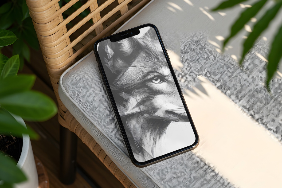
Geometric faceting meets animal form — and the tension between the two is where this piece lives. Hard angles describe something that is unmistakably organic, and that contradiction holds your attention past the first unlock. The tonal gradients across each plane keep it from reading flat; pull your phone out in morning light and the depth shifts. Something between a modern sculpture and a ink study, and genuinely unlike anything else in this edit.
4. Urban Night Pulse
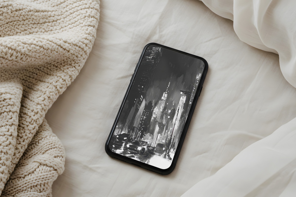
If most black and white wallpapers lean pastoral or minimal, this one goes the other direction entirely. Light trails and architectural lines rendered in grayscale give the screen a charged, late-night energy — the city after everyone stops performing for it. It reads differently on a dark mode home screen versus a bright one, which is exactly the quality that makes a wallpaper feel alive. Pair it with a charcoal phone case and the whole look clicks into place.
5. Modern Striped Symphony
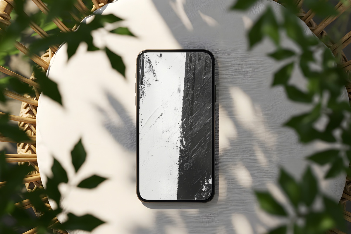
Stripes sound simple until they're done with this kind of rhythm. The weight variation between lines — some hairline-thin, some broader — gives the composition a pulse, almost like musical notation viewed from the side. Against a lock screen, it creates the sensation of depth without any literal three-dimensionality. If the clean-girl aesthetic had a visual metronome, this might be it. Structured enough for the minimalist, textured enough to hold interest past the first week.
6. Dandelion's Skyward Journey
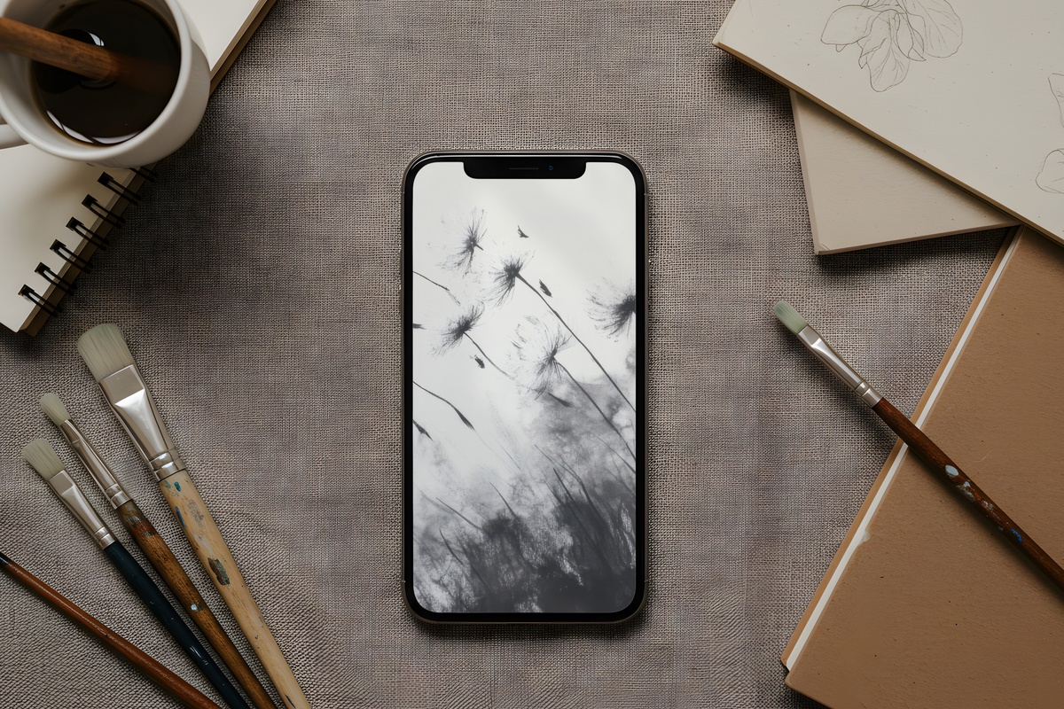
A single dandelion, seeds dispersing upward against open white — and the negative space does more work here than any ornament could. The stems and filaments are rendered with the kind of precision that rewards zooming in, all those individual wisps carrying different visual weight. It leans into a cottagecore-adjacent softness without losing its graphic edge. Honest warning: if maximalist layered prints are your thing, this stillness will feel foreign. But for anyone whose walls already hold a botanical or two, the language will be familiar.
7. Monochrome Brushwork Energy
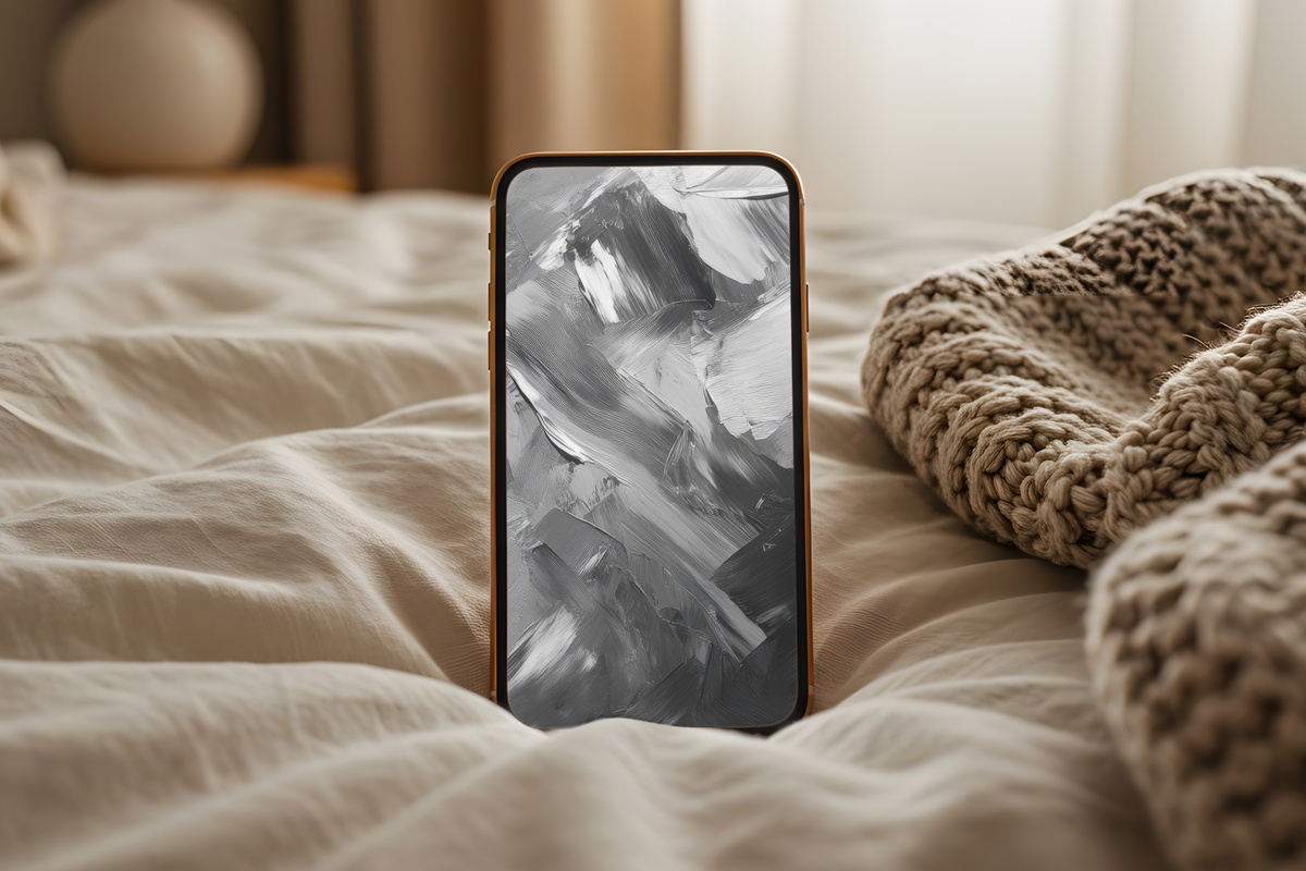
Bold ink strokes that haven't been tidied up — and that refusal to resolve into something polished is the whole point. Brushwork Energy reads like sumi-e practice that found its final form: gestural, confident, the white ground giving each mark room to expand in the eye. It brings a certain force to the lock screen, the kind that makes the phone feel less like a utility and more like something you actually chose. Set this one and notice how the energy shifts the first morning you wake up to it.
8. Intricate Lace Elegance
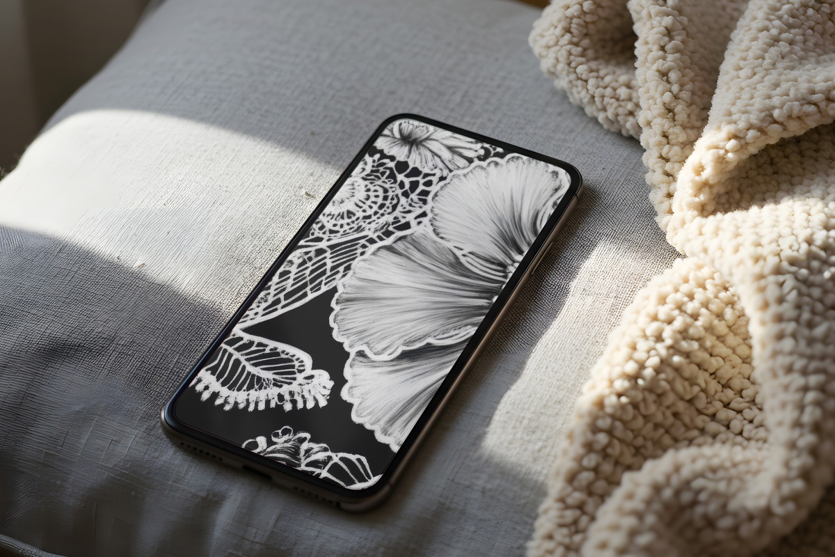
Coquette and quiet luxury arrive at the same address with this one. The lace motif is fine enough to feel like an heirloom — the repeat pattern dense with detail but never cluttered, reading as a single tonal field at normal viewing distance and revealing its intricacy when held closer. On a screen, it photographs beautifully through glass, which is a bonus for anyone whose phone doubles as a styling prop. Cream-adjacent whites and deep graphite darks give it warmth despite the monochrome palette.
9. Geometric Shadow Ascent
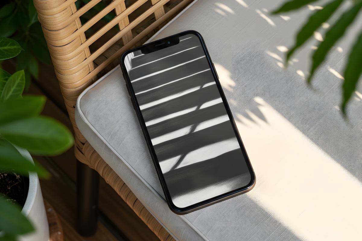
Sharp geometry caught mid-shadow — this piece has the precision of architectural photography and the mood of late-afternoon light cutting through a half-open blind. The ascending forms pull the eye upward through the frame, and the shadow gradients introduce enough tonal variation to keep it from reading as a flat graphic. It's a strong closer to this edit because it holds its ground without announcing itself loudly. A natural fit for desks and dark-mode setups where the phone sits face-up and the screen is a daily view.
Each of these downloads to your phone in under a minute — no subscription, no waiting, just the image sized and ready. Whenever one calls to you, it's there in the collection, open whenever you want it.
And if you're building a visual world across your devices — a matching wall print for the room where you charge your phone, or a Frame TV piece in the same monochrome register — mix and match across any product types: three pieces from any combination of wallpapers, wall art, and Frame TV art gets you 30% off; five pieces from any mix brings that to 50%. The palette, not the category, is what makes a collection feel whole.