9 Modern iPhone Wallpapers for Every Mood You're Living In
There's that split second before the day starts — screen pulled from the nightstand, lock screen glowing in the half-dark — when the image you've chosen for your phone tells you something about who you're choosing to be today. These nine picks were selected for exactly that moment: the daily unlock, the glance between meetings, the ambient visual company of a phone that barely leaves your hand.
What Makes a Modern iPhone Wallpaper Actually Work?
Not every image that looks good on a laptop translates to a phone screen. The best modern iPhone wallpapers share a few quiet qualities: a clear focal zone that doesn't compete with your app icons, a palette that reads well in both bright daylight and dim evening light, and a mood specific enough to feel chosen rather than defaulted to. Composition matters at small scale — negative space isn't emptiness, it's breathing room. The nine picks below were selected across a range of palettes, from raw-earth warmth to cool geometric precision, because the right wallpaper is a personal thing.
1. Nature's Earthy Rhythm
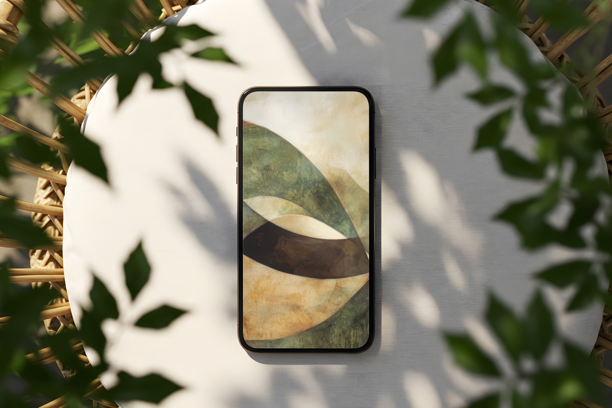
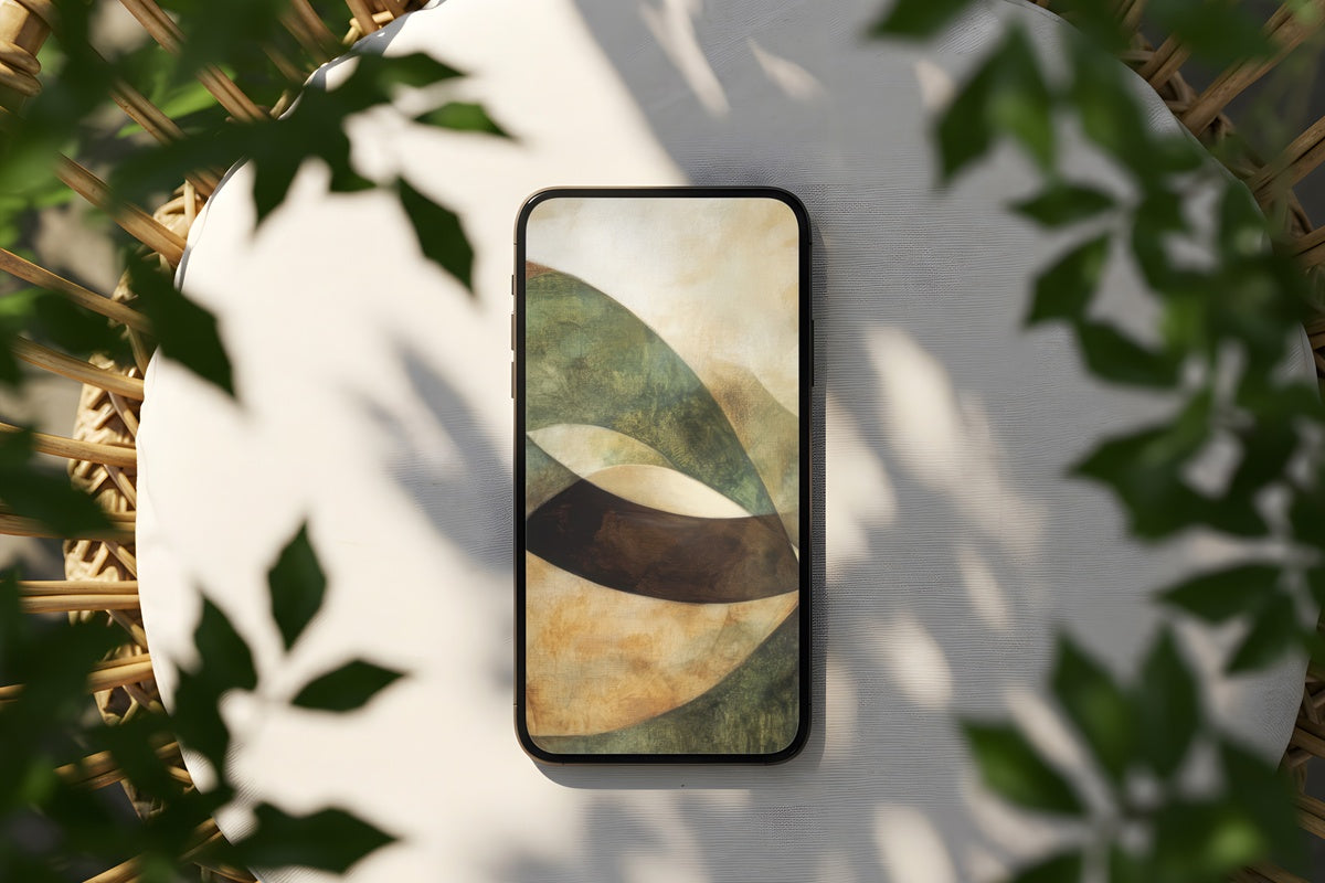
Warm terracotta, dried-grass beige, and a low amber undertone — this one carries the temperature of afternoon light through a sun-baked window. The organic movement across the composition keeps the eye interested without demanding attention, which makes it easy to live with day after day. If your home leans toward raw linen, wooden bowls, and potted fig trees, this wallpaper fits that world as naturally as anything on your actual shelves.
2. Desert Serenity in Modernion
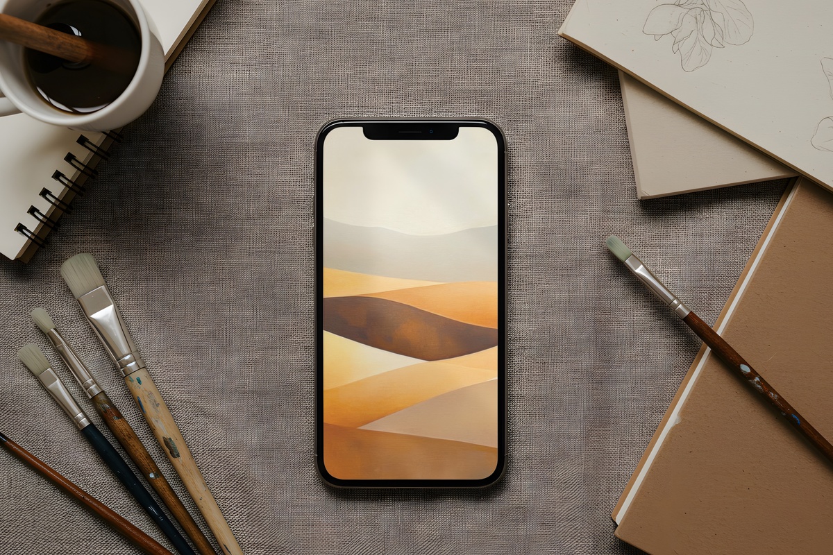
There's something almost meditative about a palette this measured. Dusty blush, pale stone, and the faintest suggestion of sage — the kind of color story you'd find on a canyon wall at dusk, flattened and refined into something you can carry in your pocket. The restraint here is the point. Anyone drawn to that girl aesthetic or clean-girl minimalism will recognize what this does to a lock screen: it reads as intention. Nothing louder than it needs to be.
3. Forest Serenity in Soft Neutrals
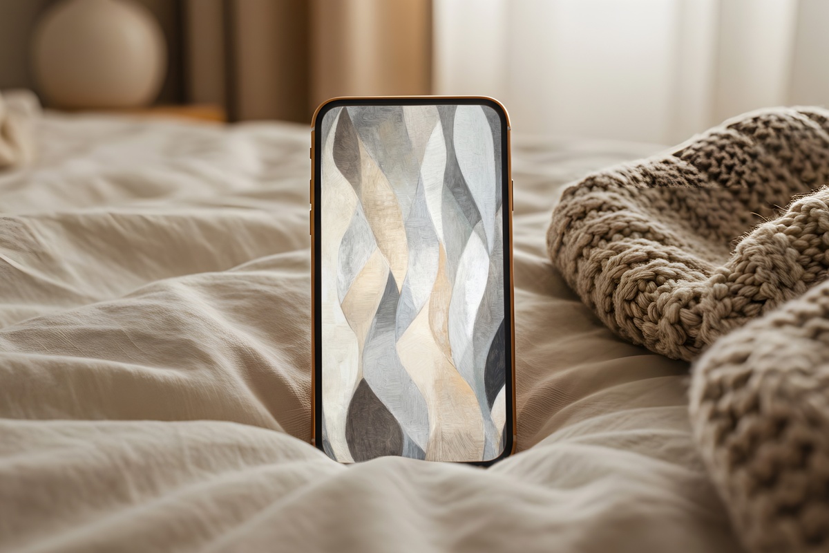
Moss, parchment, and a cool grey that sits somewhere between morning fog and overcast pine light. This one has the quietness of a slow-living mood board without veering into anything too rustic. The muted green tones don't compete with notification badges, which is a small but genuinely useful detail — and visually, the softness reads as freshly washed linen rather than washed-out. A natural companion for cottagecore and soft neutral interiors.
4. Oceanic Wave Rhythms
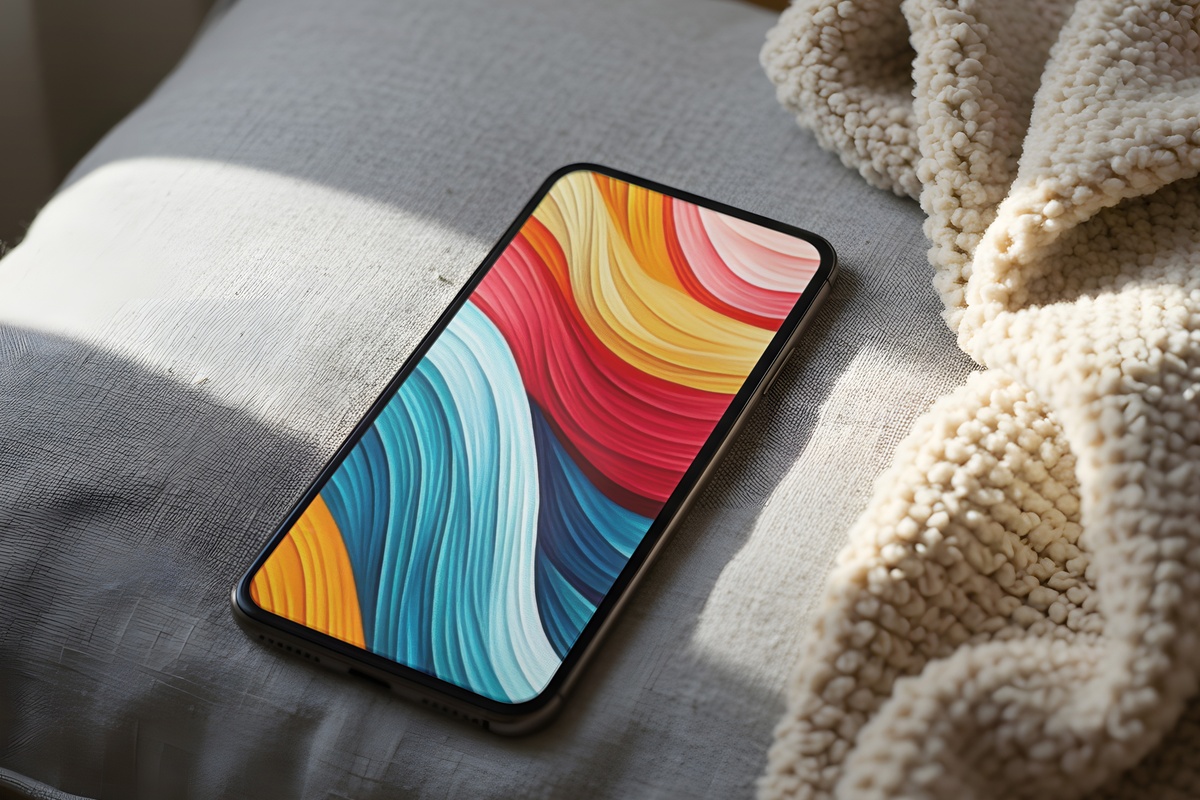
Fluid ribbons of cerulean and deep teal move across the frame with the kind of unhurried rhythm that makes you slow down to look. The movement is lateral — sweeping rather than dramatic — and it gives the composition a sense of continuous flow that suits a phone screen particularly well. Pull it from your pocket at 9 a.m. and it reads like the feeling of watching water rather than thinking about anything that's waiting for you.
5. Sunset Gradient Serenity
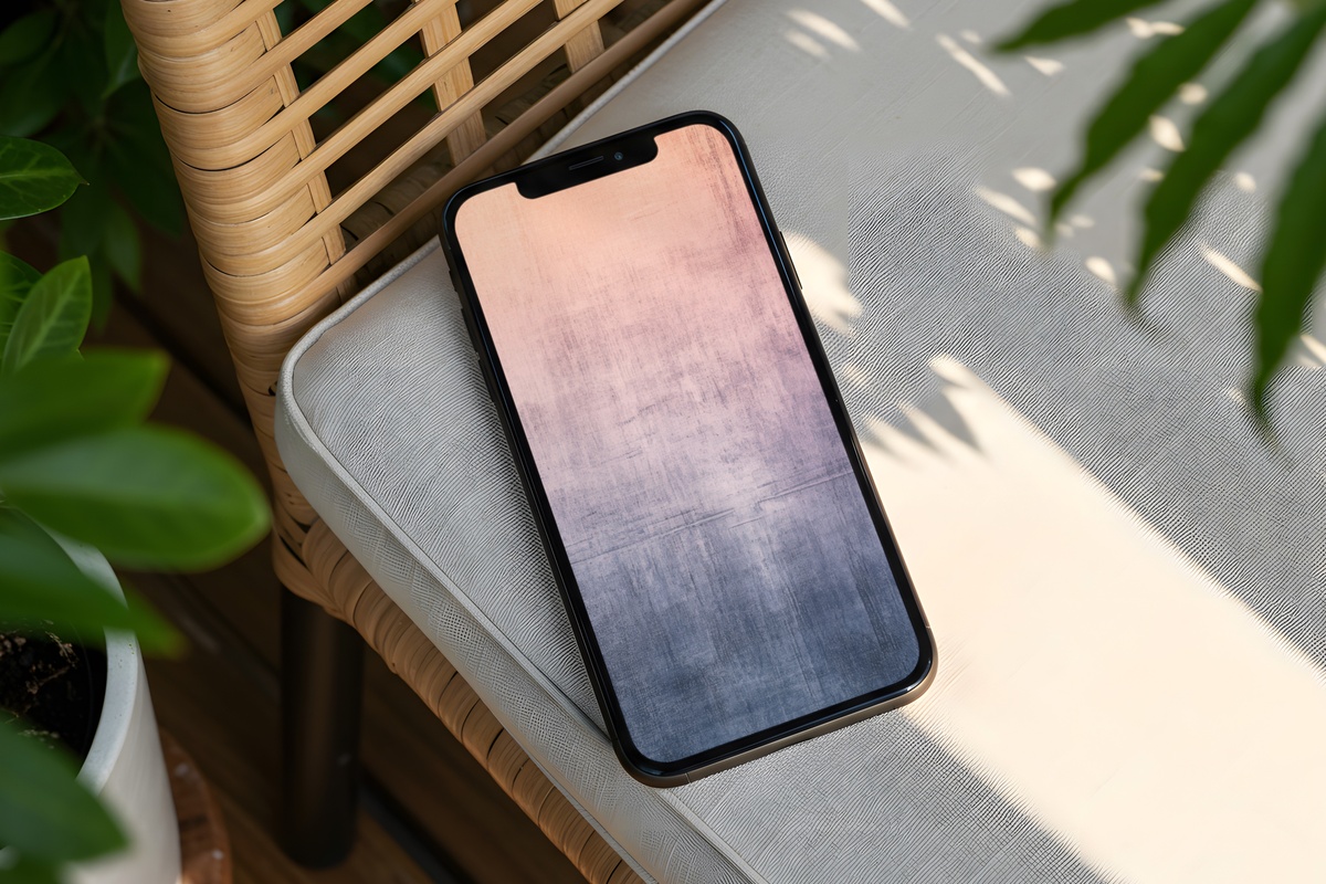
Peach bleeding into rose, with a faint lavender breath at the upper edge — this gradient sits in the register of golden hour on a clear evening, the sky about ten minutes before it goes dark. What distinguishes it from a generic pastel gradient is how the tones shift: not evenly blended, but weighted toward warmth at the base and coolness at the top, the way actual light behaves. It's a coquette and soft life favorite for good reason. Genuinely pretty at any brightness level.
6. Vibrant Red Black Splashes
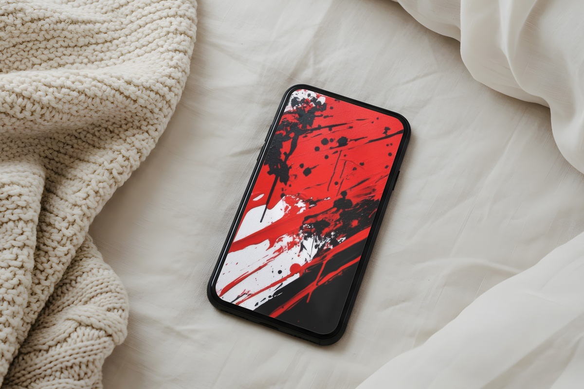
Most of this list leans soft. This one does not, and that's precisely what makes it necessary. Deep lacquer red collides with ink black in an abstract composition that reads closer to a gallery canvas than a decorative background. High contrast, high energy — the lock screen equivalent of a red lip and a dark coat. Not for rooms that already have a lot going on visually. But if your space is spare and your aesthetic runs toward drama with precision, this one earns its place.
7. Black Line Minimalist Elegance
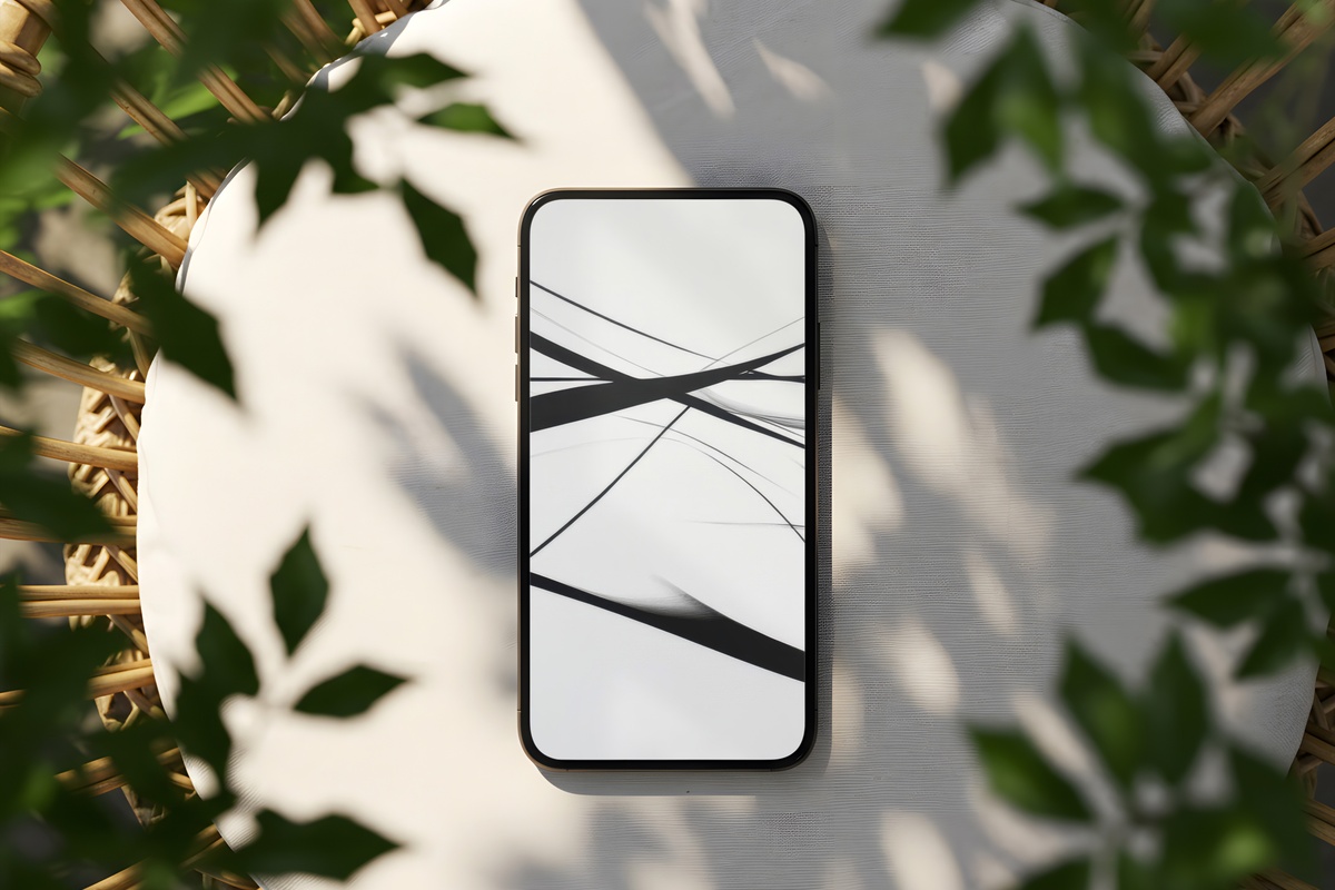
A single considered line weight. An off-white ground that's warmer than pure white. Minimal — but minimal the way a good architectural drawing is minimal: every mark doing real work. This is the wallpaper for the person whose apartment has exposed concrete walls and a single oversized art print, who deletes apps the moment they stop being useful. The monochrome palette makes app icons pop cleanly, and there's no time of day when this reads as wrong.
8. Metallic Geometric Modernion
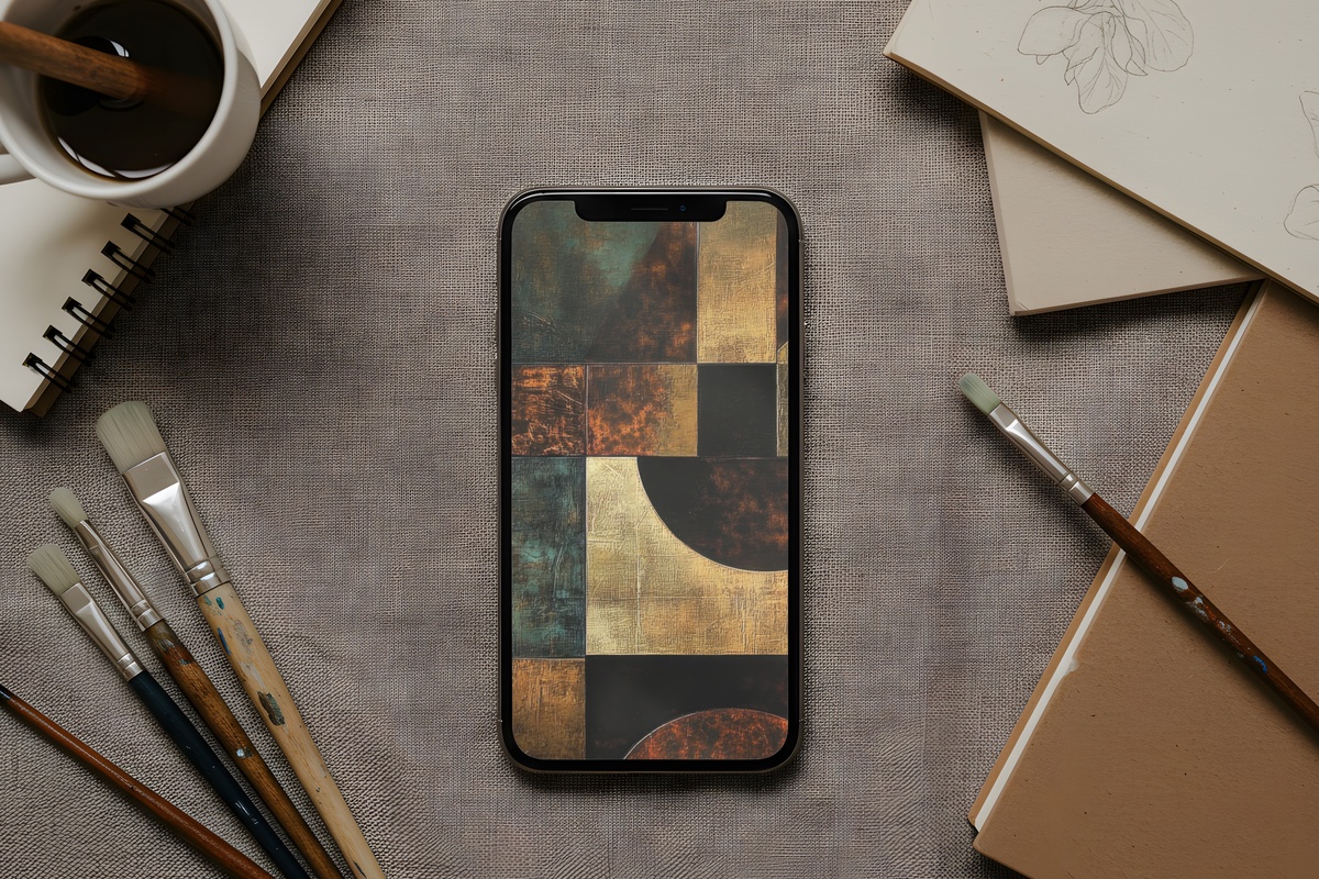
Teal with a metallic sheen, arranged in crisp geometric forms that catch light the way hammered copper does — cold and warm in the same glance. There's a tension between the hardness of the geometric structure and the luminosity of the color that gives this one an unexpected depth. It works beautifully on OLED screens, where the teal reads almost iridescent. For anyone building a lock screen that's architectural and distinctly non-neutral. Worth pairing with a tonal wallpaper at the same cool temperature for a cohesive cross-screen look.
9. Watercolor Fusion Elegance

Pale lilac and blush wash into each other with the loose confidence of wet-on-wet technique, leaving soft blooms of color where the pigments pool. There's a handmade quality to the edges — slightly unpredictable, organic in the way no digital gradient quite manages to be. Watercolor wallpapers are an aesthetic the internet has chased many times, and most land too saccharine. This one holds itself back just enough: the palette is whisper-light, but the composition has enough variation to keep it alive across a full day of glances.
Any one of these is on your screen within a minute of downloading — no subscription, no waiting, just the image ready to set. Browse the full collection at your own pace, and when something clicks, it's yours to keep across every device you use it on.
A quiet note on building a set: mixing across wallpapers, printable wall art, and Frame TV pieces in the same palette counts toward Gallery Flair's volume tiers — three pieces from any combination gets you 30% off, five pieces gets you 50% off. One visual world, one considered discount.