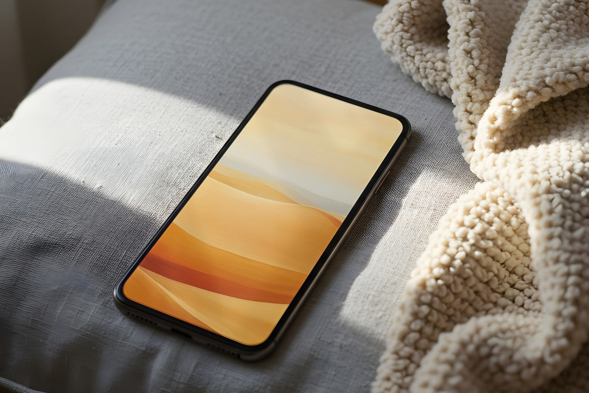
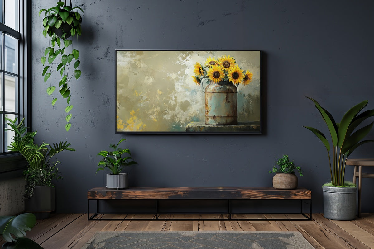
8 Vintage iPad Wallpapers That Nail the Nostalgic Aesthetic
There is a particular quality to light in old paintings — the way amber settles into shadow, the way a distant tree line blurs into atmosphere. These eight vintage iPad wallpapers chase that same feeling, the one you get when you open your tablet on a slow morning and the screen asks nothing urgent of you.
What Makes a Wallpaper Feel Genuinely Vintage?
Not every muted palette reads as vintage — the difference lives in a few specific choices. Look for tones that feel oxidized rather than filtered: warm ochres, dusty sage, aged ivory, watery slate. The scenes themselves matter too — landscapes with depth and horizon, botanical subjects with botanical patience, animals rendered with illustrative care. And the mood should carry a certain stillness, a sense that time inside the image is moving at a different speed than the world outside the screen.
1. Eternal Embrace Oak Majesty
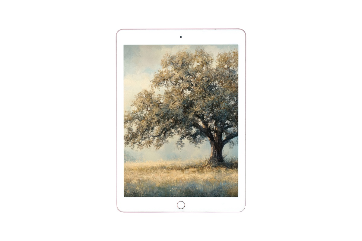
A gnarled oak rendered in warm ochre and burnt umber — this one belongs to the category of images that feel biographical. The branches reach and cross in the way old trees do, unselfconsciously. Against a sky that reads somewhere between late afternoon and early dusk, the composition holds a kind of weighted stillness that most landscape art spends years reaching. Anyone drawn to earthy tones and a sense of deep-rooted permanence will recognize exactly what this image is saying.
2. Birds in Twilight Hues
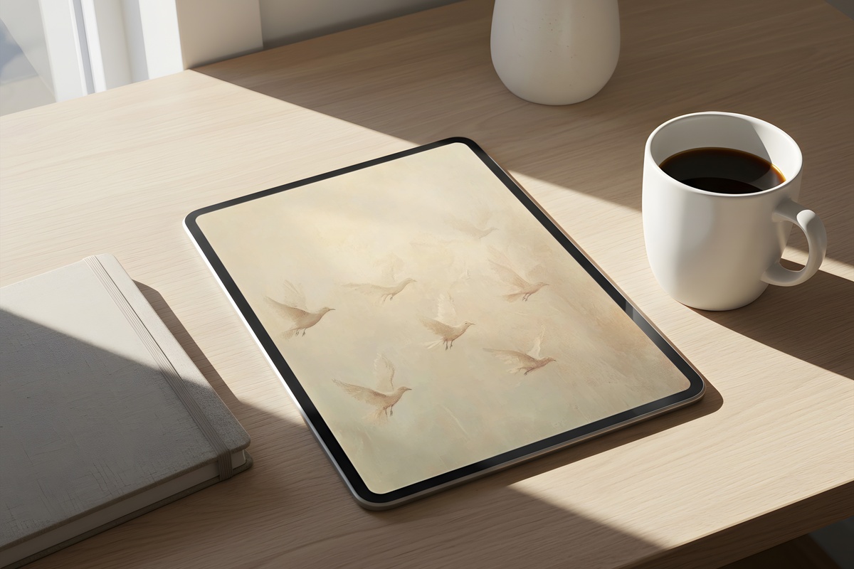
This is the wallpaper you notice between tasks — the one that catches your eye for a moment longer than it should. Muted rose and charcoal-dusted sky, birds suspended mid-flight against a horizon that feels borrowed from a nineteenth-century naturalist print. There is a looseness in how the forms are suggested rather than stated, which gives the whole image an atmospheric quality closer to memory than to documentation. It suits the reader who collects vintage prints but lives in a very modern flat.
3. Castle Sunset Layers
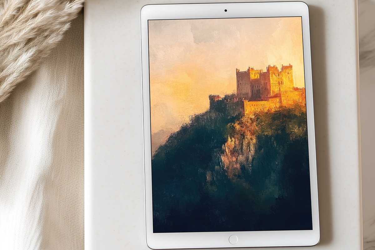
Soft amber bleeds into apricot, and somewhere in the middle distance, a castle silhouette holds its ground against a sky built in visible layers — cloud upon cloud, tone upon tone. This is Romantic-period landscape painting as tablet art, and it wears the reference without apology. The scale feels cinematic even at screen size, the kind of image that makes the light in your actual room look slightly less interesting by comparison. Reach for this one when the rest of your screen life feels relentlessly flat.
4. Majestic Beacon Cliffs
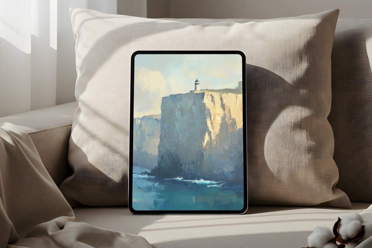
Where the warm-toned pieces in this edit lean toward the hearth, this one opens a window. Washed cerulean and steel-grey mist settle around cliff faces that recede into haze — a palette that reads as genuinely cool without ever tipping into cold. The lighthouse is a small thing in a large world, which is precisely the point. If your screen time tends toward the high-pressure end of the spectrum, placing this as your resting image offers a specific kind of exhale. And no — if relentlessly cozy warm palettes are your whole world, this cooler register may ask more of you than you want from a wallpaper.
5. Sunlit Forest Journey
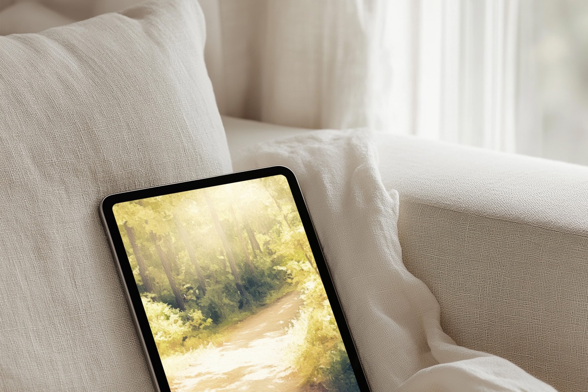
Golden light falls through a forest canopy in that particular way it does in late summer — dappled, directional, unhurried. The tones here are honeyed and green-shadowed, and the depth of the scene pulls the eye inward along a path that dissolves before it resolves. Painters in the Hudson River School tradition understood this trick: the destination is less important than the walking. On a tablet screen, especially a larger one, this image expands beautifully — wide aspect ratios give the canopy room to breathe across the full display.
6. Deer in Tranquil Meadow
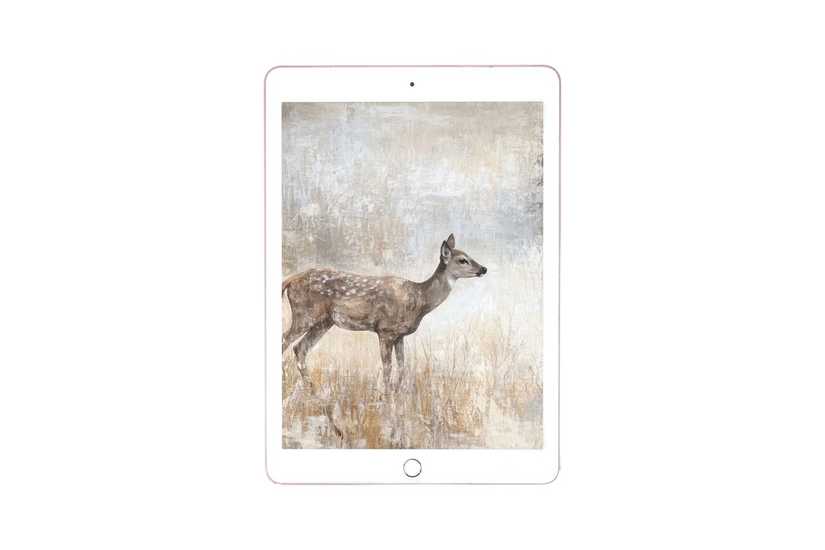
Pale flax and dusty ivory meet in a meadow where a deer stands at the edge of notice — present but undemanding. The restraint here is deliberate: the palette barely commits to any single tone, which makes the whole image feel like a faded illustration from a naturalist's field journal. It carries the soft-life sensibility without self-consciousness, which is harder to pull off than it looks. A pairing thought: this one sits beautifully alongside wall art in the same bleached-linen temperature — the mood carries across formats without effort.
7. Misty Waters Swan Ballet
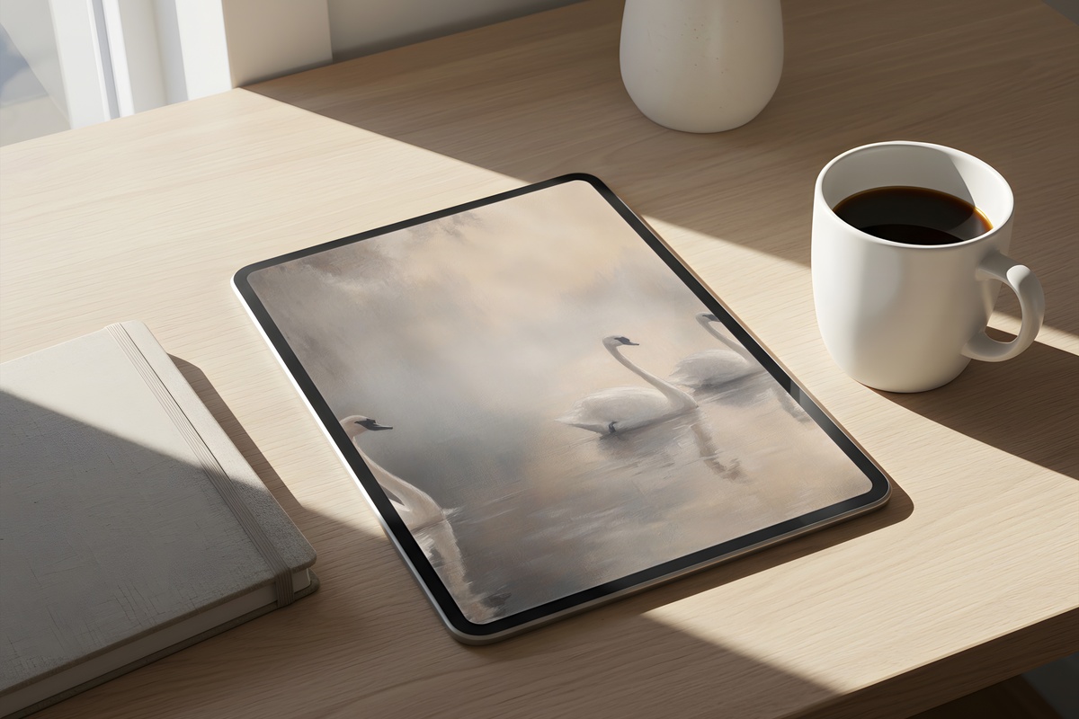
Taupe water, cream feathers, a horizon that disappears into white air. There is a symmetry at the centre of this image — swans mirrored in still water — but it is an imperfect symmetry, slightly shifted, which keeps the image from reading as decorative in the expected sense. The coquette aesthetic has a version of this subject that goes overwrought with drama. This image takes the opposite approach: it holds its breath. The negative space does real compositional work, letting the bird forms register as gesture as much as subject.
8. Island Blissful Harmony
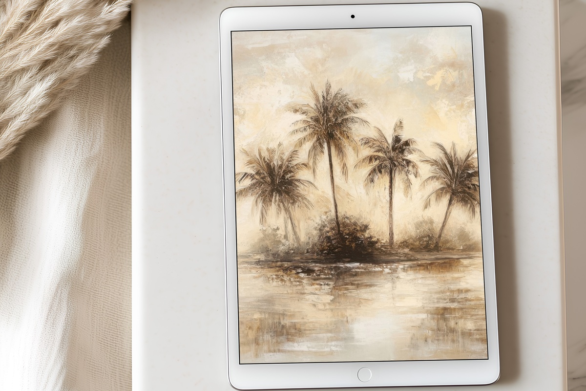
Washed coral, faded turquoise, the suggestion of palm fronds against a sky so pale it's almost white — this is the warmest piece in the edit and the one that carries a distinctly coastal, sun-bleached quality. Think vintage travel illustration reimagined at screen resolution. The pastels read aged rather than saccharine, which is the specific line this image walks. A natural companion for anyone building a soft, sun-warmed aesthetic across their devices and their walls — the same tonal family translates across printable art and phone screens without any loss of mood.
Each of these downloads arrives on your screen within moments of purchase — no subscription, nothing to wait for, just the image ready to set. Whichever piece called to you, it will be there in the collection whenever the moment feels right.
And if a few are calling at once — good news on the arithmetic front: any three pieces across the full Gallery Flair catalogue count toward 30% off, and any five pieces (from any mix of iPad wallpapers, printable wall art, Frame TV art, or phone wallpapers) bring that to 50%. One continuous visual world, one sensible price.