8 Summer Printable Wall Art Picks to Refresh Your Walls This Season
There's a particular light that arrives in early summer — slanted and golden, pooling on the floor by mid-afternoon — that makes you look at your walls differently. What felt right in January can feel heavy now. A seasonal rotation doesn't require new frames or a full redecoration; sometimes one printed piece, swapped in at the right moment, is enough to make a room exhale.
What Makes Summer Wall Art Work All Season Long?
The pieces that hold up from June through August share a few qualities worth noting before you choose: a palette that reads warm without going saturated (think sand, sea-foam, and that particular amber that appears right before the sun drops), impressionist or painterly mark-making that feels handmade rather than graphic, and enough negative space that the image breathes rather than competes with natural light. A coastal or botanical subject helps, but the mood — unhurried, open, a little luminous — is what actually carries a room through the season.
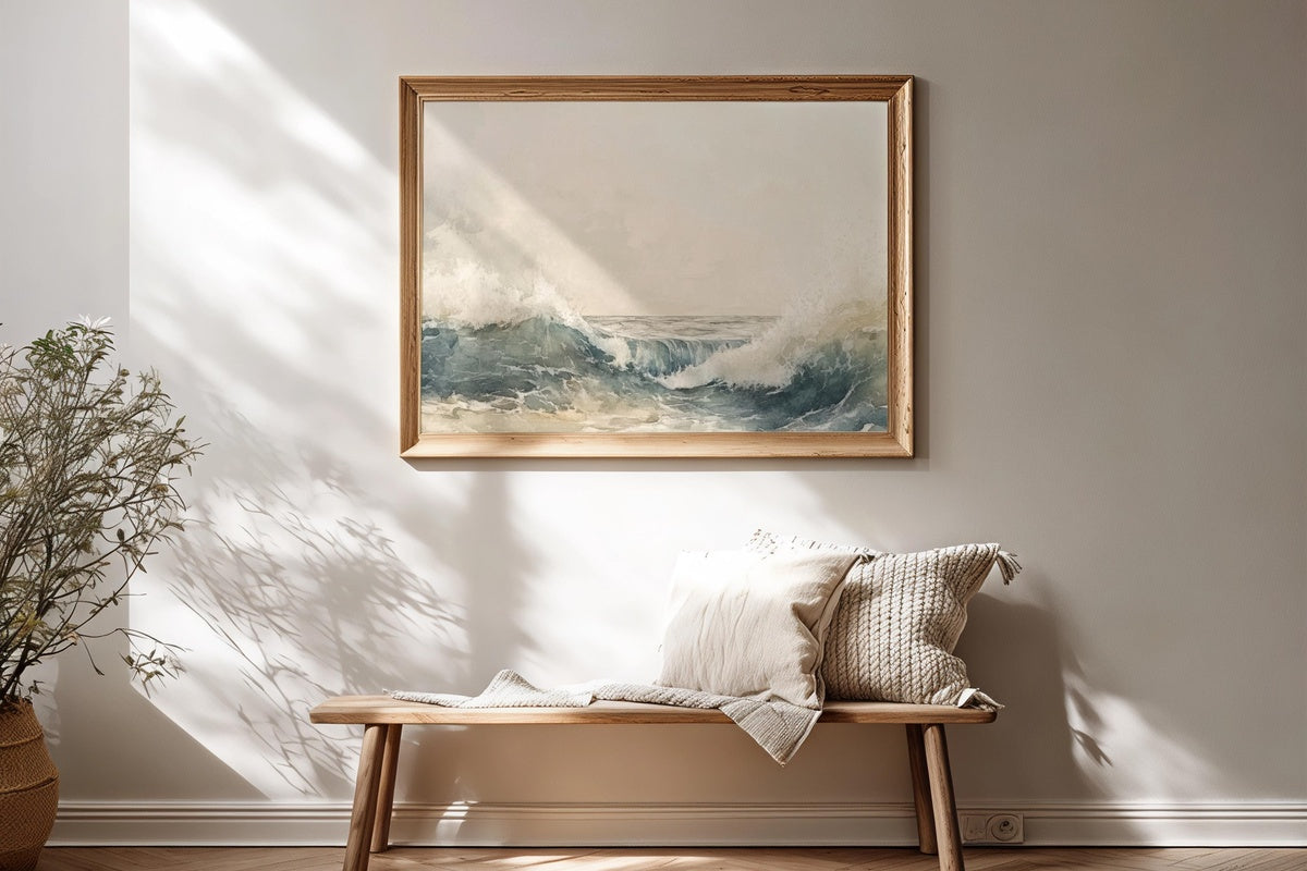
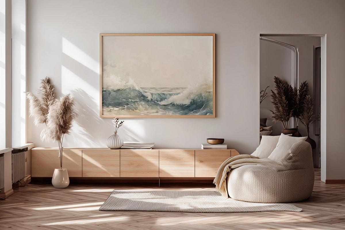
1. Abstract Oceanic Dreamscape - Printable Wall Art

Layered watercolor washes pull you straight into open water — indigo deepening into teal, then dissolving into a haze of pale foam at the edge of the composition. The abstract treatment keeps it from reading as mere coastal decor; there's genuine painterly tension here, the kind that rewards a second look on a slow evening. Hang it somewhere afternoon light reaches it directly and watch the cooler tones shift. A natural anchor for any room that wants the feeling of the ocean without a literal horizon line.
2. Sunlit Vibrance of Sunflowers - Printable Wall Art

Deep cadmium yellow against a sun-bleached background — this one doesn't whisper. The impressionist brushwork gives the field a sense of movement, petals catching light at different angles as if a breeze just passed through. Anyone whose kitchen or dining room sits on the darker side of the house will recognize this for what it is: a reliable source of warmth that costs nothing in renovation. It reads as exuberant without tipping into naivety — the color is too considered, the composition too deliberately weighted for that.
3. Soft Dunes' Serenade - Printable Wall Art

Sand rendered in warm bisque and pale gold, dunes curving under a sky that's more suggestion than statement. The restraint here is real — two-thirds of the image gives itself over to open space, which means it lives comfortably beside bolder pieces without competing. Think of it as the quieter voice in a gallery wall, or as a standalone piece in a hallway where you want something that feels like an exhale. Texturally, it prints beautifully on matte fine-art stock.
4. Gilded Shore Tranquility - Printable Wall Art

Golden hour captured not as a photographic record but as a felt memory — warm amber pooling across a shoreline rendered in loose, confident strokes. The palette moves from honey at the horizon to a deeper burnt sienna in the foreground, giving the whole piece a sense of recession and depth that feels dimensional on the wall. This one is for the living room that goes dim by five o'clock and needs something with its own inner light. A pairing with cooler coastal tones in the same room creates a satisfying tonal dialogue.
5. Turquoise Dreams Sailboat - Printable Wall Art

A single sail against an expanse of water rendered in every variation of turquoise the color family allows — aqua, verdigris, a near-green where shallow meets deep. The impressionist treatment keeps this from veering into nautical-theme-decor territory; it reads closer to a plein-air study than a decoration. Scale matters with this one — printed large, the water becomes almost immersive. A bedroom or reading nook where the walls are otherwise bare is where this piece finds its best context.
6. Glimmers of Coastal Grace - Printable Wall Art

Clifftops scattered with wildflowers in cream, blush, and a muted sage — the kind of scene that belongs to early July, when everything is still in full bloom before the heat takes over. The impressionist rendering gives the cliff face a tactile roughness against the softer botanical foreground, and that contrast carries real visual interest. If your current walls skew too neutral and you want something with colour that doesn't dominate, this lands in exactly the right register: present, but never loud.
7. Gentle Radiance Over Secret Garden - Printable Wall Art

Dappled light through garden foliage — rendered in that particular soft-focus, Monet-adjacent way that makes a room feel like it has its own microclimate. The palette leans into sage, moss, and a warm filtered white, with floral forms dissolved just enough to feel dreamlike rather than botanical-illustration. We'll admit a preference for this one in spaces where the windows face a wall or a street rather than greenery; it does something quietly compensatory in those rooms. A gentle counterpoint to the bolder coastal pieces in this edit.
8. Whispers of Seaside Minimalism - Printable Wall Art

Where the other pieces in this edit speak, this one listens. A near-empty shoreline rendered in barely-there greys and pale oyster whites — the beach as abstraction, stripped to its essential geometry. For anyone who finds the coastal-decor genre too cheerful, too busy, or too obviously thematic: this is where the genre grows up. The restraint is the whole point, and it pairs with almost anything because it asks so little of the room around it. Print it large for maximum impact from its minimum means.
Each of these files downloads straight to your device — no waiting for a proof, no lead time before the summer light is already doing something interesting on your walls. Print at home, at a local print shop, or at any online printing service; the files are sized for both. The collection is right there whenever you feel ready to make the swap.
One last note worth knowing: the 30% and 50% tiers apply across everything in the Gallery Flair shop — mix printable wall art with Frame TV art or device wallpapers and it all counts. Three pieces from anywhere in the range brings you to 30% off; five pieces to 50%. Building a cohesive visual world across your home — one palette carried from the gallery wall to the TV screen to your desktop — turns out to be the most economical way to do it too.