9 Summer iPad Wallpapers and Wall Art Picks for the Quiet-Luxury Home
There is a particular quality of light that belongs only to summer — the way it stretches long across a pale wall, or settles into a room like something unhurried. These nine picks gather that feeling into a curated palette: coastal blues, warm ochres, sun-drenched florals, and gilded shore tones that carry the season into every corner of a considered home.
What Makes a Summer Palette Feel Quiet-Luxury?
The distinction lies in restraint. A truly sophisticated summer palette reaches for tone over saturation — sand rather than neon, sage rather than lime, the dusty pink of a dried garden rose rather than hot coral. Look for compositions where negative space does as much work as the subject, where the color story holds together across formats, and where the mood reads the same whether the piece lives on your iPad screen or your bedroom wall.
1. Whispering Coastal Breeze — iPad Wallpaper
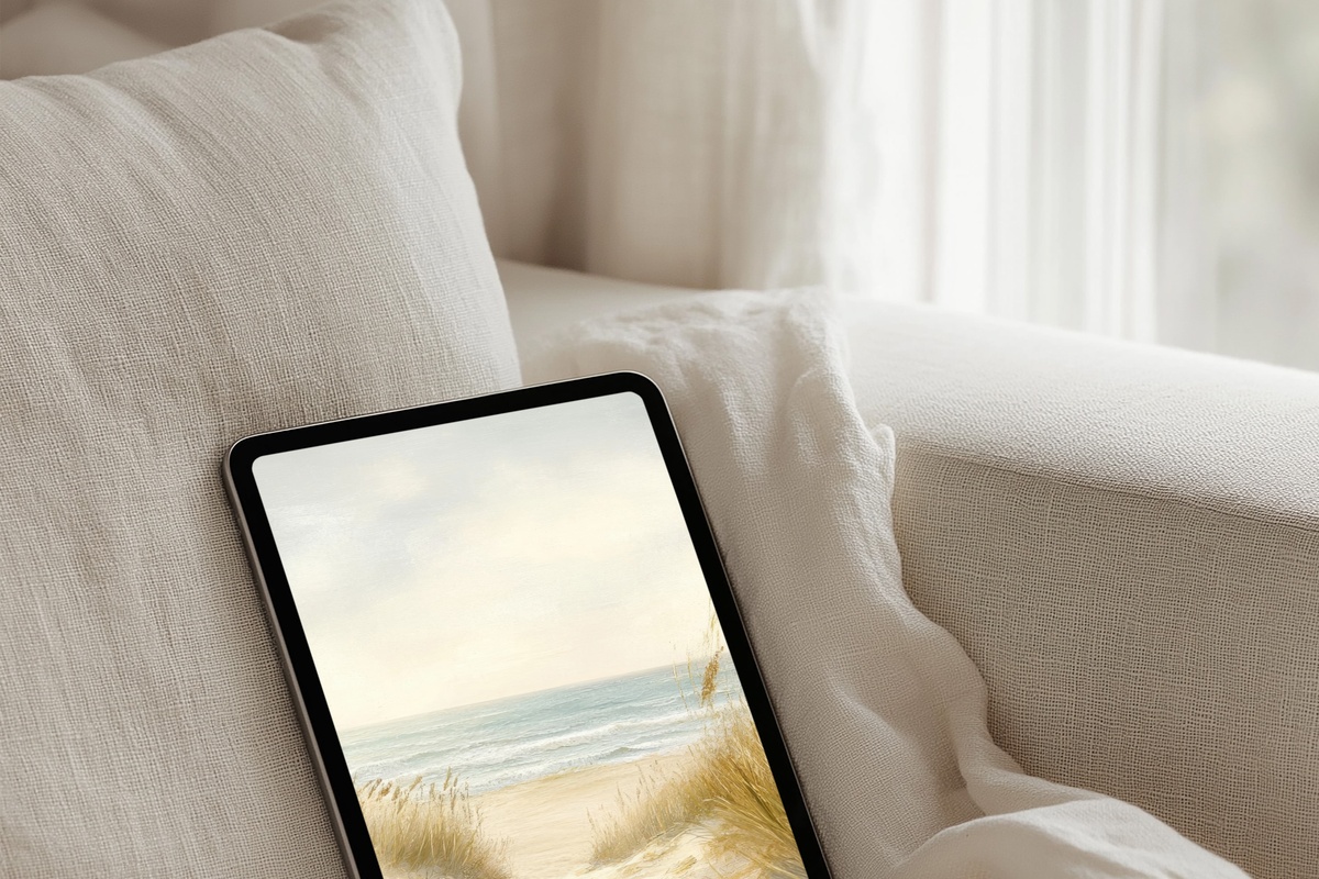
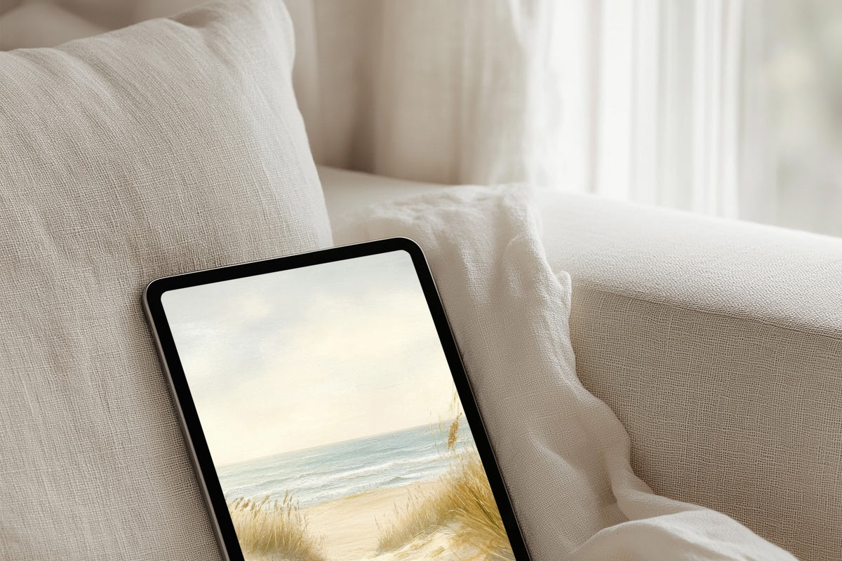
Beige and blue in the specific proportion of sea-worn linen — that is the register of this wallpaper. The palette sits somewhere between a bleached shoreline and the interior of a whitewashed room with one open window. Unlock your iPad mid-morning and the whole tone of the moment shifts: cooler, slower, more considered. Anyone whose morning ritual involves a quiet screen check before the day begins will feel exactly what this was designed for.
2. Sunlit Vibrance of Sunflowers — iPad Wallpaper
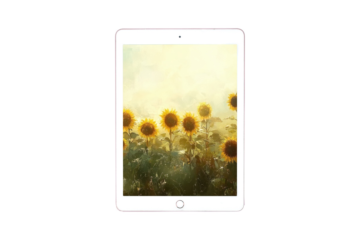
Sunflowers are the one motif that could tip into county-fair territory — all saturated yellow and obvious cheer. Here, the tones are quieter: the gold is amber-edged and dusty, the greens lean toward sage and shadow. What you get is warmth without loudness, a color story that reads as cultivated rather than cheerful. It sits naturally beside natural wood tones and cream linen, making it a strong companion for an iPad resting on a bedside tray on a slow weekend morning.
3. Soft Dunes' Serenade — iPad Wallpaper
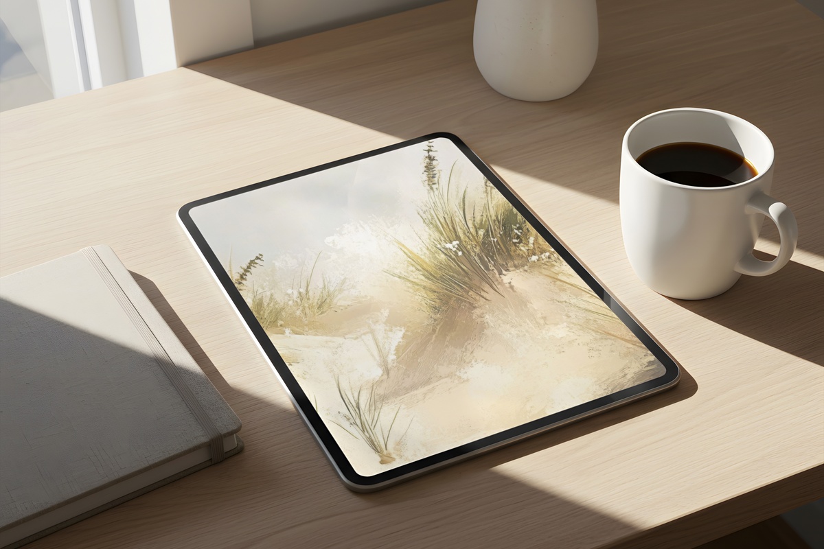
Sand dunes as a subject carry a particular stillness — no hard edges, just gradients of warm stone and ivory shifting against sky. This wallpaper leans into that quality completely. The palette is almost monochromatic, ranging from warm white through oat and caramel. There is texture implied in the rendering, a softness that makes the screen feel less like glass and more like something organic. For rooms built around travertine, linen, and raw ceramics, this one extends the material world into the digital.
4. Emerald Dreams of Palm — iPad Wallpaper
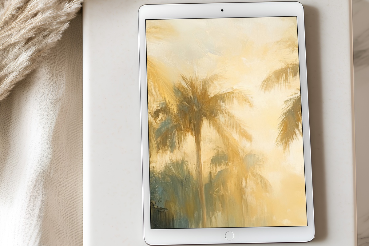
Deep botanical green against a wash of ochre and pale sky — this is the palette of a very good hotel lobby in Tulum, the one with the palms casting long shadows across the terrazzo floor at four in the afternoon. The fronds carry genuine compositional weight: the eye moves from canopy down through layered greens to the warmer tones below. Rich without being heavy. It functions as a strong visual anchor on a screen, especially for those who build rooms around deep olive, rattan, and aged brass.
5. Tropical Tranquility Tides — iPad Wallpaper
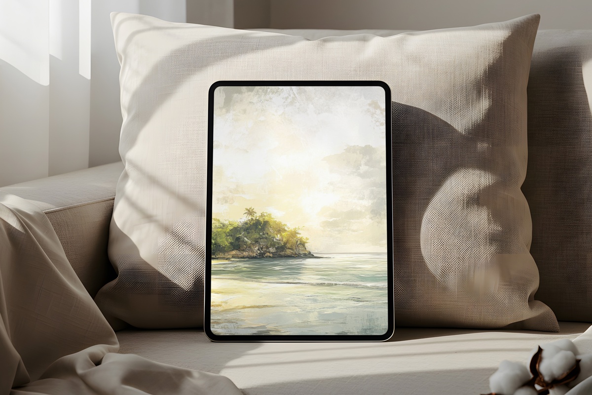
Soft pastels in a tropical register — not the neon-bright version, but the bleached-out, overexposed-film kind that reads as memory rather than postcard. Barely-there aqua, blush, and diffused coral, all held together by generous pale space. It is the wallpaper to set during the stretch of summer when the heat is at its most suspended and unhurried. On an iPad screen propped open on a sun-warmed table, the palette feels like the room itself has exhaled.
6. Abstract Oceanic Dreamscape — Printable Wall Art
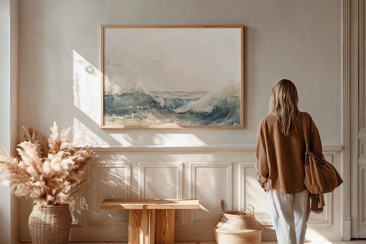
Watercolor waves rendered with an impressionist looseness — the kind that suggests water without illustrating it literally, letting the layered blues and broken whites do the interpretive work. Printed large and framed simply, it holds a wall in a living room or hallway with the quiet authority of a gallery acquisition. The abstract quality means it ages well as your room evolves; no literal motif to date it. A natural companion, palette-wise, to the coastal iPad wallpapers in this edit — they share the same sea-temperature blues.
7. Radiant Summer Reverie — Printable Wall Art
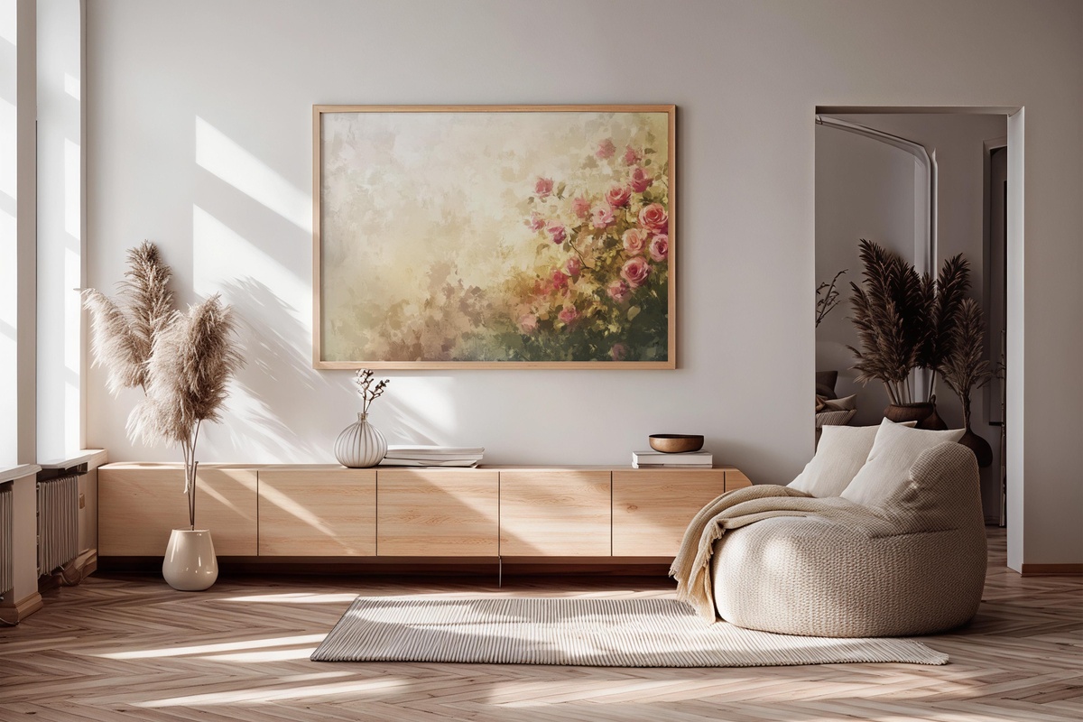
Blossoming roses rendered in a palette of dusted pink, warm cream, and the faintest green — closer to a Redouté study than anything you would find in a mass-market home store. The floral density is high, but the tones keep it from reading as overwhelmingly romantic; it is measured, even a little formal. Hang it in a dining room or a dressing corner where it can hold some ceremony. She will know exactly what this means — the woman whose shelves hold dried botanicals and a single stem in a bud vase.
8. Colorful Canopy Serenade — Printable Wall Art

Beach umbrellas in an impressionist handling — the scene is sun-struck and a little hazy, the colors vibrant but filtered through the soft grain of painterly technique. Coral, cobalt, saffron, and shadow blue all appear, yet nothing competes for dominance; the palette is internally balanced in a way that feels curated rather than chaotic. This is not a piece that disappears into the background. It holds a room's energy when the rest of the space is pale and spare, acting as the one warm note in an otherwise neutral composition.
9. Gilded Shore Tranquility — Printable Wall Art
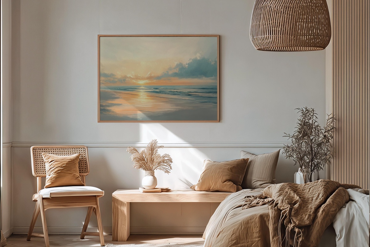
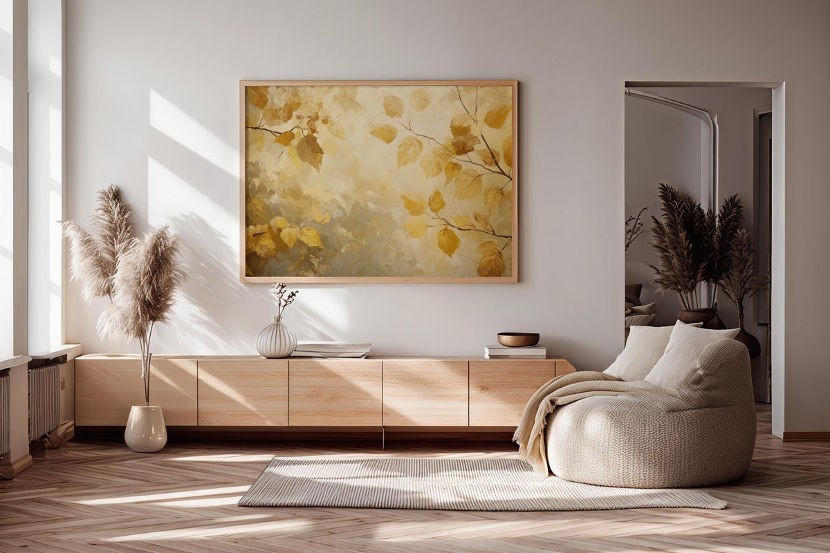
Golden hour on a calm shoreline — amber light pooling across wet sand, the horizon soft and undemanding. The palette is warm amber, honey, and pale sky, with enough tonal variation to keep it from reading flat. This is the piece for rooms where the light already does something interesting in late afternoon, where hanging this print simply extends what the room is already doing naturally. Printed at a generous scale and placed above a sideboard or console, it carries all the visual warmth of a lit candle — without any of the fragility.
Every piece in this edit is an instant download — on your screen or ready to send to a printer within moments of purchase, no waiting, no subscription required. The full summer palette is yours to keep and use across as many devices and frames as your home calls for. Browse the collection whenever the mood takes you; the door is open.
One note worth knowing: the three- and five-piece thresholds for the volume discount — 30% off at three, 50% off at five — apply across all of Gallery Flair's product lines together. An iPad wallpaper, a printable wall art piece, and a second wallpaper count as a trio. Mix formats, mix moods, build one continuous visual world from screen to wall — the numbers work in your favor either way.