10 Summer Frame TV Art Picks That Capture the Season's Mood
There's a particular quality of light in late June — the way it lingers past eight o'clock, amber and unhurried, as if the day has nowhere else to be. Summer Frame TV art lives inside that feeling. The right piece doesn't decorate a room so much as it tilts the atmosphere: a sailboat at the edge of turquoise water, a lavender field catching the last of the afternoon, a wheat field going gold under a falling sun. This edit is ten of our favorites — each one a different entry point into the season.
What Makes Summer Frame TV Art Work in a Room
The best pieces in this category do two things at once: they hold still and they move. Look for a composition with genuine tonal range — not just pale and washed-out, but with at least one moment of depth that anchors the eye. Impressionist handling works beautifully here because the brushwork suggests warmth and light without being photographic — it reads as art, not a screensaver. Palette matters too: the most versatile summer pieces sit in the warm neutrals (sand, wheat, bone) or the cool naturals (sage, seafoam, coastal blue), so they don't fight the existing furnishings once autumn comes around. And consider scale — Frame TV art that fills the screen edge-to-edge tends to disappear into the wall rather than announce itself.
1. Ethereal Summer Surf - Frame TV Art
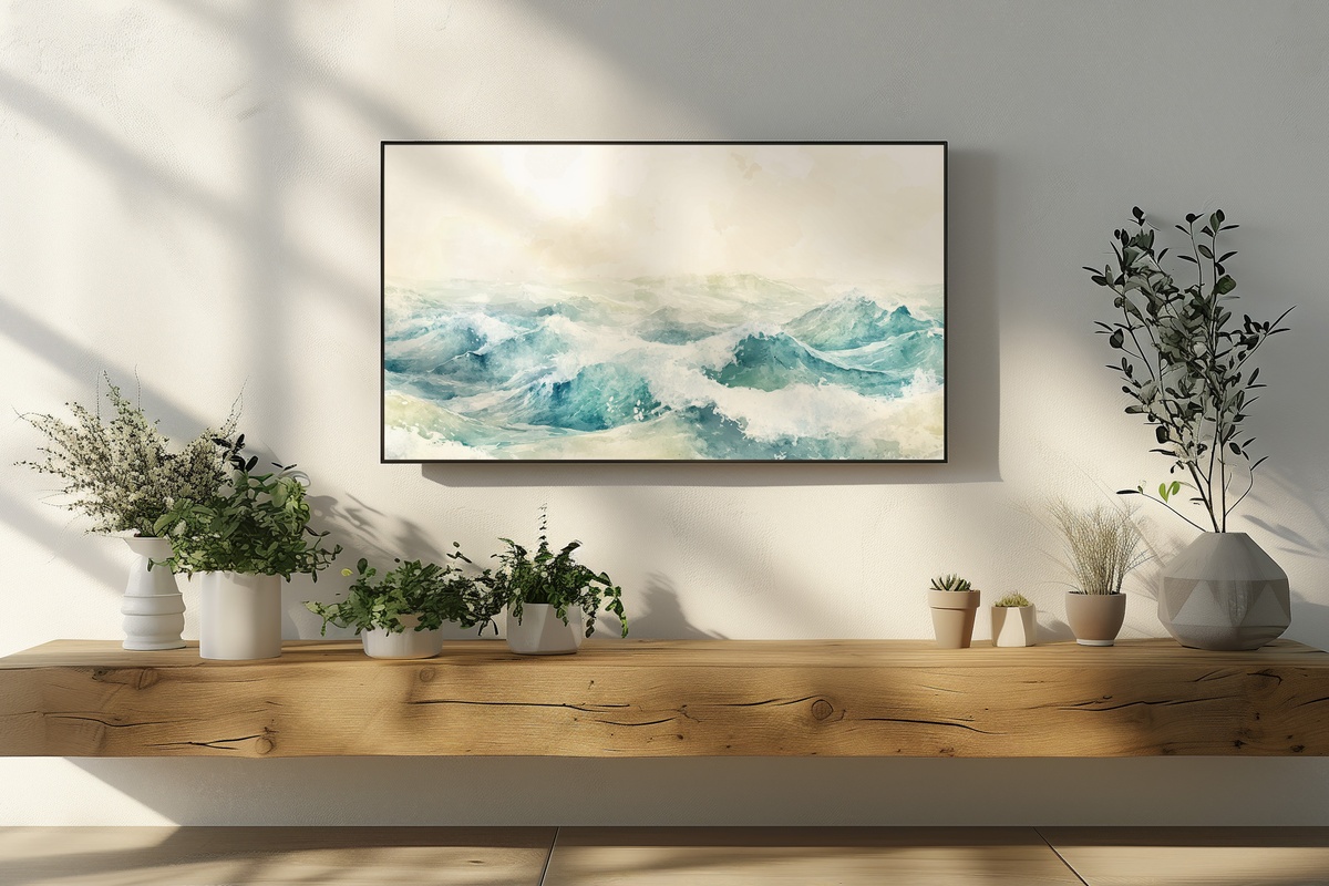
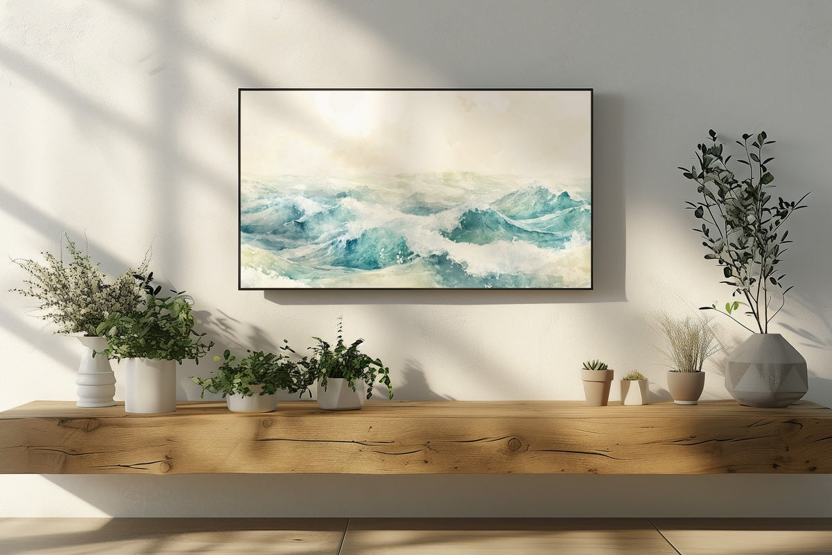
Watercolor ocean waves dissolving into white — that's the register here, and it works because the palette refuses to commit to any single blue. You get gray-green in the deep water, pale aqua near the foam, and a soft almost-white at the crest. Against a wall of warm linen or cool plaster, this one reads as genuinely coastal without veering into novelty territory. It suits the kind of living room that keeps its blinds half-drawn through the afternoon, where the light does its own work and the art simply agrees.
2. Garden of Blissful Blooms - Frame TV Art
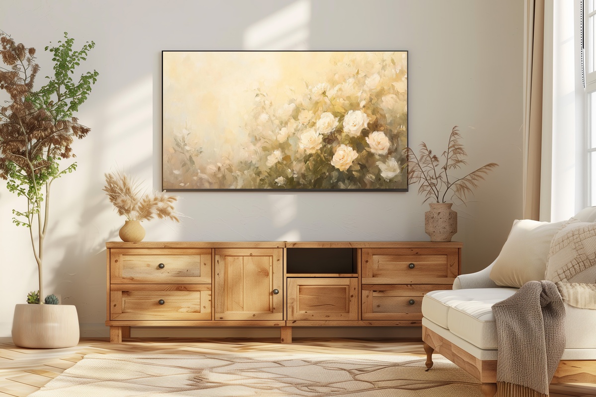
A rose garden rendered in impressionist strokes — and the handling is looser than you might expect, which is exactly what saves it. The blooms aren't arranged; they tumble, slightly overgrown, in the way an actual garden goes in July when nobody has deadheaded in a week. Pink and cream and a deep blush that sits just short of red. Anyone who keeps fresh flowers on a dining table year-round will recognize this mood immediately. It holds its own in a brighter room, where the color has something to breathe against.
3. Cherry Blossoms' Gentle Glow - Frame TV Art
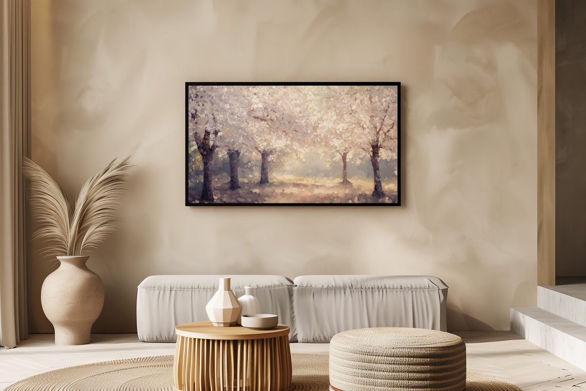
Cherry blossom art can tip into the saccharine — this one avoids that by grounding the pink in warm gold. The backlighting gives the petals a translucency closer to tissue paper than candy, and the branches carry genuine weight against the luminous sky behind them. It's a quieter piece than it first appears, and it transitions gracefully from spring into summer without feeling out of season. A natural fit for a bedroom or a reading nook where the light shifts during the day and the art needs to hold its mood across both.
4. Soft Dunes' Serenade - Frame TV Art
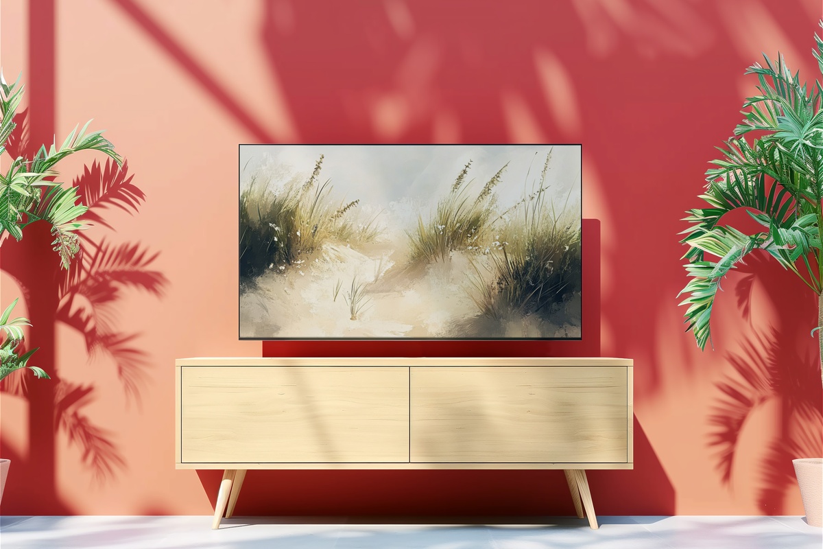
Sand dunes under open sky, rendered with the kind of restraint that makes a room feel larger than it is. The palette runs from warm oat to pale champagne — with almost no contrast, which sounds risky until you see how calmly it sits on a wall. This is the piece for rooms that already do a lot of work: bold rugs, layered textures, a statement sofa. Against that noise, this one functions as a visual exhale. Pair it in a tonal set with other coastal or neutral pieces for a continuous low-frequency mood across your home.
5. Golden Lavender Landscape - Frame TV Art
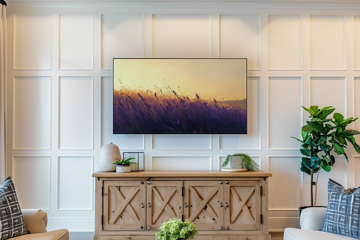
Lavender at golden hour is a subject that has every reason to feel overdone — but the light in this piece earns it. The amber sky pushes against the purple rows in a way that feels more like a Provençal oil painting than a stock photograph, and the depth in the far field gives the composition genuine perspective. What you get is warmth and softness without any loss of structure. Rooms with terracotta or ochre accents find an immediate conversation partner here, and the piece holds its own with the lamps dimmed low on an early summer evening.
6. Sunset's Golden Embrace - Frame TV Art
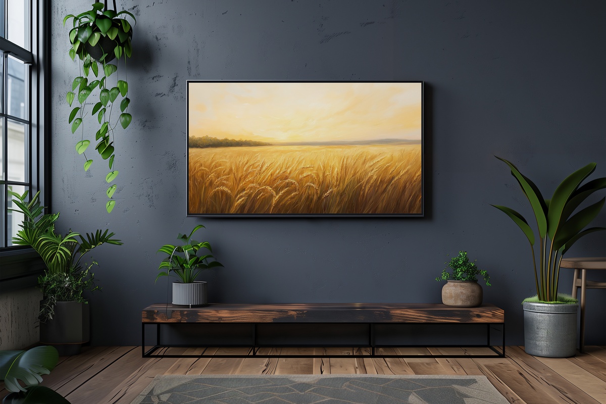
A wheat field catching the last light of the day — the stalks gone full amber, the sky that particular shade between gold and blush that only exists for about twenty minutes in late July. This is the summer piece for someone who isn't drawn to ocean motifs, who finds their version of the season inland rather than at the shore. The horizontal sweep of the field gives it a wide, cinematic weight on a large-format Frame TV, and the warmth reads especially well in the evening hours, when the room's own light has already begun to soften.
7. Breezy Seaside Silhouettes - Frame TV Art
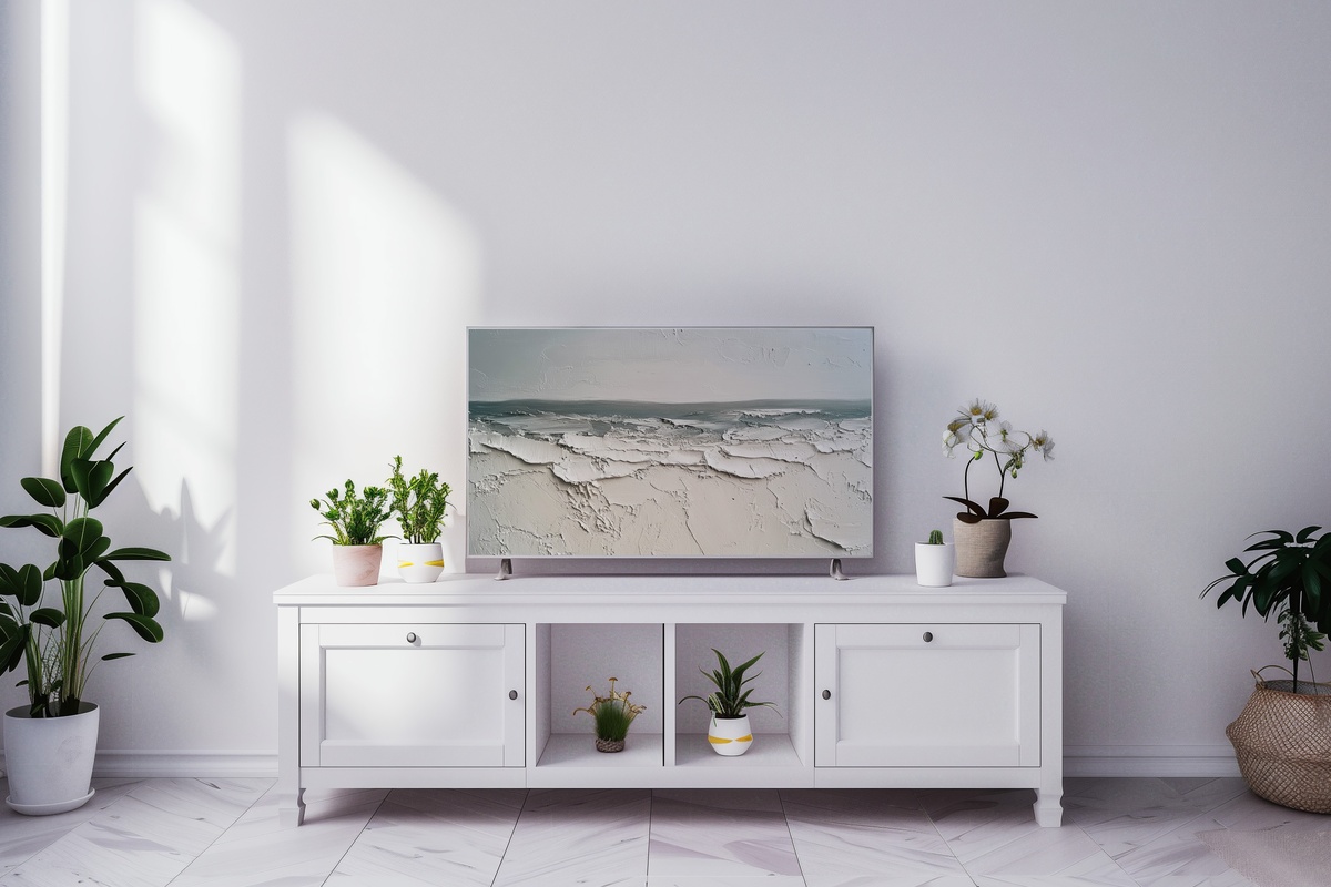
Where most coastal art leans into saturated blue, this one stays deliberately neutral — warm gray, pale stone, bleached linen. The impressionist figures on the shoreline are suggested rather than described, and that ambiguity is precisely the point: the scene invites the eye without demanding interpretation. It functions almost like negative space on the wall, present without insisting. If maximalist floral and color-saturated landscape pieces don't speak to your room — or your taste — this is where to look instead. Genuinely one of the most room-agnostic pieces in the edit.
8. Lavender Dreamscape at Twilight - Frame TV Art
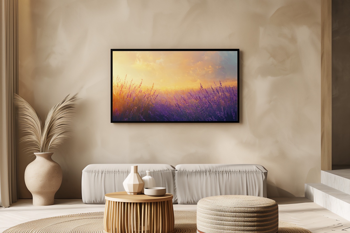
The golden-hour lavender piece earlier in this edit is warm; this one is its cooler counterpart — the same field, but at dusk, after the amber has left the sky. Violet rolls into deep indigo at the horizon, and the impressionist brushwork gives the rows of lavender a texture you can almost feel underfoot. It carries a contemplative weight that suits a living room in the last hour of the evening, lamps turned low, dinner long finished. Rooms with sage, dusty blue, or gray-green accents find it lands with almost no effort at all.
9. Turquoise Serenity Sailing - Frame TV Art
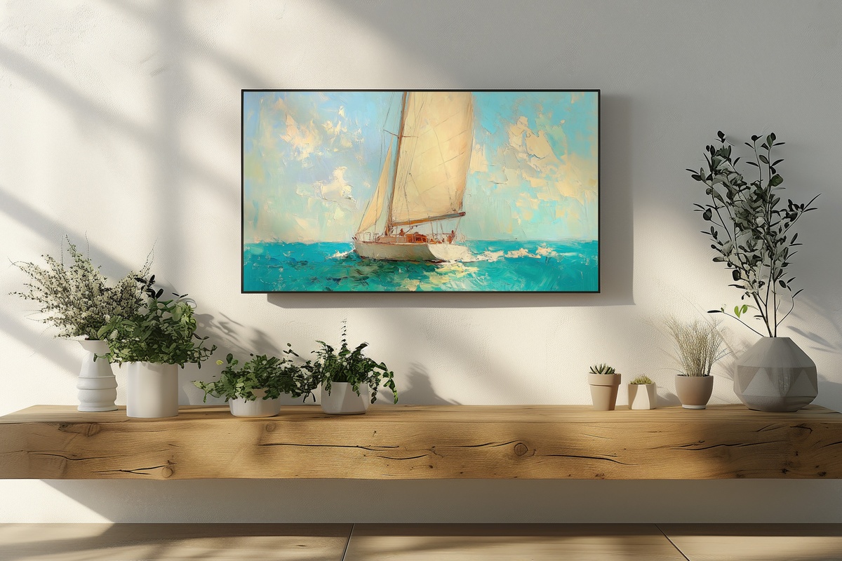
Turquoise water against a white sail — and the color here is genuinely vivid, closer to the Aegean than the Atlantic. That chromatic confidence is what separates it from the softer coastal pieces in this edit. The impressionist handling keeps it from feeling literal; the water moves, breaks into facets of teal and aquamarine, and the sail catches light rather than sitting flat. Rooms that can carry a stronger color presence — deep navy walls, natural rattan, warm teak — get a lot from this one. A bold choice, and a considered one.
10. Wildflower Sunlit Harmony - Frame TV Art
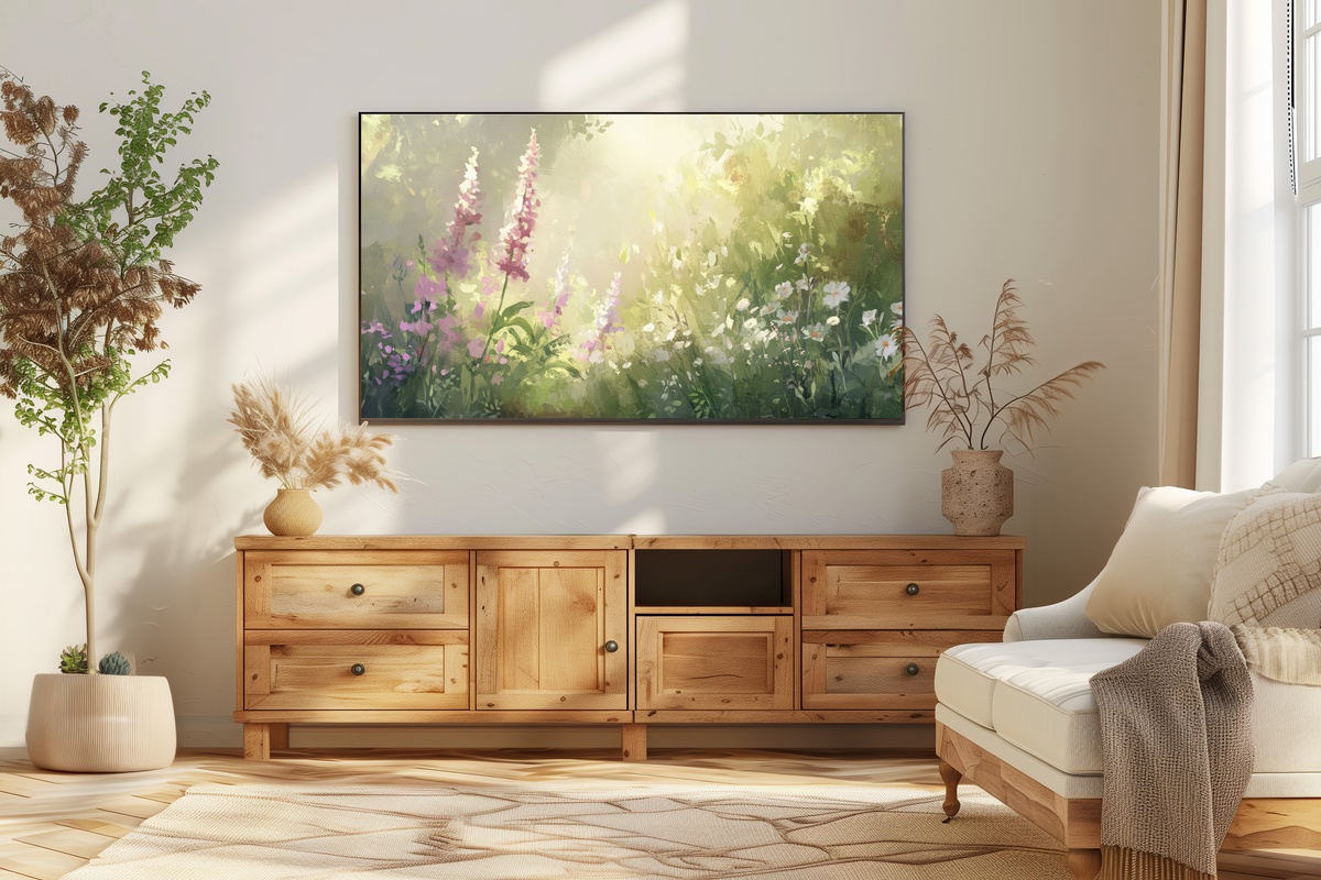
Wildflowers rather than cultivated blooms — and the distinction matters. Where the rose garden earlier in this edit is lush and arranged, this one is scattered, sun-struck, growing where it wants to. Yellow, pale violet, soft coral tumbling together under direct summer light. The brushwork is energetic in a way that reads as joyful without being loud, and the gold in the background ties it naturally to the warmer, amber-toned pieces in this collection. It closes the edit on exactly the right note: summer as it actually feels, unhurried and a little overgrown.
Each of these pieces arrives as an instant download — on your Frame TV within minutes, no waiting, no installation appointment. The season is already well underway, and a living room that catches that light before August slips past is worth setting up now. Browse the full summer Frame TV art collection whenever you're ready, and take your time with it.
One quiet note on building a set: the 3-for-30% and 5-for-50% discounts apply to any combination across the entire Gallery Flair shop — Frame TV art, printable wall art, phone wallpapers, desktop backgrounds, all of it counts together. Three pieces from three different categories still hits the first threshold. That cross-format flexibility is worth knowing if you're thinking about carrying one summer palette from the living room wall to the bedroom print to the lock screen.