10 Summer Frame TV Art & Desktop Wallpaper Picks for the Quiet-Luxury Home
There is a specific quality of light that arrives in summer — not the blinding noon kind, but the amber drift of late afternoon when the room goes golden and nothing feels urgent. That is exactly the register this edit lives in. Ten pieces across Samsung Frame TV art and desktop wallpapers, all pulling from the season's most considered palette: salt-bleached sand, deep coastal water, blossom-warmed cream, and the particular green of palm fronds backlit by sun.
What Makes Summer Frame TV Art Feel Quiet-Luxury?
The difference between art that reads as resort-kitschy and art that earns a place on a considered wall comes down to restraint. Look for compositions where color does quiet, relational work — where warm ochres sit against muted blue-greens rather than screaming at them. Watercolor and impressionist handling tend to diffuse the image's energy so the room breathes around it rather than competing with it. If a piece could belong in a linen-forward boutique hotel lobby, it belongs in this edit.
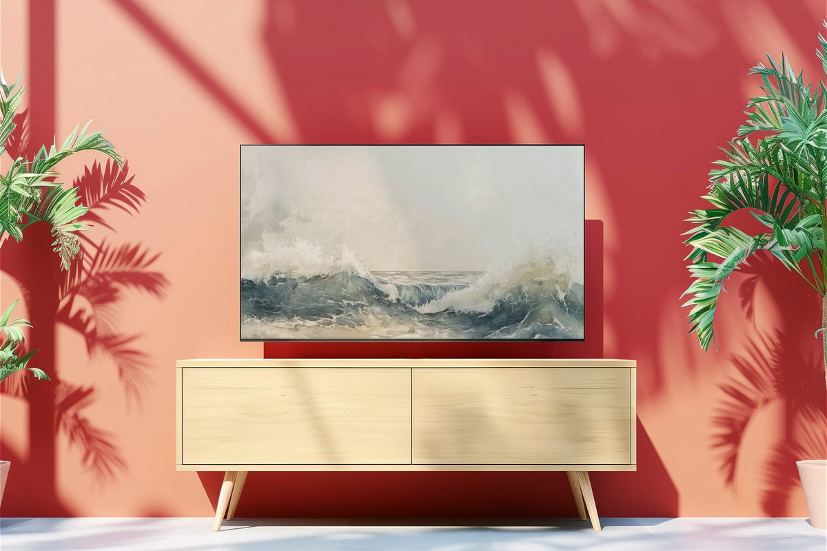
1. Abstract Oceanic Dreamscape - Frame TV Art

Watercolor impressionism at its most generous — waves rendered in layered washes of aquamarine, warm sand-taupe, and a thread of coral that resurfaces just when you think the palette has gone entirely cool. On the Samsung Frame TV, this piece reads almost like a window rather than a canvas. It anchors a living room that leans into natural linen, rattan, or bleached timber without ever tipping toward beachy-cliché. The abstraction gives it a gallery credibility that more literal coastal art simply cannot hold.
2. Summer's Radiant Echoes - Frame TV Art

Blossoms handled with this much warmth could easily veer precious, but the palette here stays grounded — honey-gold and dusty rose against a background that reads closer to aged parchment than bright white. The florals feel less like decoration and more like something caught mid-afternoon, petals slightly heavy with heat. For a dining room that gets the last hour of evening light, or a bedroom where a warm-toned reading lamp is always on, this piece absorbs the glow around it and gives it back in equal measure.
3. Whispering Cliffs Symphony - Frame TV Art

There is a geographic specificity to this one that the other coastal pieces in this edit don't share — you can almost place it. Pale chalk cliffs descending to water the color of a shallow bay on a clear July morning, the kind of scene that still looks quiet even when the sun is directly overhead. The tonal restraint between sky and stone is where the composition earns its keep: two near-whites, differentiated only by temperature, creating a depth that rewards a second look on a large-format Frame TV display.
4. Soft Dunes' Serenade - Frame TV Art

This one rewards a room that already leans sandy — warm plaster walls, jute underfoot, furniture in the biscuit-to-caramel range. The dunes here are rendered with enough negative space that the piece breathes rather than fills, and that sky — a washed-out periwinkle that barely asserts itself — gives the warmer tones room to settle. Anyone whose living room doubles as a wind-down retreat by 7 p.m. will recognize exactly what this piece does to the atmosphere when the lamps come on low.
5. Gilded Shore Tranquility - Frame TV Art

Golden hour as a full-room event, not merely a subject. The ochre-to-copper gradient across the waterline does what only late-afternoon light actually does — it flattens and warms simultaneously, turning an ordinary shore into something verging on the ceremonial. This is the Frame TV art pick for the minimalist home where every surface has been considered twice. Too much pattern on the walls or too many competing colors, and this piece gets lost. Give it a clean room and it becomes the focal point that makes the room feel complete.
If you are building a visual world rather than selecting individual pieces, this is the moment to think across formats. A Frame TV piece in a coastal watercolor palette, a matching desktop wallpaper in the same warm-ocean tonal family, and a wall print in a complementary sandy neutral can carry one mood from the living room to your desk to the hallway without any of them needing to match literally — the palette does the connective work.
6. Ethereal Summer Surf - Desktop Wallpaper

Opening a laptop to this at 9 a.m. is a small but deliberate act of mood-setting. Abstract watercolor ocean waves in a palette of muted seafoam, warm white, and a faint blush undertone — atmospheric enough to feel like art rather than a stock photograph, but airy enough that it never fights with application windows or text. High-resolution, so it holds its softness even on a Retina or 4K display without the grainy compromise that kills most wallpaper art. The ocean-meets-watercolor aesthetic bridges directly with the Frame TV pieces above.
7. Cherry Blossoms' Gentle Glow - Desktop Wallpaper

Cherry blossom wallpaper tends to live in two registers: the oversaturated pink-on-pink that exhausts you by lunchtime, or the truly considered kind where the blossoms are backlit into near-translucence and the warmth comes from the light source rather than the pigment. This lands firmly in the second camp. Sunlight filters through the petals in a way that reads gold rather than pink, making this a natural companion to the floral Frame TV pieces in this edit and a warmer alternative for desks that already carry cream, bone, or aged-brass tones.
8. Vibrant Wave Symphony - Desktop Wallpaper

Where the other ocean pieces in this edit settle and diffuse, this one has motion. Crashing waves rendered with enough saturated cobalt and turquoise that the energy is palpable — and yet the surrounding composition holds it, so it reads as dynamic rather than chaotic. It is the outlier in an otherwise still-water edit, and intentionally so. If your workspace tends toward the clean and stripped-back — white desk, minimal objects, no competing pattern — this is the piece that gives the whole setup a pulse without overcrowding it.
9. Lush Golden Dreams - Desktop Wallpaper

Golden palm trees are one of those motifs that walk a genuine line — lean one degree too illustrative and you are in a travel-poster cliché, lean one degree too abstract and you lose the warmth that makes the subject worth rendering. This one holds the line. The palette is amber, antique gold, and deep shadow-green, and the 4K resolution ensures every frond edge stays crisp even on large ultrawide displays. For a desk that already carries warm wood tones or terracotta ceramics, this wallpaper reads less like decoration and more like a natural extension of the surface below it.
10. Emerald Dreams of Palm - Desktop Wallpaper

A cooler counterpoint to Lush Golden Dreams — where that piece tilts toward amber dusk, this one holds the palms in a richer, more saturated green with gold light pressing in from behind rather than suffusing the whole frame. The effect is lush without being heavy, tropical without veering resort-commercial. On a laptop screen mid-morning, the depth of the foliage pulls the eye in just enough to signal that this is a considered desktop, not an afterthought. It pairs naturally with any piece in the coastal or botanical family of this edit.
Every piece in this edit is an instant download — on your screen or Frame TV within moments of purchase, no subscription required, yours to keep and use across devices at full resolution. If summer is already settling into the room around you, now is a natural moment to let the art catch up.
One more thing worth knowing: the 3-for-30% and 5-for-50% discounts work across every product line we carry — mix a Frame TV piece with a desktop wallpaper and a wall print in the same palette family and all three count together. That cross-format flexibility is the quiet arithmetic of building one visual world rather than three separate purchases.