Old Money Home Decor: 6 Considered Picks for a Curated Home
Old money home decor moves at a different pace — unhurried, grounded in palette discipline, drawn to surfaces that absorb light rather than compete with it. These six pieces share a common thread: the kind of restraint that reads, quietly and unmistakably, as taste.
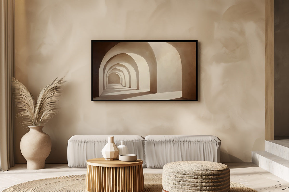
1. Arching Shadows Dance Elegance — Frame TV Art
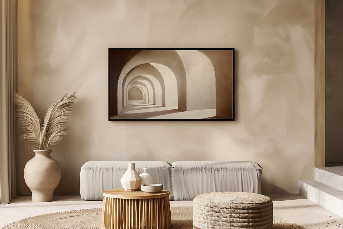
A study in architectural shadow — soft arches fold across one another in a palette of warm stone and deep ivory, the kind of composition that feels like afternoon light caught on a plaster wall. On a Frame TV above a linen sofa or a marble-topped console, this piece does something rare: it fills a room without commanding it. The mood is unhurried and European, exactly where old money taste lives.
2. Floral Mandala Tranquility Blossoms — Frame TV Art
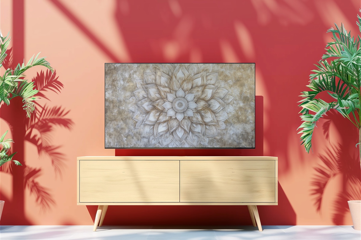
Symmetry and botanical detail rendered entirely in neutral tones — this mandala composition carries the visual weight of antique wallpaper without the ornament. The petals radiate outward in graduated tones of parchment and warm grey, drawing the eye to the center without urgency. Position this on a Frame TV in a library or sitting room and it reads as something collected rather than downloaded — which, for old money sensibility, is exactly right.
3. Earthy Window Harmonies — Frame TV Art
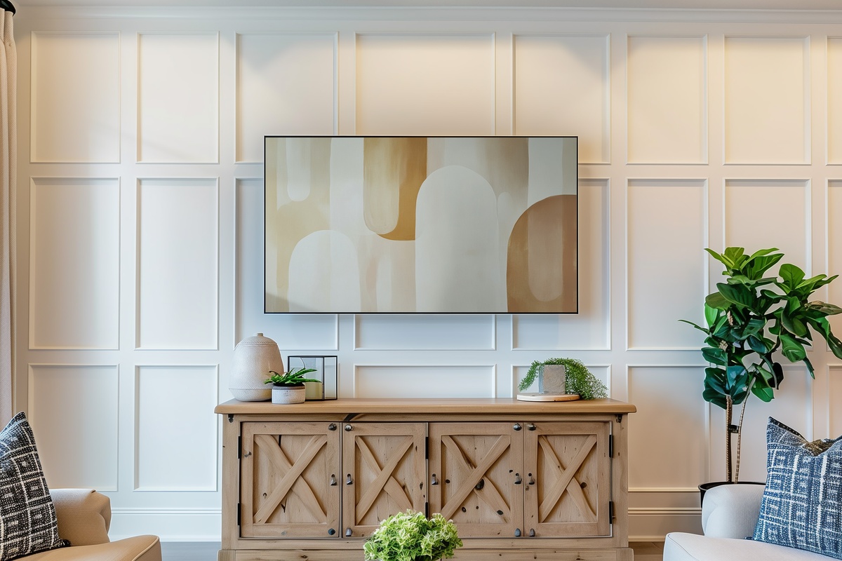
Abstract window shapes stack in warm terracotta, raw umber, and faded clay — a palette that recalls aged ceramics on a farmhouse shelf. The composition is unhurried: forms open and close like shuttered windows on a warm afternoon. For a Frame TV positioned above a fireplace or against a raw plaster wall, this delivers the kind of warmth that no overhead light can manufacture. It's understated in exactly the way old money interiors tend to be.
If the Frame TV picks here have caught your attention, our 9 Neutral Frame TV Art Picks to Anchor Your Living Room This Season goes deeper into the cluster — more compositions, more moods, same palette discipline.
4. Elegant Shadow Arches Serenade — Desktop Wallpaper

The arch motif moves from your living room to your workspace here — soft shadow forms shift across a warm neutral ground at 4K resolution, so the detail reads even on the largest monitors. There's something grounding about opening your laptop to a composition this considered: it sets a tone before the first email. For anyone building a consistent visual world across their home and their desk, this is where the thread continues.
5. Serene Canvas of Leaf Harmony — Desktop Wallpaper
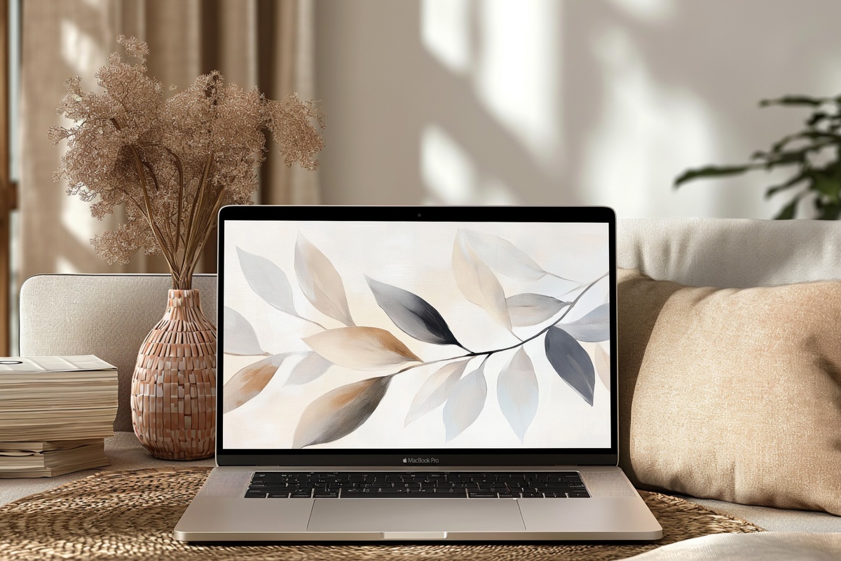
Abstract overlapping leaves rendered in soft sage, warm ivory, and pale sand — a palette that breathes without demanding attention. At 4K, the layering reads almost like a watercolor study: edges soften, forms settle into one another. This wallpaper suits anyone who wants their screen to feel like a cleared desk rather than a distraction. It pairs naturally with linen, aged wood, and the unhurried energy that defines a well-composed neutral interior.
6. Earth's Gentle Symphony — Desktop Wallpaper
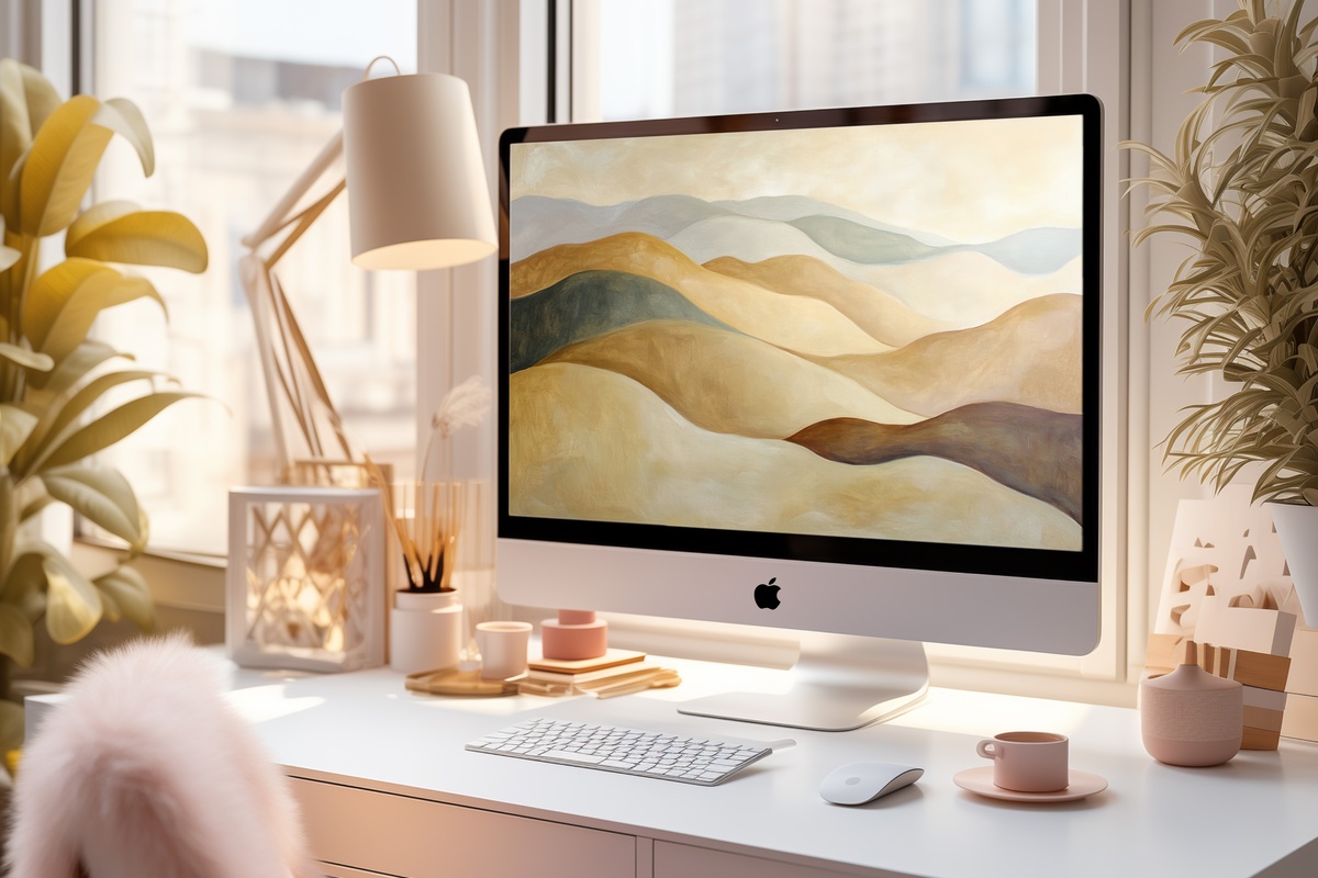
Earthy abstract landscapes in warm ochre, dusty rose, and deep sand — this composition reads like a landscape seen through gauze, all atmosphere and no hard edges. At high resolution the gradients hold beautifully, shifting with your screen brightness in a way that keeps it alive throughout the day. For a workspace that should feel more like a thoughtfully furnished room than a productivity station, this is the piece that closes the gap.
What connects these six pieces is palette confidence — the willingness to work entirely within warm neutrals and let composition carry the room. Nothing here shouts. That's not restraint for its own sake; it's what old money interiors have always understood about visual weight.
Any three pieces across the Gallery Flair line bring the bundle to 30% off, any five to 50%. The line is built to layer — Frame TV art and desktop wallpapers share the same palette logic, so a room and a workspace can finally feel like they belong to the same story.