9 Neutral iPhone Wallpapers to Refresh Your Screen This Season
There's a particular moment when you pull your phone from your pocket and the screen lights up — and the image waiting there either adds something to your morning or quietly takes from it. A neutral wallpaper that actually suits the season does the former: it settles the eye, matches the light coming through the window, and feels like a small decision made well.
What Makes a Neutral Wallpaper Work on iPhone?
Not every beige or gray qualifies. The ones worth keeping share a few things: a palette that reads as warm or cool rather than flat and undecided, a composition with enough interior movement to stay interesting after the hundredth glance, and a tone that holds up across both light and dark mode surroundings. Organic textures, botanical silhouettes, and soft geometric layering tend to age better on screen than anything with high contrast or strong color saturation.
1. Arching Shadows Dance Elegance - iPhone Wallpaper
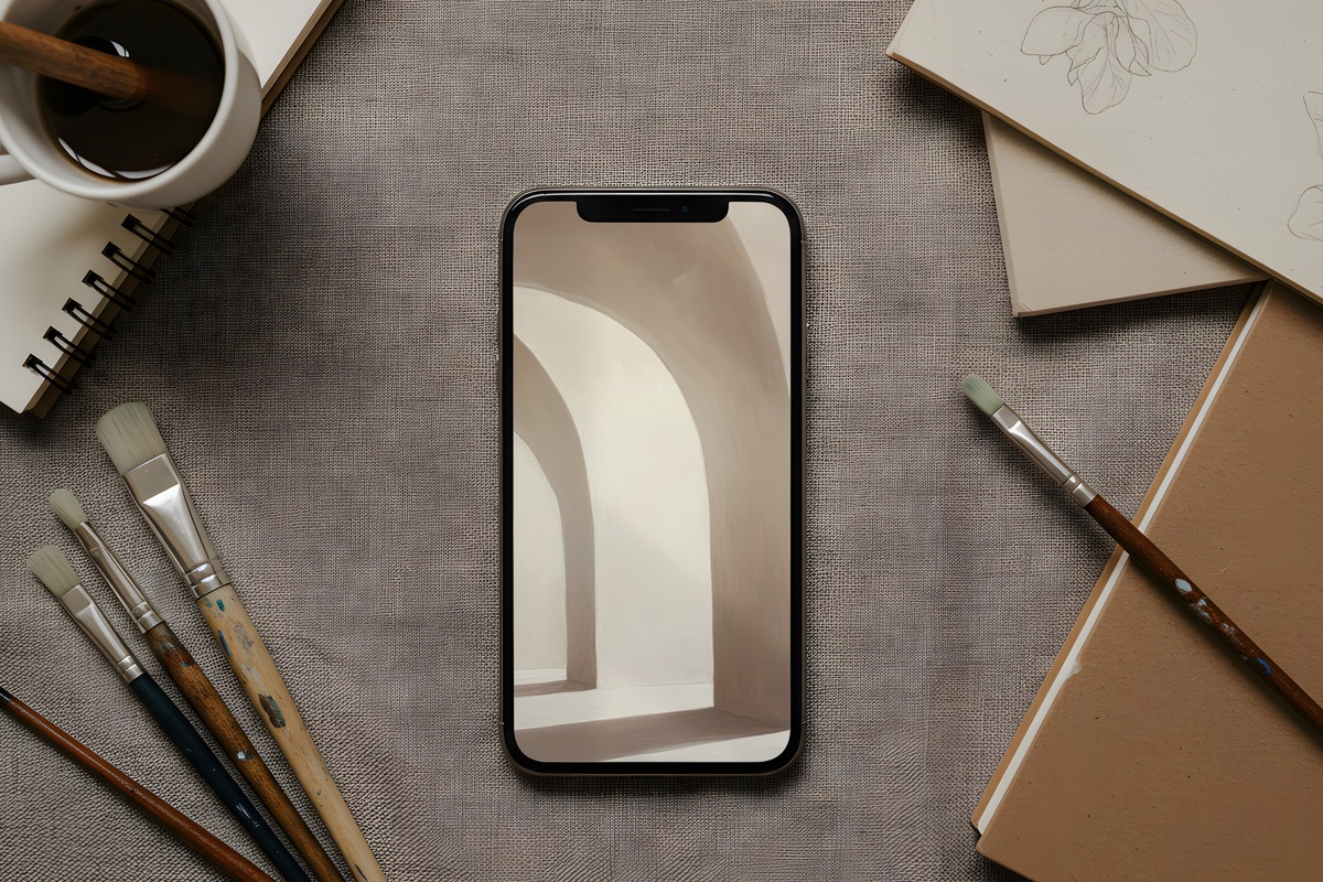
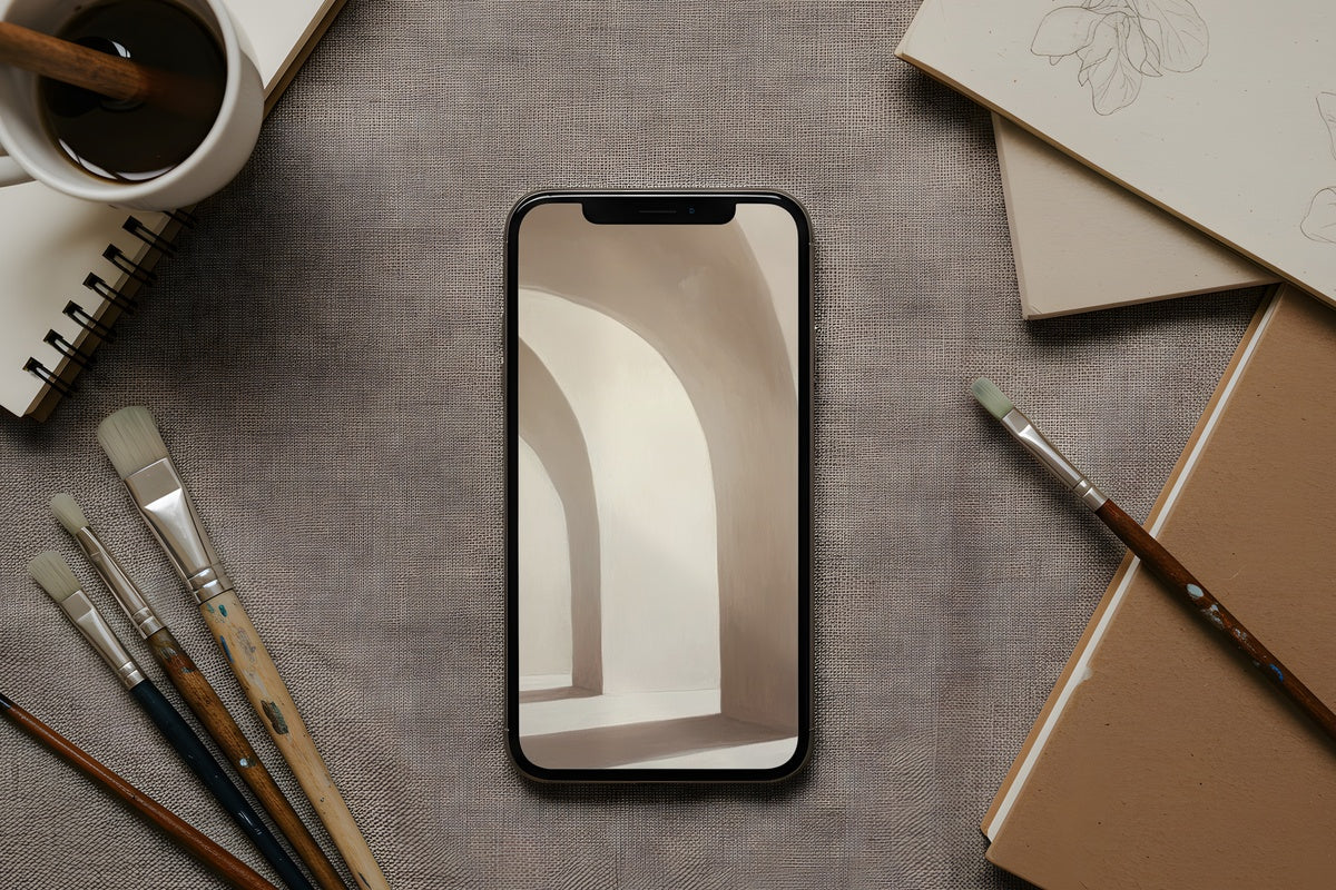
Imagine the last slant of afternoon light falling across a linen-white wall, casting soft arched shadows that barely distinguish themselves from the background. That interplay lives here — warm off-white tones with just enough movement to keep the eye occupied without demanding attention. It pairs naturally with a cream or tan phone case and reads particularly beautifully at dusk when your screen brightness dips. Anyone who gravitates toward plaster-textured interiors and undyed fabrics will feel immediately at home with this one.
2. Floral Mandala Tranquility Blossoms - iPhone Wallpaper
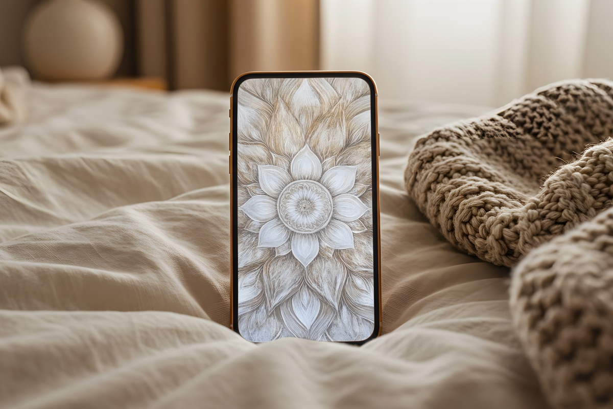
Mandala-inspired florals have a reputation for tipping into the overly decorative — too many colors, too much symmetry fighting for dominance. What saves this one is restraint: the palette stays entirely within warm parchment and dusty ivory, so the intricate petal geometry reads as texture rather than pattern. Hold your phone at arm's length and it almost disappears into a soft botanical field. Up close, the detail rewards the slower look. A natural fit for mornings when you want ritual without noise.
3. Intersecting Layers of Tranquility - iPhone Wallpaper
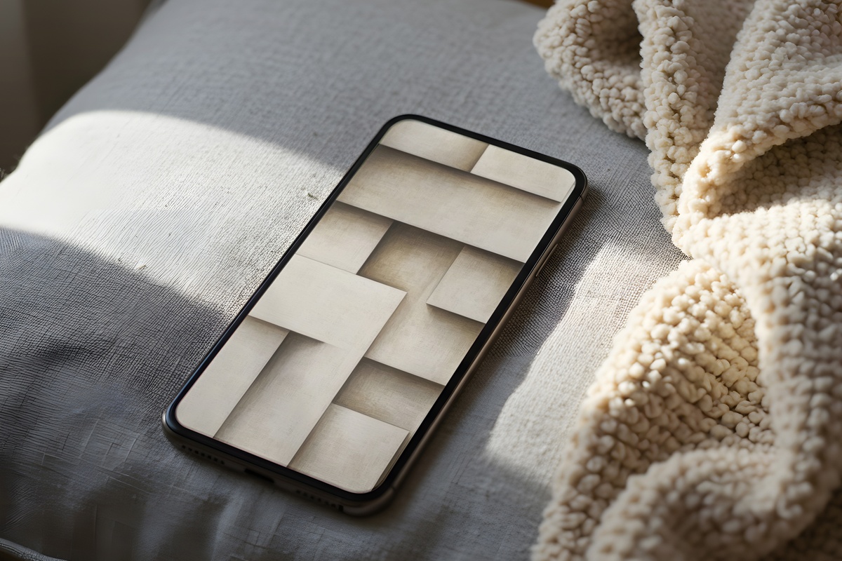
Layered forms in warm beige — each plane just slightly shifted from the last, building depth without contrast. There's something almost architectural about it, closer to a cross-section of travertine than anything digital. The beige here runs warm with a faint golden undertone, which means it shifts subtly depending on whether you're looking at it under tungsten light or natural daylight. If your current wallpaper feels either too busy or too flat, this sits exactly between the two.
4. Desert's Soft Embrace - iPhone Wallpaper
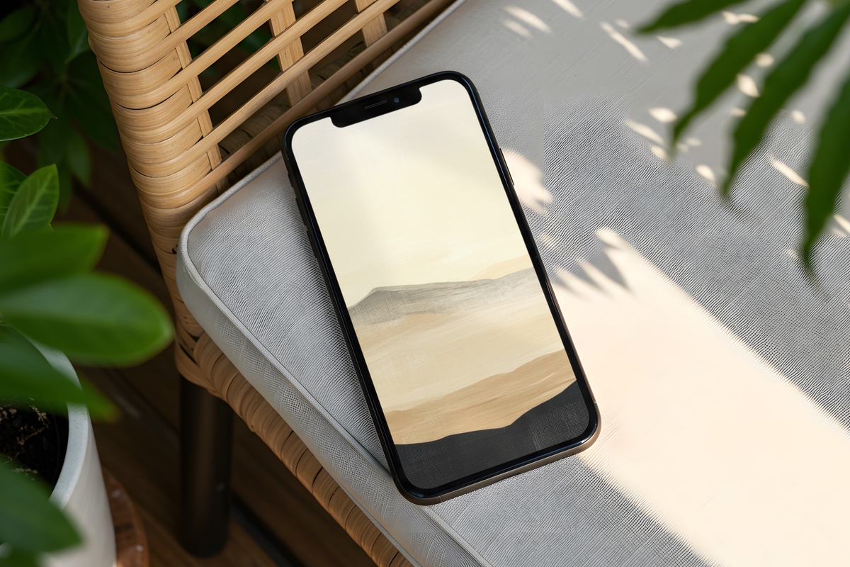
Terracotta adjacent but never loud — the palette here hovers between pale clay and sun-bleached sand, evoking the way desert light flattens color just before it disappears. It carries a dusty warmth that reads as grounded rather than earthy in the overtly boho sense. Set this as your lock screen on a cool morning and the warmth coming off the screen genuinely feels like something. She who keeps a dried pampas stem on her nightstand and her skincare minimal will know exactly what this mood is reaching for.
5. Monochrome Botanical Elegance - iPhone Wallpaper
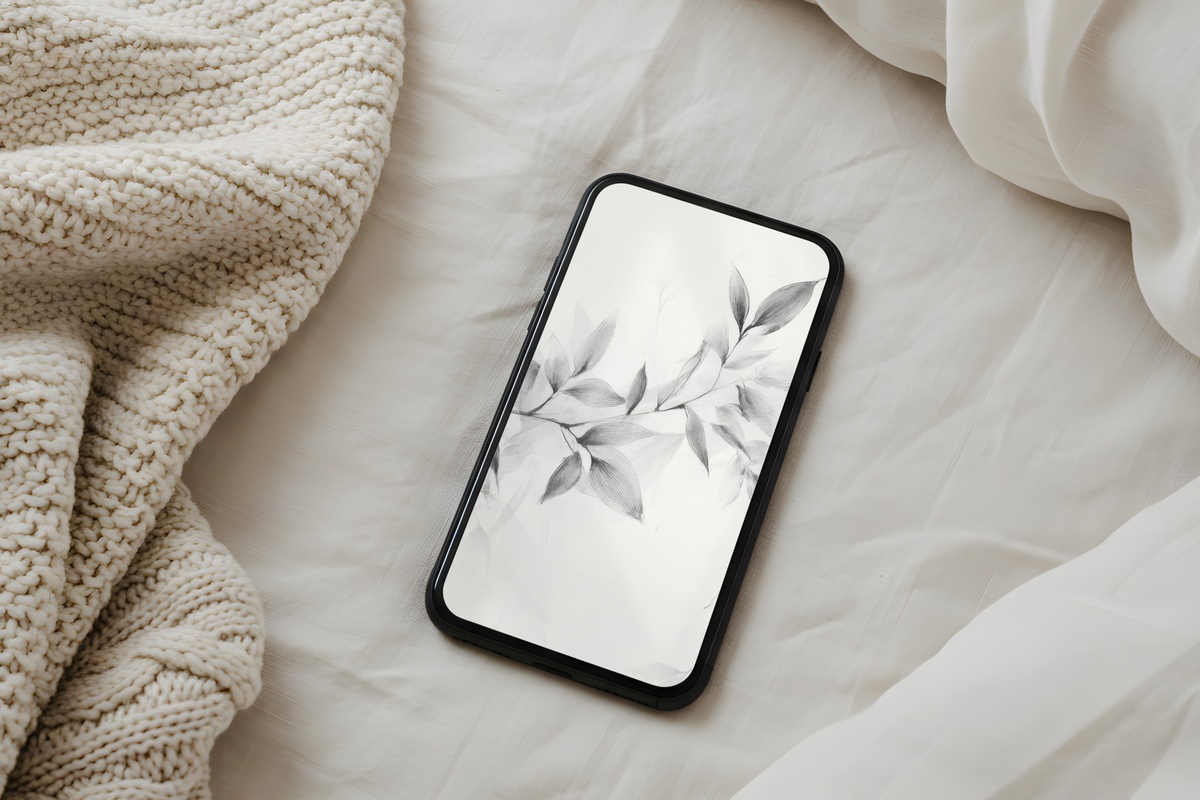
Gray botanicals in this register — graphite stems and silvered leaves against a pale ash ground — occupy the same quiet corner as a pressed herbarium page. The monochrome palette is decisive without being stark; there's enough tonal variation within the grays to prevent it from reading flat. Worth noting: this one works particularly well as a home screen companion to widget-heavy layouts because the soft midtone background lets text and icons land cleanly without competing. A clean-girl lock screen that actually holds its own aesthetically.
6. Serenity of Silhouetted Palms - iPhone Wallpaper
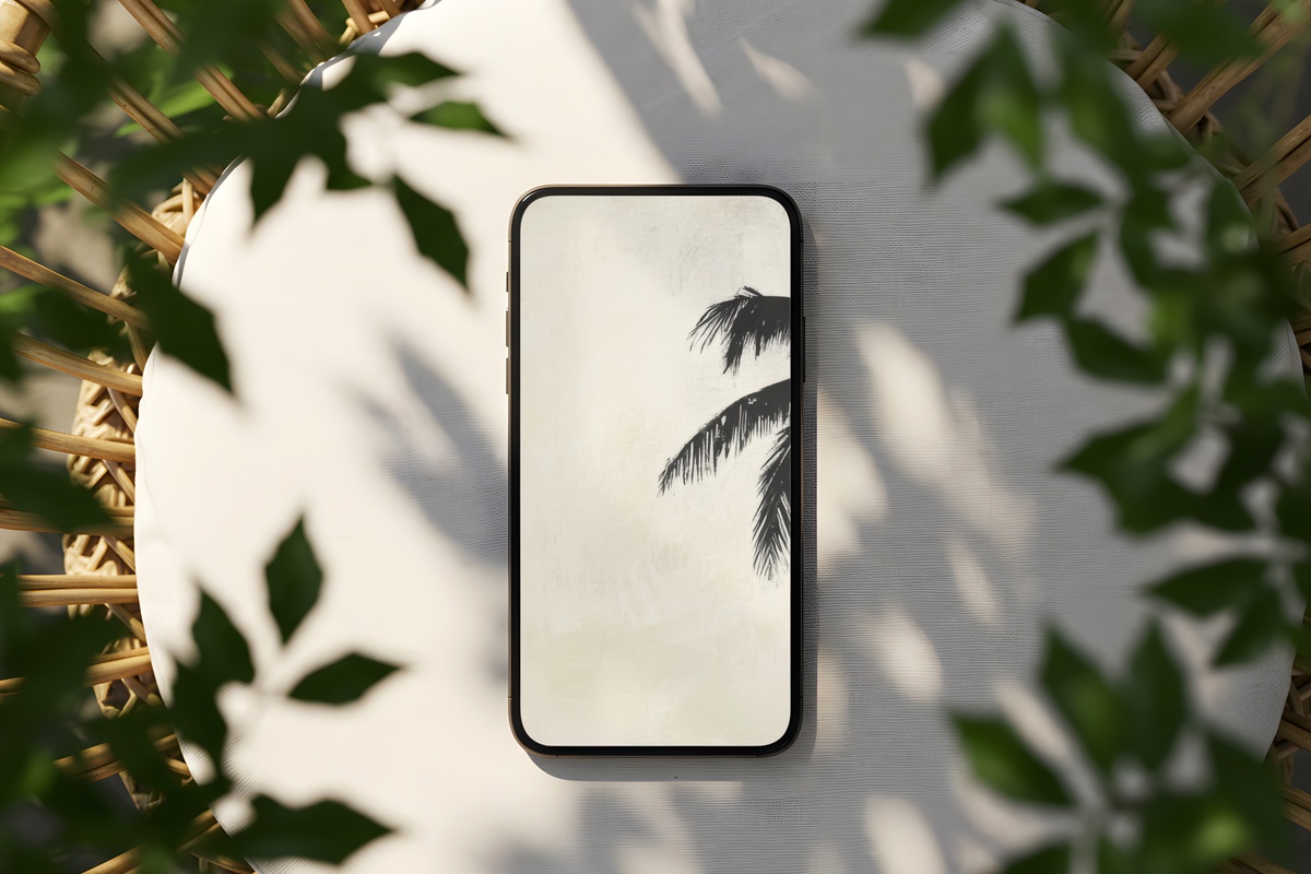
Palm silhouettes in soft cream — the kind of image that would look at home framed in a whitewashed beach house just as easily as on a screen. The palette keeps to warm off-white with muted, barely-there shadows, so the tropical reference stays understated rather than resort-y. What makes it work seasonally is how it carries that feeling of diffused coastal light without needing any actual color to do it. Pull this one out when the light outside starts to feel thin and you want something that pushes gently back.
7. Geometric Harmony Whispers - iPhone Wallpaper
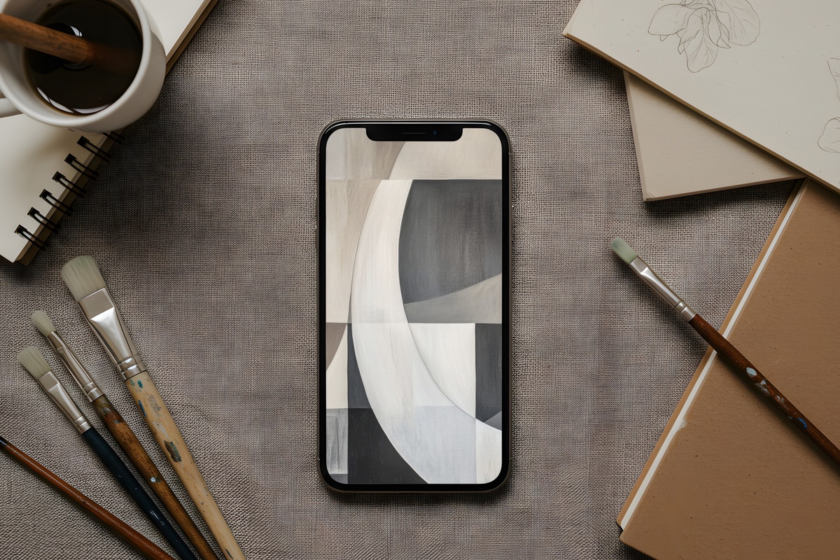
Soft geometric shapes in blended neutral tones — each form fitting against the next with the easy logic of a well-constructed weave. There's a warmth to the palette, something between stone and raw linen, that stops it from feeling cold or overly mathematical. If you tend to rotate between warmer organic images and want something to bridge into a slightly more structured aesthetic without losing the softness, this is a reliable mid-season reset. And it scales well — looks just as considered on a larger iPhone Pro screen as on a compact Mini.
8. Gray Balance of Geometric Traces - iPhone Wallpaper
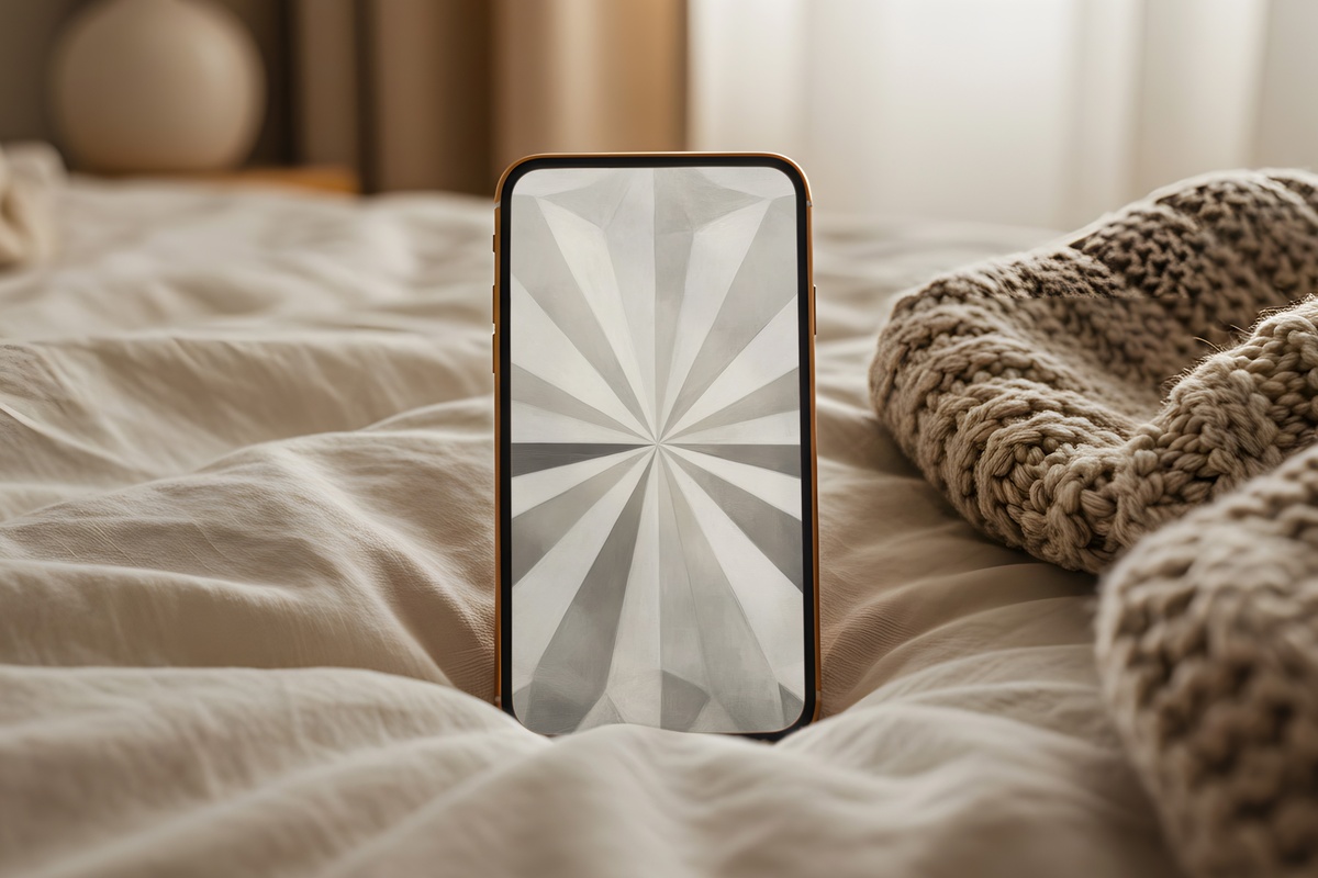
Honest. That's the best single word for this one — the gray here doesn't pretend to be warmer or more romantic than it is. It's a cool, clear mid-gray with traced geometric marks that feel closer to architectural drafting than decoration. Recommended for anyone whose aesthetic runs minimalist in the truest sense: no warmth added, no softening, just clean tonal balance. It would feel out of place on a maximalist moodboard, but in a paired-back flat lay or against a white marble case, it reads as genuinely considered.
9. Nature's Linear Elegance - iPhone Wallpaper
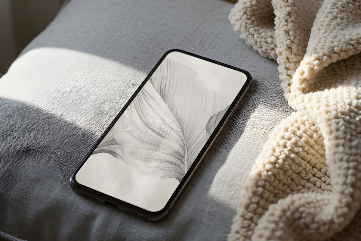
Natural forms rendered in fine, soft-gray lines — the kind of mark that looks less like digital art and more like a botanical illustrator's first careful study. The composition uses vertical rhythm well, which is something wallpapers genuinely benefit from on a portrait screen: the eye follows naturally downward without feeling directed. The overall tone is a chalky, slightly warm gray that avoids the cold end of the spectrum. A screen that opens to this at 7 a.m. sets a different quality of morning than one that opens to nothing in particular.
Each of these downloads straight to your camera roll — no account, no waiting, ready to set within a minute of finding the one that fits. The collection is there whenever the season shifts and your screen feels ready for something new. Browse the full neutral wallpaper edit at Gallery Flair and find what your lock screen has been missing.
Worth knowing as you build your rotation: any mix of wallpapers, printable wall art, and Frame TV art counts together toward the same volume tiers — three pieces from anywhere in the shop brings 30% off, and five unlocks 50%. Cross-category collecting is just good math.