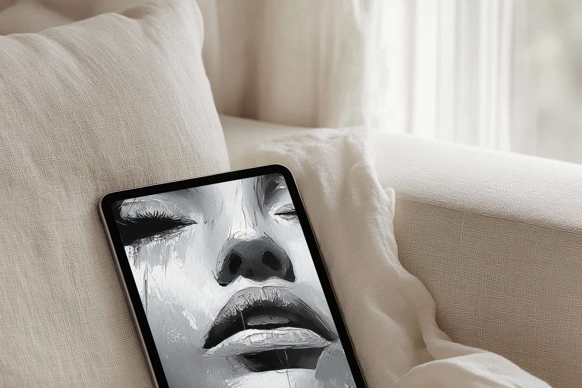
9 Neutral iPad Wallpapers That Decode the Quiet Aesthetic
There's a specific moment — tablet on the coffee table, morning light angling across the screen — when the wallpaper you chose yesterday either holds the room or quietly fights it. The neutral aesthetic isn't about emptiness. It's a considered reduction: only what belongs, nothing that shouts.
What Makes a Neutral iPad Wallpaper Actually Work?
Not every muted background reads as intentional. The ones that do share a few things: a palette anchored in one temperature (warm stone, cool ash, or dusty linen — not a mix of all three), a composition with enough movement to feel alive but enough restraint to recede when the app grid arrives, and a tonal range that handles both bright daylight and night-mode dimness without losing its character. These nine picks were chosen with exactly that standard in mind.
1. Elegant Shadow Arches Serenade - iPad Wallpaper
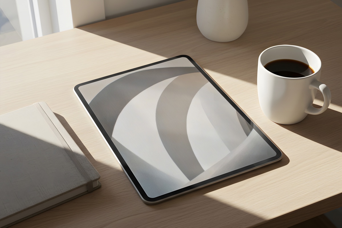
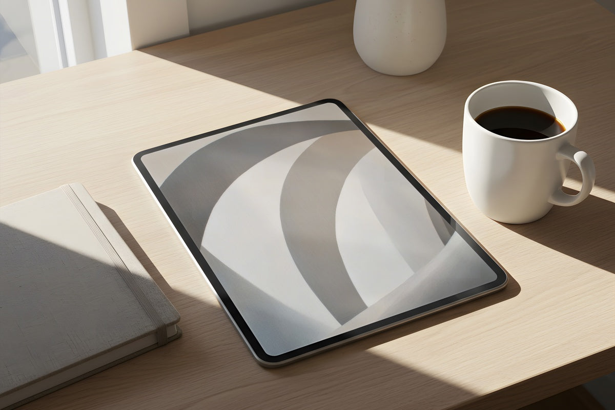
Arched forms rendered in soft shadow — this one sits somewhere between architectural study and mood photography. The palette lives in warm greige and faded chalk, with just enough tonal contrast to keep the eye interested without competing for attention once your apps are open. Set it up before a slow afternoon and notice how the whole device feels less like a tool and more like an object worth placing carefully on a desk.
2. Serene Canvas of Leaf Harmony - iPad Wallpaper
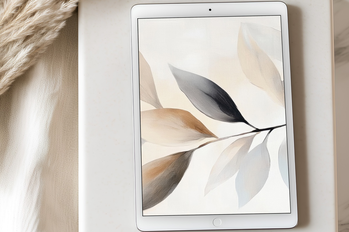
Botanical motifs can tip into the overly decorative — this one doesn't. Leaves rendered in near-neutral sage and faded linen keep the subject matter secondary to the overall texture, so what you're really looking at is a wash of organic calm. Anyone whose daily ritual involves a matcha on a wooden tray will recognize exactly why this wallpaper makes sense. Grounded without being heavy. Alive without being loud.
3. Striped Monochrome Drama - iPad Wallpaper
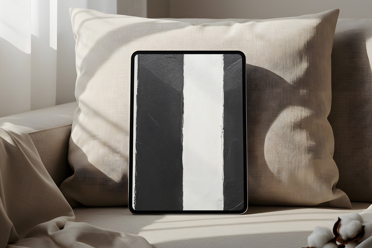
The word drama earns its place here. Bands of cool charcoal and bone white move across the vertical plane with enough rhythm to feel almost architectural — like standing in a corridor where the light falls in precise intervals. If your aesthetic leans less cottagecore and more editorial-minimal, this is where the neutral wallpaper conversation takes a sharper turn. Bold within a monochrome framework. Restrained in color, assertive in structure.
4. Monochrome Botanical Elegance - iPad Wallpaper
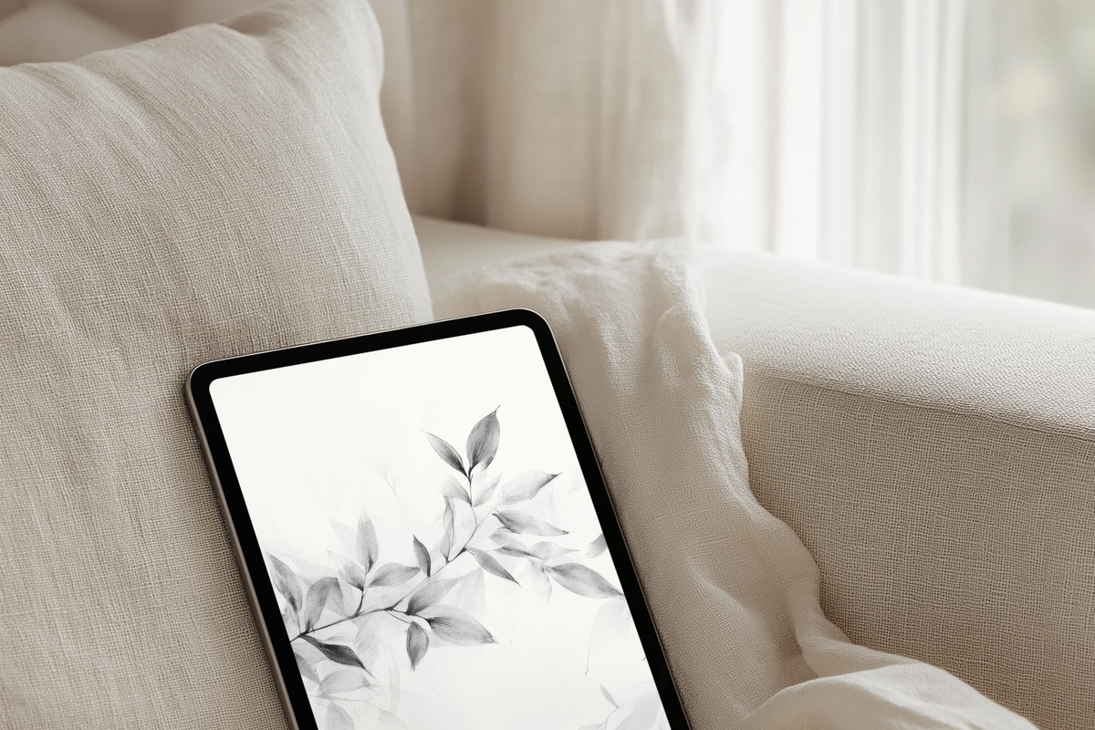
Where the Leaf Harmony piece reads soft and organic, this botanical study turns cooler and more considered — rendered in a slate-and-silver grayscale that feels closer to botanical illustration than to decorative print. The negative space does real work here, letting individual leaf forms breathe without crowding. A natural match for a setup that already includes a neutral linen case and a desk cleared of everything non-essential.
5. Whispering Mountain Hues - iPad Wallpaper
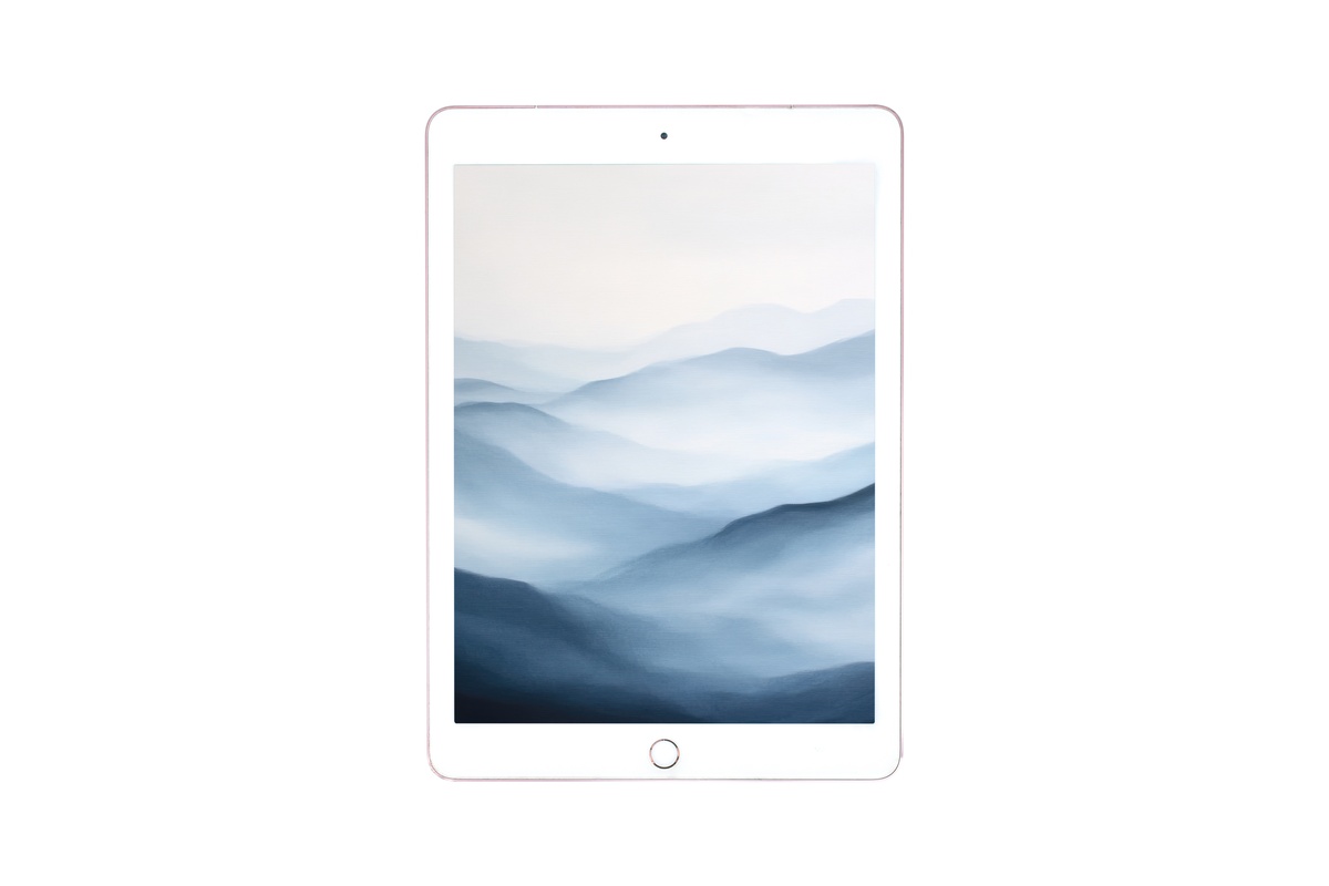
Earthy terracotta, dusty rose-beige, and hazy horizon-blue layered into something that reads like a landscape seen through gauze. The palette tilts warm — think clay pottery on a windowsill, late-afternoon light gone golden. What keeps it from becoming purely decorative is the mood: unhurried, far-away. On a large iPad screen, the gradient quality of these hues has real presence, without ever demanding you notice it.
6. Whisper of Feathered Lines - iPad Wallpaper
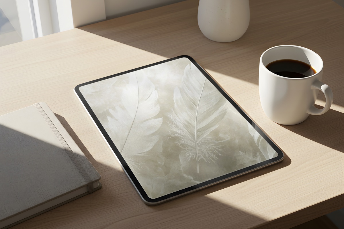
Fine, feathered marks against a pale oat ground — this one rewards a moment of actually looking before the apps take over the screen. The linework has the quality of something hand-drawn and then held very still: deliberate, but not rigid. It pairs instinctively with a journaling setup or an afternoon of reading in low light. Not every wallpaper needs to recede. This one earns its quiet presence by saying something specific.
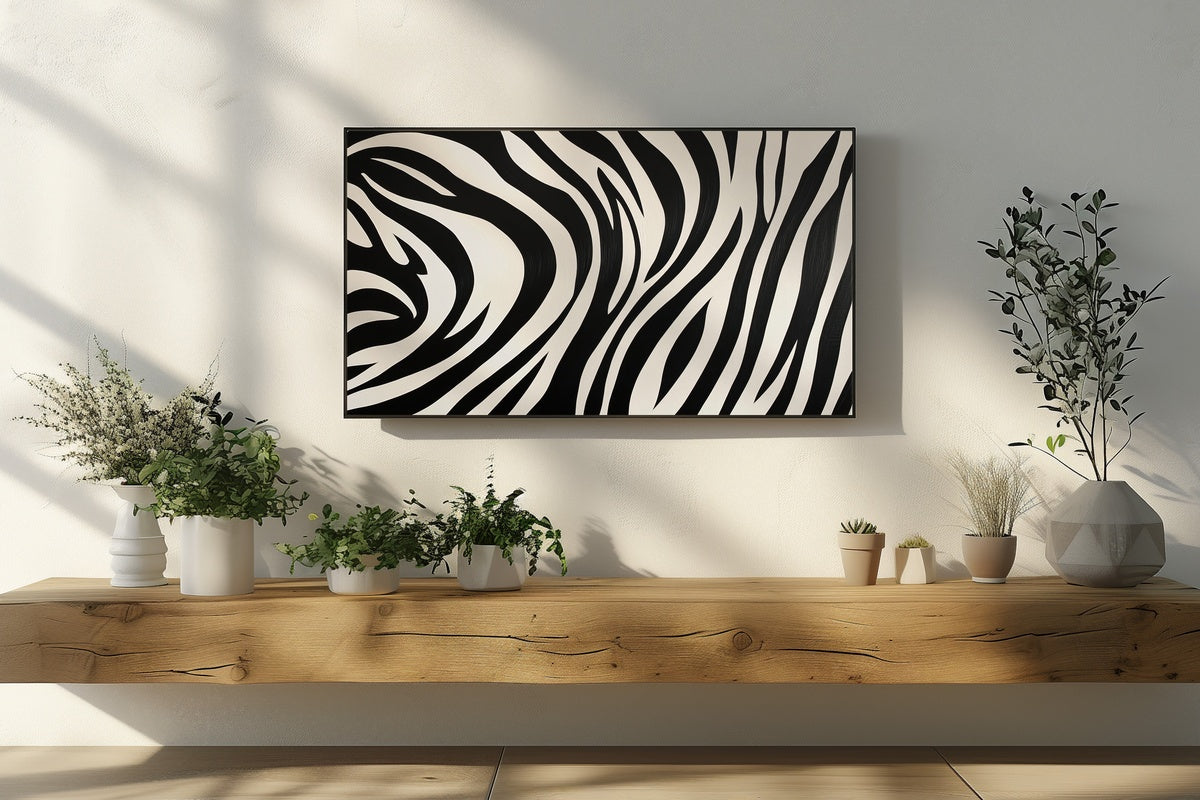
If you're building a visual world across devices and walls — not just a single screen — these pieces pair well with their print and Frame TV counterparts in the same palette family. A cool-toned wallpaper here, a warm botanical wall print there, a grayscale landscape on the Frame TV across the room. The through-line is temperature and restraint, not matching motifs.
7. Timeless Silhouettes in Grayscale Elegance - iPad Wallpaper
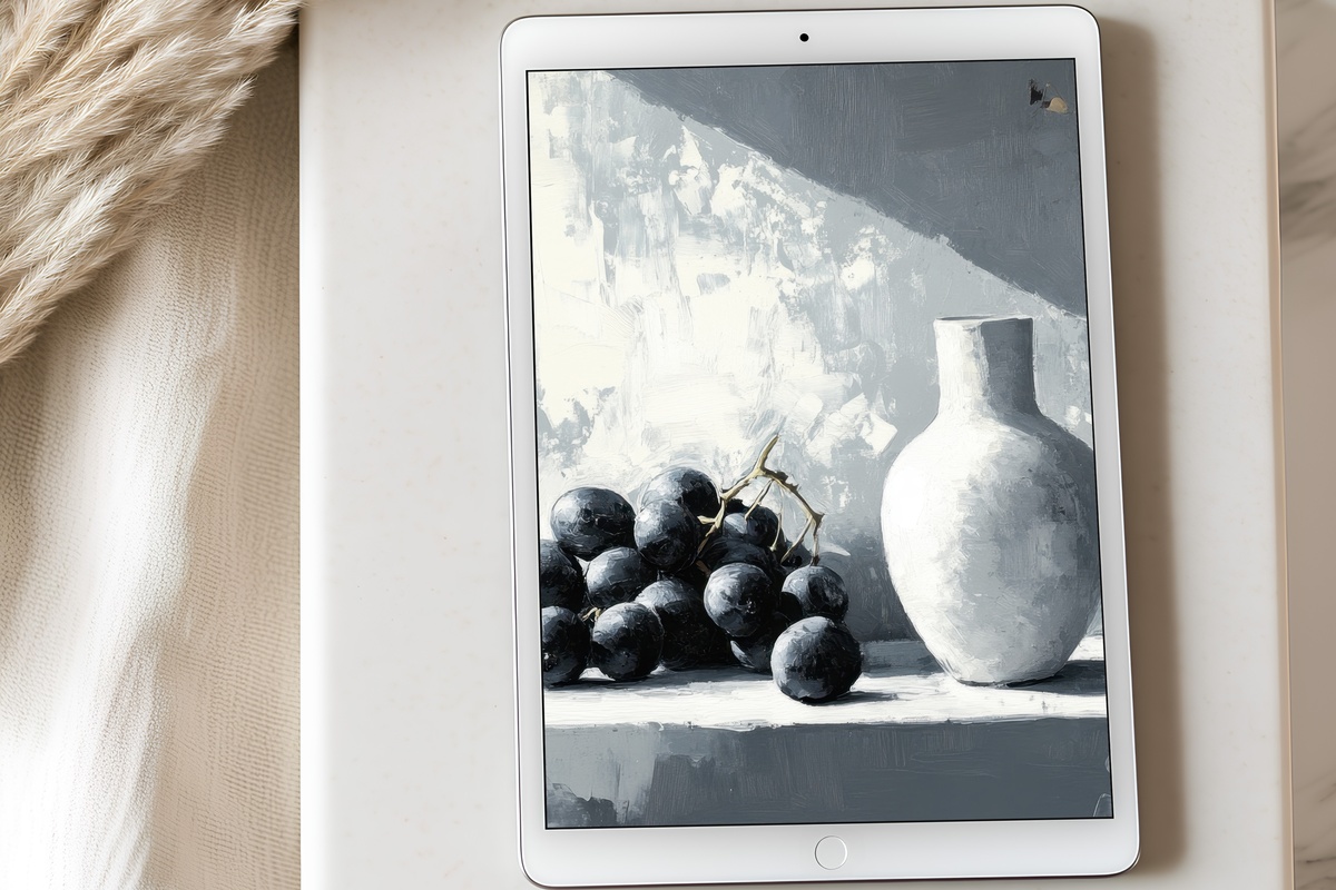
Silhouette work lives or dies by what it leaves out — and this piece leaves out everything unnecessary. Forms dissolve into a layered grayscale fog, giving the screen a depth that reads differently depending on how much ambient light is in the room. Low-contrast at a glance, quietly complex on close attention. The aesthetic is closer to a vintage photography study than to a pattern, which is exactly the distinction worth making.
8. Layered Serenity Harmony - iPad Wallpaper
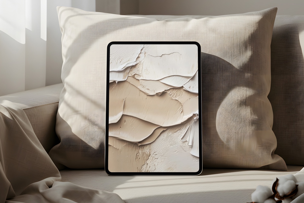
Honestly, the layering in this one is doing something more interesting than a screenshot can fully communicate. Translucent planes of warm ivory and sand shift across each other in a way that suggests depth — almost like looking through a stack of handmade paper held up to light. The mood is unhurried and unhurried only — not melancholic, not aspirational. Just settled. The sort of backdrop that makes a long notes session feel more considered.
9. Pebbles of Serendipity - iPad Wallpaper
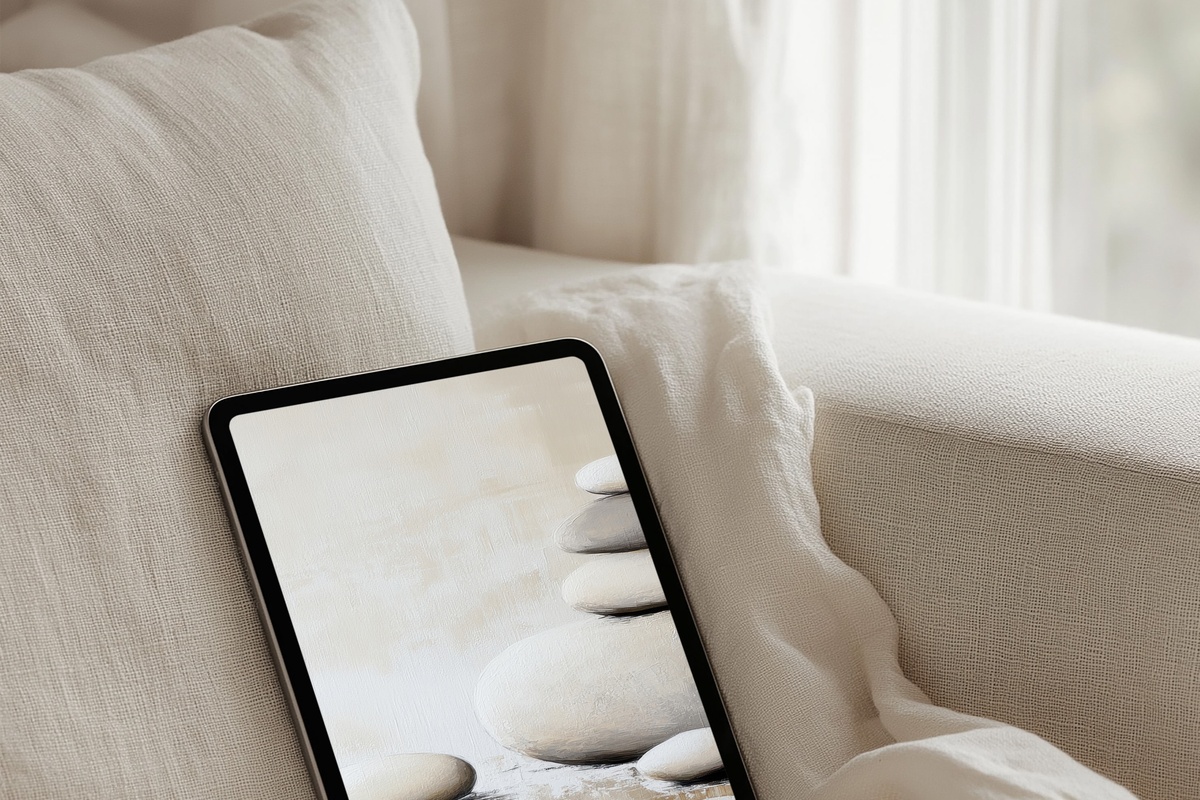
Soft gray pebble-forms arranged with the kind of spacing that feels found rather than designed — like a shoreline at low tide, rearranged only by water. The palette is cool pearl and dove white, with faint shadow detail that keeps each form from flattening into abstraction. For anyone whose aesthetic vocabulary starts with texture over pattern, this one offers exactly that: tactile mood without a single decorative flourish to justify.
Each of these arrives as an instant download — on your screen within minutes, no subscriptions, no waiting. If one piece catches you and another holds you a little longer, that's the edit working as intended. Browse the full neutral iPad wallpaper collection at Gallery Flair and set the one that fits your current mood.
And here's a small detail worth knowing: the 30% and 50% volume discounts apply across every product line — mix iPad wallpapers with printable wall art or Frame TV art and any combination of three pieces unlocks the first tier. Building a cohesive visual world across your home and devices turns out to be its own kind of savings logic.