9 Neutral Frame TV Art Picks to Anchor Your Living Room This Season
There is a particular quality of light in a room where the TV has gone quiet — the way a well-chosen piece on the screen holds that stillness rather than interrupting it. A neutral art rotation for your Samsung Frame TV does exactly that: it keeps the room breathing through the season, shifting in mood from morning to evening without ever demanding your attention.
What Makes Neutral Frame TV Art Work All Season Long?
The best neutral art for a Frame TV is not simply beige or greige for its own sake. Look for restraint in palette — warm oat, chalky bone, cool ash, raw linen — paired with enough compositional tension to hold the eye across a room. Layered texture, tonal variation within a narrow range, and a focal point that doesn't resolve too quickly are the three qualities that separate art that ages well on screen from art that reads as wallpaper filler. The pieces in this rotation were chosen with those criteria in mind.
1. Elegant Shadow Arches Serenade - Frame TV Art
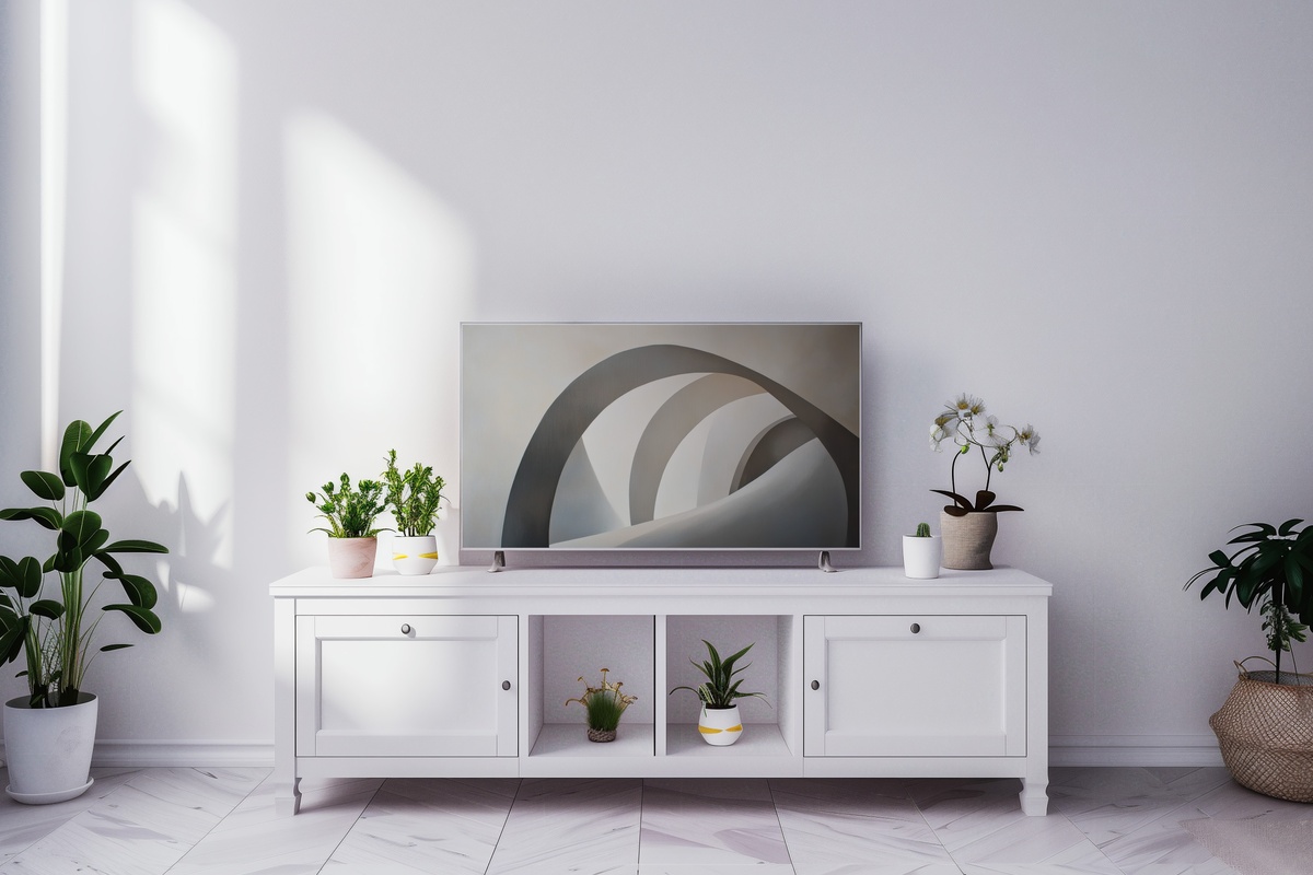
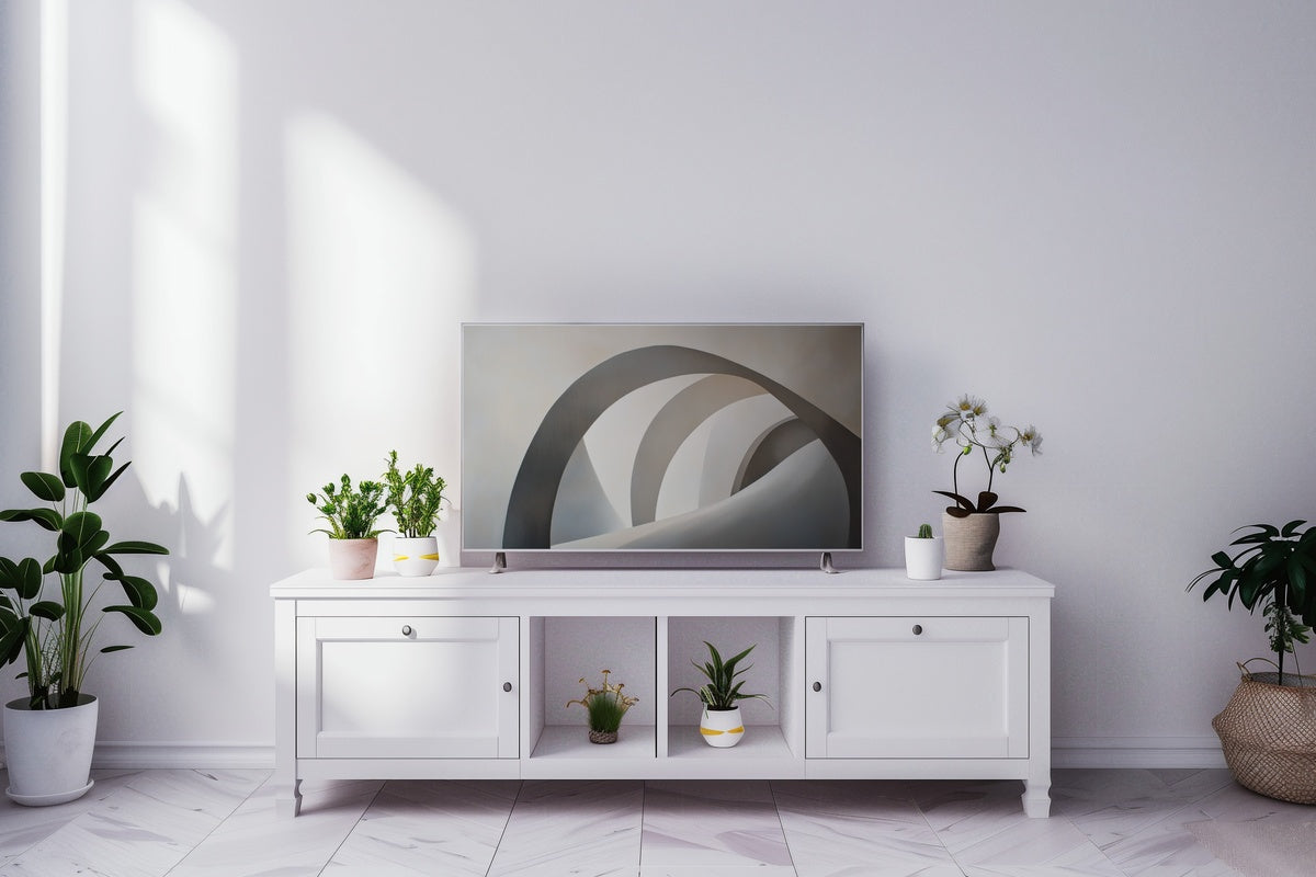
Arched forms cast in soft, warm-stone shadow against a pale ground — this piece has the architectural confidence of a plaster wall in a Milanese apartment, without any of the coldness. The shadows shift as ambient light in your room changes, so the piece reads slightly differently at midday than it does by lamplight. A measured, elegant opener to any seasonal rotation; strong enough to hold a large wall-to-ceiling Frame TV without ever raising its voice.
2. Equilibrium of Tranquil Waves - Frame TV Art
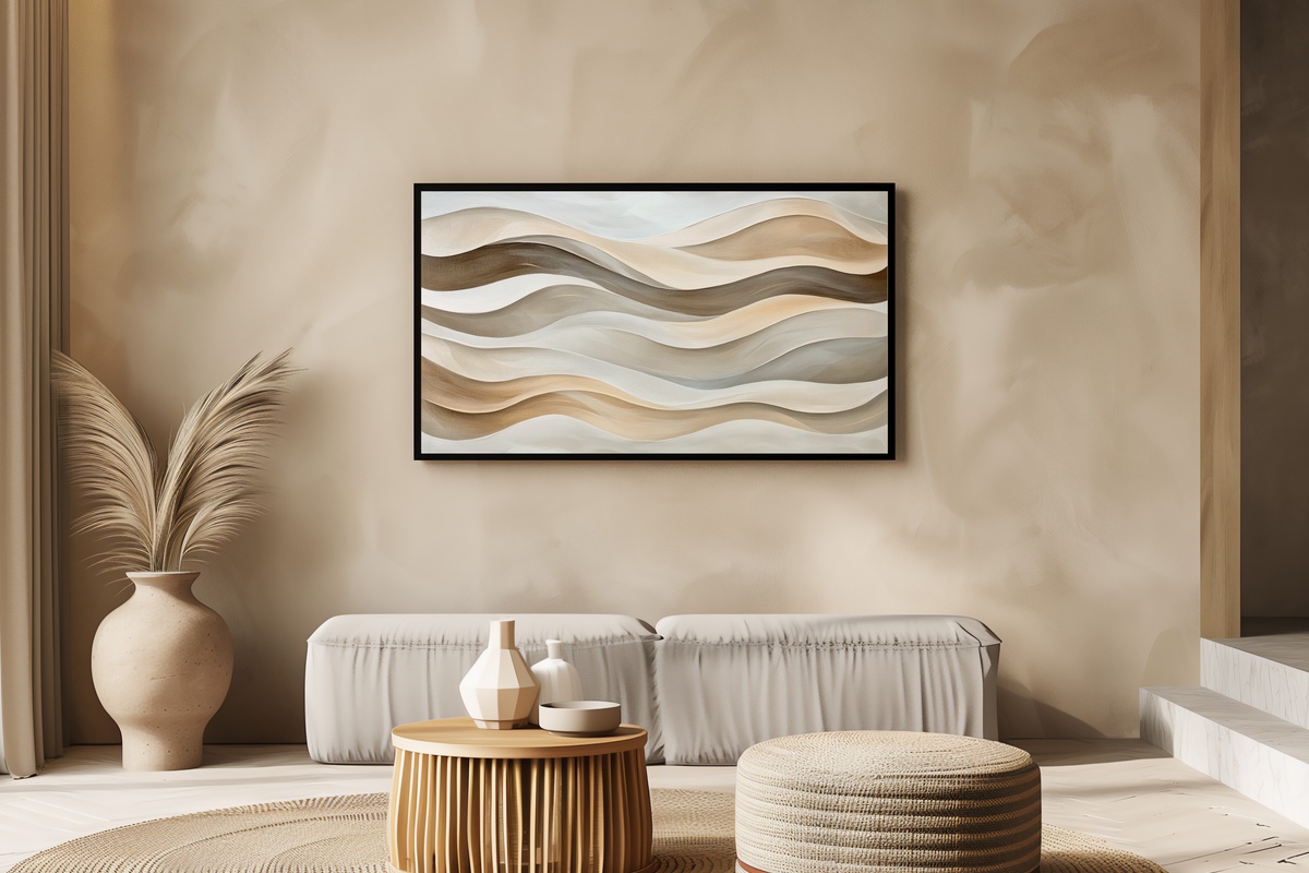
Abstract wave forms in graduated warm grey and linen white — the composition moves horizontally across the screen in a way that quietly widens a room. There is a rhythmic quality here that feels less decorative and more meditative, closer to a long exhale than to a pattern. Anyone who keeps their living room deliberately underfurnished and lets the art do the spatial work will find this one speaks their language. It also pairs beautifully alongside earthier, more textured pieces in a rotation.
3. Nature's Graceful Trace - Frame TV Art
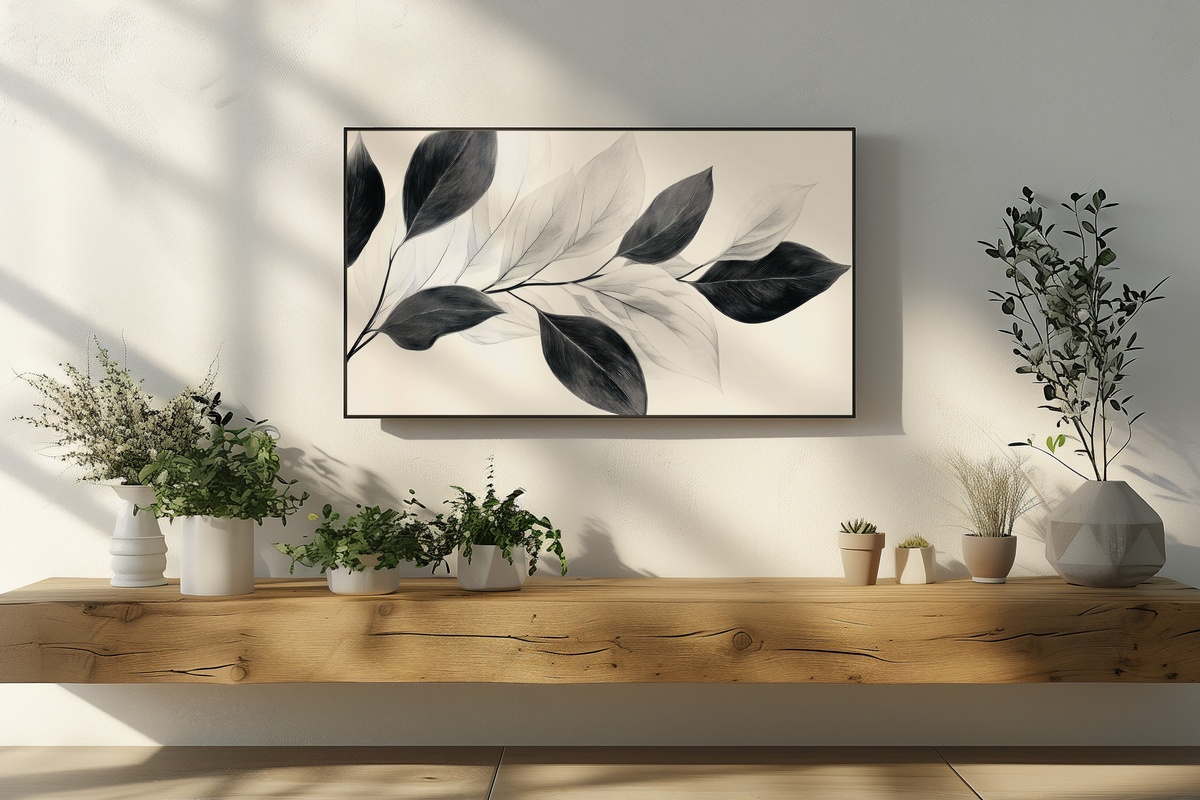
Botanical line work rendered in a single dusty ink tone against bare parchment — spare, unadorned, and quietly alive. The lines suggest a plant reaching upward without ever declaring it, which is exactly the restraint that keeps a botanical from tipping into predictable spring-decor territory. This one suits rooms where natural materials already do the talking: raw wood, woven textiles, matte ceramics. On screen it reads like something pressed between the pages of a very old notebook, then opened again at just the right moment.
4. Earth's Gentle Symphony - Frame TV Art
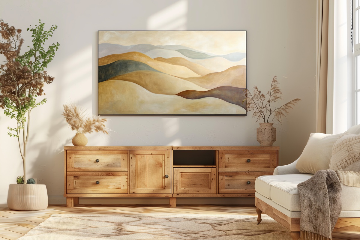
Layered earthy tones — terracotta dust, warm umber, dry sand — arranged in abstract horizontal bands that evoke a landscape viewed from a long distance. Not a literal landscape, though; abstract enough that the mood shifts depending on what you bring to it. On a grey morning it reads contemplative. By evening candlelight, it warms to something almost amber. The natural pigment palette makes this the anchor piece of a tonal rotation, the one everything else in the edit orbits around without competing with it.
5. Serenity of Silhouetted Palms - Frame TV Art
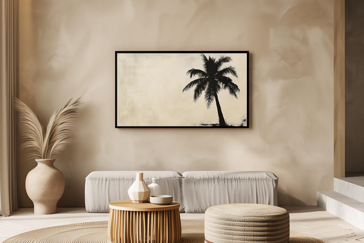
A palm silhouette rendered in monochrome — ash and near-white — with the kind of negative space around it that makes the whole frame breathe. It is worth naming honestly: if your space leans maximalist or runs rich in saturated color, this level of graphic minimalism may feel too withdrawn. But in a room of linen, travertine, and muted natural wood, this piece finds its register perfectly. The vertical line of the palm trunk draws the eye upward in a way that adds perceived height to a standard-mounted Frame TV.
6. Whisper of Feathered Lines - Frame TV Art
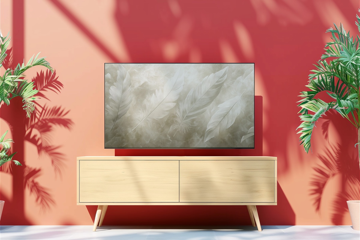
A monochrome feather study, but executed with enough abstraction that it never resolves into illustration. The filament lines radiate outward from a central spine in gradations of charcoal and pale dove grey, creating a texture you almost expect to feel through the glass. It is a softer counterweight to the architectural pieces in this edit — organic where the arch and wave compositions are structural. In a rotation, position this one for early mornings or the quieter middle of the week, when you want the room to feel unhurried.
7. Shadows Whisper in Grayscale Dance - Frame TV Art
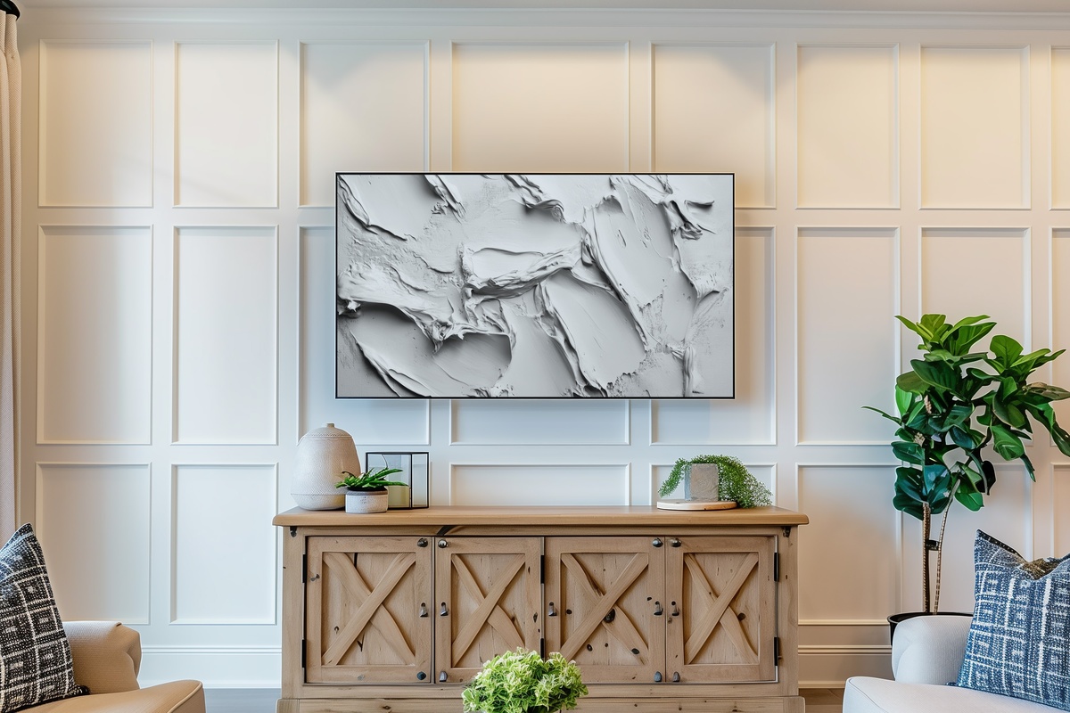
Grayscale textures in overlapping, semi-transparent layers — this one operates like a slow exposure photograph, where the subject only becomes clear if you stop and look. Not everyone wants art that asks that of them, and that is a fair preference to hold. But for rooms where the intention is to slow the room's pace, to turn the space into somewhere you actually linger rather than pass through, this piece earns a permanent slot in the rotation. It shifts in apparent depth as natural light crosses the screen through the day.
8. Neutral Brushstroke Symphony - Frame TV Art
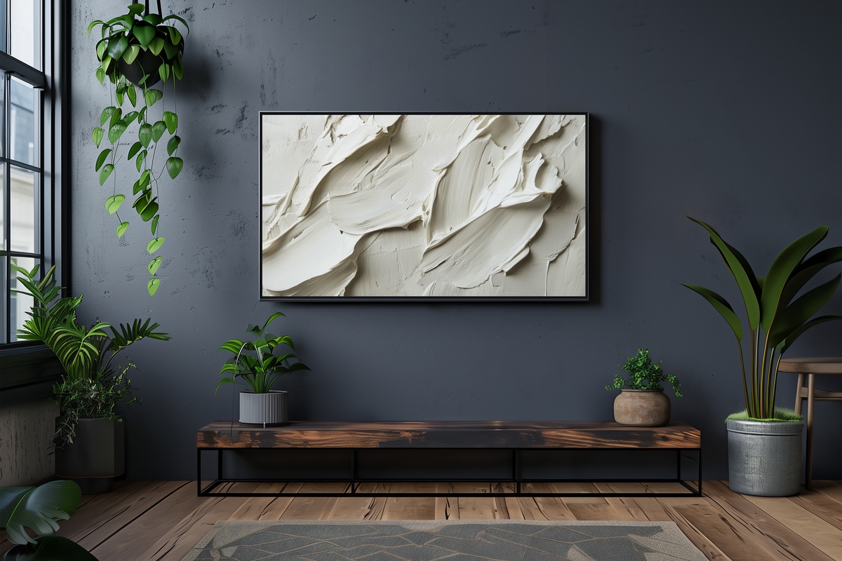
Layered brushstrokes in raw canvas, warm ivory, and faded chalk — built up in loosely horizontal marks that stop just short of becoming a landscape. There is a physical quality to this piece that is unusual for digital art: the stacked strokes carry visible weight, as though pigment dried and was worked back into itself. It reads as the most tactile piece in this edit, a natural pairing with a room full of woven throws and unfinished plaster. Consider it the mid-rotation reset — familiar, grounding, and impossible to tire of quickly.
9. Sunrise over Serene Peaks - Frame TV Art
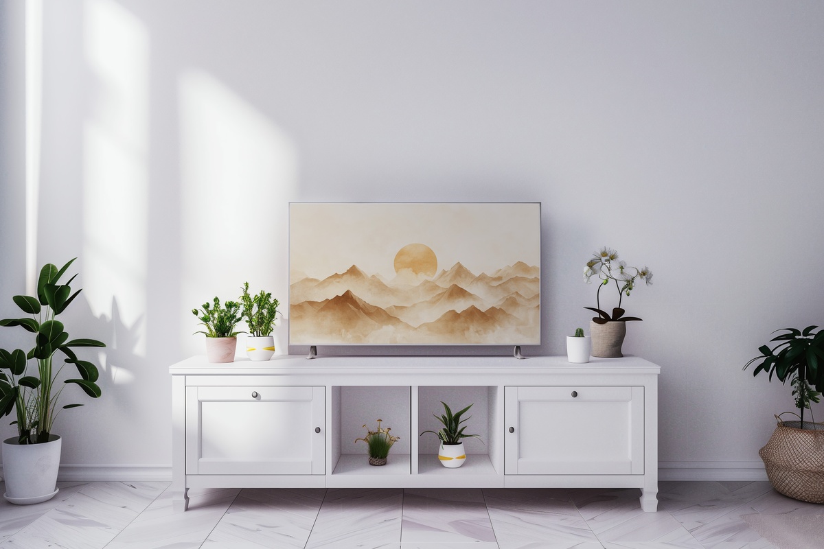
A minimalist mountain silhouette at the precise moment before sunrise — when the horizon reads as a thin line of pale gold against a near-white sky and the peaks are barely distinguishable from the atmosphere above them. Quieter than a landscape, more evocative than an abstract. This is the piece to set on a slow Sunday morning, when the light coming through your own windows matches it almost exactly. The entire composition holds in a breath, and the screen feels less like a screen and more like a very clean pane of glass.
Each of these files is available as an instant download — on your Frame TV within minutes, no waiting, no subscription, no guesswork about sizing. If you are building out your seasonal rotation now, setting a few of these up in the weeks ahead means you actually live with the shift rather than arriving at it after the season has already settled in.
Worth noting as you build your edit: the 3-for-30% and 5-for-50% discounts apply across every product line in the shop — Frame TV art, printable wall art, and device wallpapers all count together. A Frame TV piece, a coordinating wall print in the same tonal family, and a matching phone wallpaper: that trio qualifies at the 3-piece threshold. One continuous visual world across your home, and the arithmetic works in your favor.