7 Neutral Frame TV Art Picks That Let Your Living Room Breathe
There's a particular quality to a room that's done well with neutrals — not stripped bare, not beige-by-default, but genuinely considered. The Samsung Frame TV sits dark between uses, which means the art you choose carries the whole wall. These seven picks are the ones that earn that responsibility.
What Makes Neutral Frame TV Art Actually Work
Neutral doesn't mean absent. The pieces that hold a room are the ones with internal tension — a tonal contrast, a compositional decision, a texture that shifts as the light changes from midmorning to the hour before dinner. Look for work where restraint is deliberate rather than accidental: a palette that pulls from no more than three values, negative space that breathes rather than empties, and a subject (or near-absence of one) that your eye can return to without fatigue. The seven pieces here pass that test.
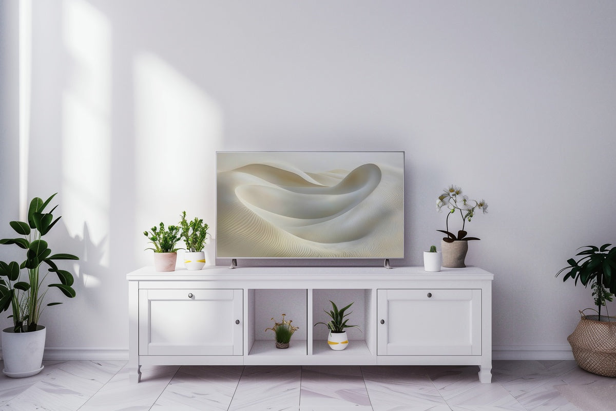
1. Dunes Whispering Tranquility - Frame TV Art
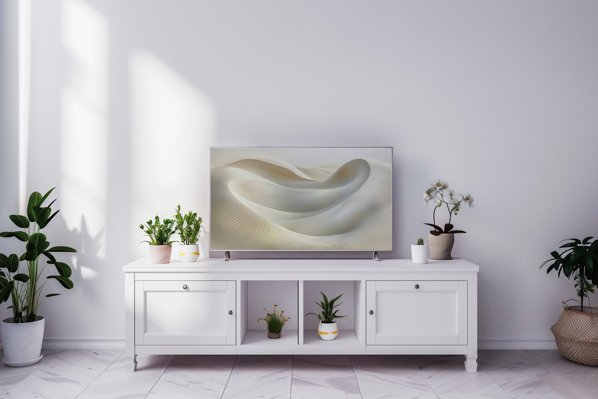
Abstract linear dunes rendered in graduated sand and warm stone — this piece reads almost like topographic data made painterly. The horizontal rhythm is unhurried, each band of tone shifting just enough from the next that the whole image feels like it's breathing slowly. It works in rooms with linen, with plaster walls, with furniture that sits close to the floor. Put it on when the afternoon light is already doing something interesting, and the two will find each other.
2. Calming Celestial Cycle Melody - Frame TV Art
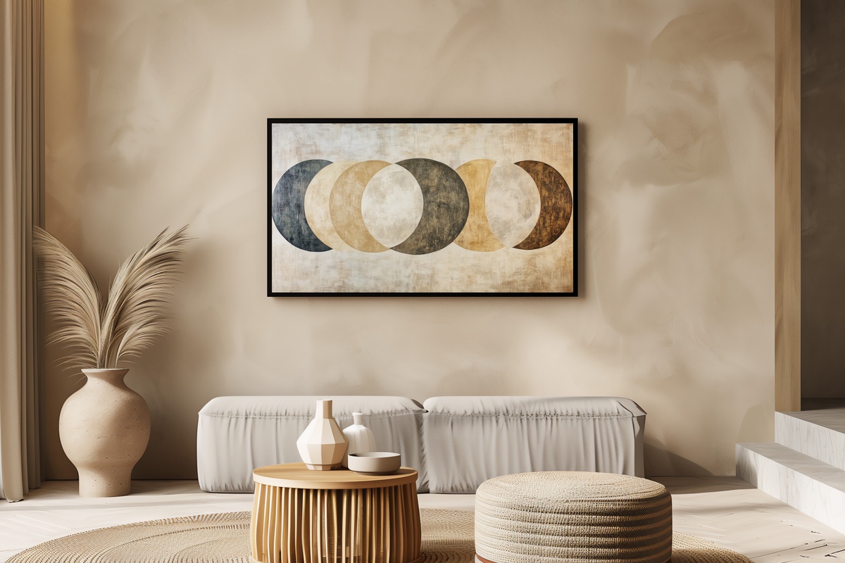
A sequence of abstract moon phases in muted ivory and charcoal — not illustrated, exactly, more like pressed into the surface of something older. There's a meditative quality to how the forms progress across the frame, each phase a quieter version of the last. This one belongs in a room where lamps are dimmed before nine, where the evening ritual matters. Anyone whose bookshelf leans toward ritual objects and slow-burning candles will recognize what this piece is doing immediately.
3. Striped Monochrome Drama - Frame TV Art
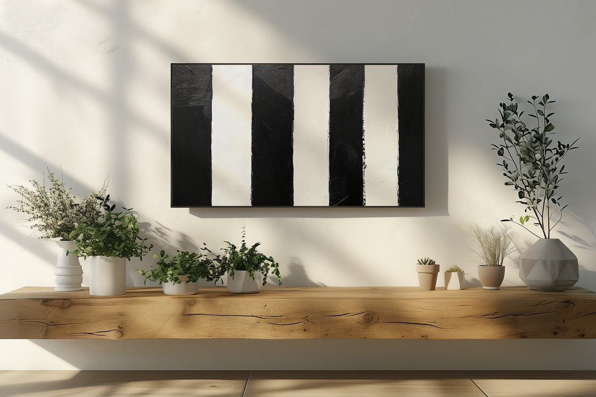
Not every neutral piece wants to recede. This one leans into contrast — bold graphic stripes in true black and white that hold the wall like a statement without ever raising its voice. It suits rooms with architectural confidence: high ceilings, concrete, raw wood, or furniture with strong silhouettes. If the rest of your edit skews soft and warm, this is the piece that keeps it from tipping into sweetness. A single tonal anchor for a room that already knows what it is.
4. Serene Stone Fragments Alchemy - Frame TV Art
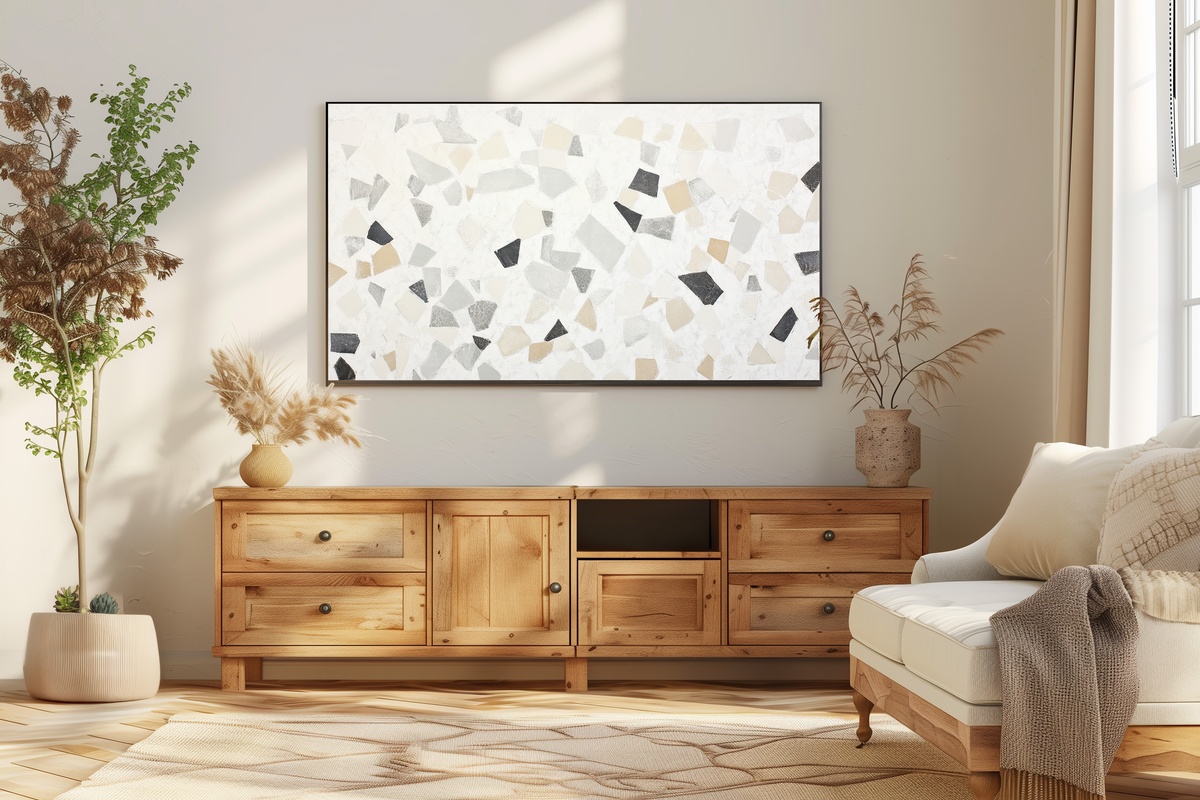
Terrazzo rendered at a scale that makes you reconsider the material entirely — the fragments here are larger, more deliberate, distributed across a warm cream ground with a quietness that feels almost geological. It has the same appeal as a well-worn marble countertop: unpredictable, but never chaotic. If you're someone who collects objects with patina — aged brass, weathered ceramic, matte stone vessels — this piece fits that impulse without needing an explanation.
5. Serenity of Silhouetted Palms - Frame TV Art
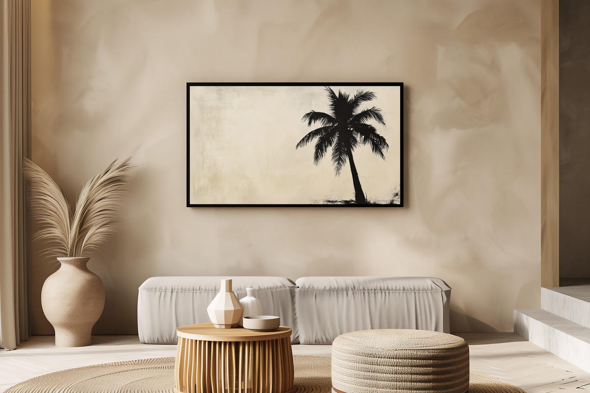
A palm silhouette distilled to its most essential line — no colour, no fuss, just the geometry of fronds against a pale ground that could be early morning or just before dusk. The minimalism here is botanical rather than clinical, which matters: it brings organic softness without the literal-tropical associations that can date a room. Closer to a Japanese ink study than to resort décor. Natural textures — rattan, jute, unbleached cotton — settle around it as if they were always meant to.
6. Whisper of Feathered Lines - Frame TV Art
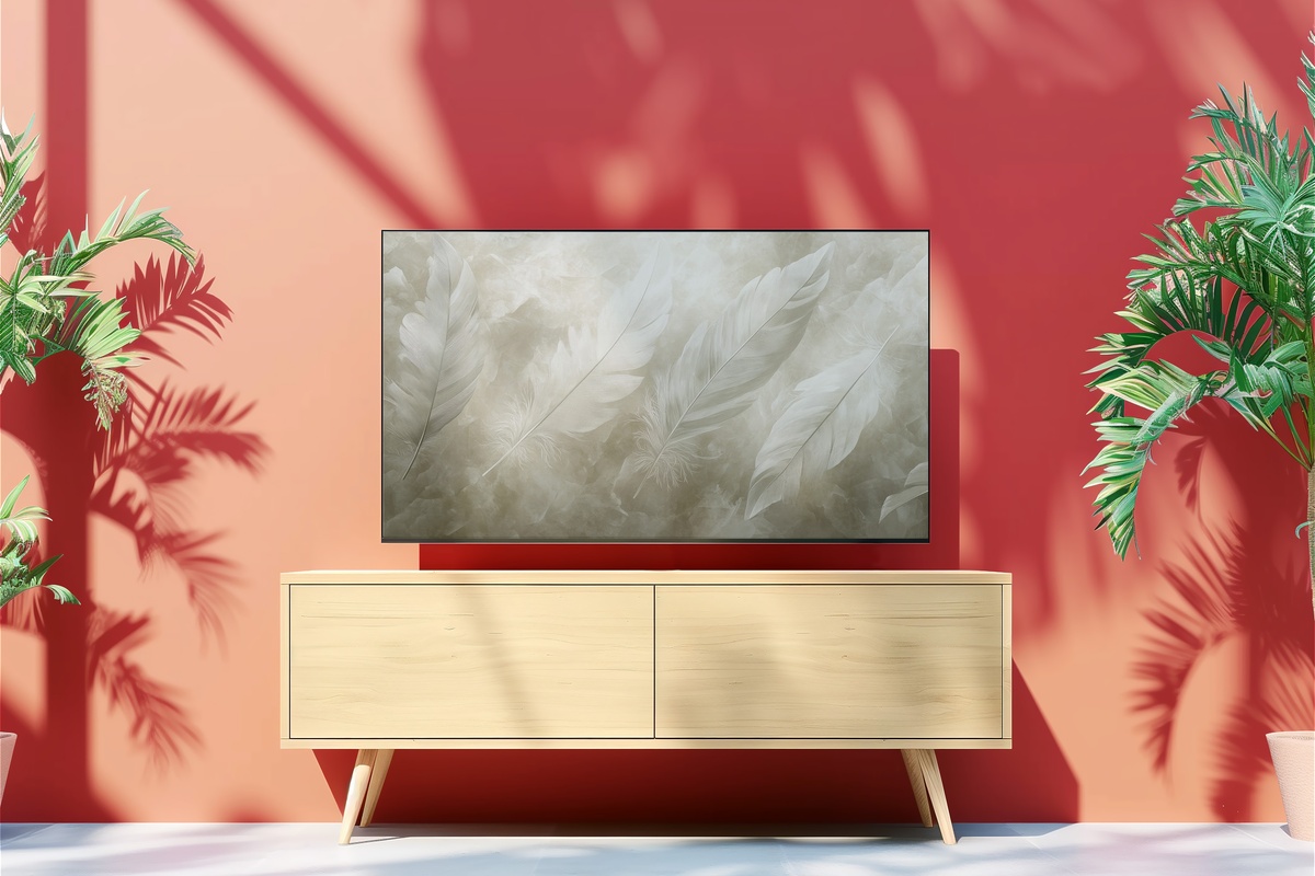
Monochrome feather forms abstracted until the subject hovers at the edge of recognition — you know what you're looking at, but the image doesn't insist on it. The linework is fine enough that it rewards closer attention, with a delicacy that most neutral pieces don't attempt. This is the one for rooms that already lean spare, where every object is chosen rather than accumulated. It doesn't crowd; it completes. A good match for walls that have been left deliberately bare on either side.
7. Neutral Brushstroke Symphony - Frame TV Art
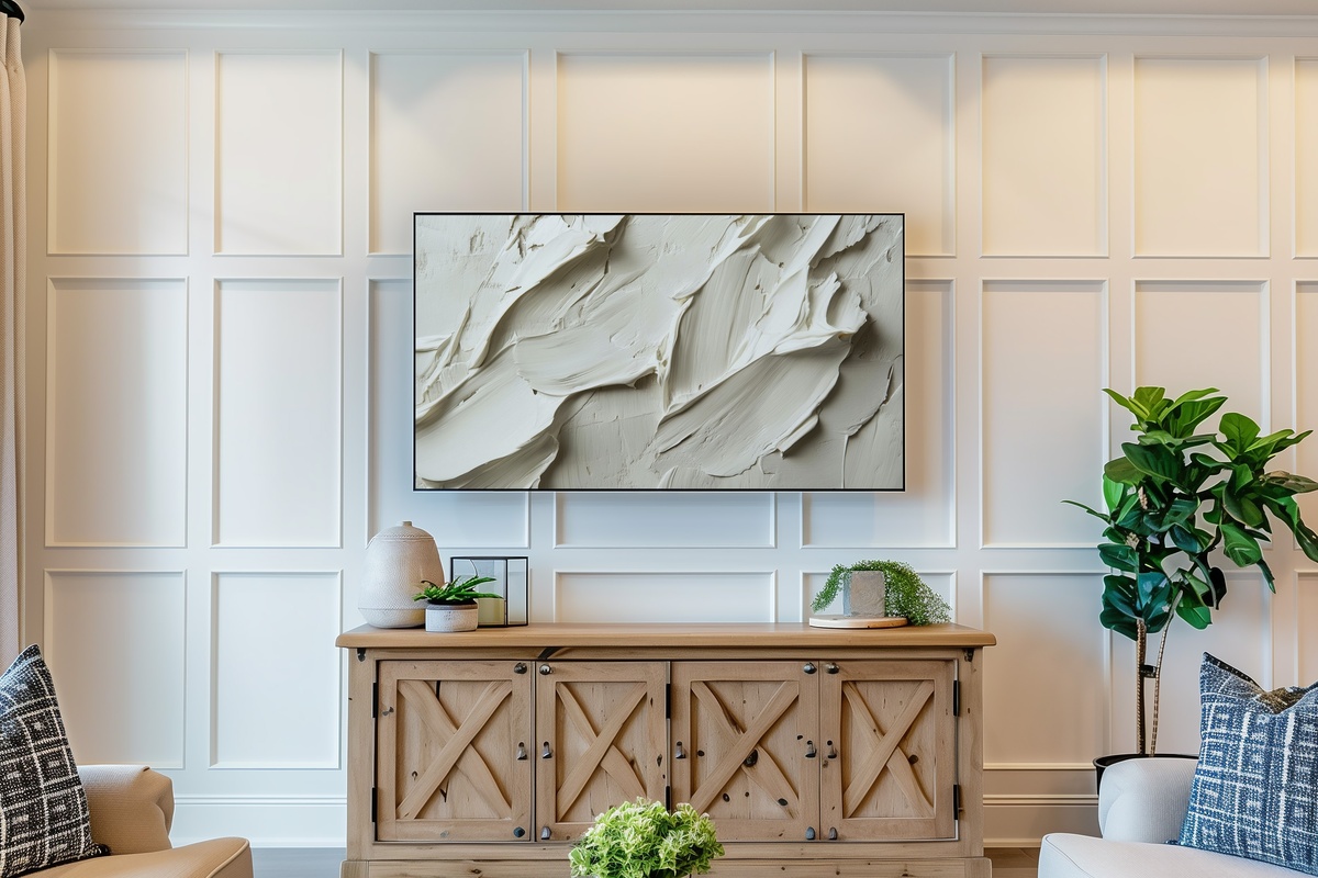
Layered brushstrokes in taupe, ash, and barely-there warmth — stacked and overlapping in a way that gives the surface an almost tactile depth. Where the other pieces in this edit work through restraint of subject, this one works through restraint of colour: the palette barely moves, but the mark-making carries enough variation that the piece feels genuinely alive. It suits those who find pure minimalism a touch too resolved. Something between a studio study and a finished work — and that tension is exactly the point.
Each of these pieces downloads directly to your device — formatted for the Samsung Frame TV and ready to display in minutes, no waiting, no subscription. If one pulled you in, the collection stays open whenever you're ready to come back to it. A small note worth knowing: pair any mix of three pieces — Frame TV art, printable wall art, wallpapers, in any combination — and you save 30%; any five and that becomes 50%. A single cohesive palette drawn across formats counts as a collection, and the numbers reflect that.