7 Modern Printable Wall Art Picks for a Curated Living Room
There's a particular quality a room takes on when the art is right — not just hung, but chosen. A living room with one considered print can read as more intentional than one layered with objects. These seven picks lean into that idea: each one is a distinct mood, a distinct palette, but together they trace a through-line of restraint and presence that defines a genuinely curated space.
What Makes Modern Wall Art Feel Curated, Not Collected?
The difference usually lives in three things: palette discipline, compositional confidence, and a willingness to let negative space do its share of the work. Modern prints that age well tend to avoid novelty for its own sake — they're anchored in either natural reference or geometric logic, and they hold their ground as rooms shift around them. Look for pieces where the subject and the background are in conversation, where the color range is tight enough to coexist with your existing furniture without demanding attention.
1. Desert Calm in Modern Brushstrokes
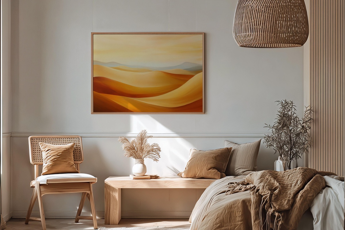
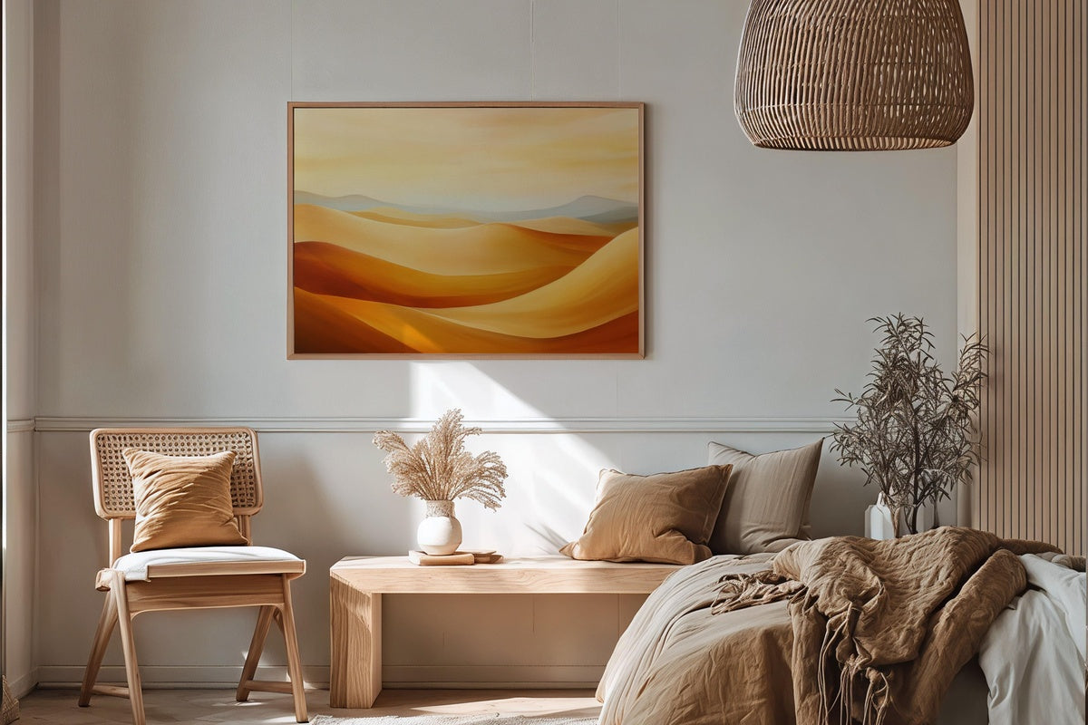
Sienna, warm sand, and the muted grey-violet of a late-afternoon sky — this piece carries the color temperature of a desert at the edge of dusk. The brushwork is loose where the horizon should be precise, and that tension is exactly what gives it life. It reads well large, where those gestural marks have room to breathe, but holds its own at a mid-sized scale above a console or sideboard. For rooms built on ochre, terracotta, or warm linen tones, this one locks the palette in place.
2. Blush Floral Modernion
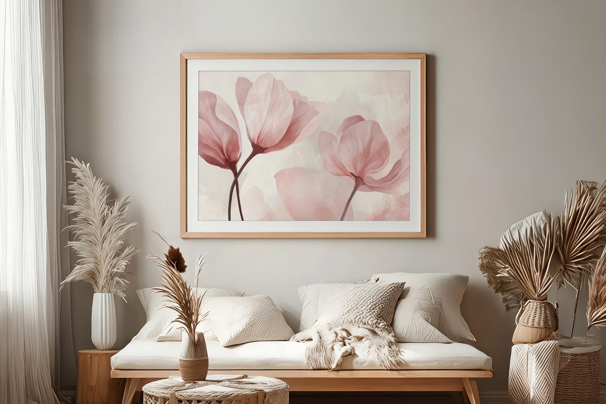
Floral prints can drift toward something overly decorative — a sweetness that tips the room into gift-shop territory rather than gallery. This one holds a different register entirely. The blush tones are tempered by dusty ivory and a near-neutral background that keeps the whole composition grounded. Petals resolve into near-abstract shapes at the edges, which is where the modernity lives. Hang it in a bedroom or reading corner where morning light touches it first — the petal forms catch that kind of diffuse glow in a way that feels almost architectural.
3. Forest Serenity in Soft Neutrals
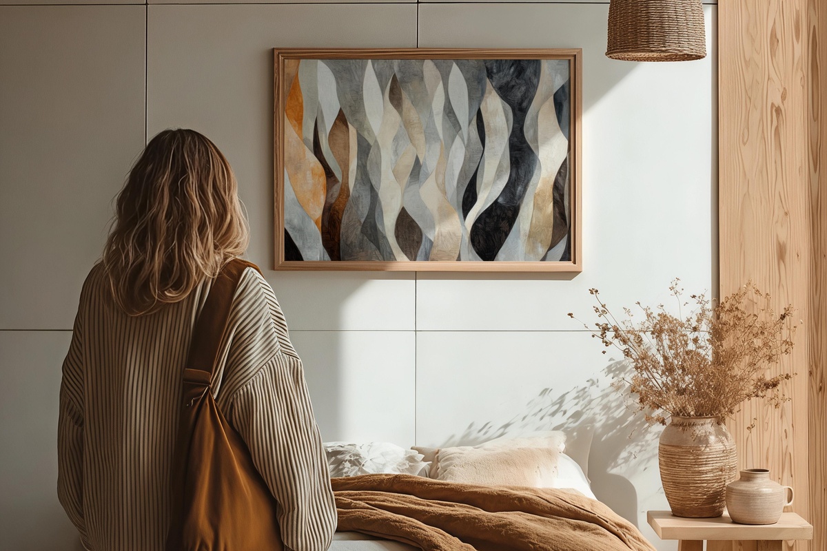
The palette here is essentially a fog study — greige, pale sage, and the grey-white of birch bark pulled into a scene that feels more mood than landscape. Anyone whose shelves lean toward natural linen, stone, and unglazed ceramics will recognize the frequency immediately. What keeps it from going too spare is a quiet layering of tone within tone: the mid-ground has depth you notice gradually rather than all at once. A strong candidate for a living room gallery wall where one piece needs to do the settling work while bolder neighbors hold the edges.
4. Oceanic Wave Rhythms
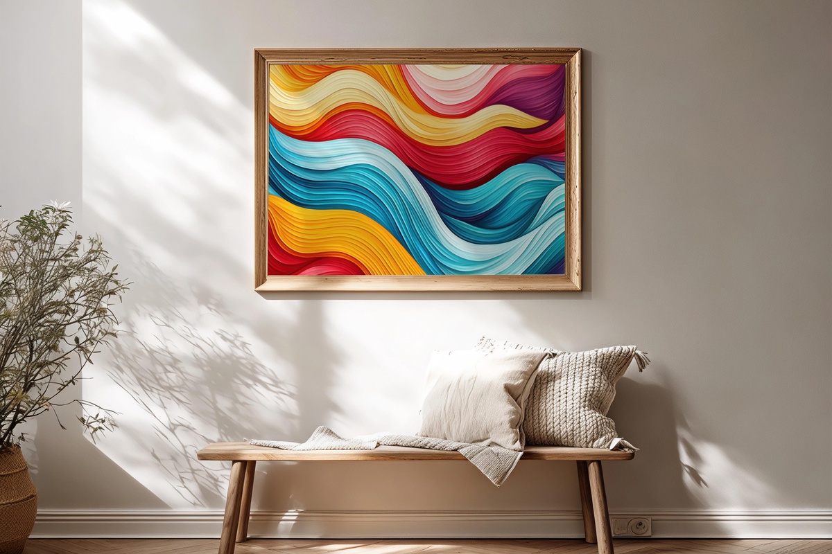
Movement rendered as geometry — that's the most precise way to describe what's happening here. The wave forms are abstracted just enough to feel structural rather than decorative, and the blue-teal-slate range sits in a cooler register than the warmer picks in this edit. It brings something the others don't: lateral energy. The horizontal rhythm pulls the eye across the frame in a way that makes a narrow hallway feel longer and a low-ceilinged room feel wider. Pair it with natural-fiber textures — jute, raw cotton, unfinished wood — to stop the cool palette from feeling clinical.
5. Bold Black & White Harmony
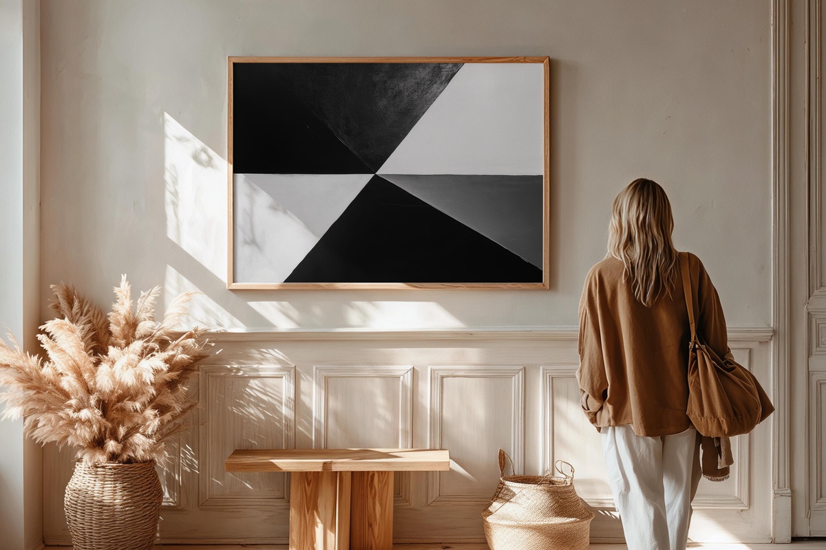
No color at all — and that is entirely the point. The contrast here operates as a kind of visual reset: this is the piece for a room that already has a great deal going on in terms of texture and material, and needs one anchor that refuses to compete. The composition relies on weight distribution rather than palette to create interest, and it does so with a confidence that reads differently at every viewing distance. Up close, the marks are gestural; from across the room, it resolves into something almost architectural. If you tend to rotate seasonal accents but want the art to stay permanent, this is the piece that outlasts trends.
6. Minimalist Earthy Geometrics
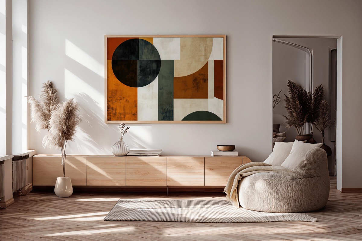
Clay, raw umber, and a near-white that reads warmer than cream — the palette is pulled straight from adobe and kiln-fired stoneware. The geometric forms sit in a quiet conversation with each other, separated by generous negative space that gives the composition an unhurried quality you feel as soon as you walk into the room. This is the print we'd suggest to someone building their first considered art collection and unsure where to start: it pairs with almost any warm-neutral furniture scheme without flattening the room, and it grows on you slowly in the best possible way.
7. Modern Metallic Symmetry
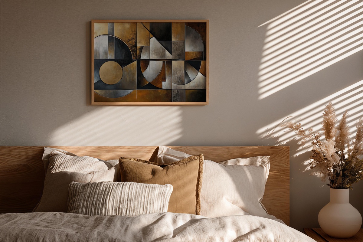
Something between a technical drawing and a ceremonial object — that's the register this piece occupies. The metallic tones are rendered in print as a spectrum from champagne to deep pewter, and the symmetry gives it a stillness that feels less decorative and more declarative. It belongs in a space with at least one other hard or reflective surface — brushed metal hardware, a lacquered tray, a brass-framed mirror — so the metallic language has somewhere to land. Not every room is ready for this level of formality, and that's the point: the rooms that are will feel immediately more complete with it on the wall.
Each of these prints is available as an instant download — on your wall the same afternoon you find it, no waiting for a delivery window. The collection lives at Gallery Flair whenever you're ready to pull the trigger on that one wall you've been leaving blank.
Worth noting as you build your set: the 30%-off-three and 50%-off-five thresholds at Gallery Flair apply to any combination across the full range — a Frame TV art file, a printable wall print, and a phone wallpaper all count together. Mixing formats to build one continuous visual world across your home is the most natural way to reach that threshold without overthinking it.