9 Minimalist Frame TV Art Picks: A Buyer's Guide to Composition, Palette, and Mood
Late afternoon, lamps dimmed to their lowest setting, the room settling into itself — this is when your Frame TV matters most. Not as a screen, but as a considered object on the wall. The art you choose for that rectangle of light shapes the entire atmosphere of the room, quietly, every evening. Here is how to choose well.
What Makes Minimalist Frame TV Art Work in a Room?
Three things carry the weight in minimalist digital art: the palette (warm neutrals or cool whites?), the subject's visual weight (does it anchor the room or float?), and the negative space — how much of the canvas breathes around the motif. A piece with generous negative space reads as calm from across a room. Heavy subject matter on a pale ground creates a focal point without demanding attention. And mood, ultimately, is what you live with — so choose the feeling first, then the form.
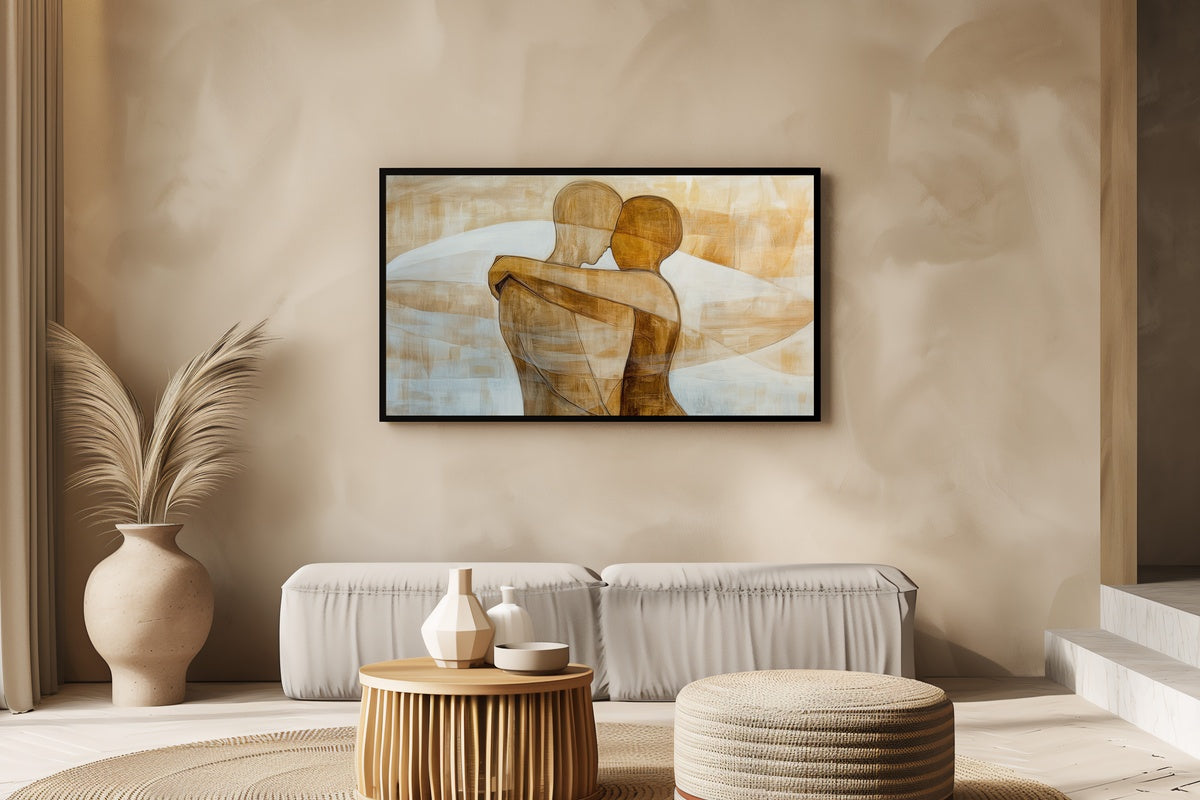
1. Minimalist Human Harmony - Frame TV Art
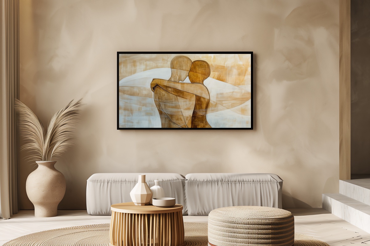
Two abstract figures drawn into each other — rendered as the quietest possible gesture of connection. The linework is spare enough that the eye reads it first as shape, then as feeling. Against a pale ground, the forms hold a warmth that suits a living room used for actual living: dinner conversations, a couch pulled close, an evening when someone falls asleep before the credits roll. If your walls already carry texture, this gives the Frame TV art enough softness to belong there.
2. Minimalist Dot Composition - Frame TV Art
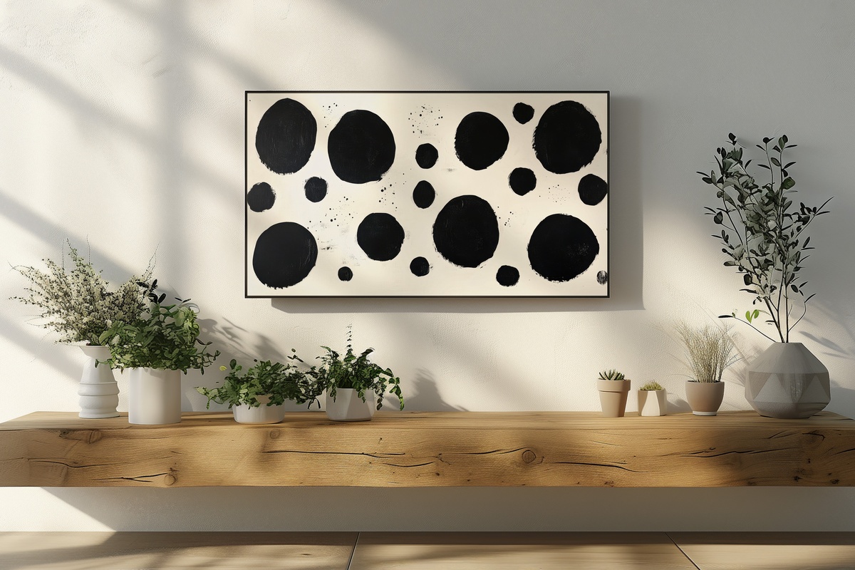
Black dots on white — it sounds almost too simple, but the arrangement is where all the interest lives. The spacing between dots creates an internal rhythm; your eye moves across the canvas in a way that feels almost musical. It belongs to the same visual family as mid-century graphic art, yet nothing about it dates. Collectors of Scandinavian furniture, raw-plaster walls, and monochrome textiles will find this one immediately legible. And it reads sharply from across a larger room, which matters more than most buyers realize when choosing Frame TV art.
3. Minimal Butterfly Wing Whimsy - Frame TV Art
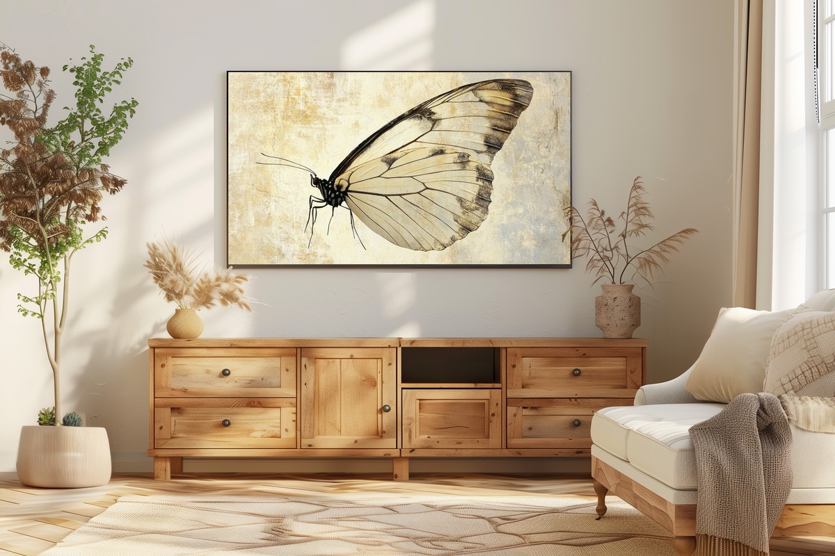
A single wing, rendered with the precision of a botanical illustration but stripped of all botanical fuss. The subject floats against open ground, and the fine linework catches at different light levels — dimmed TV ambient light pulls out the delicacy, brighter settings reveal the tonal layering in the wing's structure. This navigates a narrow corridor that a lot of nature-inspired minimalism misses — it never slips into prettiness. Natural linen, aged brass fixtures, a bedroom with gauze curtains: that is where this piece finds its room.
4. Minimal Lip Contour Expression - Frame TV Art
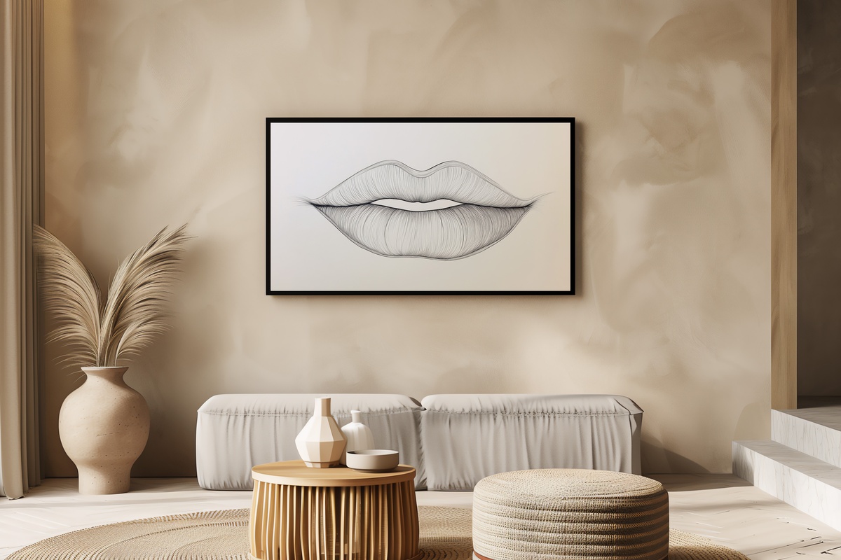
There is a version of body-part art that tips into cliché — you have seen it in every fast-furniture showroom, oversaturated and overworked. This one keeps its distance from all of that. The lip contour is drawn as a single, unbroken line that relies entirely on its own curve for expression. No fill, no shadow, no drama. It suits a space that is already curated — a dressing room, a gallery-walled hallway, a bedroom where everything else is already edited to within an inch of its life. Someone with a sharp eye will recognize what makes this different.
5. Endless Road Horizon Dream - Frame TV Art
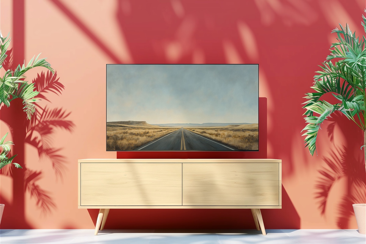
An empty road pulling toward the vanishing point, sky taking up more canvas than earth. What registers first is the silence in it — the absolute absence of anything that would complicate the horizon. If you gravitate toward landscapes but want none of the pastoral warmth that the genre tends to carry, this is where the edit starts. The palette runs cool and wide: pale asphalt, flat sky, a horizon that barely interrupts the grey. It works especially well in rooms with exposed concrete, matte white paint, or any space that already has a considered relationship with emptiness.
6. Cityscape Geometry Reflection - Frame TV Art
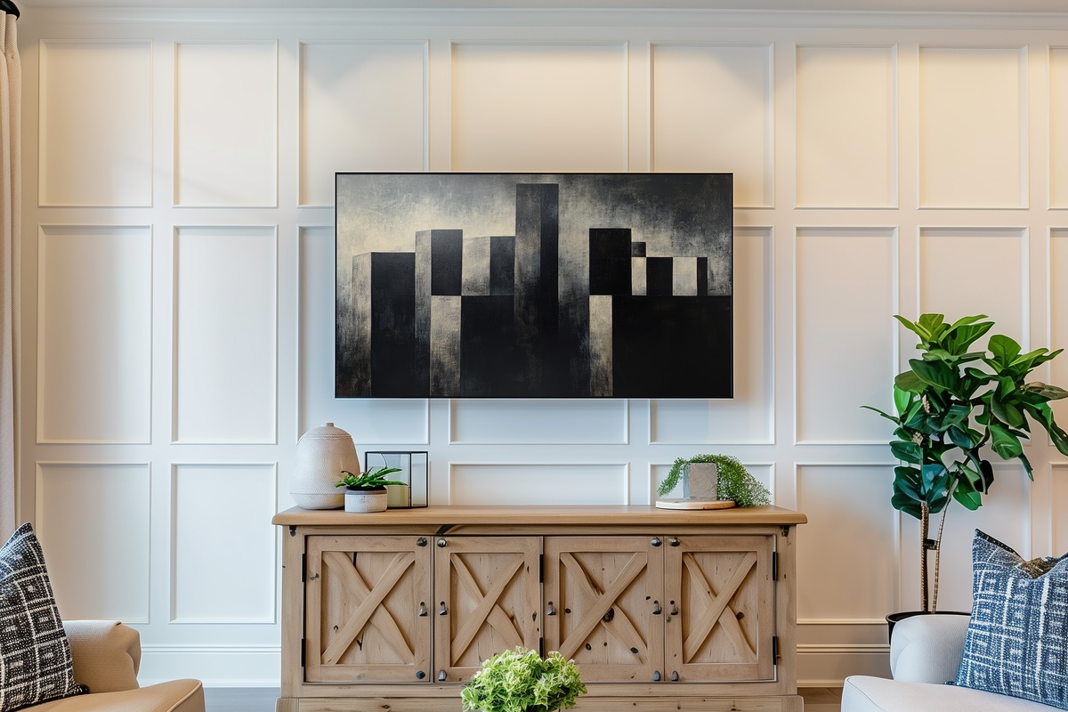
Architecture rendered as pure geometry — blocks, lines, and the reflected doubles that water or glass throws back. The reflection element is what lifts this out of straight illustration territory; it introduces a second reading, a symmetry that turns a recognizable skyline into something more abstract on second look. Anyone who keeps their home in a tonal range of charcoal, bone, and slate will find this slots in without negotiation. A natural pairing, too, with Frame TV screens set in darker-framed televisions where the art and the hardware share a palette.
7. Raindrop Dots of Serenity - Frame TV Art
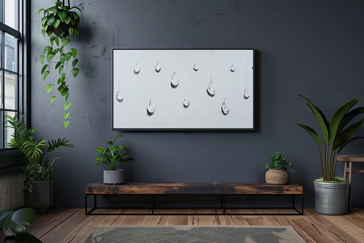
Each raindrop sits on the canvas as though it arrived there by chance, and the arrangement never tries to explain itself. That restraint is the point. Where the dot composition (Item 2) works through pattern and rhythm, this one works through irregularity — the uneven scatter that feels closer to observation than design. It suits a room where someone has deliberately chosen not to fill every surface, where the objects that remain are the ones that earned their place. Rooms that lean quiet, unhurried, and slightly Japanese in their sense of interval will know exactly what to do with this.
8. Chic Glass Minimalism - Frame TV Art
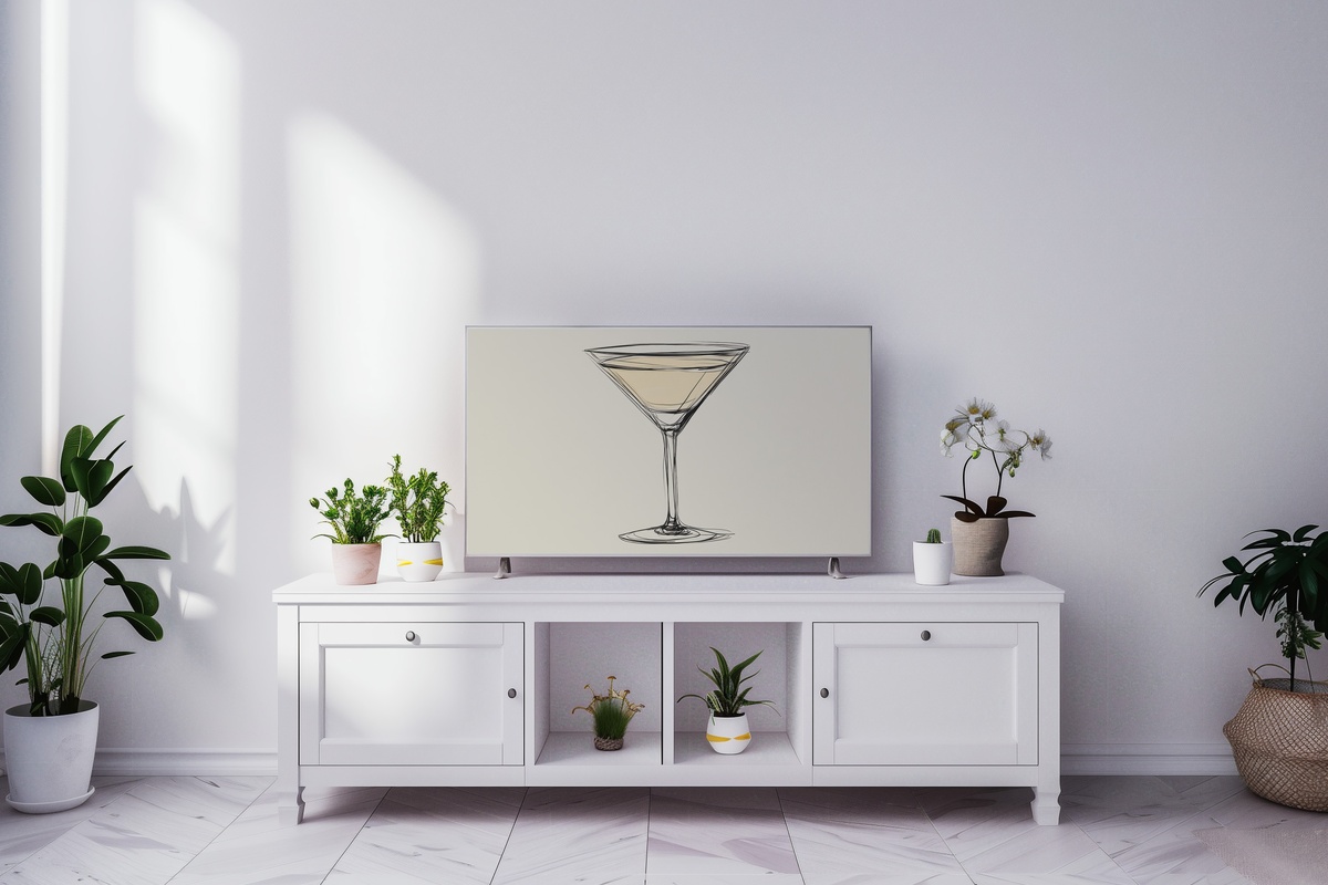
A martini glass in outline only — stem, bowl, the barely-there line of the rim. It reads as an icon, almost, a piece of graphic shorthand that carries an entire register of ease and occasion without spelling any of it out. This one is honest about what it is: a piece for a room that entertains, or aspires to. A bar cart nearby, a dining room that doubles as a social space, an open-plan kitchen with dark cabinetry. If your evenings involve candles lit before the guests arrive, this piece is already fluent in your language.
9. Apple Outline Simplicity - Frame TV Art
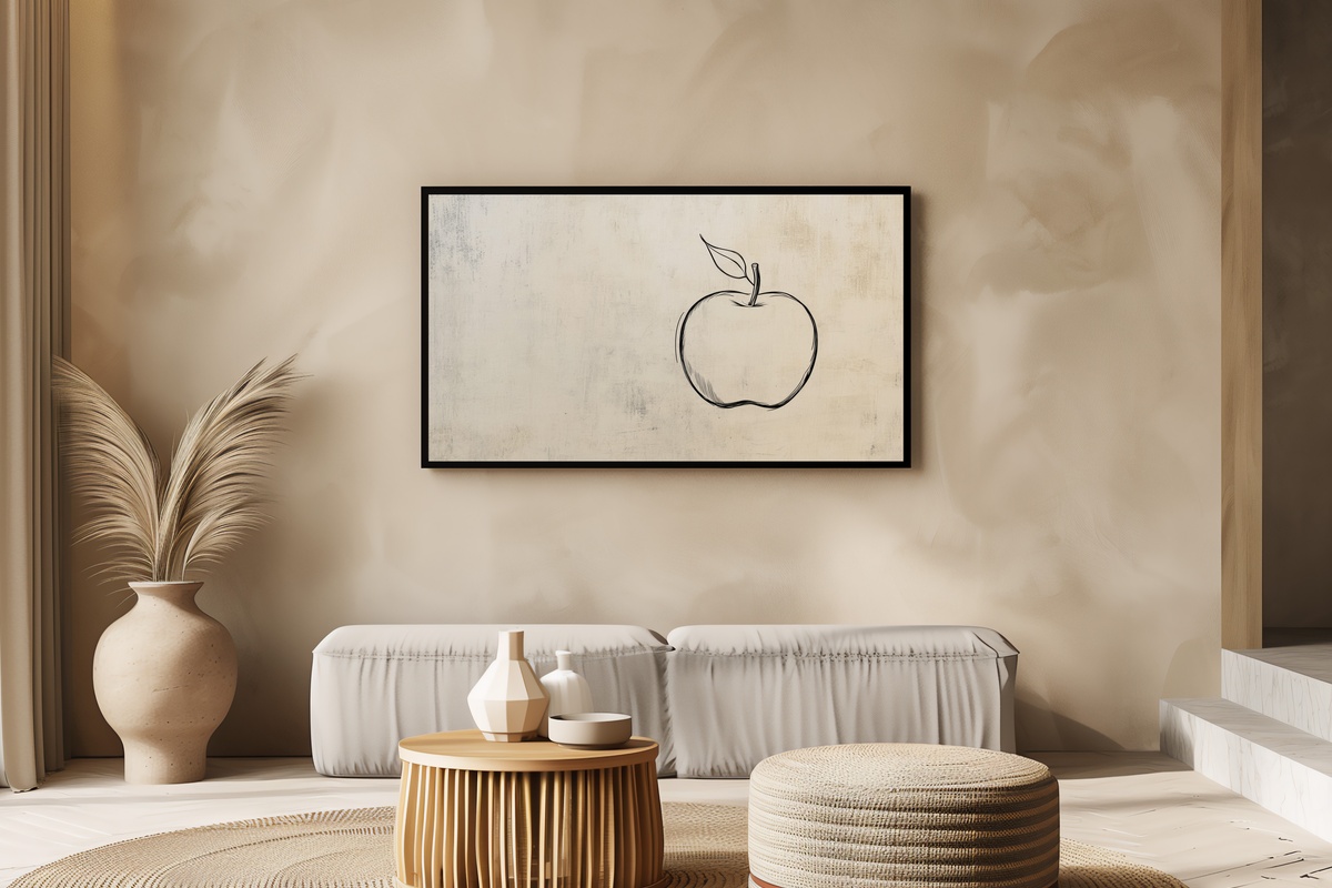
An apple rendered as a single unbroken contour — no fill, no shadow, no context beyond the shape itself. What keeps this from reading as decoration is the decision to let the outline do all the work: the slight irregularity of a hand-drawn curve, the stem as a lone vertical accent. It belongs in a kitchen, a studio, or anywhere the room's logic runs toward objects chosen for what they mean, not just what they match. If your space skews warm-neutral — cream plaster, wood grain, terracotta anywhere in the palette — the rounded form of this piece settles in without friction.
Each of these pieces is an instant download — available to your Samsung Frame TV the moment you complete the purchase, no waiting, no subscription required, and yours to keep and re-use across any display settings you choose. The collection is open whenever you are ready to commit to a mood.
A note worth keeping in mind: the 30% and 50% thresholds — three pieces and five pieces respectively — apply across every Gallery Flair product line, not just Frame TV art. Mix in a printable wall print or a desktop wallpaper in the same palette and the numbers still work in your favor. Three pieces from anywhere in the shop, any combination, any format.