Aesthetic iPad Wallpaper: 22 Mood-Led Picks for the Considered Screen
iPad wallpaper aesthetic — the phrase sounds small until you realize how much of your day that rectangle of glass actually holds. It sits on your desk during a slow morning coffee, it glows on your nightstand, it travels with you in every tote bag and carry-on. The screen you wake it to matters more than most decorating decisions you'll make this week. This hub is our most considered collection yet: 22 wallpapers organized by mood, palette, and emotional register — because a flat download file can absolutely carry weight when the image behind it was built with intention.
The Soft Pastel and Seasonal Bloom Cluster
Soft pastel iPad wallpapers occupy a very specific emotional register — one that leans into gentleness without tipping into saccharine. The picks in this section share a commitment to blush, butter, and petal-soft hue families that keep the eye rested rather than stimulated. They work best on screens that get daylight hours: a kitchen counter, a study desk near a window, a coffee table that doubles as a slow-morning ritual space. If you want to go deeper into the seasonal end of this palette territory, our 10 Easter iPad wallpapers for a curated, pastel-soft screen takes the same soft-hue logic all the way through spring motifs.
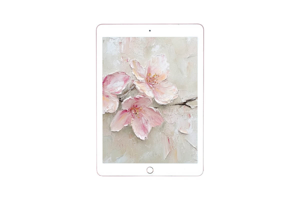
1. Pastel Blossom Harmony - iPad Wallpaper

A watercolor study in blush and pale green that reads like a branch caught just before full bloom — the kind of softness that makes your lock screen feel like a breath rather than a notification. The palette stays in the warm-white to dusty-rose range, so it recedes gracefully behind app icons without competing. Morning light on a pale desk amplifies it considerably.
2. Daisy-Wreathed Bunny Charm - iPad Wallpaper
This one is unabashedly soft-life: a daisy-crowned bunny rendered in cream and the palest sage, with a composition that centers the motif rather than scattering it. The result is charm without clutter. It layers beautifully as a home-screen background when you pair it with a minimal icon layout. Seasonal in spirit, but the palette is restrained enough to carry beyond its obvious occasion window.
The full Easter iPad wallpaper edit pairs this one against nine other pastel variations so you can choose the palette weight that suits your screen setup.
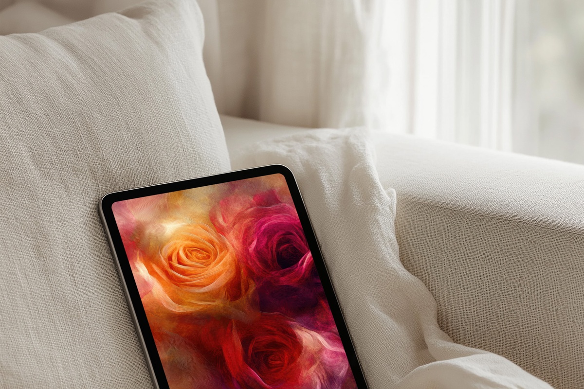
3. Expressive Rose Brushwork - iPad Wallpaper

Rich magenta brushwork on a pale ground — this sits at the more saturated end of the floral spectrum, but the loose, gestural mark-making keeps it from feeling heavy. The roses are implied rather than illustrated, which is exactly the quality that separates a wallpaper that feels curated from one that feels clipart. For a bedside iPad, this one rewards close viewing.
The Earthy Natural and Boho Cluster
The earthy natural cluster pulls together every iPad wallpaper that grounds itself in ochre, terracotta, sand, and sage — the palette language of a well-traveled shelf. These are the wallpapers for the reader who has a jute rug, a few trailing plants, and a general preference for the texture of things. If you find yourself drawn to this mood, the 7 boho iPad wallpapers guide goes deeper into the composition and palette logic behind this cluster, including how to choose between intricate mandala-led designs and more abstracted earthy fields.
4. Bronze Bohemian Elegance - iPad Wallpaper
Warm ochre and burnished bronze work in a layered composition that reads like afternoon light through a woven screen. The tonal range stays narrow — mostly amber to deep gold — so the depth comes from texture rather than contrast. This one holds its own as a home-screen background without pulling attention away from your actual workflow. It suits both creative studio setups and living-room reading tablets equally.
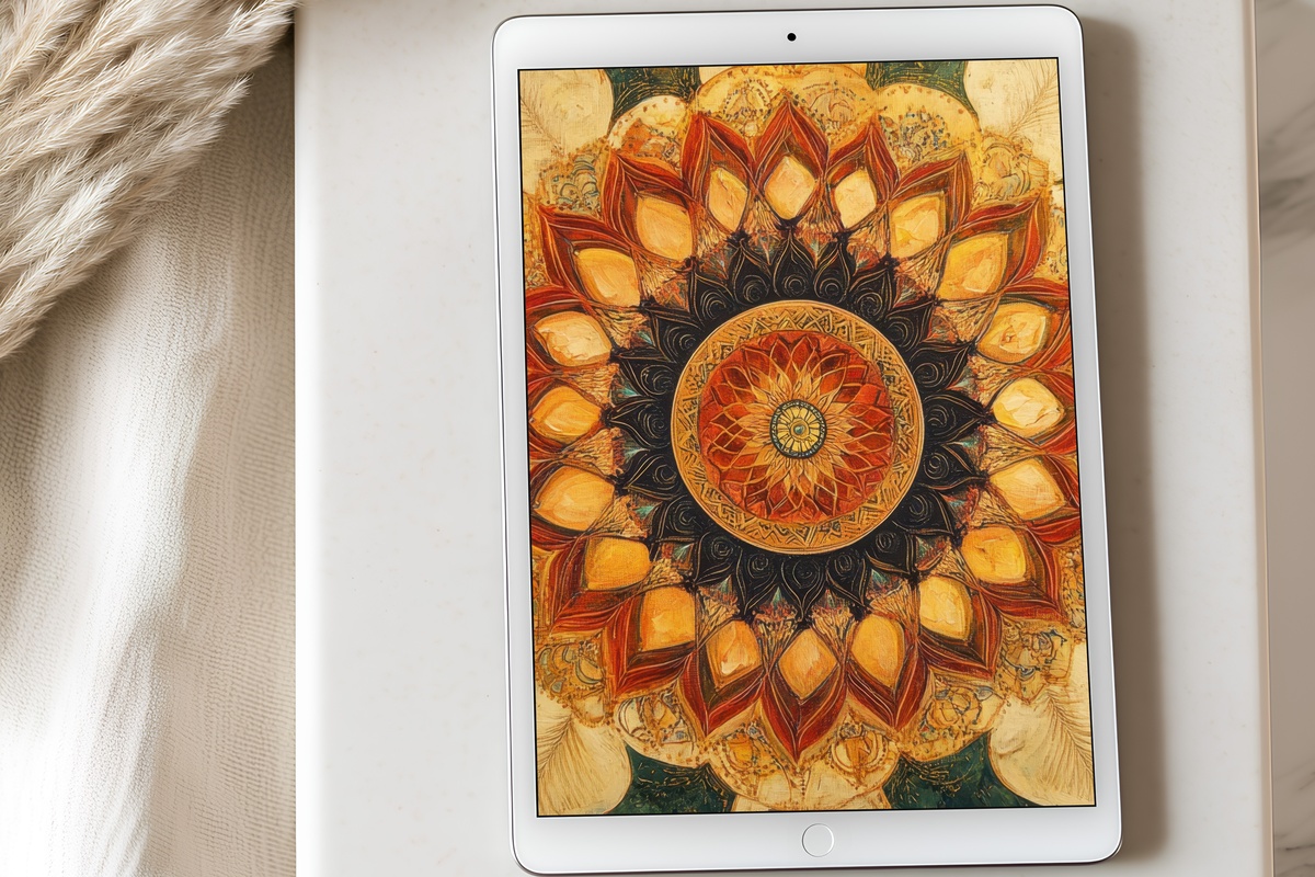
5. Earthy Mandala Tranquility - iPad Wallpaper
Mandala geometry in dusty terracotta and linen — the pattern is intricate at full zoom but reads as warm texture at normal screen distance, which is the balance that makes geometric wallpapers actually liveable. The radial symmetry creates a natural visual center, so this works as both a lock-screen statement and a home-screen ground. The earthy palette connects it immediately to the natural materials crowd.
6. Vintage Milk Bottle Charm - iPad Wallpaper
Cream, off-white, and the faintest warm grey — a farmhouse-inflected still life rendered with enough painterly looseness to avoid the greeting-card trap. The milk bottle motif is quiet and grounding, the kind of image that makes a device feel like it belongs on a countertop next to a ceramic mug rather than a tech desk. Extremely useful as a kitchen-counter iPad wallpaper for the hygge-inclined.
7. Earthy Landscape Symphony - iPad Wallpaper
Horizontal landscape bands in muted umber, sage, and pale sky — the composition is quiet enough to feel like a real view rather than a digital invention. The sense of distance is real: the horizon sits in the lower third, giving the sky room to breathe across a portrait-oriented screen. For those who want the landscape aesthetic in their device without heavy saturation, our 8 landscape iPad wallpapers that build a whole mood takes this palette further.
8. Vintage Fall Forest Harmony - iPad Wallpaper

Muted amber, tobacco, and deep forest green in a vintage-tinted forest scene that feels like a faded Kodachrome photograph — the kind of image that makes October feel like a whole personality. The muted treatment keeps it from feeling loud against a dark mode interface. Those who want more autumn variations alongside this one will find them in the 9 fall iPad wallpapers for a curated, cozy living room edit.
The Moody Romantic and Seasonal Drama Cluster
Some iPad wallpapers are not meant to recede. This section gathers the pieces that lean into atmosphere — the ones with deep reds, candlelit warmth, bold linework, and the kind of pictorial confidence that makes a screen feel genuinely different from every other device in the room. These suit evening use, dark-mode interfaces, and readers who find minimalism a little too polite. For the full Halloween-to-autumn atmospheric arc, the 9 Halloween iPad wallpapers guide builds an entire seasonal aesthetic story around this mood, while 9 Christmas iPad wallpapers takes the candlelit warmth register through the winter holiday season.
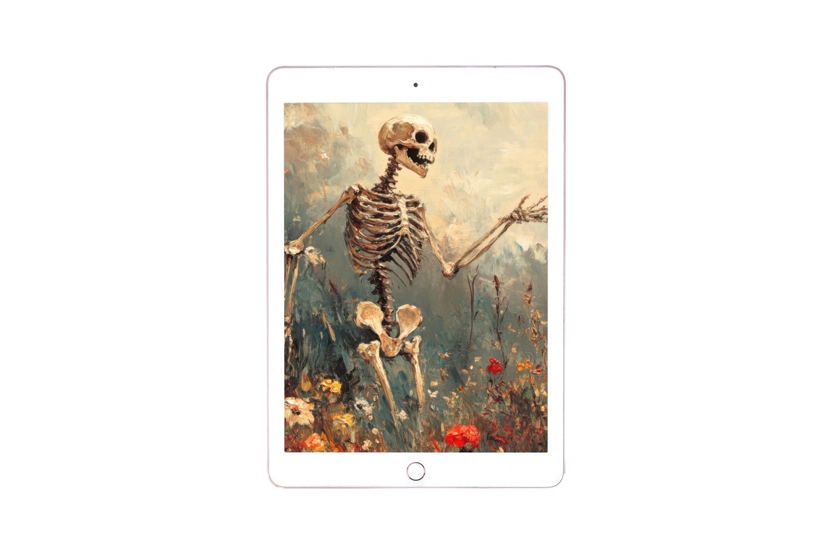
9. Autumn Skeleton Bloom Dance - iPad Wallpaper
Deep crimson and botanical illustration combine in a composition that manages to be both dramatic and elegant. The skeleton-among-blooms motif reads as art-historical rather than costume-party, which extends its useful season considerably past late October. Against a dark-mode interface, the rich reds glow in a way that feels almost backlit. Suited to evening tablet reading in a low-lit room.
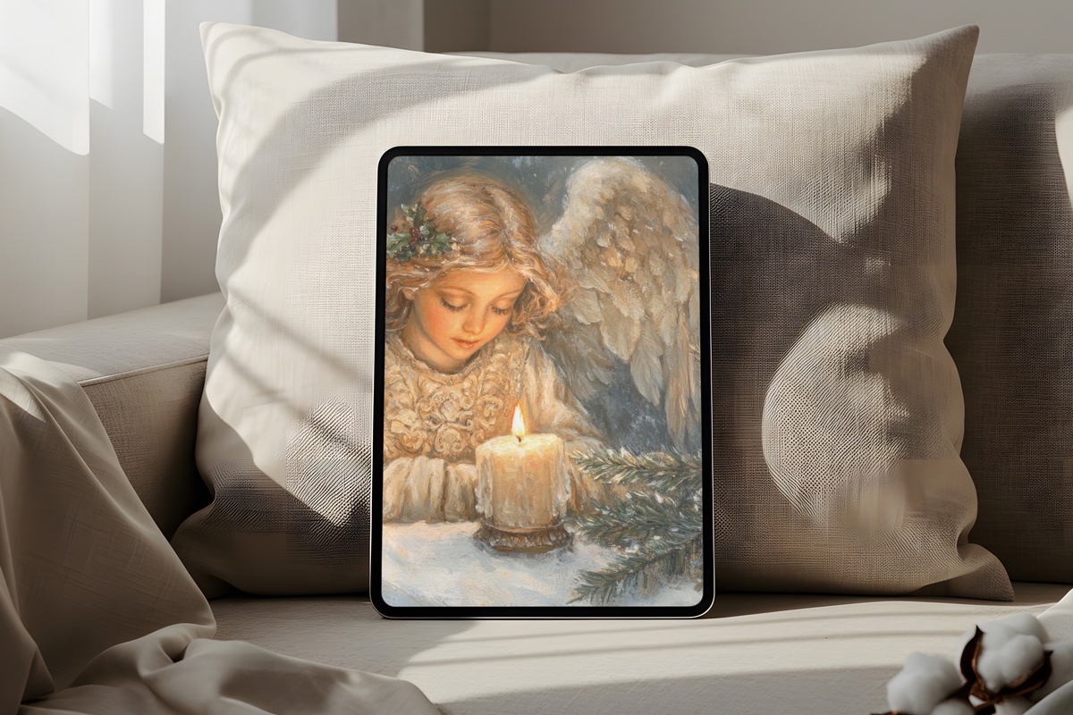
10. Candlelit Angel in Serenity - iPad Wallpaper

Warm beige, candleglow gold, and the softest halo of cream — this is Christmas-adjacent but the mood is closer to a Renaissance devotional painting than a festive decoration. The figure is rendered with a stillness that makes it genuinely calming to return to across a long winter day. The palette reads warm-neutral on most calibrated screens, which means it transitions gracefully into any screen brightness setting.
11. Vintage Sledding Joy - iPad Wallpaper

Soft earth tones and a vintage print treatment give this winter scene the feeling of an inherited postcard — warm rather than crisp, memory-tinted rather than photographically sharp. The sledding figures are small against a wide, pale landscape, which gives the composition a spaciousness that works well on both the Pro's larger canvas and the standard iPad's more compact screen. The full Christmas iPad wallpaper guide places this one against eight other seasonal moods if you want the complete holiday palette story.
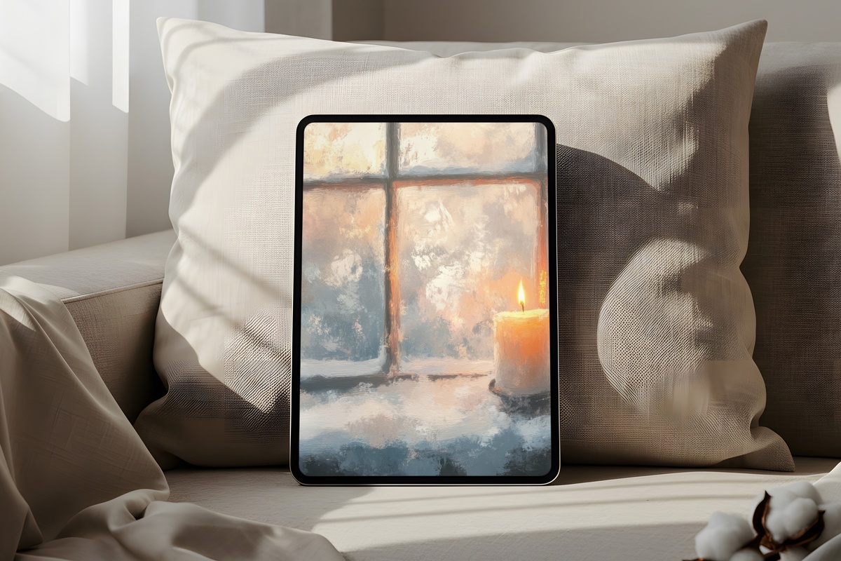
12. Warm Candle in Snowfall - iPad Wallpaper

A single candle flame against a soft fall of snow — the composition is deliberately simple, which gives the warmth of the amber glow room to do all the emotional work. This is an evening-use wallpaper in the truest sense: it changes character as room light drops, becoming more luminous against a darkened environment. The 8 winter iPad wallpapers guide covers the composition and palette logic for the full cold-season aesthetic if you want to build a cohesive set for December through February.
The Quiet Luxury and Minimalist Neutral Cluster
The quiet-luxury wavelength in iPad wallpaper translates to restraint as the primary gesture — pared-back palettes, considered negative space, and mark-making that suggests rather than declares. The pieces in this cluster share a confidence that doesn't need to announce itself. They suit clean-girl setups, neutral-first interior aesthetics, and any workspace where the screen should feel like a considered design object rather than a content device. For a dedicated editorial journey through this territory, the 9 neutral iPad wallpapers that decode the quiet aesthetic lays out the palette logic in full — and our neutral iPad wallpapers seasonal refresh shows how to rotate the palette across the year without losing tonal consistency.
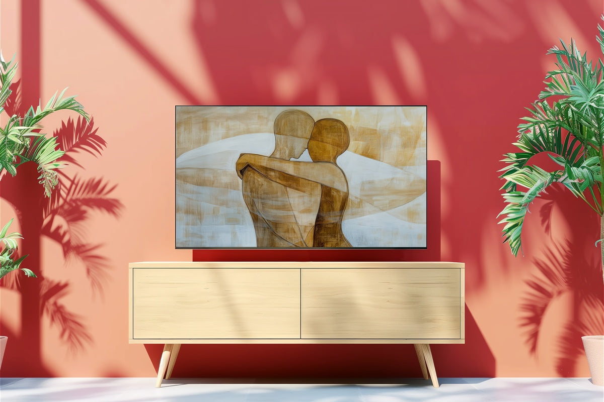
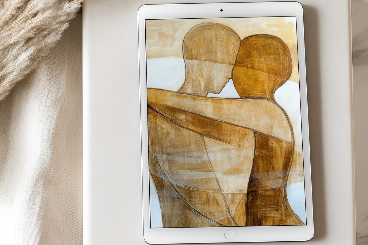
13. Minimalist Human Harmony - iPad Wallpaper
Pared-back figure study in warm sand and pale terracotta line — the kind of minimalist mark that references the Matisse-adjacent drawing tradition without quoting it directly. The composition uses the full vertical canvas with enough empty ground to keep the eye resting rather than searching. Against a white or off-white interface, it is almost indistinguishable from a curated gallery wall. Among the most versatile pieces in this entire collection.
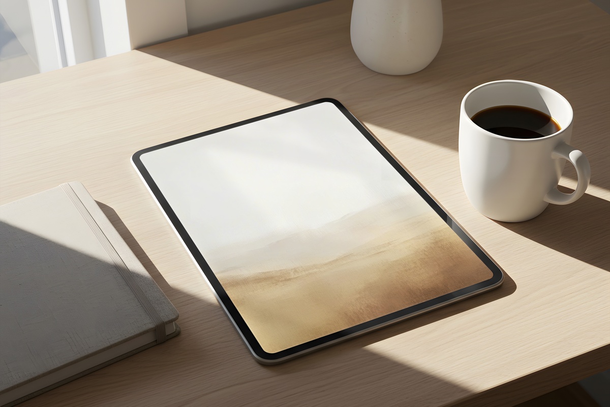
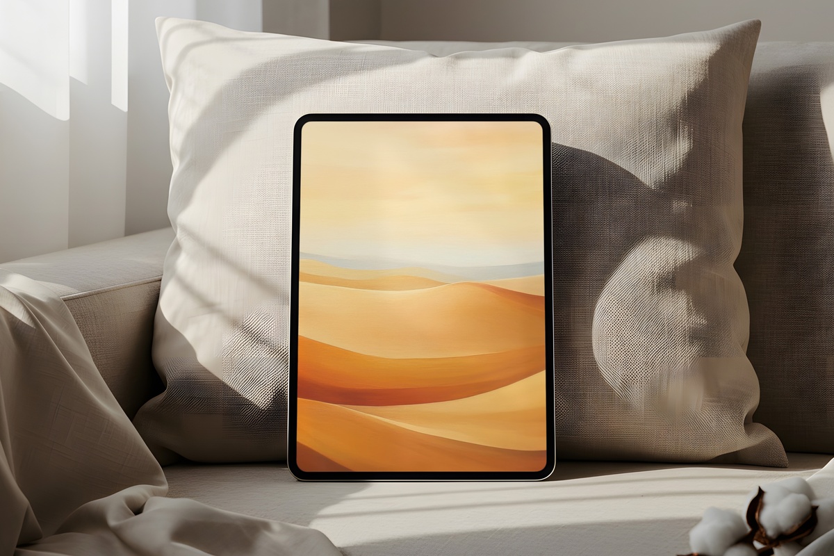
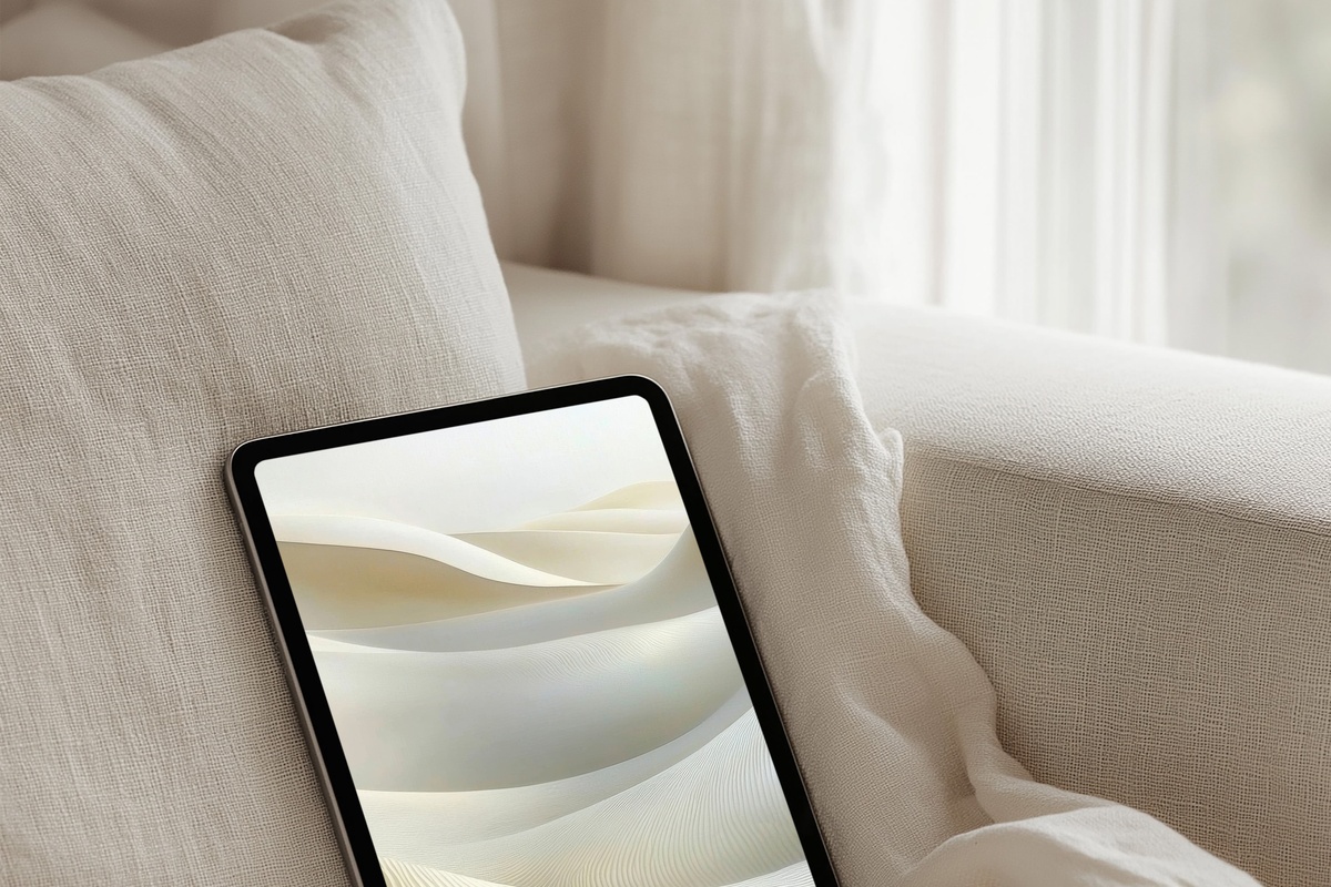
14. Dunes Whispering Tranquility - iPad Wallpaper
Sand-dune topography reduced to its essential light-and-shadow language — the palette runs from pale ivory through warm taupe to a deepened sand-brown at the base. The tonal shift is gradual enough that the image reads as near-abstract at a glance but resolves into landscape at closer attention. Exceptional as a lock-screen wallpaper for a morning desk ritual. Pairs with almost any case color.
15. Desert Calm in Modern Brushstrokes - iPad Wallpaper
Modern brushwork in a desert palette: warm sand, dry rose, and pale sky built up in loose, horizontal movements that stop short of anything that could be called landscape or abstract with full certainty. That productive ambiguity is what makes it travel so well across screen orientations. The brushstroke texture is visible at full-screen size in a way that adds tactile interest without noise.
16. Dusky Horizon Tranquility - iPad Wallpaper
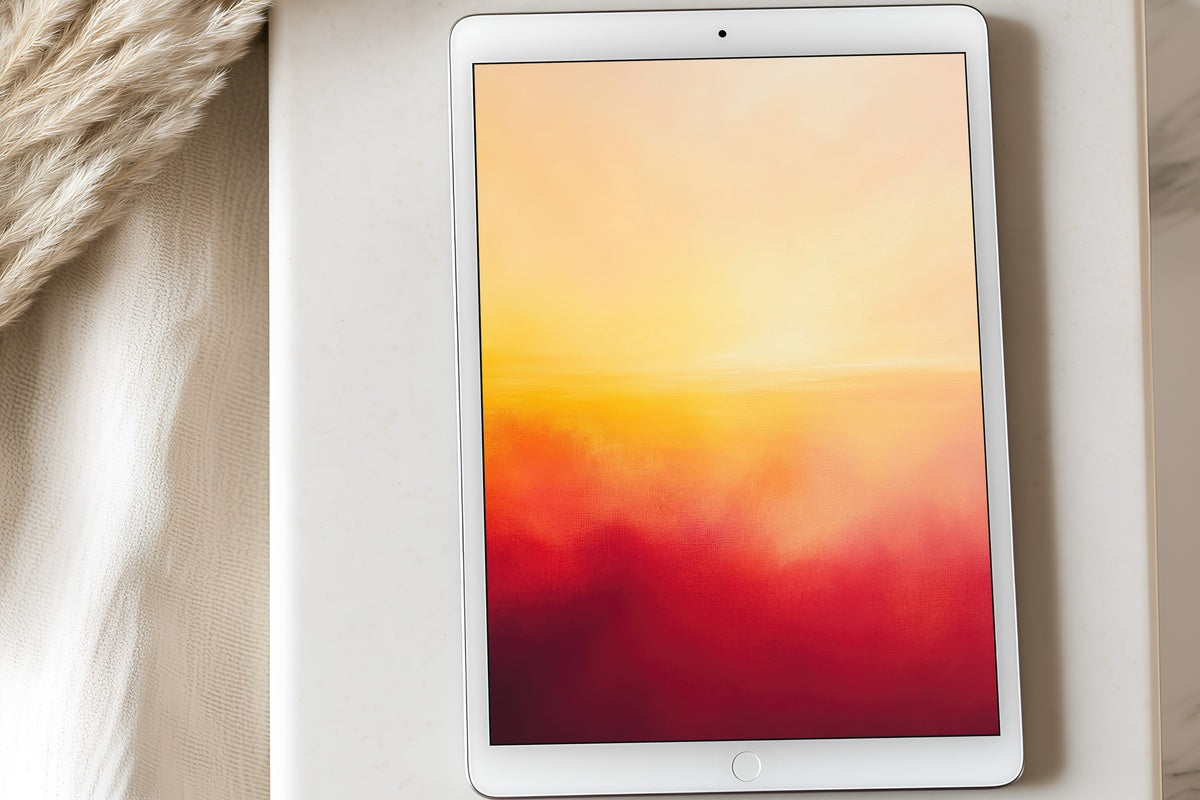
A horizon line dissolved into soft field washes — lilac, dusty mauve, and warm grey — that feel calibrated for the hour when natural light starts to lose its confidence. The abstract treatment is disciplined: nothing overreaches. At iPad screen size, the gradient transitions reward you with micro-variations in tone that a smaller phone screen would compress away entirely.
The Considered Modern and Abstract Cluster
Abstract and modern iPad wallpapers divide into two camps: those that use abstraction as visual white noise, and those where the abstraction itself is the point. Everything in this section belongs to the second camp. The mark-making is specific, the palette choices are non-arbitrary, and the compositional decisions hold up to the kind of repeated daily viewing that a wallpaper actually receives. If you are choosing between a graphic minimal approach and a more painterly one, the 10 black and white iPad wallpapers for the slow, still hour covers the full tonal-restraint end of this territory in dedicated depth.
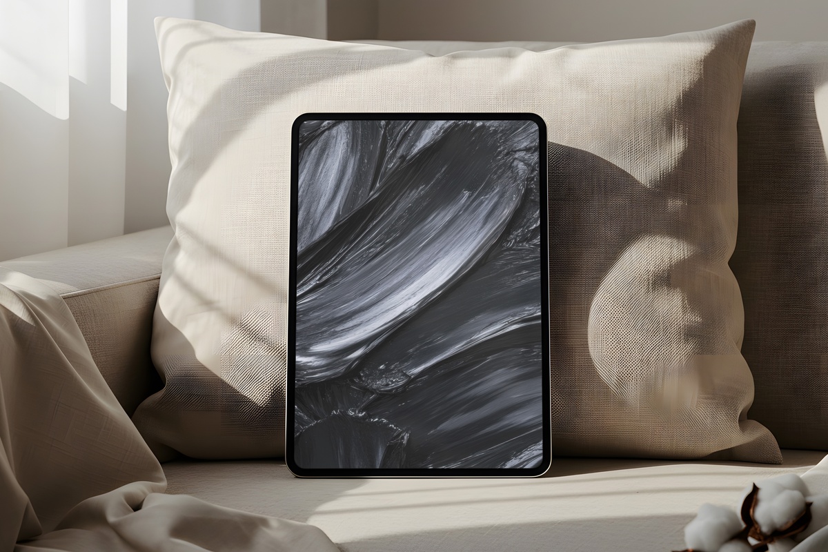
17. Charcoal Flow Dynamics - iPad Wallpaper
Charcoal ink flows across a pale ground in a composition that reads differently at every distance — gestural from across a room, intricate up close. The tonal range is narrow (near-white to deep graphite) but the internal variation within that range is substantial. For a dark-mode workflow or a creative studio iPad, this is the kind of background that feels like you made a deliberate visual choice rather than accepted a system default.
18. Energetic Brushstroke Ballet - iPad Wallpaper
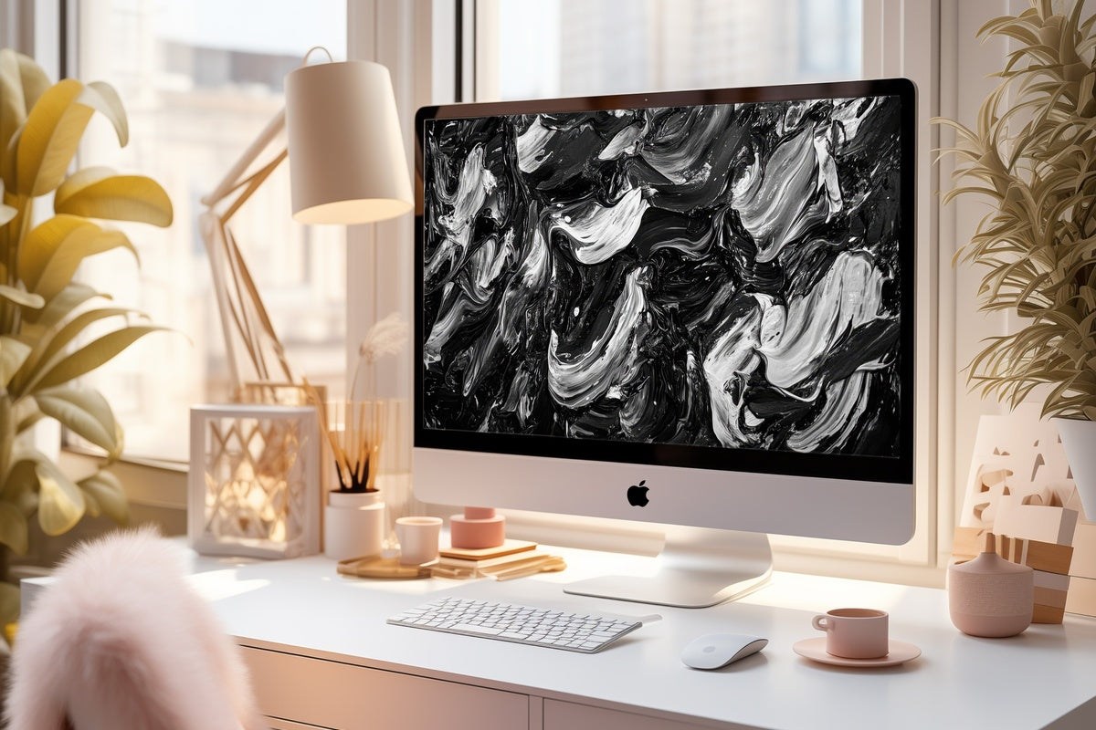
High-energy calligraphic marks in pure black on white — the title earns itself here, because the brushwork has genuine kinetic presence. It is the most visually active piece in this collection, and deliberately so. If your aesthetic tends toward the editorial end of the spectrum — more Apartamento than Pinterest board — this one rewards the confidence it takes to live with movement on your home screen.
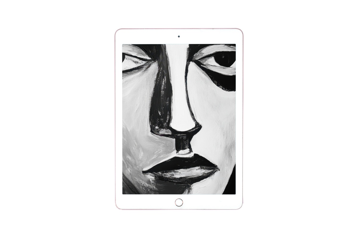
19. Black and White Face in Bold Lines - iPad Wallpaper
A portrait in continuous bold linework — graphic, composed, and carrying the particular authority that comes from a single unbroken mark rendered with complete confidence. The face is rendered in strong black lines on a flat white field, making it maximally compatible with both light and dark interface modes. The full black and white iPad wallpaper collection has nine more pieces in this tonal register for those who want to curate a full rotation.
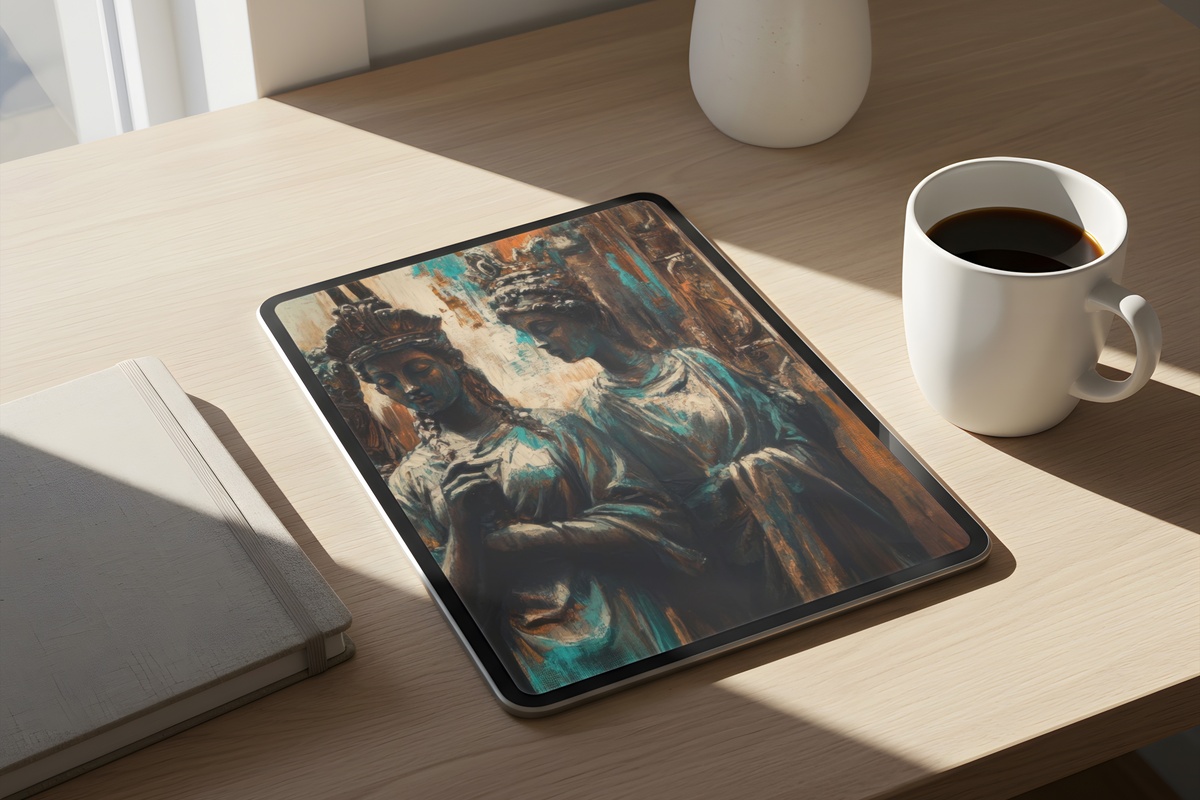
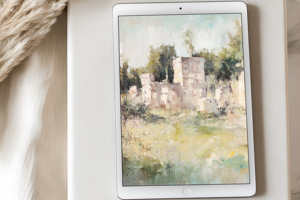
20. Timeless Echoes Among Ruins - iPad Wallpaper

Soft ochre and dusty stone — a vintage-treated architectural study that feels as though it was pulled from a travel journal rather than generated as a digital asset. The ruin motif gives the image a melancholic depth that sits well against a neutral workspace. The tonal palette is muted enough to be genuinely low-distraction as a home-screen background while still carrying visual richness at lock-screen scale.
The Coastal Calm and Summer Watercolor Cluster
The coastal aesthetic in iPad wallpaper is not about beach photography. It is about the particular palette that proximity to water produces in a room — pale blues, sea-foam whites, washed teal, the grey-green of driftwood. The pieces gathered here carry that register without relying on literal shoreline imagery. They suit summer but stay year-round in a way that a photographic ocean shot rarely does. For summer-specific palette exploration, the 7 summer iPad wallpapers to refresh your screen pairs several of these moods side by side. For landscape-led coastal interpretations, the 10 landscape iPad wallpapers for a mood-forward screen covers the horizon-to-sea compositional range in detail.
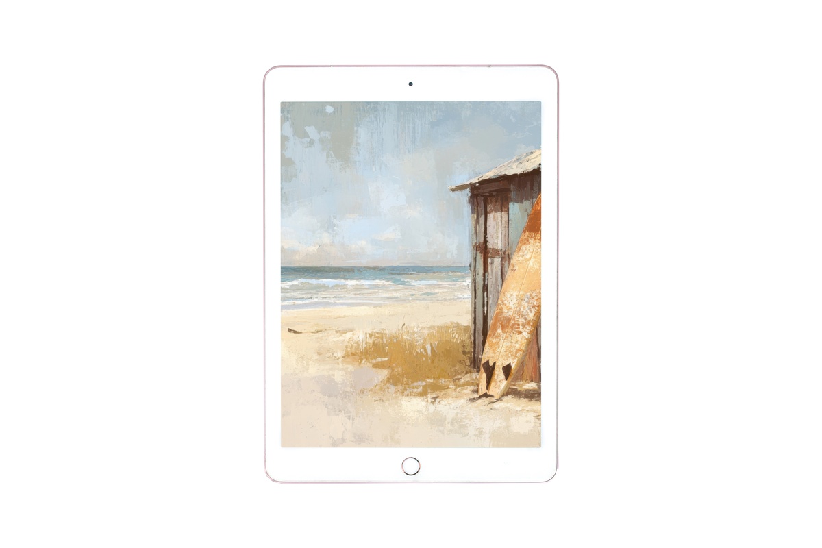
21. Surf Hut Harmony - iPad Wallpaper
Pale cornflower blue, washed-out teal, and the sandy warm-white of a sun-bleached wall — this coastal scene has the casual, unhurried quality of a place you return to rather than visit. The composition is loose and painterly, which keeps it firmly in the curated-art territory rather than the stock-photo register. On a Pro screen at full resolution, the blue gradients have a depth that photographed coastal scenes rarely achieve digitally.
22. Abstract Oceanic Dreamscape - iPad Wallpaper
Watercolor washes in deep teal, aquamarine, and pale celadon that dissolve into one another the way ocean light does at the surface — constantly shifting, never fully resolved. The summer watercolor treatment is looser and more saturated than the neutral cluster, making it the right choice when you want your screen to feel luminous rather than simply calm. The depth of the blue-green range means it looks intentional even alongside brightly colored app icons.
Twenty-two wallpapers, six moods, one consistent principle: the image behind your screen deserves the same consideration you give to anything else you choose to look at every day. The palette discipline that runs through this collection — the refusal of noise for noise's sake, the preference for images that hold up to repeated viewing — is the same logic that drives how we approach every product line at Gallery Flair. Your device is not a billboard. It is a small, personal rectangle of considered space.
Every piece in this collection is available as an instant digital download, formatted specifically for iPad and Android tablets at full resolution. Any three pieces across the Gallery Flair line bring the bundle to 30% off; any five bring it to 50%. The collection is built to layer — a soft pastel blossom for the lock screen, a charcoal flow for the home screen, and a dunes neutral for a second device will feel like a coherent suite rather than three separate downloads.
Choose the one that matches the light in your space right now, and go from there.