


8 Winter iPhone Wallpapers: How to Choose by Composition, Palette, and Mood
There's a small ritual in pulling your phone from your pocket mid-morning, glancing down, and feeling something — a hush, a shift, a quiet exhale. The right winter iPhone wallpaper does exactly that. Not decorative filler, but a mood you carry with you through the day.
What Actually Makes a Winter Wallpaper Work on Your Screen
Before choosing by title or thumbnail, look at three things: palette temperature, compositional weight, and negative space. A cool-blue scene with a tight horizon line will feel anchored and still — grounding for a busy home screen. A pale beige or gray-white image with open sky reads as airy and expansive — better if your lock screen already holds a lot. Silhouette-led pieces tend to layer well behind app icons. And always: the image should feel like a room you'd want to stand inside, not just a photograph you'd scroll past.
1. Tranquil Haven in Snowy Woods - iPhone Wallpaper
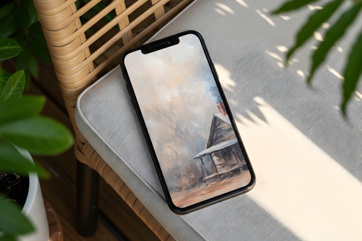
Soft powder-blue tones stretch across a hushed woodland scene — bare branches dusted in white, the whole image leaning into that muffled, after-snowfall silence. The palette sits closer to a watercolor study than a photograph, which means it layers gently beneath app icons without competing. If your mornings start slow and you prefer your phone to feel like a quiet pause rather than a notification board, this one fits that rhythm naturally.
2. Midnight's Icy Embrace Unveiled - iPhone Wallpaper
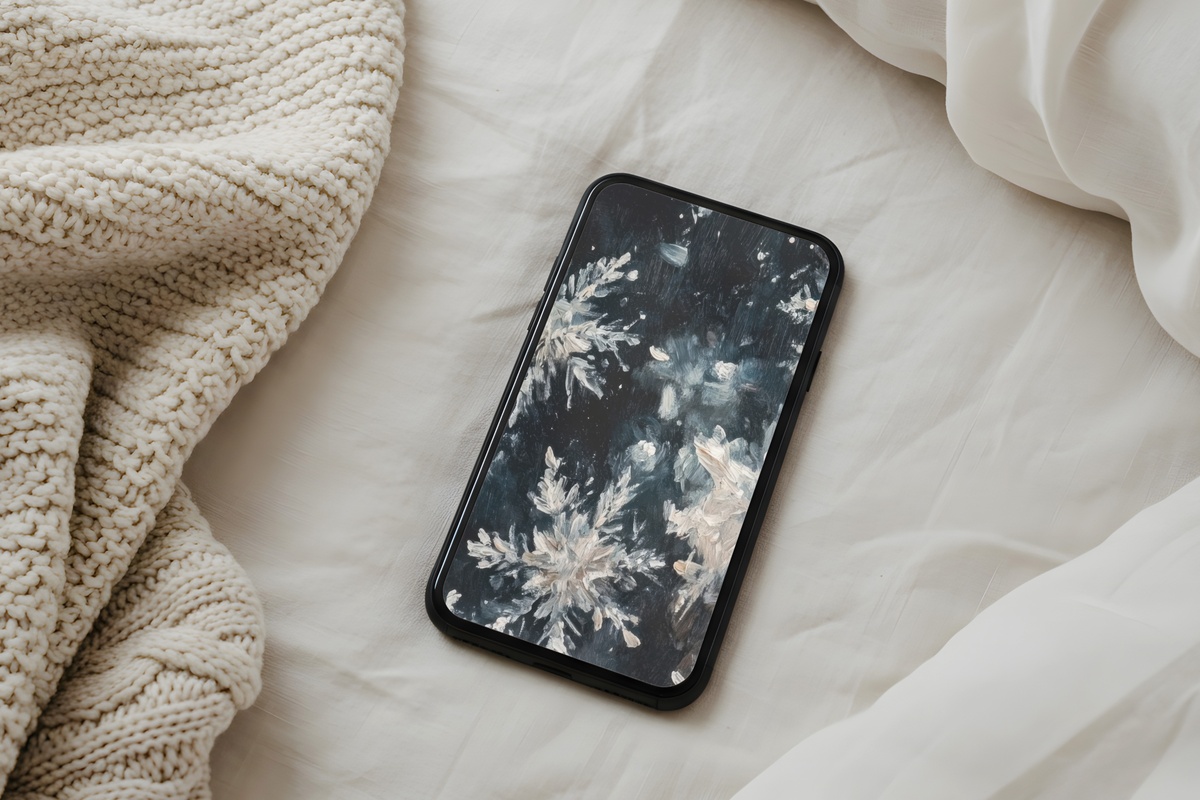
This one pulls you into deep navy and slate — the kind of palette that belongs to a frozen night sky, long after the last light has gone. There's a drama here that the other blues in this edit don't carry. High contrast, directional, a strong focal pull from dark to lighter center. Anyone who keeps her phone in dark mode and wants her lock screen to match that same after-midnight energy will recognize this immediately as hers.
3. Frozen Lake's Tranquil Tale - iPhone Wallpaper

A frozen surface reflecting pale winter sky — the scene is horizontal in mood even within a vertical frame, which gives the composition unusual breathing room. Frosty teal and dusty cerulean run through it in layers, and the whole image has a mirrored stillness that makes it feel meditative rather than decorative. A natural choice for a lock screen you glance at during transit, a waiting room, or any moment that needs to feel a little less loud.
4. Luminescent Frost Silhouettes - iPhone Wallpaper

Warm beige and soft gray — not the icy blues most winter wallpapers default to. Silhouetted frost shapes rise against a luminous background that reads almost like parchment held to morning light. This is the piece for someone whose whole aesthetic tilts toward neutral tones, linen textures, and rooms with aged wood. It doesn't announce itself as a winter scene so much as absorb you into one. Quietly. On your own terms.
5. Frosted Towering Grandeur - iPhone Wallpaper
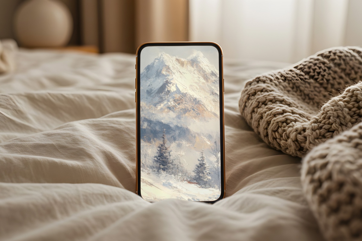
Scale. That's the word this one earns immediately — frost-covered trees reaching upward into a blue-white sky, the vertical proportions working with the iPhone frame rather than against it. Where many landscape wallpapers feel cropped or awkward on a portrait screen, this one was composed to be tall. The pale blue-white palette stays cool without going cold, and there's a grandeur here that stops short of overwhelming. Aspirational, not anxious.
6. Serenity of Snowy Reflections - iPhone Wallpaper
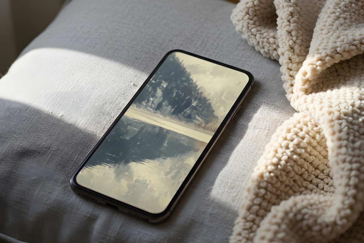
Reflection scenes carry a specific kind of visual double: the world above mirrored in frozen water below, so neither the sky nor the surface reads as dominant. Soft icy blues layered with pale silver-white create a palette that changes character depending on ambient light — cooler in fluorescent rooms, almost lavender-tinted in late afternoon. If you want your home screen to feel genuinely different each time you look at it, something about the dual symmetry here makes that happen.
Worth noting here: if a scene speaks to you across different surfaces — phone, desktop, wall print — Gallery Flair carries these winter pieces across formats. Layering the same cool palette from your lock screen to your laptop background to a printable wall piece builds something that interior people sometimes call a visual world. Palette families cross product lines, and so does the bundle pricing.
7. Slopes of Serenity - iPhone Wallpaper
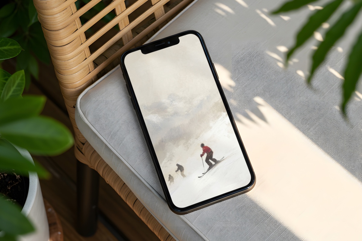
Soft beiges and cream-whites spread across a gentle slope — no stark contrasts, no drama, just gradual tonal shifts from shadow to snow. This one has the quietest palette in the edit. It reads closer to a still life than a landscape, and it belongs on the home screen of someone who has curated her whole phone aesthetic down to a single, restrained tone family. She'll know the moment she sees it.
8. Stream's Icy Embrace - iPhone Wallpaper
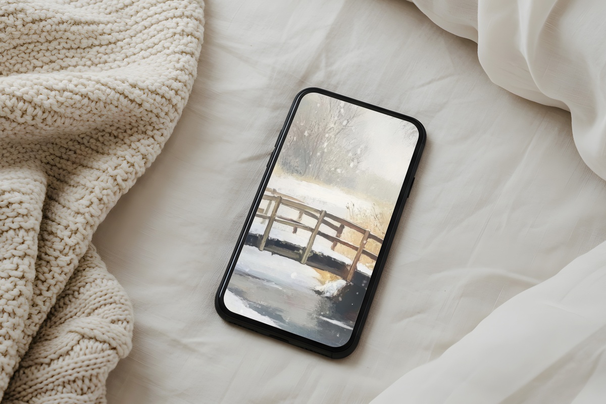
Movement, almost frozen mid-frame — a stream caught between flowing and locking over, rendered in cool white, ice-gray, and the faintest suggestion of deep water beneath. Unlike the open-sky scenes elsewhere in this edit, this one draws the eye downward, into texture and detail. It rewards a longer look. Worth it on a lock screen precisely because you return to it throughout the day, and something new tends to surface each time. And honestly, not every wallpaper has to be calm — this one has an edge to it that feels right for January.
Each of these downloads lands on your device in under a minute — no subscription, no waiting, yours to keep and swap whenever the season shifts. The full winter edit lives in the Gallery Flair collection, and every piece is ready whenever you are.
On the pricing side: any three pieces across the entire shop — wallpapers, wall prints, Frame TV art, all of it mixed however you like — comes to 30% off, and five pieces brings that to 50%. Mixing a phone wallpaper with a desktop background and a printable wall piece in the same palette all counts. The numbers add up faster than you'd think when you're building one visual world across your screens and your walls.


