7 Vintage iPad Wallpapers: How to Choose by Composition, Palette, and Mood
There is something particular about glancing down at your iPad and feeling — just for a moment — that the screen is a window rather than a tool. The right vintage wallpaper does exactly that: it holds a mood, a light, a season, so quietly that you stop noticing it consciously and simply start feeling it.
This guide walks through seven of our favourite vintage iPad wallpapers and the curatorial thinking behind each — what the palette is doing, how the composition behaves on a tall screen, and the kind of atmosphere it carries into your day. Use it like a mood-board conversation, not a spec sheet.
What to Look for in a Vintage iPad Wallpaper
Vintage palettes lean heavily on ochre, dusty rose, slate blue, cream, and muted sage — pigment tones that mimic aged paper or faded linen rather than punchy digital saturation. On an iPad screen, these sit easier on the eye during long reading sessions and feel genuinely considered rather than scrolled-past. Beyond colour, look for compositions with a clear focal depth: a horizon line, a canopy of branches, or a soft wash of botanical forms that the eye can rest on without hunting for a centre. Negative space matters too — icons will sit on top of your wallpaper, so a sky or open ground in the upper third reads as intentional framing, not empty canvas. Ask yourself: does this feel like a postcard I'd keep, or just a picture I'd swipe past?
1. Eternal Embrace Oak Majesty - iPad Wallpaper
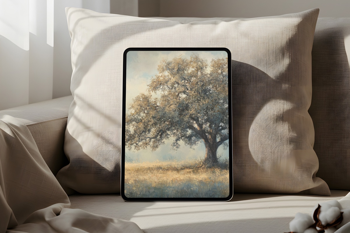
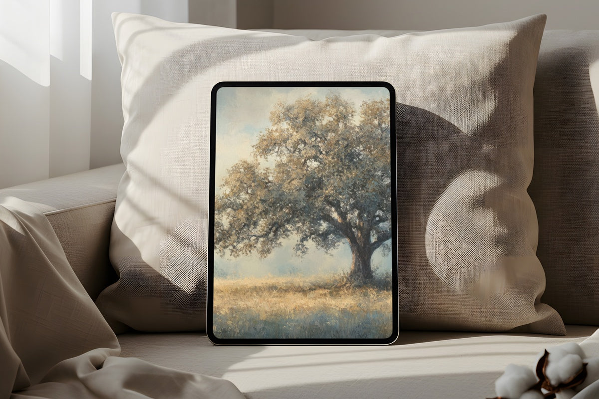
Warm ochres and burnt sienna fan across the upper portion of this piece, tracing the spread of an oak canopy that arches overhead like something out of a faded nature atlas. The palette reads amber-gold in afternoon light and shifts toward a richer tobacco tone in darker rooms — a piece that genuinely responds to the hour. It suits someone who gravitates toward interiors with worn leather and warm wood: earthy without being rugged, aged without being tired. The canopy's natural curve keeps icons from crowding the composition below.
2. Birds in Twilight Hues - iPad Wallpaper
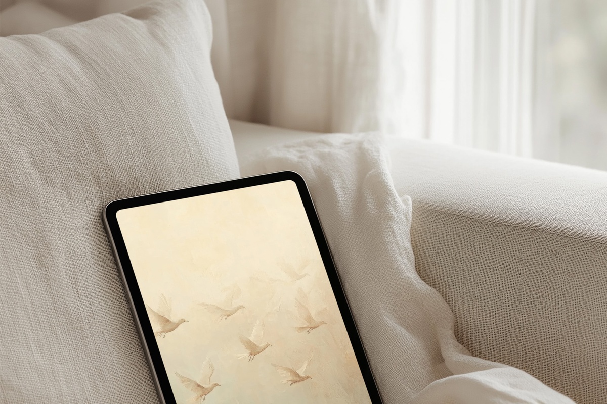
Dusk rendered in the palette of a watercolour journal: pewter, dusty mauve, and the faintest blush along a low horizon where birds drift mid-flight. The muted tones are deeply restful — closer to a twilight you'd watch from a porch than to any conventional device aesthetic. What makes it work for the iPad format is the graduated wash of tone from ground to sky, which places visual weight at the base and leaves the upper screen open and airy. Grounded and dreamy at once. Not for anyone who wants high contrast or a punchy lock screen — but for a slow, reading-heavy day, it holds beautifully.
3. Blossom Dreamscape - iPad Wallpaper
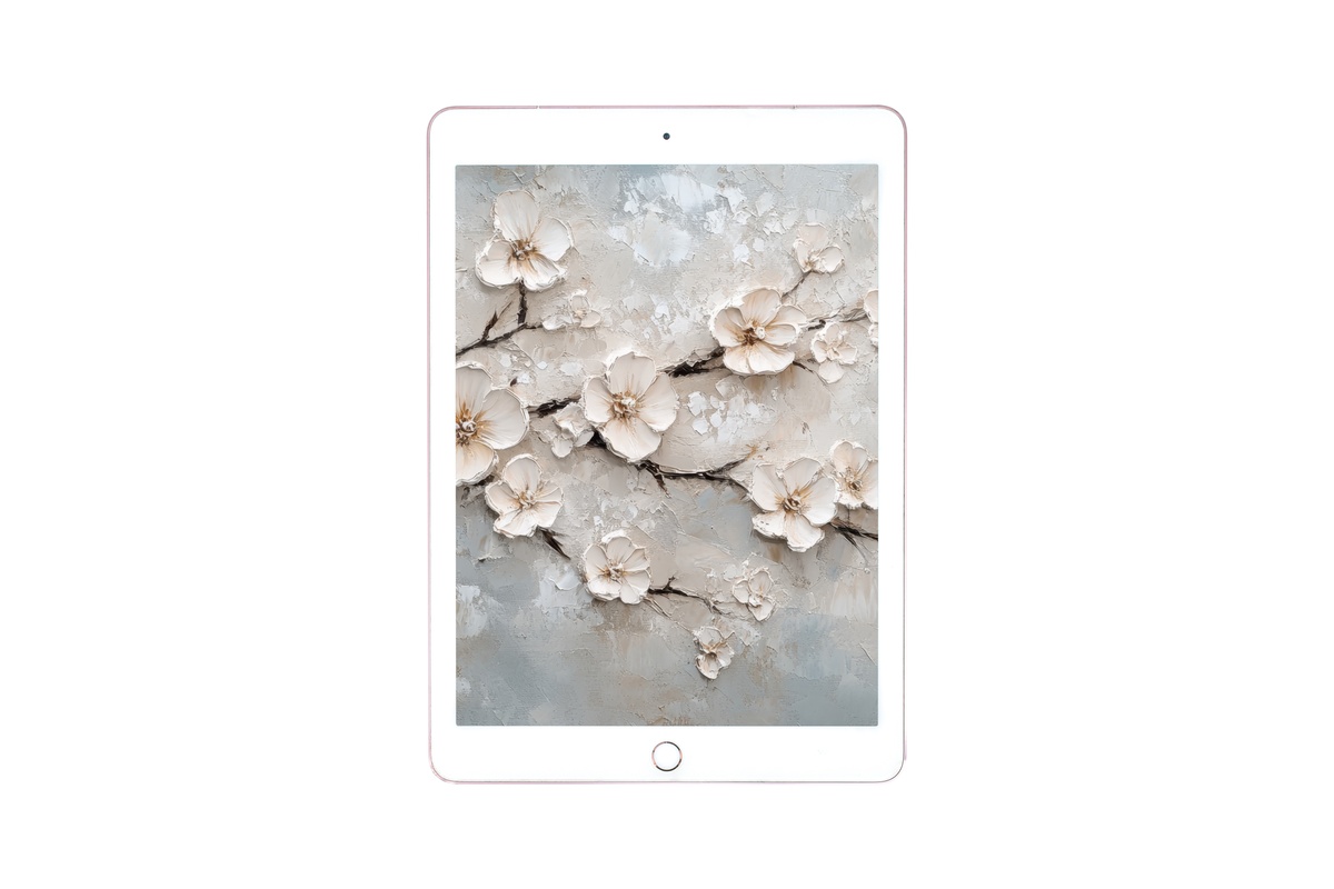
Creamy ivory and warm taupe meet in a layered botanical arrangement that feels less like a pattern and more like a pressed flower discovered between the pages of an old book. The palette is deliberate in its restraint — nothing competes for attention, which means this wallpaper recedes gracefully behind your apps while still reading as considered. Florals are a well-worn vintage trope, and Blossom Dreamscape earns its place by leaning into softness rather than sweetness: the tones are aged, not saccharine. A natural companion for note-taking mornings and slow creative work.
4. Majestic Beacon Cliffs - iPad Wallpaper
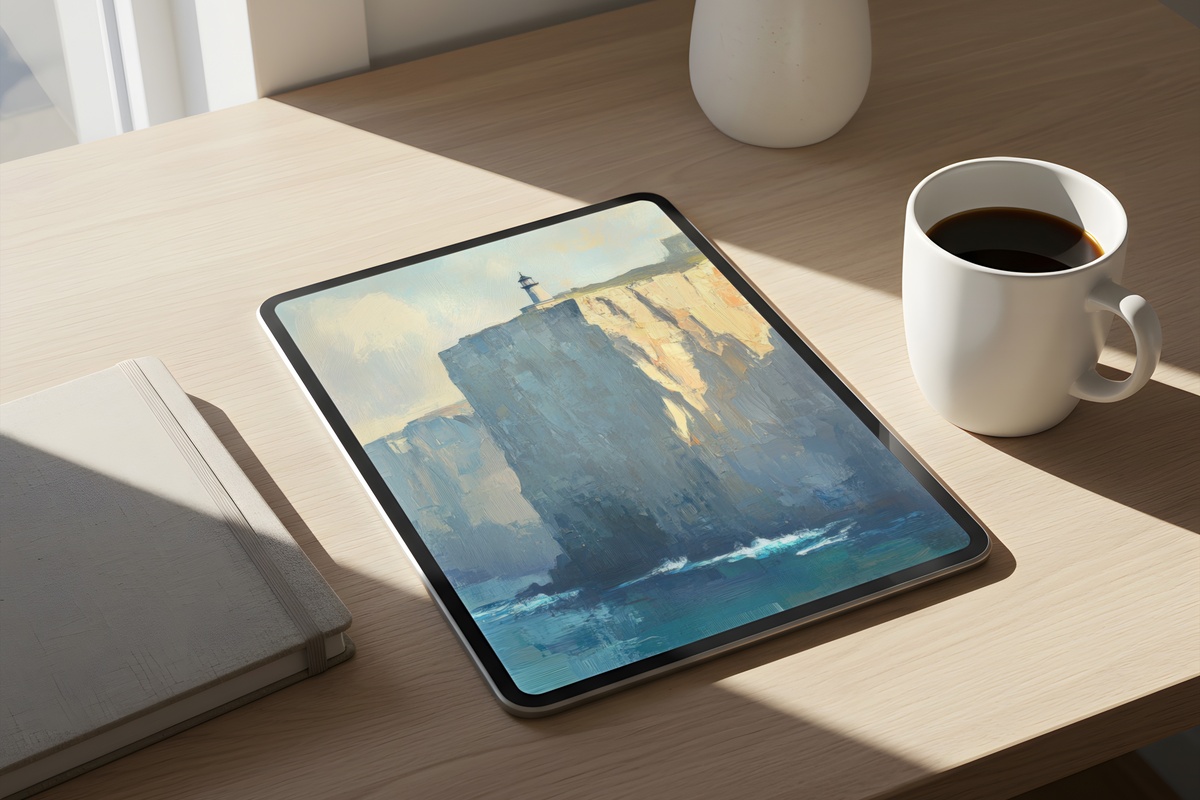
Serene slate blues and a low, fog-softened horizon make this feel like a view from the deck of something — a coastal headland glimpsed through the cool hours before midday. The vintage treatment desaturates what might otherwise be vivid sea tones into something closer to a nineteenth-century travel print: precise, atmospheric, quietly authoritative. Compositionally, the cliffs anchor the lower half while an expanse of pale sky fills the upper third — giving your home screen icons a clean, uncluttered backdrop. Anyone who keeps their iPad at a desk with a north-facing window will recognise this light immediately.
5. Sunlit Forest Journey - iPad Wallpaper
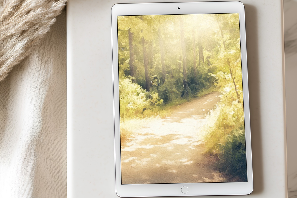
Dappled light through a forest canopy, caught in warm gold-green — the kind of colour you only see in early autumn when the leaves have not yet turned but the angle of the sun has shifted. The vertical rhythm of tree trunks suits the iPad's portrait orientation with an almost architectural precision, and the light source feels natural enough that the screen appears to glow from within rather than at you. It carries a walking-in-the-woods stillness: meditative without being melancholy, seasonal without being obvious. Pair it with a warm-toned case and the whole device reads as one quiet object.
6. Blossoming Pastoral Whisper - iPad Wallpaper
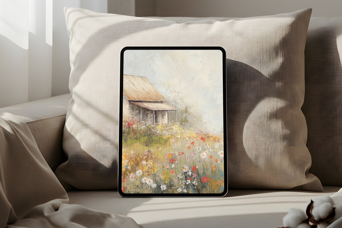
Where Blossom Dreamscape is indoor and intimate, this one opens outward: a pastoral field haze in dusty lilac, pale straw, and the softest sage, as though the scene exists just past the edge of memory. The mood is unabashedly romantic — and that is precisely its purpose. Among the seven picks here, this is the one for someone who journals in the morning, keeps dried flowers in a clay vase, and wants every object around her to hold a little tenderness. The diffuse, hazy treatment prevents any single element from dominating, so the overall effect is atmosphere rather than subject.
7. Tranquil Palm Coasts - iPad Wallpaper
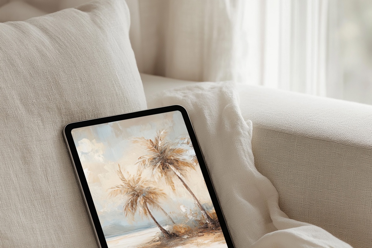
Vintage teal, faded sand, and the loose silhouette of palms against a washed sky — this one reads like a postcard that has been carried in a coat pocket for a season. The horizontal bands of sea and shore give the composition a calm, layered depth, while the desaturated coastal palette sidesteps anything tropical or garish. It sits equally well as a lock screen and a home screen; the tonal range is narrow enough that icons in any colour sit comfortably over it without creating visual noise. A considered choice for anyone building a cohesive soft-life aesthetic across their devices.
Each of these wallpapers is a digital download — available on your device within moments of purchase, no subscription, no waiting. Whenever one of them catches your eye, the collection is open and ready in the Gallery Flair shop. And if you find yourself drawn to more than one — which tends to happen — mixing across our product lines counts toward the same discount: three pieces at 30% off, five at 50%, whether those are iPad wallpapers, printable wall art, or Frame TV art. One continuous aesthetic, across every surface you look at.