9 Vintage Desktop Wallpapers Chosen for Composition, Palette, and Mood
There's a moment right around 9 a.m. — coffee still warm, laptop just opened — when your desktop wallpaper sets the tone for everything that follows. A considered vintage piece does something a generic gradient never can: it places you somewhere. Inside a misty orchard, at the edge of a cliff, watching swans drift through still water. That sense of arrival, quiet and unhurried, is worth choosing carefully.
What Makes a Vintage Desktop Wallpaper Worth Keeping?
Not every piece with aged tones earns the vintage label — and not every impressionist-adjacent image holds up at full screen. When selecting from this collection, we looked for four things: a palette that reads clearly on backlit glass (warm ambers, dusty mauves, slate blues — no muddied mid-tones), a focal point that anchors the eye without competing with open windows and taskbars, a mood that ages well across seasons, and enough negative space for the image to breathe. If a piece satisfies all four, it lives on the desktop long after the novelty wears off. If it only satisfies one, it typically gets swapped out by Wednesday.
1. Timeless Echoes Among Ruins
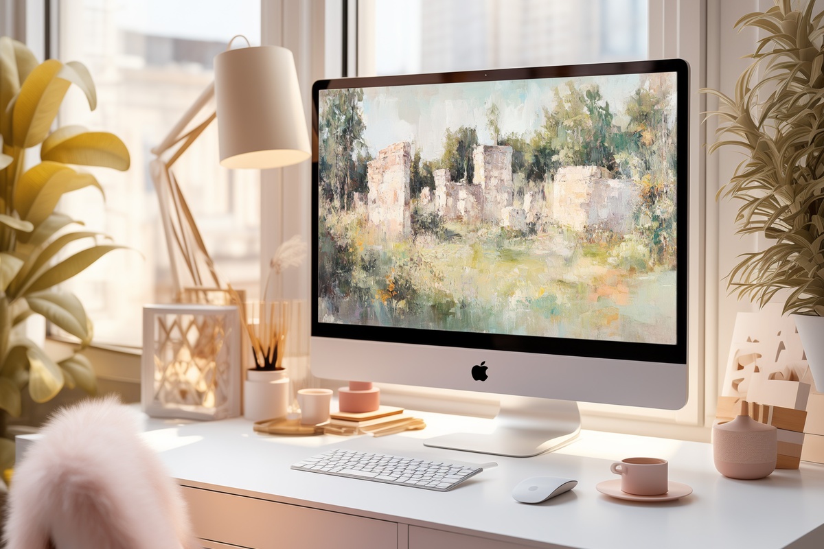
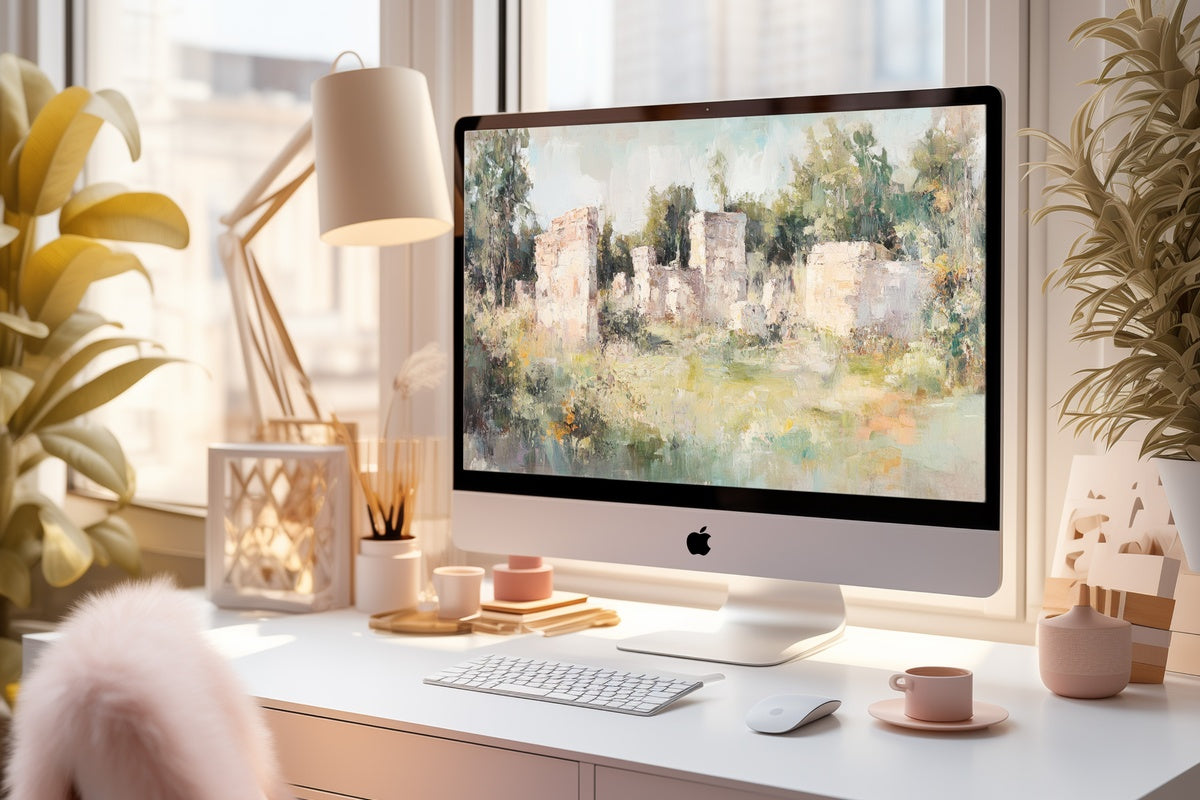
Ancient stone half-swallowed by lush overgrowth, rendered in the warm patina of old pigment — this is the piece for someone who keeps a dog-eared copy of a Romantic-era novel on the nightstand. The palette moves from mossy ochre to hazy ivory sky, and the ruins themselves occupy just enough of the frame to feel monumental without crowding. On a wide MacBook display, the surrounding field breathes generously. A sense of slow centuries, without melodrama.
2. Orchard in Spring's Brush
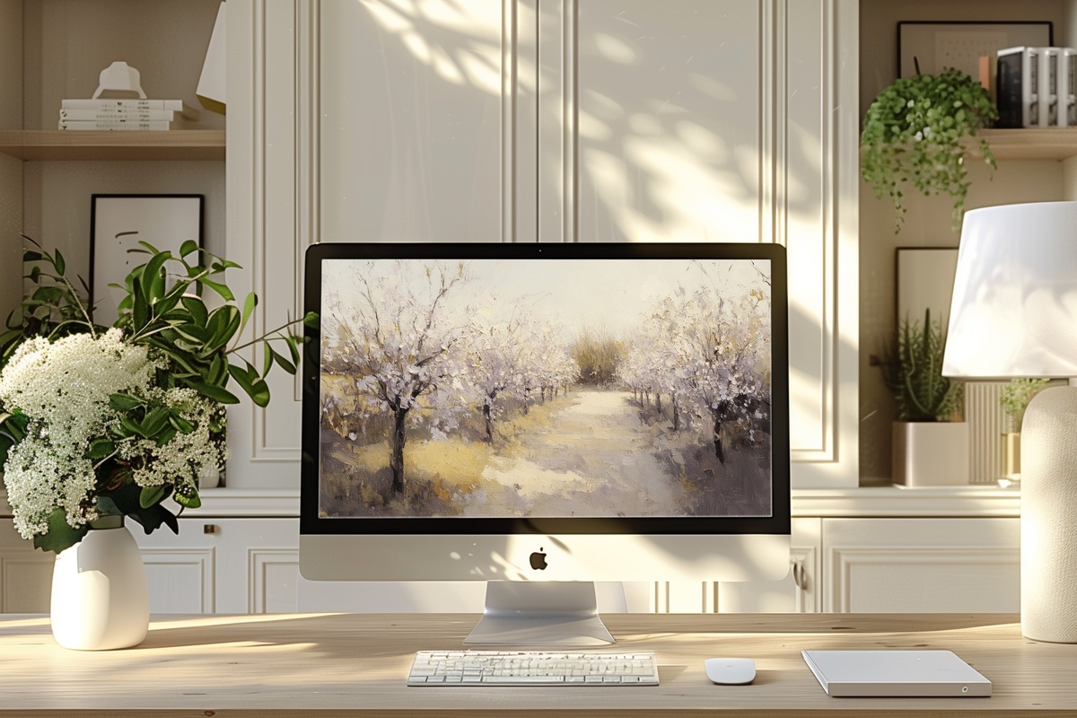
Impressionism handled with restraint. The blossoms here aren't the candy-pink excess you sometimes find in botanical wallpapers — they read more like a memory of a spring afternoon than a photograph of one. Pale blush and faded celadon sit against a milky sky, the brushwork loose enough to feel painterly but resolved enough to hold at high resolution. Open a spreadsheet in front of this and the morning somehow feels less administrative. A genuinely restorative background.
3. Cacti Silhouette Dream
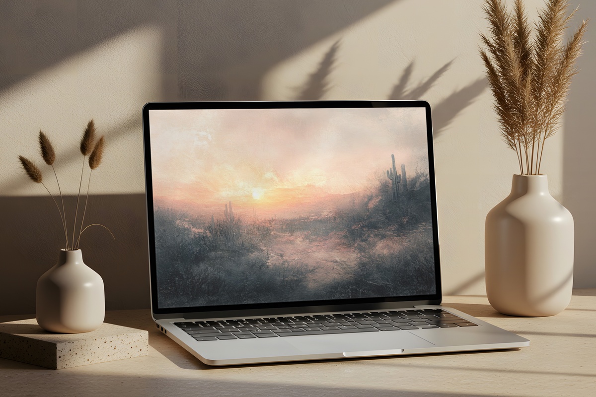
Everything here is about silhouette and gradient. Cacti rise in flat dark shapes against a desert sky that moves from burnt sienna at the horizon through terracotta into a deep, bruised violet at the top of the frame. The tension between the organic, spiky forms below and the vast, uninterrupted sky above gives the composition an unusual stillness — unhurried, almost cinematic. Anyone drawn to warm-earth interiors and Southwest-leaning palettes will recognize this frequency immediately.
4. Sunlit Forest Journey
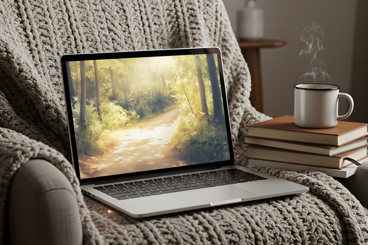
A dappled forest path rendered in the warm amber and olive of a late-summer afternoon — and the light here does something worth noting. It falls from the upper left at a low angle, catching the canopy in loose gold strokes while the path below remains cool and shaded. That contrast creates a natural depth without visual noise, which is exactly what you want when documents and browser tabs are layered on top. Grounding without heaviness. The kind of image that makes the workday feel like it has a pace.
5. Serene Meadow Deer Stroll
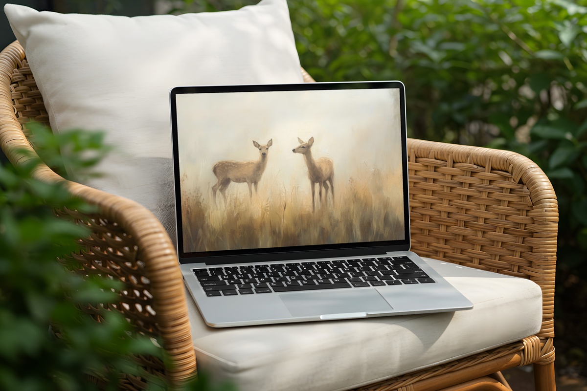
Pastoral impressionism at its most unguarded. A single deer moves through a meadow caught between morning mist and the first real warmth of day, the grasses rendered in strokes of sage, fawn, and pale gold. What holds this image together is the animal's placement — slightly off-center, mid-stride, which keeps the scene from feeling posed. A soft focal point in an otherwise open field reads beautifully as a desktop background because it never competes with what's in front of it. Unhurried. Genuinely restful.
6. Misty Waters Swan Ballet
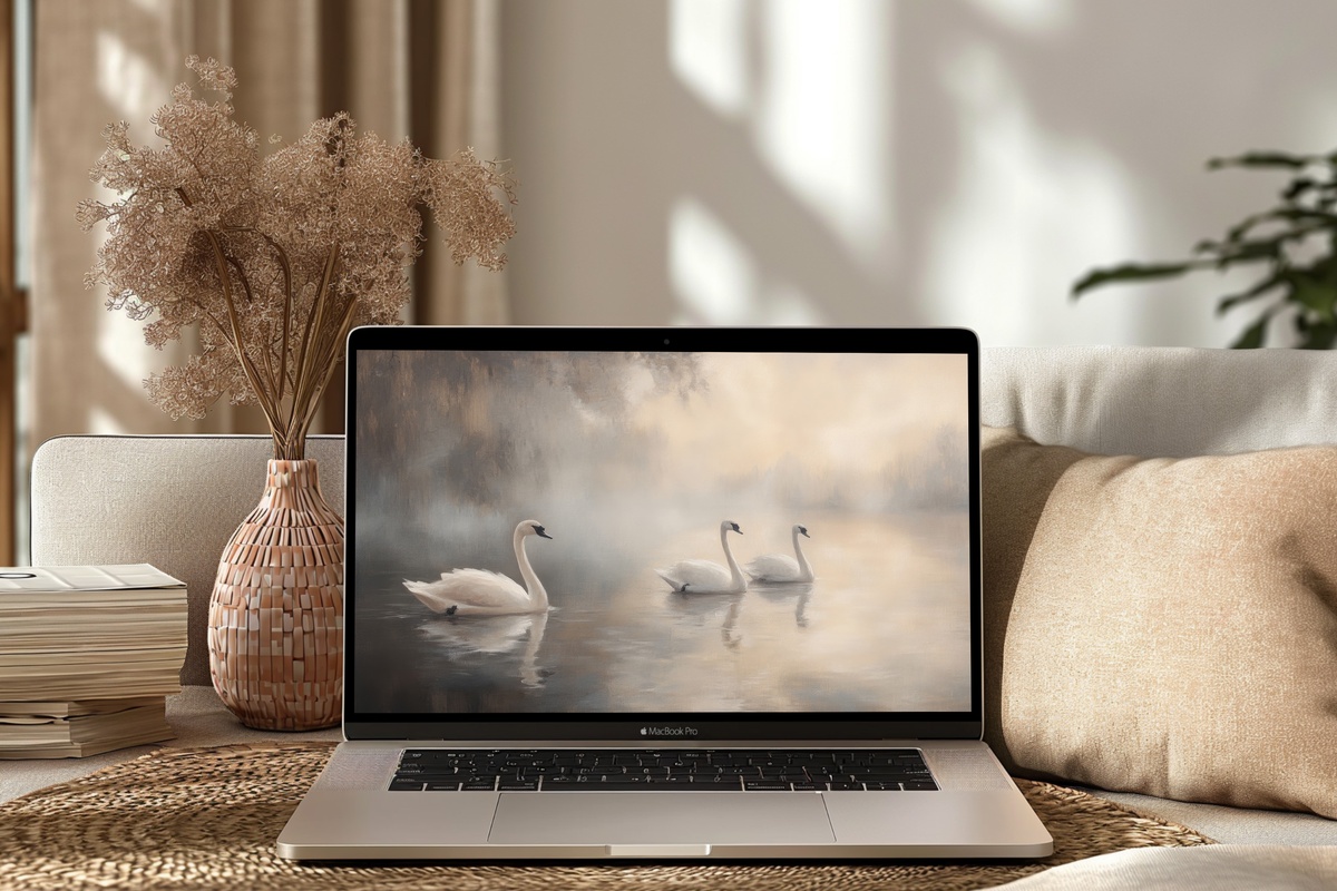
Pearl grey, muted slate, and the faint warmth of reflected light on still water — this palette reads as almost monochrome until you look closely, and then the tonal layers reveal themselves. Two swans glide in loose formation, and the impressionist water around them blurs into something closer to a wash of watercolor than a landscape. For the person whose desk leans white-and-bone, whose walls already hold something quiet and considered, this one slots in without asking for anything. Elegance with no effort required.
7. Dusk Floral Reverie
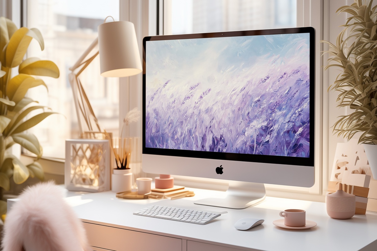
A lavender field at the last light of day, the sky above it running from dusty rose to deep plum. The rows of lavender create a strong horizontal rhythm that anchors the composition and makes the wide desktop format feel intentional rather than stretched. Honest note: if you work under bright overhead lighting, the dusk palette may read slightly darker than expected — this one truly comes into its own on a dimmed display in the late afternoon, or on a MacBook with the brightness dialed to around seventy percent. Worth the adjustment.
8. Sentinel of Tranquil Horizons

Majestic chalk-white cliffs, a lighthouse standing at their edge, and below them the kind of grey-green sea that 19th-century marine painters spent entire careers trying to capture. The vertical weight of the cliffs on one side balances against an expanse of open sky and water on the other — a compositional asymmetry that prevents the image from feeling static. For desktops where contrast matters, this piece holds its own at full brightness. Anyone who keeps coastal objects on their shelf — a piece of sea glass, a worn map — will find this image speaks the same language.
9. Ethereal Swans by Misty Lake
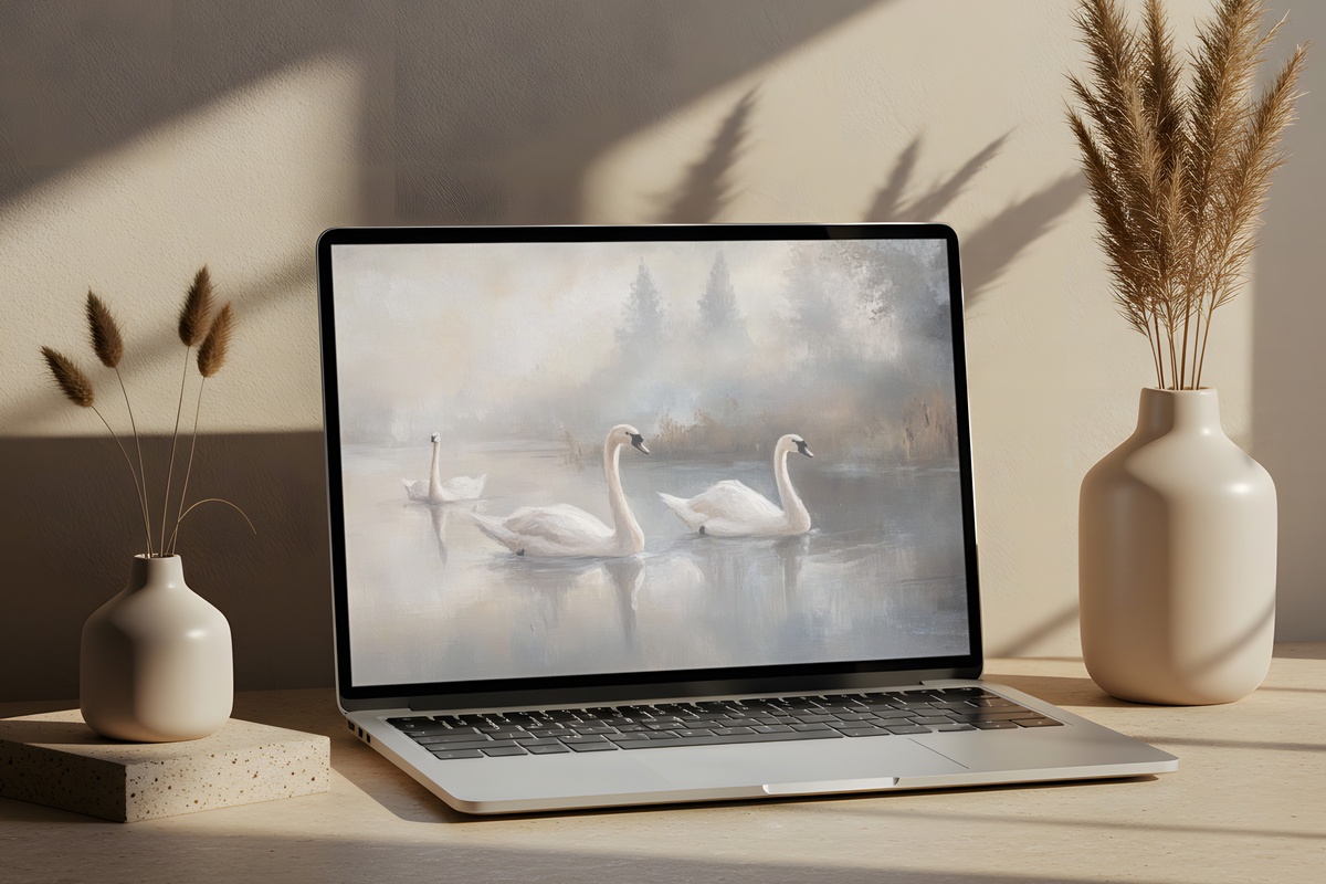
Where Misty Waters Swan Ballet leans structured and tonal, this companion piece opens the frame up entirely. Morning mist softens the far bank into near-abstraction, and the swans become less about form and more about presence — two shapes of light against a surface that's somewhere between reflection and fog. The palette is cooler here, moving from bone white through silvery blue into the faintest suggestion of blush at the waterline. A natural pairing for anyone building a cohesive collection across multiple screens or formats.
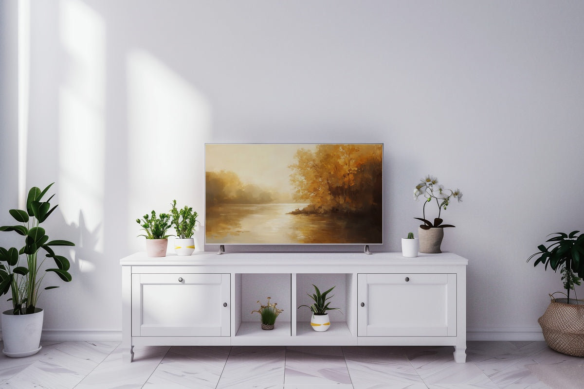
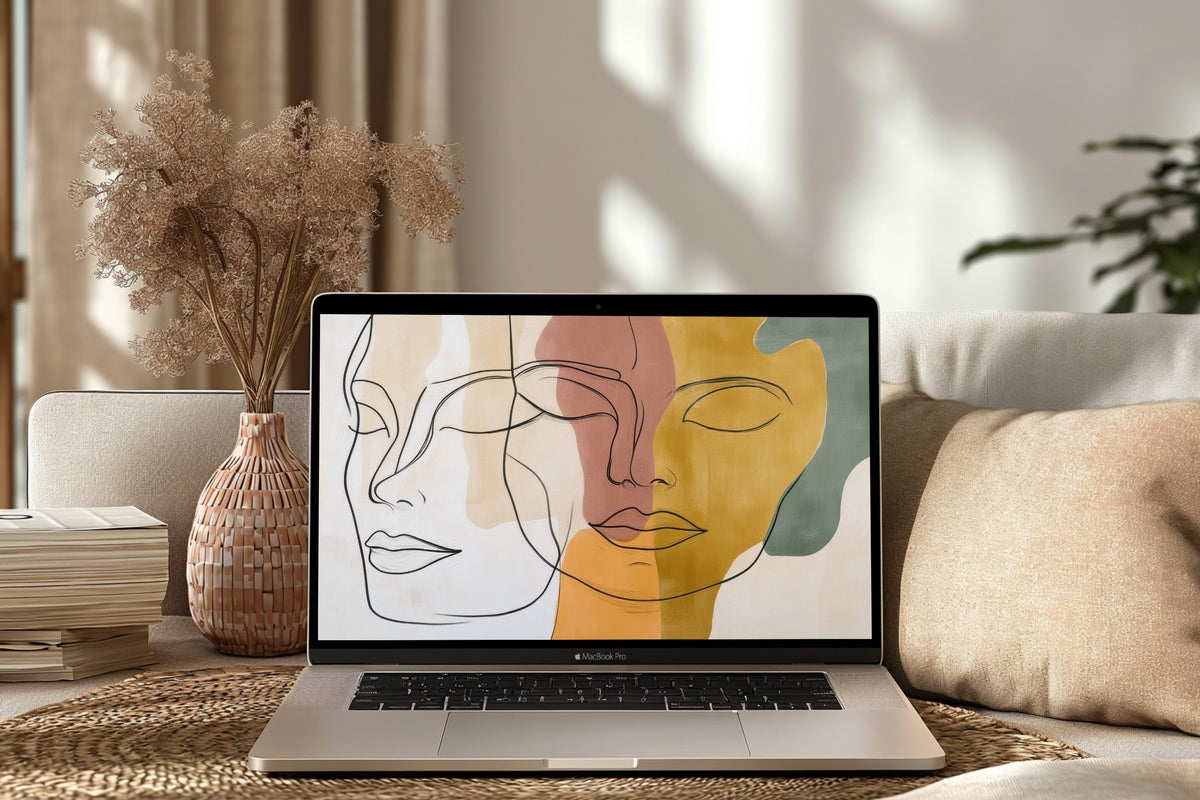
Each of these files arrives on your screen in seconds — no subscription, no waiting, just the image ready to set whenever the mood calls for it. If you find two or three that feel like they belong together — a warm-earth landscape beside a cool coastal scene, or a floral beside a pastoral — note that these pieces mix across every format in the Gallery Flair collection. A desktop wallpaper, a Frame TV art file, and a printable wall print in the same palette all count as one collection, and one collection deserves to live in more than one room.
On that note: buying any three pieces together brings 30% off the total, and any five brings 50% — across all product types, in any combination. A small aside worth knowing as you browse, because sometimes the right desk and the right wall need the same quiet reference point.