9 Summer Frame TV Art Picks: Composition, Palette, and Mood Guide
There is a particular quality of light that arrives in summer — angled, generous, the kind that pools on linen and turns an ordinary wall into something worth looking at. Your Frame TV lives inside that light, and what you put on it shapes the entire feeling of a room from June through August. This guide walks through nine picks that each earn their place — by palette, composition, and the specific mood they carry into a space.
What Makes Summer Frame TV Art Work in a Real Room?
Before reaching for the most saturated coastal scene you can find, consider three things: palette temperature, compositional weight, and the distance from which you read the piece. Summer art that works well on a Samsung Frame TV tends to share a few qualities: a light-to-mid tonal range that doesn't fight the room's natural brightness, enough compositional breathing room that the piece reads clearly at ten feet, and a mood anchored to a single emotional note — warmth, stillness, or gentle energy. If a piece tries to do all three registers at once, it usually does none of them well. Start with the mood you want the room to hold, then match the palette.
1. Ethereal Summer Surf - Frame TV Art
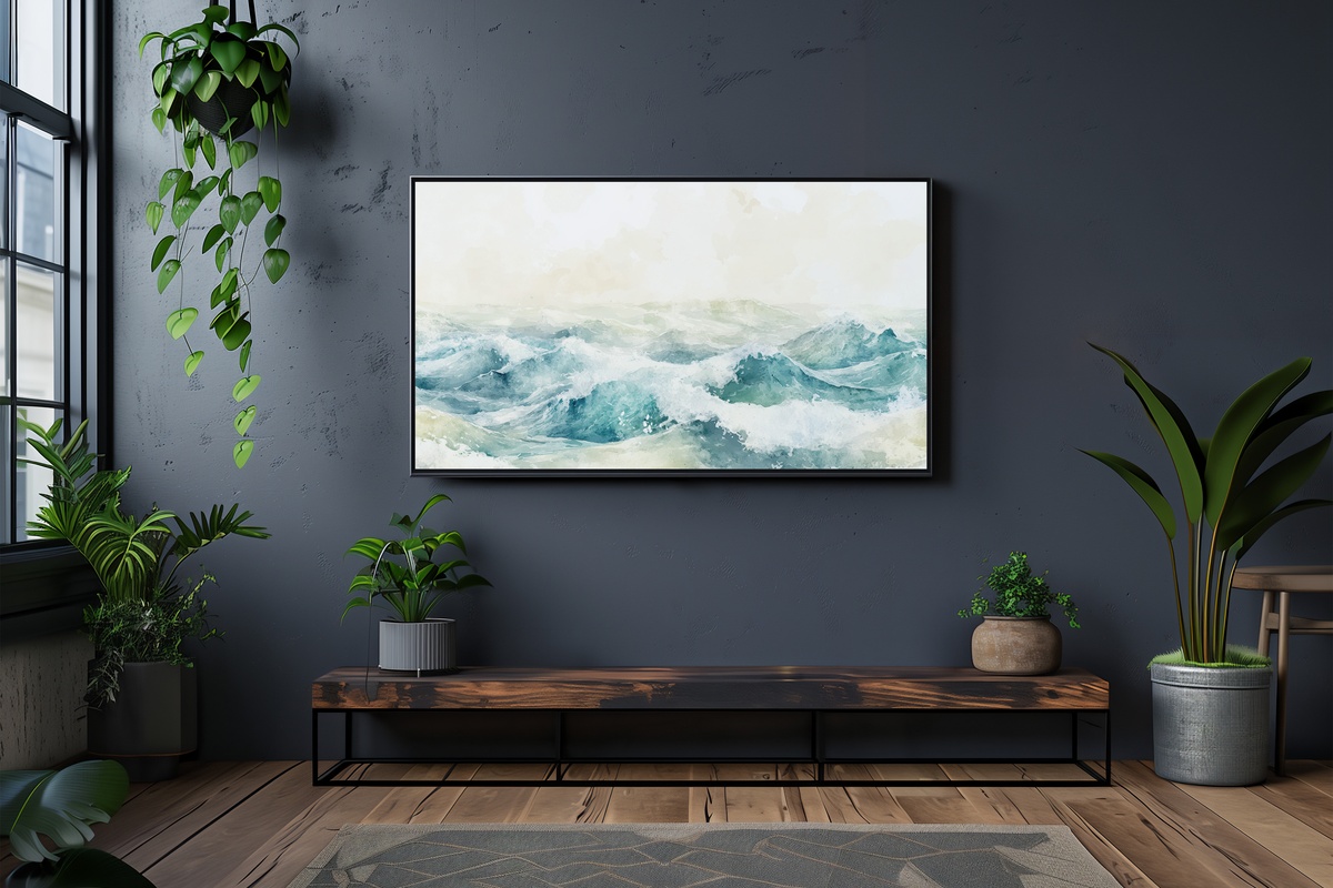
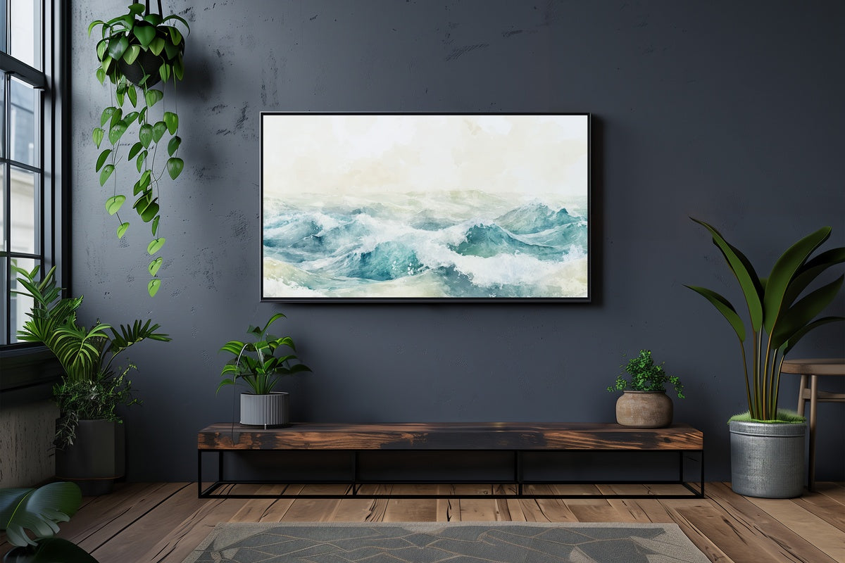
Abstract watercolor waves in diluted cerulean and sea-foam white — this piece works because it refuses to be literal. There is no horizon line demanding attention, no hard edge to interrupt the wash of color. What you get is atmospheric: a suggestion of water rather than a photograph of it. In rooms with white or light greige walls, the translucency of the palette keeps the TV from feeling like a competing visual anchor. It reads closer to a Cy Twombly seascape than to seaside souvenir art.
2. Cherry Blossoms' Gentle Glow - Frame TV Art
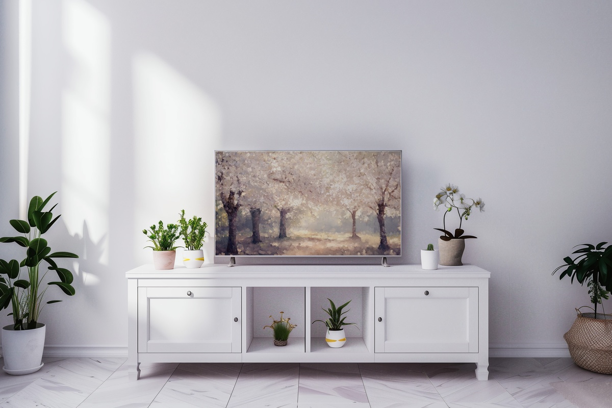
Dusty rose petals backlit by warm amber — the palette here sits at the exact intersection of late spring and early summer, making it one of the more versatile warm-toned picks in this edit. The composition layers branches across a diffused golden field, so light feels like it is actually moving through the image. Rooms that already lean into cream, blush, or natural wood tones will find this piece extends the warmth of the space outward. It has the quality of something Renoir might have left unfinished, and that incompleteness is precisely why it holds attention.
3. Colorful Canopy Serenade - Frame TV Art

If the rest of this edit is restrained, this one is a deliberate exception — and it earns it. Beach umbrellas rendered in an impressionist style: coral, cobalt, saffron, each dome loosely daubed so the color vibrates rather than sits flat. The technique is key here; if this were photographically sharp, the saturation would overwhelm. Because it is painterly, the eye reads the whole scene as a mood before it reads individual colors. For a room with neutral walls that needs one visual moment, this is that moment. Not for the minimalist living room, and it would not pretend to be.
4. Gilded Shore Tranquility - Frame TV Art
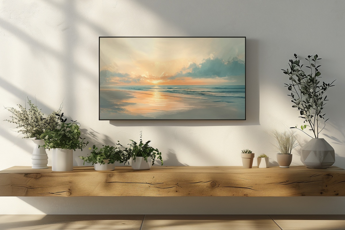
Golden hour on a shoreline — but the version where the sun has already started to lower and the water has gone the color of warm honey. The horizontal composition is especially well-suited to the Samsung Frame TV's widescreen ratio; the long stretch of shore and sky fills the frame without crowding it. What makes this one notable is the restraint in the midtones: the sand reads as pale ochre rather than orange, keeping the warmth from tipping into the garish. It settles beautifully into a living room around the time the afternoon lamps come on.
5. Sunset's Golden Embrace - Frame TV Art
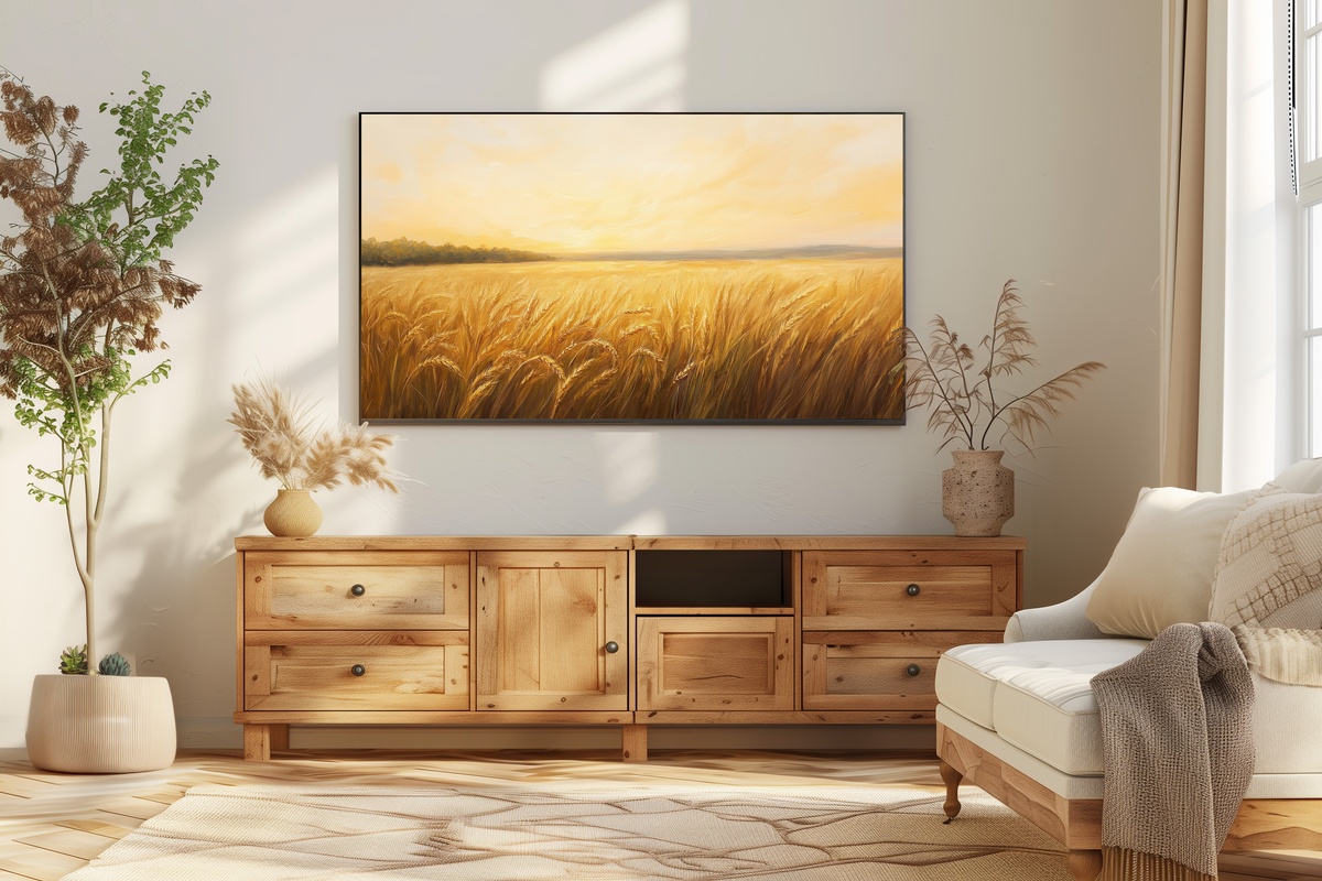
A wheat field at the end of a long summer day, the stalks catching the last of the light. Anyone whose interior instinct runs toward warmth over coolness — terracotta pots, raw linen, amber glass — will recognize exactly what this piece is doing. The palette spans burnt gold through deep sienna at the edges, and the negative space in the upper sky keeps the composition from feeling heavy. It is grounded without being dark, warm without being loud. Paired with a textured throw on the sofa nearby, the room starts to feel genuinely curated rather than decorated.
6. Breezy Seaside Silhouettes - Frame TV Art
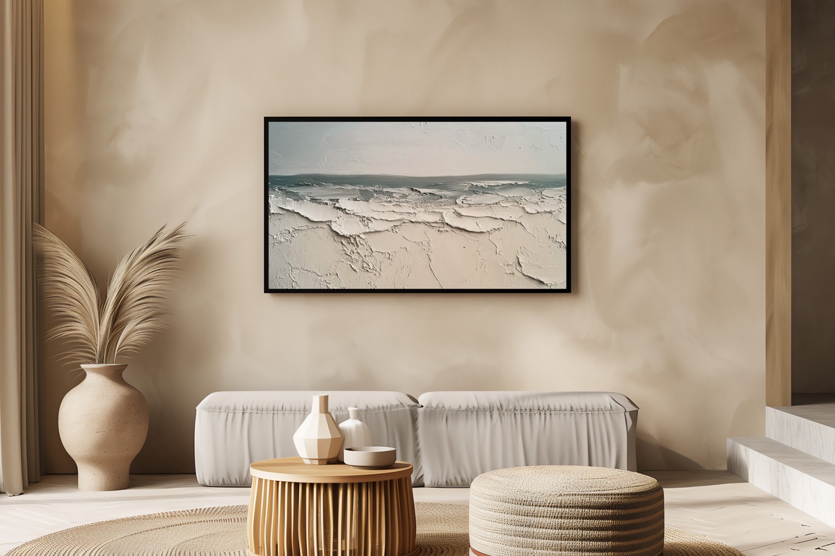
This is the pick for the room that has already done most of its speaking — the space where every object is considered and nothing competes for hierarchy. An impressionist beach rendered almost entirely in warm sand, pale stone, and soft dove grey: the silhouettes are present but gentle, more rhythm than statement. The near-monochromatic palette means it will recede or advance depending on your wall color, which is a useful quality in a piece that needs to coexist with existing art, shelving, or architectural detail. Understated in the best sense — it rewards a longer look.
7. Gentle Radiance Over Secret Garden - Frame TV Art
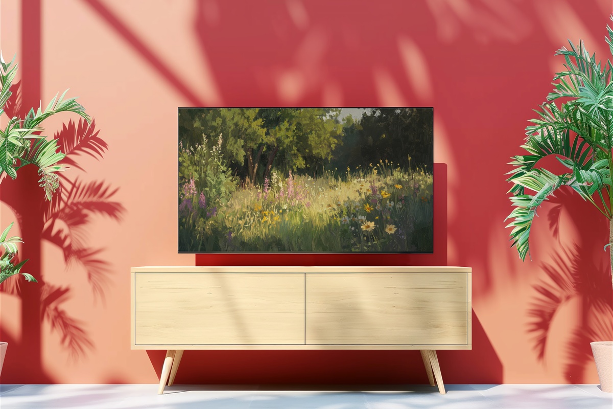
Where coastal pieces anchor you to the water's edge, this one takes you somewhere enclosed and green — a garden where the light arrives through foliage rather than across open sky. The impressionist handling of the botanicals gives them a dappled, soft-focus quality: sage, moss, pale celadon, with small moments of warm blush pushing through. Compositionally, the depth is handled well — near and far planes are distinguished without sharp perspective lines, which keeps the overall mood dreamlike rather than spatial. A natural fit for rooms oriented around plants, organic textures, or a palette borrowed from the garden itself.
8. Sunny Shore's Harmony - Frame TV Art
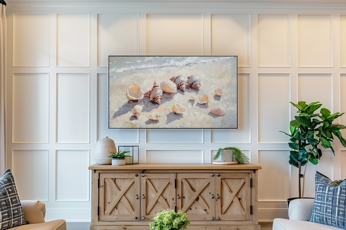
Scale shift: instead of the wide coastal panorama, this piece moves in close to the shore and lingers on seashells in an impressionist light. The intimacy is the point. Creamy ivory, pale blush, and washed sand tones fill most of the frame, with the light arriving from a high angle so each shell casts a small, soft shadow. It reads quietly from across the room but opens up considerably when the TV is at conversational distance — a quality worth considering if your Frame TV hangs in a breakfast nook, study, or bedroom rather than a large living room.
9. Azure Tranquility by the Shore - Frame TV Art
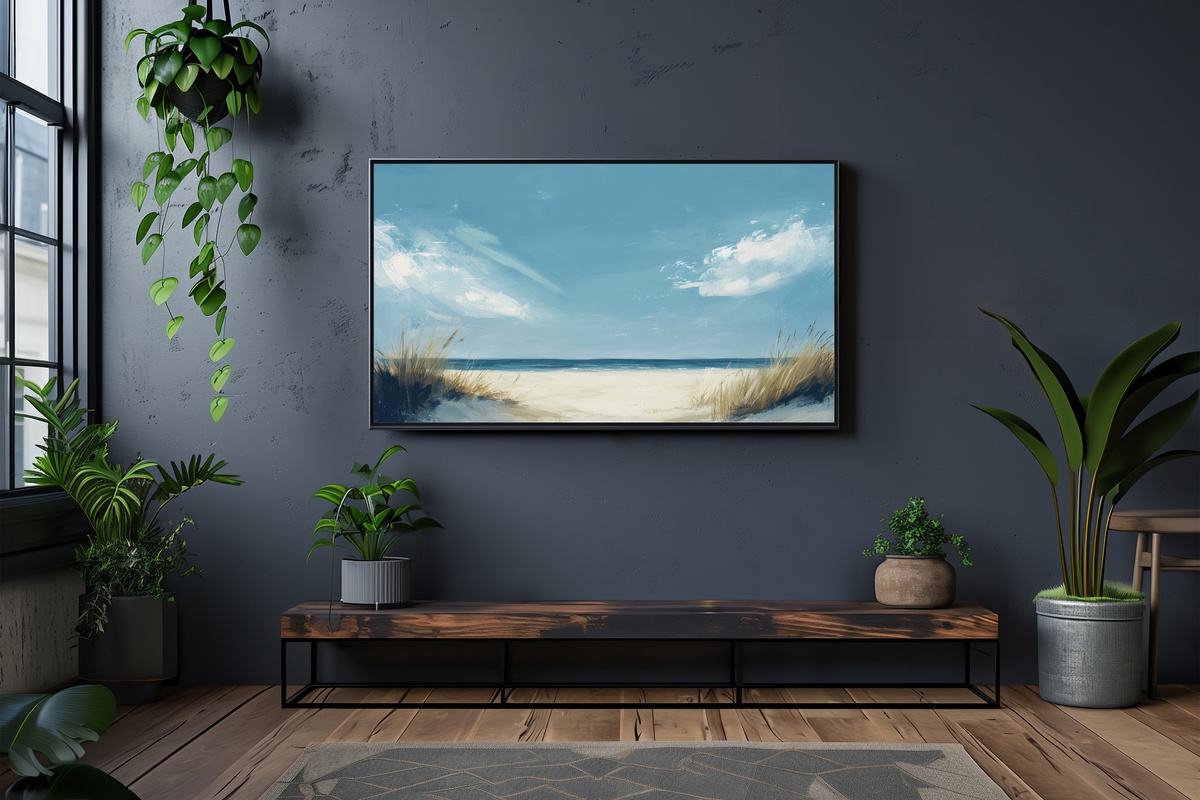
Cool and open — this is where the edit lands after the warmth of the golden-hour pieces. Impressionistic blue sky over pale sand: the upper two-thirds of the composition are almost entirely air, which creates a sense of space that very few pieces in any medium achieve on a TV screen. The blue runs from deep cerulean at the top edge through a soft powder near the horizon, a gradient handled with enough variation that it never reads as flat. If your room runs cool — slate, white, pale oak — this one will feel like it was always supposed to be there.
Each of these pieces is an instant download — on your Frame TV within minutes of purchase, no waiting, no subscription. Browse the full summer collection whenever the room calls for it, and return to this guide each time the season shifts and your eye wants something new.
One quiet note on building a set: the 3-for-30% and 5-for-50% discounts apply across every Gallery Flair product line — Frame TV art, printable wall art, desktop wallpapers, all of it counts together. A Frame TV piece alongside a coordinating wall print and a phone wallpaper in the same palette is three pieces by that measure, which is its own small, pleasing math.