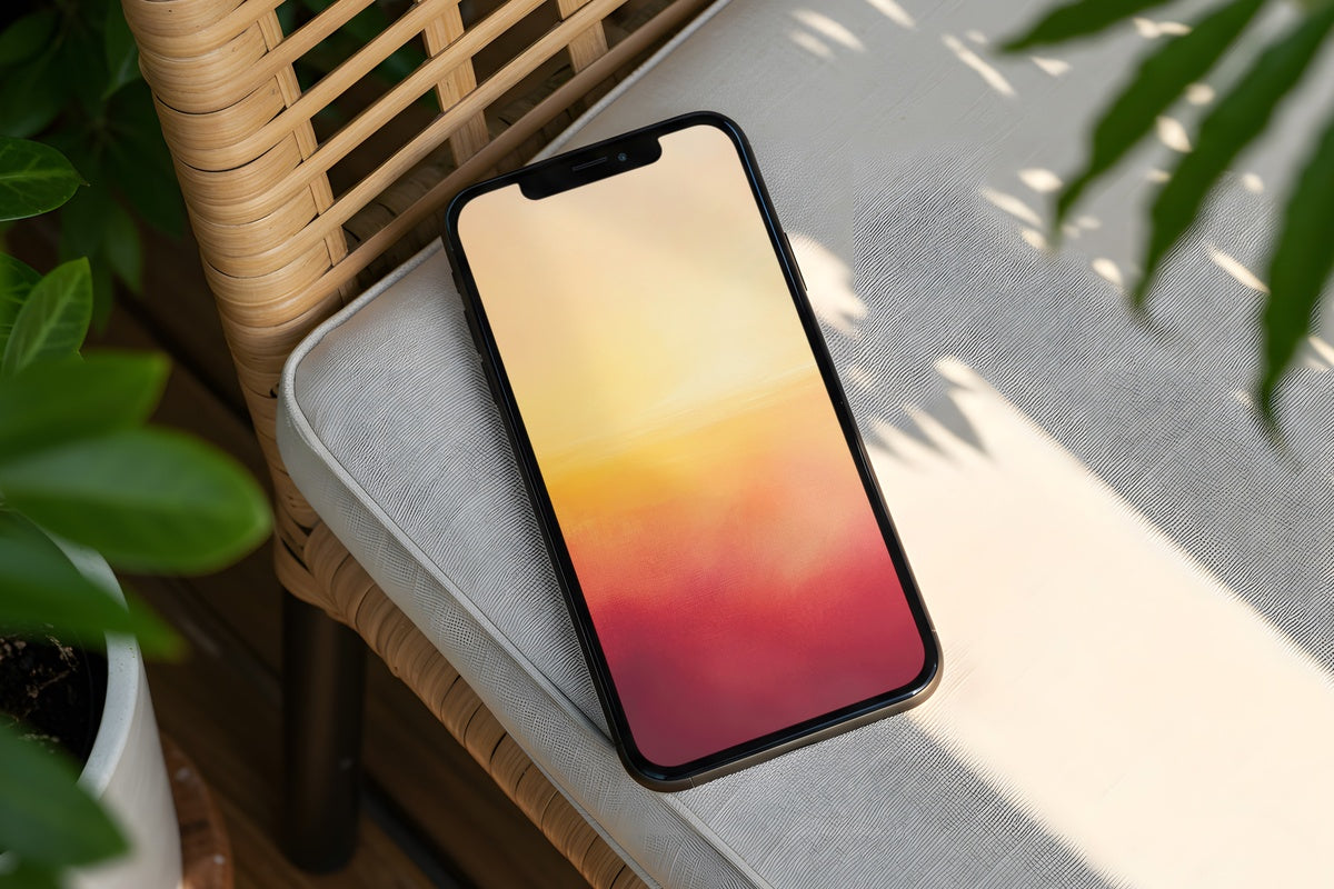
7 Neutral iPhone Wallpapers That Get Composition, Palette, and Mood Right
There's a moment right before you open an app — the half-second your lock screen just sits there, held in your hand — and if the wallpaper is right, that moment feels like a breath. Not decorative filler. An actual pause. Choosing a neutral iPhone wallpaper well means thinking about three things at once: what the composition does to your eye, whether the palette works against your case and your light, and whether the mood matches who you are when you're not performing anything for anyone.
What Actually Makes a Neutral Wallpaper Work?
Neutral doesn't mean blank. The best neutral iPhone wallpapers carry a point of view — they just carry it quietly. Look for these before you download:
- Palette temperature: warm creams and taupes read differently from cool greys and off-whites. Neither is better, but they're not interchangeable.
- Compositional weight: where does the visual mass sit? A bottom-heavy piece feels grounded; a centered design feels meditative; an all-over repeat feels alive.
- Texture vs. flatness: a piece with surface interest — grain, line work, organic mark-making — holds attention without competing with your notifications.
- Mood at distance: hold your phone at arm's length. What do you feel? That's the one you want.
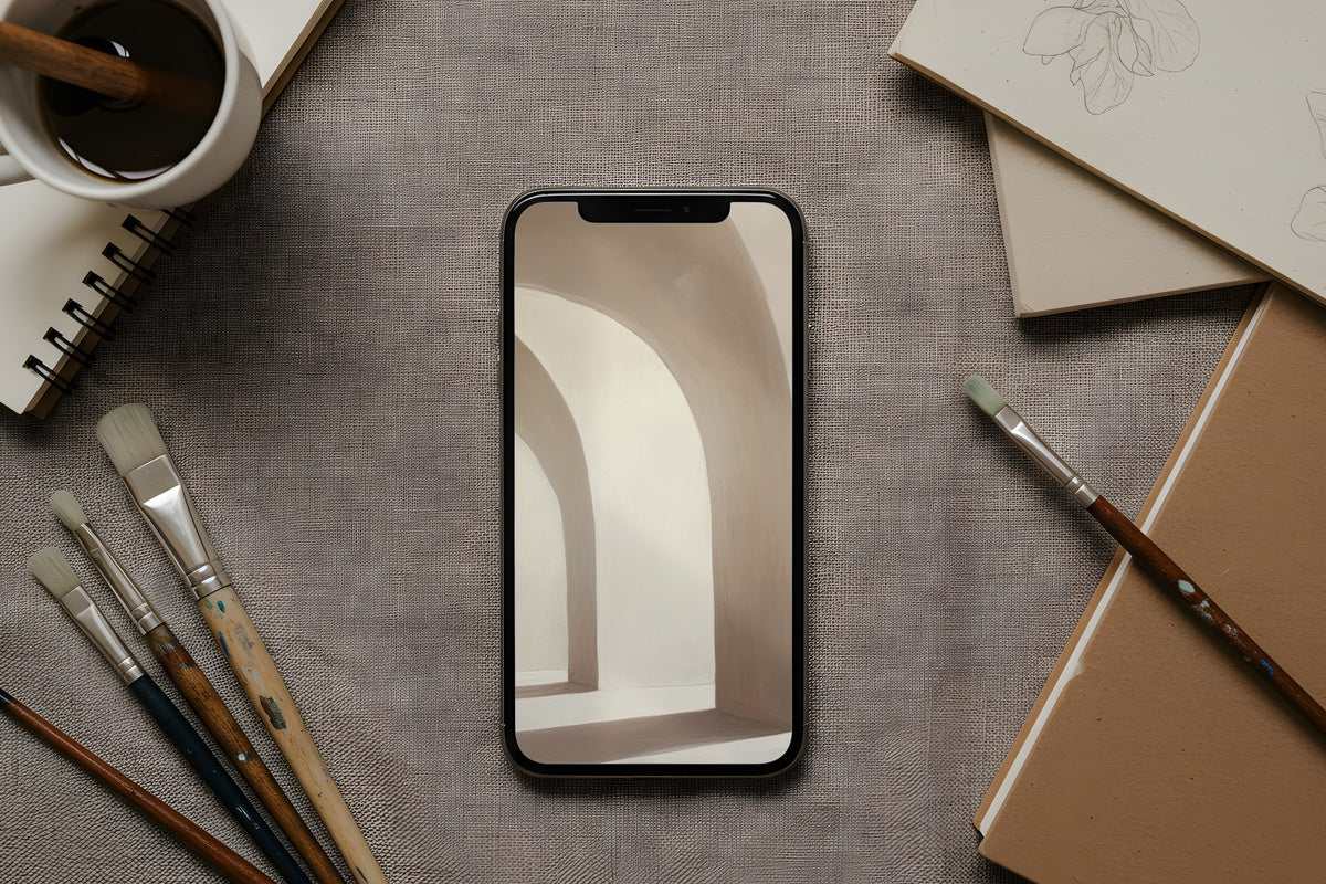
1. Arching Shadows Dance Elegance - iPhone Wallpaper
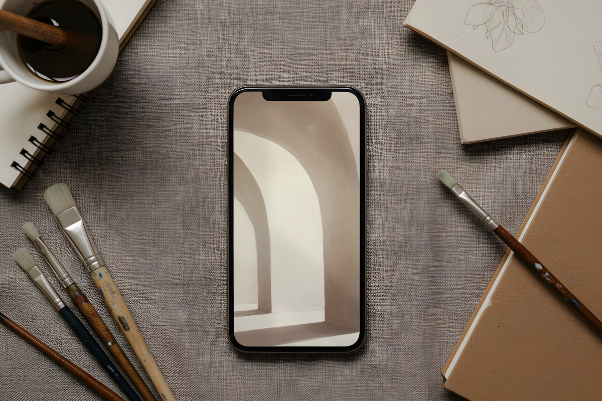
Shadow work done with restraint is one of the harder things to pull off in a flat digital format, and this piece lands it. Warm taupe arcs sweep across a pale ground, the curvature giving the screen a feeling of slow movement — like watching light shift across a wall mid-afternoon. There's nothing harsh in the palette. The shadows read as presence rather than contrast, which means your app icons float on top without visual competition. A go-to for anyone who wants her home screen to feel like a room she's actually comfortable in.
2. Floral Mandala Tranquility Blossoms - iPhone Wallpaper
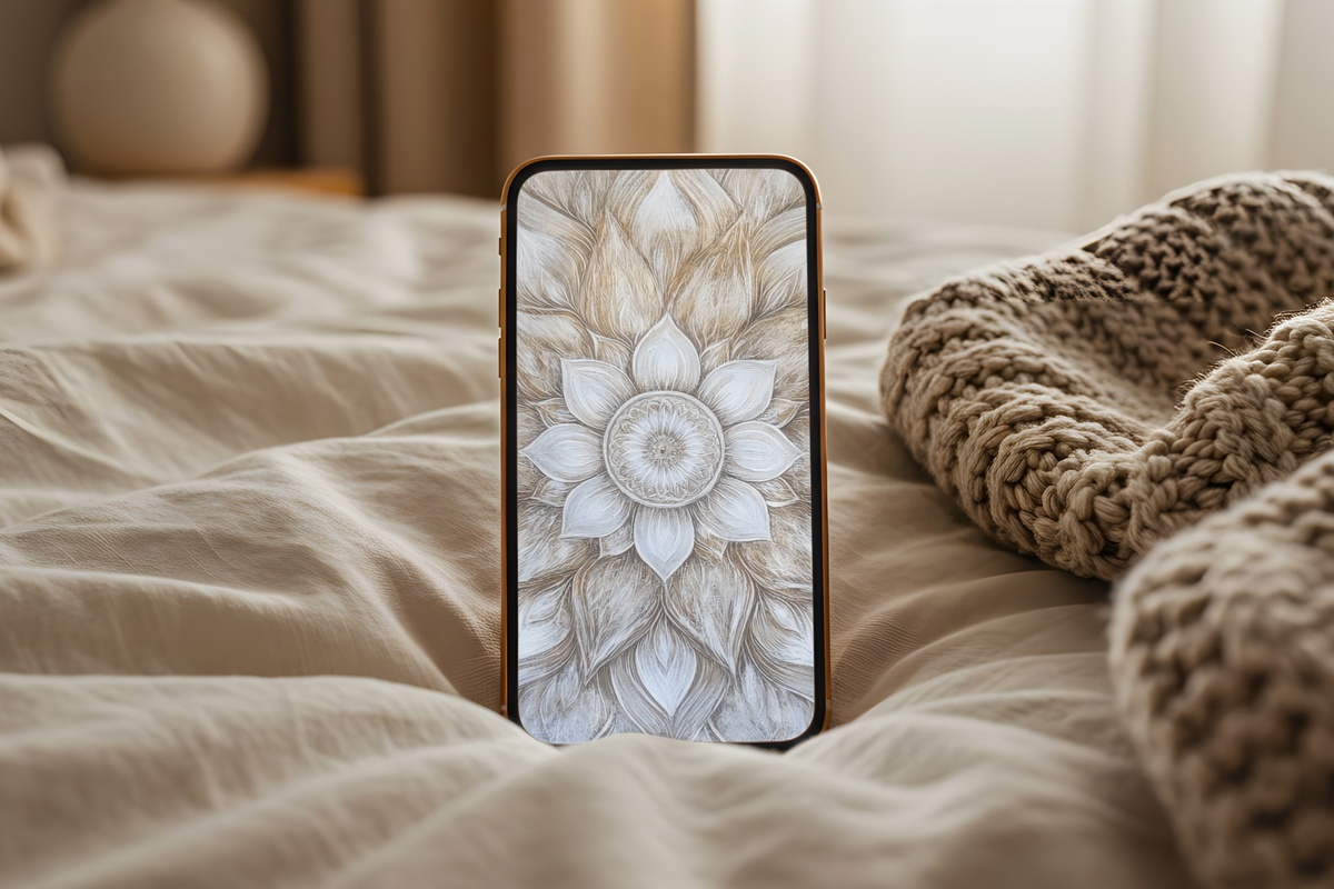
Mandala-derived patterns can tip into fussy very quickly — the radial symmetry starts piling up detail until the screen feels more like a test than a resting place. This one avoids that entirely. The floral geometry here is rendered in a bone-and-ivory palette so close in value that the pattern reads as texture at a glance and reveals itself as structure only when you look closer. Meditative in the actual sense — not as a marketing word. Anyone whose morning routine involves five minutes of quiet before the world shows up will recognize what this does to a phone screen.
3. Striped Monochrome Drama - iPhone Wallpaper
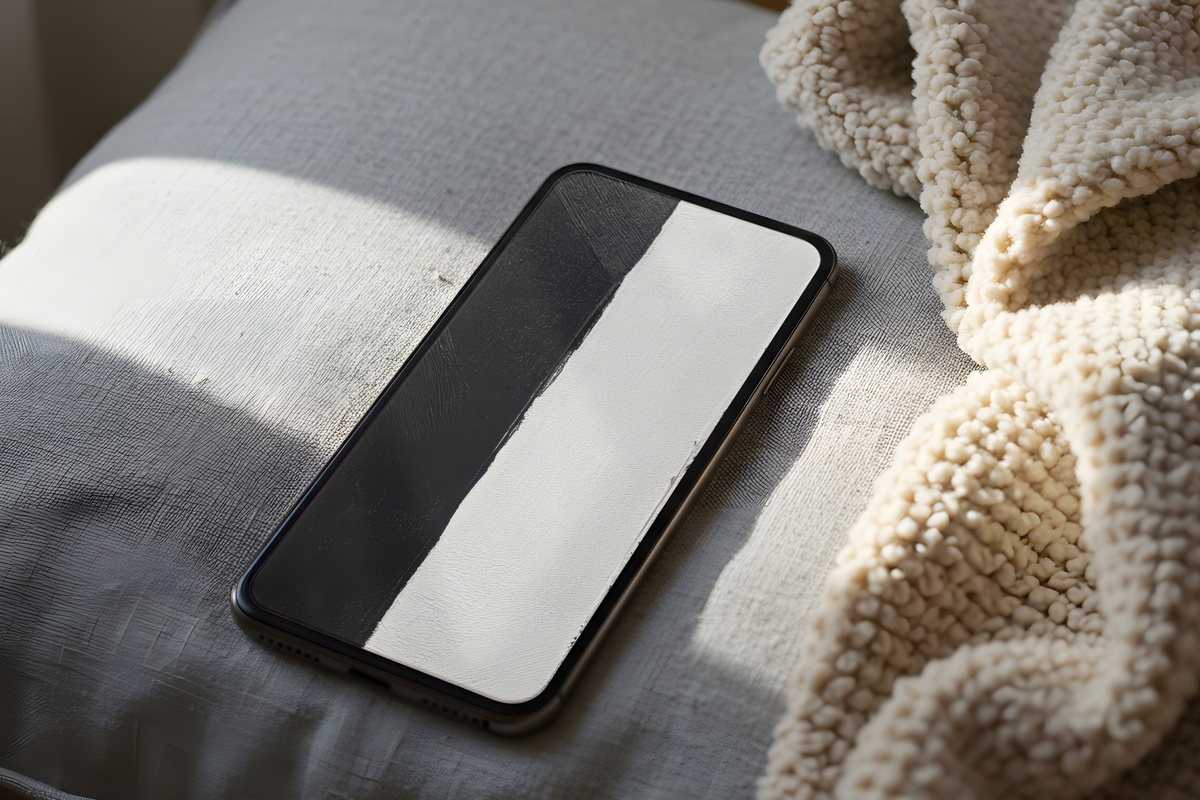
Here's where neutral earns the word drama. Monochrome stripes in a tight, high-contrast rhythm — this is technically a two-value palette, and yet the overall effect is unmistakably calm. The vertical movement pulls the screen taller, adds a crispness that works especially well against a clear phone case or a white or black housing. If your aesthetic skews toward architectural minimalism — clean surfaces, uncluttered shelves, objects chosen deliberately — this is designed in your language. Bold enough to have a point of view, stripped back enough to never shout it.
4. Artistic Silhouettes of Expression - iPhone Wallpaper
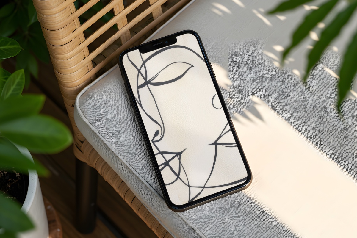
Figurative silhouettes in a warm, parchment-like ground — there's a sketchbook quality here that feels genuinely handmade. The mark-making is loose and gestural without dissolving into abstraction, so the forms stay legible without demanding attention every time you unlock. What you get is a screen that feels inhabited rather than decorated. It pairs naturally with a soft-life aesthetic — think linen, candles still in their holders, books left open on a table. A wallpaper for someone who considers her phone an extension of her personal aesthetic, not just a device.
5. Marble Dreams in Motion - iPhone Wallpaper
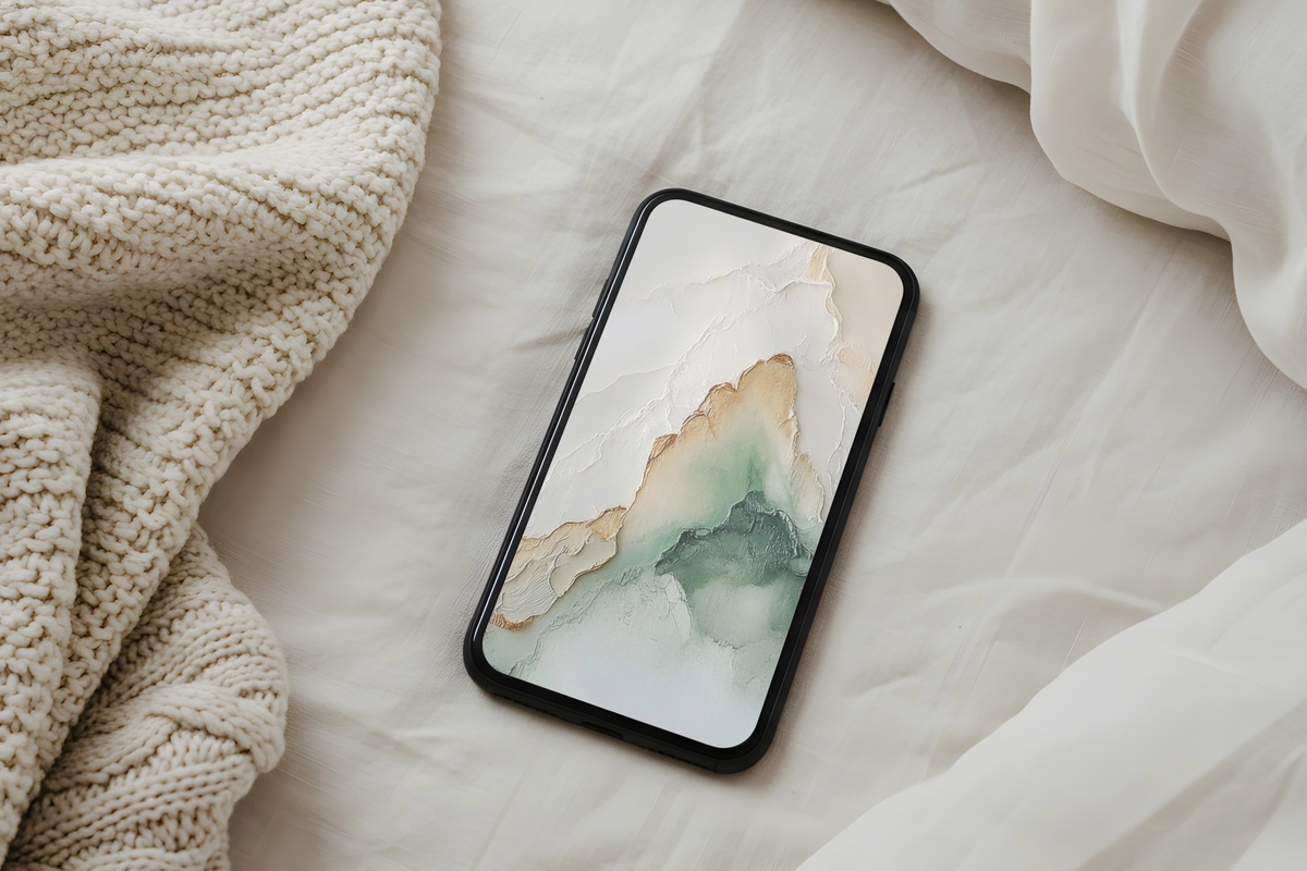
Fluid and organic where most marble-inspired designs feel static, this one moves — the veining drifts across the screen in soft sage and cool ivory in a way that suggests water or cloud rather than stone. The sage reads as a genuine neutral here, sitting between green and grey without committing to either, which makes it work across wildly different phone cases and lighting conditions. Pull it from your pocket on a grey morning and it feels like a clearing. The kind of screen you set and then forget to change because it's always right.
6. Whisper of Feathered Lines - iPhone Wallpaper
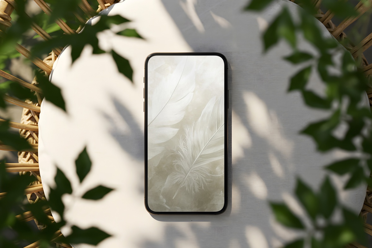
Extremely fine line work — feather-like strokes layered across a pale ground in a cool dove grey — makes this one register differently on OLED screens versus older displays. On a modern iPhone, the detail almost vibrates with quiet precision. It rewards looking at, without ever demanding to be looked at. Worth noting: if you tend toward maximalist interiors or prefer your digital spaces with a lot of visual weight, this one will probably feel underwhelmingly subtle. For everyone else — specifically, anyone drawn to the clean-girl or quiet luxury end of the aesthetic spectrum — it's exactly calibrated.
7. Nature's Linear Elegance - iPhone Wallpaper
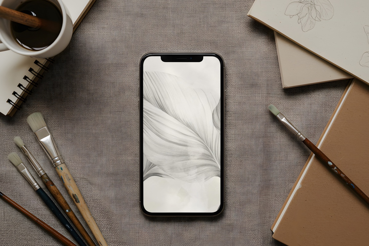
Botanical in reference, minimal in execution — slender linear forms suggest grasses or stems without fully resolving into illustration. The palette is soft grey on near-white, which gives the whole design a pressed-flower-in-a-journal quality: organic origin, refined result. It lives well on the lock screen, where there's more visual space around it, and the vertical rhythm of the forms means the composition doesn't fight with notification stacks. A quieter choice that earns attention slowly, the way a well-chosen object on a shelf does over weeks rather than immediately.
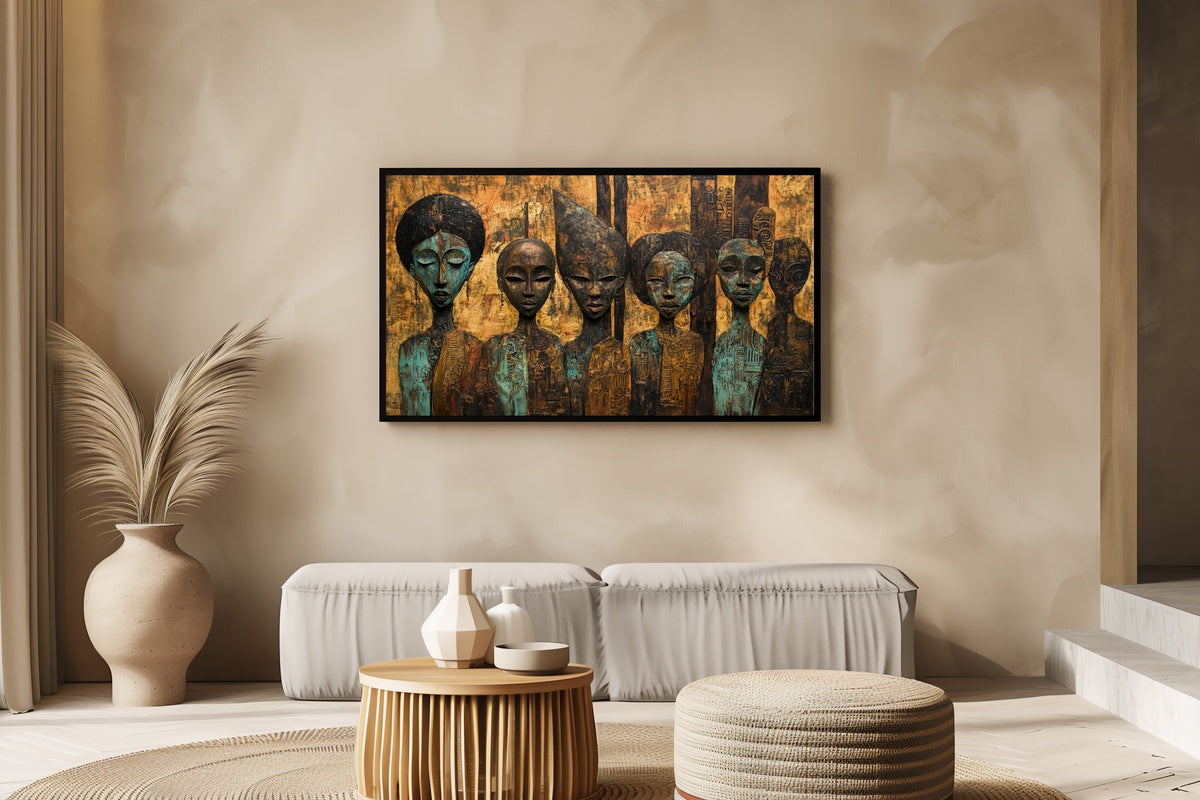
Each of these is an instant digital download — on your screen within moments of choosing, no waiting, no subscription, nothing to return. When the right one catches you, the collection is right there.
And if you find yourself drawn to more than one — which, honestly, makes sense given how differently each palette behaves across morning light versus evening — the numbers work out nicely: any three pieces across the full Gallery Flair range (wallpapers, wall art prints, Frame TV art, all of it mixed however you like) come to 30% off, and any five reach 50%. Build the visual world across your screens and your walls all at once.