7 Modern iPhone Wallpapers: How to Choose by Composition, Palette, and Mood
The lock screen is the first thing you see when you reach for your phone — a tiny gallery moment, repeated thirty or forty times a day. That flash of color, texture, and form shapes your mood more than most people realize. Choosing well means understanding what you actually want to feel in that half-second before the world asks something of you.
What Makes a Modern iPhone Wallpaper Work?
The strongest picks share three qualities: a composition that holds at portrait crop without feeling claustrophobic, a palette that stays legible under notification text and status icons, and a mood that stays true across the brightness range of your screen — from bedside dim to full noon glare. Look for generous negative space around the visual center, a dominant color temperature (warm or cool, not both fighting), and enough restraint in detail that the image reads at a glance rather than demanding study.
1. Desert Calm in Modern Brushstrokes - iPhone Wallpaper
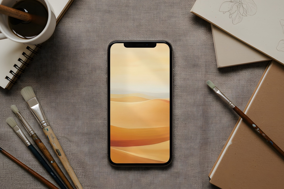
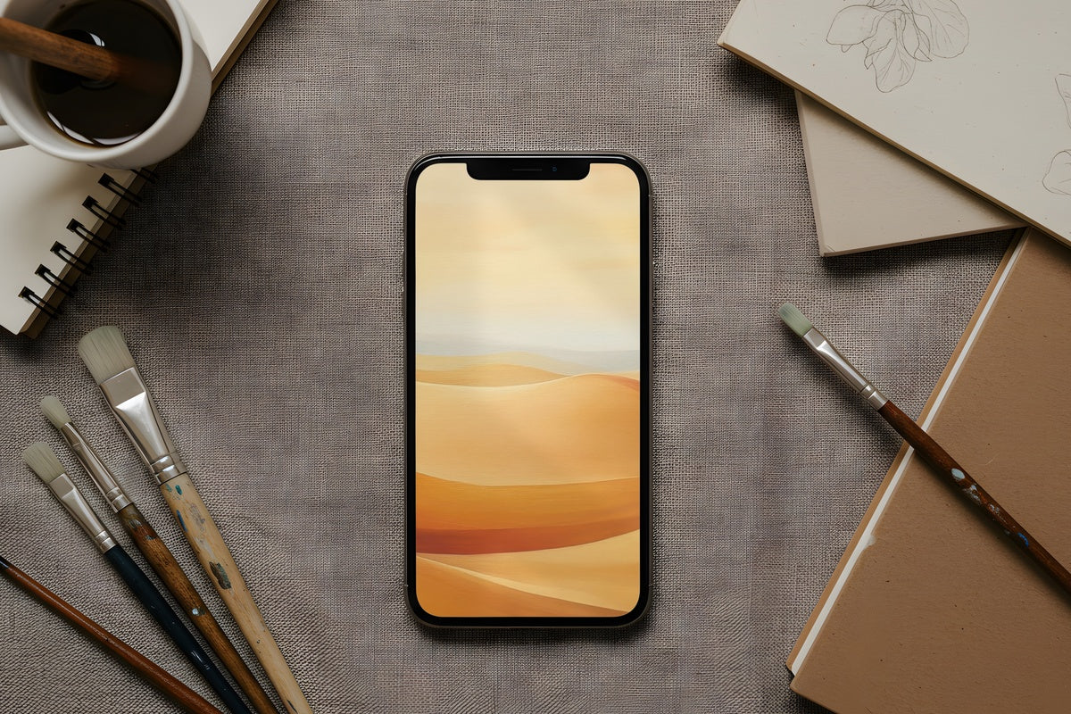
Warm sand, raw umber, and the faintest wash of terracotta — this one reads like late-afternoon light falling across an adobe wall. The brushwork is loose enough to feel alive, contained enough that white notification text floats cleanly on top. Anyone whose morning routine starts with a coffee and a window deserves a lock screen that matches that unhurried energy. A natural anchor for a warm-toned aesthetic, and a grounding choice when the rest of the day asks you to move fast.
2. Blush Floral Modernion - iPhone Wallpaper
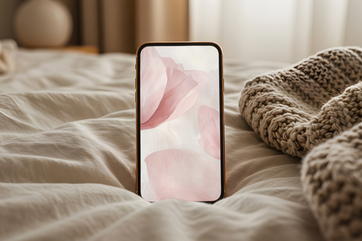
Blush florals have a reputation for tipping saccharine — this one never does. The palette hovers between dusty rose and warm cream, with forms abstracted just far enough that the floral reference feels more like a memory than a motif. What you get is softness without sweetness, femininity without fuss. It pairs beautifully with rose gold hardware and looks particularly good on an iPhone Pro in a neutral case — the warmth on screen and the warmth in hand become one quiet, considered thing.
3. Floral Forms in Blush Tones - iPhone Wallpaper
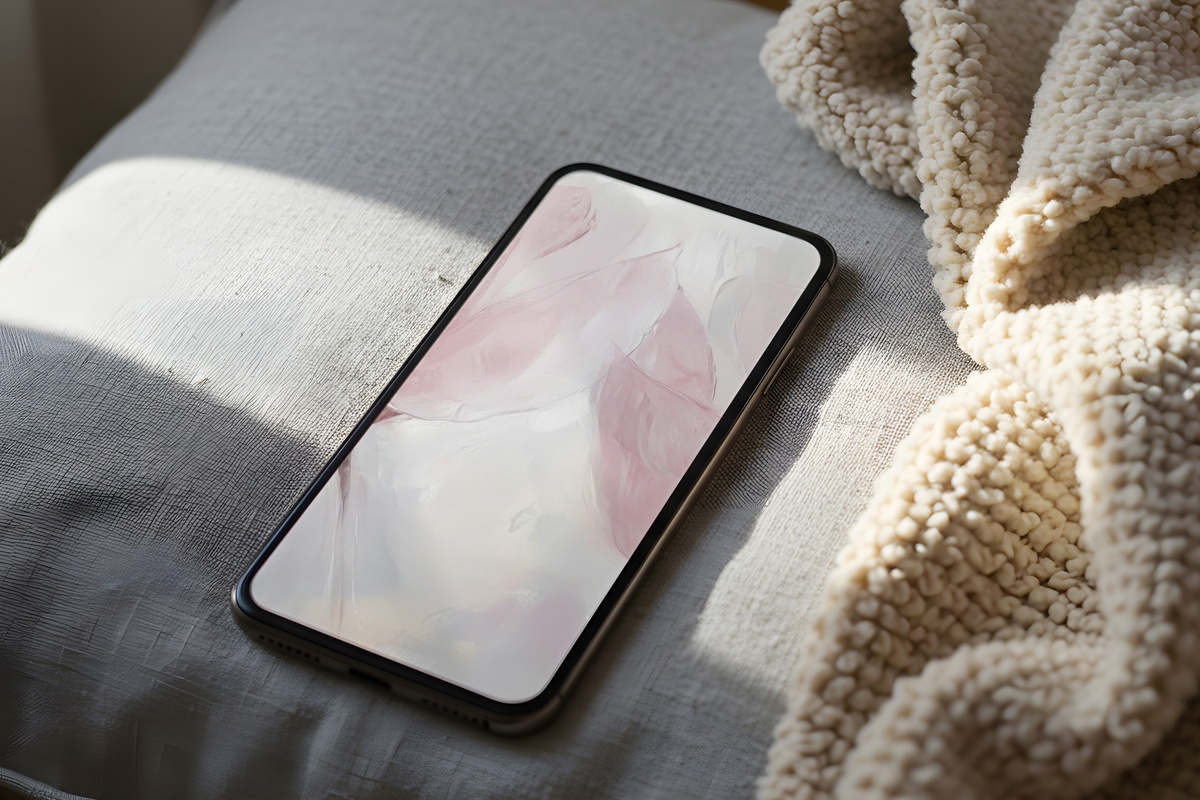
Where the previous blush pick abstracts the floral almost entirely, this one lets the botanical forms breathe — stems and petals rendered with enough definition to feel botanical, enough looseness to feel contemporary. The background tone is cooler, closer to parchment than cream, which gives the whole composition an airy, gallery-print quality. It layers well with soft-life and coquette aesthetics, and the lighter ground means your clock display reads effortlessly at any hour. Closer to a botanical study than a pattern.
If you find yourself drawn to two or three picks and wondering how they'd sit together — that instinct is worth following. A warm desert tone on the lock screen, a cool floral on the home screen, and a matching print on your desk or wall creates the kind of continuous visual mood that makes a space feel genuinely curated rather than assembled. Any mix of Gallery Flair wallpapers and prints counts together toward the volume tiers, so building across formats is worth considering now.
4. Night Sky Depth and Wonder - iPhone Wallpaper
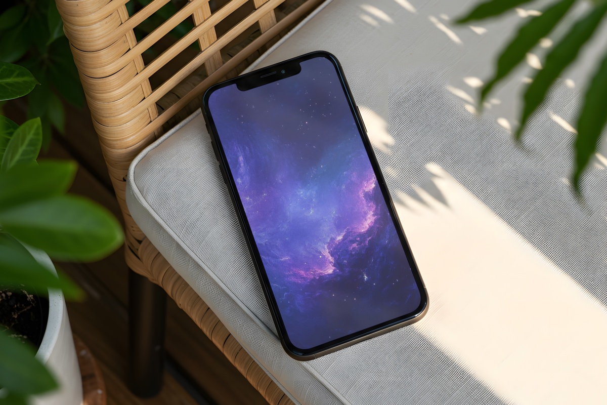
Deep indigo shading into near-black, with a luminous quality that recalls the hour just after sunset when the sky still holds a memory of blue. This is the pick for someone who wants their phone to feel like a small, private object — not a billboard. The dark ground means the display drains less at night, and notification badges pop cleanly against it. Moody without being heavy. If your aesthetic leans toward quiet drama rather than soft brightness, this is where the edit turns.
5. Blue Ocean Wave Elegance - iPhone Wallpaper
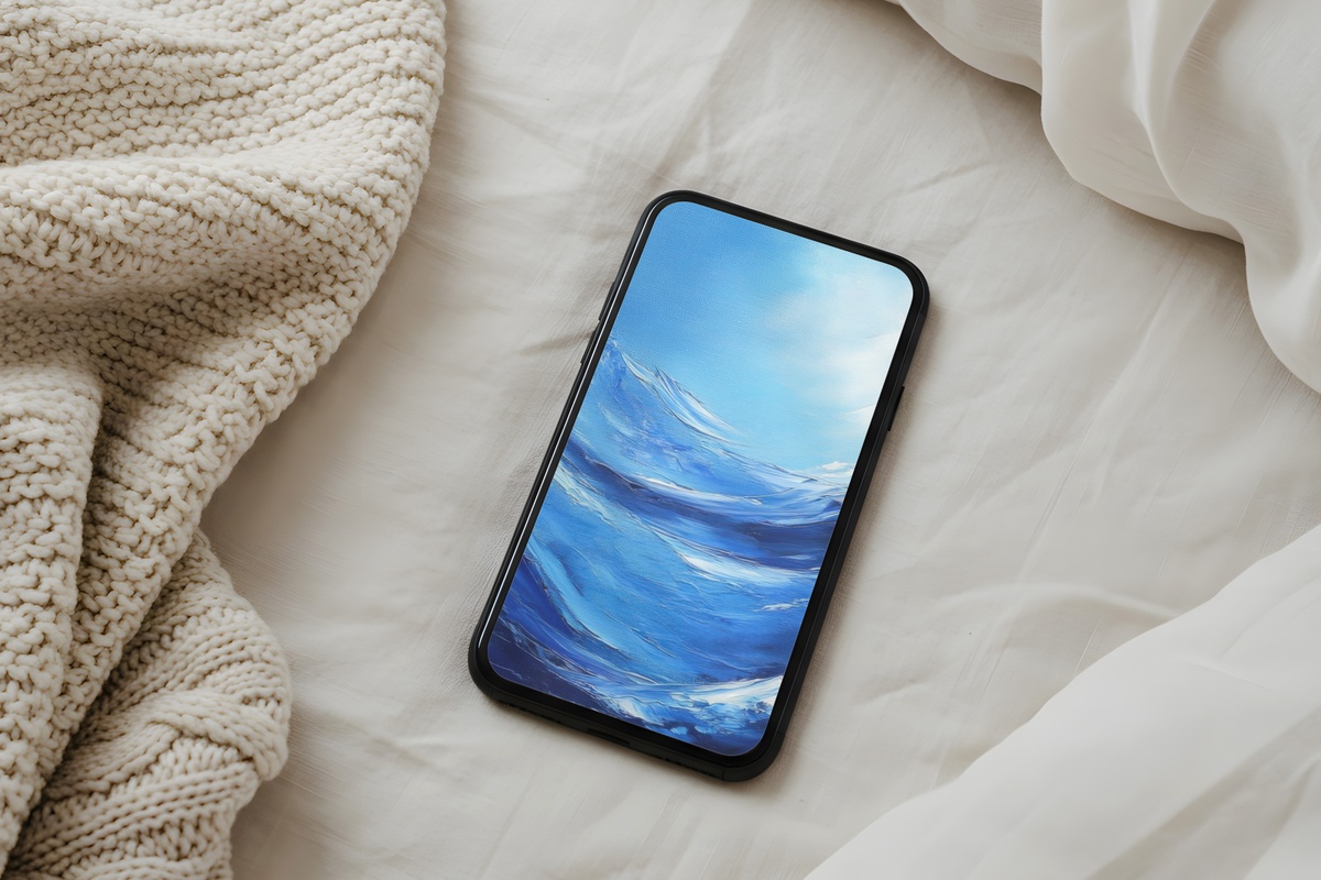
There is something in the rhythm of a wave form — the tension before the break, the release after — that makes it one of the most instinctively satisfying shapes to return to on a screen. This piece captures that in a cerulean-to-deep-teal range, the motion abstracted into graceful horizontal flow. It reads as both serene and alive, which is a genuinely hard balance to strike. A natural companion for a coastal or clean-girl aesthetic, and one that photographs particularly well when sharing screenshots of your home screen setup.
6. Bold Black & White Expression - iPhone Wallpaper
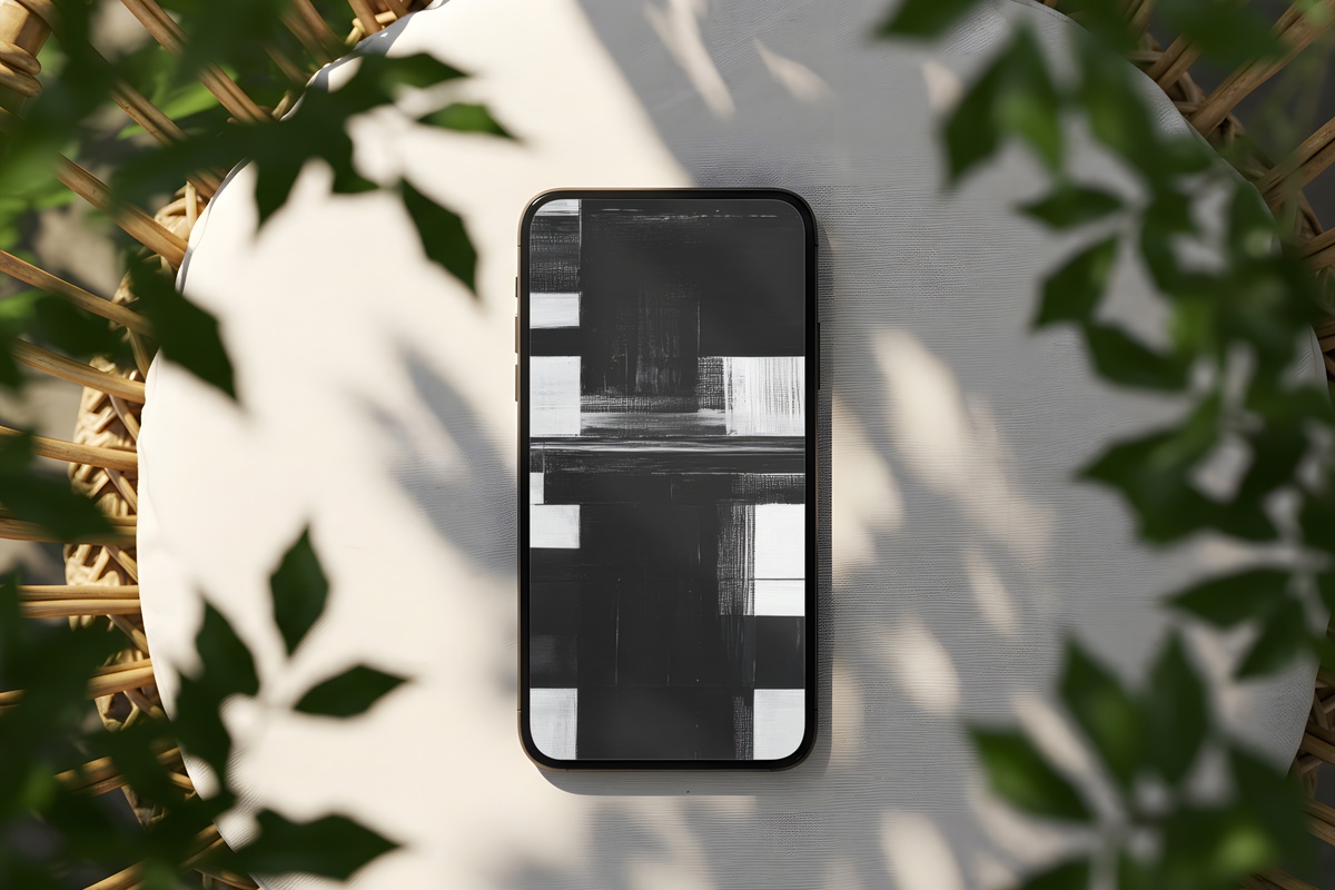
An honest question worth asking before you choose a wallpaper: do you want your screen to feel like a painting, or like a statement? This one is firmly in the second camp. High-contrast monochrome, gestural marks that suggest more than they describe, and a graphic weight that holds its own under a busy home screen grid. It suits someone who treats their phone as an extension of a considered wardrobe — all-black outfit, architectural frames, a single clean-lined ceramic on the desk. No color needed. None missed.
7. Geometric Earthy Symmetry - iPhone Wallpaper
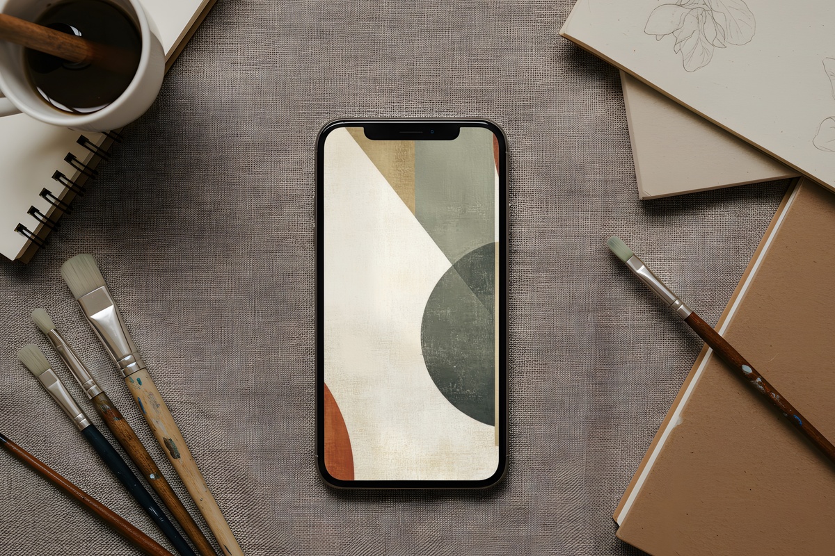
Structure and warmth don't often share a composition this comfortably. Here, geometric forms — think softened angles, symmetrical tiling — are rendered in muted clay, warm taupe, and the kind of ochre that looks like it came from a natural pigment rather than a paint chip. The symmetry gives the eye an anchor, while the earthy palette keeps the whole thing from feeling cold or digital. It bridges the gap between minimalist and organic, which makes it genuinely versatile across different phone cases and screen brightness settings.
Each of these downloads directly to your camera roll — no waiting, no account required, yours from the moment you tap. When the right image is already there and the screen you look at fifty times a day finally reflects your actual taste, something small but real shifts. Browse the full collection whenever you're ready, and trust the piece that made you pause.
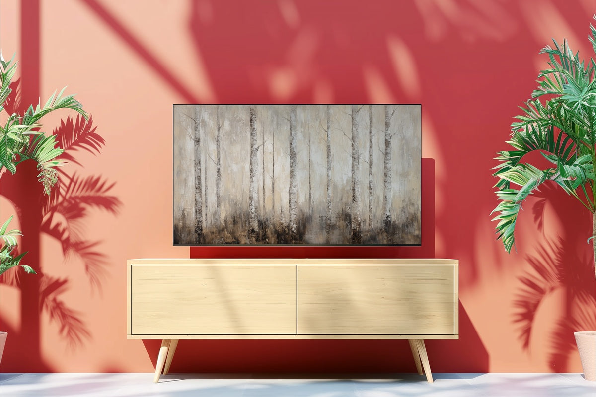
And a small note on building out: the 3-for-30% and 5-for-50% tiers apply across every Gallery Flair format — phone wallpapers, printable wall art, and Frame TV art all count together. Mix a phone wallpaper, a matching wall print, and a Frame TV piece in the same palette and the discount math takes care of itself.