7 Floral iPad Wallpapers: How to Choose by Composition, Palette, and Mood
There's a particular feeling when you lift your iPad off the nightstand first thing in the morning — the screen wakes, and whatever lives on it sets a quiet tone for the hour ahead. A wallpaper isn't decoration in the traditional sense; it's a mood you return to dozens of times a day. Getting it right means knowing what you actually want from it: stillness, energy, softness, or something with a little more texture and story.
What to Look for in a Floral iPad Wallpaper
Three things shape how a floral wallpaper will feel in daily use: composition, palette, and mood. Composition determines where your eye rests — a centered bloom feels grounded, scattered petals feel airy, a close crop feels immersive. Palette sets emotional temperature — cool mauves and blues read as restful, warm blush and peach feel tender, high-contrast brights carry energy. Mood is the sum of both: the difference between a wallpaper that makes you exhale and one that quietly says something about your aesthetic. Consider how the piece reads behind your app grid, not just at full view.
1. Floral Fluidity in Serenity
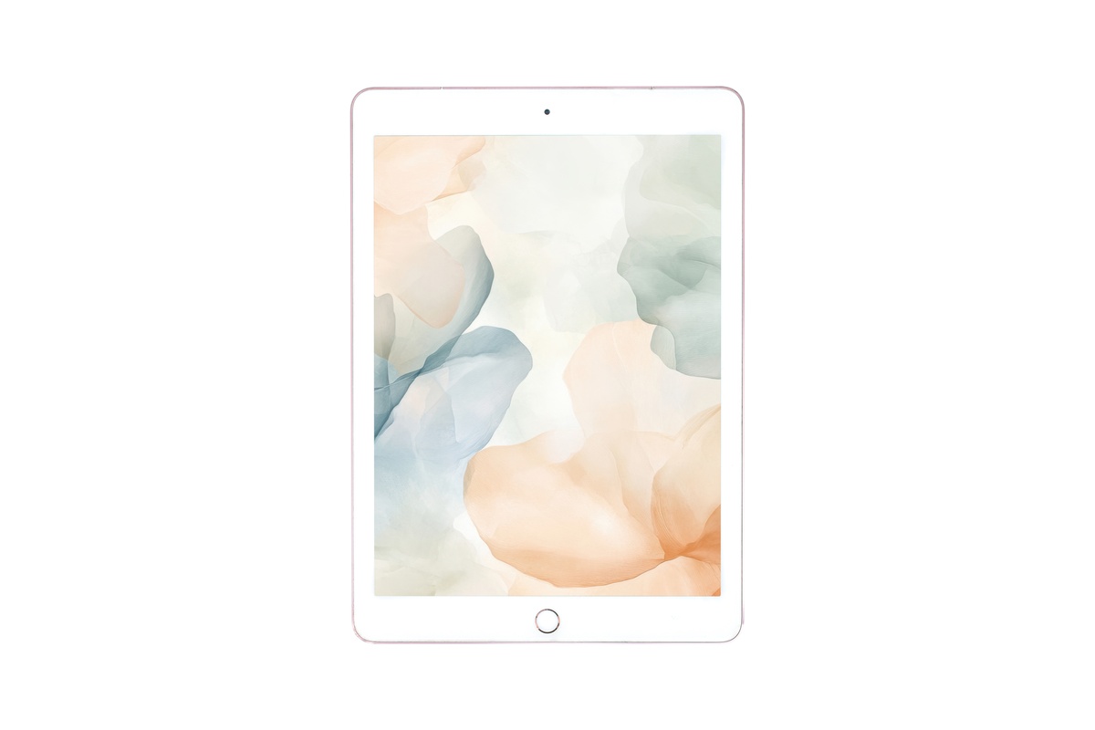
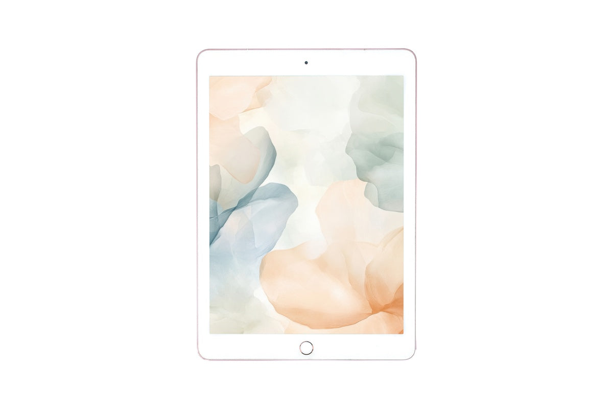
Pale lavender, ivory, and the faintest sage drift across this wallpaper in a way that resists any hard focal point — the whole surface breathes. It's the opener for anyone building a soft-life home screen aesthetic where nothing shouts. Behind app icons, the muted tonal range creates a gallery-quality negative space that doesn't compete. If your iPad lives on a white linen desk or floats between a reading chair and a café table, this one will feel exactly at home there.
2. Graceful Floral Hues

Where the first pick dissolves into atmosphere, this one has a little more presence — blooms that hold their shape without tipping into botanical-chart rigidity. The palette moves through warm cream, dusty rose, and the softest hint of amber, a combination that photographs the way candlelight looks in a white room. It suits someone whose screen time includes journaling apps, digital planners, and late-evening reading — the warmth in the tones ages beautifully across different screen brightness settings.
3. Woodland Bluebells in Tranquil Bloom
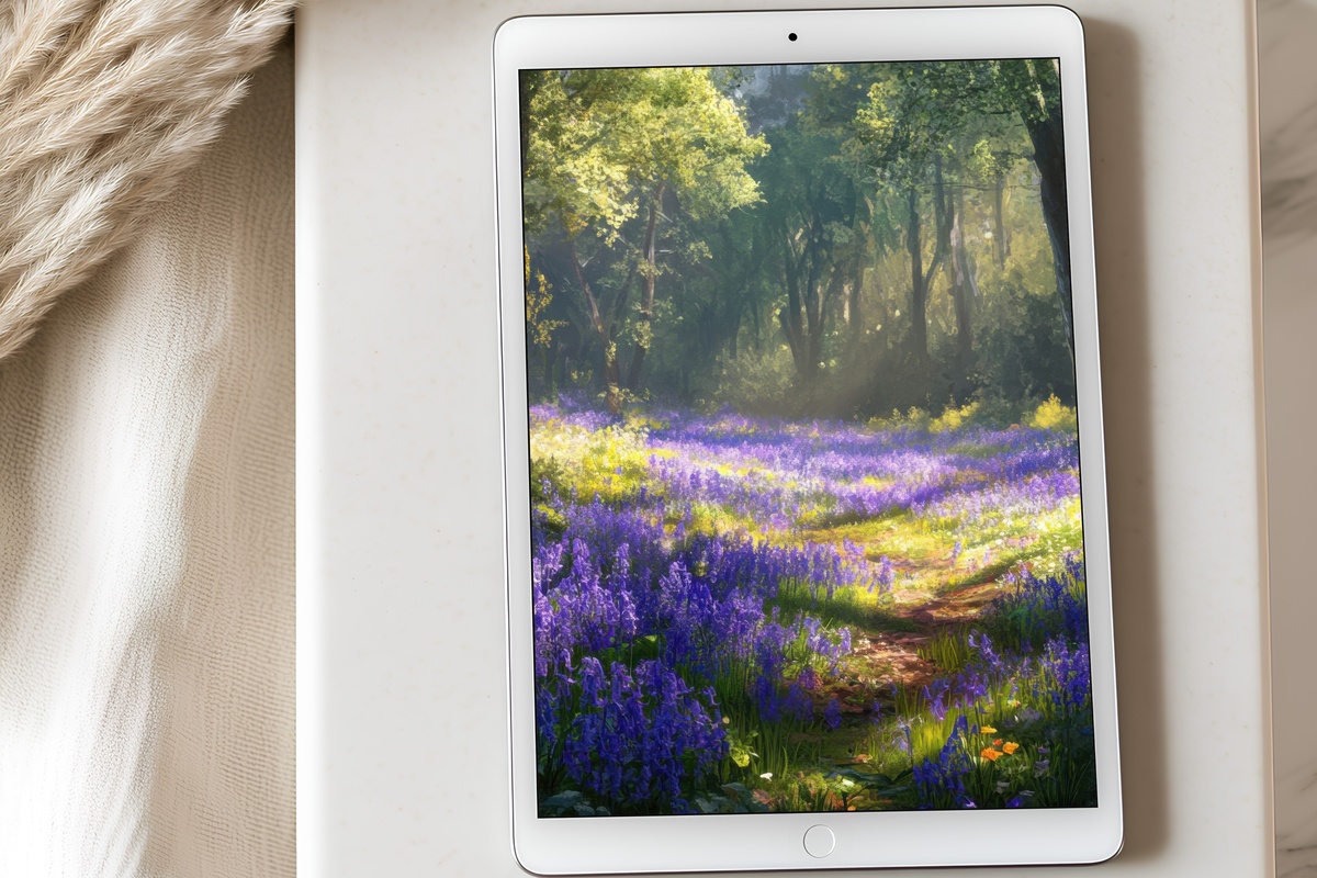
Cool steel-blue and soft violet-grey give this one a vintage botanical quality — closer to a pressed-flower watercolor in a country-house library than anything digital. The loose, trailing composition keeps it from feeling stiff; clusters of bluebells lean and overlap with the relaxed rhythm of something growing rather than arranged. Among the seven picks here, this is the one for readers who prefer their aesthetic to carry a note of quietness with an edge — cottagecore without the sweetness overload.
4. Vased Blush Rose Elegance
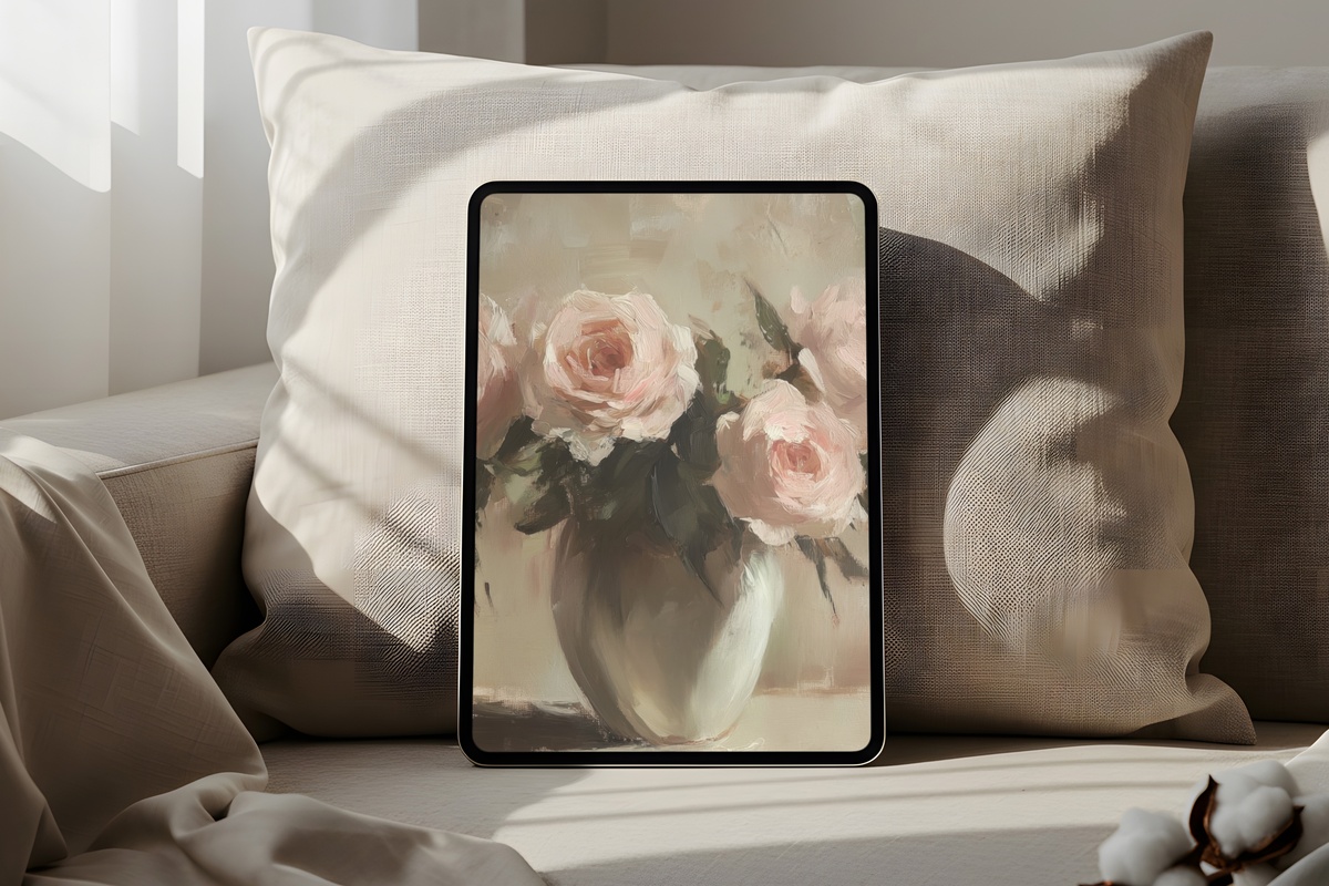
A single vased arrangement against a pale background — this is a composition choice with real restraint behind it. Rather than filling the frame, the roses occupy one zone, leaving generous breathing room on all sides. That negative space is what makes it work as a wallpaper: your app icons find natural room rather than colliding with the image. The blush-to-parchment palette reads as quiet luxury, the visual equivalent of fresh flowers on a marble countertop.
5. Eternal Spring Cherry Blossoms
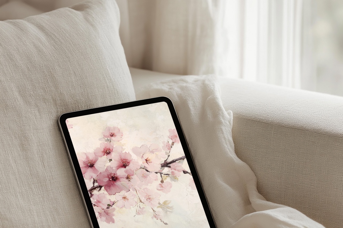
Cherry blossom imagery has a timing problem — lean too literal and it reads as seasonal novelty. This one avoids that by rendering the blooms with a soft diffusion that feels less like a photograph of a specific April and more like a memory of one. The palest shell-pink against a warm white carries a coquette-to-clean-girl versatility that crosses aesthetic lines. Anyone who keeps their iPad in a case that leans cream, blush, or natural linen will find the match here almost uncanny.
6. Blue Sky Daisies in Motion
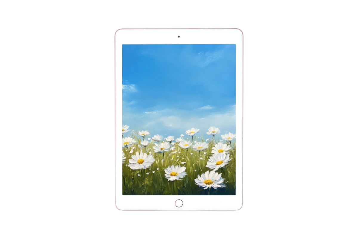
Contrast note: if everything above felt like an exhale, this one is a breath in. Bright white daisy petals against a vivid cornflower blue carry actual energy — the kind of visual temperature that makes a 9 a.m. screen-open feel more like stepping into a garden than sitting down to work. And that's precisely the point. Not every wallpaper needs to whisper. For the person whose aesthetic runs toward dopamine dressing, clean brights, and vintage-summer nostalgia, this one is doing something the softer picks simply aren't.
7. Roses on Weathered Wood
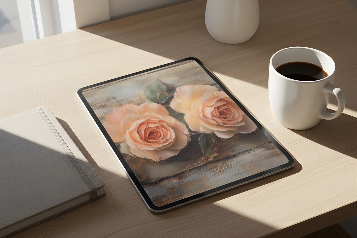
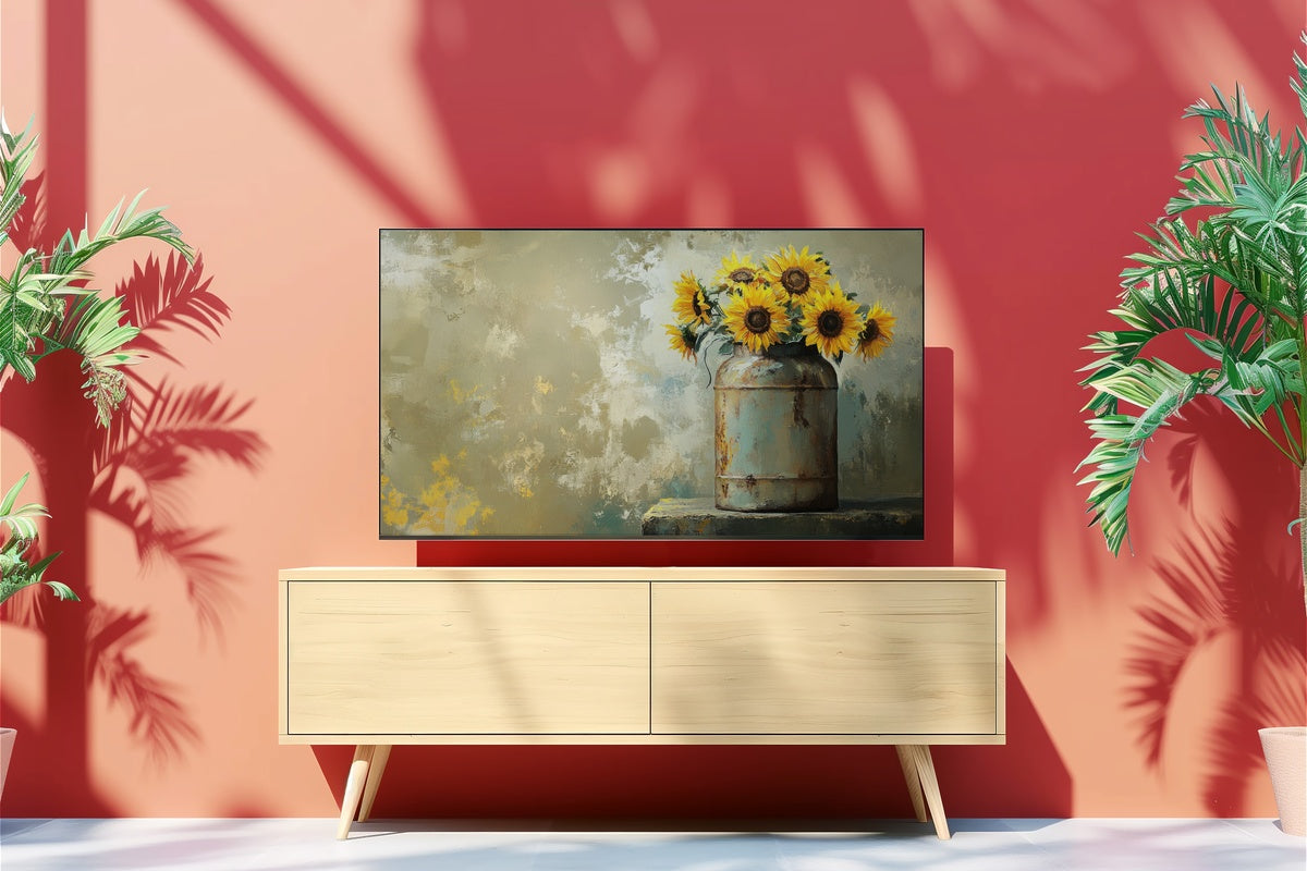
Texture arrives properly here. Roses laid against a weathered wood surface bring a material quality that most floral wallpapers deliberately avoid — and that difference is worth naming. The warm ochre and grey grain of the wood anchor the softness of the petals so nothing drifts into saccharine territory. It reads as slow living with substance: the aesthetic of a farmhouse table, dried botanicals, and something always cooling on the stove. A natural pairing with a warm-toned Frame TV art print or a sepia-palettted wall art piece across the same room.
Each of these is an instant download — no waiting, no subscription, just the file on your device and your screen changed within the next few minutes. Browse the full floral collection whenever the mood strikes; the door stays open.
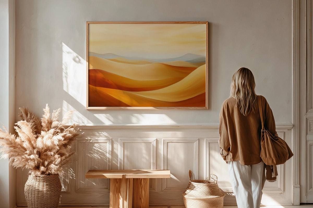
One quiet note on building a visual world: mix formats freely. A floral iPad wallpaper, a coordinating printable wall print, and a Frame TV art piece in the same warm or cool palette family all count toward the volume tiers — three pieces gets you 30% off, five gets you 50%, across any combination of product lines. That kind of cross-format thinking is how a single aesthetic carries from your screen to your wall without feeling like it was planned too hard.