7 Coastal Frame TV Art Picks: How to Choose Composition, Palette, and Mood
Late afternoon. The lamps are on low, dinner is somewhere in the background, and your Samsung Frame TV is the quiet center of the room. What it holds matters — not as a screensaver, but as a considered choice that shapes how the whole space feels. Coastal art is one of the most requested aesthetics for Frame TV, and also one of the easiest to get wrong. Here is how to get it right, with seven pieces worth considering.
What Makes Coastal Frame TV Art Work in a Real Room?
The pieces that hold up over time tend to share a few qualities: a restrained palette that doesn't compete with your furniture, a subject that rewards lingering (something in the middle distance, or a texture that reveals itself slowly), and a mood that stays consistent across different lighting conditions. Avoid anything that looks technically photographic — impressionist brushwork and painterly rendering age far better on an illuminated screen than high-contrast photography does. And pay attention to negative space. Coastal art with breathing room around the subject feels considered; without it, even a beautiful scene can read as crowded.
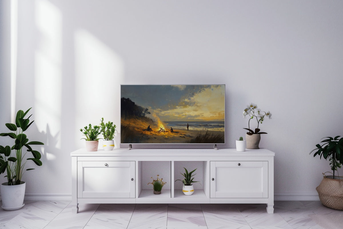
1. Bonfire Gatherings - Frame TV Art
Amber and char and salt air — that is the palette here, rendered in loose impressionist strokes that suggest warmth without spelling it out. The bonfire anchors the foreground while the darkening coastline opens behind it, giving the piece a sense of depth that draws the eye inward rather than across. It reads as genuinely warm in a dimly lit room, the kind of piece that makes a living room feel inhabited rather than decorated. Anyone who gravitates toward gatherings over grand gestures will feel this one immediately.
2. Serene Sailboat Tranquility - Frame TV Art
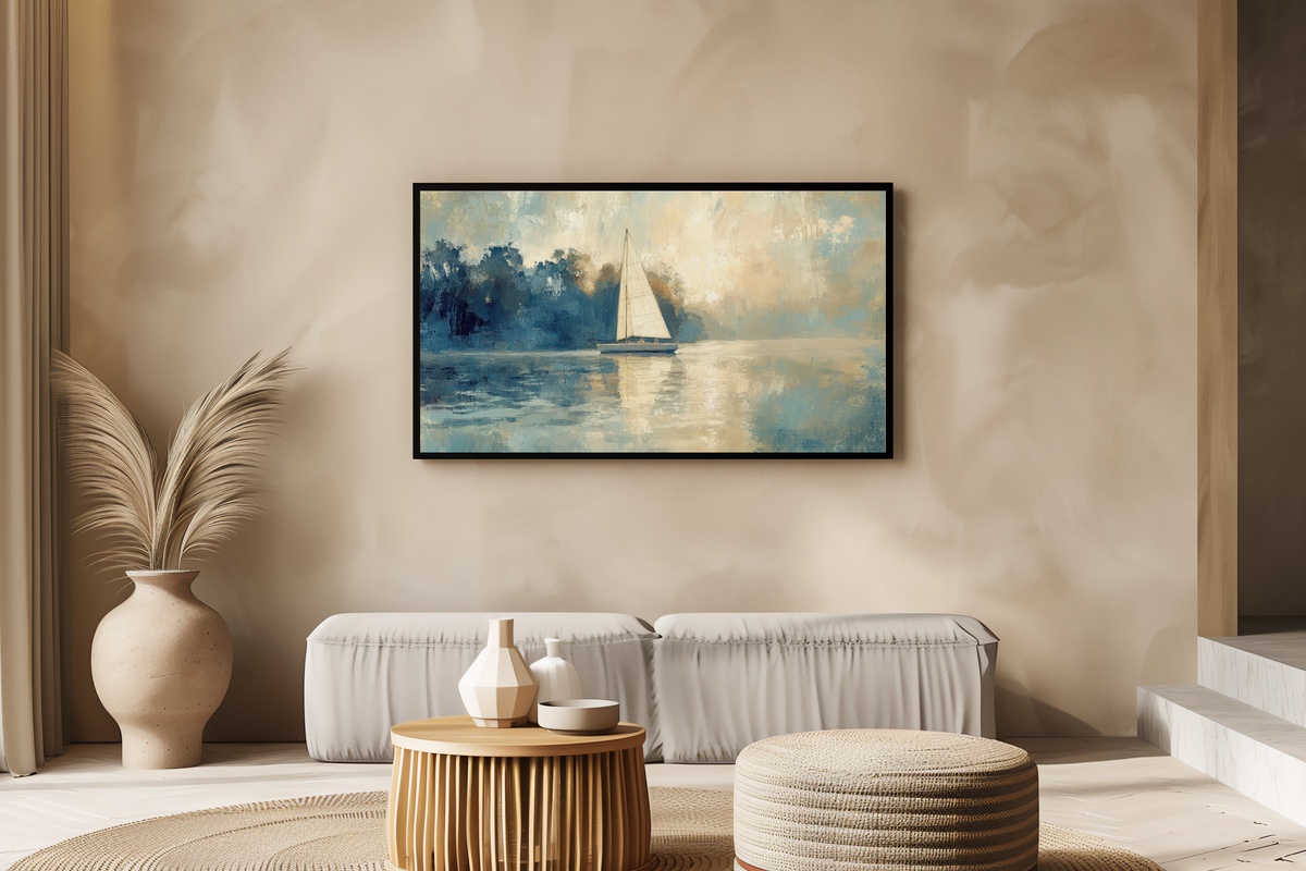
There is a version of nautical art that tips into yacht-club cliché — bold signal flags, high contrast, a kind of performative sailing energy. This piece occupies the opposite end of that spectrum. The sailboat sits small within a broad field of muted blue-grey water and hazy horizon, its white sail a quiet focal point against a sky that barely differs in tone. The impressionist handling keeps it from feeling literal. Rooms with cooler furnishings — stone, linen, pale oak — will find this one a natural fit.
3. Soft Sunrise Serenity - Frame TV Art
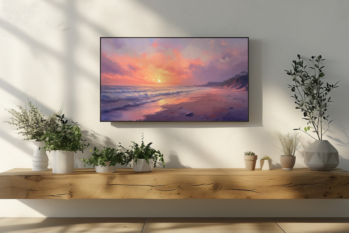
Pale rose bleeding into a washed-out gold, the horizon line sitting low and unhurried — this is the mood of the first twenty minutes of daylight, before the world gets loud. What makes it work on a Frame TV is precisely what could make it difficult: the softness. There is very little contrast here, and that restraint is the point. On a wall where the surrounding tones are cream, warm white, or dusty blush, the piece dissolves into the room in the best possible way. It does not announce itself; it simply belongs.
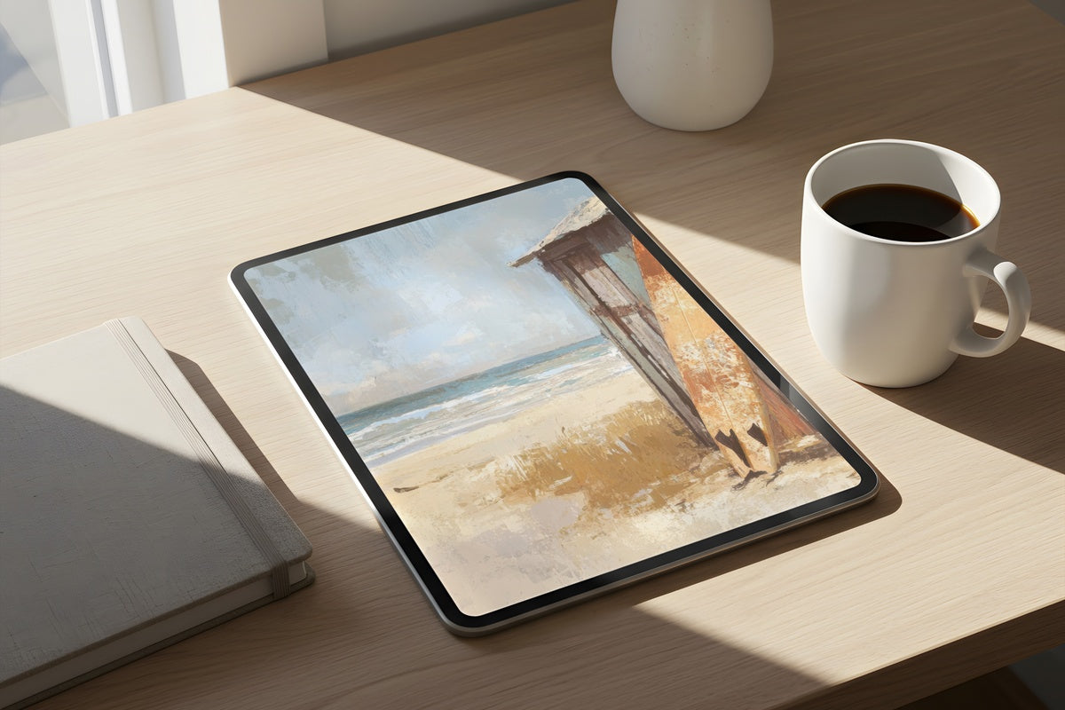
A note on building a coherent visual world: if you are drawn to two or three pieces here, they do not all need to live on the Frame TV. A warm sunrise print on the wall, the sailboat on your desktop background, the bonfire scene on the Frame — same coastal palette carried across different formats, different rooms, one continuous atmosphere. That kind of tonal layering is where the collection really lands.
4. 3D Sunrise Reverie - Frame TV Art
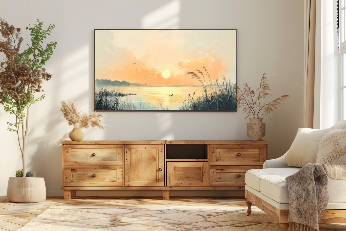
Where Soft Sunrise Serenity recedes, this one steps forward. The 3D rendering gives the beach scene a layered, almost tactile quality — the light seems to exist at different distances from the viewer, which is genuinely unusual for still digital art. Warm coral and burnished gold tones carry more saturation than the other sunrise piece, making this the stronger choice for rooms with deeper wall colors or heavier furniture. Worth noting: if your interior skews minimal or already quiet, this one asks for a little more from the space around it. And that is not a flaw — it is a distinction.
5. Impressionist Reef Depth - Frame TV Art
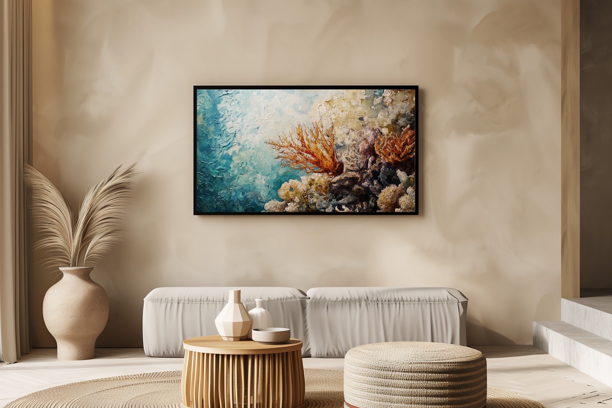
Most coastal art stays at the surface — shoreline, horizon, open water. This piece goes under. The coral reef subject gives it a palette unlike anything else in this edit: deep teal, saturated coral orange, flickers of near-white light filtering down through layered water. The impressionist brushwork is essential here — it keeps the underwater scene from reading as a nature documentary still, and instead gives it the quality of a remembered place. A room dominated by greens or blues will find this one extraordinarily complementary. It is also, genuinely, a conversation piece.
6. Driftwood Shore Solitude - Frame TV Art
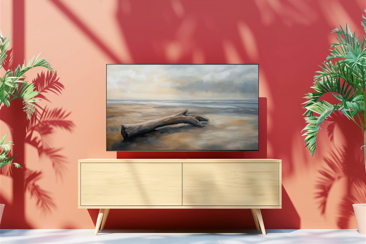
Bleached grey, pale sand, and the kind of overcast coastal light that flattens shadow into mood — this piece asks nothing of you except to slow down. The driftwood subject is formally interesting: it introduces organic texture and a horizontal resting weight that grounds the composition without the usual focal-point tension of a horizon-and-sky scene. If maximalist color is not your register, this one was made for you. Interiors that lean toward raw linen, concrete, washed timber, or any variation of Scandinavian restraint will find this piece a genuinely uncomplicated addition.
7. Soft Hue Fishing Serenity - Frame TV Art
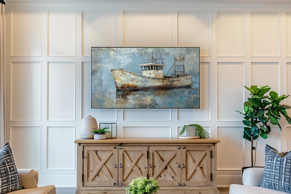
Dusty lavender water, a fishing boat rendered in faded terracotta, the whole scene wrapped in a soft atmospheric haze — there is a quality here closer to memory than to observation, and that is exactly what makes it distinctive. Among the seven pieces, this one carries the most muted overall temperature, which means it pairs easily with nearly any neutral interior. The subject — a working boat rather than a leisure vessel — gives it an unpretentious, lived-in quality that keeps it from feeling like a resort brochure. It is coastal art that has earned its salt.
Every piece here is an instant download — on your Frame TV within minutes of purchase, no waiting, no subscription, nothing to return. The full edit lives in the Gallery Flair collection whenever you are ready to look through it properly.
One last thing worth knowing: the 3-for-30% and 5-for-50% discounts apply across all Gallery Flair product lines together — Frame TV art, printable wall art, and device wallpapers all count in the same tally. So pairing a Frame TV piece with a matching wall print and a phone wallpaper in the same coastal palette gets you there without staying in a single category. The numbers work out more easily than most people expect.