7 Boho Frame TV Art Picks: Composition, Palette, and Mood
There's a particular hour in the late afternoon when the light through linen curtains turns everything honey-warm — and the right piece on your Frame TV can hold that feeling long after the sun moves on. Boho art for the Samsung Frame TV works precisely because it doesn't demand attention; it settles into a room like something that was always there. But choosing well means understanding how composition, palette, and mood each do their part.
What Makes Boho Frame TV Art Work in a Room?
Boho — real boho, not the watered-down version — lives in the tension between pattern and breath. A piece can carry intricate geometric detailing and still feel spacious if the background palette is muted enough to let the eye rest. When choosing boho Frame TV art, look for three things: a palette anchored in at least one earth tone (terracotta, sand, warm taupe, dusty sage); a focal motif with enough visual weight to read across a room; and negative space — even just a suggestion of it — that stops the composition from closing in. The pieces below were selected with all three criteria in mind.
1. Boho Sunburst Harmony - Frame TV Art
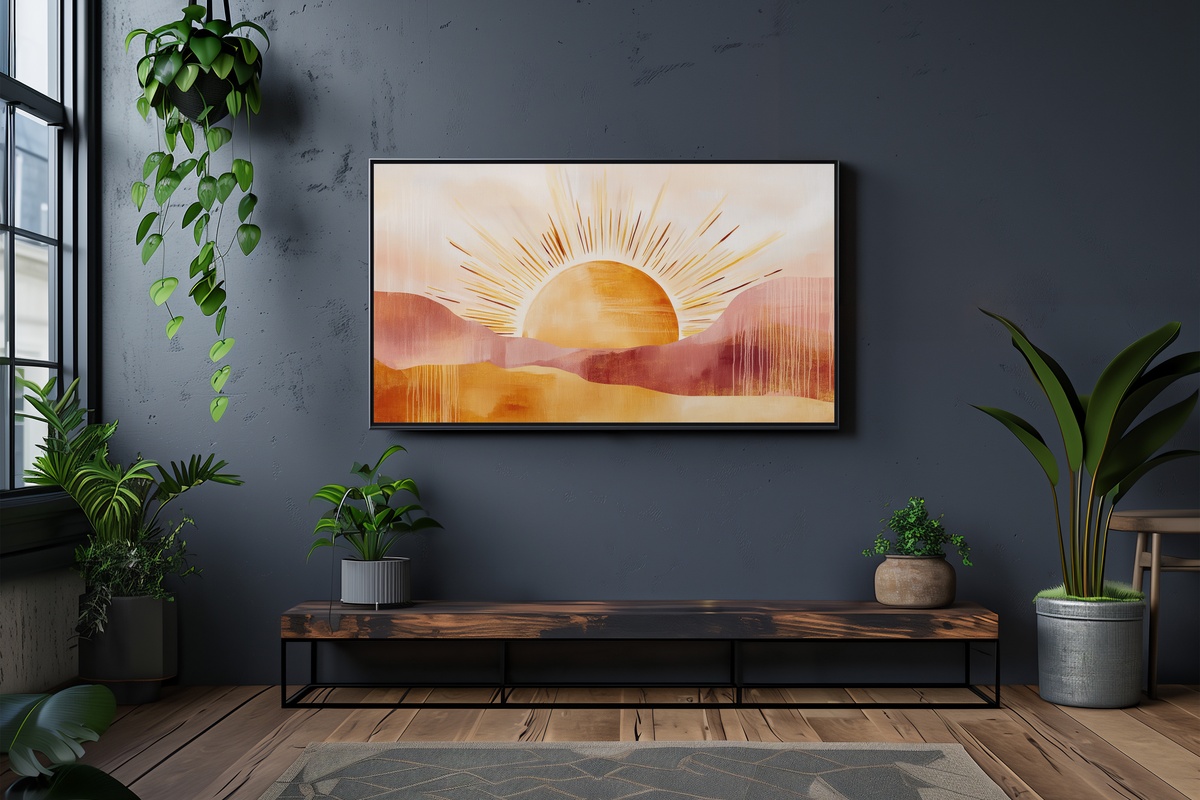
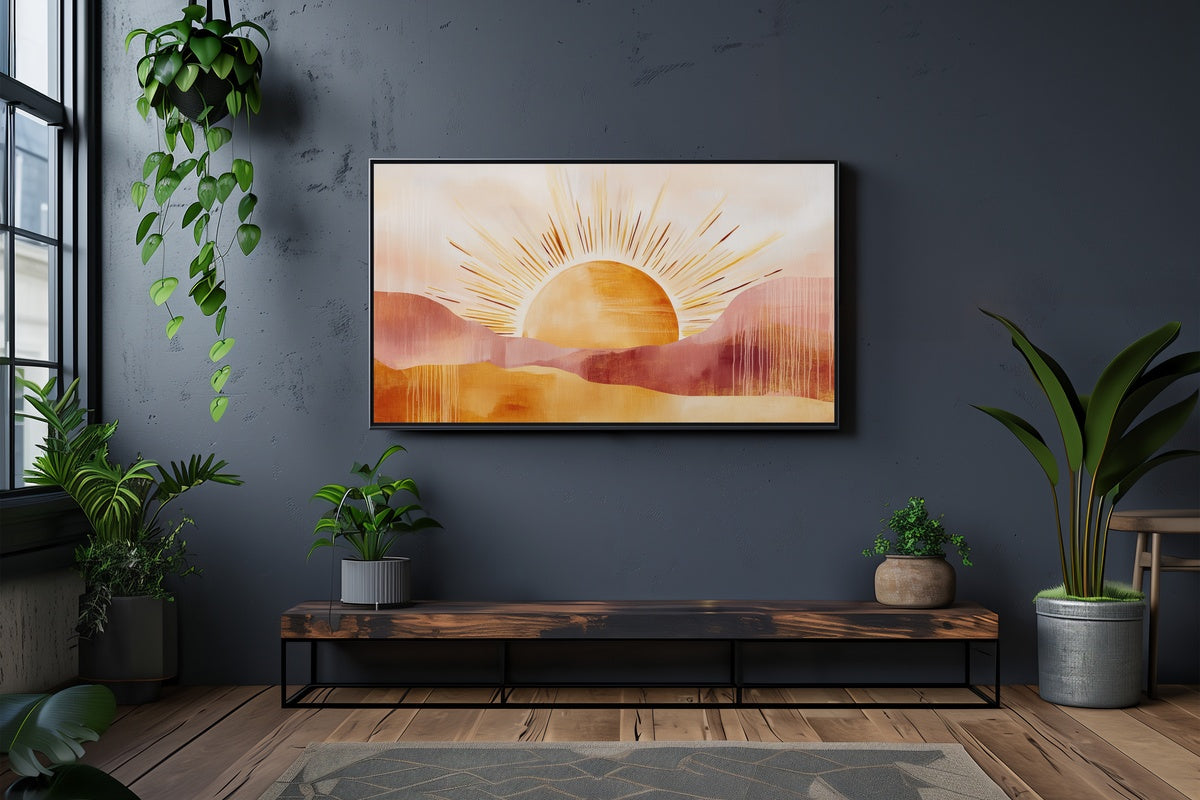
A sunburst rendered in warm amber, ochre, and raw linen — this piece radiates outward from a single point with enough controlled energy to anchor a whole living room wall. What reads as exuberant at first glance resolves into something quite measured: the rays taper deliberately, and the palette never tips into citrus-bright. Think of it as the focal piece for a room that layers jute, raw wood, and woven textiles. It holds its own in both daylight and lamplight, which is rarer than it sounds.
2. Handwoven Basket Elegance - Frame TV Art
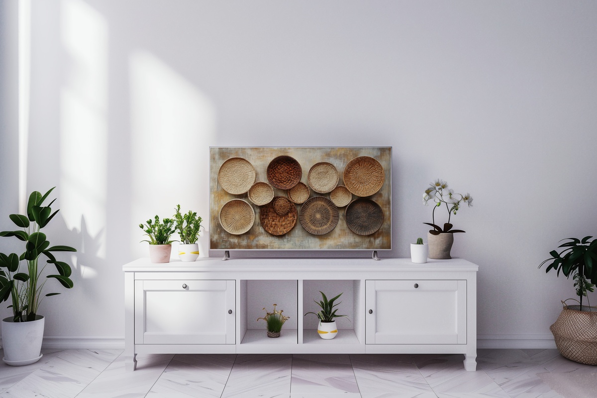
Tactile is a word that shouldn't apply to a screen — and yet here we are. The illustration of handwoven baskets in this piece carries such careful attention to weave texture and shadow that the eye reads it as dimensional. The palette runs warm: dried grass, sienna, aged cream. Anyone who collects actual woven baskets and rattan objects around the home will find this extends that obsession into the Frame TV in a way that feels curatorially intentional rather than accidental. Understated enough to live beside busier rooms without competing.
3. Pastel Mandala Serenity - Frame TV Art
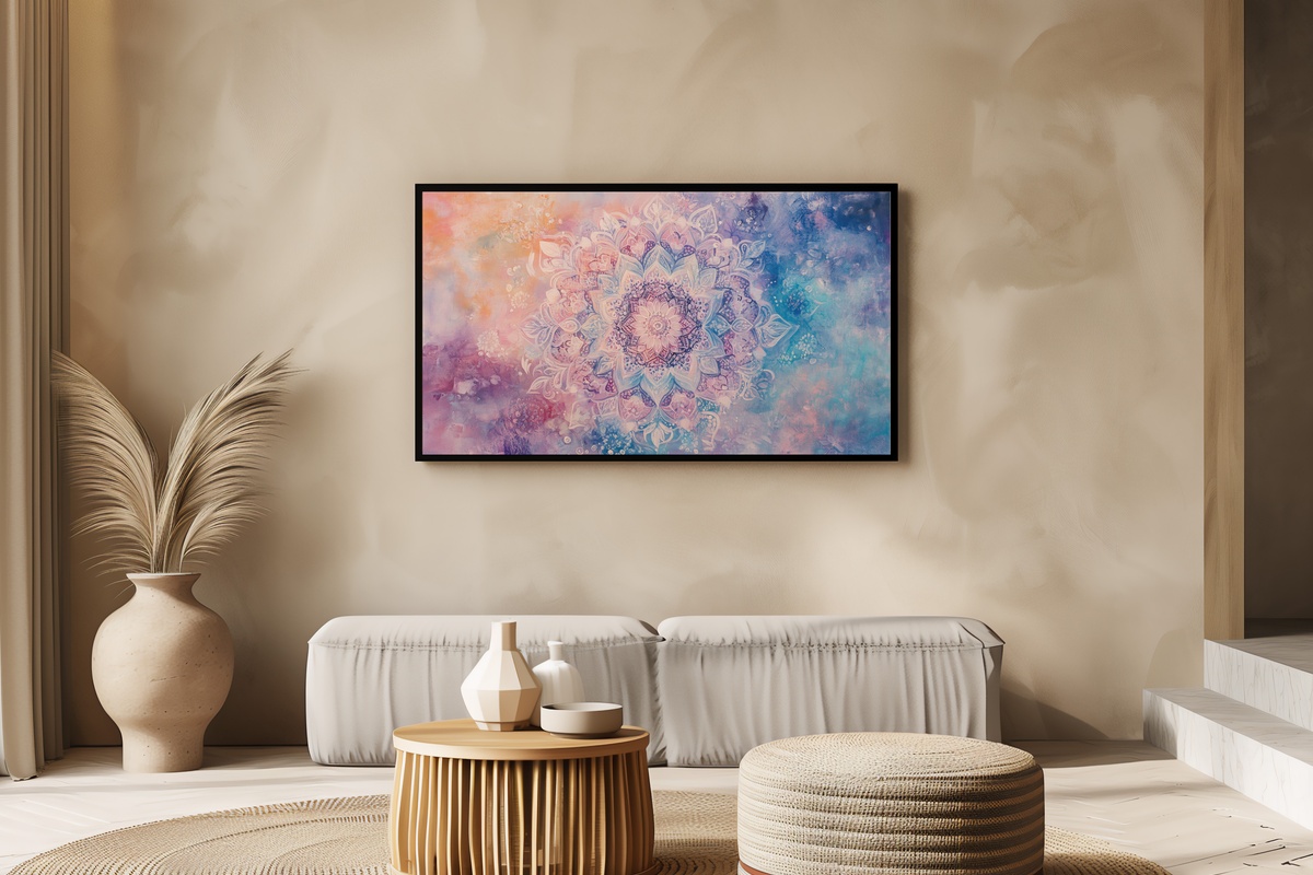
Mandala art has a reputation for veering decorative in the wrong direction — all density, no room to breathe. This piece sidesteps that entirely. The palette shifts toward dusty rose, soft lavender, and pale sage, and the mandala's outermost rings dissolve into open field rather than bleeding to the edge. It reads almost meditative on a dimmed Frame TV in the evening, the kind of thing you notice slowly rather than all at once. A natural fit for bedrooms and reading corners where the goal is quiet rather than statement.
4. Rattan Shelf Whimsy - Frame TV Art
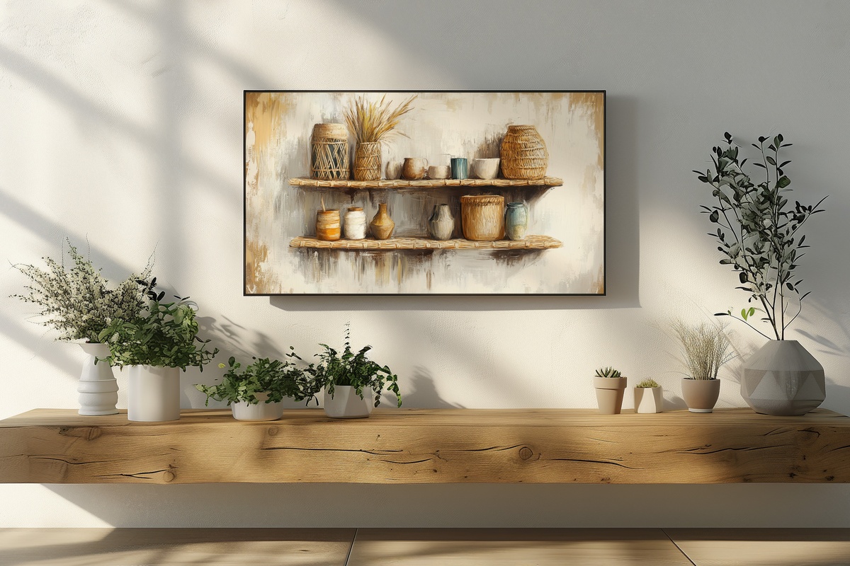
This one operates on a different compositional principle than the others — it uses a vignette-style arrangement, a styled rattan shelf scene with trailing plants and earthy vessels, to create a window into a world rather than a flat pattern. The effect is almost trompe-l'oeil: the Frame TV starts to read as an actual shelf niche in the wall. Warm honey tones dominate, with flashes of terracotta and dried botanicals. It suits rooms that lean into the lived-in, collected feeling of slow-living interiors — and if your actual shelves are already styled this way, the visual rhyme is quietly satisfying.
Worth noting: if you're building a visual world across your home rather than a single statement piece, a warm-toned boho Frame TV piece pairs naturally with a wall print in the same earthy palette, or a phone wallpaper carrying a similar botanical motif. All three formats count together toward the volume tiers — more on that below.
5. Tribal Adventure Palette - Frame TV Art
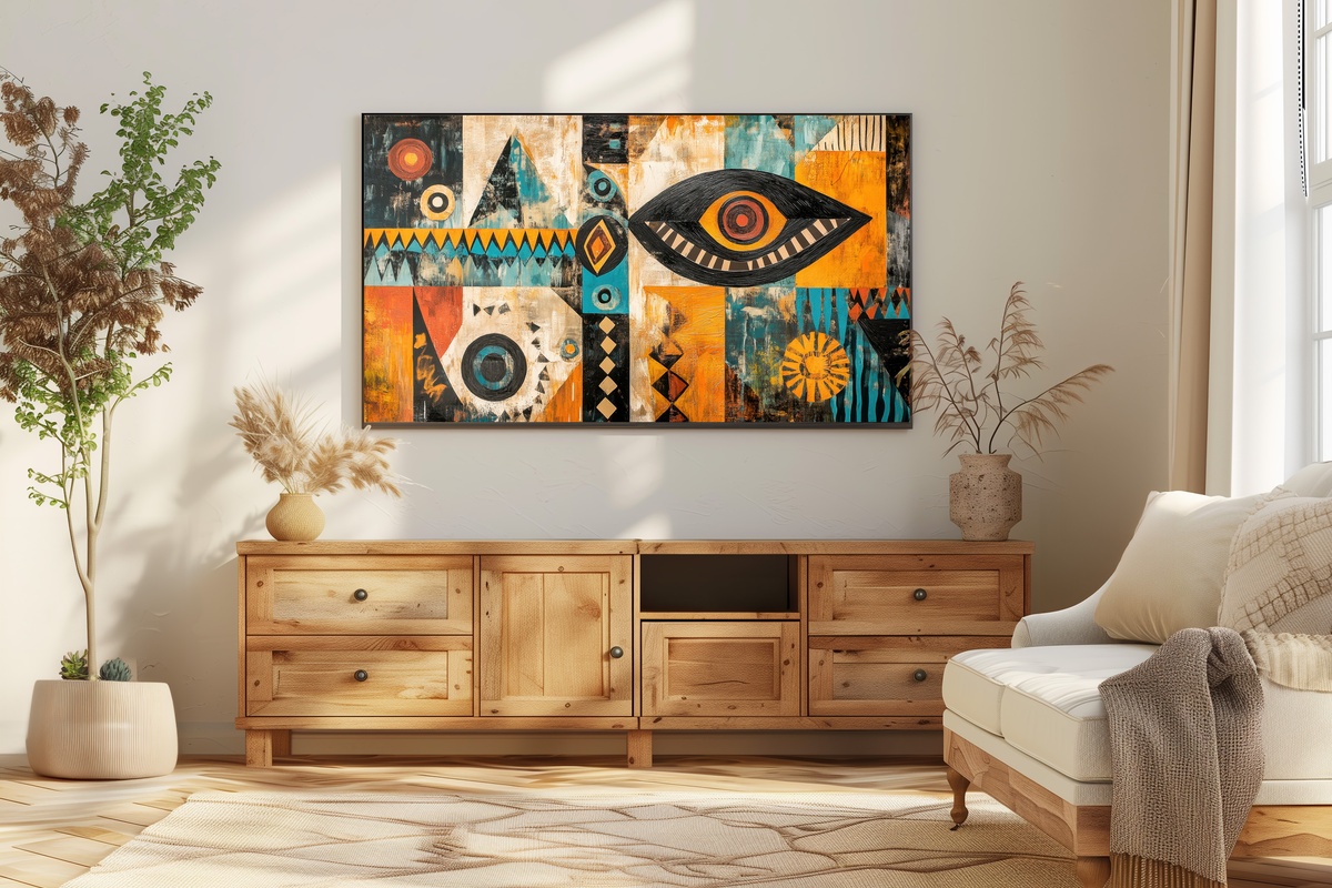
Richer and more saturated than the other picks here, the Tribal Adventure Palette leans into rust, deep teal, and warm ivory in a geometric composition drawn from global textile traditions. It's the piece for rooms that aren't shy — a space with a bold Moroccan rug or chunky knotted throw will meet this piece as an equal. But the geometry is precise enough that it never feels chaotic. High contrast, clear structure, genuine visual energy. If your interior tends toward the spare, this one may ask more of you than you're comfortable giving — and that's a feature, not a flaw.
6. Earthy Feather Elegance - Frame TV Art
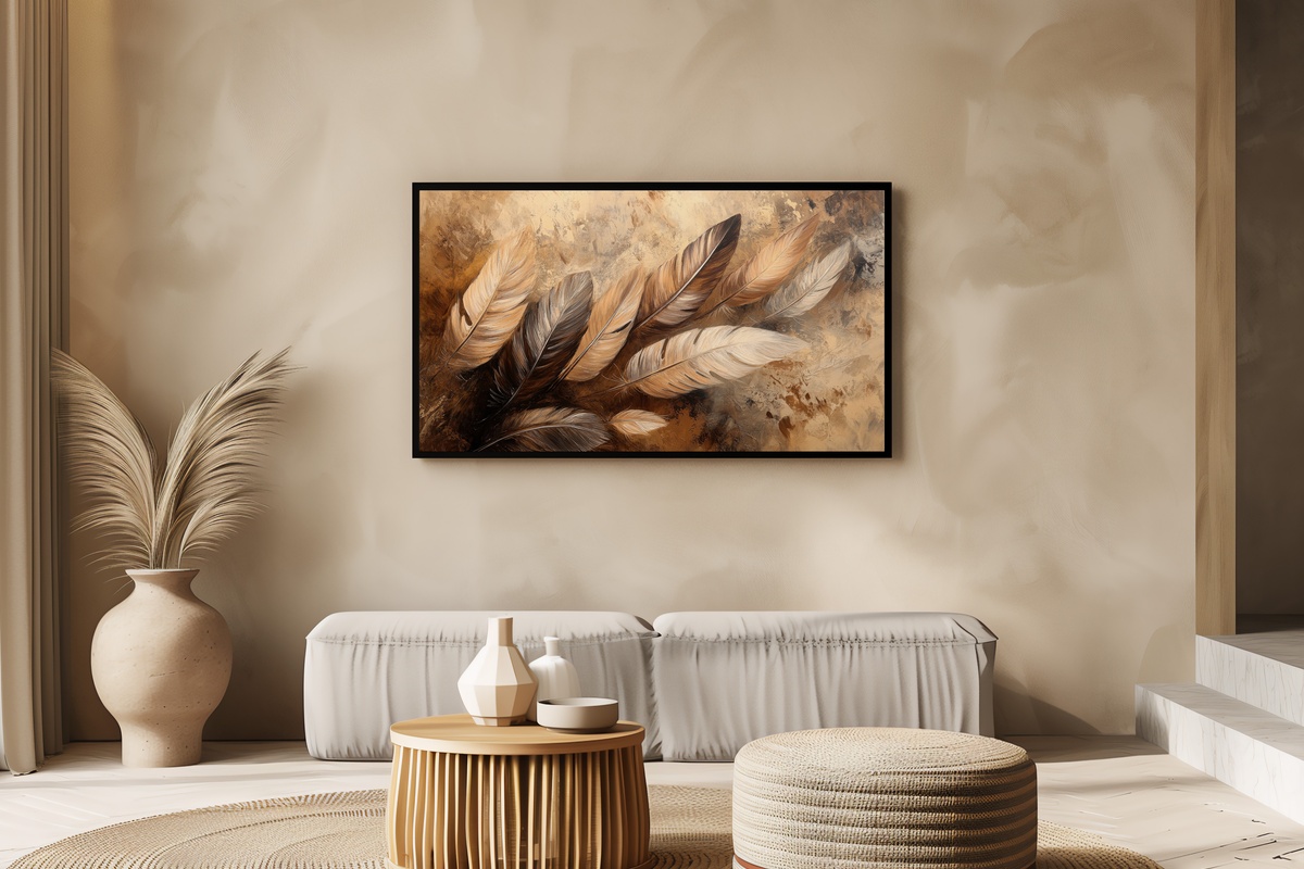
Feather motifs in boho interiors have become so common that the execution now matters enormously. Here, the rendering is genuinely considered — each feather drawn with enough individual detail that the overall composition rewards closer looking while still reading clearly from across the room. The palette is grounded: warm taupe, muted olive, and a thread of copper that catches the eye without shouting. Something between botanical illustration and folk art. It works particularly well in entryways and transitional spaces, where guests encounter it briefly but leave with an impression.
7. Henna Floral Harmony - Frame TV Art
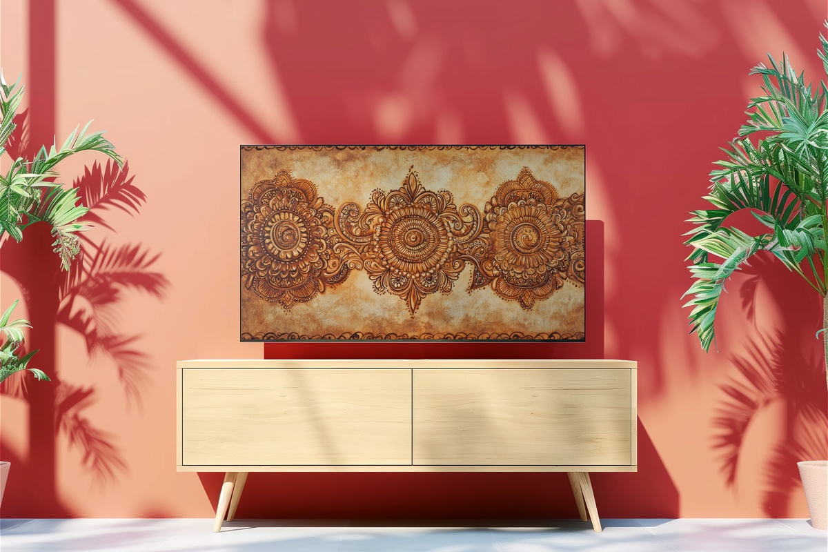
Drawn from the visual language of henna artistry, this piece carries a density of line that rewards patience — the longer you look, the more you find. Warm umber and raw ivory form the base, with florals spiraling outward in the interlocking rhythms of South Asian pattern-making tradition. It's best suited to rooms where the surrounding decor is relatively restrained, letting this serve as the room's one moment of elaborate detail. The Frame TV's matte finish mode handles the fine linework beautifully, preserving every curl and petal without the glare that would flatten them.
Each of these pieces downloads instantly — no waiting, no subscription — and loads directly into your Samsung Frame TV's Art Mode at full resolution, ready to live in your room before the evening is over. When you're certain which pieces feel right, take your time browsing the full collection.
A note on collecting across formats: the 30% and 50% volume tiers at Gallery Flair apply to any combination of three or five pieces — Frame TV art, printable wall art, and device wallpapers all count in the same basket. If a sunburst or mandala from this edit pairs naturally with a wall print for your reading nook and a coordinating phone wallpaper, that three-piece mix reaches the first tier. The math tends to work itself out once you start thinking in palettes rather than single pieces.