7 Abstract Printable Wall Art Picks: Composition, Palette & Mood
There's a particular pause that happens when a piece of art is genuinely right for a room — not a dramatic reaction, just a quiet settling, the sense that the wall has finally found its purpose. Choosing abstract printable wall art is less about matching paint swatches and more about reading a piece the way you'd read a room: for temperature, weight, and what it asks of the light around it.
What to Look for in Abstract Wall Art
Before you scroll, a few things worth holding in mind. Composition governs where your eye goes first and how long it stays — a piece with strong directional movement reads differently at a distance than one built on balance and rest. Palette sets the room's emotional register: warm golds and blush read as golden-hour intimacy; charcoal and ink read as considered restraint. And mood is the cumulative effect of both — the feeling that lingers after you stop consciously looking. Ask yourself whether a piece needs to anchor a room or simply breathe inside it. The answer shapes everything.
1. Golden Tapestry Splendor - Printable Wall Art
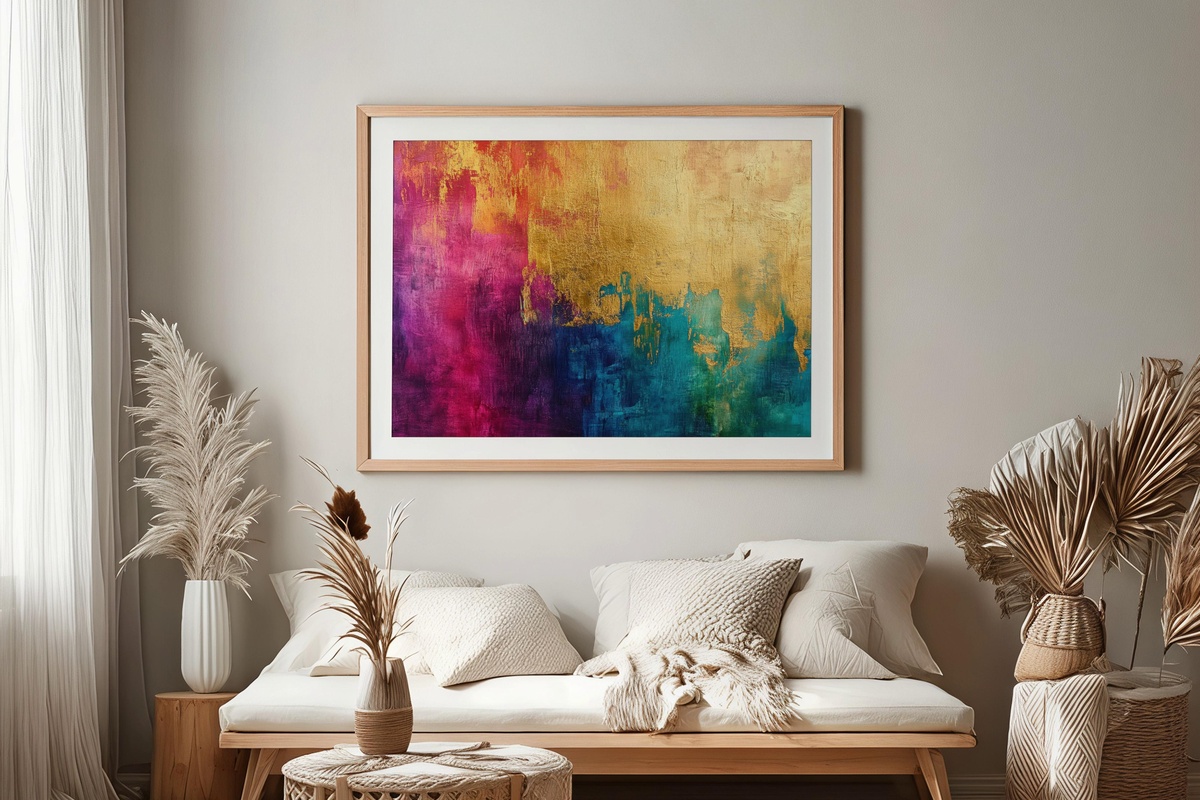
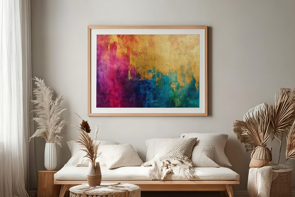
Gold leaf rendered in layered, interwoven strokes — this piece reads more like woven textile than paint, which is exactly what makes it interesting. The warm amber and antique-gold palette draws light into a room rather than reflecting it back harshly. A natural match for dining rooms lit by pendant lamps or a living room where candlelight flickers at dusk. There is genuine depth here: the longer you sit with it, the more the layering reveals itself, thread by visual thread.
2. Rosy Gilded Harmony - Printable Wall Art
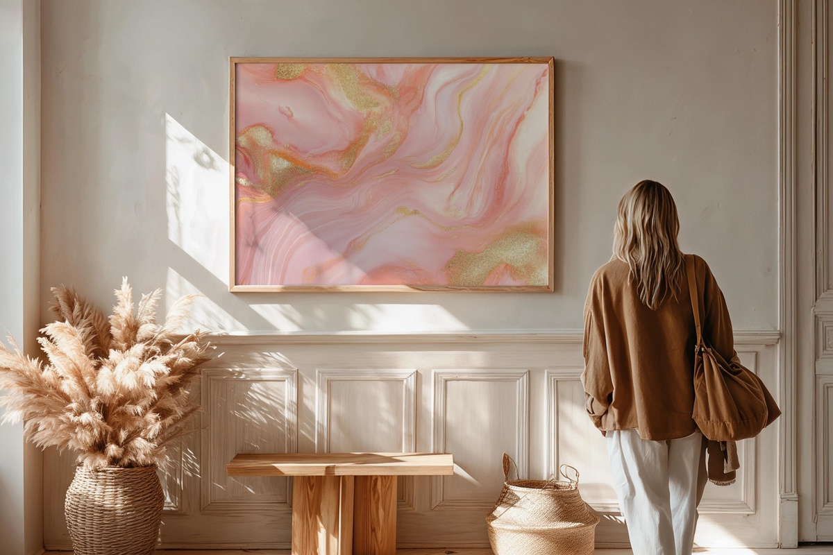
Blush and gold is a pairing that risks tipping saccharine — all sweetness, no tension. What saves this piece is the way the gold traces are applied with restraint, threading through the rose tones like light through a sheer curtain rather than sitting on top as ornament. The mood is genuinely serene, closer to a soft February afternoon than to a Valentine's palette. A bedroom, a dressing nook, a reading corner where the lamp stays warm — those are its natural habitats. Pairs beautifully with natural linen and matte white frames.
3. Sunset Hues Canvas - Printable Wall Art
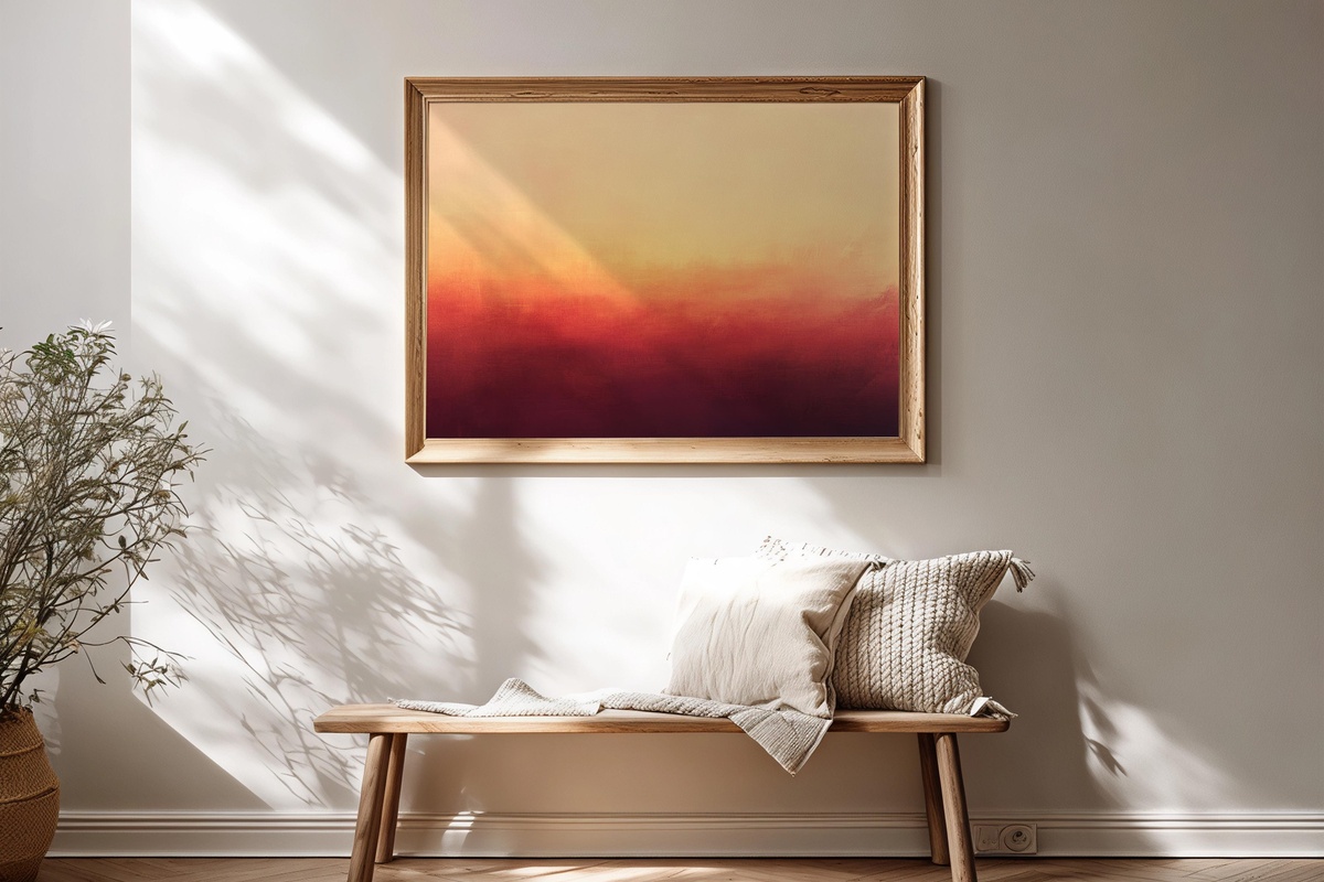
Terracotta bleeding into amber, amber lifting toward a pale coral — the palette here records a specific moment in the sky, that ten-minute window when colors stop competing and simply dissolve into each other. What makes it work as wall art rather than just as a color study is the composition's horizontal flow, which carries the eye across the frame at a slow, unhurried pace. Rooms that already hold warm wood tones or earthy ceramics will find an easy rhythm with this one hanging nearby.
4. Crimson Noir Cascade - Printable Wall Art
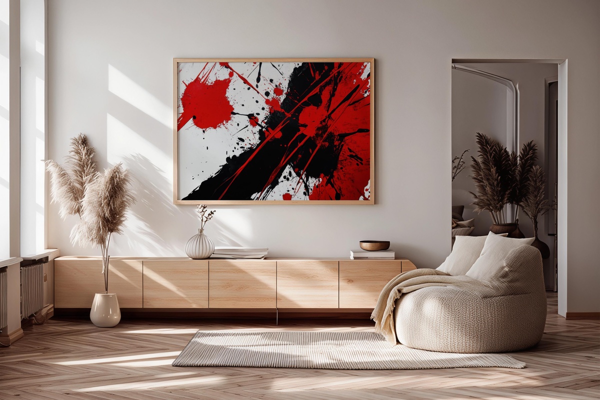
Red and black in motion — this is not a quiet piece, and it makes no apology for that. The dynamic splashes carry genuine kinetic energy, the kind of visual tension you'd associate with action painting at full commitment. For anyone who finds most abstract art politely decorative rather than actually alive, this is a different proposition entirely. It asks for a wall with space around it: a wide hallway, a living room with high ceilings, or a studio where creative energy is already the ambient condition. Nothing timid pairs well alongside it.
5. Bold Silhouette Balance - Printable Wall Art
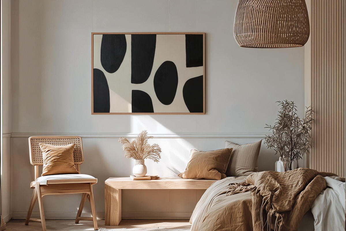
Negative space is doing substantial work here. Bold black forms float against a cream ground, and the silence between them is precisely where the composition breathes. If you've ever rearranged a bookshelf specifically to create more emptiness — pulling volumes out just to let the remaining ones feel more intentional — you'll recognize the aesthetic logic of this piece immediately. It lives comfortably in minimalist interiors, Japandi-influenced rooms, or any space where restraint is the governing design principle. A piece that rewards attention without demanding it.
6. Strokes of Monochrome Energy - Printable Wall Art
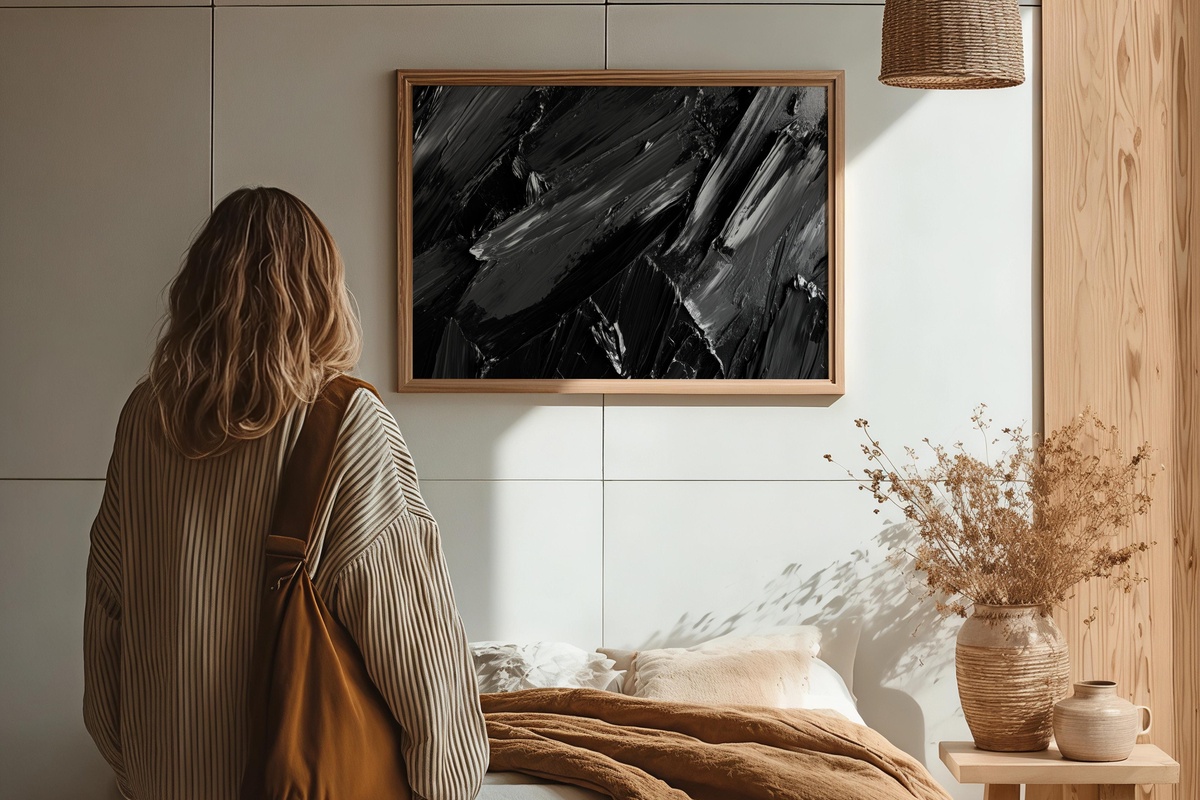
Where Crimson Noir Cascade leads with color drama, this piece channels its energy through contrast alone — charcoal, mid-gray, and white in layered, gestural strokes. The monochrome constraint is what gives it authority: every mark earns its place because there is nowhere for a weak one to hide. Particularly well-suited to rooms built on a neutral palette where a single piece needs to provide all the visual interest without introducing a competing color temperature. A home office wall, a concrete-floored loft, a gallery-hung staircase — this one holds its ground in all of them.
7. Vibrant Shape Crescendo - Printable Wall Art
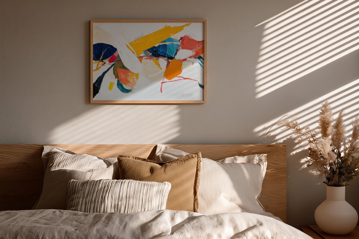
If the rest of this edit leans toward contemplation, this piece is unambiguously about joy. Saturated shapes — deep blue, ochre, coral, forest green — arranged with a rhythm that feels genuinely musical, each form arriving at the right interval. Mounted in a kitchen, a children's creative space, or an entryway that sets an optimistic tone for every return home, it does something the quieter pieces here cannot: it greets you. Anyone who makes decorating decisions the way they build playlists — color, energy, and sequence all considered together — will know exactly what this means.
Every piece in this edit is an instant download — print-ready files on your screen within moments of checkout, sized for whatever wall or frame you already have in mind. No waiting, no subscription, no expiry on the files. When the right piece presents itself, there's rarely a good reason to let the room stay empty longer than it needs to.
And if more than one piece has stayed with you while reading — that pull toward building a palette rather than just placing a single print — the numbers work in your favor. Any combination of three pieces across our printable wall art, Frame TV art, and device wallpapers brings the total down by 30%; five pieces across any mix of those same categories brings it to 50% off. One continuous visual world, at a price that reflects the way most rooms actually come together: a few considered things at once.