7 Abstract Desktop Wallpapers: How to Choose by Composition, Palette, and Mood
There's a moment every morning — laptop open, coffee still steaming, the day not yet demanding anything — when your desktop background is the first piece of visual information your brain receives. It lands before your inbox, before your calendar, before any of it. So what you put there matters more than most people think.
Abstract art has a particular advantage on a desktop screen: no literal subject, no narrative to process, just palette and form doing their quiet work. But choosing well means knowing what you're actually responding to. Here's how we think about it.
What Makes an Abstract Desktop Wallpaper Work?
Three things: composition (where the eye goes and how much tension it carries), palette (warm, cool, neutral, or high-contrast), and mood (the emotional register the piece occupies all day while you work). A restless composition fragments focus. A palette that fights your app windows creates visual noise. And a mood that doesn't match how you want to feel at your desk is just friction. The picks below represent seven distinct answers to this equation — spanning earthy calm to bold drama, woven texture to gestural energy.
1. Woven Harmony Threads - Desktop Wallpaper

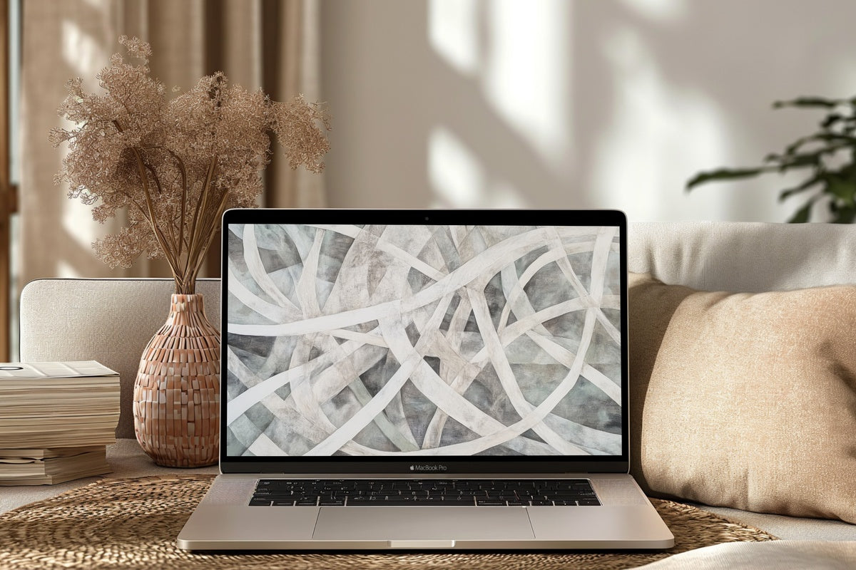
Threads and crossings, rendered in muted ochre, warm grey, and ivory — this one feels less like a digital file and more like a piece of undyed linen pinned behind your workflow. The interwoven structure gives the eye enough to trace without demanding attention, which is exactly what a background should do. It recedes when you're focused, and surfaces as something quietly considered when you look up. For desks that lean neutral and rooms where the word "considered" does a lot of work.
2. Earthy Horizon Whispers - Desktop Wallpaper
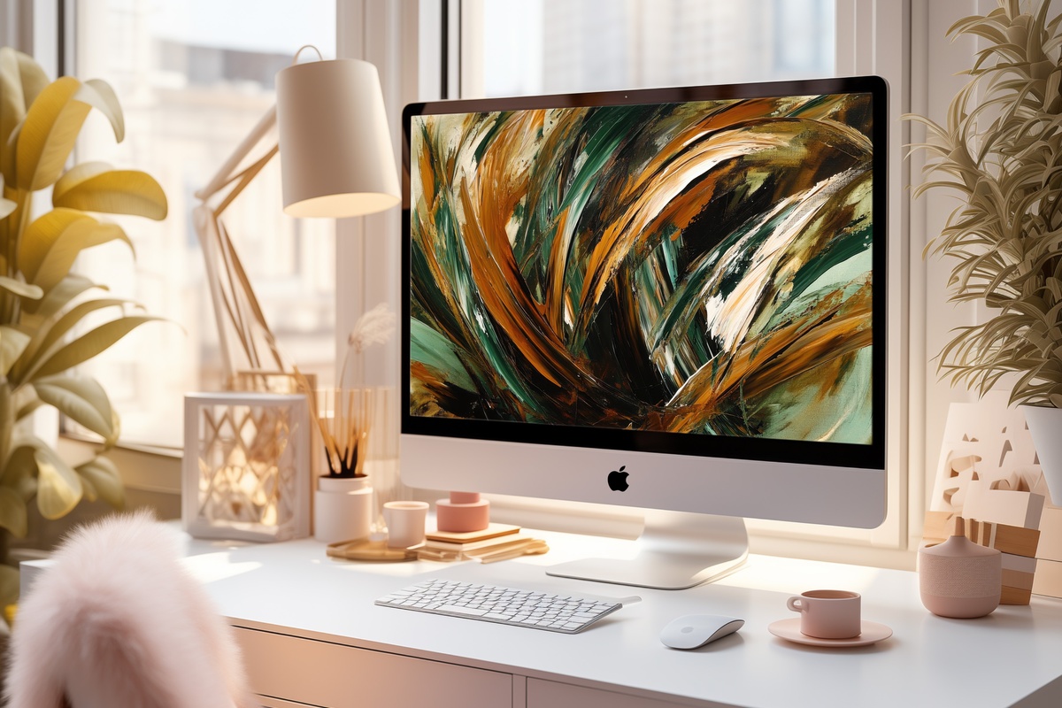
Horizon-bound strokes in terracotta, raw sienna, and pale dune — this reads as landscape without committing to one. The horizontal layering pulls the eye gently left to right, mimicking the natural reading rhythm your eyes already follow across a screen, which makes it unusually restful as a backdrop. There's warmth here that holds steady from the first task to the last. If your desk sits near a window and the afternoon light tends toward amber, this palette will meet it without argument.
3. Sunset Hues Canvas - Desktop Wallpaper
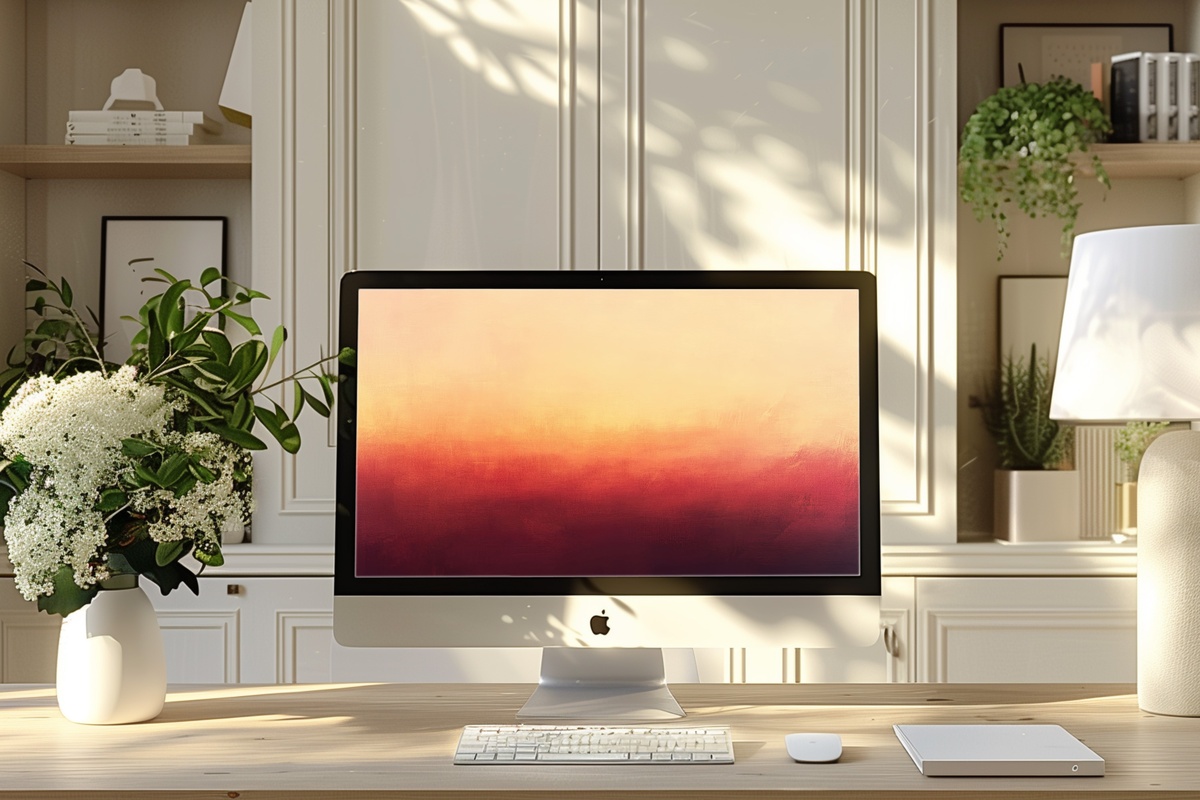
Acrylic-textured fields of peach bleeding into dusty rose and warm violet — this one belongs to the hour right before dusk, translated into a format you can keep. What saves it from tipping into saccharine is the texture: visible brushwork breaks the gradient into something with real surface and weight. The palette is generous without being loud, and it photographs beautifully on a desk flat-lay if that matters to you. Anyone whose creative work benefits from a warm, slightly dreamlike backdrop will recognize immediately what this does for focus.
4. Crimson Noir Cascade - Desktop Wallpaper
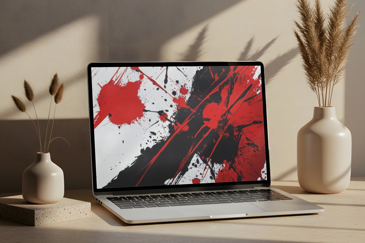
Crimson against deep black, moving with the velocity of something mid-fall. This is a high-contrast, high-energy choice — and it makes no apology for that. The dynamic splash composition channels the kind of focused aggression that suits a deadline sprint or a creative session where momentum matters more than quiet. Worth naming honestly: if your preference runs to minimalism or muted neutrals, this register will feel like too much voltage. But for a workspace that should feel activated rather than serene, the tension here is precisely the point.
5. Noir Gold Contrast Elegance - Desktop Wallpaper
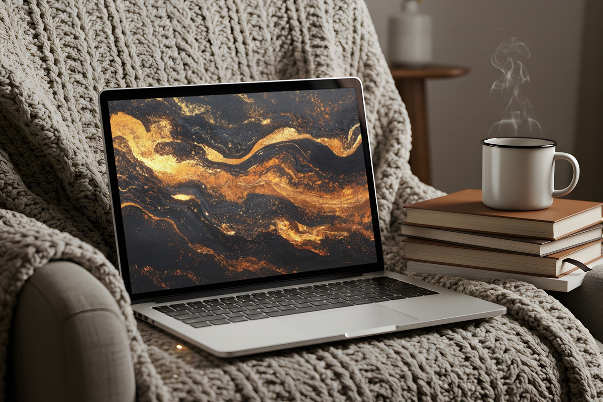
Deep matte black and burnished gold — a pairing with centuries of decorative history behind it, and for good reason. On a MacBook screen, the contrast reads as genuinely luxurious: the gold elements seem to emit their own warmth against the black ground, particularly on Retina displays where that depth really lands. The composition leans asymmetric, which keeps it from feeling ornamental. A natural fit for home offices styled around dark wood, brass hardware, or any space where drama is a considered aesthetic choice rather than an accident.
6. Bold Form Serenity - Desktop Wallpaper
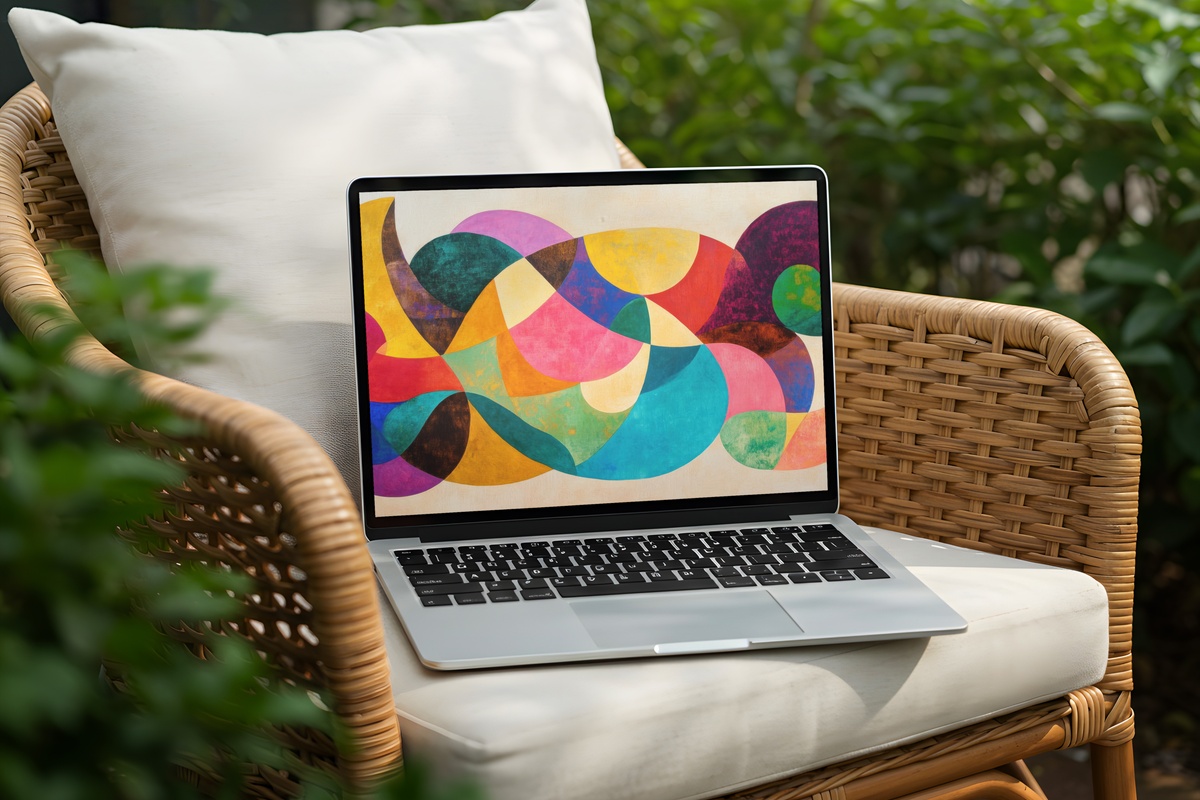
Geometric forms — present, deliberate, occupying real visual weight — placed against a background soft enough to give them room to breathe. It's a study in productive tension: the shapes are assertive without crowding, and the negative space is doing as much compositional work as the forms themselves. The mood lands somewhere between a mid-century gallery wall and a clean architectural detail. We're aware that pairing "bold" with "serene" sounds like a contradiction — but this piece actually earns that description rather than just claiming it.
7. Strokes of Monochrome Energy - Desktop Wallpaper
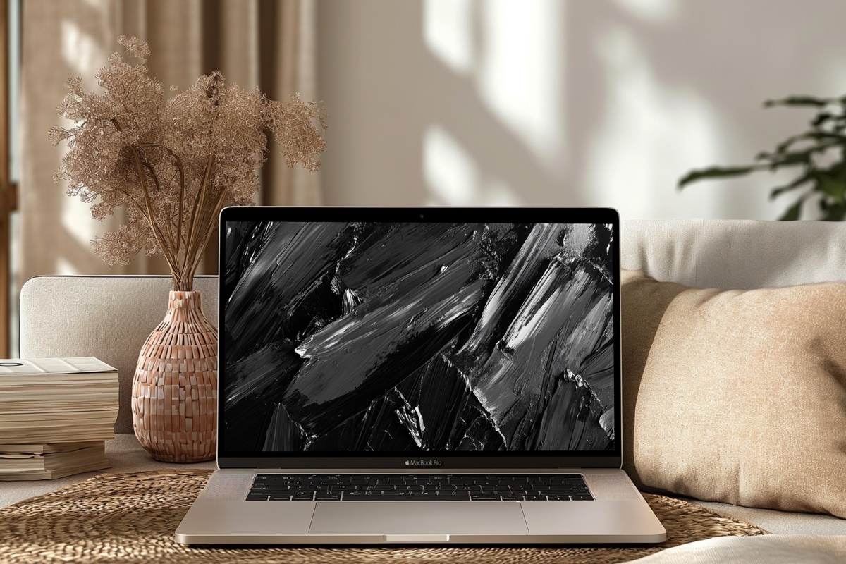
Gestural black and graphite strokes across a near-white ground — the kind of mark-making that references calligraphy, ink wash, and expressive painting all at once without belonging neatly to any of them. Each stroke reads as a decision: confident, unrepeated, not over-refined. On a wide monitor, the spacing between marks becomes its own element, and the whole piece takes on a rhythm closer to music notation than to decorative pattern. For the desk where output is measured and the aesthetic is rigorous, this one keeps pace.
Each of these is available as an instant download — files are on your screen within moments of purchase, no subscription, nothing to wait for, yours outright. If a piece from this edit is calling to you, it's already ready. And if you're building a visual environment rather than just changing one background — pairing a desktop wallpaper with a complementary piece of Frame TV art or a printable for the wall behind your monitor, say — the numbers work in your favor: any mix of three pieces across our wallpaper, wall art, and Frame TV collections takes 30% off, and any five takes 50%.
Bring the edit together one screen, one wall, one room at a time.