Frame TV Art Ideas: 22 Mood-Anchored Picks for the Living Room
Frame tv art ideas are, at this point, their own search universe — and for good reason. The Samsung Frame changed the relationship between television and interior design in a way that no amount of gallery-wall advice fully anticipated. Suddenly the largest object in most living rooms could become something intentional: a mood anchor, a palette setter, a conversation piece that shifts with the seasons. The problem isn't finding options anymore. The problem is the scroll — hundreds of generic downloads that treat the Frame like a screensaver rather than a considered piece of art. What follows is a different kind of edit: 22 picks organized not by cluster tags or file specs, but by the feeling a room is trying to hold.
The Soft Sunday Section — Calm, Warm-Neutral, and Made for Morning Light
These are the pieces that work hardest during the quietest hours. Soft Sunday mood lives in cream-adjacent palettes, organic shapes, and the particular quality of light before noon fully arrives. The Frame becomes less of a screen and more of a framed canvas hanging above a linen sofa — which is exactly what this cluster is designed to suggest. If you want a single-cluster deep-dive on the neutral and minimalist end of this territory, our 10-piece minimalist Frame TV art edit goes piece by piece through composition and placement logic.
1. Curved Face Minimalism - Frame TV Art

Single-line portraiture rendered in the softest possible stroke weight — this piece holds the eye without demanding anything of it. The ivory field reads as near-white on most Frame displays, which means it absorbs morning light rather than competing with it. Hang it in a room where the sofa is oatmeal or sage and the effect is almost architectural: the face becomes a detail, not a focal point. The minimalist Frame TV art guide positions this style as the anchor pick for scandi-adjacent living rooms.
2. Arching Shadows Dance Elegance - Frame TV Art

Abstract arch shadows in warm sand and taupe — the geometry here is soft enough that it reads as texture rather than pattern from across a room. There is something almost photographic about how the shadow bands fall across the neutral field, as though late-afternoon light has caught a set of venetian blinds. This is the piece that bridges the gap between abstract and architectural, and it pairs particularly well with natural linen, rattan, and matte ceramic finishes nearby.
3. Earthy Landscape Harmony - Frame TV Art

Terracotta, umber, dusty olive — the palette here reads like a cross-section of dry ground seen from very far above. It has the quality of a painting you might find in a Southwestern gallery, but the composition is spare enough to live comfortably in a contemporary room. For anyone building a room around warm earth tones, the landscape Frame TV art deep-dive shows how pieces like this anchor a full gallery-wall system.
4. Floral Fluidity in Serenity - Frame TV Art

Petals rendered in watercolor washes so light they almost dissolve into the background — this is florals at their most restrained, which means it crosses into rooms that would reject a more saturated botanical print. The fluid movement in the composition keeps the eye traveling gently rather than settling, giving the piece an almost meditative quality on Sunday mornings. The floral Frame TV art guide places this exact style in the context of how to rotate seasonal pieces without losing palette continuity.
The Cozy Evening Section — Rich Tones, Depth, and the Art of the Low-Light Room
After dark, the Frame operates differently. With ambient lighting dimmed, a piece that felt subtle at noon becomes the primary light source in the room — which means palette depth matters in a new way. This section covers the picks that hold their own in low-light conditions: pieces with tonal contrast, warm undertones, or enough visual texture that they read as intentional rather than decorative. The abstract and vintage clusters earn their place here especially. For more on how abstract art performs in these conditions, the 8-piece abstract Frame TV art seasonal guide covers this exact scenario.
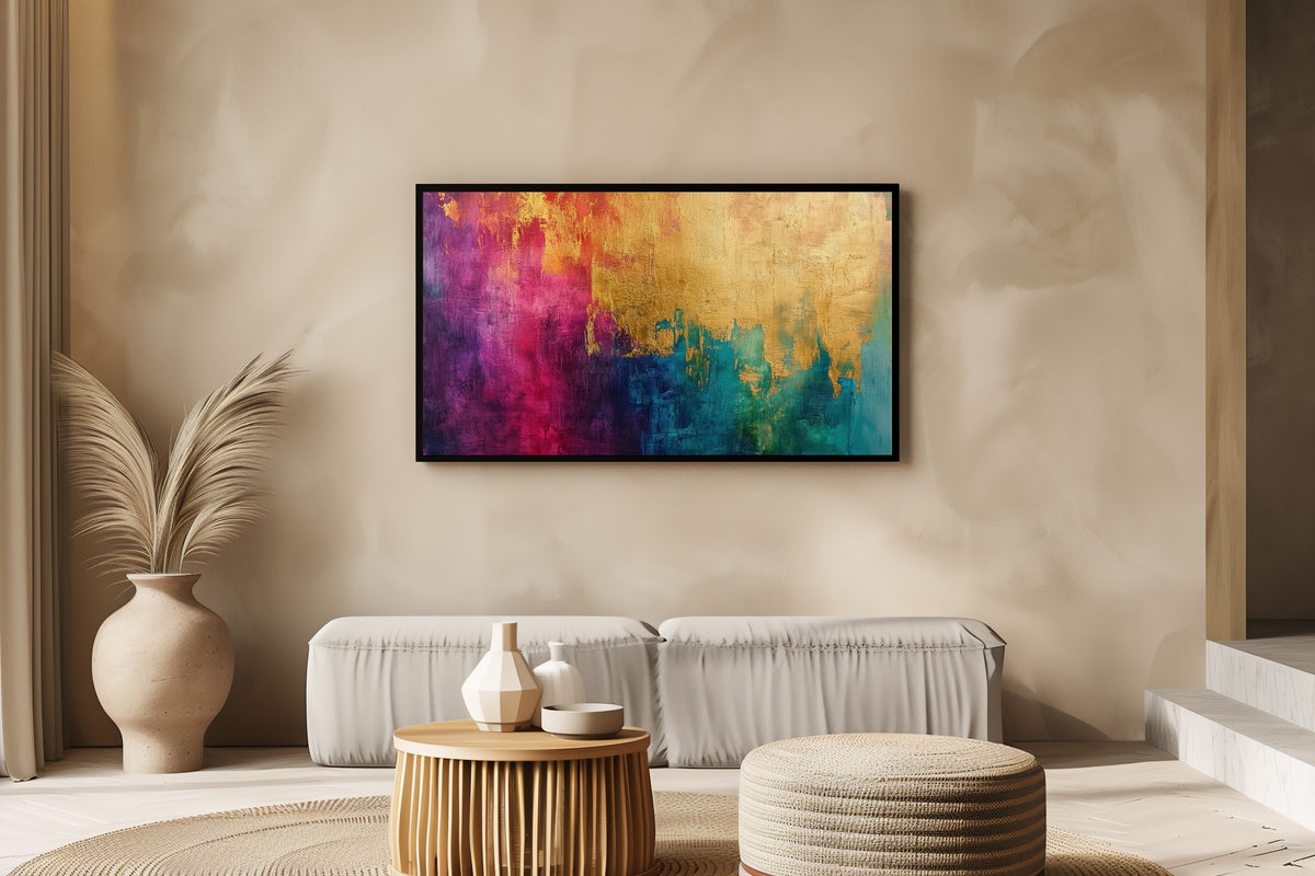
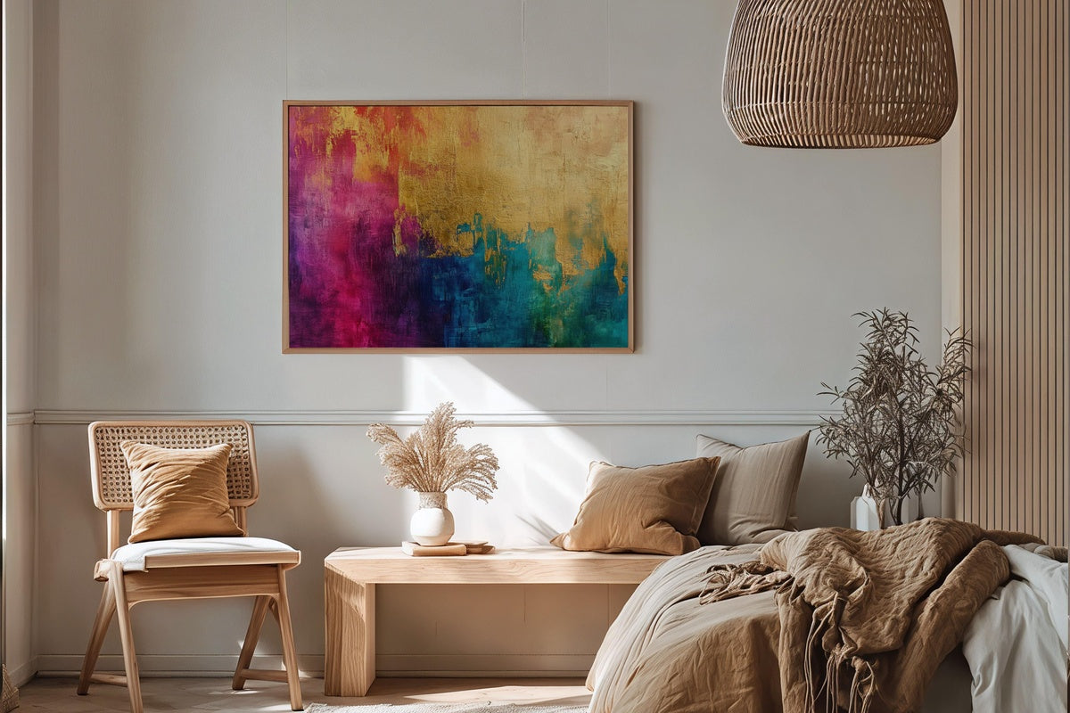
5. Golden Tapestry Splendor - Frame TV Art

Gold leaf abstraction that genuinely glows on the Frame's display — the warm amber tones pick up the ambient light in a dim room and give the whole wall a quality that is somewhere between candlelight and gallery spotlighting. The layered texture reads as depth rather than flatness, which matters at scale. This is the piece for a living room where the primary palette is charcoal, black walnut, or deep navy, where gold becomes the accent that pulls everything together.
6. Charcoal Flow Dynamics - Frame TV Art

Black and deep gray strokes that move across the canvas with real momentum — this is the kind of abstract piece that earns second glances because the brushwork holds visible energy. It reads confidently in a room with light walls, where the contrast does the work, and it reads just as well against a dark accent wall, where the tonal range within the piece itself becomes the point of interest. The abstract Frame TV art edit puts this alongside complementary palette options if you are building a rotating display.
7. Whispering Winds of Time - Frame TV Art

An ancient grove rendered in impressionist strokes — the palette runs from muted gold to forest shadow, and the overall effect is of a painting that has been hanging in a country house library for decades. This is the vintage cluster at its most atmospheric. The depth of color and the way the canopy closes over the composition makes it particularly effective in rooms with wood paneling, dark bookshelves, or any space that leans into the dark-academia-adjacent end of cozy. The vintage Frame TV art edit offers seven more pieces in this tonal register.
8. Desert Calm in Modern Brushstrokes - Frame TV Art

Sage, ochre, and dusty blush meet clean compositional structure — the desert vista rendered in modern brushwork sits in the space between landscape painting and color-field abstraction. It holds up beautifully in lower light because the warm undertones do not go muddy when the room dims. For anyone building a palette around terracotta, warm white, or olive green, the modern Frame TV art guide walks through how to extend this palette across a full room system.
The Coastal and Seasonal Light Section — Fresh Palettes for Rooms That Follow the Calendar
One of the Frame's underused superpowers is its ability to shift a room's atmosphere with the season — not through redecorating, but through swapping a single file. This section gathers the picks that do that most effectively: pieces tied to coastal light, spring bloom, and summer water. The palette range here runs from salt-white and seafoam to soft pink and watercolor teal. If coastal art for the Frame is the primary draw, the 7-piece coastal Frame TV art guide on composition and palette and the 10-piece coastal edit both go significantly deeper on that cluster specifically.
9. Surf Hut Harmony - Frame TV Art

Impressionist brushwork captures a beach hut and stacked surfboards in the kind of late-morning coastal light that has a particular quality of warmth — not quite golden hour, not quite midday, but the hour in between when everything looks like a memory. The color palette brings in coral, sea-glass teal, and sandy white. This piece carries an entire coastal living room concept on its own, and it is charming enough to hold up through all twelve months, not just summer.
10. Ethereal Summer Surf - Frame TV Art

Abstract watercolor ocean waves in aquamarine and translucent white — the paint handling is loose enough that the wave crests read as atmosphere rather than literal water, which gives this piece more versatility than a straight seascape. It works in a coastal room as anchor art and in a city apartment as a mood-lifter. The palette is cool and light enough to lower a room's perceived temperature on a hot afternoon, which is a less-discussed benefit of Frame art that holds.
11. Whispering Cherry Blossoms - Frame TV Art

Pale pink blossom clusters rendered in impressionist softness against a milky ground — the entire palette sits within three values of each other, which is exactly why it works. There is no jarring contrast here, just the quiet accumulation of petals. It is a natural partner for rooms with dusty rose accents, white oak furniture, or sage-painted walls. Spring Frame TV art often over-saturates; this one holds back and is better for it.
12. Autumn Forest Symphony - Frame TV Art

An abstract autumn forest painted in amber, rust, and dusty gold — the palette here is warm without being heavy, and the soft haze in the background gives the tree forms a sense of distance that reads as genuine atmosphere. This is the fall Frame TV art pick for rooms that already lean warm, where adding more orange might tip into oversaturation, but this particular rendering keeps everything balanced and unhurried.
The Eclectic and Boho Section — Pattern, Texture, and Rooms That Go Their Own Way
Not every living room wants quiet. Some rooms are built around layered textiles, macramé, terracotta pots, and the accumulated visual texture of things that have been collected rather than curated. For those rooms, the Frame works best when it participates in the maximalism rather than retreating from it. This section covers the boho and pattern-forward pieces in the line — the ones with enough visual personality to hold their ground against a patterned rug or a gallery wall. For a more focused look at the bohemian cluster specifically, the 11-piece boho Frame TV art gallery-wall guide and the 10-piece boho curation edit are both worth a visit before you commit.
13. Boho Sunburst Harmony - Frame TV Art

A sunburst motif in the warm, hand-drawn lineweight that characterizes the best boho illustration work — terracotta, ochre, and a dried-grass tan form the palette. The radiating geometry gives the piece a sense of optimism that reads clearly from across a room, and the hand-crafted quality of the linework means it sits naturally alongside actual handmade objects: baskets, pottery, woven wall hangings. This is the Frame art equivalent of a piece you'd find at an independent craft fair and carry home carefully.
14. Artisanal Woven Whimsy - Frame TV Art

A woven stool rendered with the close attention to texture that makes craft objects beautiful as subjects — the fibers in the weave are individually visible, the palette runs from natural jute to warm caramel. There is something deeply satisfying about seeing this kind of object elevated to art-object status on the Frame, particularly in a room that mixes handmade textiles with cleaner-lined furniture. The piece functions as both subject and texture reference for the room around it.
15. Zebra Stripe Symphony - Frame TV Art

The zebra stripe is one of those patterns that sits at the intersection of maximalist and graphic — it has strong visual identity without requiring color. The artistry in this piece is in how the stripes curve and compress across the animal's form, giving the flat pattern genuine three-dimensional presence. It is bold enough to anchor a room with white walls and minimal furniture, and confident enough to hold its own in a layered, eclectic space. Exactly the kind of piece the Frame was designed for.
16. Angular Animal Symmetry - Frame TV Art

Geometric animal portraiture in high-contrast black and white — the angular fragmentation of the form gives the piece a modern edge that separates it from conventional animal art. The symmetry in the composition creates visual stillness despite the complex faceting, which is a notable technical achievement. This one carries the graphic confidence of a luxury hotel lobby installation, scaled and optimized for a 55- or 65-inch Frame display.
17. Sunlit Milk Can Vintage - Frame TV Art

An antique milk can dressed in sunflowers, rendered with the warmth and visual weight of a plein-air oil painting — the palette is golden yellow, sage green, and the particular off-white of worn enamel. This is farmhouse-cluster art that earns its place in a maximalist room as readily as in a traditional farmhouse kitchen. The composition has generosity to it: there is clearly a story behind the object, which is what makes still-life work this well at scale.
The Holiday and Seasonal Occasion Section — Pieces Built for the Specific Atmosphere
The Frame's greatest seasonal contribution to a home is the ability to mark occasions with art rather than plastic. This section covers the holiday and occasion-specific pieces in the line: Christmas, Halloween, Easter — each executed with enough craft that they feel like curated gallery additions rather than seasonal decorations. The difference between holiday art that elevates a room and holiday art that cheapens it comes down to restraint in palette and confidence in execution. Both are present here. For the Halloween cluster in full, the 11-piece Halloween Frame TV art edit shows how this aesthetic extends across a broader selection. For Christmas specifically, the winter palette picks below carry some of that same candlelit quality.
18. Candlelit Angel in Serenity - Frame TV Art

An angel figure illuminated by a single candle source — the chiaroscuro handling here is genuinely lovely, with the warm amber light casting soft gradients across the figure and the deep background receding into near-black. The Christmas association is present but gentle enough that this piece extends comfortably through the full Advent period and into January. It holds particular power in rooms where the surrounding lighting has been lowered for the evening: the Frame becomes the candlelight in the room.
19. Festive Farmhouse Charm - Frame TV Art

A snow-settled farmhouse decked with festive greenery — the palette is forest green, barn red, and the luminous white of fresh snow under overcast sky. The composition has a storybook quality without tipping into kitsch, which is the precise difficulty of holiday art done well. This is the Frame art pick for a household that takes Christmas decoration seriously and wants the television to participate rather than sitting as a blank rectangle in the corner of an otherwise dressed room.
20. Scarecrow Amid Wildflower Whimsy - Frame TV Art

A pumpkin-headed scarecrow standing in a wildflower field — the palette leans warm and pastoral rather than dark and menacing, which means this piece works across the full October season rather than just the final week. The wildflowers bring in sunflower yellow, cornflower blue, and dried-grass tan alongside the expected rust and pumpkin orange. The full Halloween Frame TV art edit extends this palette across eleven picks for anyone building a seasonal rotation.
21. Decorated Egg Basket Whimsy - Frame TV Art

A wicker basket arranged with hand-decorated eggs in the kind of gentle pastel palette — lavender, pale blue, soft coral, mint — that signals spring without announcing it loudly. The still-life composition is tightly controlled: the arrangement has clearly been considered. This is the Easter Frame art pick for households that treat the spring season with the same decorating intention they bring to Christmas, where the television is part of the overall seasonal scheme rather than an afterthought.
22. Warm Candle in Snowfall - Frame TV Art

A single candle on a snow-dusted windowsill, the flame reflected faintly in the frosted glass — the palette is the amber of the flame against the blue-white of snowfall, and the result is one of those images that is almost uncomfortable in how perfectly it captures the feeling of being warm inside while cold sits just beyond the glass. The 8-piece winter Frame TV art seasonal guide positions this kind of candlelit composition as the cornerstone of a January-through-February rotation when the decorations have come down and the room needs a different kind of warmth.
What runs through all 22 of these picks, across every cluster and every season, is the same underlying principle: the Frame earns its place in a room when the art on it has been chosen with the same consideration as everything else in the room. That is a different approach from filling a preset playlist with whatever downloads happened to be available. It is also the approach that produces the rooms you stop and look at twice.
Every piece here is an instant download, sized and formatted for the Samsung Frame. Any three pieces across the Gallery Flair line bring the bundle to 30% off, and any five bring it to 50%. The line is built to layer — seasonal rotations, mood-shift swaps, and whole-room palette systems all become more coherent when the pieces come from a consistent curatorial perspective.
The screen on your wall is already one of the largest objects in the room. It might as well be something you chose.
