Frame TV Art: 25 Considered Picks for the Samsung Frame
Frame tv art occupies a genuinely strange position in the home-decor conversation right now — half technology, half gallery wall, the Samsung Frame has quietly become the most contested surface in the modern living room. What sits on it in ambient mode matters more than most people admit: it shapes the quality of the light in the room, the mood at six in the evening, the first impression a dinner guest forms before they even sit down. The collections flooding generic screensaver libraries tend to treat it like a neutral placeholder. We treat it like a hanging. That distinction is the entire premise of this edit. Twenty-five pieces, chosen for their staying power across the hours of the day, grouped into clusters that match how you actually live in the space — slow Sunday mornings, lamp-lit late afternoons, seasonal rotations, and the long stretch of dinner-party ambient. No filler. No screen-grab quality. Every piece is a full-resolution instant download calibrated for the Frame's matte display.
The Abstract and Tonal Cluster — Mood Over Motif
Abstract frame TV art has a particular advantage in ambient mode: it holds the eye without demanding attention. These pieces work on tone and movement rather than narrative — horizon gradients, wave rhythms, brushstroke fields — so they slot into a room rather than competing with it. The palette range here runs from the warm amber end of sunset through the cooler blue-grey of open water. Both ends of that spectrum earn their place in a considered living room, and both perform differently under warm lamp light versus natural afternoon sun. If you want a more focused edit of this cluster, our eight-piece abstract Frame TV art guide breaks the selection down by composition type and dominant hue.
1. Dusky Horizon Tranquility - Frame TV Art
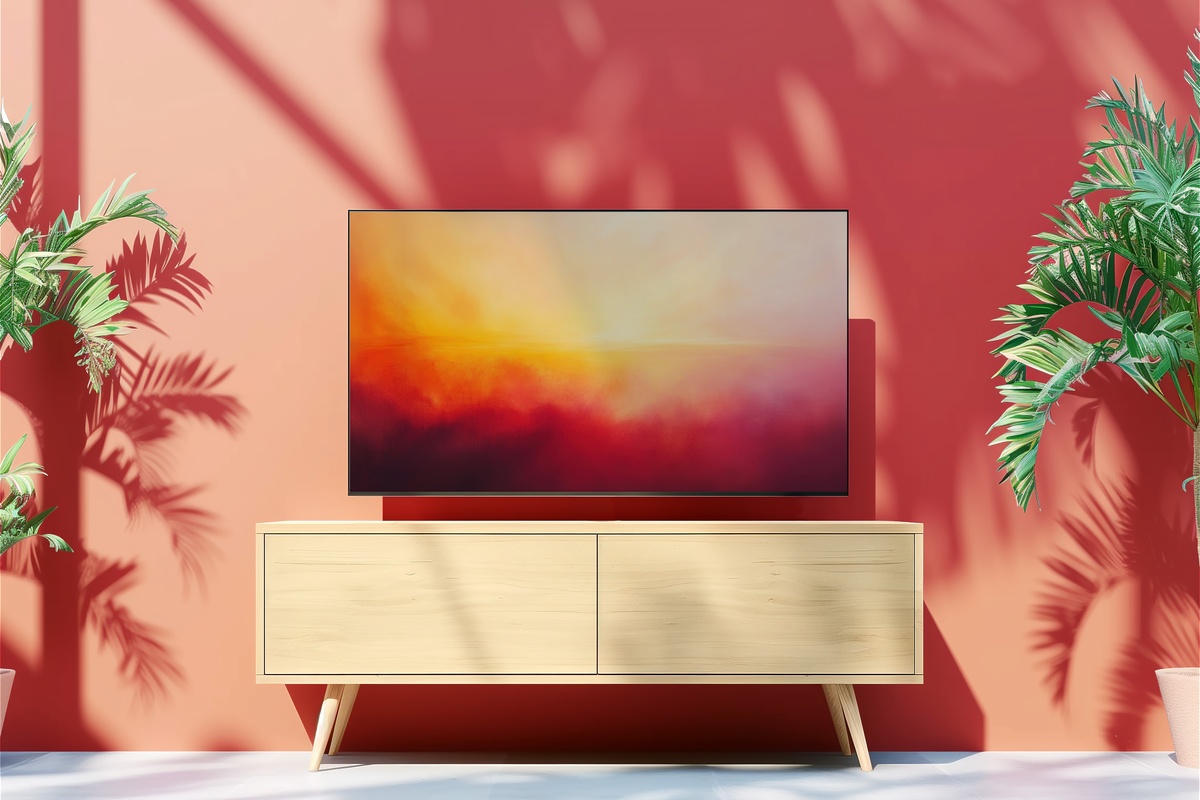
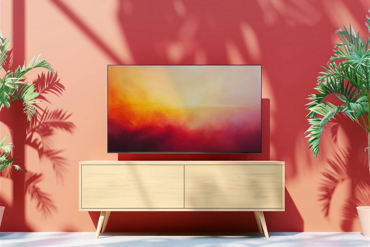
There is a specific quality to the sky in the ten minutes after the sun drops below the horizon — that bruised amber-into-lilac band that makes you stop talking mid-sentence. This piece captures exactly that register. The composition runs horizontal across the Frame's proportions in a way that feels native to the screen rather than cropped. Under warm lamplight in the early evening, the rose and ochre tones deepen in a way that feels less like digital art and more like a glowing canvas. Ideal for living rooms with cream or warm-white walls.
2. Azure Tides Reverie - Frame TV Art
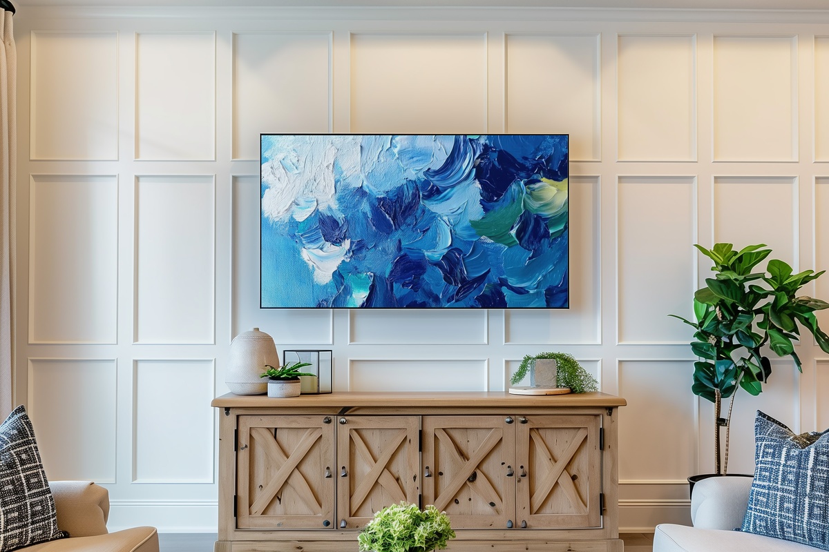
Ocean-wave abstraction done at the cooler, more restrained end of the palette — slate blue, sea foam, and that particular grey-green that only exists at the waterline. The movement in this piece reads as genuinely rhythmic rather than static; there is a horizontal energy that keeps the eye traveling across the Frame's wide format without ever feeling restless. It pairs well with rooms that already carry coastal or Scandinavian references, but it also holds its own in a purely contemporary interior. On a bright Sunday morning with natural light coming in, the blues shift closer to cerulean.
The Quiet Precision Cluster — Monochrome, Minimalist, and Neutral
The single highest-volume request in the Samsung Frame community is some version of "art that looks like a gallery wall, not a screensaver." This cluster is the answer. Black and white frame TV art, minimalist line work, and neutral tonal fields all share the same structural logic: they reduce the visual temperature of a room, making other design elements — textiles, lighting, architectural detail — read more clearly. They are also the most versatile picks for rooms that rotate other art seasonally, because they reset the visual baseline rather than competing with it. For a dedicated deep-dive into the neutral end of this spectrum, our eleven-piece neutral Frame TV art guide covers the full palette range from warm stone to cool graphite. If black and white is your specific focus, our seven-pick black and white Frame TV art edit examines how contrast level and motif type affect the gallery-wall reading.
3. Zebra Stripe Symphony - Frame TV Art
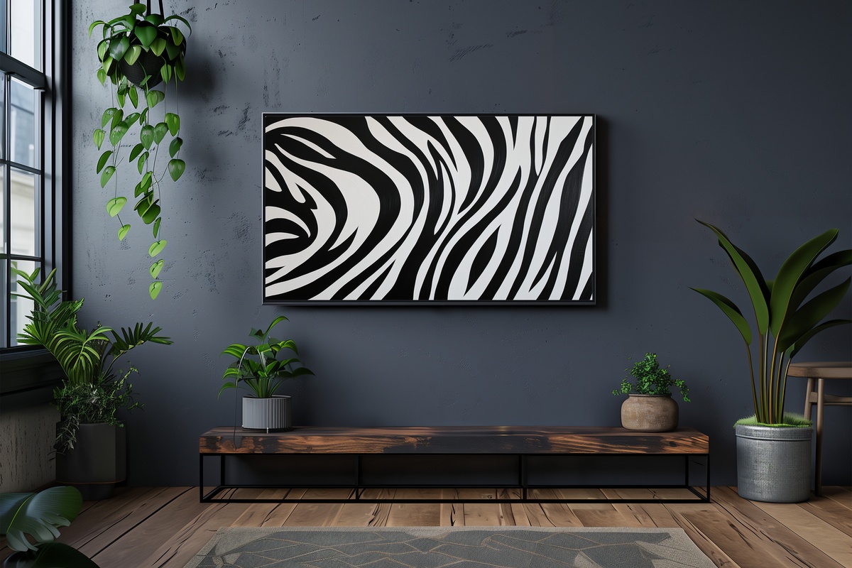
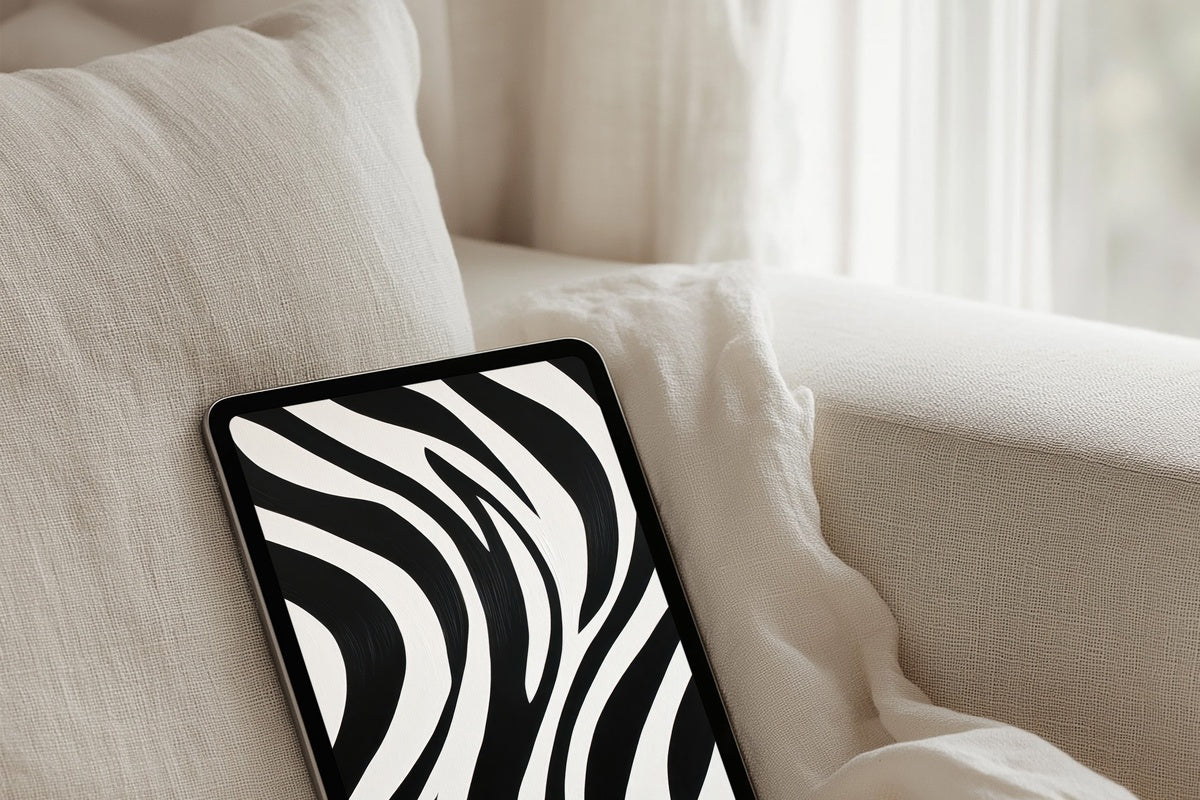
Graphic without being loud. The zebra-stripe pattern here has been handled with enough artistic restraint that it reads as a composition study in light and shadow rather than a wildlife reference — the kind of thing you might find matted in a downtown gallery rather than printed on a canvas tote. The high contrast works particularly well on the Samsung Frame's anti-reflection finish; blacks hold their depth without washing out. Strong choice for a home office or dining room where you want presence without warmth.
4. Monochrome Inked Whimsy - Frame TV Art
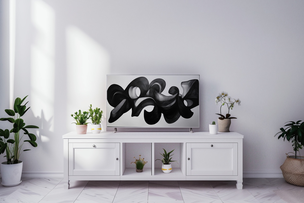
Where the Zebra Stripe piece leans graphic, this one leans gestural — inked shapes that carry the slightly imperfect edge of hand-drawing, translated into a composition that feels both modern and timeless. The monochrome palette means it slots into virtually any room, but it performs best somewhere it has a little breathing room: a bedroom wall, a reading nook, a study. The inked mark-making texture catches the matte display finish in a way that genuinely mimics paper.
19. Minimalist Human Harmony - Frame TV Art
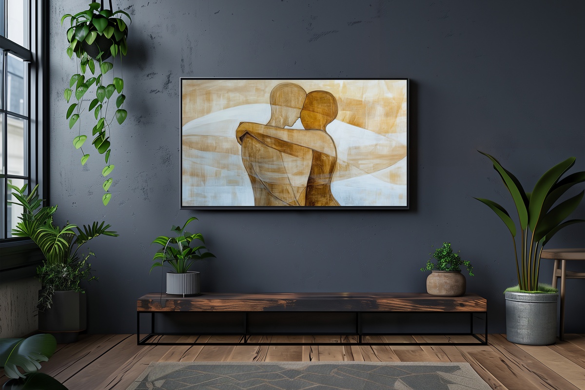
Minimalist frame TV art succeeds when the economy of line carries enough emotional weight to hold a room — and this piece manages it by choosing connection as its subject. Two forms in an embrace, rendered in spare, clean strokes, carry a warmth that purely geometric minimalism often can't reach. The result reads as sophisticated rather than cold. For a deeper look at how minimalist pieces perform across different room types and frame sizes, our nine-piece minimalist Frame TV art buyer's guide covers composition, palette, and scale in detail.
21. Arching Shadows Dance Elegance - Frame TV Art
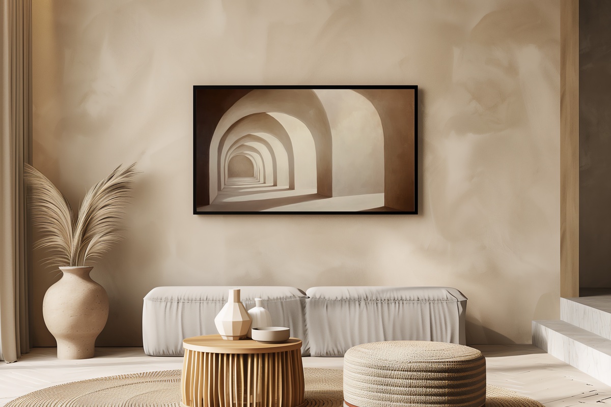
Shadow studies have become one of the defining visual languages of quiet-luxury interiors, and this piece translates that language directly to the Frame display. Abstract arch shadows in a warm neutral palette — sand, parchment, and a hint of terracotta at the edges — produce the feeling of afternoon light crossing a linen-draped room. The neutrality of the palette means it holds across seasonal rotations without fighting whatever else is in the space. A reliable anchor piece for a living room or primary bedroom. Our complementary neutral Frame TV art edit explores how pieces in this tonal register shift the perceived warmth of a room.
The Landscape and Place Cluster — Rooms That Look Outward
Some rooms need art that opens them up rather than closing them in — a visual horizon, a sense of being somewhere with air. This cluster covers landscape, coastal, farmhouse, and vintage terrain picks: pieces where location and light are the subject. The mood range runs from the warm pastoral of an apple orchard in afternoon sun to the cooler, more brooding register of ancient ruins in a green field. These are the pieces that carry the strongest narrative charge in ambient mode, the ones that invite a pause. If coastal is your primary frame, our spring Frame TV art picks extend the same outdoor-light sensibility into the warmer season. For vintage landscape specifically, our nine-piece vintage Frame TV art guide examines how historical patina translates to the matte display finish.
9. Evening Bonfire Bliss - Frame TV Art
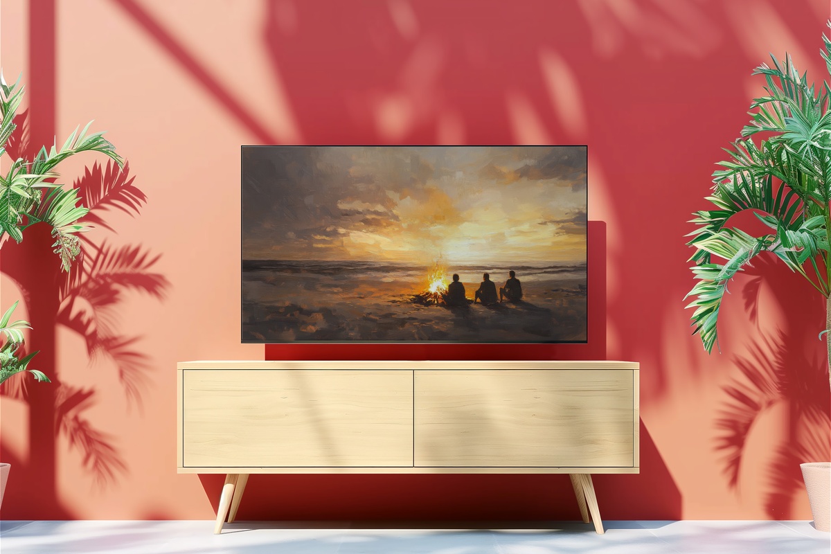
The particular warmth of firelight against a dark coastal sky is one of those subjects that almost writes its own emotional brief — and this impressionist rendering earns it without sentimentality. The composition centers on the fire itself, with the surrounding darkness handled loosely enough to suggest rather than describe. Under warm lamp light in a living room, the amber and ember tones in this piece create a feedback loop with the room's own light sources that feels genuinely atmospheric. Best displayed in the early evening hours.
10. Wicker Picnic Serenity - Frame TV Art
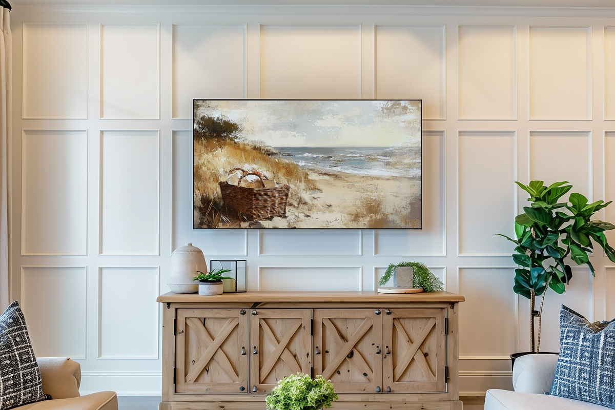
An impressionist picnic scene — wicker basket, dappled coastal light, the softened edges of a warm afternoon — that manages to feel genuinely nostalgic rather than kitsch. The palette sits in that specific register of bleached linen, pale grass, and warm cream that photographs well but is even better in person on the Frame's anti-glare surface. This is a slow-Sunday-morning piece: unhurried, soft-spoken, the kind of image that makes a room feel like a long exhale.
13. Autumn Forest Symphony - Frame TV Art
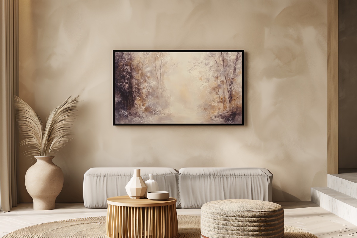
Abstract autumn in gentle hues — the palette runs amber, burnt sienna, and a pale sage-gold that only exists in October. The abstraction here keeps it from being purely seasonal; the color field reads as a considered tonal composition that can carry into early winter without feeling out of place. The vertical rhythm of the tree forms gives it a quiet architectural quality that holds well in rooms with tall ceilings or narrow wall sections.
14. Orchard Dreams in Fall - Frame TV Art
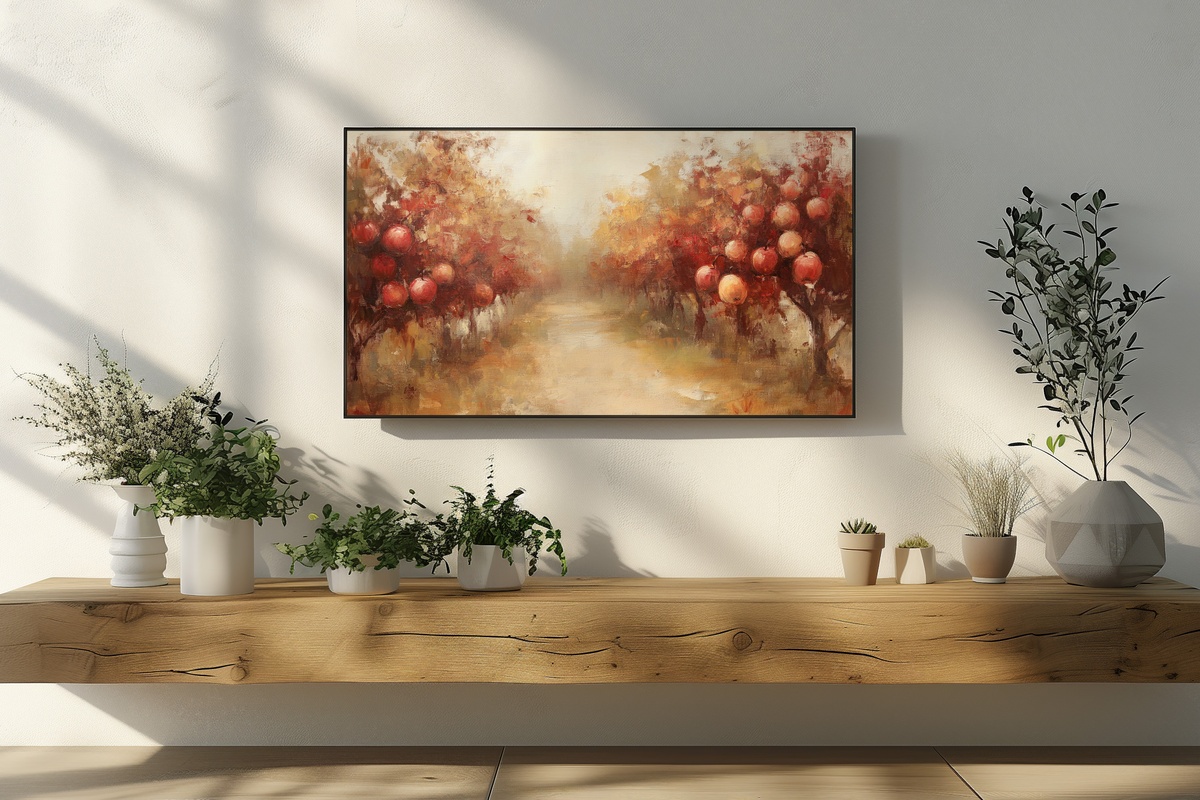
Pastoral and deeply warm — a serene apple orchard rendered with the slightly hazy depth-of-field quality that the best landscape painters bring to afternoon light. The reds and golds sit against a sky that has the particular pale blue of late September, a combination that performs beautifully against both white walls and darker, more moody interiors. A dinner-party background piece of genuine staying power. Pairs naturally with farmhouse and vintage-register rooms.
18. Earthy Landscape Harmony - Frame TV Art
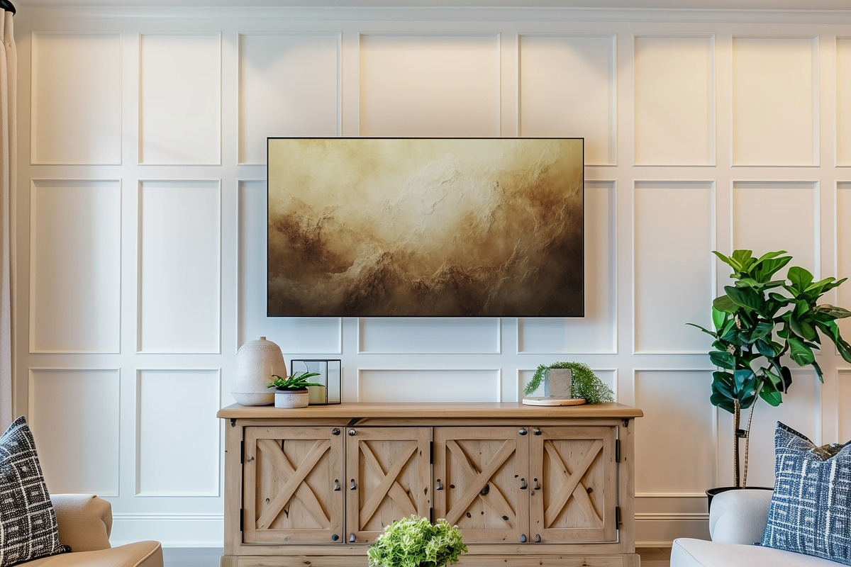
Earth tones in a landscape format — terracotta, clay, warm umber, and the dusty olive of drought-season grasses. This piece has the quality of a field study by a painter who actually stood in the landscape rather than composing from a photograph; there is something slightly imperfect in the horizon line that makes it feel genuinely observed. Under warm evening light the palette deepens considerably. Strong fit for Japandi, wabi-sabi, and organic-modern room registers.
20. Desert Calm in Modern Brushstrokes - Frame TV Art
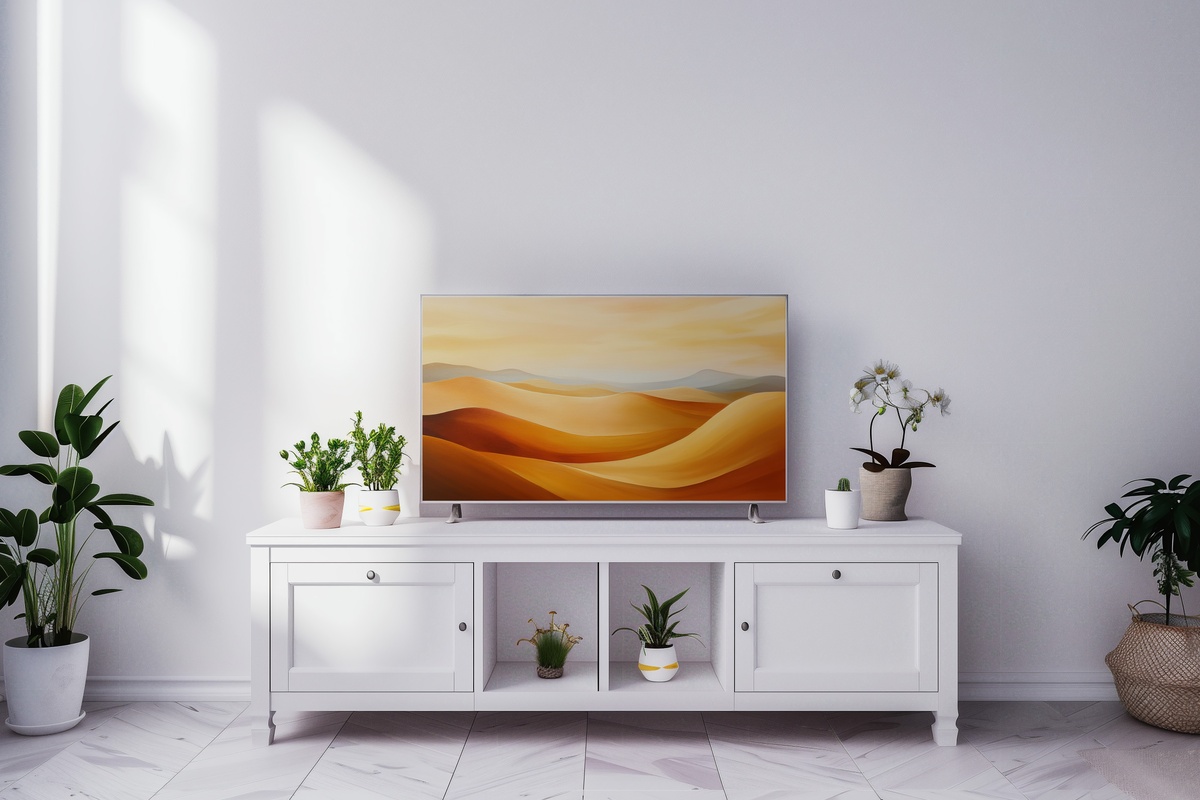
Desert landscape through a modern mark-making lens — the brushstrokes are loose and directional, carrying the heat and horizontal stillness of arid terrain without tipping into illustration. The palette is bone, sand, and a faint sage, punctuated by the ochre of exposed rock. It reads as both landscape and abstraction depending on how close you stand, which gives it an unusual versatility. Our seven-piece modern Frame TV art guide places this cluster in the broader context of contemporary interior design trends.
24. Timeless Echoes Among Ruins - Frame TV Art
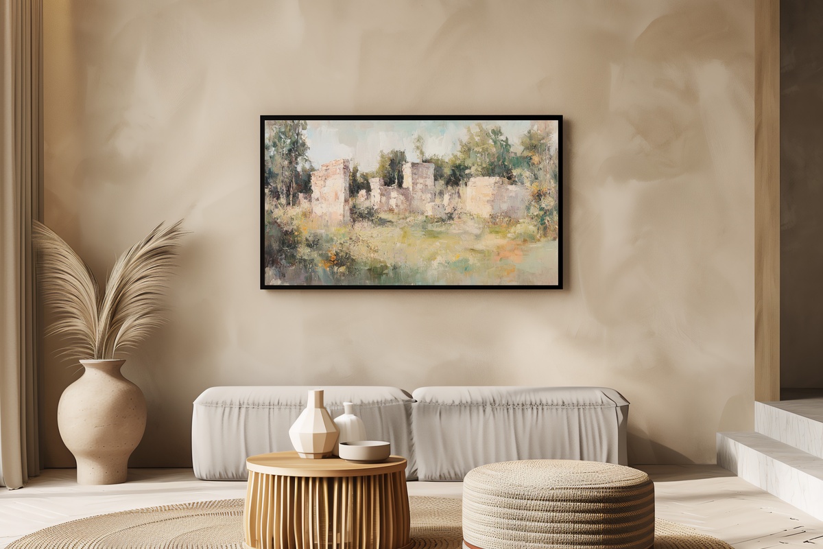
Ancient ruins in a lush green field — the palette is verdant and sun-warmed, the stonework carrying that particular golden weathering that only comes with centuries of exposure. The composition has a Grand Tour quality, the kind of subject that framed oil paintings in European country houses for two hundred years. On the Samsung Frame in ambient mode, it functions as a window to another era. For more in this historical-register vein, our nine-piece vintage Frame TV art edit covers the full spectrum from antiquarian map prints to aged botanical studies.
15. Vintage Milk Bottle Charm - Frame TV Art

Antique milk bottles in a wooden crate, rendered with the kind of still-life precision that makes you notice the individual imperfections in the glass. The palette is warm cream, aged wood, and the faint green cast of vintage bottle glass — a combination that slots directly into farmhouse and cottagecore rooms without any negotiation. This is the piece for the kitchen Frame or the dining room wall, where it reads as deliberate and characterful rather than decorative filler.
The Botanical and Floral Cluster — Nature, Translated
Floral frame TV art occupies a different emotional register than landscape — it's more intimate, more interior, less about space and more about sensory presence. The pieces in this cluster translate the visual language of botanical prints and floral painting into formats that genuinely hold up at the scale of the Samsung Frame. The palette range here moves from the cool impressionist pink of cherry blossoms to the warm, paint-loaded expressiveness of roses in full brushstroke. Both ends of that range serve the room differently: cherry blossom reads as airy and transient; full-body rose reads as saturated and confident. The boho picks in this cluster add an eclectic textural register that neither purely botanical nor purely abstract pieces can match. Our spring Frame TV art picks examine how seasonal botanical pieces shift across morning, afternoon, and evening light.
5. Boho Sunburst Harmony - Frame TV Art
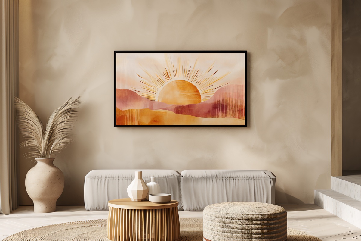
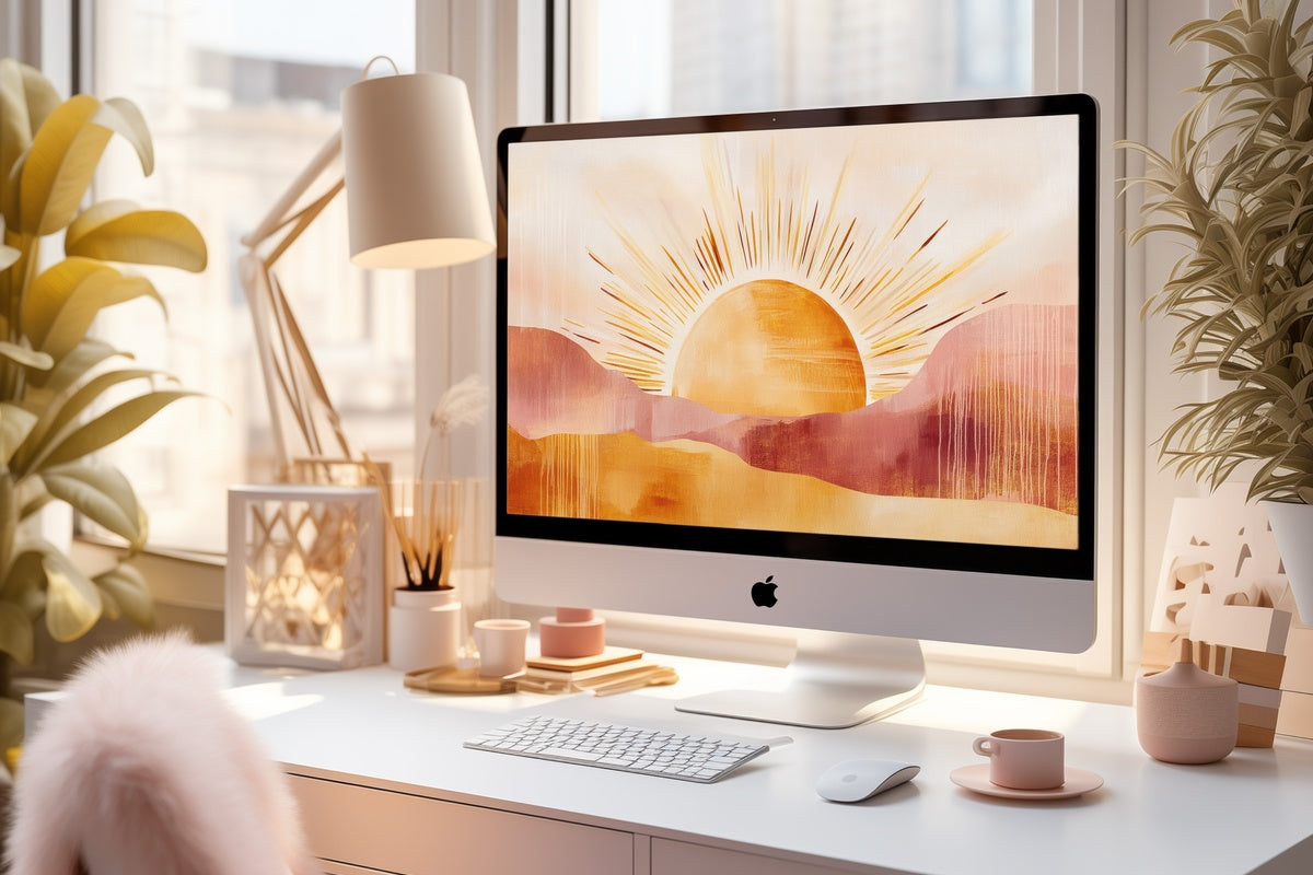
A sunburst rendered in warm ochre, rust, and the particular dusty gold that defines boho interiors at their most considered. The radial energy of the composition gives it a vitality that most ambient art avoids, making it the right choice for rooms that feel a little static and need something that pulls focus deliberately. Against rattan, macramé, or warm terracotta walls, this piece performs as a central visual anchor rather than a background note.
6. Timeless Bronze Whimsy - Frame TV Art
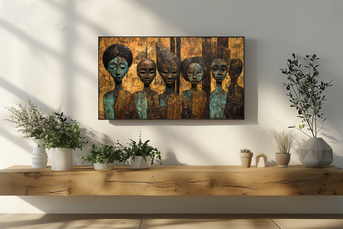
Antique bronze figurines with a boho compositional sensibility — the patina tones run from deep verdigris to warm honey-gold, set against a background that feels deliberately aged and layered. The eclecticism here is earned rather than assembled; the objects have the kind of quiet authority that comes from being genuinely old-looking rather than decoratively distressed. This piece has strong dinner-party ambient energy: it sparks curiosity in a way that purely abstract pieces cannot.
16. Expressive Rose Brushwork - Frame TV Art
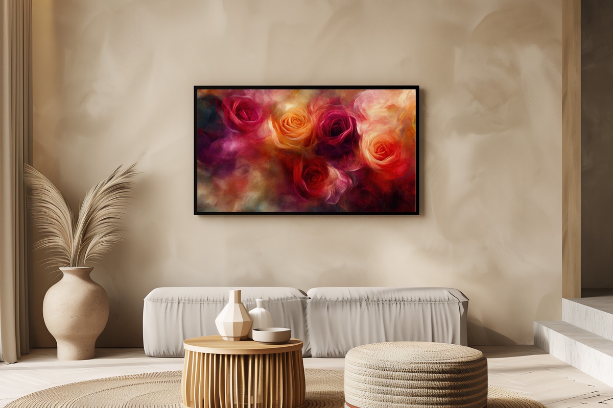
This is not the soft-pink botanical-print rose. This is the rose in full impasto confidence — deep crimson and rose madder, brushstrokes that carry their own shadow, petals that feel genuinely three-dimensional on the Frame's matte surface. The expressiveness of the mark-making puts it in the same territory as late Cy Twombly or early contemporary floral painting, which means it reads as art first and decoration second. A statement piece for rooms with the confidence to carry it.
22. Whispering Cherry Blossoms - Frame TV Art
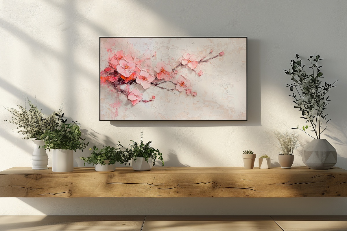
Abstract cherry blossom in the impressionist register — the palette is powder pink, the faintest lavender, and the particular translucent white of petals against a pale sky. The looseness of the handling means this works year-round in a way that a literal botanical print does not; it reads as a tonal field with floral memory rather than a specific calendar event. On a slow Sunday morning with clear light coming in, the pinks in this piece have an almost luminous quality on the Frame's display. Our nine-piece spring Frame TV art guide pairs this with complementary seasonal picks.
23. Ethereal Summer Surf - Frame TV Art
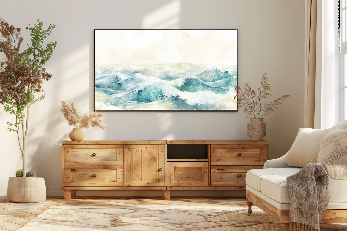
Watercolor ocean waves in the abstract — the palette here is the specific blue of a summer sky at two in the afternoon, layered over a foamy white that carries the translucency of actual watercolor paper. The technique means there is a lightness to this piece that more precisely rendered wave paintings lack. It reads as summer without being insistently seasonal, which makes it a flexible long-term display piece for coastal and contemporary rooms alike. Our ten-piece summer Frame TV art edit extends this palette across a range of coastal and botanical subjects.
The Seasonal and Festive Cluster — The Art of Rotating Your Frame
One of the genuinely underused capabilities of the Samsung Frame is the seasonal rotation — switching from a year-round anchor piece to something that marks a specific time of year with the same curatorial intention you'd bring to changing a physical print. The pieces in this cluster cover the calendar from spring Easter charm through summer's coastal ease, autumn's harvest palette, Halloween's playful pastoral register, Christmas's candlelit warmth, and winter's most intimate interior glow. The key to rotating well is choosing pieces whose quality of light aligns with the season's ambient mood rather than simply referencing its iconography. For the Christmas cluster specifically, our eight-piece Christmas Frame TV art guide explores the range from quiet-luxury candlelit to festive and characterful. For the Easter picks, our ten-piece Easter Frame TV art curation and our eleven-piece spring Easter edit both offer extended context.
7. Winter Glow Angel - Frame TV Art
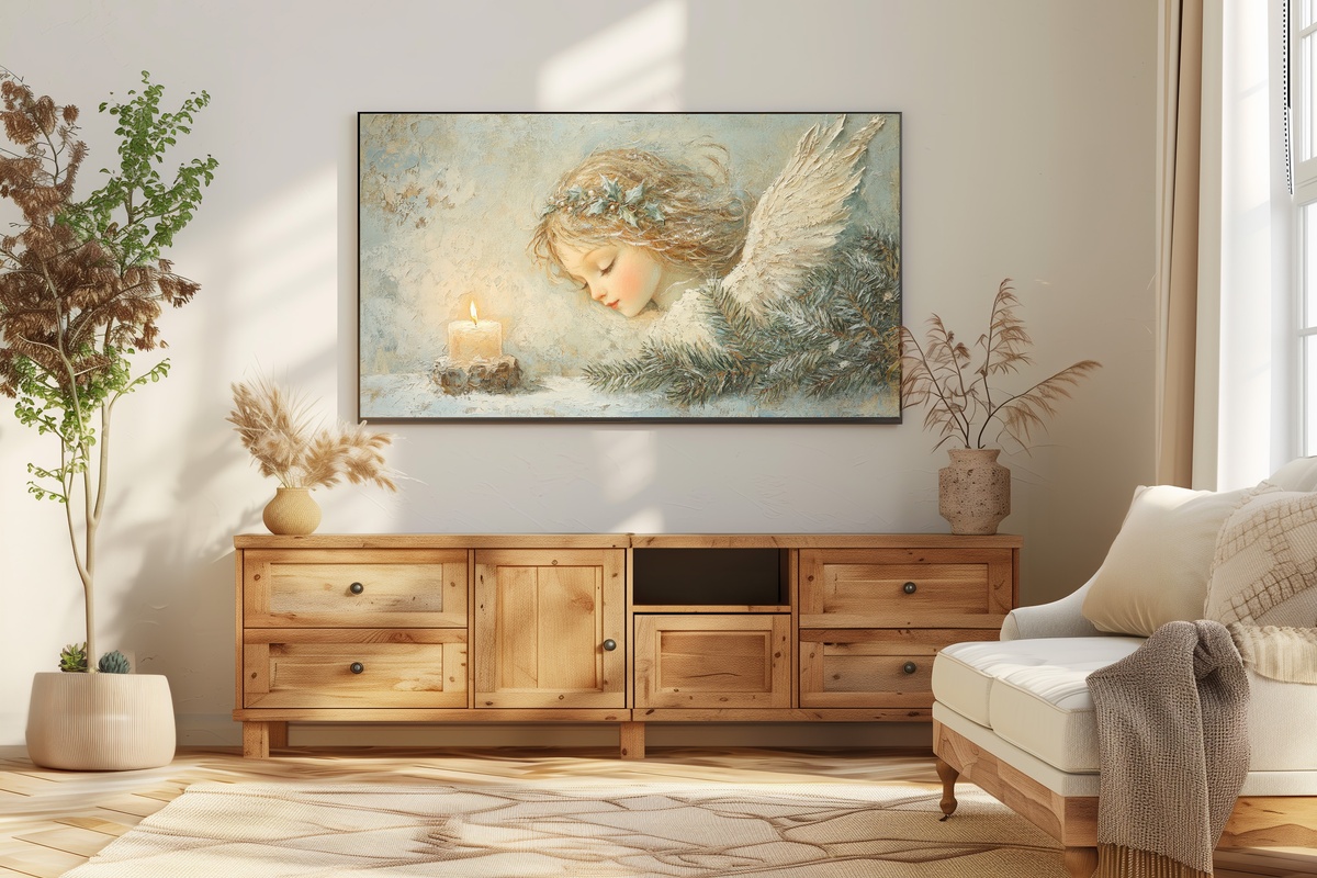
An angel figurine by candlelight — the treatment is painterly and intimate rather than illustrative, and the palette is almost entirely warm gold and cream against a deep background shadow. This piece performs best in the pre-Christmas weeks when rooms are already lit with candles and string lights; the ambient feedback between the Frame's display and the room's own warm light sources creates something genuinely beautiful. The restraint of the subject matter makes it suitable for non-religious homes as well as those celebrating Christmas with more traditional feeling.
8. Festive Farmhouse Charm - Frame TV Art
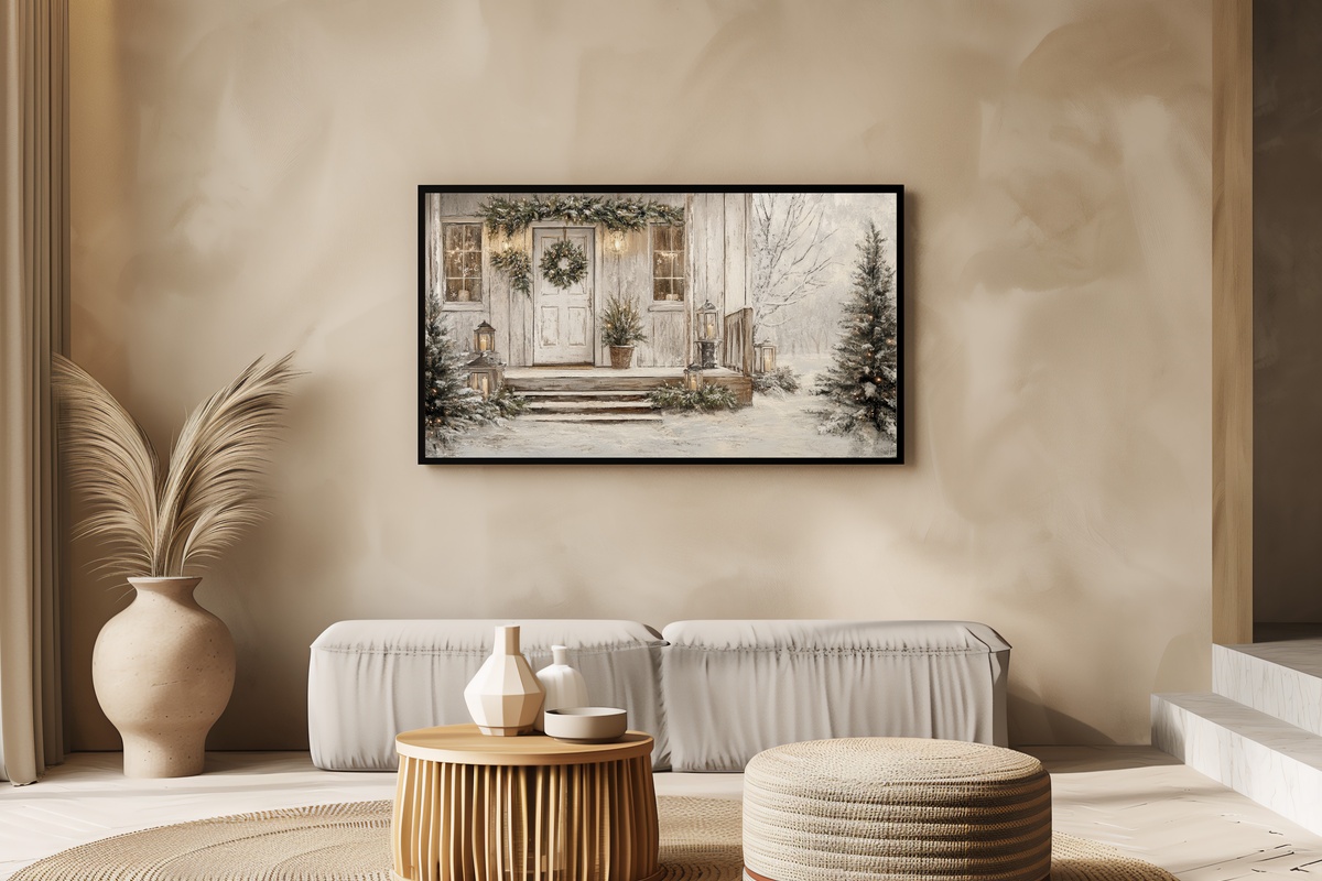
A winter farmhouse scene decked for the season — the composition has the coziness of a Christmas card at its most elevated, with snow-dusted architecture, warm window light, and a red-and-green palette handled with enough restraint to feel genuinely curated rather than commercially festive. This is the piece you leave up from the first of December through the New Year, the one that makes visitors pause on their way to the kitchen. Works equally well in a farmhouse-register room and a contemporary one.
11. Decorated Egg Basket Whimsy - Frame TV Art
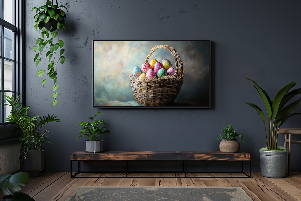
The Easter basket still-life in vibrant, warm tones — the decorated eggs carry that particular mix of rose, cobalt, and gold that defines the season's palette at its most joyful. The composition is generous and centred, the kind of image that children and adults respond to equally. As an ambient Frame display for the two weeks around Easter, it functions as a seasonal marker without overwhelming the room's year-round design language.
12. Daisy-Crowned Bunny - Frame TV Art
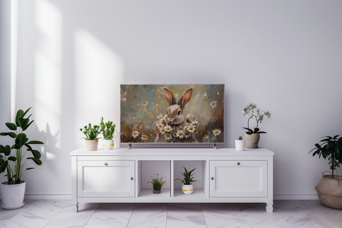
A bunny with a daisy-wreath crown — the treatment is illustrative and charming without crossing into saccharine territory, the palette sitting in pale spring green, white, and the lightest possible yellow. The soft rendering has a storybook quality that makes it a natural choice for family homes or anyone leaning into the coquette and soft-life aesthetic registers this season. Our eleven-piece Easter Frame TV art spring edit places this piece in a broader seasonal styling context.
17. Scarecrow Amid Wildflower Whimsy - Frame TV Art
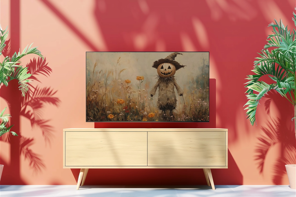
Halloween art for the Frame that leans pastoral and playful rather than dark or graphic — a pumpkin-headed scarecrow in a wildflower field, rendered in the warm amber, rust, and dusty purple palette of late October. The whimsy of the subject is earned through the quality of the botanical detail around it; this reads as a considered harvest-season composition rather than a novelty screensaver. Strong choice for households that want to mark the season without committing to maximalist Halloween decor.
25. Cozy Winter Evenings Glow - Frame TV Art
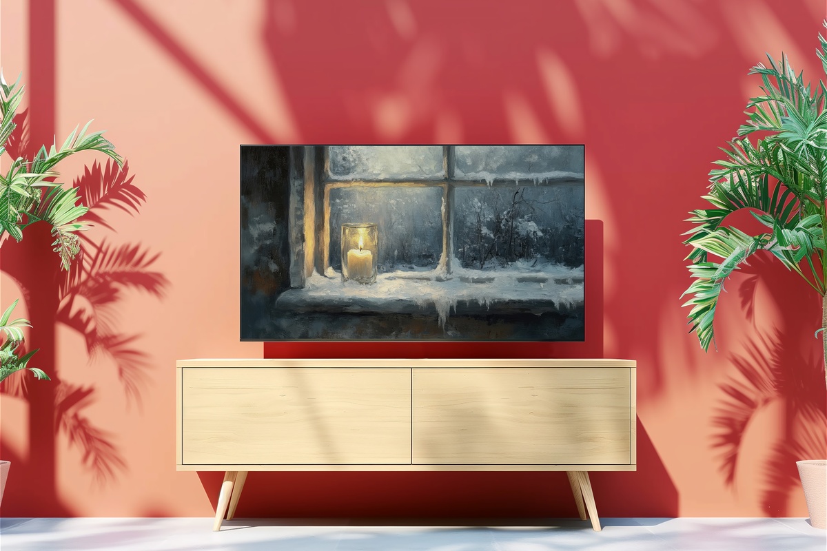
A candlelit window in winter — the view from outside, looking in at warm amber light through frosted glass, snow accumulating on the sill. The composition is intimate and quietly cinematic, the kind of image that condenses the entire emotional promise of the season into a single glowing rectangle. On the Frame in ambient mode during a dark January evening, the warmth of this piece does something measurable to the atmosphere of the room. The premier choice for post-Christmas winter, when the decorations come down but the short days remain.
What runs through all twenty-five pieces in this edit is a consistent discipline about light. Not every piece is warm-toned; not every piece is quiet. But each one was chosen because it responds to the actual light conditions of a real living room at a specific hour — the blue-grey cool of morning, the amber weight of late afternoon, the deep pool of lamplight at ten in the evening. The Samsung Frame at its best is not a screensaver; it's a light source with a point of view. These pieces give it one.
Any three pieces across the Gallery Flair line bring the bundle to 30% off; any five reach 50%. Most rooms benefit from a year-round anchor piece, one or two seasonal rotations, and a wild card. The line is built to layer exactly that way.
The rest, as always, comes down to the room, the hour, and what you want to feel when you walk through the door.