10 Floral Frame TV Art Picks That Define Every Mood in the Room
Late afternoon, the lamps not yet switched on, the living room settling into that particular amber quiet — this is when the Frame TV earns its place. Not as a screen, but as a painting that breathes. Florals have always understood this hour better than almost any other subject: the way a single bloom can hold a whole feeling, the way a dark background can make a petal look lit from within.
What Makes Floral Frame TV Art Work in a Room?
Not every floral piece translates well at television scale. The ones that do tend to share a few qualities: a clear tonal relationship between bloom and background (whether that's drama or whisper), a palette that reads as intentional rather than incidental, and enough negative space that the eye can rest somewhere. Watch for these when you're choosing — a floral that reads busy on a small screen will only amplify at 55 or 65 inches. The ten picks below each have that considered relationship between subject and surround, which is why they hold up when the room goes quiet and the art does all the talking.
1. Daisies in Contrasting Light - Frame TV Art
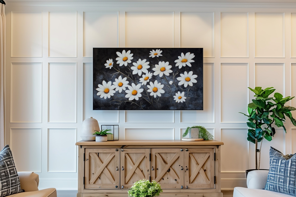
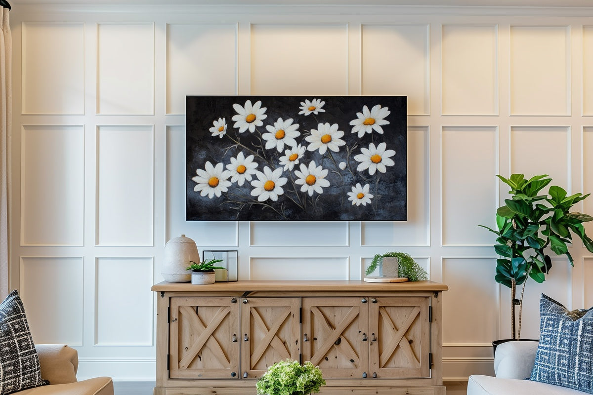
There is something almost cinematic about the way these daisies are lit — crisp white petals against a near-black surround, the contrast pushed just far enough to feel deliberate. This is a piece for rooms that lean into high-contrast styling: dark-painted walls, black-frame furniture, or a gallery-style setup where the art is the focal anchor. The composition reads like a still from a slow, considered film. Anyone whose first instinct is to reach for a moody, drama-forward palette will recognize exactly why this one belongs on their screen.
2. Orchid Elegance in Soft Light - Frame TV Art
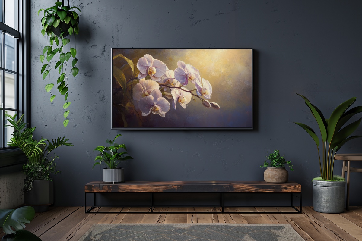
Orchids rendered in a diffused, studio-like glow — the petals hold just enough warmth to keep the image from reading cold, and the negative space does exactly the work restraint should. This piece has an almost Japanese botanical print quality to it, minus any rigidity. It suits rooms that already have a quiet-luxury lean: creamy linens, marble surfaces, a considered void or two. Display it in the dining room at dinner, lamps low, and the whole space acquires a different kind of ceremony.
3. Blush Florals in Dramatic Shadows - Frame TV Art
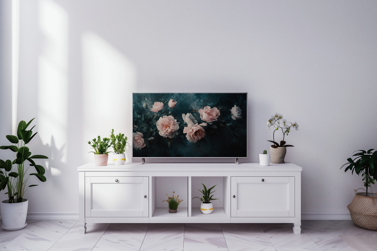
Blush and darkness — a pairing that shouldn't feel as resolved as it does here. The florals emerge from shadow like something caught mid-bloom at dusk, and the palette walks a genuinely interesting line between romantic and severe. Worth naming honestly: if your space trends toward all-white and airiness, this one will pull against your room rather than with it. But in a space with depth — charcoal, navy, aged wood — it lands as exactly the right kind of tension. A statement without needing to announce itself.
4. Vased Blush Rose Elegance - Frame TV Art
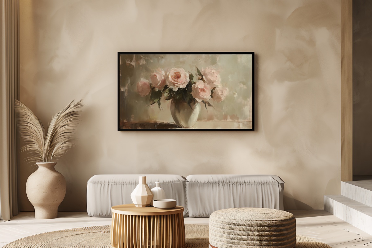
A vase of blush roses — it could go saccharine, and it doesn't. The rendering keeps a certain photographic weight to it, a gravity that stops the piece from floating into greeting-card territory. The roses are full, unhurried, placed the way you'd arrange them after coming home from a Saturday market. This is the piece for the living room that already has fresh stems on the coffee table; it extends the mood rather than creating it from scratch. Warm neutrals and linen tones are its natural companions.
5. Watercolor Cherry Blossom Dreams - Frame TV Art

Watercolor florals at Frame TV scale risk going loose and unanchored — but the cherry blossoms here are handled with enough tonal discipline that the softness reads as intention, not drift. The palette is pale pink bleeding into near-white, with barely-there branch structures that give the composition its spine. Think of it as the visual equivalent of a window left open on a cool spring morning: present, gentle, not demanding attention so much as offering it. A natural pairing with pale wood furniture or rooms with a clean, east-Asian-inflected minimalism.
6. Floral Vine Watercolor Grace - Frame TV Art

Where the cherry blossoms concentrate and pool, this vine composition stretches — a looser, more wandering energy that fills the frame laterally rather than centering itself. The watercolor handling gives the stems a botanical-illustration quality, slightly translucent, as if the paper beneath is still breathing. This one pairs beautifully across product lines: a matching wall print in the same soft-botanical register, or a phone wallpaper in a pale-vine tone, builds a continuous visual thread from the living room wall to the pocket. Rooms with white or warm-plaster walls give it the most room to do its thing.
7. Floral Line Art Elegance - Frame TV Art
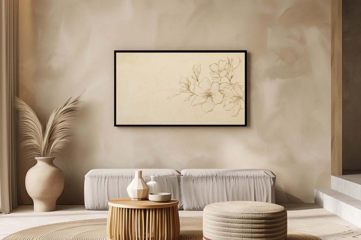
Line art florals occupy a register that painterly pieces can't — closer to a technical drawing or a couture sketch than to a photograph, with all the elegance that implies. Single-weight lines on a clean ground, just enough detail to identify the bloom without over-explaining it. And — we'll say it plainly — this one rewards spaces that have committed to restraint. If your room already has a minimal, monochrome-leaning palette, this piece reads less as decoration and more as punctuation. A single, considered mark at the end of a quiet sentence.
8. Velvet Rose Silhouette - Frame TV Art
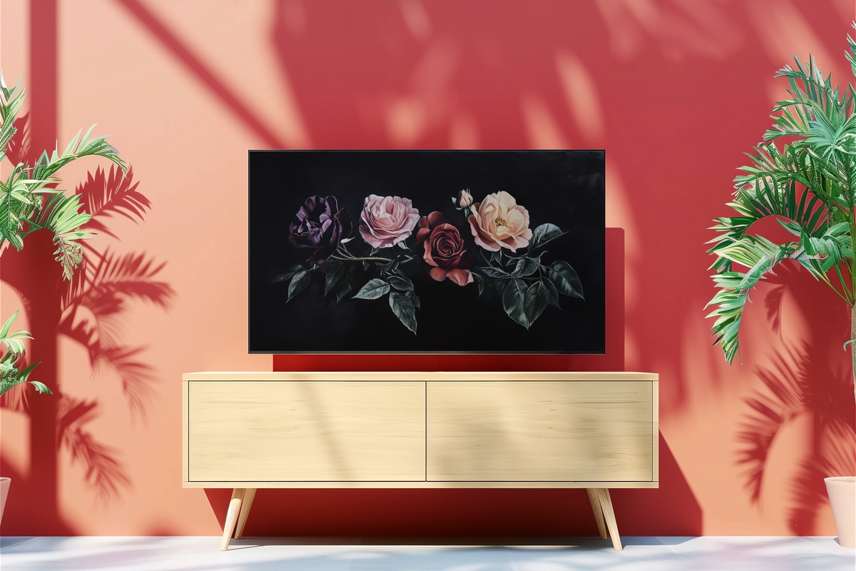
Roses on a ground so dark it reads almost as textile — the velvet quality isn't metaphor, it's genuinely what the image evokes, a richness that absorbs light rather than reflecting it. The silhouette framing removes the botanical softness and replaces it with something closer to drama: the shapes of the roses become graphic, almost architectural. This is the piece for a room that already knows what it wants to be. Deep jewel tones, a dark sofa, candlelight — it doesn't suggest a mood so much as confirm the one already present.
9. Glass-Held Eucalyptus Grace - Frame TV Art
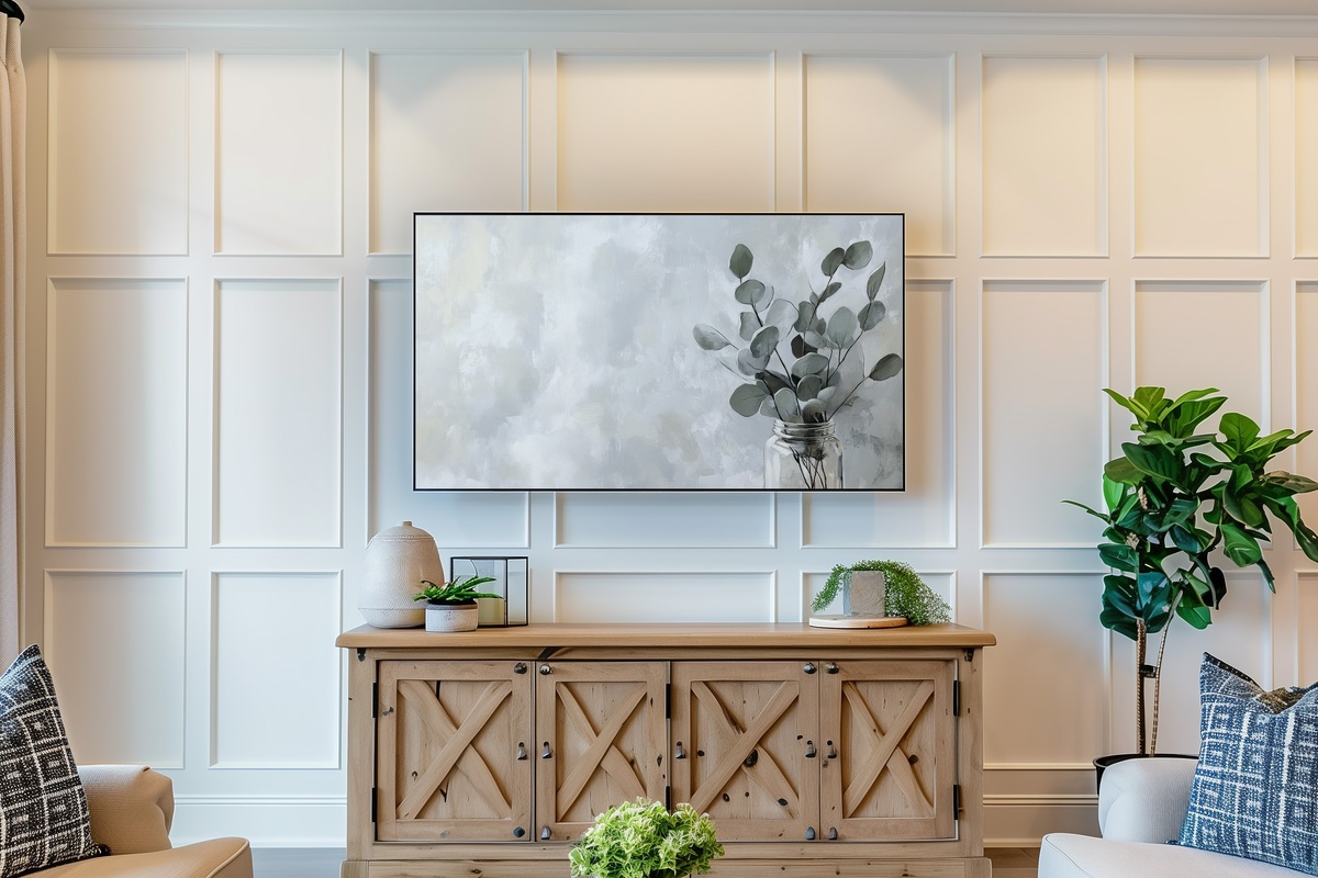
Not every floral piece needs a bloom to carry the room — this eucalyptus in a glass jar makes that argument quietly and wins it. The grey-green of the stems against the transparency of the vessel produces a palette that sits somewhere between sage and smoke. It's the edit's most understated pick, and something about that understatement is precisely the point. Rooms that have moved past maximalism into something more pared-back — a single ceramic, a stack of unread books, bare floors — will find it fits without effort. Organic. Unhurried.
10. Rustic Hydrangea Essence - Frame TV Art
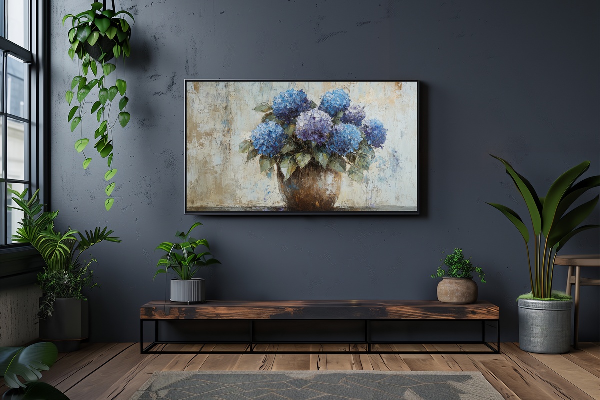
Hydrangeas in a worn clay or terracotta pot — the combination carries a specific weight of place, somewhere between a French countryside kitchen and a well-loved cottage windowsill. The palette is faded violet, dusty cornflower, and the muted warmth of aged clay, a tonal family that reads as gathered rather than designed. This piece closes the edit on a note of grounded warmth, the kind that makes a room feel inhabited rather than styled. It's a natural fit alongside natural-fibre textiles, reclaimed wood tones, and anything else that was chosen for feel over finish.
Each of these pieces downloads directly to your Samsung Frame TV — on your screen within minutes of purchase, no waiting, no subscription, yours to keep and display on rotation as the season or the light changes. The full collection lives at Gallery Flair whenever you're ready to find the one that belongs in your room.
And if two or three are calling to you — that happens — mixing across formats counts toward our volume pricing. A Frame TV piece, a matching wall print, a phone wallpaper in the same botanical register: any combination of three from anywhere in the shop brings 30% off, and five brings 50%. One continuous visual world, built at your own pace.