Fall Home Decor: 10 Considered Picks for a Curated Home
Fall home decor earns its place when it feels less like a seasonal swap and more like your home finally exhaling — amber light pooling on the walls, the palette softening toward rust and forest. These ten pieces work across Frame TVs, printed frames, and desktop screens to carry that mood from room to room without a single plastic pumpkin in sight.
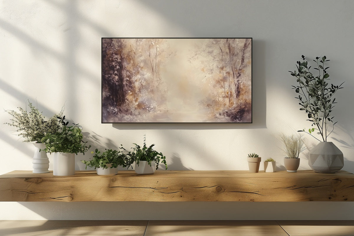
1. Autumn Forest Symphony — Frame TV Art

A wash of softly abstracted tree canopy — muted sage, dusty amber, and whispered ochre — this piece works like a landscape seen through frosted glass. On a Frame TV above a linen sofa it reads as art-gallery calm rather than seasonal statement. The palette is restrained enough to carry through October and well into November without feeling like it missed its exit.
2. Autumn Bridge Elegance — Frame TV Art

A stone bridge half-swallowed by falling leaves — the kind of scene that feels like a walk you've been meaning to take all season. The warm coral and deep sienna tones here read as genuinely vibrant without tipping into loud. Position it on a Frame TV in a reading nook or hallway and let it do what a well-chosen art print does: make the room feel like it has a story.
3. Textured Berries on Branch — Frame TV Art

An impressionist study of a berry-laden autumn branch — the kind of close-crop composition that holds attention at arm's length as much as it does from across the room. Rich burgundy, dusty rose, and warm clay tones give this one a tactile quality that photographs almost never capture fully. On a Frame TV it layers beautifully against a warm white wall or a dark, moody accent surface.
If the Frame TV direction is where you're focusing this season, our 9 Fall Frame TV Art Picks to Rotate Through This Season goes deeper into the format with a full seasonal rotation edit.
4. Vintage Fall Forest Harmony — Printable Wall Art

Abstract enough to feel contemporary, warm enough to feel like it arrived from an estate sale — this printable occupies a rare middle ground. The vintage forest palette leans into burnt sienna and aged parchment tones. Print it at 18×24 for a living room gallery wall, or smaller for a bedside vignette. Either way, it reads as something you found rather than something you ordered, which is the whole point.
5. Sunlit Amber Canopy — Printable Wall Art

Golden light filtering through a canopy of turning leaves — this piece captures the exact quality of late-afternoon October sun that every fall mood board is reaching for. The amber and honey tones are warm without veering orange, which makes it unusually easy to pair with neutral linens, dark wood frames, and terracotta ceramics. One of the quieter picks in this edit, and one of the most livable.
6. Abstract Autumn Trees Dance — Printable Wall Art

Where the other forest pieces in this edit feel still, this one has movement — brushstroke energy that suggests wind through the canopy rather than a composed landscape. The color range here is broader: rust, forest green, gold, and near-black all coexist without fighting. It earns the word abstract without sacrificing warmth, and it scales beautifully as a large-format print anchoring a dining room wall.
For a fully gallery-wall-oriented approach to these printables, our 8 Fall Wall Art Prints to Build One Cohesive Gallery Wall maps out exactly how to layer pieces like this into a single cohesive arrangement.
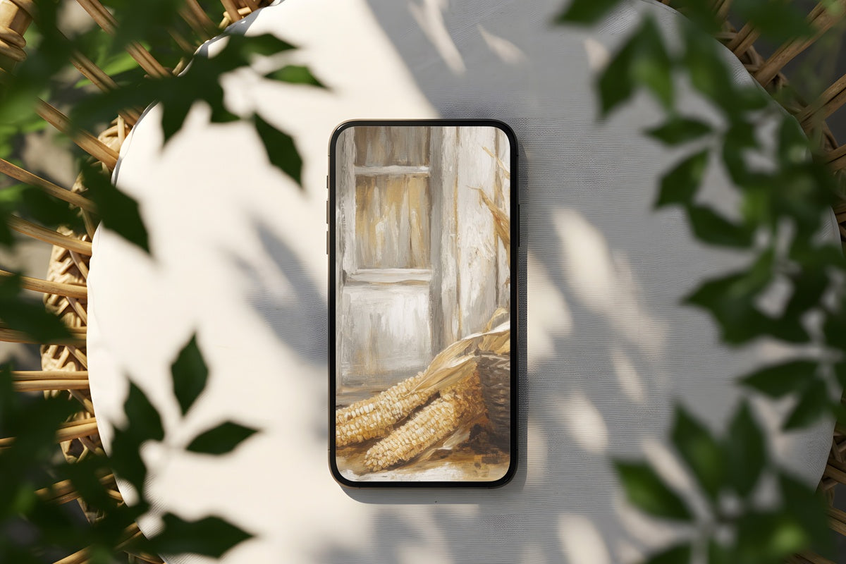
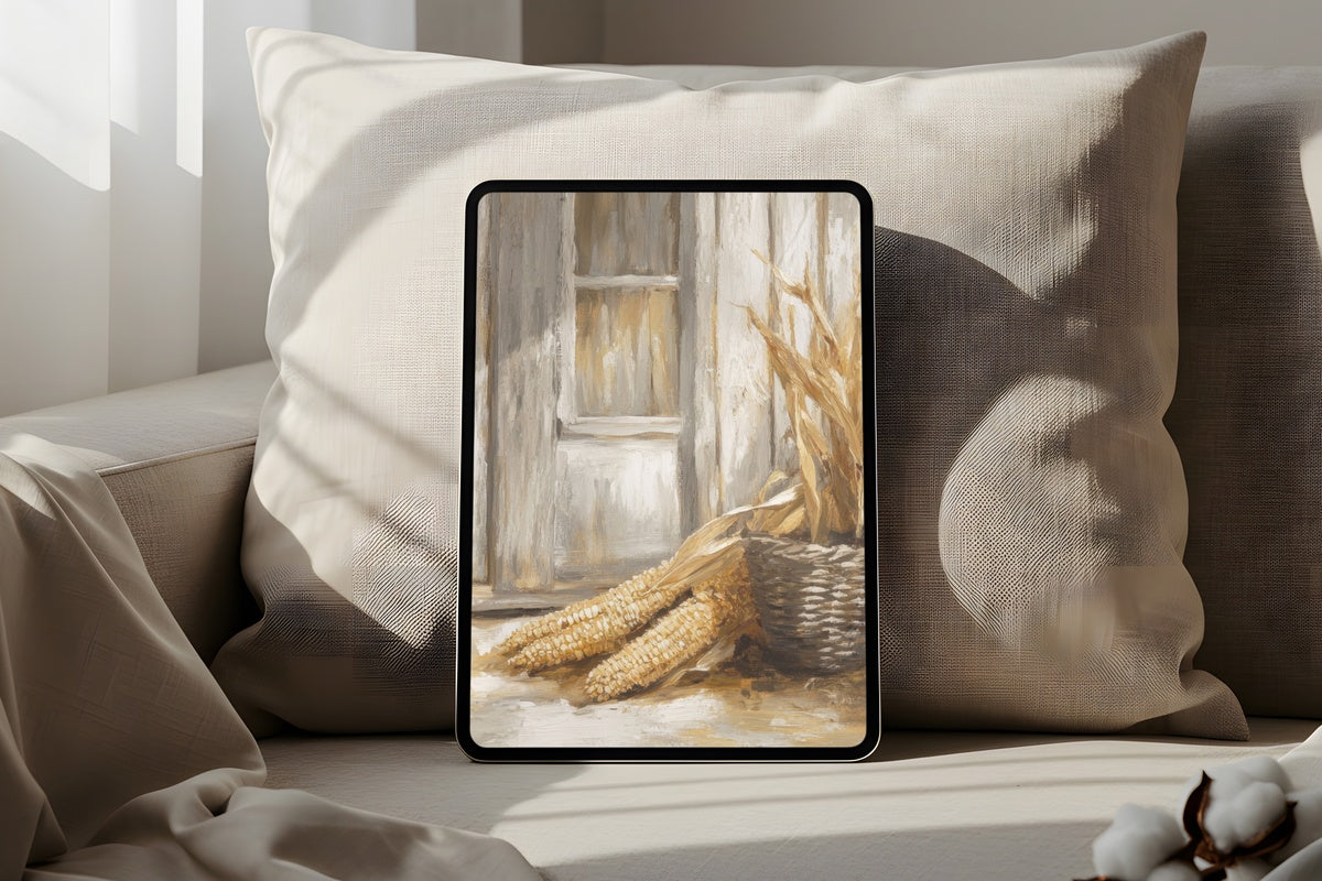
7. Vintage Fall Forest Harmony — Desktop Wallpaper

The same vintage forest palette from item four, reformatted for the screen you look at most. The abstract quality of the composition means desktop icons don't compete with it visually — they float on top of the texture without clutter. For anyone who keeps a tidy desktop, this is the autumn mood board you actually use rather than save-and-forget.
8. Orchard Apple Harvest — Desktop Wallpaper

An apple basket in an orchard scene — the kind of image that turns a Tuesday afternoon at a laptop into something that feels like a weekend. Warm crimson, earthy green, and dappled light make the palette feel genuinely seasonal without being kitschy. High resolution means it holds up perfectly on Retina displays, and the scene's horizontal rhythm leaves breathing room on both edges of a widescreen monitor.
9. Abstract Forest Autumn Harmony — Desktop Wallpaper

A forest abstraction that functions as color field as much as landscape — the kind of image that shifts depending on the light in the room behind you. Deep ochre, smoked amber, and soft moss tones sit together in a composition that never fights with whatever's open on your screen. Equally at home on a MacBook in a coffee shop or a wide monitor in a home office styled for the season.
10. Amber Leaves Elegance — Printable Wall Art

Amber leaves rendered with a vintage illustrative quality — not a photograph, not fully abstract, but somewhere in between that tends to age very well on a wall. The warm gold and honey tones pair naturally with dark oak frames and cream mats. It carries the kind of serene, slightly nostalgic energy that makes a room feel like it was decorated slowly and on purpose, which is exactly the goal.
What holds this edit together is palette discipline — amber, rust, muted forest green, and aged parchment running through ten pieces across three formats. A Frame TV in the living room, two or three prints in the hallway, a desktop wallpaper on your laptop: that kind of quiet continuity is what makes fall home decor feel intentional rather than assembled.
Any three pieces across the Gallery Flair line bring the bundle to 30% off, any five to 50%. The line is built to layer — and this particular palette across formats is one of the more effortless ways to do it.