9 Fall Frame TV Art Picks to Rotate Through This Season
There's a particular quality to the living room in October — the lamps come on earlier, the blanket stays on the armchair, and the television, even when switched off, sits in the room like a second window. What it shows matters more than you might expect. These nine pieces were chosen for exactly that moment: the amber-lit evening, the season fully arrived.
What Makes Fall Frame TV Art Work in a Real Room
The strongest seasonal pieces share a few qualities: a palette grounded in earth tones rather than cartoon harvest colors, a compositional depth that reads well from across the room, and a mood that shifts with the ambient light. Look for impressionistic texture over photographic literalism — it ages better through the season and layers naturally with warm interior lighting. A piece that reads as a painting on the wall will always outperform one that reads as a screensaver.
1. Vintage Oil Forest Whispers - Frame TV Art

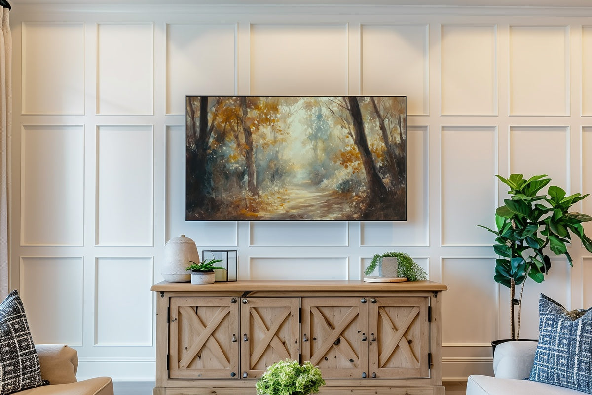
Opening with the heaviest atmospherics: this one renders an abstract forest interior in oil impressionism, all umber and moss and the suggestion of light filtering through a canopy long past its green season. The palette runs toward antique brown and oxidized gold — closer to a Barbizon landscape study than to anything digital. Hang it in a room where the lamps are already warm and it will disappear into the walls in the best possible way, indistinguishable from something framed and inherited.
2. Autumn Bridge Elegance - Frame TV Art
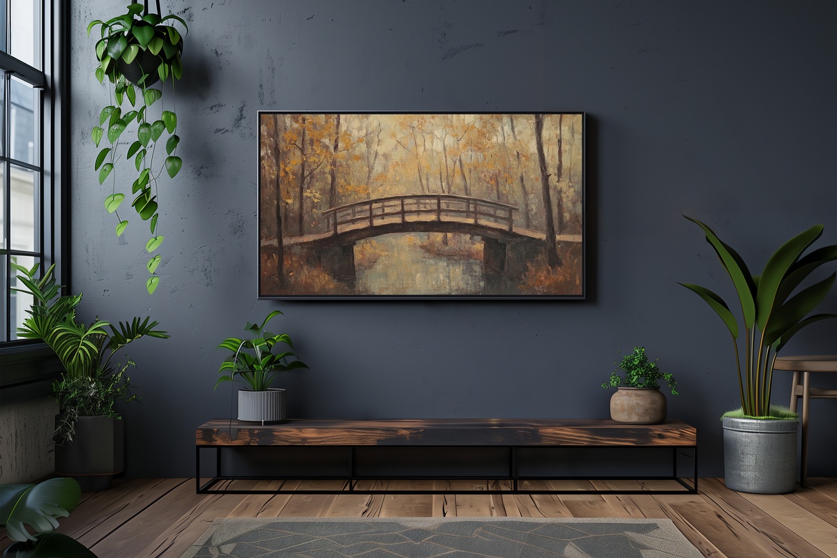
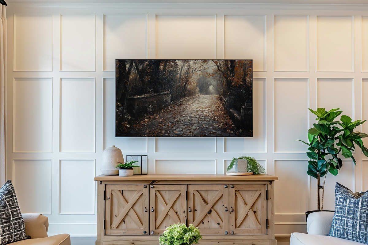
A stone bridge mid-canopy — leaves descending on both sides, the arch framing a corridor of amber and sienna that draws the eye straight through to the distance. There's a narrative tension here that purely abstract pieces can't offer: you feel the walk, the cold just arriving, the crunch underfoot. For a dining room or entryway where movement and depth serve the space, this delivers both without tipping into greeting-card literalism. The impressionistic handling of the falling leaves keeps it squarely in art territory.
3. Textured Berries on Branch - Frame TV Art
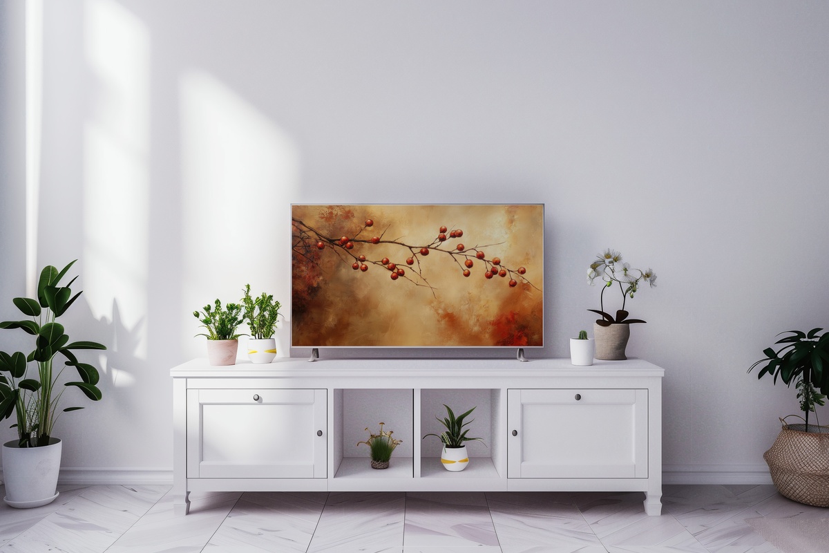
Where the other pieces in this edit reach for landscape scale, this one goes quiet and close. A single branch, berries clustered in deep burgundy and dusty crimson against a muted ground — the texture so present you can almost sense the weight of the pigment. It suits a bedroom or reading corner, the kind of wall where a larger scene would crowd the room. Someone who arranges dried botanicals on a windowsill and keeps a linen throw in precisely the right shade of rust will know exactly why this piece belongs here.
4. Abstract Forest Autumn Harmony - Frame TV Art
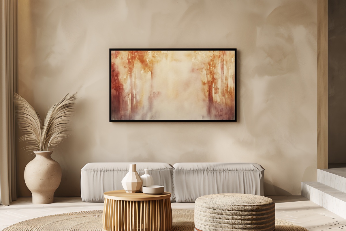
Autumn forest at the level of color field rather than representation — vertical striations of ochre, burnt orange, and cooled green that suggest tree columns without insisting on them. It reads differently depending on how far back you stand, which is exactly what makes it work in a living room where people move through the space rather than settle in front of it. A room with neutral furniture and clean architectural lines will let this piece carry the season without competing with anything else on the wall.
5. Autumn Stream Serenity - Frame TV Art
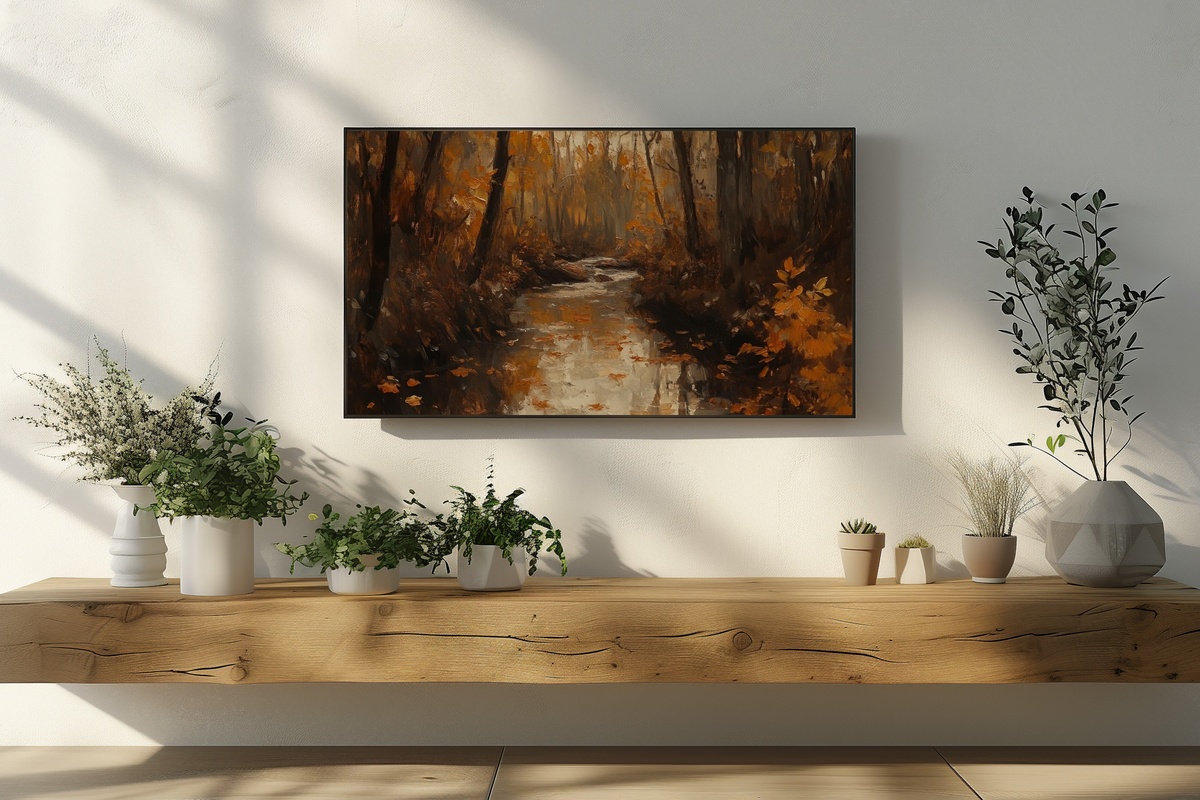
Moving water rendered in impressionistic strokes — a forest stream catching the dappled amber of the canopy above, the current implied rather than illustrated. Water in autumn scenes risks tipping into calendar art, but the looseness of the brushwork here keeps it anchored in painterly tradition. What you feel looking at it is something like early morning quiet: the house still, the coffee just poured. A natural pairing with warmer neutrals — cream plaster, aged oak, anything that already holds a little gold.
6. Vintage Lake Mist Serenity - Frame TV Art

Mist on an autumn lake rendered in a desaturated vintage palette — ash, pale pewter, the faintest suggestion of tree-line. If the other pieces in this rotation run warm, this one cools the room just enough to feel considered rather than seasonal. It's the anchor piece for anyone who finds the full amber-and-rust treatment too saturating — this offers autumn through atmosphere rather than color saturation. Pair it mid-season when you want the Frame TV to read as a painting you've owned for years rather than a decoration you've just put up.
7. Falling Leaves Symphony - Frame TV Art
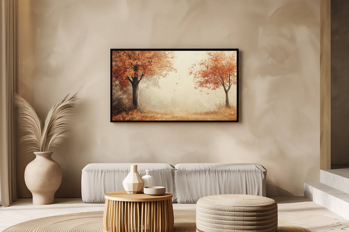
Autumn trees in full release — leaves mid-fall, the canopy thinning, the light coming through at an angle that only exists in November. There's a looseness to the composition that suits late-season use: once the deep amber of early fall gives way to bare branches and grey afternoons, this piece bridges the two moments rather than clinging to one. It also layers well as a pairing — a wall print in the same tonal family alongside this on the Frame TV creates the kind of visual continuity that makes a room feel genuinely collected.
8. Autumn Breeze Lake Whispers - Frame TV Art
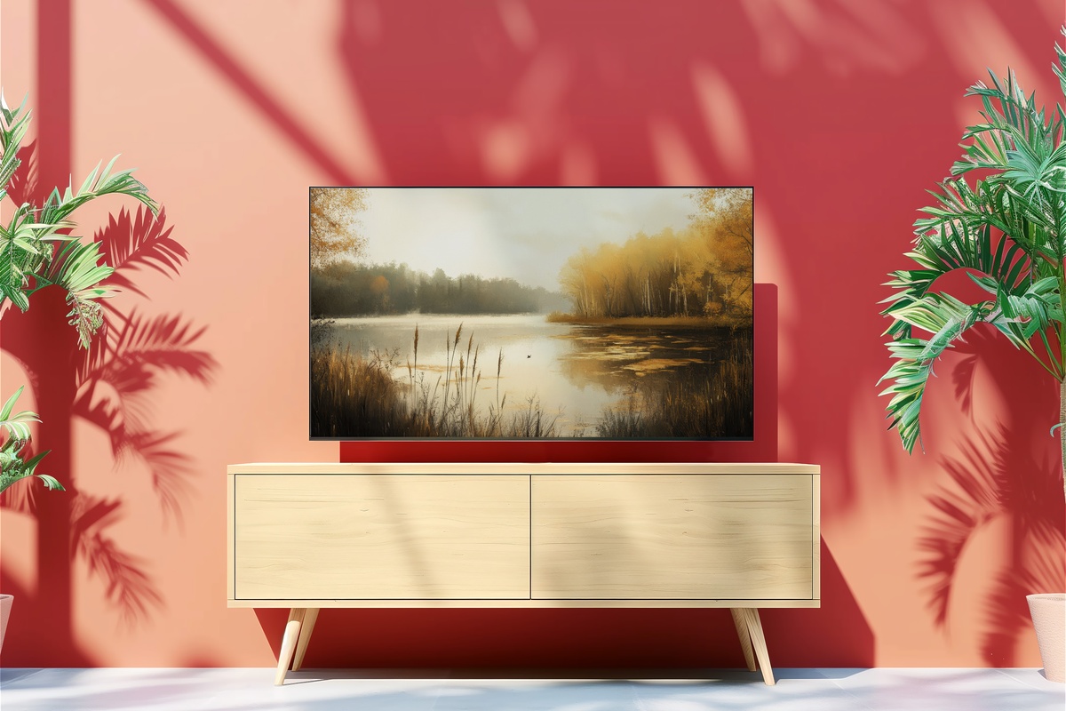
A lake surface touched by wind, the surrounding treeline in full seasonal color — tawny orange and deep copper reflected and slightly broken in the water below. The doubling effect, landscape above and its distorted mirror below, gives the piece an unusual vertical weight that fills the Frame TV format particularly well. And honestly, we're a little partial to this one — there's something in that wind-rippled reflection that makes the room feel like it's breathing. Best placed where afternoon light crosses the screen at an angle.
9. Leaf Resting on Stone - Frame TV Art
A single fallen leaf on a stone path — this is restraint fully committed to. The palette is almost monastic: cool grey stone, one leaf in amber-veined ochre, negative space doing most of the surrounding work. Macro botanical subjects at this scale can read as overly precious, but the rough stone ground keeps this one tethered to the natural and worn. A piece for rooms that already lean minimal — concrete, raw linen, matte ceramics — where a single point of seasonal color is exactly the right amount.
Each of these downloads straight to your Frame TV — no subscription, no waiting, yours to keep and rotate as the season moves. The rotation idea is the point: start with the warmer, richer pieces in early October, shift to the cooler and more restrained ones as November settles in. The collection is already there whenever you're ready to make the change.
Worth noting as you build your seasonal set: the 30% and 50% thresholds apply to any combination across the full Gallery Flair range — Frame TV art, printable wall art, device wallpapers, all mixed freely. Three pieces from anywhere in the shop brings the first tier; five brings the second. A Frame TV piece paired with a wall print and a phone wallpaper in the same autumn palette counts as three — which is a quietly efficient way to build one continuous visual world across your home before the season peaks.