10 Fall Desktop Wallpapers for a Curated, Cozy Workspace
There's a particular quality to a MacBook screen at 9 a.m. in October — coffee still steaming beside it, the window doing something golden outside. The right fall desktop wallpaper doesn't just fill that space; it extends the mood of the room into the machine, so that every time you lift the lid, the season is already waiting for you.
What Makes a Fall Desktop Wallpaper Feel Curated Rather Than Seasonal?
Two things separate a considered autumn wallpaper from a generic November screensaver: palette control and compositional restraint. Look for imagery that holds a single tonal family — amber-to-sienna, or mist-grey-to-sage — rather than throwing every autumn color at once. Strong pieces also leave room to breathe: a sky with negative space, a foreground detail that anchors the eye without fighting your desktop icons. These ten picks were chosen with exactly that balance in mind.
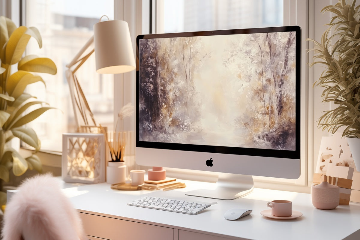
1. Autumn Forest Symphony

What registers first here is the hush — a layered forest interior rendered in the kind of muted amber and dusty rose that reads closer to a watercolor study than a photograph. The abstracted forms push the literal season into something more atmospheric, less calendar-page. It sits quietly behind a full spread of open tabs and still holds its composure, which is harder to achieve than it looks. For screens that share a room with warm-toned linen and earthy ceramics, this one finds a natural home.
2. Autumn Bridge Elegance

A stone bridge arching through a corridor of amber and crimson foliage — it sounds like it could tip into postcard territory, and yet it doesn't. The image earns its drama through tonal precision: the burgundy canopy above, the mirrored reflection below, and a path that draws the eye forward without demanding attention. On a wide desktop monitor, the horizontal composition becomes almost cinematic. Open your laptop on a slow Tuesday afternoon and it feels like you scheduled a brief escape somewhere in the Burgundy countryside.
3. Autumn Tree Line Harmony

Rendered in an impressionist register — loose brushwork, color fields that bleed at the edges — this tree line trades photographic clarity for painterly warmth. The palette spans yellow-ochre to burnt umber, with a sky that settles somewhere between overcast and luminous. It's the fall desktop wallpaper for the MacBook that lives on a desk beside a stack of art books and a clay mug. Anyone whose workspace is as much an aesthetic environment as a functional one will read this immediately for what it is: a deliberate, considered choice.
4. Deer Forest Family in Harmony

There's a gentleness here that doesn't announce itself. The deer — a family grouping, rendered in the dappled half-light of a woodland clearing — sit within a composition that uses the surrounding forest as a soft frame rather than a backdrop. Fawn-brown, forest-shadow grey, and warm foliage gold make a palette that feels deeply autumnal without shouting it. Worth noting for those who love figurative subject matter but want it handled with restraint: this is narrative imagery that still functions as a mood, not an illustration.
5. Sunlit Forest Whispers

Light rays cutting through a tall autumn canopy — it's a composition built entirely around luminosity. The amber and copper of the leaves are almost secondary to the quality of the light itself, which has that specific mid-morning angle that makes even ordinary October days feel like a film still. On a high-resolution display, the tonal range between deep forest shadow and sun-struck foliage is where this piece really performs. Set it on a bright screen and the glow does something the other picks in this edit don't.
6. Impressionist Leaf Dance

Pure movement. The loose impressionist handling of falling leaves creates a surface that feels kinetic — colour and form dissolving into each other at the edges, rust-red and saffron swirling against a soft, diffused background. If you're the type who organizes your workspace around texture and visual rhythm rather than literal seasonal imagery, this is where the edit turns in your direction. It has the energy of a late-October gust captured at the exact moment it breaks into beauty. Genuinely one of the more unexpected picks in this group.
7. Pumpkin Cart Harvest Harmony

Harvest imagery can easily veer into country-store signage — this avoids that entirely. The pumpkin cart is rendered with a painterly warmth that places it closer to a Dutch still-life study than a seasonal greeting card. Deep pumpkin-orange anchored by weathered wood tones and a soft, receding background gives the scene genuine depth. If autumn for you means farmers markets, dried botanicals on the mantlepiece, and a kitchen that smells of roasting squash, this piece carries that specific frequency without sentimentality.
8. Window View of Harvest

A window frame looking out over an autumn harvest scene — the framing device is doing real compositional work here, creating a layered picture-within-a-picture that gives the whole image an intimate, interior quality. Warm amber light pools on windowsill details while pumpkins and autumn foliage fill the view beyond the glass. It's the fall desktop wallpaper that makes the laptop feel less like a work surface and more like a small room with a very good view. Set it up before the season peaks and let it settle in.
9. Autumn Breeze Lake Whispers

Where most of this edit runs warm, this piece introduces a cooler current — the steel-blue-grey of a lake surface rippling under an autumn wind, shoreline trees burning copper and gold against the water. The contrast between cool water tones and warm foliage gives the palette a tension that keeps it from feeling monochromatic. A natural fit for workspaces styled in slate, aged brass, or eucalyptus green — rooms where the autumn mood runs more toward atmosphere than harvest abundance.
10. Vine-Covered Fence Harmony

Neutral, close-toned, and quietly architectural — climbing vines tracing the lines of an aged fence in a palette of parchment, dusty sage, and faded terracotta. This is the outlier in the collection: no dramatic canopy, no golden hour. Just texture, structure, and a muted seasonal warmth that suits the person whose taste runs toward wabi-sabi and raw linen rather than rich autumn saturates. And honestly? For a screen that stays open all day through back-to-back calls and spreadsheets, that restraint is a relief.
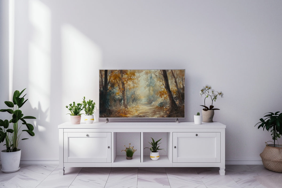
Each of these downloads straight to your device — no waiting, no account required, yours the moment the file lands. If you're building a cohesive autumn palette across your home and screens, these pair naturally with fall wall art and Frame TV pieces in the same warm tonal family, wherever the season shows up in your space.
One note worth knowing: any three pieces across the entire Gallery Flair collection — desktop wallpapers, printable wall art, Frame TV art, all mixed freely — bring the total to 30% off. Reach five across any combination and that becomes 50%. Building a whole-room autumn mood across formats is, as it turns out, also the most economical way to do it.