8 Black and White Wall Art Prints for a Cohesive Gallery Wall Statement
There's a particular clarity that comes over a room when every piece on the wall speaks the same visual language. No competing hues, no tonal friction — just ink, contrast, and negative space doing exactly what they were made to do. This is a curated set of eight black and white prints (and a few screen companions) chosen to hang together, layer quietly, and mean something as a whole.
What Makes a Black and White Gallery Wall Feel Cohesive?
The answer isn't matching frames or uniform sizing — it's shared visual temperature. Pieces that belong together tend to carry a consistent weight of line: either they all lean expressive and gestural, or they all lean geometric and ordered. Mixing the two only works when one register anchors and the other accents. As you browse below, notice where each piece sits on that spectrum. The edit here is deliberately varied enough to breathe, contained enough to unify.
1. Dynamic Brushstroke Energy - Printable Wall Art
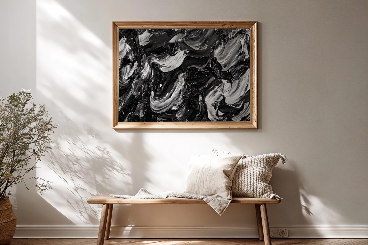
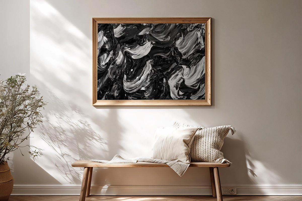
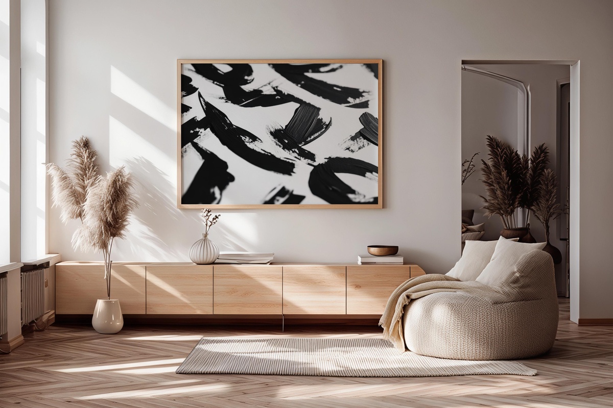
Open the gallery wall with something that moves. This piece leads with raw gestural energy — broad, overlapping brushstrokes that read like a single exhaled breath caught mid-motion. The ink ranges from near-charcoal at its heaviest passages to a pale grey wash at the edges, giving the composition real tonal depth without ever introducing a second color. Hang it at eye level where the light crosses it in the afternoon; the texture becomes almost three-dimensional. It anchors an expressive grouping without overpowering quieter neighbors.
2. Black Ink Letter Elegance - Printable Wall Art
Typography elevated to the point where it stops being language and starts being form. The letterforms here carry the confidence of a calligrapher working at full scale — clean entry strokes, deliberate weight shifts, ink pools that settle into near-black at the terminals. It reads as modern without chasing trends, which means it will hold its place on the wall long after more fashionable pieces have been rotated out. A natural fit for rooms where the rest of the decor is already restrained: white plaster, linen, pale oak.
3. Dynamic City Silhouette - Printable Wall Art
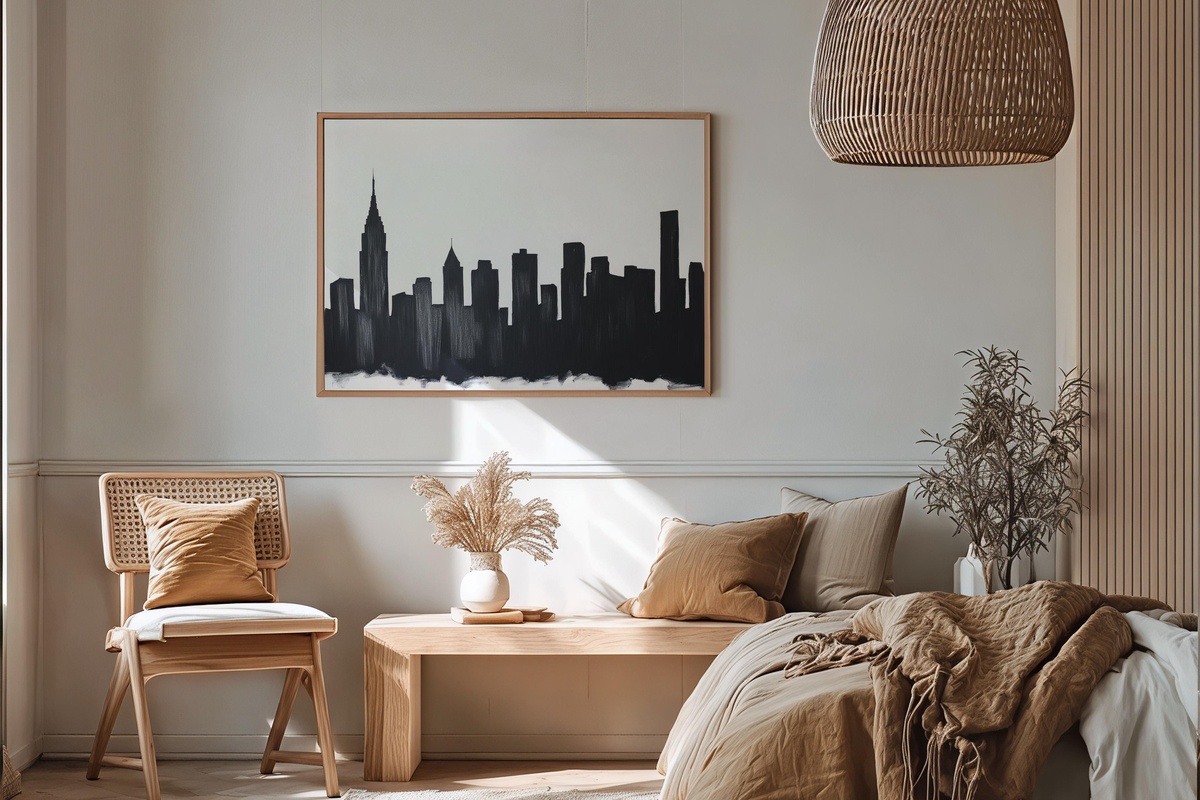
Pure silhouette work has an honesty to it that other approaches rarely match — you get only outline and mass, nothing to hide behind. Here, a dense urban skyline is compressed into a flat horizon of black, the negative sky above it left almost entirely bare. That tension between the packed lower register and the open upper field is where the piece earns its keep. It introduces a representational element to the gallery wall without breaking the monochrome contract, and it pairs well immediately left or right of something more abstract.
4. Dynamic Stripe Rhythm - Printable Wall Art
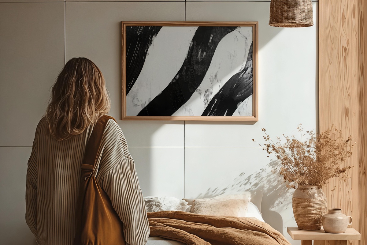
If you've ever worried that a monochrome wall might go flat, this is the piece that answers the concern. Bold horizontal banding, varied in weight and spacing, generates an optical pulse — something between a sound wave and a textile weave. It's geometric where the brushstroke print is expressive, ordered where the silhouette is atmospheric, and that contrast is deliberate. Anyone whose instinct is to layer graphic pattern against looser mark-making will recognize exactly what this does for the wall around it. Print it large and let it hold its own.
One curatorial note worth making here: the four prints above translate beautifully into a paired digital world. If the aesthetic you're building on your walls is the same one you want to wake up to on your screens, the four items below extend the visual vocabulary without repeating it — same temperature, different format.
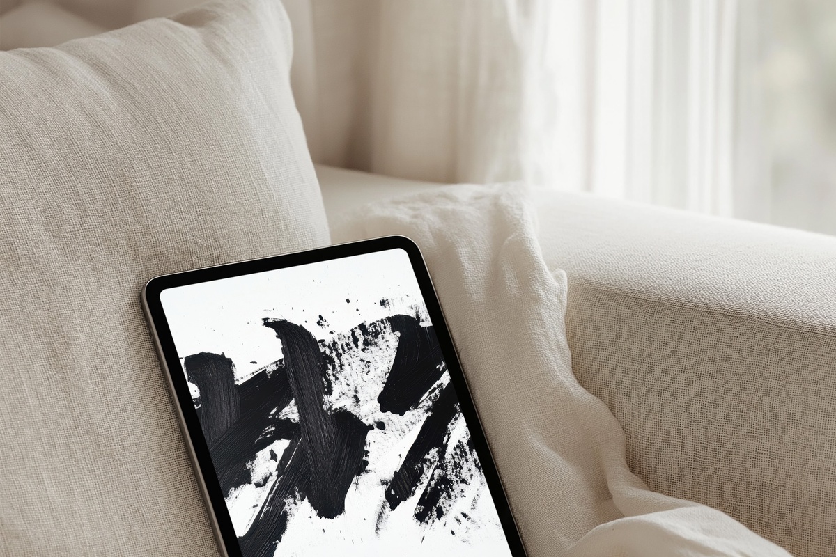
5. Dynamic Brushstroke Energy - iPad Wallpaper
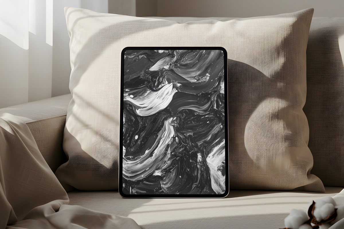
The brushstroke motif from the wall print reappears here, re-cropped and re-proportioned for a vertical screen ratio. What reads as a sweeping horizontal gesture on paper becomes a more intimate, close-in view on the iPad — as if you're looking at a section of the print rather than the whole. The soft grey midtones translate well on a backlit display, avoiding the harshness that pure-black compositions can develop on screen. Carry the gallery wall into the one surface you actually hold in your hands.
6. Typography as Artistry - iPad Wallpaper
Where the letter elegance print on the wall leans toward formal calligraphy, this screen companion takes typography somewhere more expressive — letterforms overlapping, scaling unpredictably, treating the grid as a suggestion rather than a rule. It's a more restless piece, suited to the active surface of a tablet rather than the fixed frame of a wall. The contrast is kept high throughout, so it remains legible and clean even at arm's length. Open the iPad on a Monday morning to something that actually has an opinion.
7. Chic Fashion Sketch - iPad Wallpaper
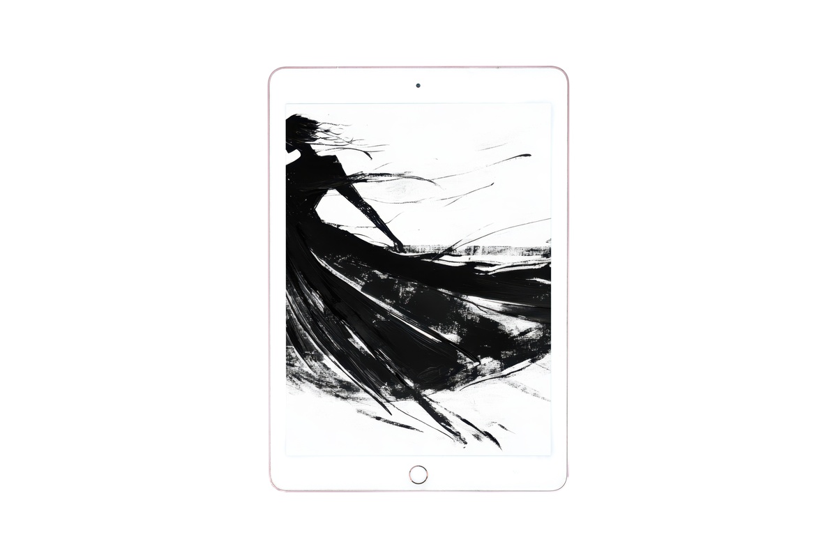
A loose fashion illustration rendered in fine ink lines — the kind of drawing that communicates posture, fabric, and attitude with almost no information, because the artist knew exactly which lines to leave in and which to cut. This is the most figurative piece in the set, and it brings a useful human presence to what might otherwise be an entirely abstract collection. It doesn't announce itself loudly; the sketch quality keeps it light. But pair it against the stripe rhythm or city silhouette and the gallery wall — real or digital — gains a genuine range of registers.
8. Shadowed Reverie Portrait - iPad Wallpaper
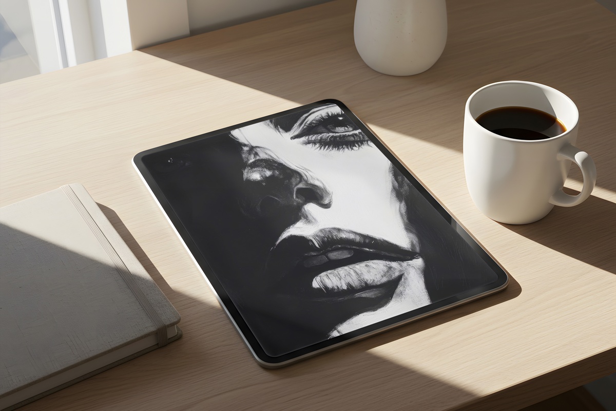
Shadow as subject matter, not incidental effect. This portrait uses deep chiaroscuro — the face partially receding into darkness, only the lit planes asserting themselves — to create something closer to a mood study than a conventional portrait. It's the most atmospheric piece in the edit and the one most likely to feel different at different hours of the day, shifting from meditative in morning light to genuinely dramatic by evening. Those who prefer their screens minimal and their walls expressive will find this resolves both instincts at once.
A gallery wall built in this register — ink, contrast, restraint — tends to settle into a room and stay. Every piece here is an instant download, ready to print or load onto a screen before the afternoon is over. Browse the full set whenever the walls feel ready, and take your time with placement; the arrangement matters as much as the individual pieces.
One quiet note on pricing: mix and match freely across formats. Three pieces from any combination of wall prints and tablet wallpapers brings 30% off the total; five pieces from any mix takes it to 50%. Building one continuous visual world across your walls and screens turns out to be the most economical way to do it too.