10 Abstract Printable Wall Art Picks to Refresh Your Space This Season
There's a particular restlessness that arrives with a new season — the urge to shift something, rearrange the light in a room, make the walls feel alive again. Abstract printable wall art is one of the quietest ways to answer it: no hammer required, no lead time, just a new composition breathing in a frame you already own.
What Makes Abstract Wall Art Work in a Seasonal Rotation?
The pieces that hold up through a rotation share a few qualities worth noting before you choose. First, palette temperature — warm amber and burnished gold read entirely differently in October than they do in April, and that's a feature, not a flaw. Second, surface quality: textured and layered compositions carry more visual weight and suit rooms where you spend slower hours. Third, scale and negative space — a busier piece needs breathing room; a quieter one can anchor a gallery wall without dominating it. Keep these in mind as you move through the edit below.
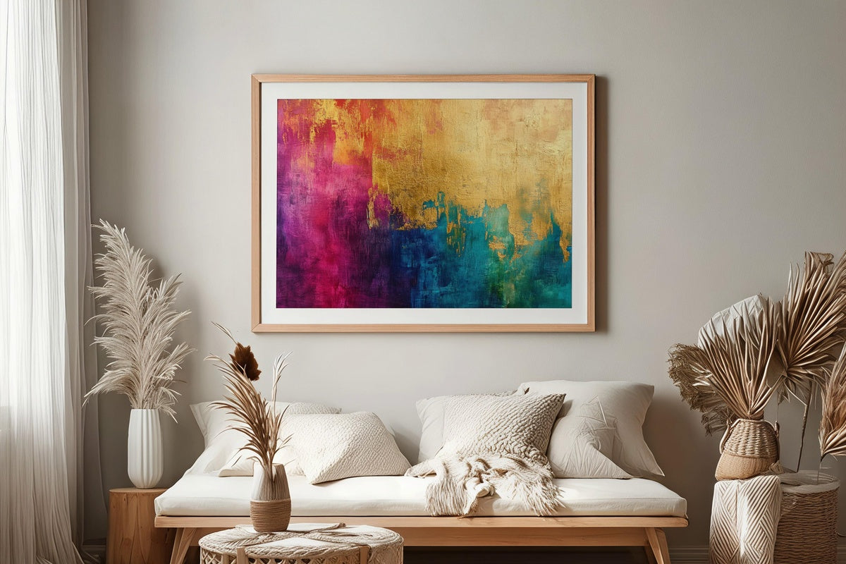
1. Golden Tapestry Splendor - Printable Wall Art
Gold leaf rendered as woven structure — that's the precise effect here. The surface reads like hammered metal caught in late-afternoon light, where horizontal and diagonal threads of amber and ochre intersect without ever feeling frenetic. Hang this above a console with a warm-toned lamp beside it and the room takes on a burnished, end-of-day quality. A natural anchor for anyone whose interiors lean toward richness over minimalism — and who wants a focal point that holds the eye without competing with everything else on the wall.
2. Rosy Gilded Harmony - Printable Wall Art
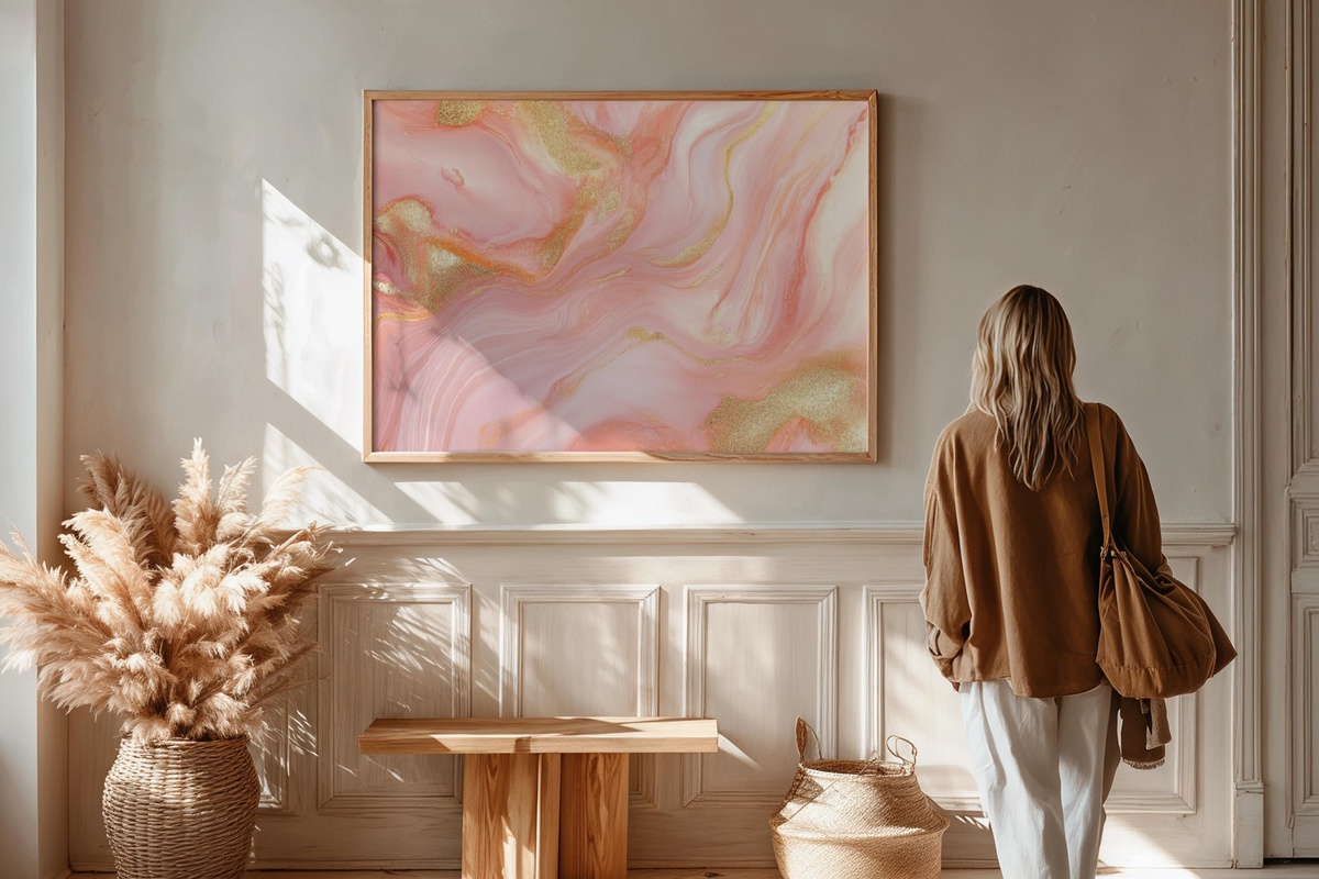
Blush and gold is a pairing that can tip saccharine fast — dusty rose softened with true metallic restraint is what keeps this one on the right side of that line. The tones here are muted enough to work in a bedroom or reading nook without overwhelming the space, yet the gilded passages carry just enough warmth to feel considered rather than timid. If your walls are already neutral and you've been circling a piece with colour but couldn't commit, this is a gentler entry point than most.
3. Textured Gold Layers - Printable Wall Art
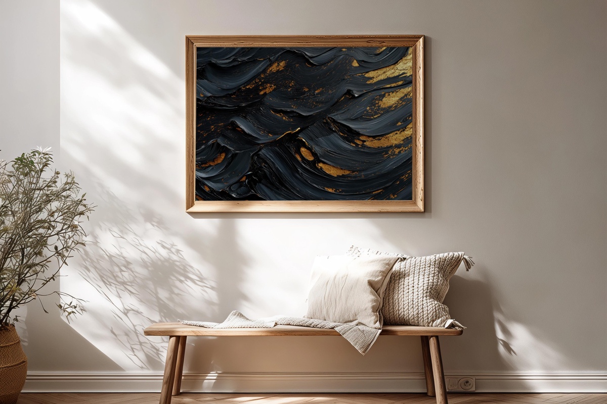
Where Golden Tapestry Splendor moves in crossing lines, this piece works through accumulation — stratum upon stratum of warm gold, each layer slightly cooler or warmer than the last. Printed large, the depth reads almost architectural; in a smaller frame, it functions closer to a detail study in precious material. Either way, it brings weight to a wall without demanding a statement frame or elaborate styling around it. Think of it alongside raw linen, unfinished wood, and a single ceramic object nearby.
4. Organic Comfort Flow - Printable Wall Art
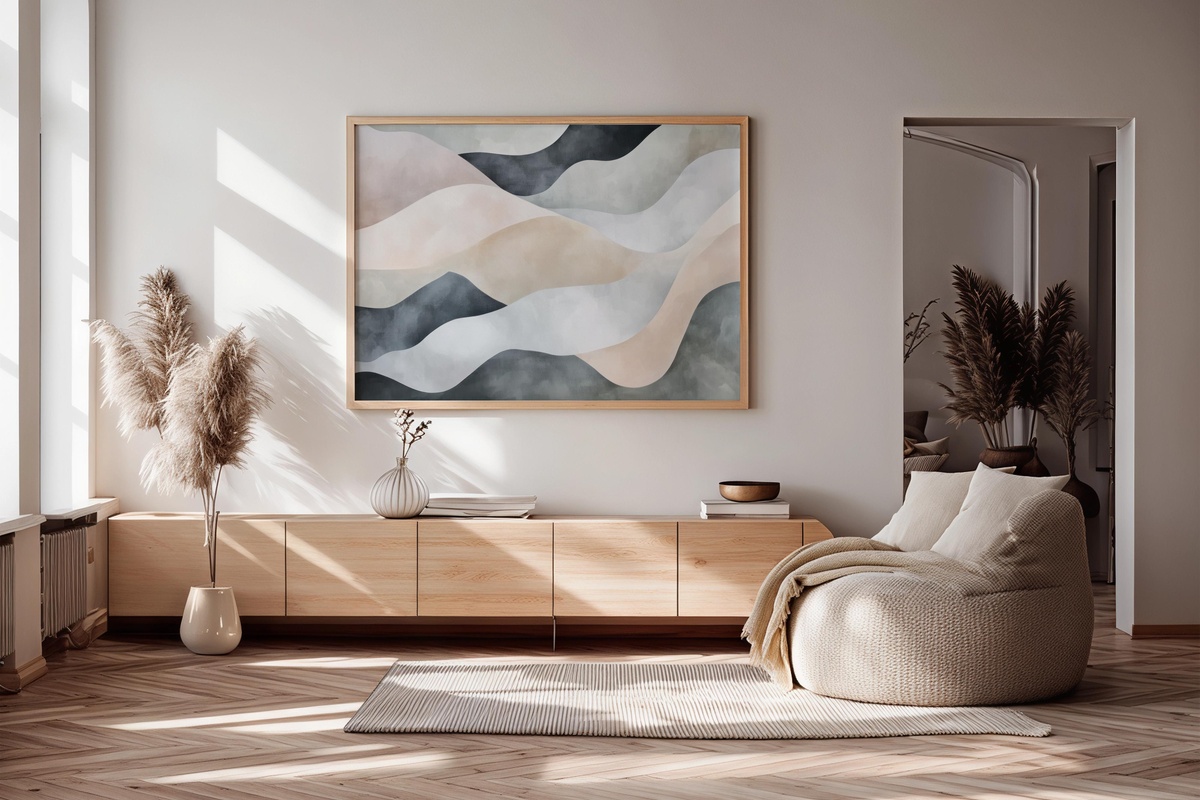
Soft biomorphic shapes drift through the field here with no hard edges in sight — the kind of composition that slows your eye down rather than directing it anywhere in particular. There's a looseness to it that feels genuinely restful, closer to a slow exhale than to anything decorative. Rooms that carry a lot of right angles and hard surfaces benefit most; this piece does something to soften the architecture around it. Someone who takes their mornings slowly, with tea and unhurried light, will understand exactly what this means.
5. Futuristic Metallic Silhouettes - Printable Wall Art
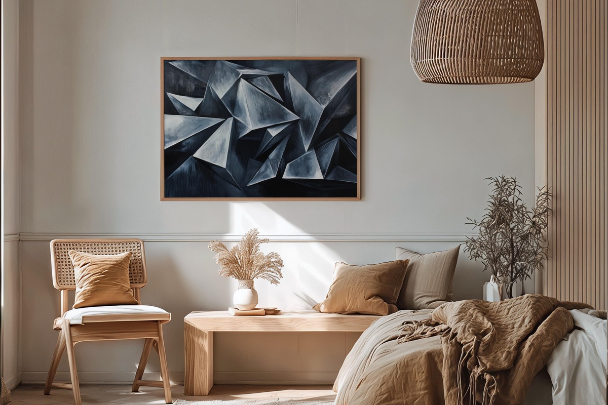
Graphite and silver geometry — angular forms that read less like decoration and more like architecture seen from a great height. This sits at the cooler end of this edit, and that contrast is intentional: if the rest of your seasonal rotation leans warm, one piece with a different temperature gives the grouping something to push against. It suits a home office wall or an entry with clean-lined furniture. Not a piece for the maximalist corner of the room — but for spaces where restraint is already the operating principle, it lands with real authority.
6. Vibrant Energy Tapestry - Printable Wall Art
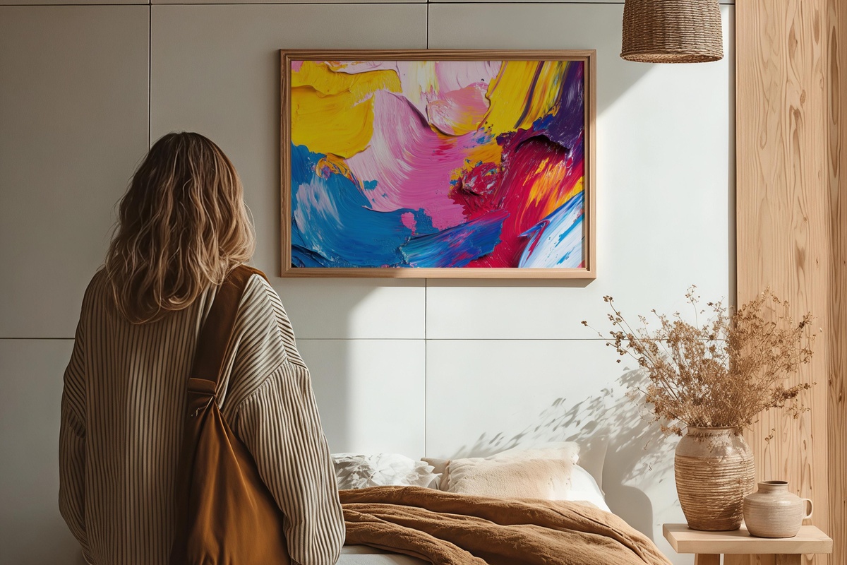
Teal meeting burnt orange in sweeping, charged strokes — this is the piece in the rotation that refuses to be background. The energy here is kinetic rather than decorative; it reads differently depending on the hour, almost darker and more grounded in evening light, electric in the morning. Give it a wall of its own rather than folding it into a gallery grouping. Rooms built around pale, understated palettes will find this particularly useful — a single moment of full-throated colour can do more compositional work than five neutral pieces combined.
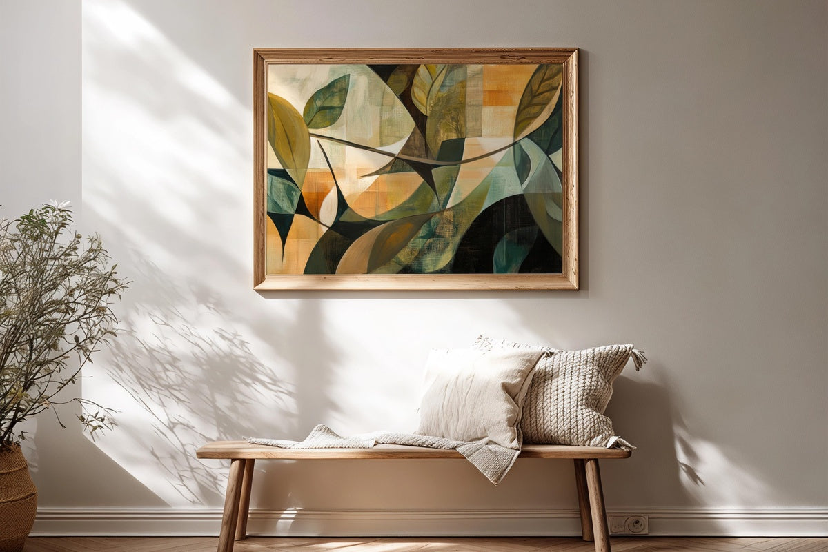
7. Textured Earthy Layers - Printable Wall Art
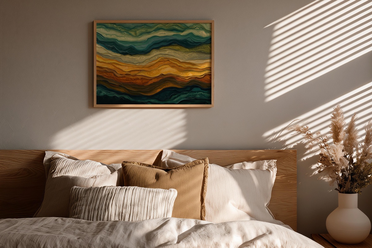
Umber, sand, and raw sienna built up in horizontal planes — this reads almost like a cross-section of earth, the kind of image that makes a room feel grounded in the most literal sense. It pairs naturally with jute, terracotta vessels, and the particular smell of a room where candles are burning low. What separates it from generic earth-tone prints is the visible layering: the surface has depth you want to lean toward rather than simply glance at. A patient piece. One that rewards a slow look.
8. Nature Forms in Earth Tones - Printable Wall Art
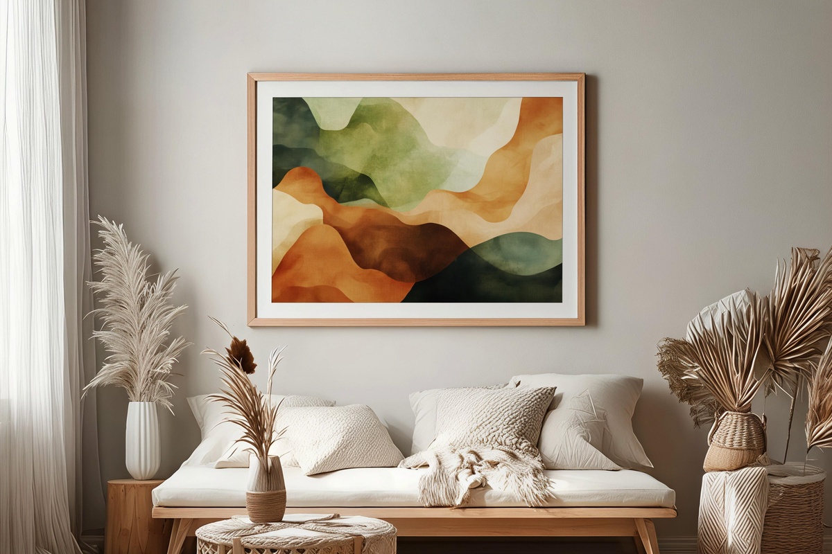
Organic silhouettes — shapes that suggest leaf, root, stone — suspended in a palette of warm cream and dried-clay brown. The forms are abstract enough to avoid literalism, yet clearly rooted in the natural world. This occupies a useful middle ground for rooms that want a botanical sensibility without the specificity of a botanical print. Pair it with the Textured Earthy Layers piece in the same frame family and you have a two-piece wall moment that feels curated rather than matched — a tonal family where each piece still reads independently.
9. Tranquil Water Elegance - Printable Wall Art
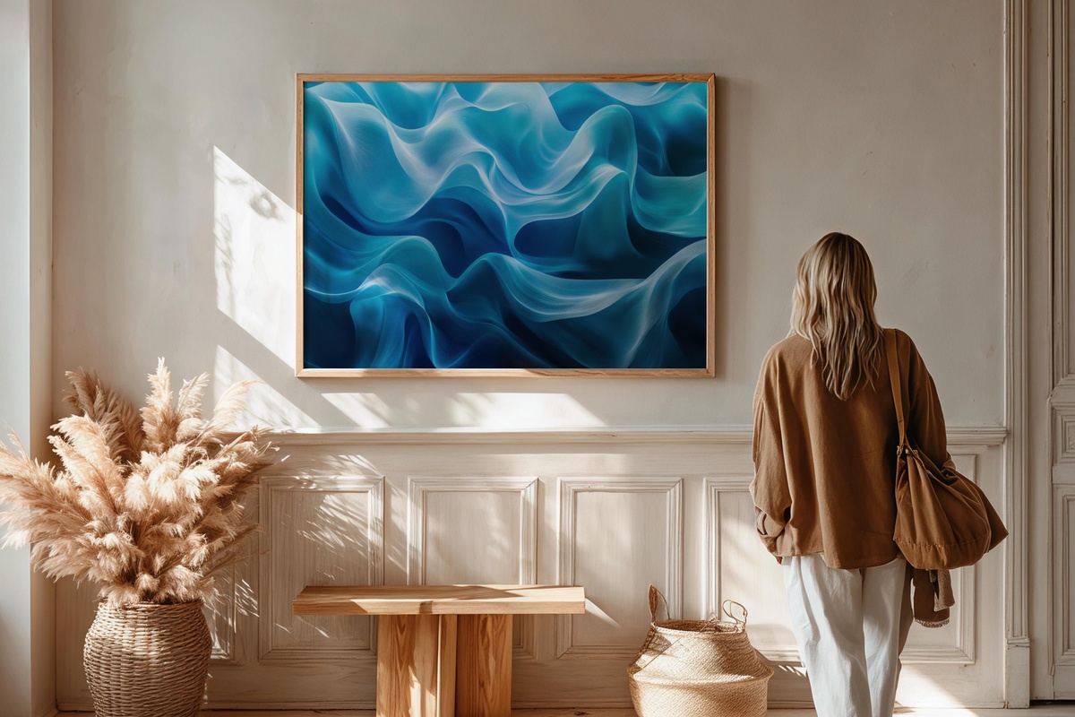
Cool blue-grey tones move in horizontal waves through this piece — unhurried, almost silent. Where the gold and earth-toned works in this edit carry warmth and weight, this one introduces a different register entirely: something closer to early morning on still water, or a room with the curtains just parted. Bathrooms, reading corners, and bedrooms all receive it well. Anyone drawn to Scandinavian or Japanese interiors — spaces built around restraint and the deliberate absence of noise — will find it fits without effort.
10. Earthy Tone Harmony - Printable Wall Art
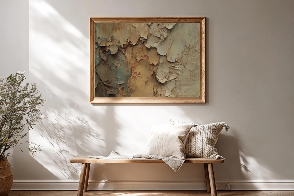
A warm, enveloping palette of terracotta, caramel, and soft ivory — this is the piece you reach for when a room needs to feel inhabited rather than styled. The forms are loose and generous, the overall mood closer to a lived-in farmhouse kitchen than to a gallery white cube. And yes, we're aware that sounds like a cliché. But there's a difference between rustic and genuinely warm, and this one lands firmly in the latter: considered tones, unhurried marks, the visual equivalent of a room where someone actually spends time.
Every piece in this edit is ready to print the moment you choose it — no waiting on shipping, no tubes rolled in a corner. Download, size to your frame, and the wall changes today. The season is already shifting; there's something satisfying about having the art up before the room fully settles into its new mood rather than after.
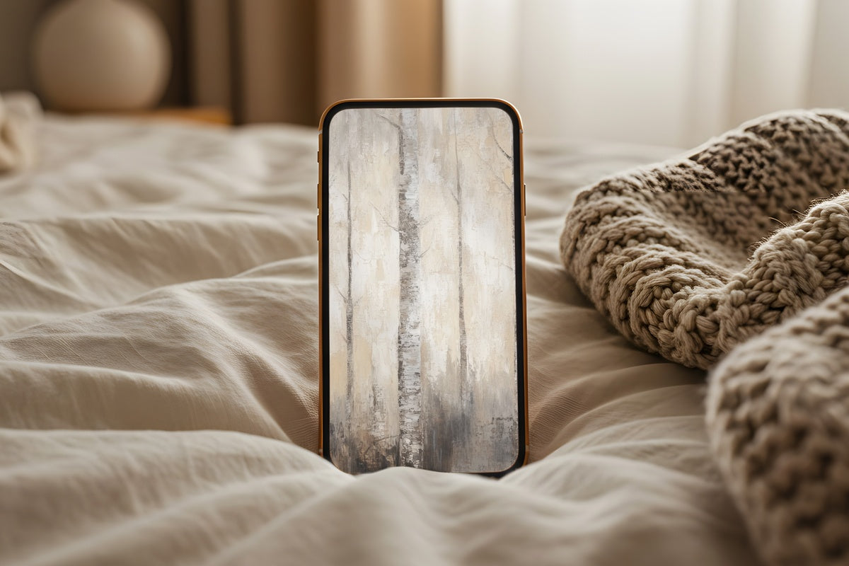
A quiet note on collecting: mixing across formats deepens a visual world rather than diluting it. A wall print from this edit alongside a coordinating Frame TV piece or a device wallpaper in the same tonal family — all three count together toward Gallery Flair's volume pricing. Three pieces from any combination of product lines brings 30% off; five brings 50%. That's the kind of arithmetic that makes a full-room palette feel less like an indulgence and more like good sense.