10 Abstract Wallpapers and Art Pieces to Build One Cohesive Aesthetic
There's a certain satisfaction in pulling up your phone, glancing at your lock screen, then looking across the room to your wall — and feeling like it all belongs together. Not matching, exactly. Attuned. That's what a considered abstract palette can do across formats, and this edit is built around that idea.
What Ties an Abstract Aesthetic Together Across Formats?
When curating across phone wallpapers, Frame TV art, and printable wall art, the connecting thread isn't a motif — it's temperature and weight. Warm amber and terracotta read consistently across a 6-inch screen and a 55-inch display. Cool sage and stone hold their register whether they're framed on a wall or glowing softly on a TV at rest. Look for shared undertones (golden, rosy, or muted green) and consistent contrast levels — not identical imagery. A low-contrast piece on your phone and a low-contrast piece above your sofa will feel curated even if the subjects are entirely different.
1. Golden Tapestry Splendor - iPhone Wallpaper
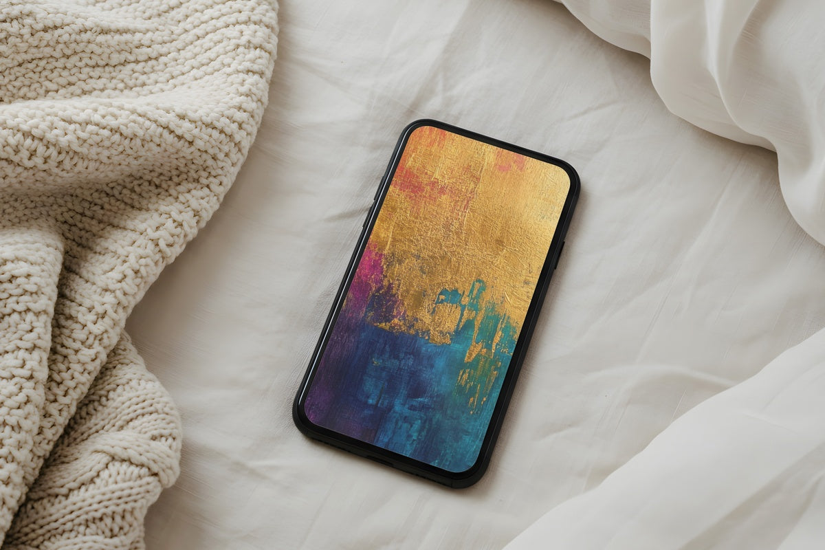
Pull your phone from your pocket at 7 a.m. and this is what you're greeted with — layered amber and antique gold, rendered with the textural density of pressed brocade. Nothing sharp or jarring. The warmth moves across the screen in gradients that feel less digital than they do dipped. Anyone whose home already leans toward ochre textiles and warm wood tones will find this sits like it was always there. A natural anchor for the whole visual world you're building.
2. Earthy Horizon Whispers - iPhone Wallpaper
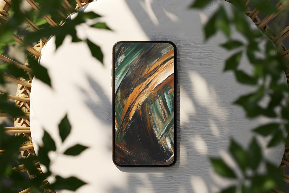
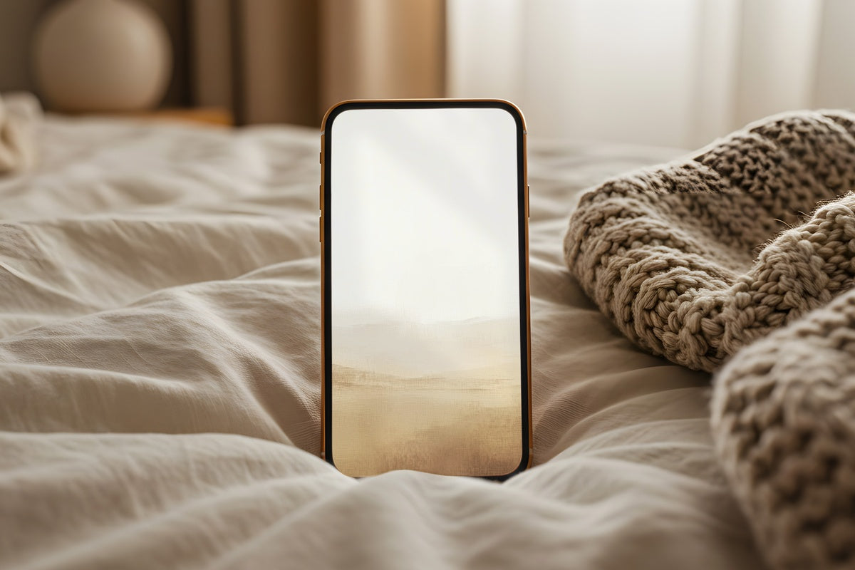
Where the Golden Tapestry reads dense and layered, this one opens up. Horizon-like bands in dusty amber and raw umber stretch across the format with the quiet authority of a landscape seen through gauze. There's restraint here — the palette is deliberately narrow, which makes it incredibly easy to pair with other pieces in this edit without visual noise. Set it as your home screen and notice how the mood of that unlocking moment shifts toward something unhurried.
3. Sunset Horizon Fusion - iPhone Wallpaper
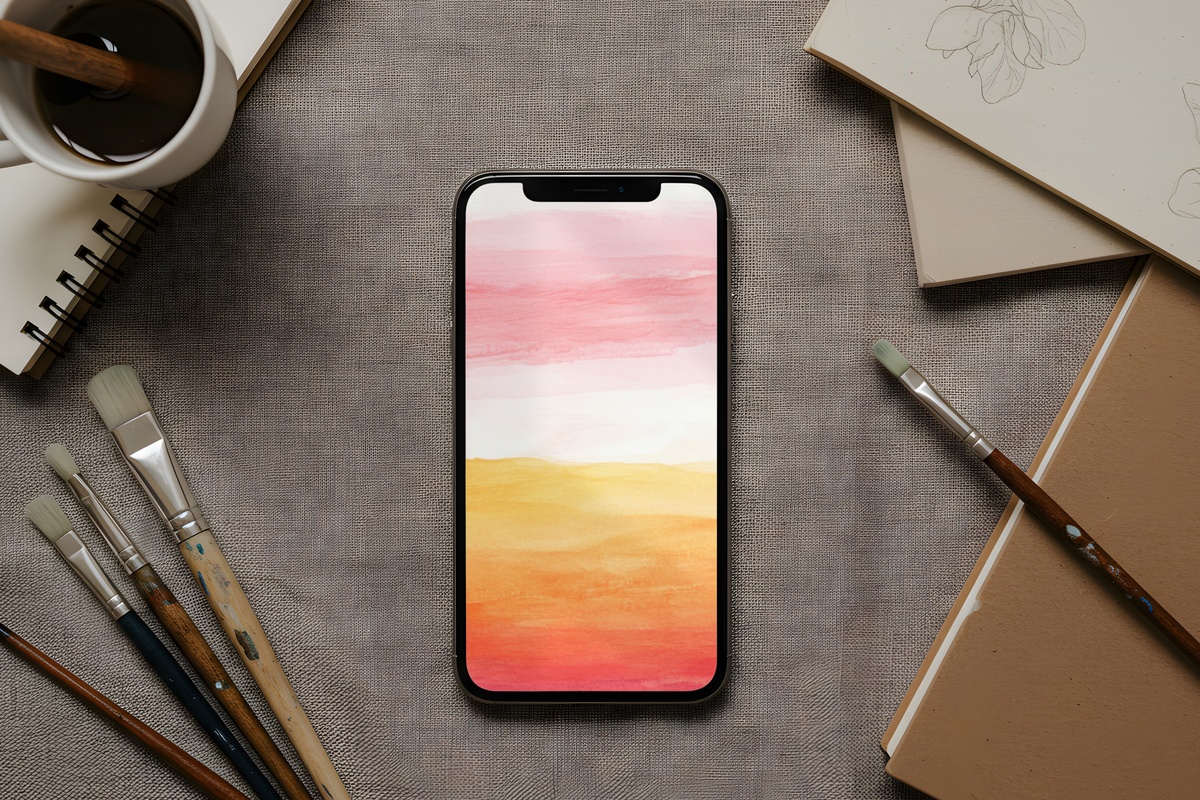
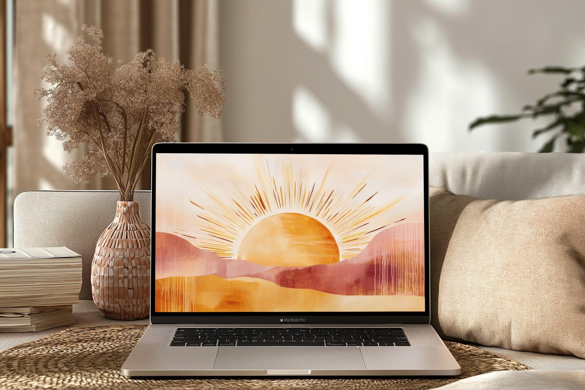
Closer to coral and burnt sienna than the earthier entries — this one carries more chromatic energy, the way late-afternoon light does right before it tips into gold. The gradient is generous and soft, without the hard-edge transitions that can make abstract phone art feel algorithmic. It works especially well if your space includes terracotta ceramics or rust-toned textiles; the screen becomes a continuation of the room rather than a contrast to it. Warm without being loud.
4. Organic Comfort Flow - iPhone Wallpaper
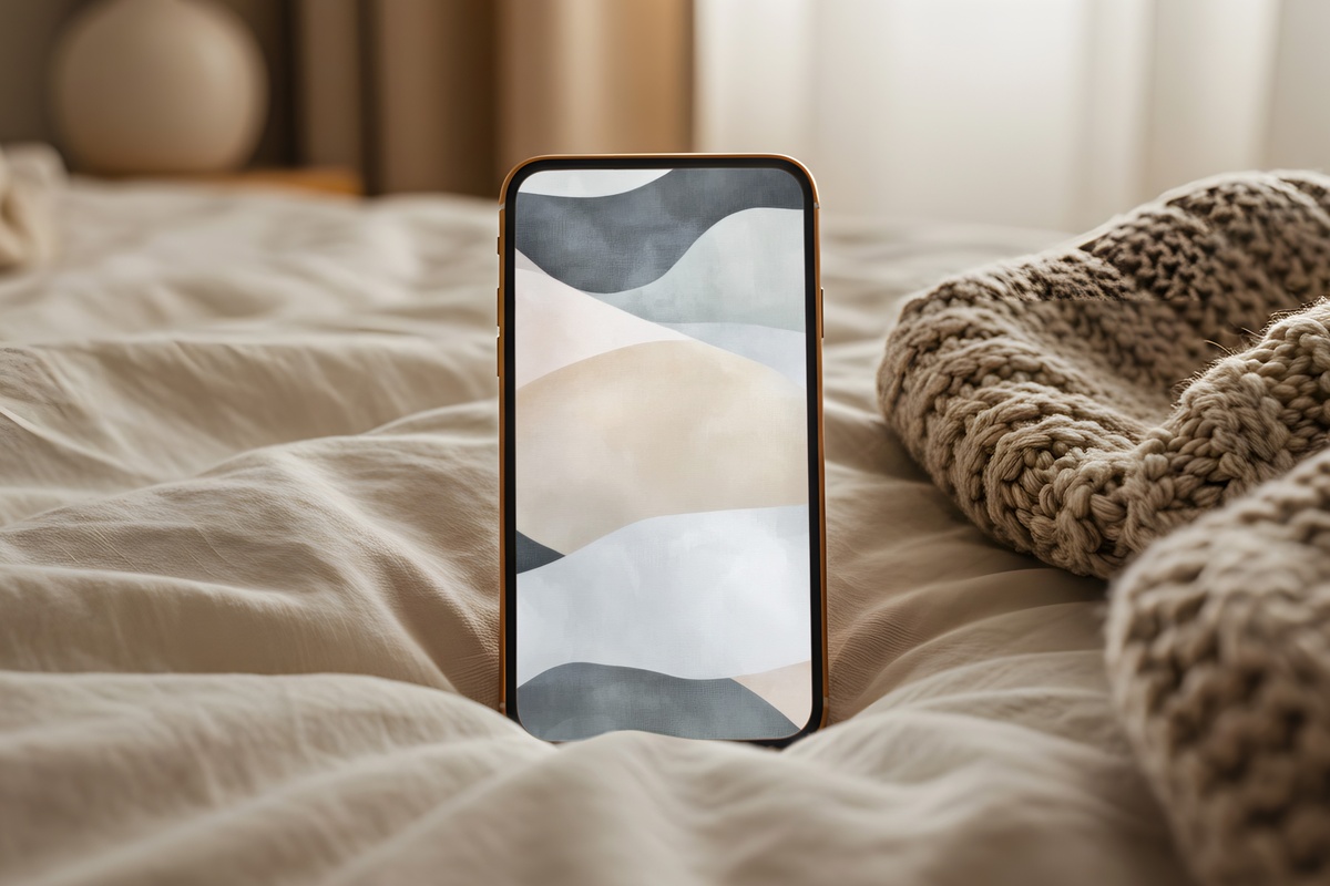
The most subdued of the phone wallpapers — and in many ways the most versatile. Muted cream, warm greige, and hints of blush drift across the composition in fluid, unresolved forms. No hard focal point. The eye settles rather than travels. If you find that most abstract wallpapers feel too intense the moment you glance at your phone mid-conversation, this one is built differently — it recedes, holds, and rests. Pairs beautifully with both the warmer entries here and the wall art further down.
5. Woven Harmony Threads - Frame TV Art
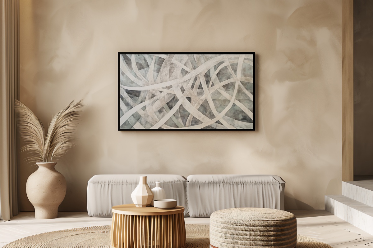
On a Samsung Frame TV at rest, this piece does something genuinely lovely — the interwoven lines in muted linen and warm stone read almost tactile, like a close-up of a hand-loomed textile. The horizontal emphasis suits a wide-format display without crowding it. Dimmed lamps in the evening make the middle tones bloom slightly; brightened in daylight they hold their composure. If your living room already gravitates toward natural materials and neutral upholstery, this is the abstract piece that disappears into the room while still adding something.
6. Rosy Gilded Harmony - Frame TV Art
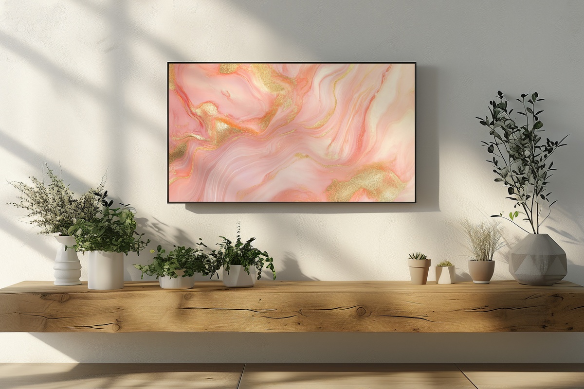
Blush and pale gold is a palette that earns its clichés — and this piece knows exactly how to sidestep them. The gold doesn't gleam; it diffuses. The blush doesn't go saccharine; it leans toward dusty rose and stays there. The result is something that feels genuinely warm in the late-afternoon living room without tipping into anything too sweet. A natural companion to the Organic Comfort Flow wallpaper — together they carry the same rosy-neutral temperature from the room to the palm of your hand.
7. Verdant Forest Dream - Frame TV Art
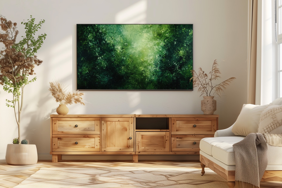
The outlier in the warmth-heavy selection — and deliberately so. Deep sage, forest moss, and muted emerald move through this piece in soft, atmospheric layers. On a Frame TV it carries the quality of looking into a wood at dusk, that moment when the light goes green before it goes dark. If warm amber and terracotta aren't your register — if your space reads cooler, more botanical — this is where your version of this aesthetic starts. Honest note: not every piece in this edit will suit every room, and this one belongs specifically to the cooler, plant-forward spaces.
8. Woven Harmony Threads - Printable Wall Art
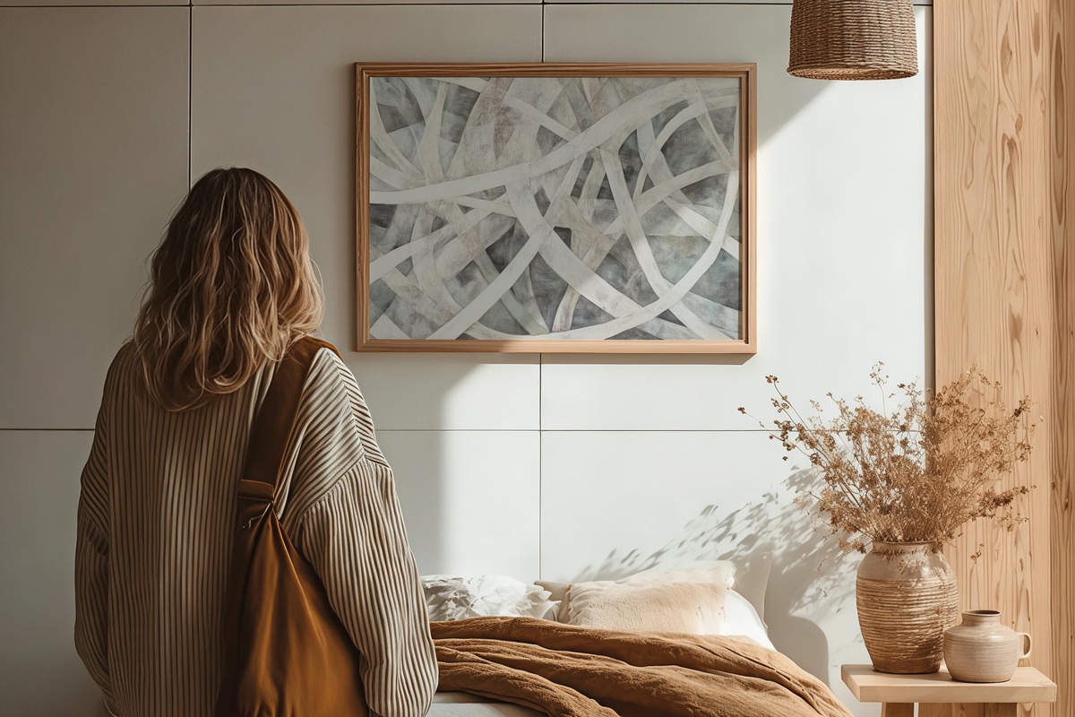
The same image as the Frame TV version — but in a printable format, sized for a physical frame on the wall. And that shift in context changes how you see it. Printed and hung, the woven texture picks up the grain of matte paper in a way a screen can't replicate. Pair it with the Frame TV piece in adjacent rooms if you want to carry a single motif through the home without it feeling like a collection from a hotel corridor. Same warmth, different weight.
9. Neutral Geometry Elegance - Printable Wall Art
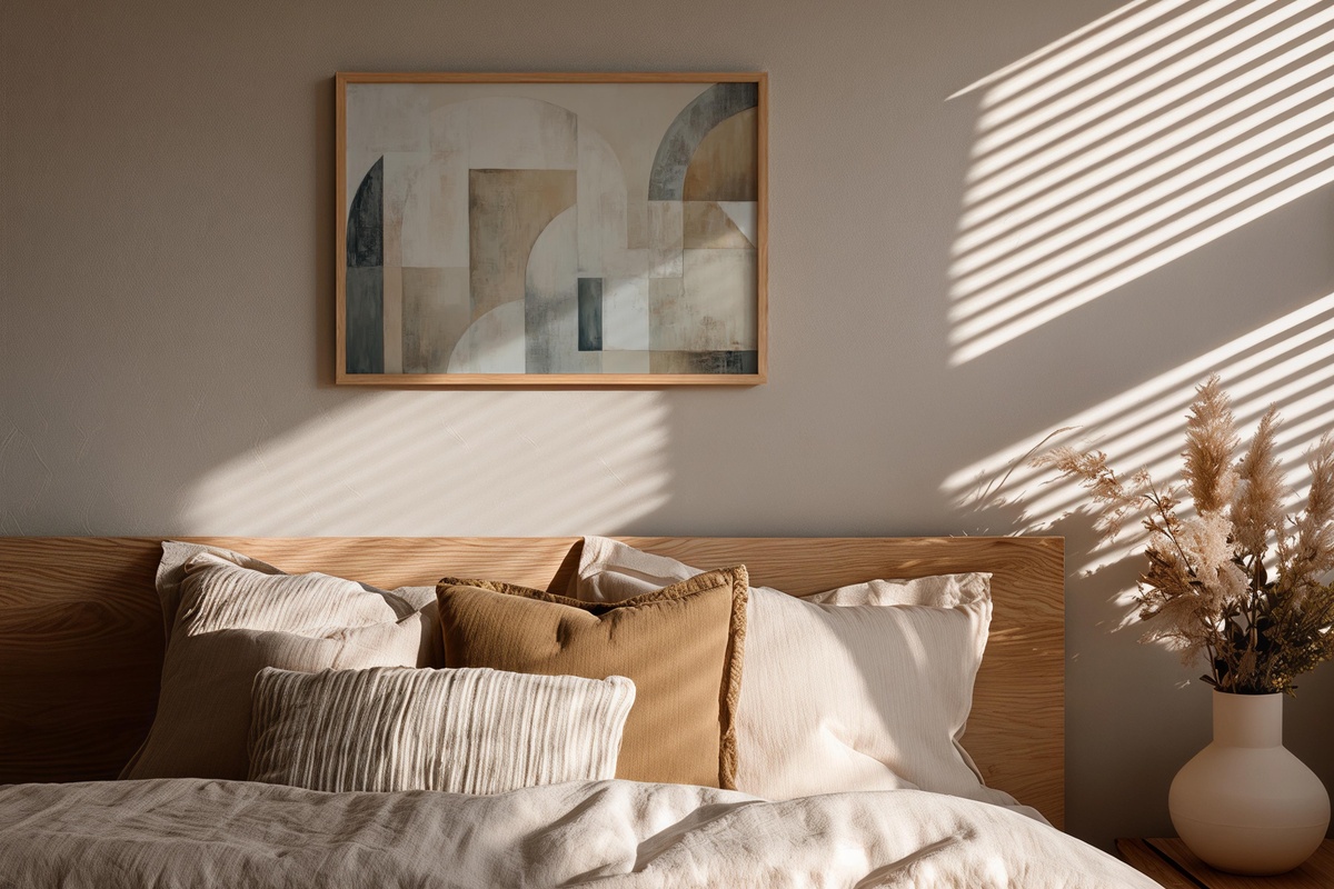
Where most pieces in this edit move fluidly, this one introduces structure — geometric forms in bone, warm white, and greige arranged with deliberate negative space between them. The restraint is the point. It reads as the room taking a breath. Printed large and placed in a hallway or above a minimal console, it anchors the warmer, more atmospheric pieces around it. Something between a Bauhaus study and a mood board — the rational counterpart to the more gestural work elsewhere.
10. Sunset Hues Canvas - Printable Wall Art
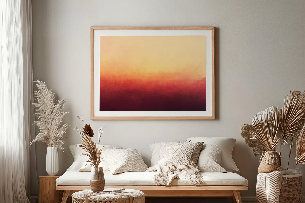
Acrylic layers in peach, rose, and faded gold — the palette of a sky that's already decided to be beautiful about it. The marks here feel painted rather than rendered; there's a handmade looseness to the edges that prints exceptionally well on textured fine art paper. Hang it somewhere the afternoon light crosses it directly and the warm tones shift with the hour. A piece that closes the loop on this edit: the same temperature that starts on your phone screen ends here, framed and glowing on the wall.
What makes this kind of cross-format curation satisfying is that it doesn't require matching — just shared temperature. Pick the phone wallpaper you want to wake up to, then follow that palette to the wall. Every piece here is an instant digital download, on your screen or ready to print within minutes of purchase, no waiting required.
And if you're drawn to more than one — which, honestly, is the whole point of building a visual world — the numbers work in your favor. Any combination of three pieces across phone wallpapers, Frame TV art, and printable wall art gets you 30% off; five pieces brings that to 50%. Mix formats freely; the threshold counts across all of them.