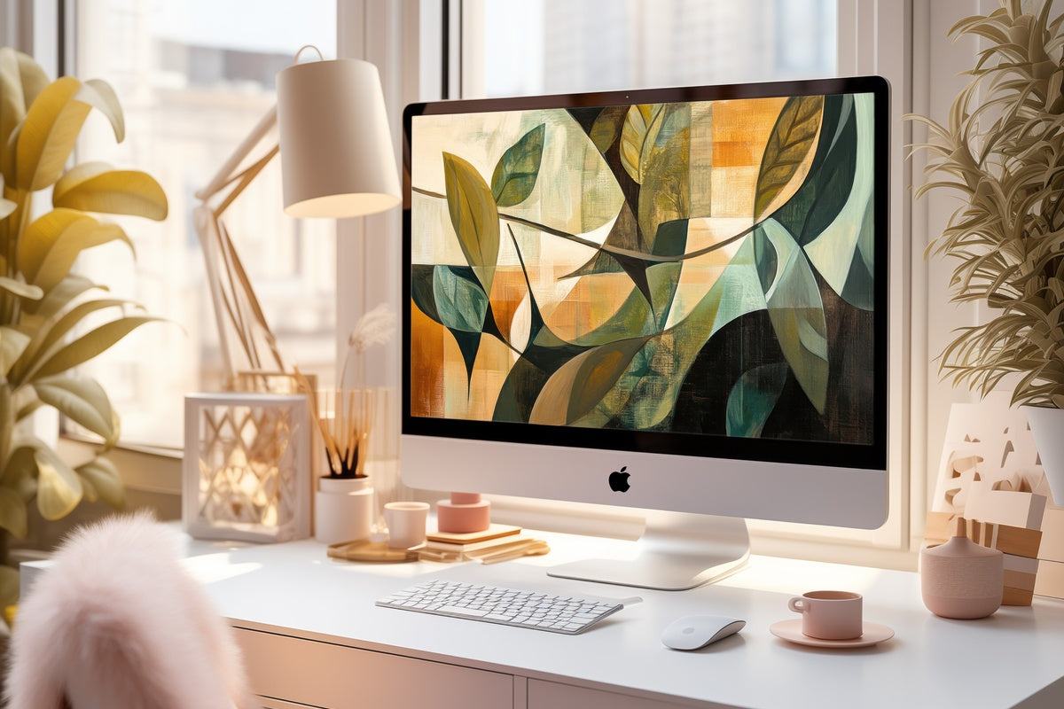
9 Abstract iPad Wallpapers and Frame TV Art Picks for the Quiet-Luxury Home
There is a particular hour — mid-morning, the tablet face-up on the kitchen counter, light coming in at an angle — when the screen you wake it to matters more than you might expect. Not in a grand way. In the way a well-chosen linen does, or the color of a candle you reach for without thinking. This edit gathers nine abstract pieces — iPad wallpapers and Frame TV art — built around that same quiet instinct for palette.
What Makes an Abstract Piece Feel Quiet-Luxury Rather Than Decorative Noise?
Not every abstract image reads as considered. The pieces that hold up in a refined space share a few traits: restrained palette range (never more than three dominant tones), a compositional tension that gives the eye somewhere to settle without forcing it, and a surface quality — textural, layered, or gradient-soft — that reads as deliberate rather than generated. These nine were chosen on those terms.
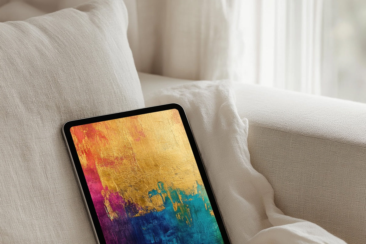
1. Golden Tapestry Splendor - iPad Wallpaper
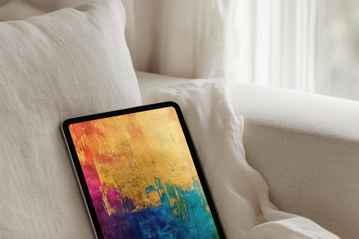
Warm amber and burnished ochre weave across the canvas in a rhythm that recalls aged silk — luxurious but never loud. On an iPad screen, the layering catches differently in different light: brighter at midday, honey-deep in the evening. For rooms anchored in caramel, ivory, or aged brass, this one slots in without effort. It reads as the kind of detail that suggests a point of view rather than announcing one.
2. Verdant Forest Dream - iPad Wallpaper
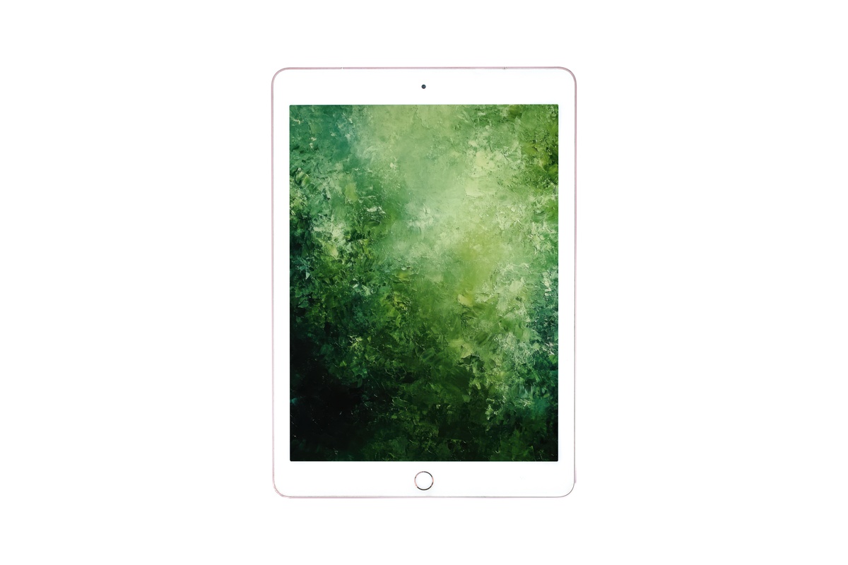
Deep sage bleeding into forest shadow — this wallpaper occupies the cooler, greener end of the quiet-luxury spectrum. The abstraction here is loose and organic, the edges of each tonal field soft enough to feel like something natural rather than designed. Pull it up on a morning when the windows are fogged and there is still coffee in the cup. It pairs especially well with spaces that lean into botanical textures, raw ceramics, or dark wood tones.
3. Sunset Horizon Fusion - iPad Wallpaper
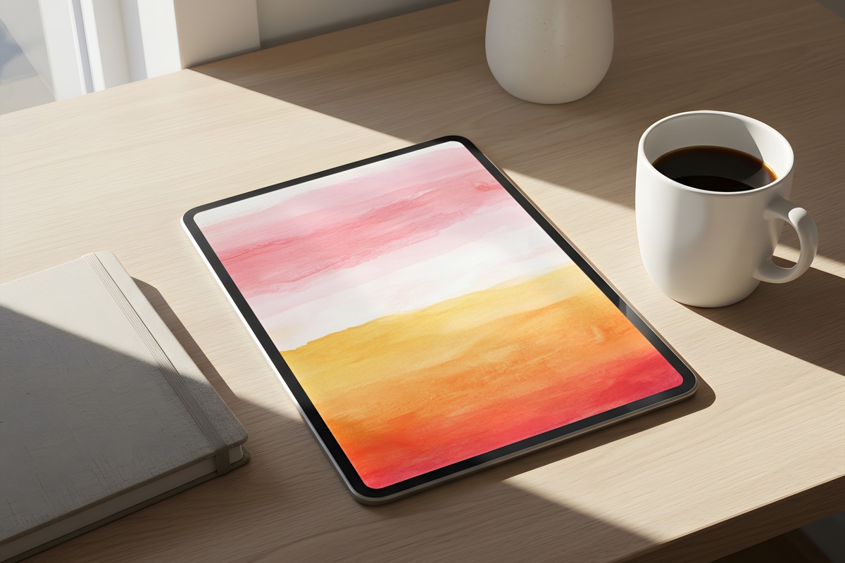
Terracotta, rose, and a thin band of pale gold — arranged as if the horizon had been folded flat and abstracted. There is gradient work here that rewards a larger screen; on an iPad Pro or a full-size Android tablet, the tonal shift across the surface feels genuinely atmospheric. Anyone whose evening ritual involves a glass of something and a dimmed screen will recognize exactly what this is reaching for. Warm, resolved, not overly sweet.
4. Crimson Noir Cascade - iPad Wallpaper
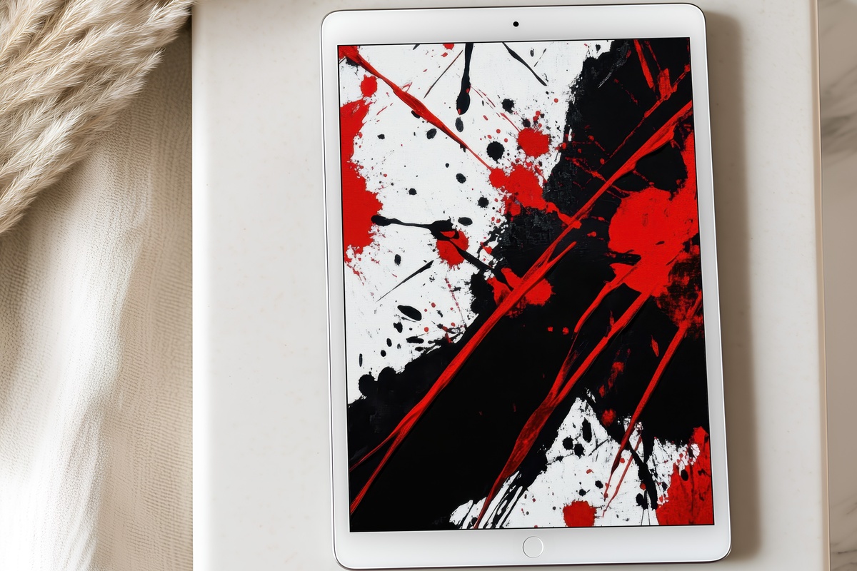
Deep crimson against near-black — a palette that could read as dramatic if handled carelessly, but lands here as controlled and interior-confident. The cascade structure pulls the eye vertically in a way that feels intentional, almost architectural. This is not a wallpaper for every space. But for rooms that already hold dark leather, matte black fixtures, or a single bold art piece, this holds its own without competing.
5. Bold Silhouette Balance - iPad Wallpaper
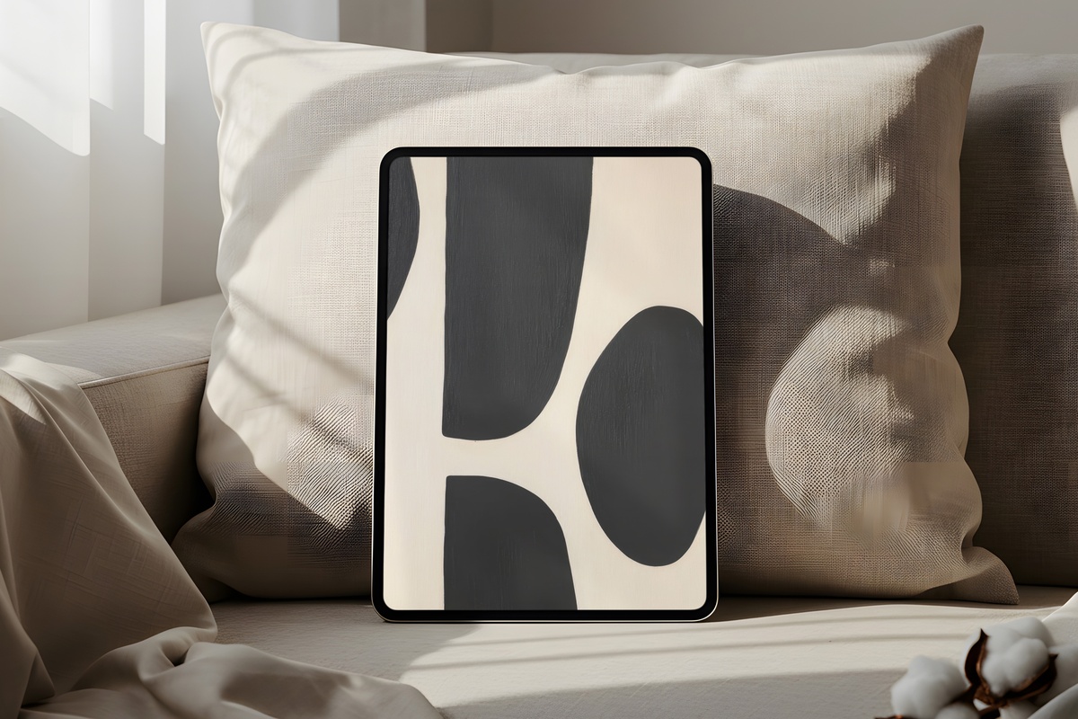
Where most abstract wallpapers dissolve into texture, this one holds form — silhouetted shapes in careful counterweight, the negative space as active as the marks themselves. It has the sparse confidence of a signed lithograph. If your flat lays and reading-nook aesthetics tend toward monochrome or a clean two-tone palette, this is the abstract iPad wallpaper for that instinct. Structured without rigidity. Considered without overthinking.
6. Woven Harmony Threads - Frame TV Art
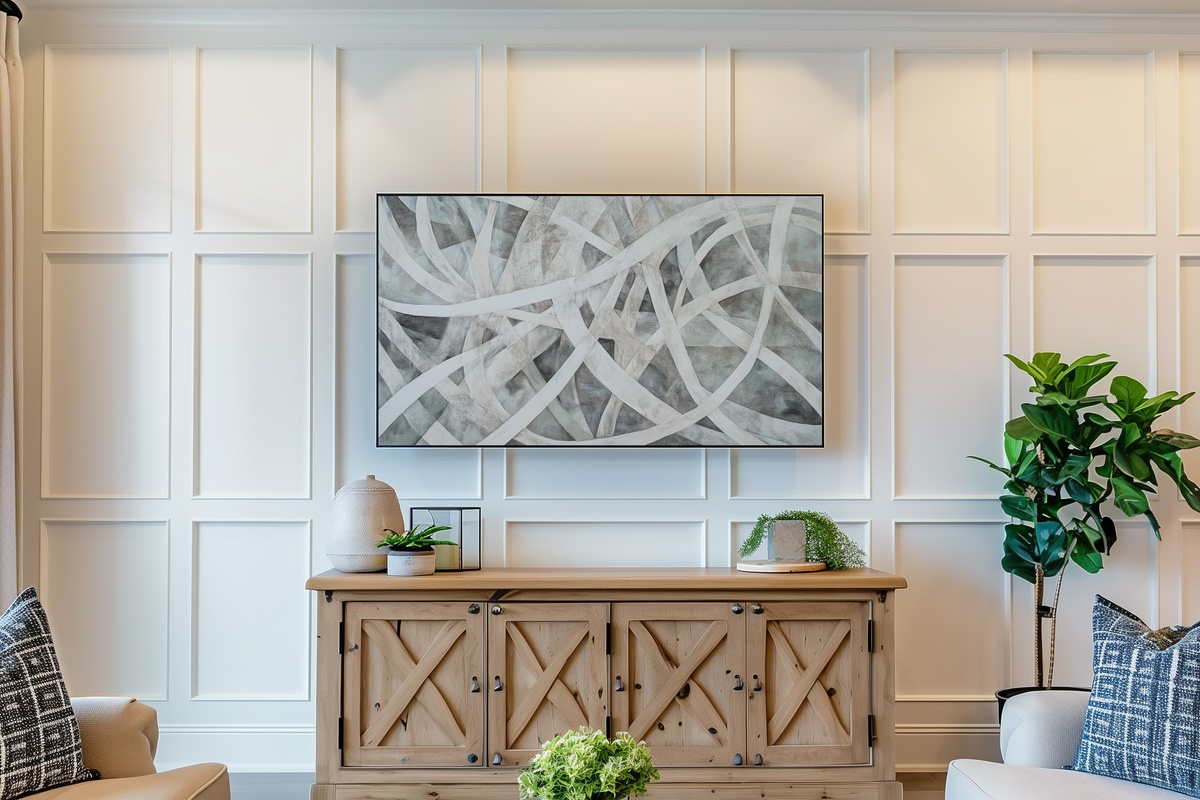
Pale linen tones interlaced with thread-thin lines of warm grey — the kind of surface you could almost reach out and feel as fabric. On a Samsung Frame TV, the matte finish setting makes this read as an actual woven textile hanging on the wall rather than a screen. It holds the room during those long mid-afternoon stretches when the television is simply part of the backdrop. A natural companion for neutral interiors built on texture over color.
A note on building cohesively across formats: the warmest pieces in this edit — the amber, rose, and linen tones — pair naturally as a single tonal family, whether you're setting one on a Frame TV and another as a tablet wallpaper. That cross-screen continuity is worth pursuing intentionally.
7. Rosy Gilded Harmony - Frame TV Art
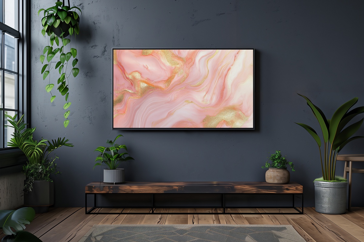
Blush meeting gold at a soft intersection — not sugary, not maximalist. The restraint here is deliberate: the gold reads as aged rather than metallic-shiny, and the blush is dusty enough to sit comfortably in a room that skews more editorial than romantic. On a Frame TV above a console or a linen sofa, this piece catches the last hour of afternoon light and holds it. A warmer-palette companion to anything ivory, champagne, or pale peach in the same room.
8. Textured Gold Layers - Frame TV Art
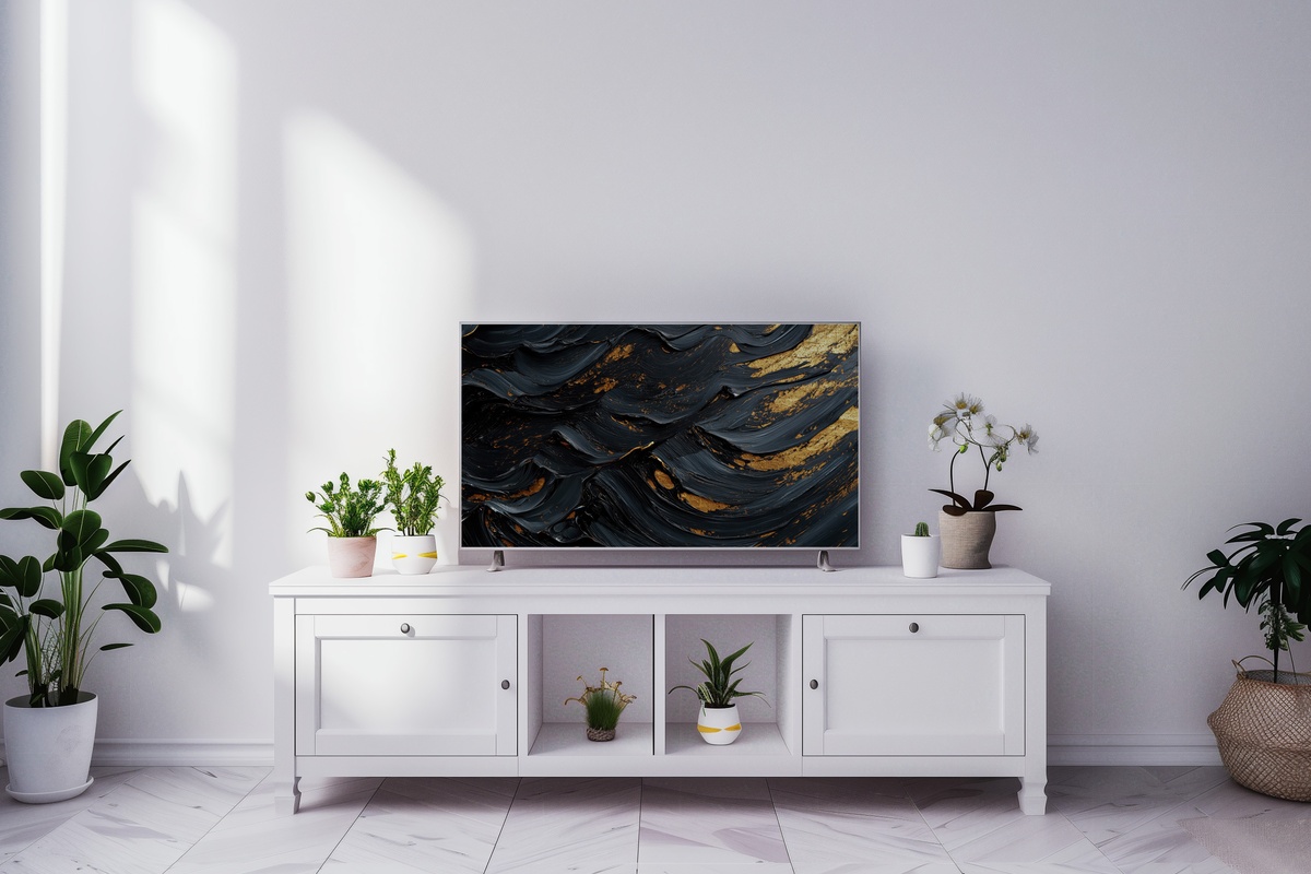
Gold here is not a color so much as a material — the layered depth in this piece suggests strata, mineral cross-sections, something geological and slow. That kind of surface complexity rewards a larger display. On a 65-inch Frame TV in a room with low, warm lamp light, the tonal variations shift visibly as the ambient lighting changes through the evening. Less decorative accent, more mood anchor. For rooms that already lean into brass, aged bronze, or richly grained wood.
9. Petal Swirl Reverie - Frame TV Art
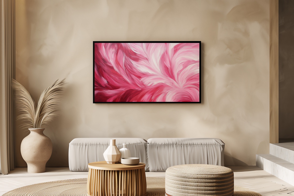
Pink floral abstraction that moves — the swirling structure gives the surface a gentle kinetic quality, as if the petals are mid-fall rather than posed. On a Frame TV it functions almost as a living painting: soft enough to disappear into the room at a glance, detailed enough to hold attention when you look directly. Worth noting for anyone who finds purely geometric or tonal abstract pieces a little cold: this one brings just enough organic warmth without tipping into illustration.
Each piece in this edit is an instant download — on your screen or your Frame TV within minutes of choosing, no waiting, no subscription required. The collection is there whenever the palette feels right.
One last thing worth knowing: the 3-for-30% and 5-for-50% discounts apply across every format in the shop — mix iPad wallpapers, Frame TV art, and printable wall art in any combination that serves the room. Three pieces from three different categories still count. That cross-format flexibility is the quiet arithmetic behind building a cohesive visual world at home, rather than decorating one screen at a time.