8 Abstract Frame TV Art Picks to Refresh Your Samsung Display This Season
There is something about the shift in seasons that makes you look at a room differently — the angle of light changes, the air settles into a new register, and suddenly the art on your walls (or your Frame TV) feels either exactly right or quietly overdue for a change. These eight abstract picks are curated as a seasonal rotation: warm gilded pieces for evenings lit by amber lamps, cool wave-washed canvases for mornings, and graphic forms for rooms that are still figuring themselves out.
What Makes Abstract Art Work on a Samsung Frame TV?
The Frame's matte display reads closest to canvas — it rewards pieces with tonal depth, strong negative space, or layered texture. What to look for: a dominant palette that reads well at arm's length, enough internal movement to hold the eye without competing with the furniture, and a mood that shifts gracefully between the lamp-lit evening and the natural light of noon. The eight pieces below were chosen with all three criteria in mind.
1. Golden Tapestry Splendor - Frame TV Art
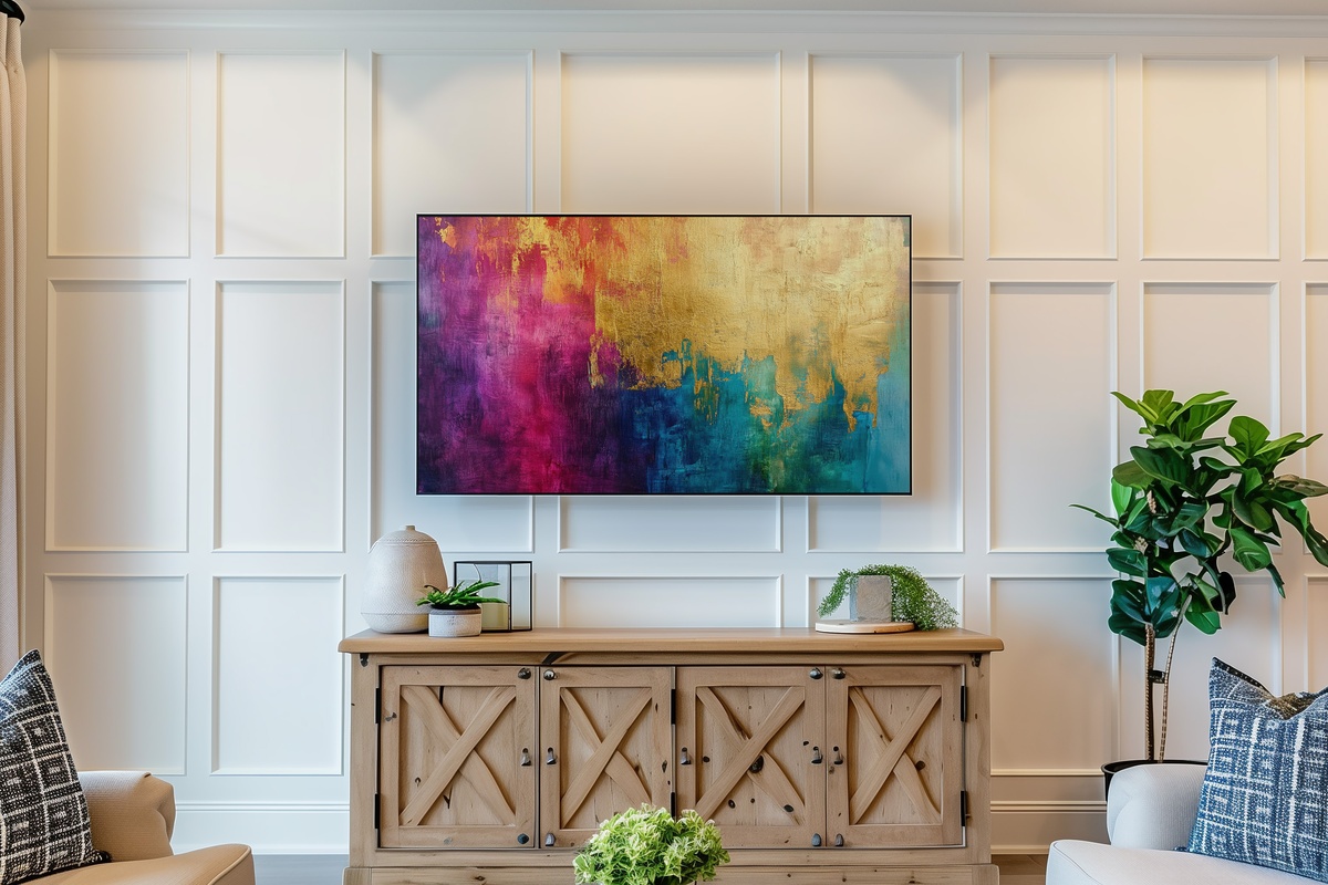
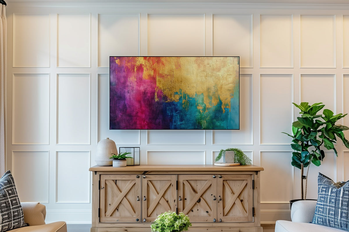
Gold leaf rendered in high-resolution abstraction — this piece reads like candlelight frozen mid-flicker across a dark ground. The layered filaments catch the Frame's matte finish beautifully, giving the illusion of actual metallic texture without the reflective glare. In a room anchored by deep walnut tones or inky velvet upholstery, it creates that particular glow you associate with late-autumn dinner parties — warm, unhurried, and a little theatrical. A natural opening piece for a seasonal rotation leaning into amber and bronze.
2. Rosy Gilded Harmony - Frame TV Art
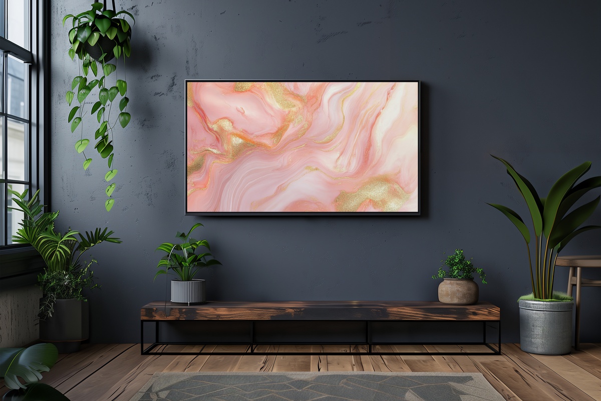
Blush and gold in abstraction can tip easily into the saccharine — this piece avoids that entirely by keeping the palette on the dusty side of rose, closer to dried petal than fresh bloom. The gold is restrained, arriving as a quiet accent rather than a statement. The result is something between a 1970s Italian design poster and a softly lit vanity tableau. She'll know exactly what this means: the piece that makes the room feel like it was styled rather than decorated. Works especially well lit by the warm-bias setting on the Frame.
3. Sunset Horizon Fusion - Frame TV Art
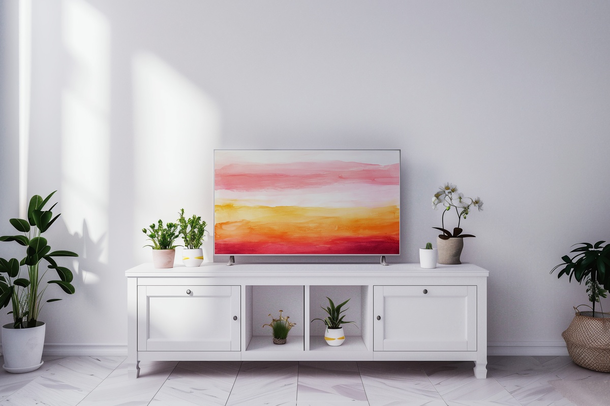
Terracotta bleeds into saffron bleeds into a faint, hazy mauve — the gradient here has the loose, unprecise quality of a sky rather than a color chart. There is no hard line; the whole composition breathes. On the Frame, the horizontal sweep makes a room feel wider, which is useful in a narrow living wall or a dining space that needs to exhale. If your room already carries warm wood tones, natural linen, or any amount of rust and ochre, this piece will feel less like an addition and more like something that was always there.
4. Cerulean Wave Harmony - Frame TV Art
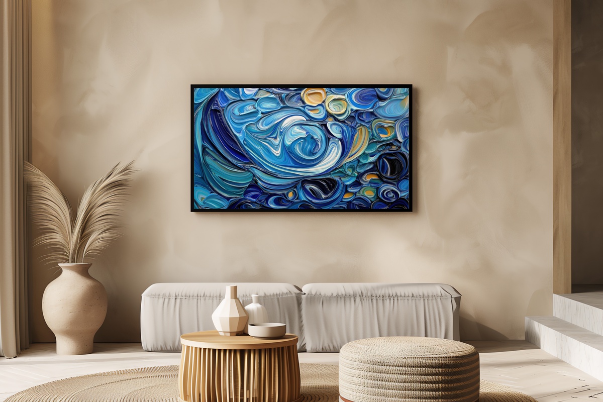
This is the cooldown piece in a warm-toned rotation — or the anchor for a room that runs entirely blue and white. The cerulean here is not flat: it layers from deep ink at the base through a mid-range cobalt toward a pale aqua edge, suggesting depth and surface simultaneously. It reads like an ocean swell observed from above. On the Frame during morning light, the cool palette meets the natural daylight in a way that feels almost architectural. Pair this with one of the warmer pieces in this edit and you have a rotation that genuinely shifts the room's emotional register by 180 degrees.
5. Futuristic Metallic Silhouettes - Frame TV Art
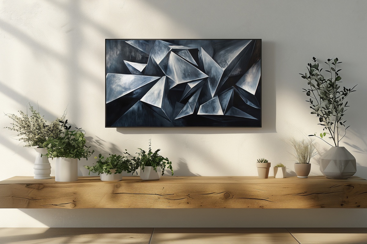
Angular, precise, and unrepentantly modern — this one is for the room with concrete floors, brushed steel fixtures, and a deliberate absence of soft furnishings. The metallic silhouettes are rendered against a field that hovers between charcoal and deep space, giving each form the kind of crisp presence you see in brutalist sculpture or a well-composed architectural photograph. It does not try to blend in. If the rest of your rotation leans warm and organic, this is the deliberate contrast piece that sharpens everything around it. Not for the maximalist; entirely for the editor.
6. Bold Form Serenity - Frame TV Art
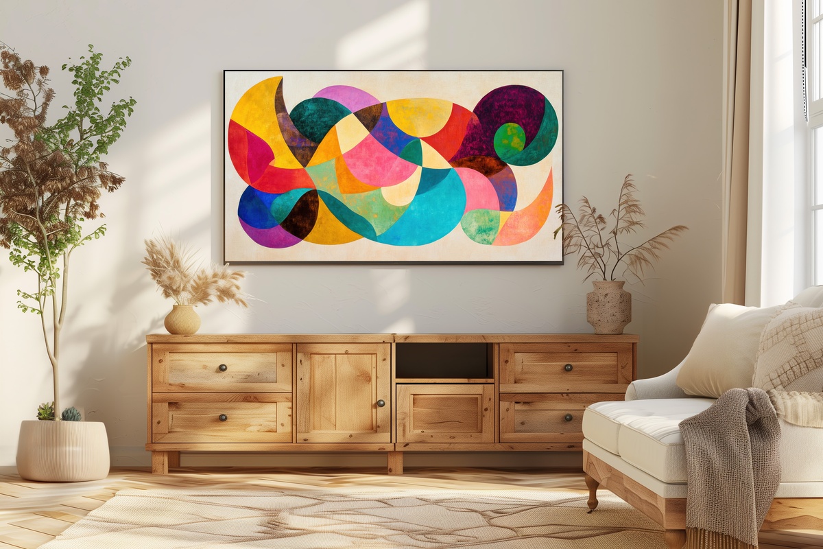
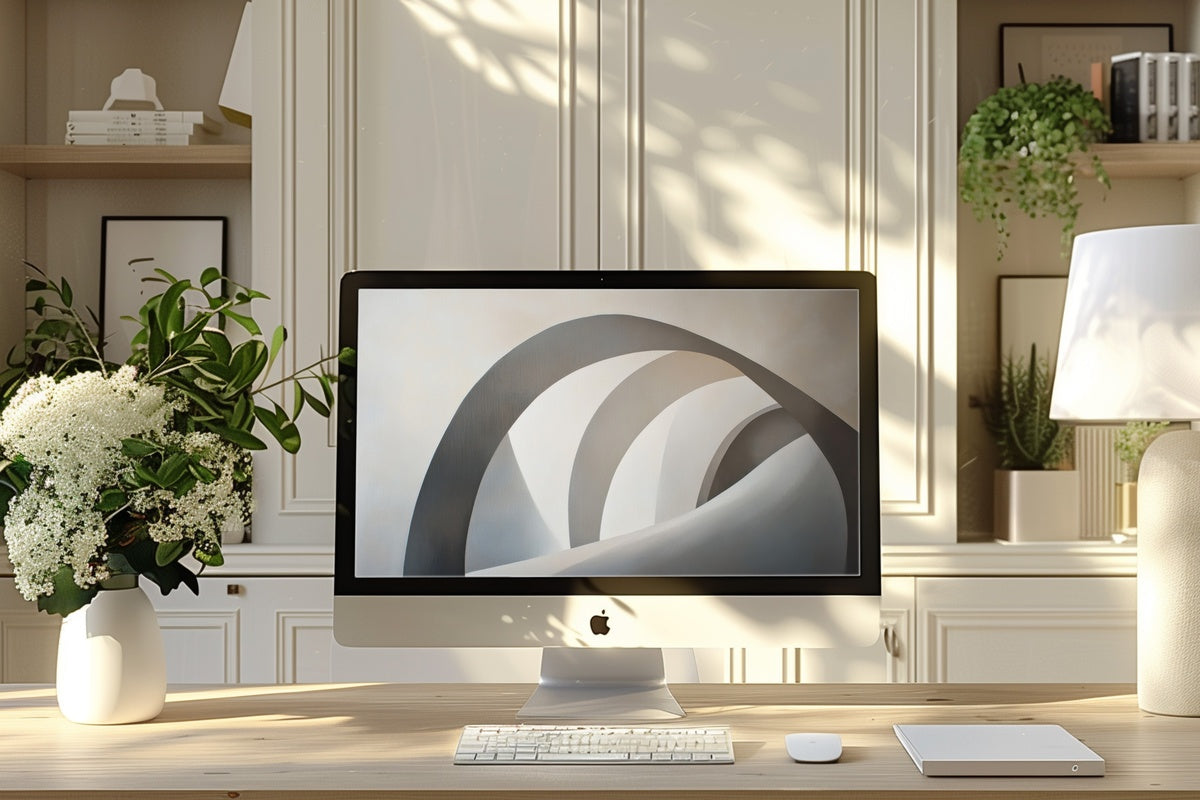
A rare pairing: bold geometric weight held against a ground so pale it reads almost as breath. The forms have authority — you register them from across the room — but because the background gives them so much air, the overall effect settles rather than demands. It is closer to a Richard Serra study rendered for a quiet living room than to anything you would find in a hotel lobby. For rooms where you want visual presence without tension, this piece occupies a very specific and useful middle ground between statement and rest.
7. Dynamic Shape Symphony - Frame TV Art
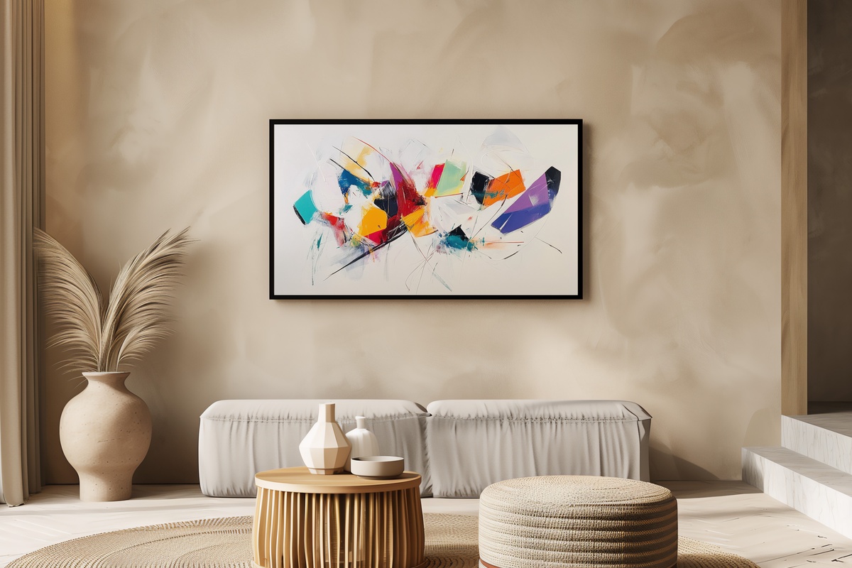
Where most abstract pieces in this category aim for stillness, this one goes in the opposite direction with full conviction. Shapes scatter and overlap across a white field in a way that suggests music in mid-performance — Kandinsky's visual grammar, brought into a contemporary resolution. The brightness of the white ground means it reads particularly well in a room with low ambient light, where it introduces energy without requiring any additional sources of contrast. Use it as a seasonal transition piece: something to rotate in when the room needs waking up after a long stretch of the same palette.
8. Earthen Swirl Elegance - Frame TV Art
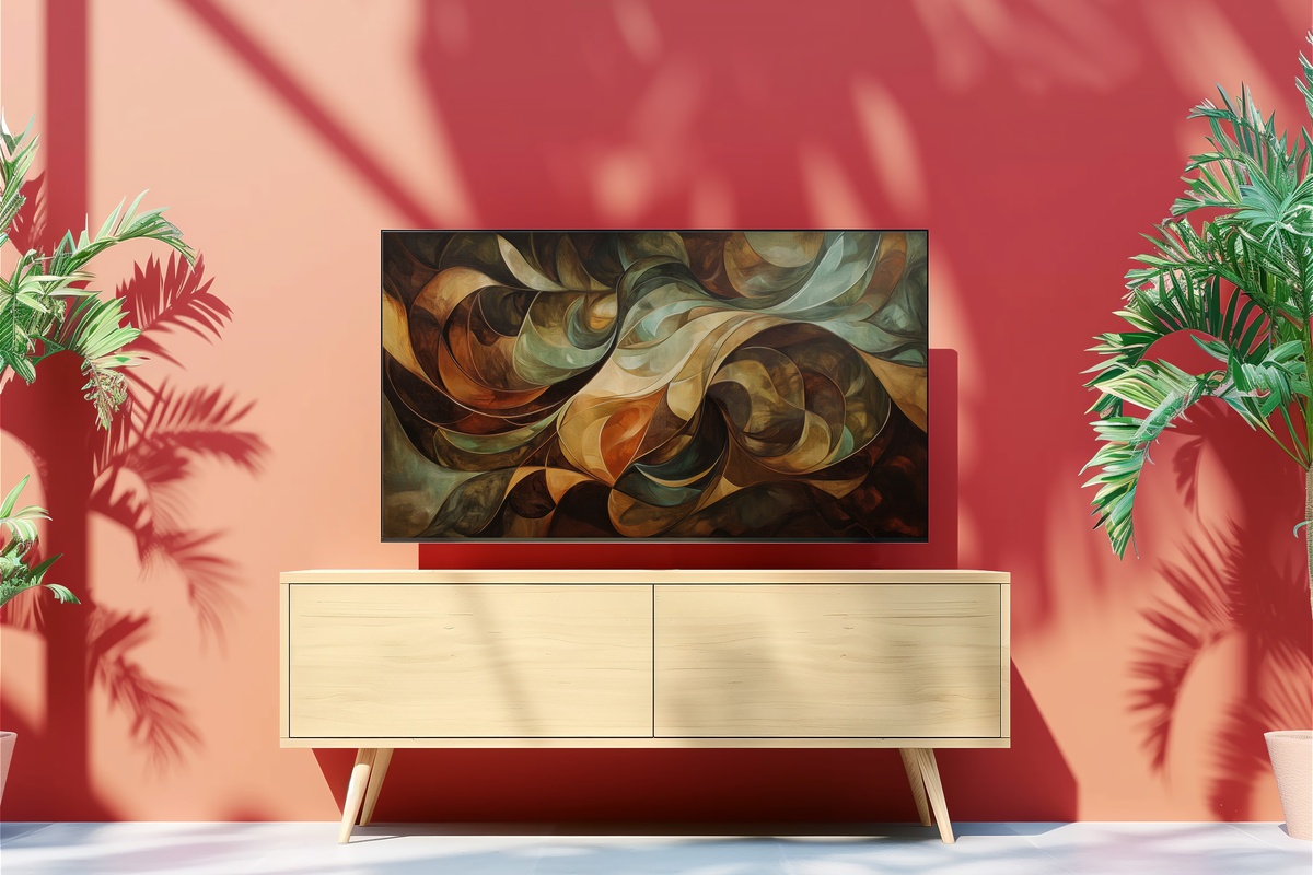
Umber, warm clay, and a trace of aged cream move together in slow, orbital arcs — this is the piece that settles a room rather than activating it. The swirl pattern has a geological quality, something between agate cross-section and tidal flat at low water, and that unhurried rhythm translates directly onto the Frame's matte surface. For rooms built around natural materials — jute, unglazed ceramic, raw linen — this feels less like digital art and more like a window onto something organic. A considered close to a rotation that began with gold and ends with earth.
Each of these pieces downloads instantly — on your Frame within minutes, no waiting for a print to ship or a frame to hang. The season is already shifting; setting up a new piece now means you actually live with it through the best weeks, rather than getting to it after the mood has moved on.
And if several pieces are speaking to you at once — that is entirely the point of a rotation. Worth knowing: any three pieces across the full Gallery Flair collection (Frame TV art, printable wall art, device wallpapers — mix and match freely across all three) bring the price down by 30%, and any five together land at 50% off. A Frame TV piece, a coordinating wall print, and a matching phone wallpaper in the same palette all count together toward that threshold. Quiet arithmetic for building one continuous visual world.