9 Abstract Frame TV Art Picks for a Curated Living Room
There's a particular stillness that settles into a room when the television disappears — when the screen on the wall becomes something you actually want to look at. That's the quiet promise of the Samsung Frame TV, and it's only as good as the art you put inside it. These nine abstract picks are chosen for rooms that take their visual cues seriously: spaces where the light changes at six in the evening and the art on the wall is expected to hold its own.
What Makes Abstract Art Work on a Frame TV?
Not every abstract piece translates well to a backlit display. The strongest picks tend to share a few qualities: a clear tonal range so detail reads at distance, enough negative space that the composition doesn't feel busy when the room is already full, and a palette that can coexist with both warm lamp light and cooler afternoon daylight. Edge-to-edge drama can overwhelm a small wall; restrained compositions with one strong focal movement tend to age better in a living room setting. These nine pieces were selected with those criteria in mind — across a range of palettes from warm amber and terracotta to charcoal and cream.
1. Dusky Horizon Tranquility - Frame TV Art
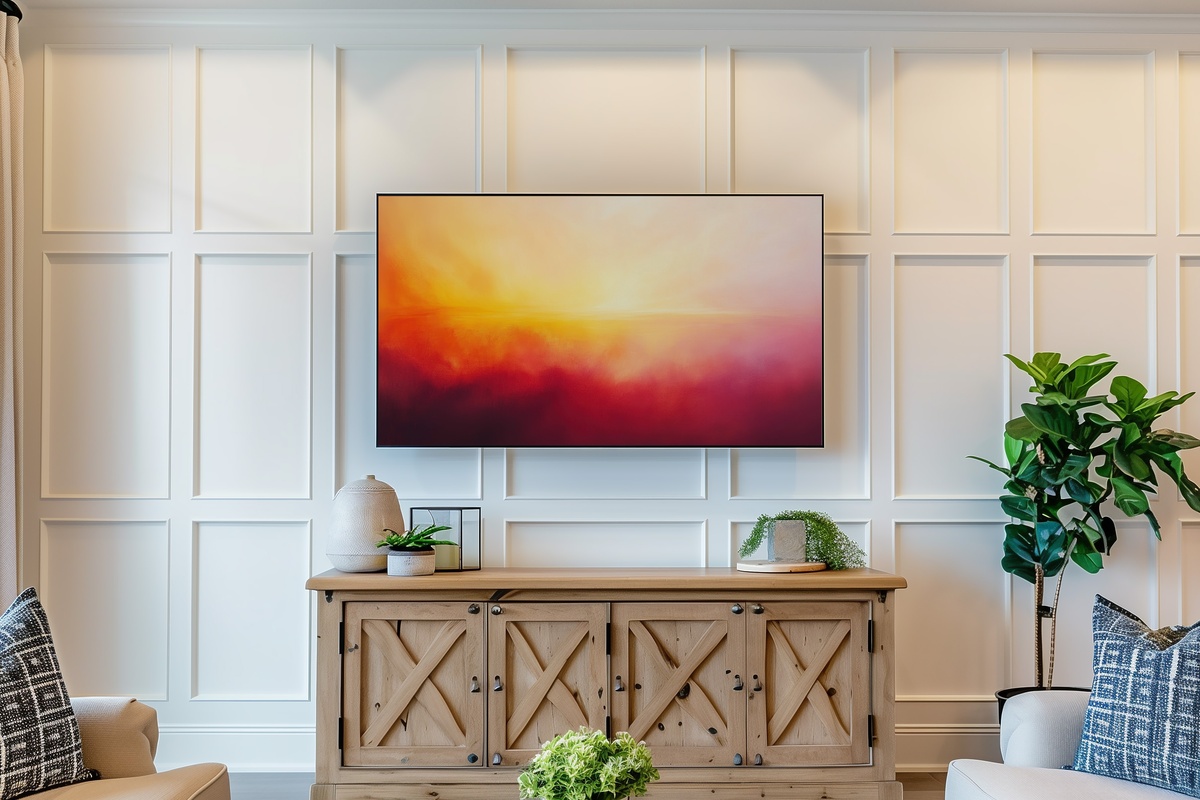
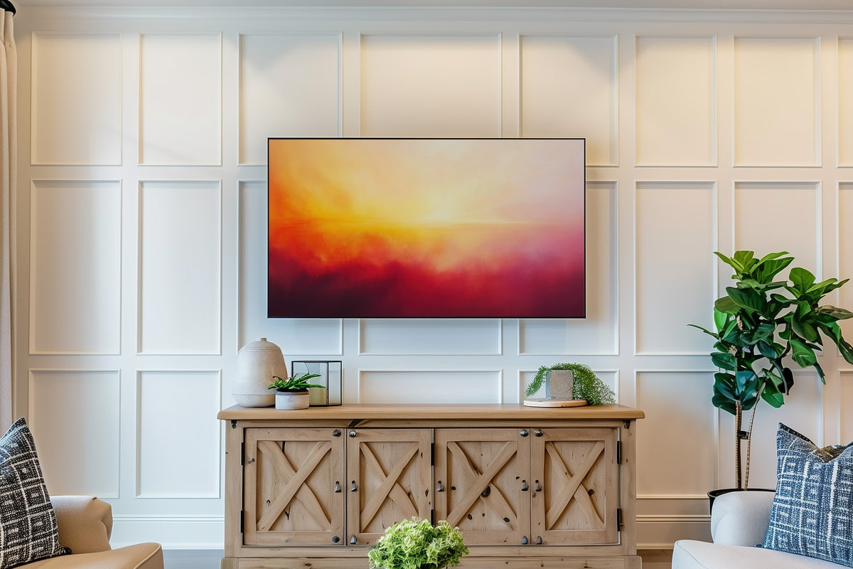
Open a gradient of dusty rose, amber, and muted gold, and you have something that functions almost like a second window — one facing permanent golden hour. This piece layers horizon-like bands of sunset tone across a wide, unhurried field, never forcing drama where quiet suggestion does more. It reads at arm's length as warmth and at a full room's distance as calm. For a living room that leans toward warm neutrals, linen textures, and natural wood, this is the piece that ties the temperature of the whole room together without announcing itself.
2. Charcoal Flow Dynamics - Frame TV Art
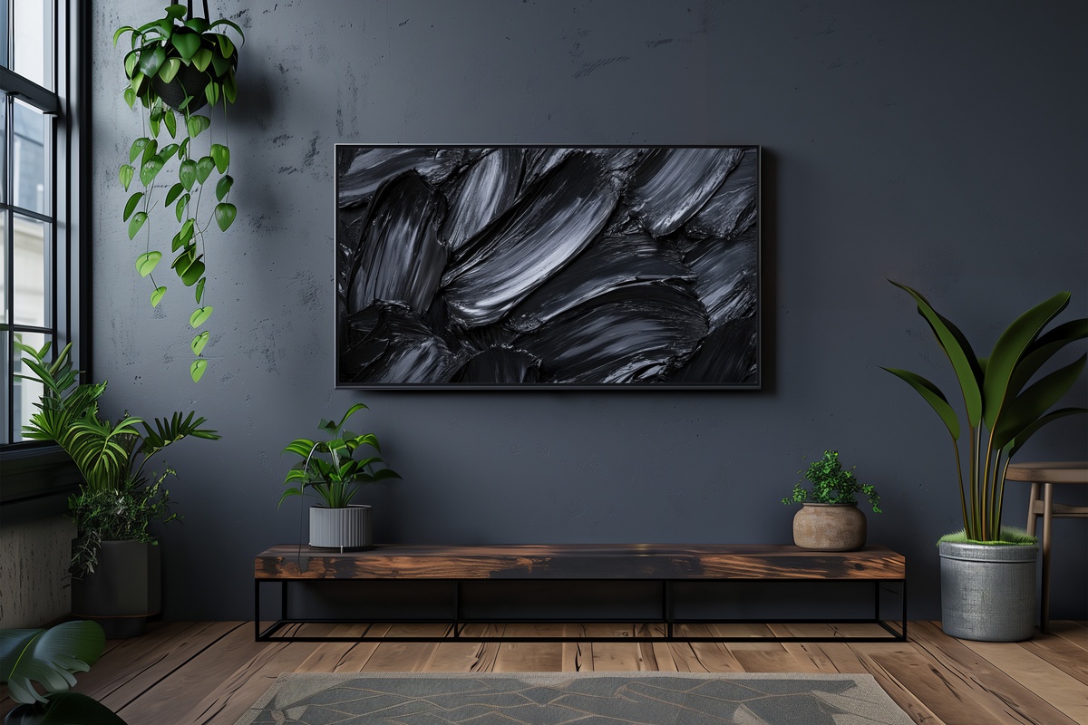
Some abstract pieces whisper. This one speaks with its chest — black and graphite strokes moving across a field with the kind of directional energy you feel more than analyze. The contrast is high enough to hold attention from across the room, yet the strokes carry enough variation in pressure and weight that the composition never tips into graphic-design territory. Hang it in a room with concrete, matte black fixtures, or dark-stained oak and it finds its people immediately. Anyone whose instinct runs toward the architectural side of interior design will recognize exactly what this is doing.
3. Earthy Horizon Whispers - Frame TV Art
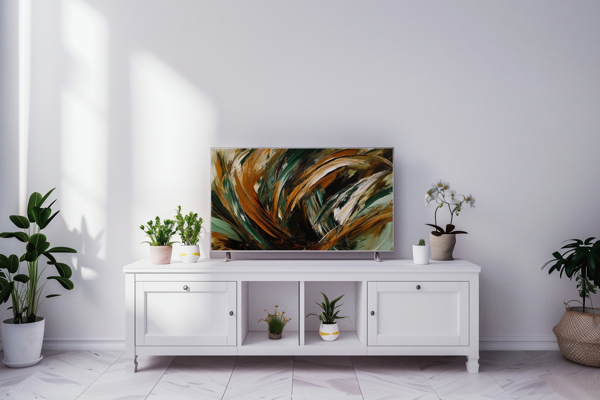
Where Dusky Horizon leans into the warmth of sunset color, this piece pulls from the ground — clay, sand, dried sage, the particular brownish-green of lichen on stone. Horizontal strokes suggest a landscape without ever committing to one, which is precisely where its staying power lies. You can live with it through four seasons and it won't feel tied to any of them. Pair it with rattan, unglazed ceramics, or sisal — the tactile materials that the palette seems to want beside it.
4. Sunset Hues Canvas - Frame TV Art
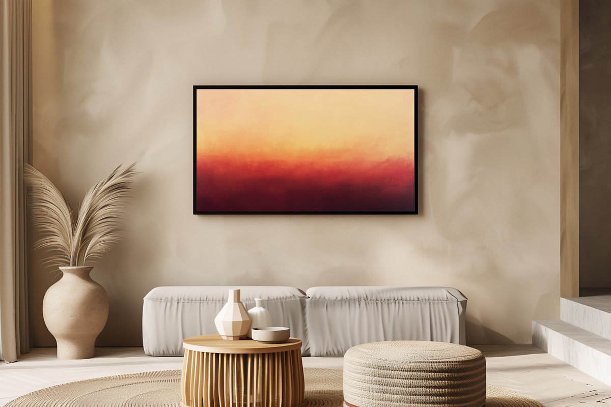
Think of warm acrylic pigments pulling apart just at the moment before they fully blend — that suspended, almost-wet quality is what this piece captures. Peach meets burnt sienna meets a thread of gold, and the result is less like a painted canvas and more like the memory of one. It flatters a room in the last hour of daylight particularly well, when the Frame TV's ambient mode and the actual light coming through the window start to feel like a continuous conversation. Rooms in need of a mood without a color commitment — this is where to start.
5. Subtle Shape Symphony - Frame TV Art

Restraint is a design decision, and this piece commits to it fully. Gentle geometric shapes — softened at the edges, never rigid — float against a muted backdrop with enough breathing room between them that the negative space reads as intentional as the marks themselves. It's closer to a Scandinavian design ethos than to expressive abstraction, which means it works especially well in rooms where the furniture is already doing something strong. The visual quietness here is not emptiness; it's discipline.
6. Bold Silhouette Balance - Frame TV Art
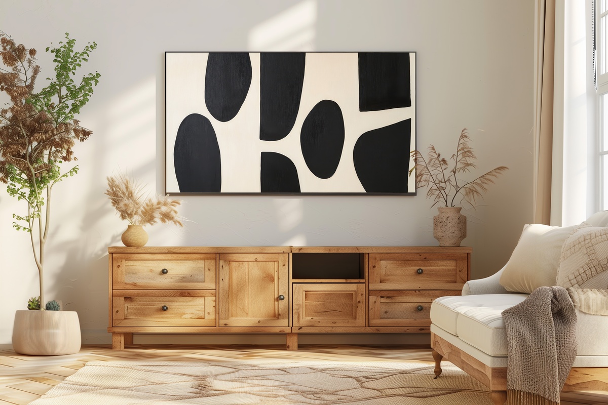
Black on cream, with the kind of tonal economy that makes you realize how rarely most art earns its contrast. The shapes here are decisive — placed rather than scattered — and the cream field around them has a papery warmth that keeps the whole composition from reading as cold. Abstract in form but legible in feeling, it belongs in rooms that favor a gallery-wall sensibility: white plaster, visible hardware, a single good reading lamp. If your instinct for abstract art stops short of anything too gestural or painterly, this is worth a long look.
7. Brushstroke Dreamscape Waves - Frame TV Art
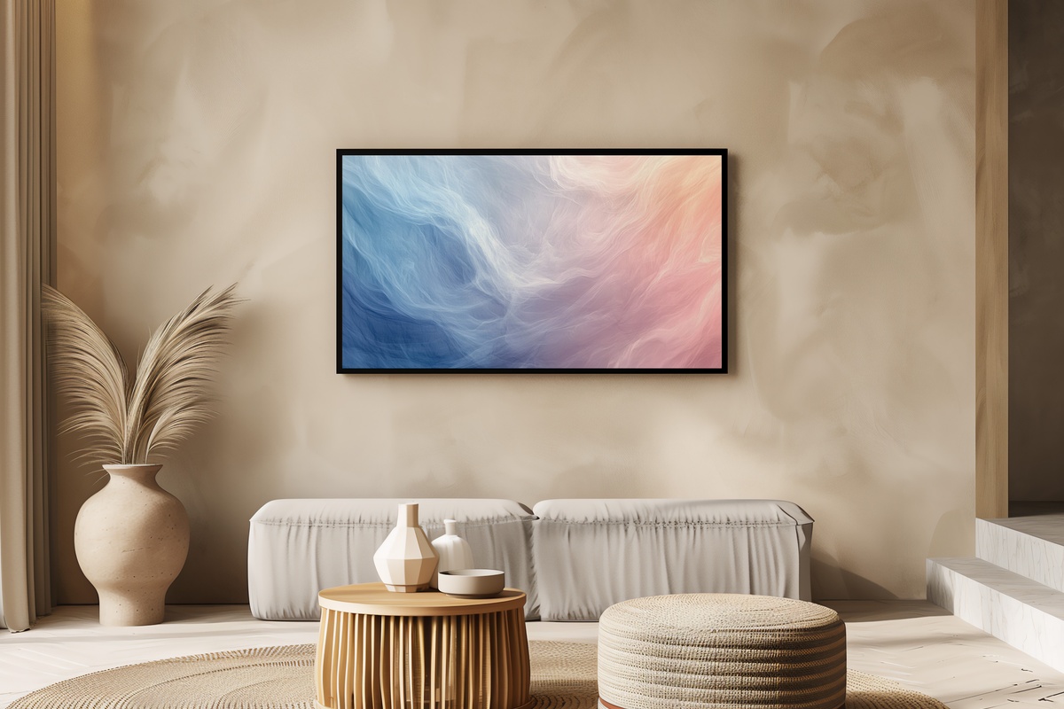
Soft pastel brushstrokes — think dusty lavender, pale aqua, and a blush just shy of pink — move across the canvas in loose, undulating rhythm. There's a haziness to the color boundaries that reads like watercolor even though the overall weight is more substantial. Abstractly, it evokes water or atmosphere rather than any fixed subject, which gives it unusual versatility across room moods. A natural companion to cane furniture, sheer curtains, and rooms that get good morning light — the sort of piece that looks different at 8 a.m. than it does at dusk.
8. Earthy Brushstroke Rhythm - Frame TV Art
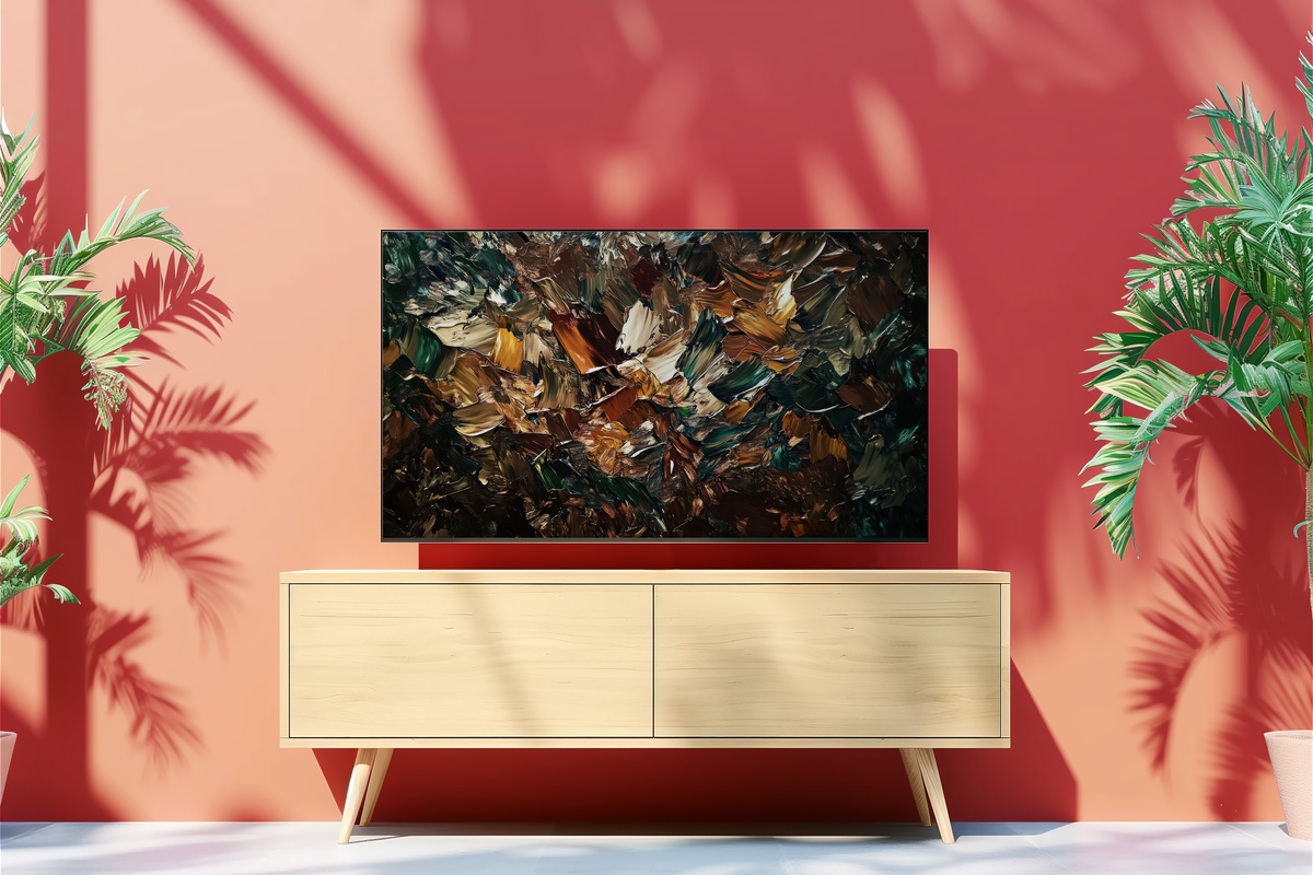
Where Earthy Horizon Whispers is contemplative and horizontal, this piece has genuine forward motion — strokes of ochre, raw umber, and deep terracotta move with an energy that feels handmade in the best possible sense. You can almost read the direction of the brush. That visible gesture is what distinguishes this from more polished digital work; it carries the warmth of a studio rather than a screen. Rooms that already have organic shapes — curved sofas, asymmetric shelving, irregular pottery — will find something that amplifies rather than interrupts their rhythm.
9. Textured Earthy Layers - Frame TV Art
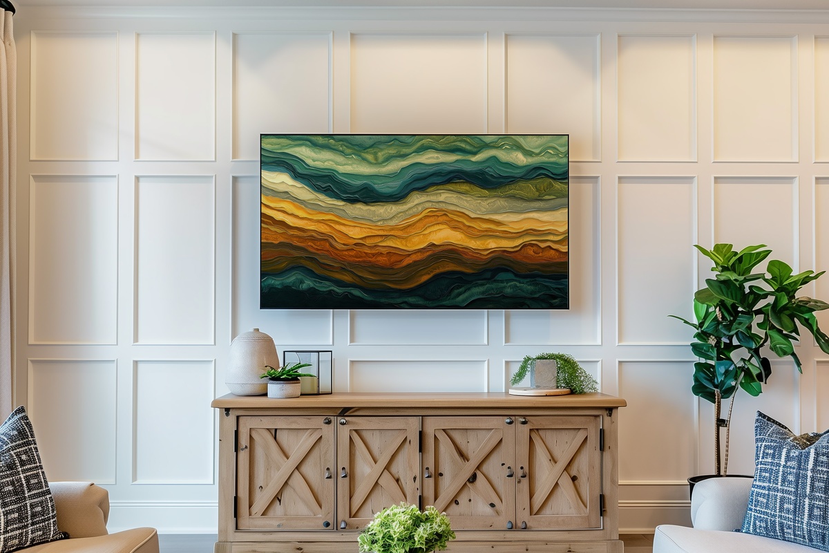
Strata. That's the word this piece keeps returning to — geological layers of warm brown, sand, and burnished amber built up with a textural density that the Frame TV renders with surprising depth. This is the pick for rooms where materiality matters: raw plaster walls, a plank table worn at the edges, a wool throw in undyed cream. It doesn't ask for much in the way of surrounding color — the palette is self-contained and complete. A genuinely grounded piece, without tipping into rustic.
Each of these files is available as an instant download — on your Frame TV within minutes of purchase, no waiting, no subscription required. If one piece has already caught your eye, the rest of the collection is there whenever you're ready to look.
Worth noting as you browse: any combination of three pieces across the full Gallery Flair range — Frame TV art, printable wall art, device wallpapers, all mixed freely — brings the total to 30% off, and five pieces unlocks 50% off. Building one continuous visual world across your home turns out to be the most economical way to do it.