9 Summer iPhone Wallpapers for a Curated, Mood-Board-Worthy Screen
There's a particular moment — phone pulled from a pocket, screen lighting up between meetings or on a slow walk home — where the image you've chosen either matches your energy or quietly misses it. These nine summer iPhone wallpapers are curated for the latter kind of decision: considered, unhurried, built around palettes that feel like a room you'd actually want to live in.
What Makes a Summer Wallpaper Feel Curated, Not Kitschy?
The usual pitfall of seasonal wallpapers is literalness — sunbursts, cartoon crabs, text overlays. What separates a curated summer screen from a novelty one comes down to palette restraint and mood. Look for tones that evoke warmth, salt air, or golden-hour light without spelling it out. Soft saturation, honest negative space, and a clear emotional register matter more than thematic iconography. The nine picks below all pass that test.
1. Whispering Coastal Breeze - iPhone Wallpaper
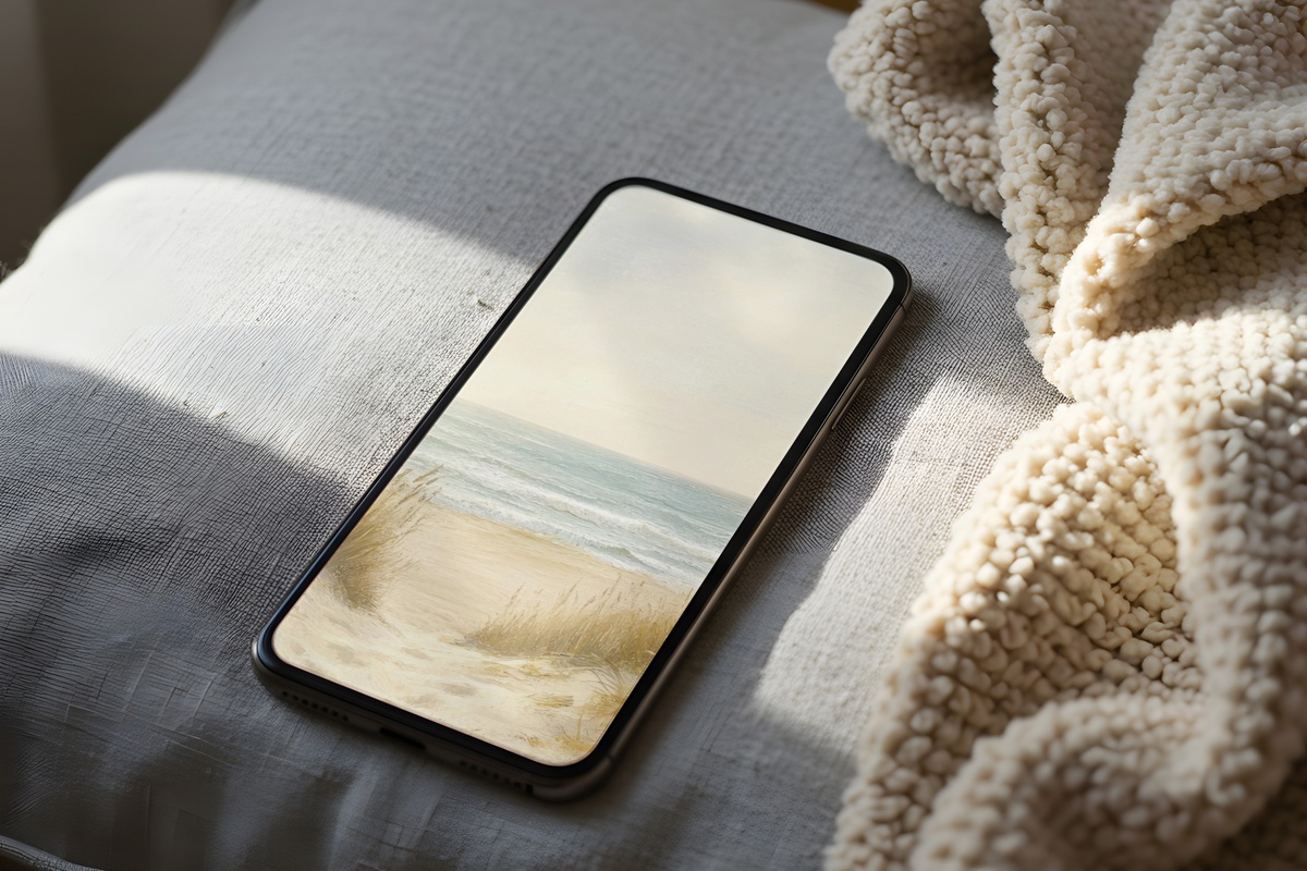
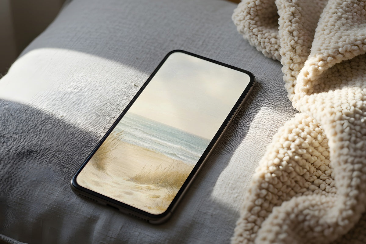
A beige-to-blue gradient that reads less like a screensaver and more like the view from a linen-curtained window facing the sea. The palette sits between driftwood and a faded wash of ocean — grounding without being heavy, airy without being blank. If your home leans toward natural materials, woven textures, and a general preference for less, this is the unlocking moment that keeps that aesthetic going into every pocket check of the day.
2. Summer's Radiant Echoes - iPhone Wallpaper
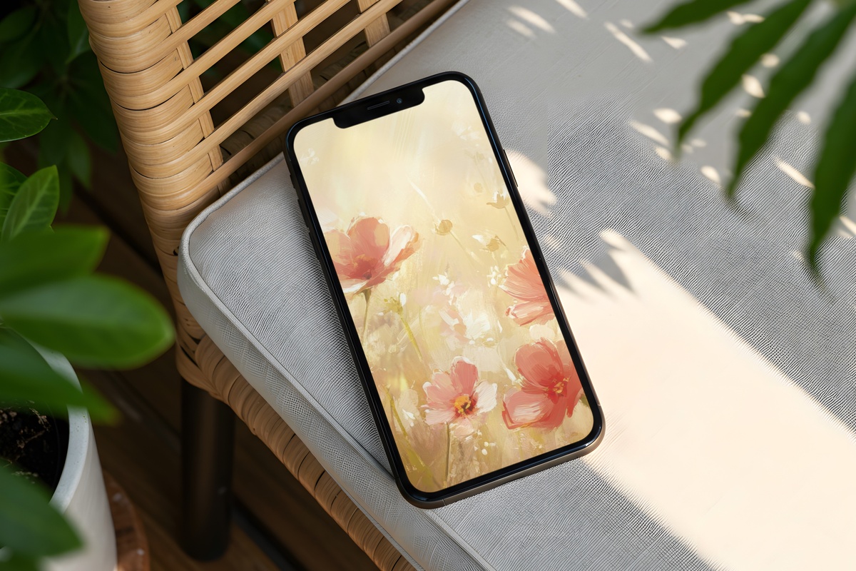
Coral deepening into peach — the color of afternoon light caught on warm plaster. There's a richness here that reads differently from the typical sunset cliché; the warmth is present but not loud, closer to a terracotta wall in late July than to anything neon or oversaturated. Anyone drawn to earthy, blush-adjacent palettes in their home will find this translates naturally to a phone screen, giving the unlock moment a quiet radiance that suits both a soft-life aesthetic and a cleaner, more minimalist feed.
3. Playful Summer Reverie - iPhone Wallpaper
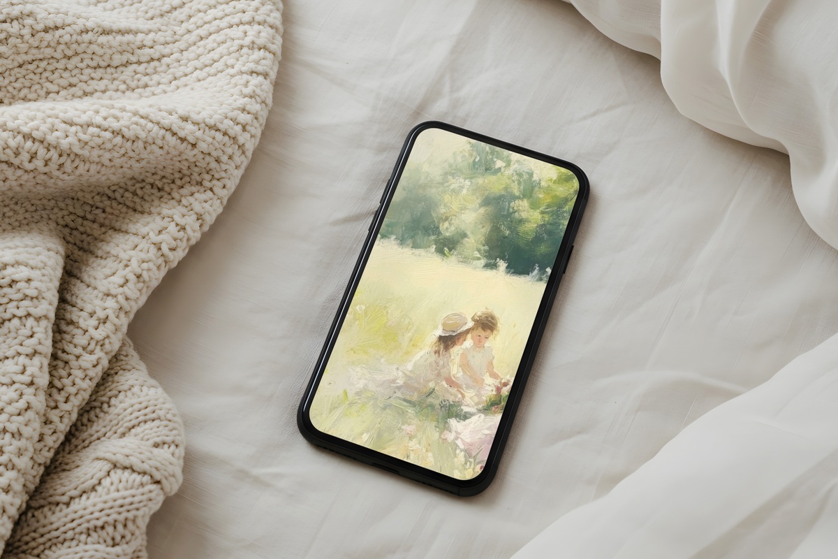
Here the palette shifts into softer, more whimsical pastel territory — the kind of hues you'd associate with a Sunday market, a ceramic mug in a color you didn't expect to love, a room that somehow feels both playful and composed without trying. It doesn't lean coquette in the heavy-handed way some pastel wallpapers do; the lightness here is balanced by genuine restraint in tone and contrast. A natural companion to spaces with curved furniture, soft-organic shapes, and a collector's eye for subtle color.
4. Radiant Wheatfield Reverie - iPhone Wallpaper
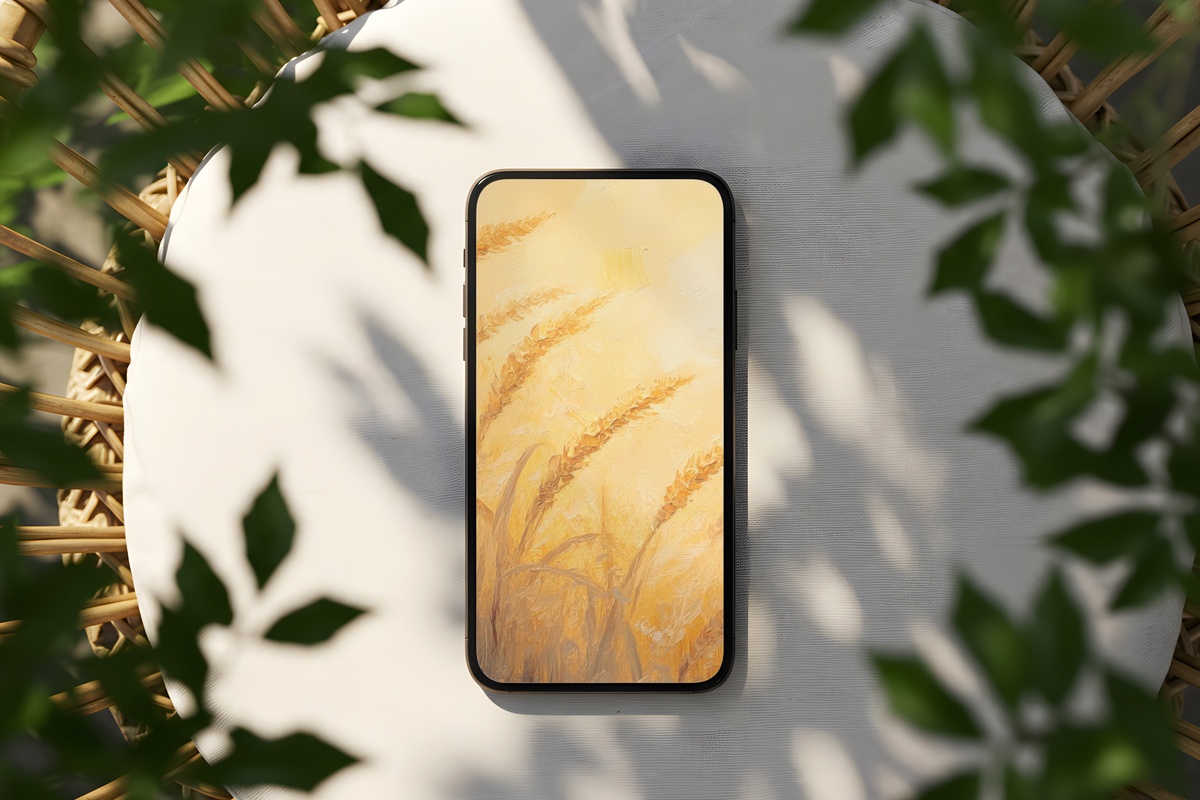
Amber and wheat — tones that belong to the long, dry stretch of midsummer when the light turns golden before it even hits the horizon. This one carries a stillness that feels almost agricultural in the best sense: unhurried, warm, grounded in something real. It pairs visually with rooms that feature raw linen, dried botanicals, or aged brass hardware. Pull it from your pocket mid-morning and the warmth registers immediately — not as decoration, but as atmosphere.
5. Emerald Dreams of Palm - iPhone Wallpaper
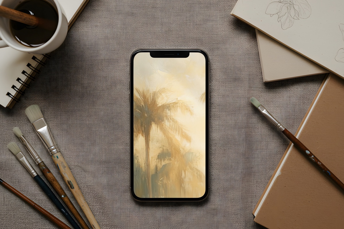
A muted emerald — not the bright, saturated green of a tropical resort brochure, but the deeper, more interior tone you'd find in a vintage botanical print or a shadowed garden in mid-afternoon. The warmth beneath the green keeps it from reading as cold or clinical. She'll know exactly what this means: that specific register where lush meets restrained, where green becomes a neutral. Works beautifully as a phone wallpaper for anyone building a home around plants, earthy color, and a general distrust of anything too precious.
6. Tropical Tranquility Tides - iPhone Wallpaper
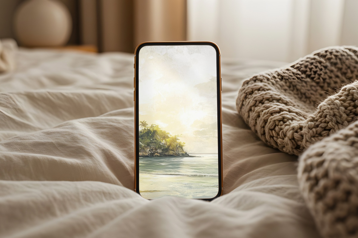
Soft blues and greens layered in a way that suggests tidal movement — not literal waves, but the color memory of water: shallow, clear, and slightly cold even in summer heat. This one is for screens that get pulled out in bright light, because the palette holds beautifully at high brightness without becoming garish. Among this entire edit, it has the most immediate cooling effect — the moment of unlocking genuinely shifts the room's felt temperature, which is a small and pleasurable thing to experience six or eight times a day.
A note on building a visual world across your devices: if a palette speaks to you on your phone, consider carrying that same temperature through your Frame TV art or a printed wall piece. A beige-and-blue coastal mood at pocket scale reads just as intentionally on a gallery wall. That kind of continuity — small screen to large — is something we find genuinely lovely to build toward.
7. Lavender Dreamscape at Twilight - iPhone Wallpaper
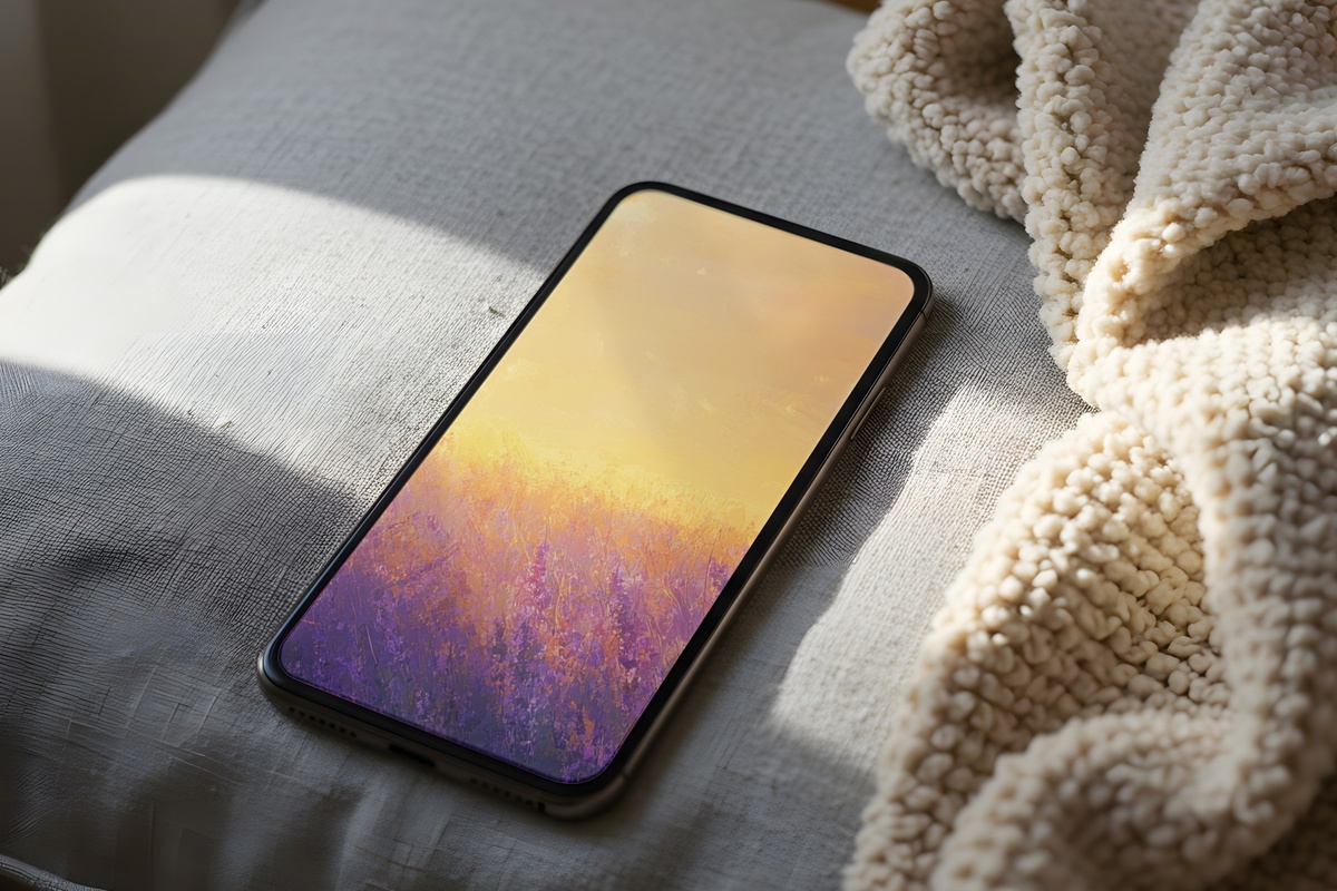
Lavender at the cooler end of the pastel spectrum — not the powdery, overtly sweet version the color sometimes becomes, but a more silvered, dusky tone that sits closer to twilight sky than to a candle boutique. It suits the phone-before-bed ritual, the quiet wind-down moment when the screen is the last thing you see. If your evenings involve tea, dimmed lamps, and a general resistance to anything overstimulating, this wallpaper settles into that rhythm with uncommon ease.
8. Sunny Shore's Harmony - iPhone Wallpaper
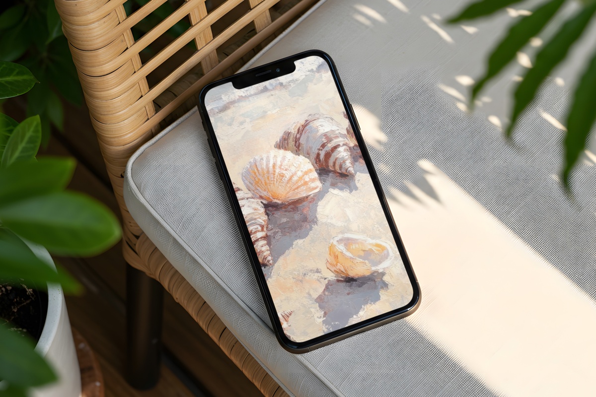
Where some pieces in this edit settle into quietude, Sunny Shore's Harmony carries a gentle brightness — the soft hues here have warmth and lift, the way a whitewashed room fills with light on a clear morning without ever feeling harsh. It's composed without being stiff, warm without tipping toward saturated. An excellent all-day companion for the phone that moves between a coffee shop, a linen-covered desk, and an evening out — a wallpaper that doesn't ask for a specific context to look right.
9. Coastal Calm of Timeless Reflections - iPhone Wallpaper
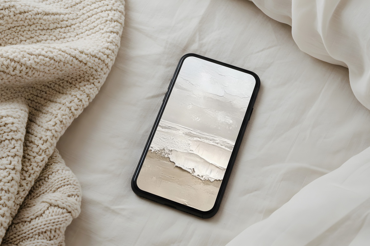
Calming beige with a coastal undertone — sand-warm, slightly misted, with the specific quality of light that arrives on a still beach morning before anyone else has come out. Among the nine, this one has the most staying power across seasons; the palette doesn't read as urgently summery, which means it will still feel right come September. It suits the clean-girl aesthetic that values a neutral, considered screen above novelty — a phone wallpaper that functions less like a seasonal swap and more like a keeper.
Each of these wallpapers downloads instantly — on your screen within moments of purchase, no subscription required, yours to keep and use across every device. Summer has a way of passing before you've properly settled into it, so setting one of these up now means living with the right light for the whole season rather than catching the tail end of it.
And if a palette has drawn you in — whether it's the coastal beige, the amber warmth, or the twilight lavender — consider carrying that same mood across your wall art or Frame TV pieces. Any three items across the full Gallery Flair collection (phone wallpapers, printable wall art, Frame TV art — any mix) brings the price down by 30%, and any five pieces together brings it to 50% off. Building one continuous visual world across your home costs considerably less than it sounds.