8 Floral iPad Wallpapers That Decode the Botanical Aesthetic
There's a particular feeling that arrives when you lift your iPad from the nightstand and the screen blooms open — not just to an app or a notification, but to something genuinely worth looking at. Floral iPad wallpapers have become a quiet language of their own: they signal a certain attentiveness to small beauty, a preference for softness over noise. This edit gathers eight distinct takes on that language, from ink-washed pastels to deep jewel-box contrasts.
What Makes a Floral iPad Wallpaper Actually Work?
Not every botanical image earns a place on a screen. The ones that do tend to share a few things: a considered palette that doesn't compete with app icons, a composition with enough negative space to breathe around UI elements, and a mood specific enough to feel curated rather than stock. Look for pieces where the light source reads naturally — where shadows fall convincingly and petals seem to exist in three dimensions. That quality is the difference between a wallpaper you swap out in a week and one that stays for a season.
1. Floral Fluidity in Serenity
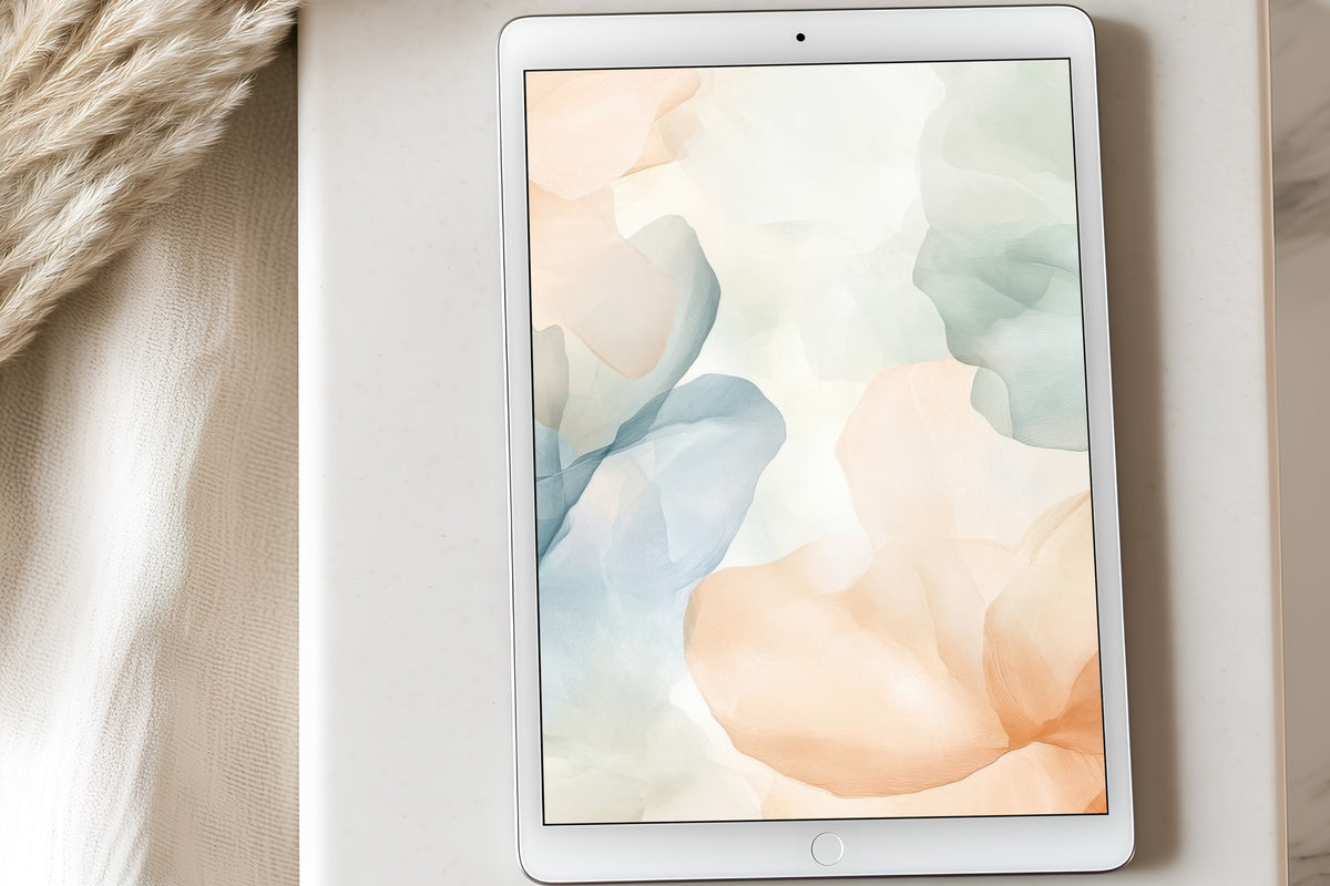
Imagine a watercolor left to dry in morning light — pigment pooling just slightly at the edges of each petal, the whole composition held in a palette of blush, ivory, and the faintest sage. Floral Fluidity in Serenity operates in that register. The blooms don't assert themselves; they drift. For anyone whose iPad sits open on a desk during a long work session, this is the kind of ambient backdrop that keeps the eye rested without demanding attention. Soft, unhurried, and genuinely pretty to wake up to.
2. Orchid Elegance in Soft Light
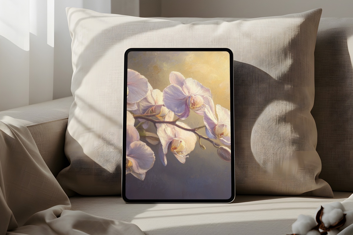
Orchids photographed under diffused window light carry a particular kind of refinement — nothing showy about it, just the geometry of the bloom and the way indirect sun renders each translucent petal. This piece leans into exactly that. The tones sit between warm pearl and pale mauve, and the composition is restrained enough that it reads as art first, wallpaper second. She'll gravitate toward this one if her aesthetic already includes linen, neutral ceramics, and a small vase of dried stems on a shelf. One of the more quietly confident picks in this edit.
3. Dark Background Blush Blooms
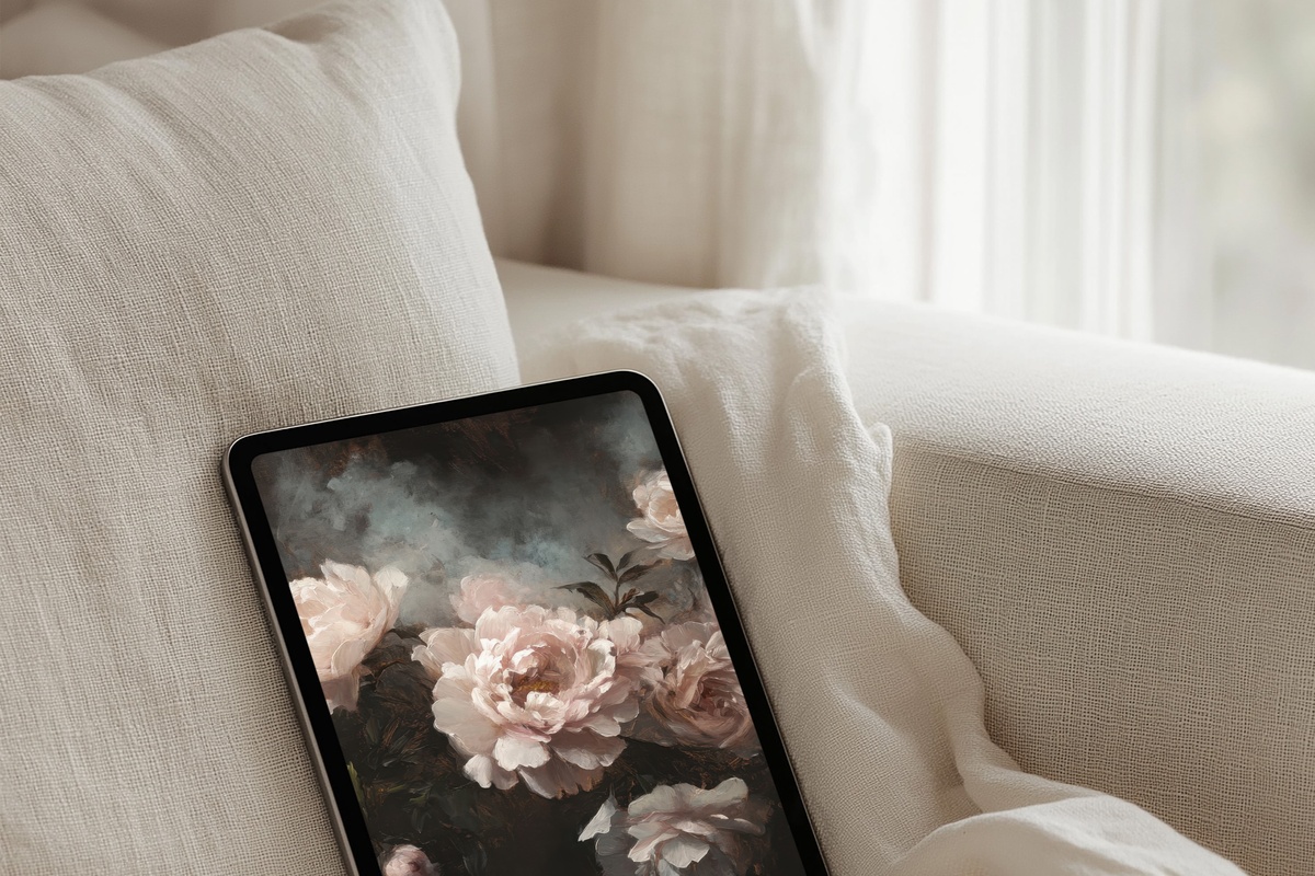
Most floral wallpapers reach for lightness. This one goes the other direction — and the contrast is arresting. Blush and rose-cream petals set against a near-black background produce the kind of drama you get from a Dutch Golden Age still life, where flowers glow as if lit from within. On an iPad screen in a dim room, this piece comes alive in a way that pale-ground alternatives simply cannot. If every other floral in this edit reads as morning, this one is unambiguously evening — a deliberate choice for a deliberate aesthetic.
4. Eternal Spring Cherry Blossoms
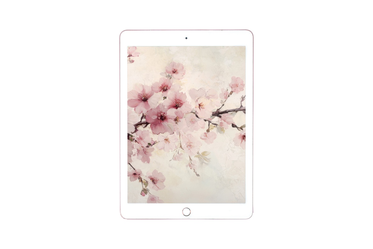
Cherry blossoms are one of those motifs that could easily tip into sentiment — all pink fluff and no structure. This piece avoids that entirely by keeping the palette close to true: the blossoms read as a dusty, slightly grey-pink rather than a candy hue, and the branch work grounds the whole composition with genuine weight. There's a Japanese aesthetic influence here that shows in the use of open space around the clusters. Pull this up on a cold-weather afternoon and the screen feels warmer than the room actually is. Quietly seasonal, broadly flattering to most home-screen layouts.
5. Nature's Floral Wreath Harmony
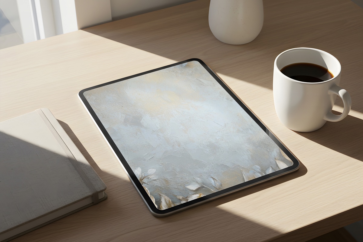
A wreath composition gives a wallpaper something most botanicals don't have: a visual center of gravity that actually suits an iPad's portrait orientation. The eye settles into the ring of petals and stems, then reads outward to the ground. This piece uses a mixed-bloom palette — dusty rose, soft peach, a thread of muted green — with enough variety in the floral shapes to feel hand-gathered rather than designed. Anyone who keeps a real vase of cottage garden flowers on their desk will recognize the impulse behind this one. Warm, rounded, and surprisingly versatile across light and dark UI settings.
6. Minimalist Floral Line Dream
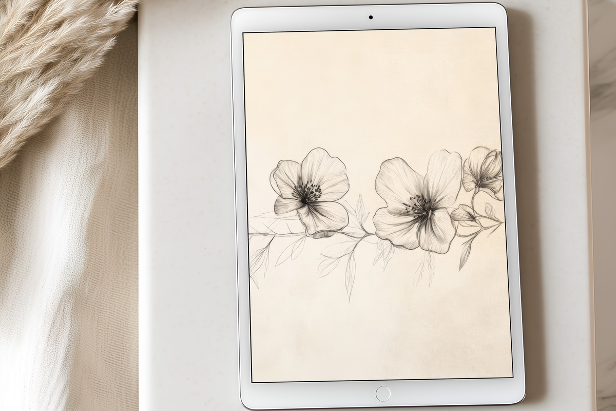
Line-work florals occupy a different register than their painterly cousins — less about color saturation, more about gesture and restraint. This piece brings single-weight botanical illustration into a pastel field, and the result is something closer to a page from a very good sketchbook than to a print. It's the edit's most minimal option, which also makes it the most useful: the sparse lines read cleanly through app icon grids, and the pale ground works equally well in sunlight or under low artificial light. For anyone whose aesthetic vocabulary runs toward clean girl or quiet minimalism, this is a natural anchor.
7. Pastel Garden Bloom Dance
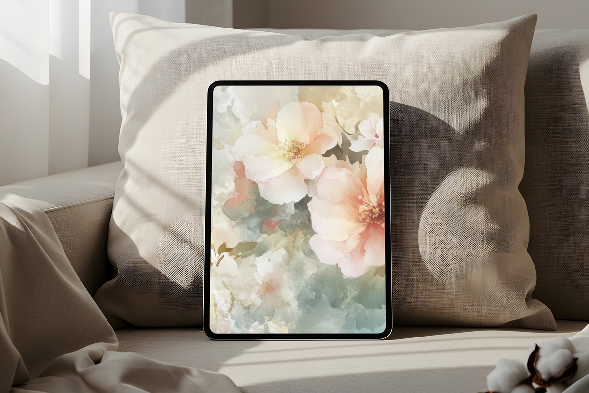
Where most watercolor-style florals settle into stillness, this one moves. The arrangement has a looseness to it — stems crossing at slight angles, petals caught mid-unfurl — and the palette shifts across the composition from chalky lilac to sun-warmed peach without ever losing coherence. It reads less like a posed still life and more like something glimpsed through a cottage window in mid-afternoon. Pair this with a warm-toned phone wallpaper or a soft botanical print in the same dusty hue family, and the visual world you're building starts to feel genuinely considered rather than assembled by accident.
8. Glass-Held Eucalyptus Grace
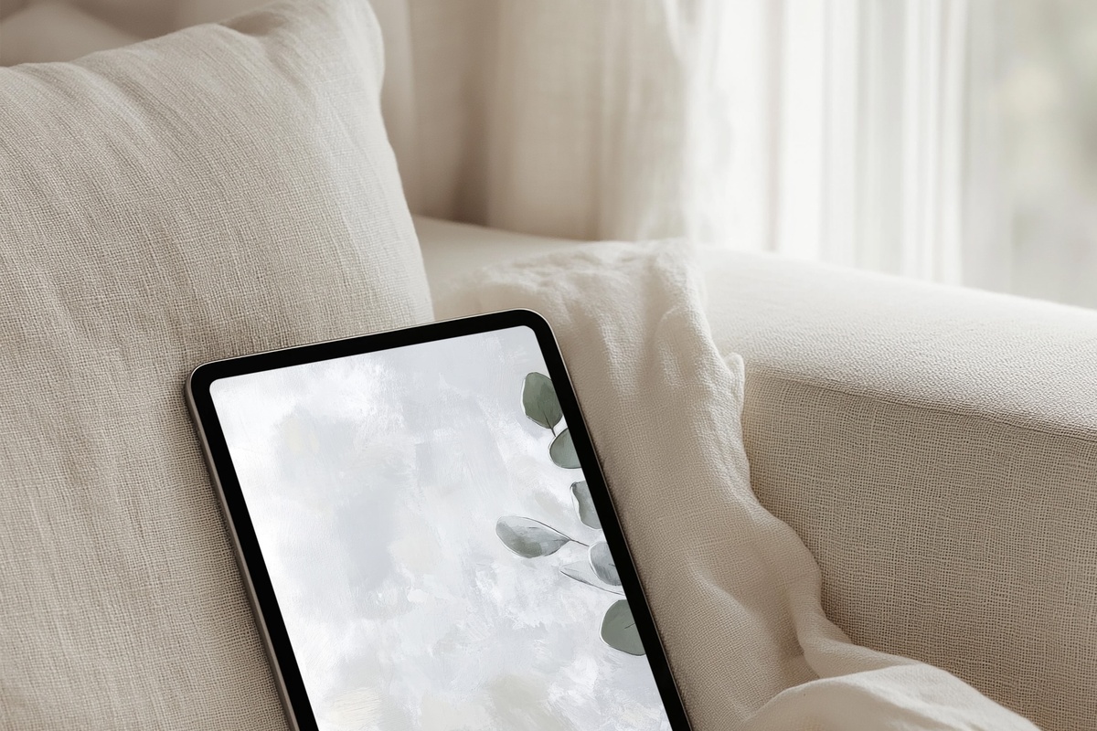
This one earns its place by being something slightly different from the rest: a botanical scene with a domestic object at its center. Eucalyptus stems held in a glass vessel, rendered in the silvery-green and cool grey tones that make this plant endlessly photographed. The glass introduces a translucency element — refracted light, a faint reflection — that gives the composition a depth that flat botanical prints rarely achieve. It's also the edit's most neutral pick by palette, which makes it extraordinarily easy to live with. Refresh your screen after a long afternoon and it genuinely feels like setting fresh stems on a table.
Each of these arrives as an instant download — on your screen within moments of purchase, no waiting, no subscription, yours across every ratio your device needs. The collection is open whenever you're ready to change what your first screen says about you.
And here's a small note on building a set: the 3-for-30% and 5-for-50% discounts apply to any combination across the full Gallery Flair range — mix iPad wallpapers with printable wall art or phone wallpapers and the thresholds count together. Three pieces in a shared botanical palette, spanning your wall, your tablet, and your phone, adds up faster than you'd think.