8 Floral Desktop Wallpapers That Bring a Curated Living Room Energy to Your Screen
There's a particular quality that shows up when you open your laptop on a slow morning — the screen lights up before you've even reached for your coffee, and for one unguarded second, it sets the entire register of the day. A floral desktop wallpaper, chosen with some intentionality, does something a neutral grey never quite manages: it gives the room a second heartbeat.
This edit is for the woman whose desktop is an extension of her aesthetic — not a utility screen, but another surface in the room she's been quietly curating. We pulled eight pieces across wildly different moods: ink-fluid, dramatically shadowed, watercolor-light, silhouetted, and quietly rustic. One of them will fit your palette exactly.
What Makes a Floral Desktop Wallpaper Feel Curated Rather Than Cluttered?
The difference usually lives in restraint. The strongest pieces either commit to a single dominant subject with generous surrounding space, or they distribute pattern with enough tonal consistency that the eye can rest. Color temperature matters too — warm ochre-and-blush feels entirely different from cool lavender-and-bone at 9 a.m. when the screen is the brightest thing on your desk. Look for compositions where the floral element has room to breathe, and where the background hue is one you could imagine on a wall.
1. Floral Fluidity in Serenity
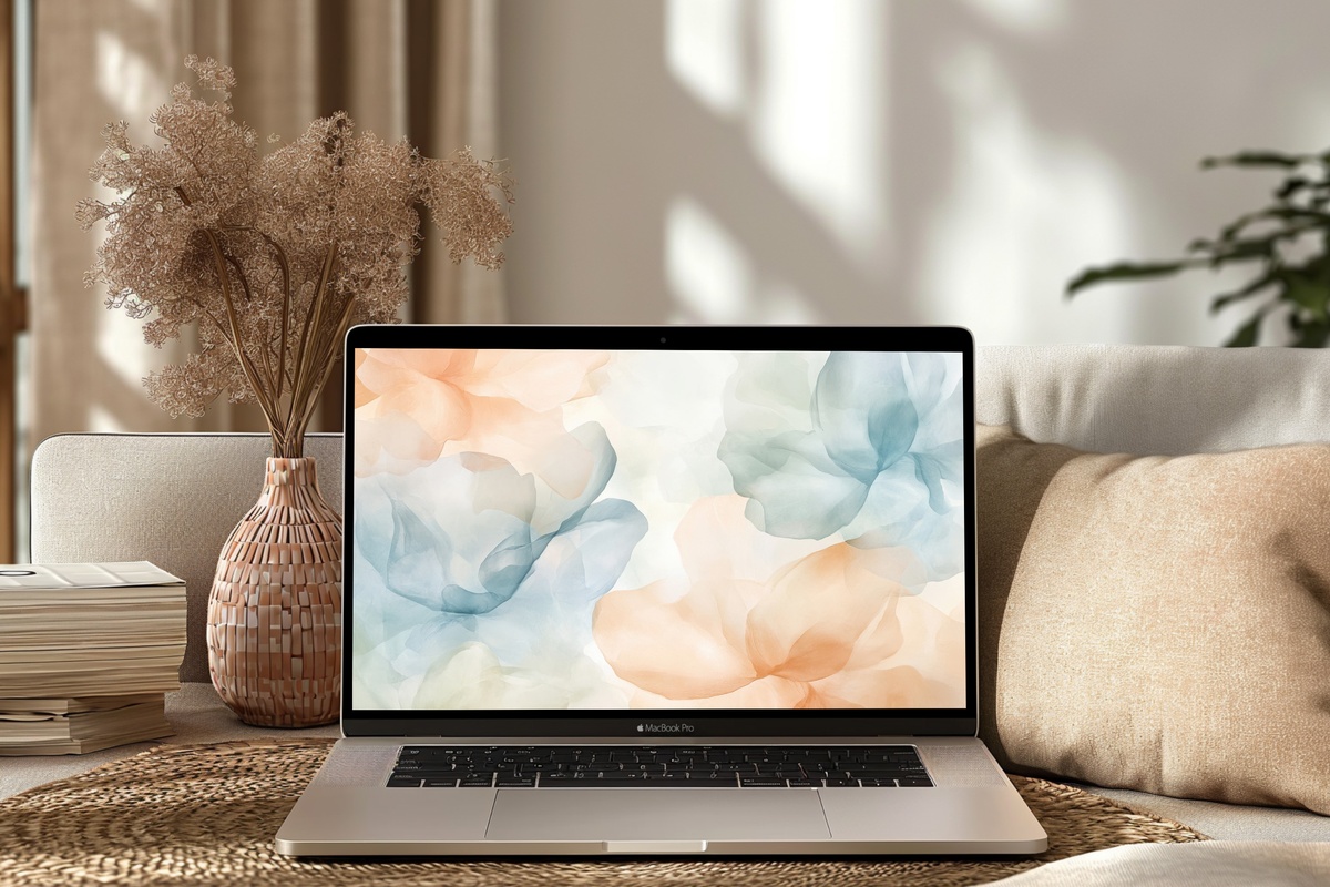
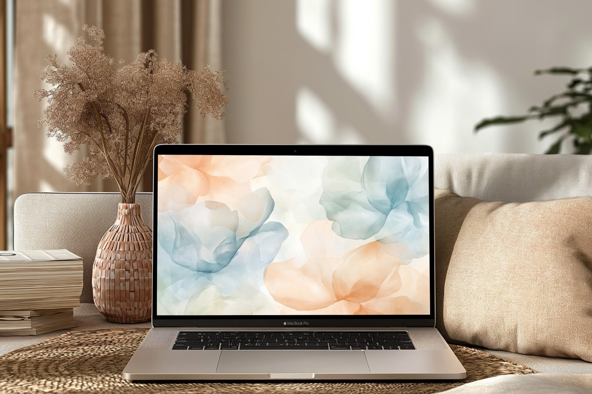
Petals dissolving into pale water — that's the closest visual shorthand for what this piece does. The ink spreads in the way only wet-on-wet florals can, trailing edges that never quite resolve into sharp lines. The background holds a cool, porcelain-white tone that keeps the whole composition from reading as dense. On a MacBook screen mid-morning, with a ceramics mug in your peripheral vision, it reads less like wallpaper and more like a framed print you happened to also be working in front of.
2. Blush Florals in Dramatic Shadows
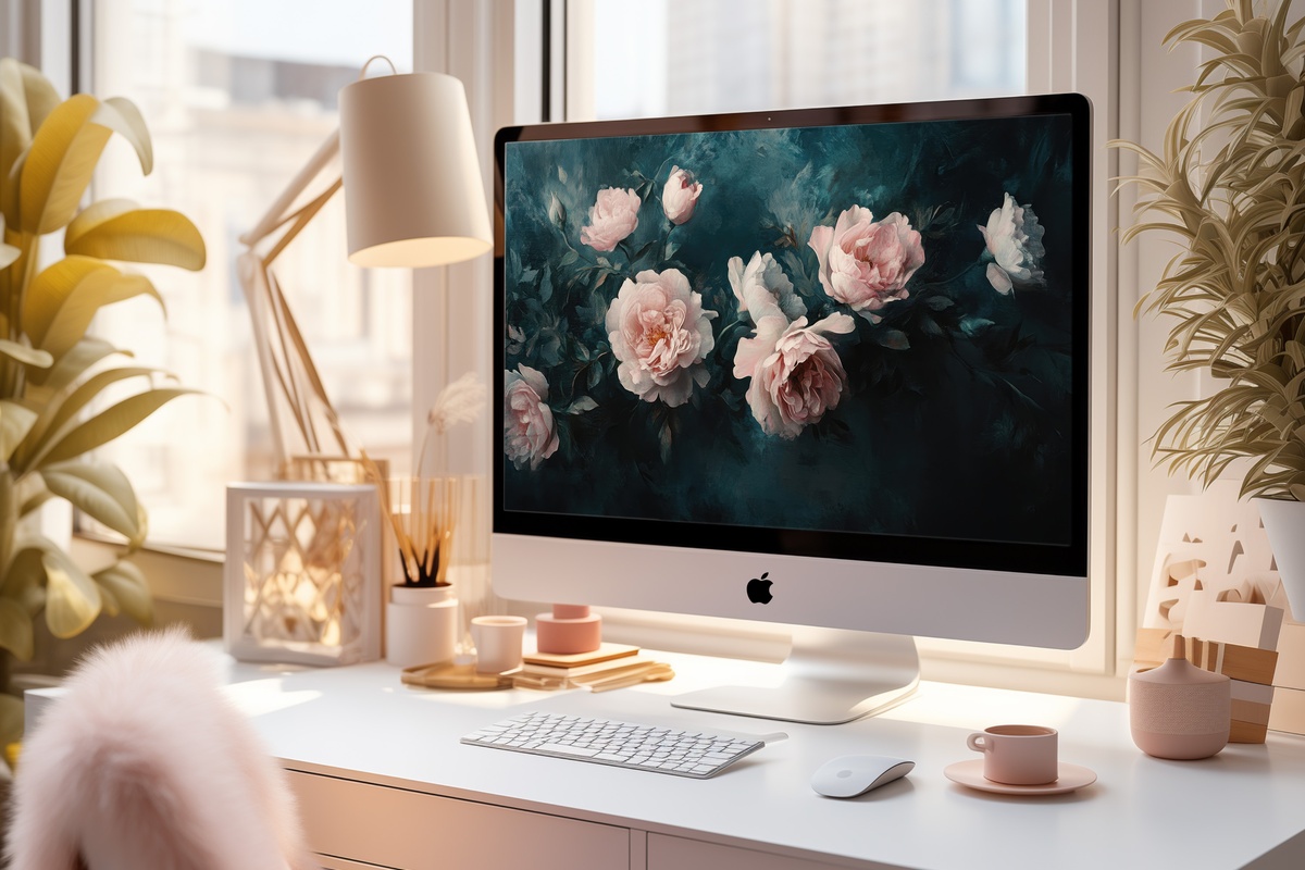
Plenty of floral wallpapers lean sweet. This one leans into chiaroscuro — blush peonies pressing forward against a background that recedes into near-black. The contrast is operatic in the best sense: vivid without being loud, structured around deep tonal shadow the way old Dutch flower paintings are. If your home runs toward moody lighting, dark wood, or charcoal-toned textiles, this is the screen companion that doesn't apologize for having a point of view. A genuinely striking piece that reads as intentional art direction rather than decoration.
3. Blush-Toned Centerpiece Whimsy
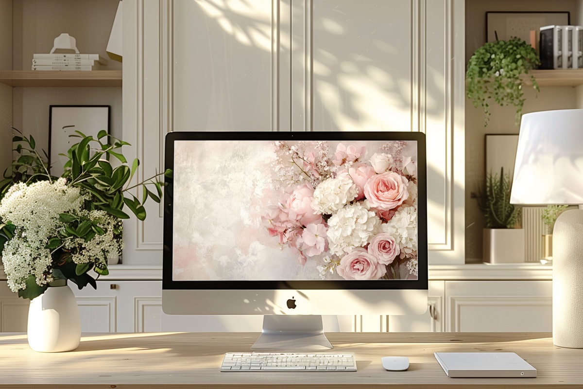
Where the dramatic shadows piece uses contrast as its primary tension, this one uses softness — deliberately. A single blush bloom sits in the center of the frame with the composed assurance of something arranged, not scattered. The surrounding negative space carries a warm ivory that shifts the whole palette from clinical white toward linen. It's the floral desktop wallpaper for someone who keeps a bedside table with one book and one candle, never three of anything. Understated in the way that takes actual discipline to achieve.
4. Floral Vine Watercolor Grace

Watercolor florals have a reputation for going saccharine. This one escapes it through the vine structure — there's a loose architectural quality to how the stems thread across the frame, giving the soft washes of coral, sage, and dusty rose something to anchor against. It feels like a page from a botanist's sketchbook left open on a sunlit table rather than a stock pattern pulled off a mood board. Pair this mentally with a room that has linen curtains, natural light, and at least one plant that is actually thriving.
5. Beige Florals in Outline Grace
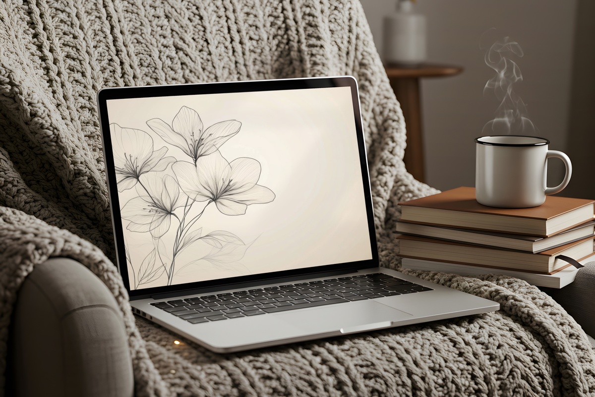
Line-drawn florals on a warm beige ground occupy a different register entirely from anything painterly — closer to engraving than illustration, with just enough weight in the stroke to feel considered. This piece works especially well on screens you keep open in a shared space: a home office corner, a kitchen counter desk, a studio table. The neutral warmth of the base means it reads as background when you need to focus, and surfaces as design when someone else walks through the room. Genuinely versatile without sacrificing character.
6. Velvet Rose Silhouette
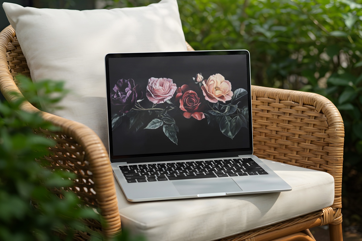
If Blush Florals in Dramatic Shadows is the moody romantic, the Velvet Rose Silhouette is the one that commits completely to darkness — rose forms rendered as pure silhouette against a ground so deep it absorbs light rather than reflecting it. The result is something between textile and photography, the kind of graphic restraint that makes other floral wallpapers feel fussy by comparison. Anyone drawn to coquette-dark or noir-botanical aesthetics — the black-and-deep-red shelf, the taper candles, the pressed velvet throw — will understand immediately what this piece is doing.
7. Dandelion Seed Magic
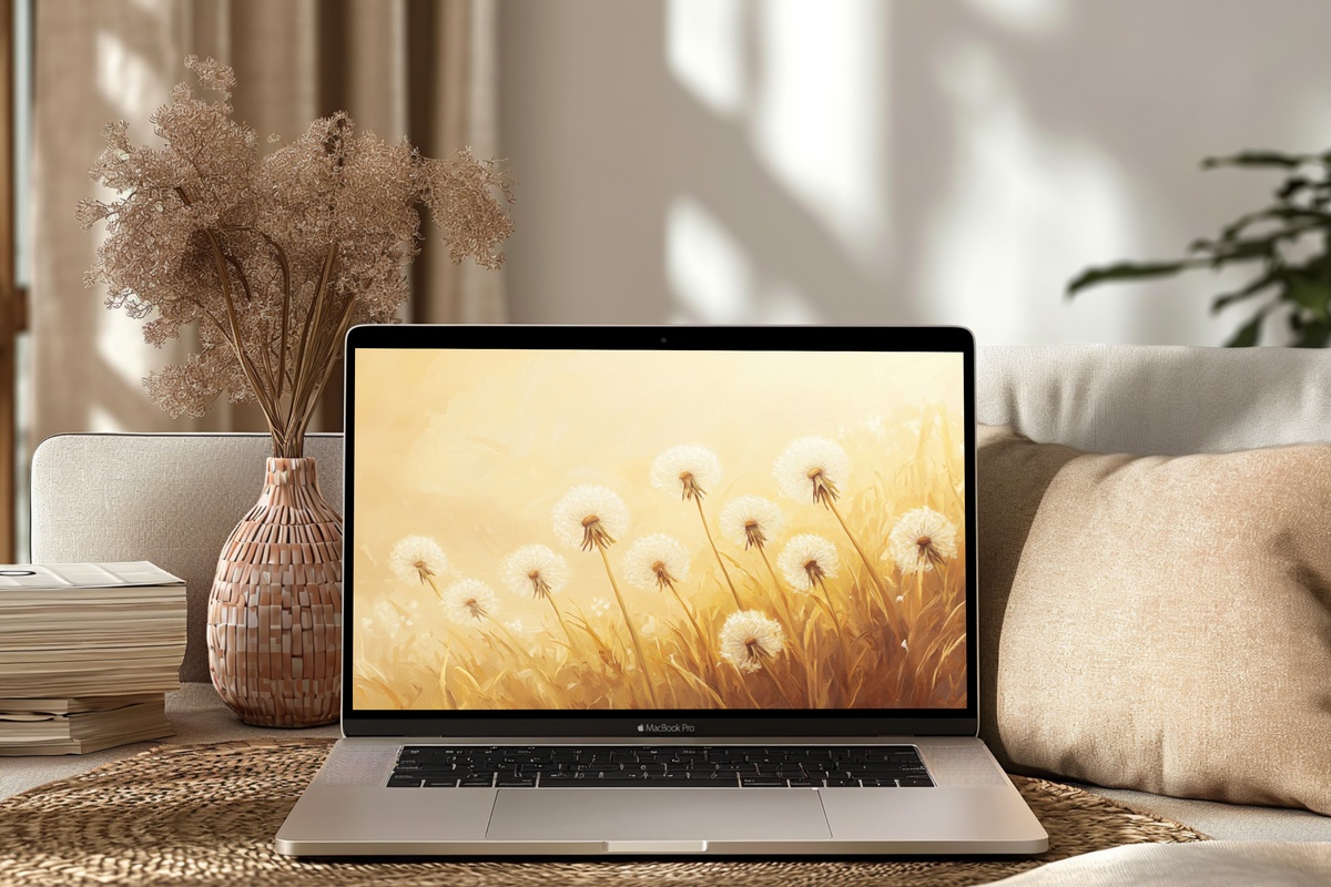
Every other piece in this edit uses flowers as its anchor. This one uses dispersal — golden dandelion clocks mid-release, seeds catching some imagined updraft across the frame. The palette is warm amber and pale gold on a background that suggests late afternoon rather than noon. There's genuine movement in the composition, a sense that something is passing rather than static. For a room built around natural materials, raw wood, and handmade ceramics, this piece carries the same unhurried energy without trying to match it literally.
8. Rustic Lavender Wreath Whimsy
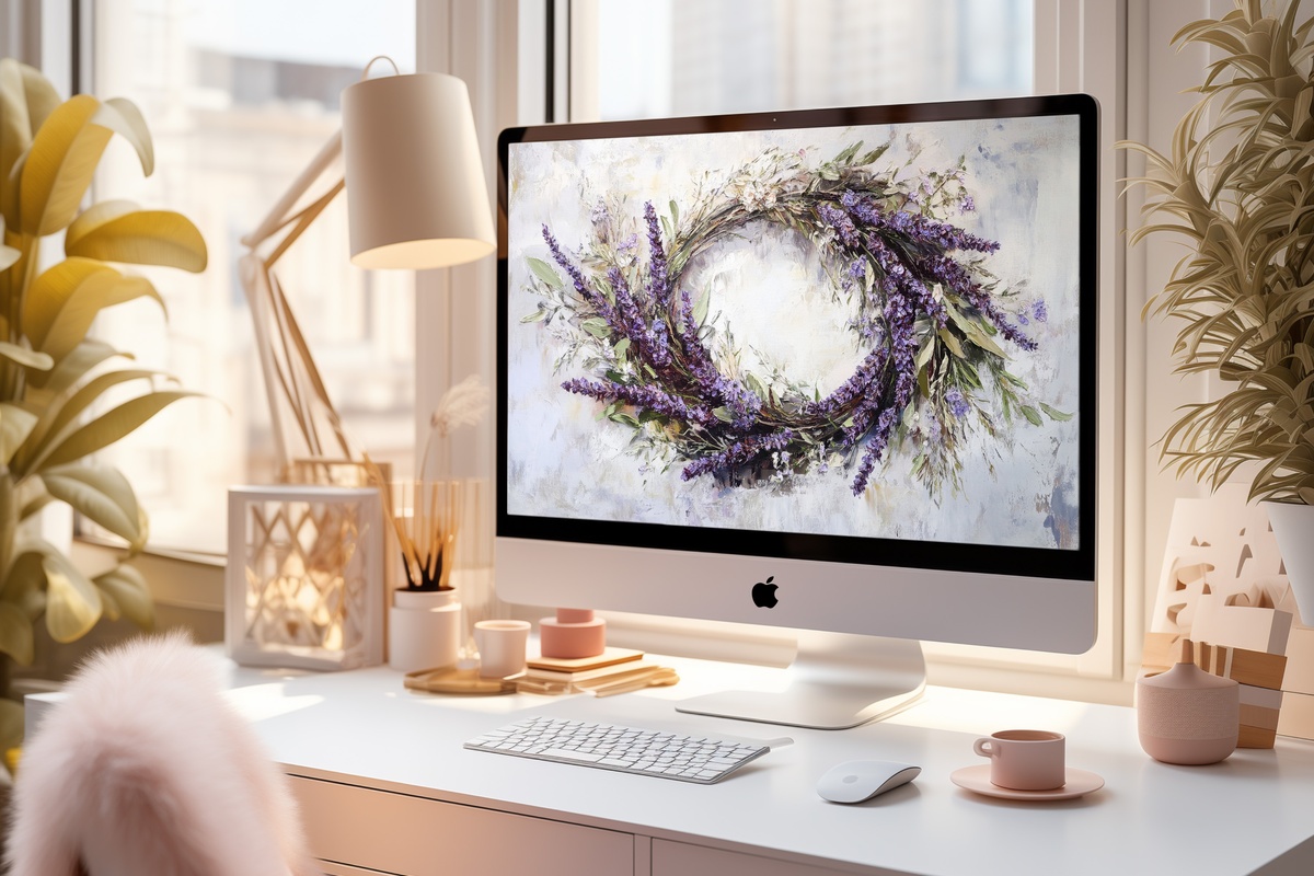
A wreath composition creates a natural focal point — the eye circles the arrangement and comes to rest at the center, which here is open space, not another element. The lavender palette runs from grey-lilac through dusty mauve, kept from reading as overly sweet by the slightly weathered, hand-tied quality of the illustration style. Think of a Provençal kitchen shelf rather than a bridal mood board. Rooms with sage-green walls, aged terracotta, or warm stone tones will find this piece slips in like it was always planned to be there.
Each of these downloads directly to your device — no waiting, no accounts, no subscription. Set one up this afternoon and see whether the room agrees with your choice by morning; that feedback loop is genuinely one of the pleasures of digital art. All eight live in the Gallery Flair collection, ready when you are.
And if you find yourself drawn to two or three — or want to carry a palette from your screen across a wall print or Frame TV piece — the numbers work out kindly: any three pieces from anywhere in the collection come in at 30% off, and any five at 50%. Different formats, same visual world. Worth keeping in mind as you browse.