8 Fall iPhone Wallpapers That Feel Like a Curated Living Room
There's a moment, somewhere between September and October, when you pull your phone from your pocket and the screen just feels wrong — too bright, too sterile, somehow out of step with the light outside. These eight fall iPhone wallpapers are for that moment. Warm amber canopies, misty forest paths, sun-caught orchards — each one chosen because it carries the specific mood of the season, not a cartoon version of it.
What Makes a Fall iPhone Wallpaper Worth Keeping?
The most lasting wallpapers work like a still from a film you already love. Look for a palette that reads warm without veering into orange overload — think burnished gold, muted ochre, and bone-white fog. Composition matters too: a strong horizon line or centered subject gives the lock screen something to anchor to, while softer, more diffuse images breathe better as home screens. And a mood-first approach — choosing by feeling rather than by literal autumn symbols — tends to age better all season long.
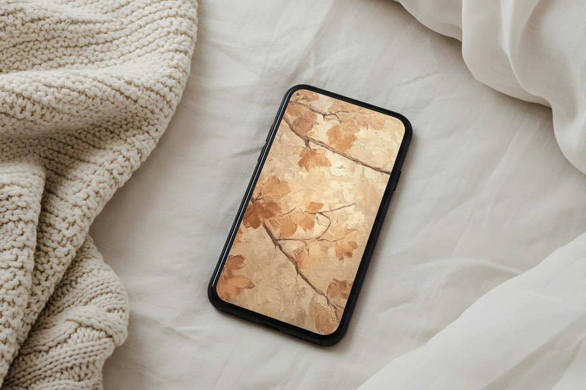
1. Sunlit Amber Canopy - iPhone Wallpaper

Golden light filtered through a dense canopy — this one reads less like a photograph and more like a memory of a walk you wish you'd taken. The palette moves from deep amber at the edges to a luminous honey center, giving the screen a natural focal warmth the moment it wakes. It works especially well for anyone who keeps their phone face-up on a desk, where that glow catches the eye all day. Grounded, unhurried, and far closer to late-October afternoon light than to anything seasonal-trend-adjacent.
2. Orchard Apple Harvest - iPhone Wallpaper

There's something about a harvest scene rendered in muted, dusty tones that avoids every cliché it could have fallen into. This one keeps the reds quiet — closer to dried rose than candy apple — set against soft grey-green foliage and a pale, diffused sky. The result feels more editorial than rustic, which is exactly the distinction that matters if your aesthetic runs clean and considered rather than farmhouse-cozy. Pull your phone out of your bag on a Tuesday morning and this is a genuinely nice thing to see.
3. Neutral Cottage Autumn Calm - iPhone Wallpaper

Soft amber, aged linen, a whisper of sage — this is autumn rendered through a neutral lens, stripped of the usual saturation. The composition rests quietly in the centre of the frame without demanding attention, which makes it ideal as a home screen background where widgets and app icons still need room to breathe. If your phone background is usually white or grey and you're cautious about going seasonal, this is where to start. It earns its place without announcing itself.
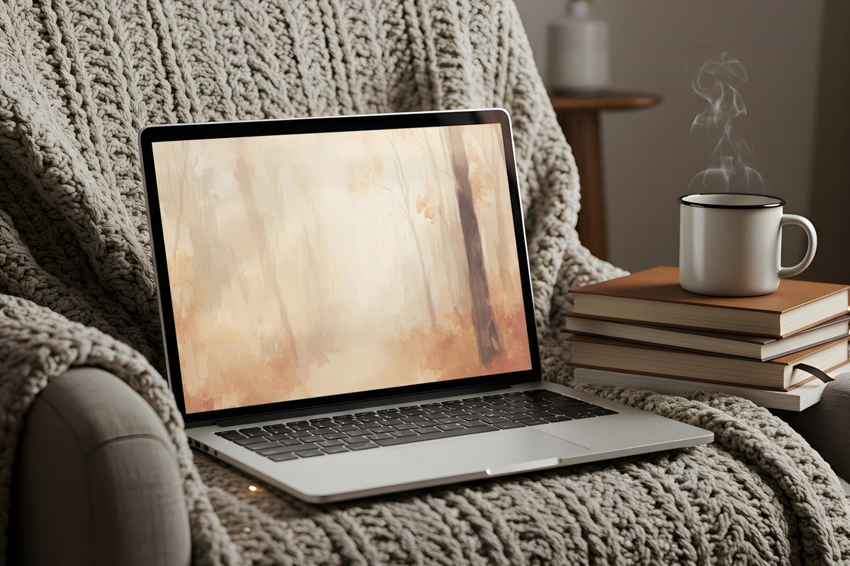
4. Forest Deer Tranquility - iPhone Wallpaper

Misty woods, warm neutrals, and a deer half-swallowed by morning fog — this fall phone wallpaper operates in a genuinely different register from the rest of the edit. Where others offer warmth, this one offers stillness. The tonal range is narrow: pale fawn, smoke, and the faintest blush of moss. It's the screen you unlock at 6 a.m. before the day starts, or on a slow rainy afternoon when you want something quieter than what's outside your window. Understated in the best possible way.
5. Autumn Stream Serenity - iPhone Wallpaper

Water and autumn foliage together produce a particular palette that's hard to replicate in flat design — the way the colors double and blur in the reflection gives this image a depth most phone screens rarely show off. The warm terracotta and rust tones in the canopy above mirror themselves in the moving water below, creating a gentle visual rhythm that makes the whole frame feel alive. A natural fit for anyone whose lock screen aesthetic trends toward the kind of nature imagery that reads as fine art rather than screensaver.
6. Pumpkin Cart Harvest Harmony - iPhone Wallpaper

Yes, there are pumpkins here — and yet this manages to sidestep every over-decorated autumn cliché that subject usually invites. The scene is styled with genuine restraint: muted squash tones against weathered wood and dry grasses, shot in the kind of flat, even light that belongs to late September mornings. It's the pick for readers who love the harvest season's tactile quality — the texture of rough bark and dried stems — but have no interest in anything that reads as seasonal decoration rather than considered art.
7. Vineyard Path in Autumn Gold - iPhone Wallpaper

A gravel path bisecting rows of vines turning gold — it's a subject with art historical weight, and this image earns the reference. The tonal palette here is drier than the others in the edit: muted gold, pale sage, and the silvery grey of autumn sky. Something about the receding perspective of the path gives the lock screen an unusual sense of invitation, as if you're about to step somewhere. Pair it with a warm-toned Frame TV art piece or a complementary wall print in the same dusty-gold family and you'll feel the connection across every screen in the room.
8. Autumn Picnic Warmth - iPhone Wallpaper

Soft ochre, faded olive, and the particular warmth of afternoon light falling across a wool blanket and scattered leaves — this image has a tactile quality that most phone screens don't get to carry. It's styled simply, with nothing extraneous in the frame, and that restraint is what gives it staying power. Swap it in as the season shifts from early fall into November and it continues to feel right. Anyone whose phone is an extension of her home's visual identity will recognize exactly what this is doing.
Each of these downloads to your device in moments — no subscription, nothing to install, yours to keep and set immediately. If you're building a visual world that runs consistently from your phone screen through to your living room wall, the collection is open whenever you're ready.
One quiet note on the numbers: mix and match freely across product lines — a wallpaper here, a Frame TV piece, a printable wall print — and three pieces together brings 30% off, five brings 50%. The season is already here; there's real pleasure in setting everything up before the best weeks of it pass.